Type: A brief guide on typography
What do Chanel, Target, and Harley Davidson have in common? They all use Helvetica. This versatile Swiss typeface speaks to us every day. It’s on street signs, album covers, paper coffee cups, and even the shopping bags of our favorite stores.
Helvetica is just one of many expressive typefaces available to us today. If you’re a business owner that needs an introduction or a designer in need of a brief refresher to typography and font selection, we’ve put together a little guide. We won’t get too in depth- just some basics of typography, different type families, and some recommendations on our favorite typefaces. Sound good? Let’s jump in!
Typography
Typography is the art of arranging letters and characters in creative ways without impacting legibility. Typography isn’t just selecting an interesting font, it’s the art of adjusting the size, spacing, and placement of text in creative ways that captures the viewer’s attention. (source).
Typefaces vs Fonts
One common misconception is that typefaces and fonts are the same thing. The key difference is that font is what you use and a typeface is the creative style you see. In the early days of manual printing, individual metal blocks were used to print each character. If you wanted to use the typeface Baskerville, you would need to purchase the font in the desired point size, style, and weight separately.
Leading, Kerning & Tracking
Leading is the vertical spacing of lines of text. When dealing with several lines of text, you may need to adjust the leading. Kerning is the spacing between two letters to produce an aesthetically pleasing result. You never want your viewer to struggle to decipher tight letters that are smashed together, or to see loose awkward spacing that distracts from the message you’re trying to convey. Not to be confused with kerning, tracking is the adjustment of spacing throughout an entire word.
Type Categories
Because of its rich and lengthy history, there are several different type families. We’ve included a few examples, but if you’re eager to learn about more in detail, you can read more here.
SERIF:
SANS SERIF:
SLAB SERIF:
Serif
Typefaces in this family utilize serifs, which are the small decorative lines attached to the stroke of a letter. Serifs are like extensions or finishing strokes at the end of characters. Serifs are often used in print media like books, magazines, and newspapers. Some examples of this type are: Garamond, Times New Roman, and Baskerville.
Sans Serif
In the early 1900’s, San Serif was criticized as being ugly because they lacked the elegance of the classic Serif style.
Derived from the French word sans, meaning “without”, this typeface does not use decorative finishing strokes associated with its formal counterpart. Because of its simplicity and clarity, Sans Serif typefaces are usually used for websites, signage, and government documents. A popular example that is used almost universally is Helvetica.
Slab or Square Serif
Developed in the early 19th century, this style implies a heavy block-like serif. Slab Serifs are more geometric in style and have a strong square-like appearance than traditional Serif fonts. Rockwell, Aleo, and Courier New are a few examples of this mechanistic style.
In the early 19th century, Slab Serif was extremely popular for newspapers. The bold style was eye-catching and held up well is mass printing.
Our Favorite typefaces
There are endless styles to choose from. Here are some of our favorite styles that we think would work well for different areas.
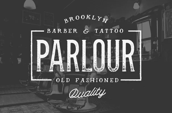
We love this rustic and masculine typeface, and think it would be perfect for menswear brands, barbershops, and tattoo shops.
This style is a popular choice for designers because it’s minimalistic, yet strong.
We like the retro feel of this stylish serif typeface, and think it would be great for blogs, headlines, or logos.
Clean and easy to read, this modern San Serif style provides a futuristic feel to websites and logos.
This serif typeface is delicate yet memorable. It would work well for magazines, brochures, books, and most printed media.
Zefani has a sophisticated feel and would be perfect for luxury projects.
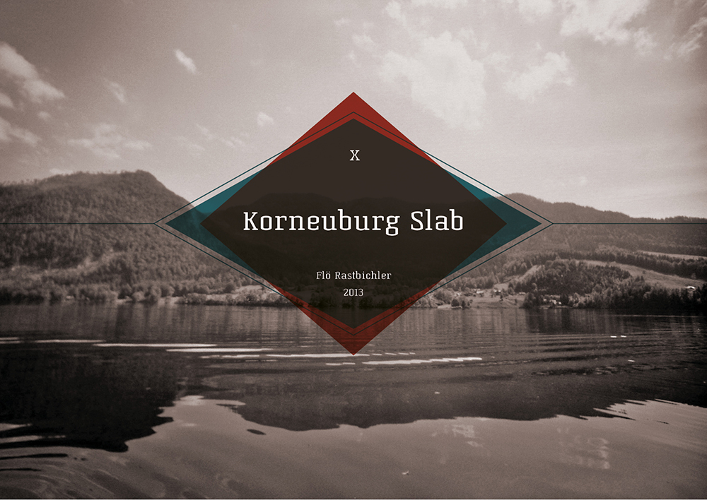
This thick slab serif is a great choice for eye-catching titles and headlines.
We love the old world feel of this eye-catching serif typeface.
We love this versatile typeface, and think it would be perfect choice for fashion brands, coffee shops, or bakeries.
This typeface was inspired by 1920’s typography. This minimalistic style pairs well with images.
This script adds a fun vintage feel to fashion labels, signage, packaging, and logos. We like that this typeface isn’t gender specific, so it would work well for both menswear and women’s fashion.
Not sure where to find different typefaces? We’ve got you covered. Here are a few of our favorite sources- several of them offer free downloads:
Great typography can elevate the quality of a design and transform it into something remarkable. It takes time, patience, and a lot of trial and error to develop this skill, so don’t get discouraged! Play around with spacing, placement, and color until you find the best fit for you. Don’t try to force it - great typography speaks for itself.
What do you want to know about typography? Leave a comment!


