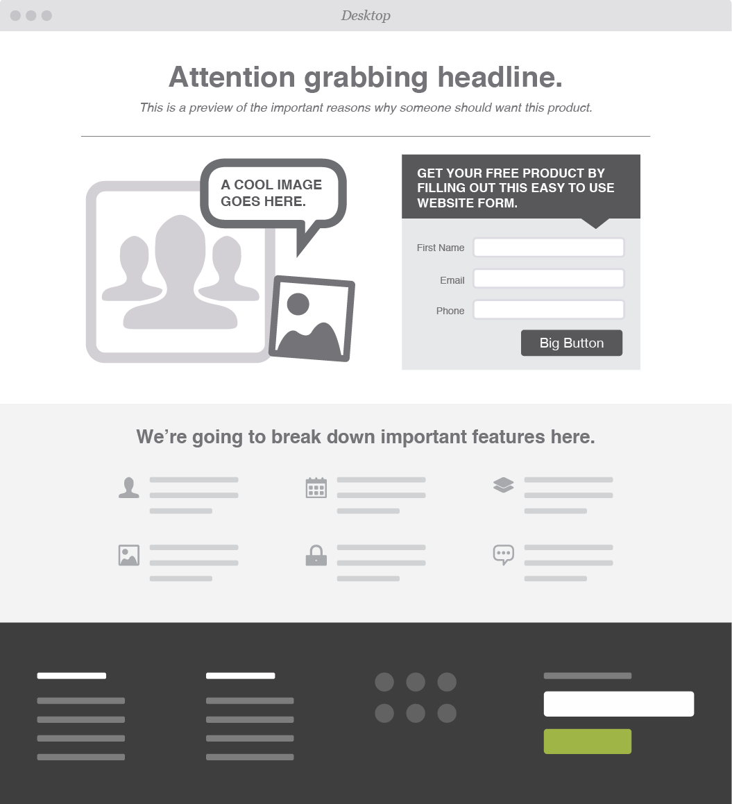
4 Elements for a Killer Landing Page
When it comes to lead generation, landing pages count. A landing page gives your customers a clear why and how -- it tells them why they should care about your product and it gives them a clear next step to take.
Keep in mind that landing pages shouldn't look like your homepage. Where homepages are general and intended to appeal to everyone, landing pages are tailored to a specific type of customer. Homepage typically have multiple messages, where landing pages have one focused message.
A special type of page means a special design. We've broken down our four must have elements for a lead generating landing page:
Attention Grabbing Headline
The first thing your visitors see is your headline, so make sure to capture their attention and incentivize them to stay longer. Most people tend to skim over body text quickly, and will leave sites that aren’t relevant or seem too wordy.
To craft the most effective headline, keep these three principles in mind:
Share Information
Solve a Problem
Show Value
What are you selling? Why does your customer need this product/service? What can your customers gain/save? Write a headline that packs a punch and leaves your customer wanting more.
Call to Action
After you’ve effectively gotten your viewer’s attention and promoted your business, it’s crucial to capture their contact information and turn those visitors into leads.
Offer up discounts, free downloads, or exclusive offers -- the catch? All we need is your email address.
To keep your CTA from sounding too self-serving be sure to keep the focus on the customer. Try something like “Get your free coupon” instead of “Sign up for emails here.”
Form
Having a form to capture your customers information is a must. How else will you follow-up so you can turn someone into a potential customer? We suggest asking for as little information as you can get away with -- this ups the chances of someone filling out your form.
Multiple target demographics? Create multiple, tailored landing pages so that you can effectively reach all of your customers.
Graphics
Eye-tracking studies have found that people pay more attention to information when it’s combined with relevant images. Pair your headline and body text with pictures or videos that will help your information stick.
If you choose to go the video route, make sure the videos load quickly aren’t too distracting to the overall composition of your landing page.
OPTIONAL: Testimonials & Endorsements
A great way to show value in your brand is by providing proof from actual human beings.
People tend to trust others they can relate to. Share feedback from influencers or previous customers. If your products have been featured in any noteworthy blogs, publications, or social media pages, show it off!
Web & Graphic Design in Greensboro, NC
Time to revamp your outdated site? Leave it to the experts! From product websites to landing pages, Hue & Tone can help you market your brand and leave a lasting impression.

