Client Spotlight: Drive Moodboards
Drive’s mission statement: Current and future women business leaders, connecting and building community through networking, mentorship and education.
More information here.
When we connected with our friends at Triad Local First about their new women’s networking group, we couldn’t wait to be a part of what they were doing. Not only have we gotten to be a part of this amazing group – but we were also brought on to design the program’s new logo!
Completed in May of 2019, we worked with the TLF team to create a logo, color scheme, and font palette that would speak to women entrepreneurs. Feminine, but not girly, TLF was looking to create a versatile and simple brand mark.
Our logo design process typically involves 8 main steps:
Initial Consultation
Branding Questionnaire
Moodboard Design
Initial Logos (in black & white)
Tweaks and revisions (typically, 2-3 rounds)
Color Options
Tweaks and revisions (typically, 1-2 rounds)
Compilation of all final elements in a brand board or brand book (this includes the logo in multiple formats, patterns, web elements, icons, color palette, and font palette)
Quick tip: The moodboard a client picks can serve as a helpful visual guide for when you are selecting imagery for your website or social media.
One of the most underrated steps of this process is the creation of the moodboards. The moodboard stages helps us turn the adjectives the client has been giving us into a visual and helps ensure we’re on the same page. By designing them as the first step in the process our client has a chance to give us feedback before we get too deep into the designing process. If we’ve had a miscommunication during the consultation or questionnaire stage, we’ll know before we even start designing the first round of logos.
After the TLF team had completed our initial client consultation and branding questionnaire, we were ready to jump into designing a series of moodboards for TLF to respond to.
We typically present 2-3 moodboards to our client: each with a different look, feel, and color scheme. During this part of the process, we're looking to nail down which of the options feels most on brand -- it's about figuring out the general feel and energy that the logo will have.
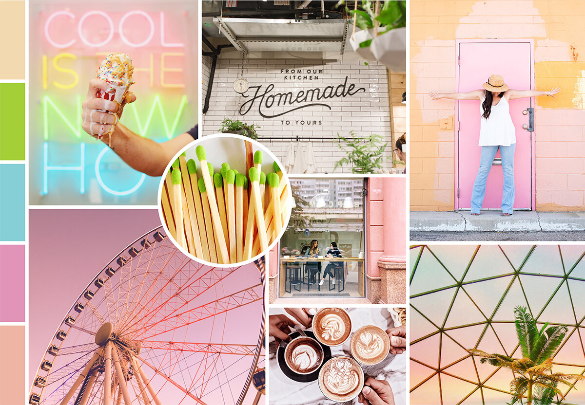
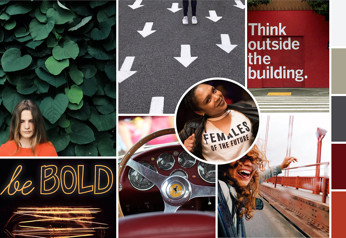
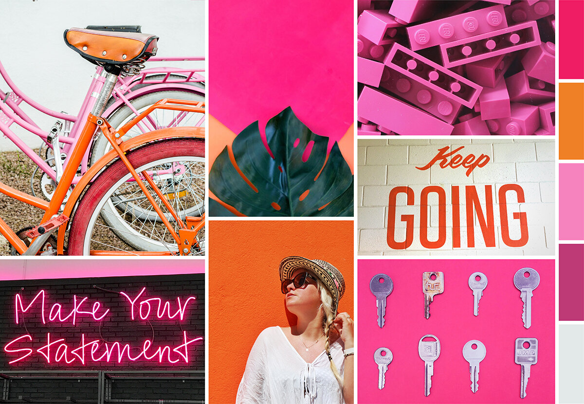
The four moodboards we presented to TLF incorporated a wide range of colors, textures, and wording that all related to the adjectives we received on the branding questionnaire. We weren’t sure which look was our favorite – and neither was the client! After a few days of deliberation, they finally landed on their favorite moodboard:
Featuring bold women -- and even bolder typography – this moodboard connected with the powerful and playful vibe that the team was looking for.
Here’s a sneak peak of the other three moodboards that were in the running:


Using the chosen look as guidance, we started designing our first round of logos. Rather than interpreting the chosen moodboard literally, we used the feel of the imagery to help guide the first step of our logo creation.
From there, we completed the other stages of the process: logo options, tweaks, color choices, more tweaks, and the final branding sheet. While we want to focus this blog specifically on the moodboard part of the process, we’ll go ahead and give you a sneak peak at the final logo:
Have a question about the process? Want to see how we ended up at this final logo?
Don’t hesitate to email us and ask! We love sharing what we do with past clients, potential clients, or even just interested individuals. To connect, contact us here.
Hue & Tone Creative: Your Branding Experts
Whether you have a new business — or are looking to rebrand your existing business — we can help. From logo development to creating custom social media packages, we’ll work with you to create a brand you can be proud of and brand elements that are easy to use.


