Posts in Hue & Tone
Client Spotlight: Faces of Revolution

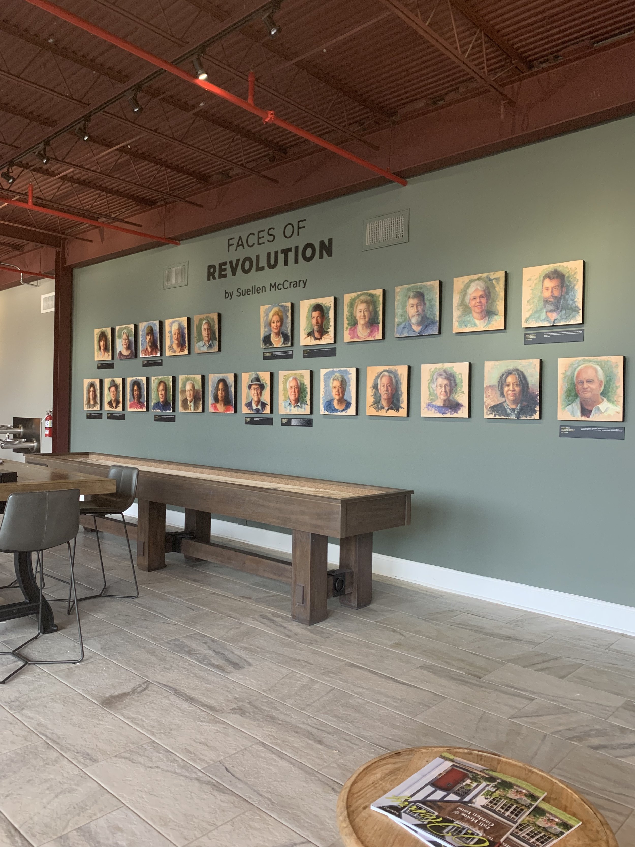
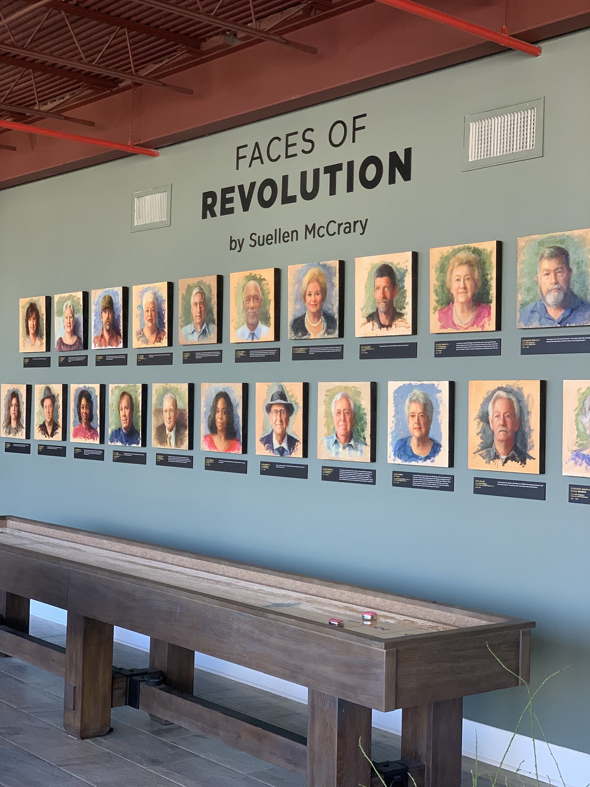
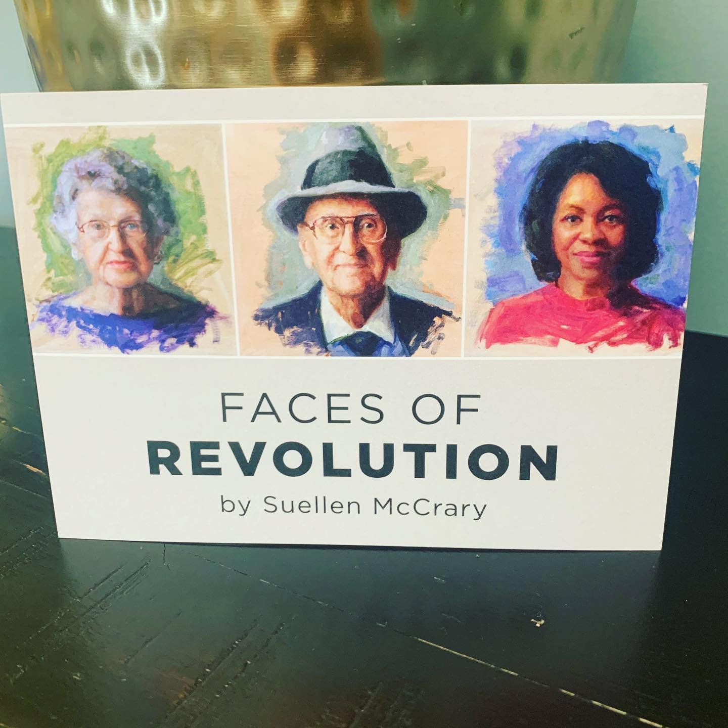
A project that’s been long in the making, the Faces of Revolution exhibit is a series of 25 portraits painted by Suellen McCrary. Featuring subjects with both current and historic ties to Revolution Mill, this exhibit is now part of the permanent historical collection at the mill. 

Started almost 3 years ago, this project was initiated to both document the history of the mill and to democratize portraiture. The subjects include employees and family from the mill’s heyday as the world’s largest maker of flannel to current day tenants of the new multi-use development. The portrait subjects also received free prints of their likenesses, making it possible to obtain an otherwise costly keepsake. The price of an original oil portrait can range from $3,000 to six figures. 

Historic subjects included descendants of the mill co-founders, mill villagers, and dye house employees. In addition to the subjects with historical ties to the mill, the exhibit also features a number of people who keep the Mill running today. Tenants, janitorial staff, and the lead architect of the renovation are among the subjects who were chosen to be included. 

As the portraits neared completion, we became involved with helping design the plaques, signage, print material, and website. After taking measurements and having an initial exploratory meeting, we completed a first mockup of how the exhibit might look:

After some back and forth on the color of the wall and the size of then plaques, a final look for the exhibit was determined. Minimal colors were chosen for all elements of the physical installation and the website, allowing the portraits to take center stage. 

To provide context for each person’s role in the Mill a quote from the participant is featured below each portrait. We designed these plaques at 16x3” for readability. 

These subjects sat for their portraits in Suellen’s Revolution Mill studio, sharing their stories as they were painted. In addition to the experts from their stories that are featured on the plaques, you can read longer comments from everyone on the website at www.facesofrevolution.com.  


Gate City Signs fabricated the exhibit signage from black PVC. The dimensional lettering was chosen over a simple vinyl to provide a more permanent and elevated look. 

You can view the installation in the Hall of Fame at Revolution Mill – located at 1050 Revolution Mill Drive. Learn more about the subjects + exhibit here. 


How to make the most of your 2021 Holiday Marketing Efforts

It’s that time of year again: holiday campaign season! Most customers don’t realize it, but the heavy lifting for small business holiday campaigns is typically completed sometime in August through October. Larger businesses might even be planning their holiday marketing out as early as spring or summer. But, if you’re just starting to think about holiday marketing for this year, there’s nothing to fear – you still have plenty of time to get caught up to have a successful winter season. 

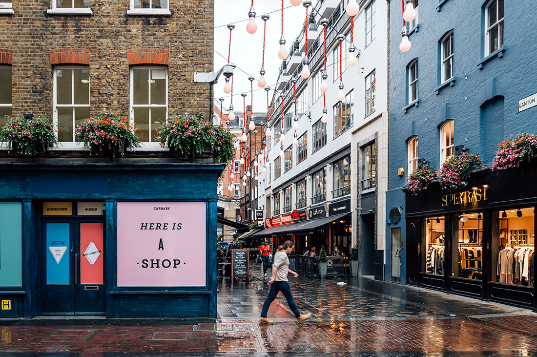
There are a lot of ways to capitalize on the holidays, but this post is specifically geared toward small businesses. Whether you have a brick & mortar store or are primarily operating through e-commerce, you can find a way to adapt these tips to your business model! 


Email Campaigns: 

  • Start marketing early! Now is the time to start marketing to your customers – while many people wait until the last minute to shop, others get started far ahead of schedule. With shipping delays and product shortages in several industries, we suggest you encourage customers to start shopping even earlier than usual. Motivate shoppers to get started ahead of schedule by offering exclusive pre-season discounts! 

  • Include a gift guide: To help streamline online shopping and reduce decision making, give customers a quick and simple way to find gifts for their loved ones. Consider categorizing these guides by personality, relationship, or demographic. This will allow people to quickly locate (and purchase) an appropriate gift without endless scrolling. 

  • Don’t forget to include the gift giver: You know the customer you’re emailing loves your brand. However, you don’t know if your products are a good fit for the customers family and friends. Capitalize on your existing relationship by targeting the customer themselves! Even when they’re shopping for other people, people will be drawn to the idea of rewarding themselves. Promote special coupons and play around with a “treat yourself” message. 

Website: 

  • Consider a flash sale: Use limited time offers to spike sales and offload slow moving products. Putting the pressure on to buy is a great way to motivate people to make a purchase. You can host a flash sale for a few hours – or an entire week. In general, the shorter the sale the higher the chance that people will jump on making a purchase. 

  • Make shipping deadlines clear:  Don’t risk having to deal with a disgruntled customer because their order arrived late – feature any key shipping deadlines on your website to set expectations for when orders need to be placed. Update your messaging to let people know if they need to select ground, two-day, or one-day shipping to get their items on time. 

Offline: 

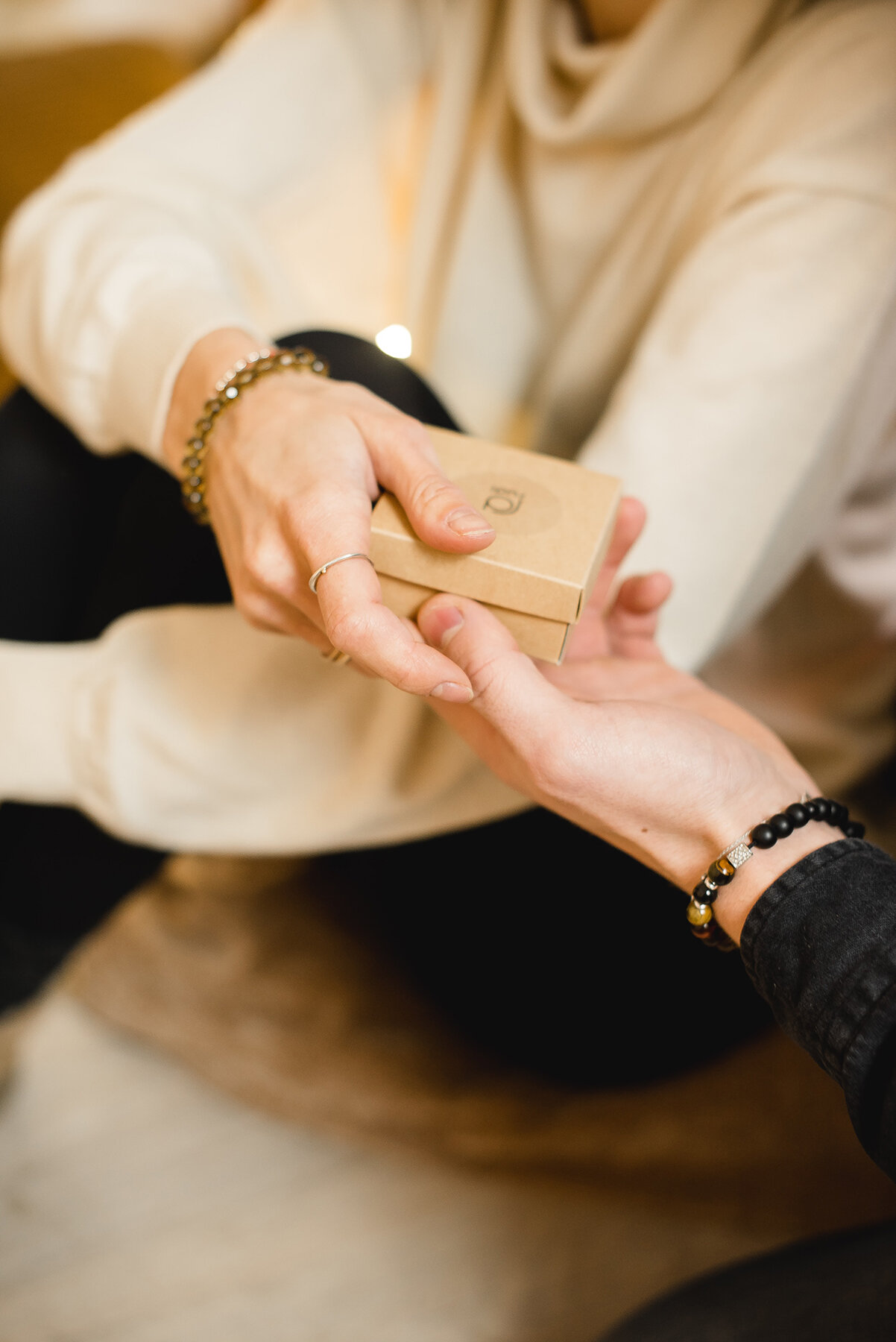
  • Create a special unboxing or gift-wrapping option: Enhance a great product by creating a special unboxing experience – you’ll take some of the work off the customer by pre-wrapping their gift and you’ll enhance their brand experience. Utilize high quality materials and remember that no detail is too small. Color coordinate everything and brand wherever possible with stickers, packaging, and handwritten or branded notes. An added bonus? A beautifully packaged gift might just land you a tag on social media! 

General tips: 

  • Holiday Bundles: Whether online or in person, consider offering holiday gift bundles to your customers. This is a great way to move more products without offering incredibly deep discounts. Bundle like products together for a small discount and package them well. This kind of collection is great for hard-to-buy-for individuals or last minute gifts — it also gives the customer the impression that they’re getting a great deal.

  • Holiday return policy: With many people shopping early for the holidays, a 30-day return period is often inefficient. We suggest considering offering free returns throughout the month of January -- but no matter what your policy is, make sure it’s clear to the customer and gift recipient. Offering a gift receipt with a purchase is a great way to clearly communicate your policy. 

  • Don’t just think about holiday campaigns for Christmas: Educate yourself on other culturally important holidays and tailor your message to fit a wider range of customers. For reference, here are some key dates to consider: 

    • Diwali – 11/4

    • Thanksgiving Day – 11/25

    • Black Friday – 11/26

    • Small Business Saturday – 11/27

    • Hanukkah – 11/28-12/6

    • Cyber Monday – 11/29

    • Giving Tuesday – 11/30

    • First day of Winter – 12/21

    • Christmas Day – 12/25

    • Kwanzaa – 12/26 – 1/1

    • New Year’s Eve – 12/31

Our last tip? No matter what medium you are utilizing, keep a positive customer experience front and center. Do what you can to alleviate the stress of your customers – this might mean providing free wrapping or flexible delivery options. Or maybe it comes in the form of producing content that takes the guesswork out of the shopping experience (think gift guides or recipe suggestions). 

Now, go get started on prepping your holiday cards, planning customer loyalty events, rolling out gift lists, and putting the final touches on your annual giving campaigns!

Client Spotlight: Stubbs Mobile PT
Lauren Stubbs, Owner of Stubbs Mobile PT

Lauren Stubbs, Owner of Stubbs Mobile PT

For our first client spotlight of the year, we’re excited to share a fresh branding project for a brand-new business. We partnered up with Stubbs Mobile Physical Therapy in late 2020 to develop a custom logo and corresponding visual brand elements. Owner, Lauren Stubbs, recently started this mobile concierge physical therapy practice as a response to COVID-19 pandemic. Many outpatient physical therapy practices pivoted to include telehealth and some started offering PT at home, but Lauren jumped at the opportunity to make a fully mobile and telehealth practitioner available to the Triad for years to come.

Stubbs Mobile PT brings physical therapy to your home or private workspace to save you time and unnecessary hassle – all while keeping you safer than a traditional office setting. Being outside of insurance, Stubbs Mobile PT also offers preventative physical therapy services including an Annual Wellness Visit, Health Coaching, or Evaluation and Treatment before you have an injury (i.e. if something "just doesn't feel quite right"). Their goal is to provide top-quality service with longer appointment times and one-on-one individualized care so that you are feeling, moving, and living your best as soon as possible. 

We connected with Lauren while teaching Launch Greensboro’s Marketing 101 class. After discussing the importance of marketing and branding, she wanted to start things off strong with a bold and eye-catching brand. Knowing that a standout look would be crucial to marketing her business, we wanted a logo that would translate flawlessly to polo shirts, sprinter vans, and client swag. 

In the initial branding stages, it was clear Lauren was looking for a pictorial mark to accent her logo type and wanted to emphasize a feeling of movement and energy. Friendly, attentive, trustworthy and proactive are just a few of the words that were used to describe the desired look and feel of Stubbs Mobile PT’s future branding. 

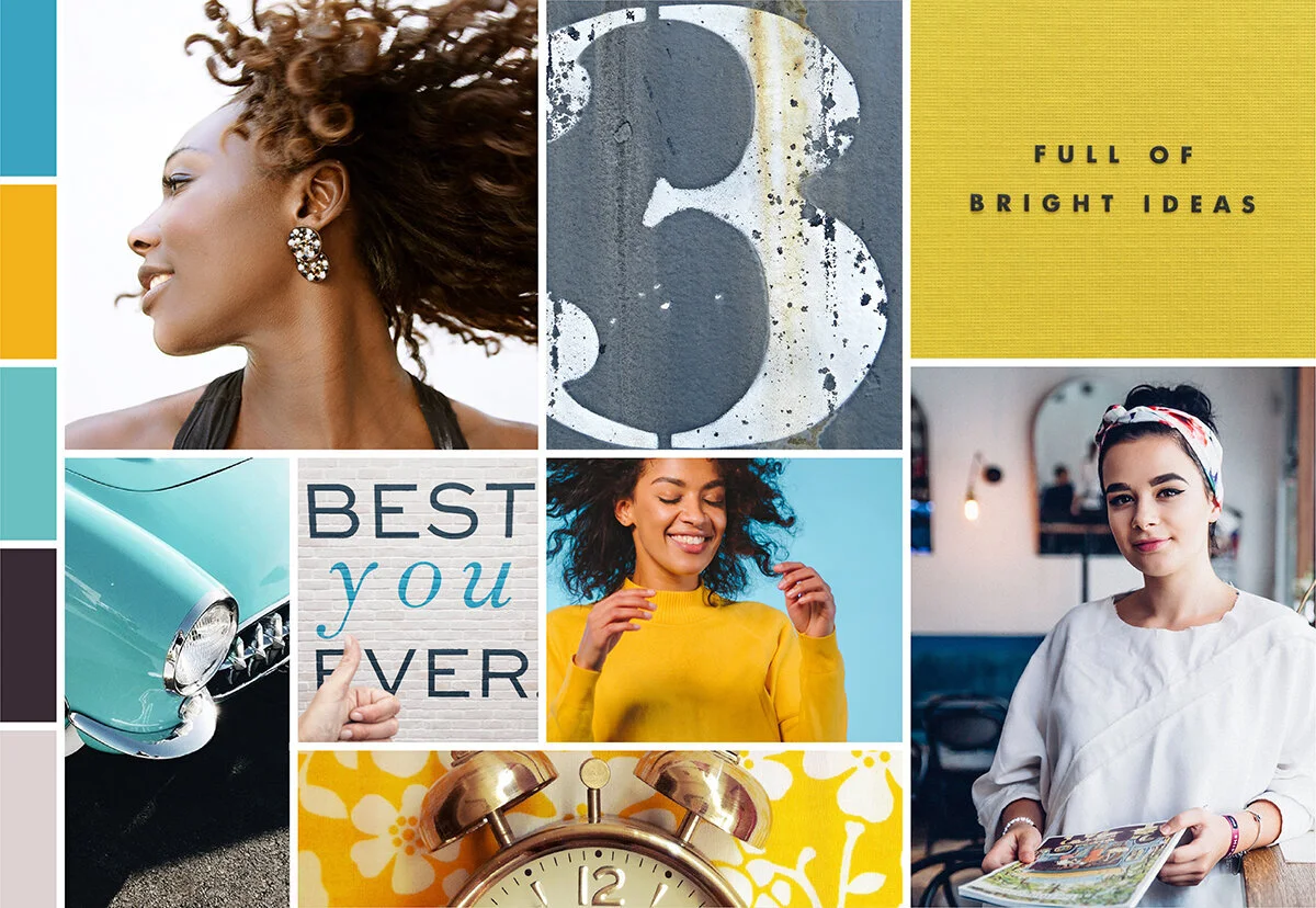
One of our favorite stages of the branding process, a mood board helps ensure we’re on the same page as our client. By assigning visuals to the words we’ve been using, we can begin to home in on a feel for the future brand. 

After presenting three mood board options, we refined Lauren’s favorite to have an even more high-energy and vibrant feel. Lauren had mentioned aquas and blues during our initial branding kick-off, and we ended up tailoring her favorite option to include two shades of blue. The final product? A look that hinged on vibrant colors and energetic scenes. Healthy eating, movement, and the outdoors are central to Lauren’s business and we wanted to reflect that from the very early stages of the process.  

StubbsMoodboard.jpg

After narrowing down Lauren’s favorite mood board concept, it was time to move on to the logo design phase. Ultimately, we went through 4 rounds of initial concepts, and four rounds of color options to narrow down the exact look and feel. 

Many of the initial concepts incorporated kettle bell imagery, hearts, play or motion. After some brainstorming, we landed on the wording concept of “pressing play.” Used with various action phrases, this tagline could be targeted to a wide range of clients. You’ll see the main logo incorporates the phrase “Press play on being pain free.” 

 
Horizontal.png
 

The final logo uses pops of bright oranges, aqua, and yellow – all anchored by a deep blue. These colors pop on any timeline, and the graphic mark adds an element of action. The graphic mark is a take on a press play symbol – which ties into the tagline and lends itself well to use on social media. When working in tandem, all these elements create an action-packed look that’s sure to be eye catching and memorable. 

Untitled-7-01.png

We’re thrilled with how this rebrand went, and we’re not the only ones. Hear firsthand from business owner, Lauren Stubbs, about the process: 

“I really enjoyed the entire process of working with Hannah at Hue & Tone Creative. Being a first-time entrepreneur, I knew little about the branding process. Hannah guided me through it with confidence and understanding... even when decision-making was tough because she had created multiple amazing logo options. If I could have two logos I would, because that's how great both of the final options were. Despite the Hue & Tone office and my home office being less than 1 mile apart, we went through the entire process virtually (due to COVID-19). The virtual experience didn't detract from the branding process, but I loved knowing we were both members of the same community. Knowing our proximity, ties to Launch Greensboro, and both being women business owners, gave me a sense of connection even though we never met in-person. Supporting small and local businesses, whether walking distance in downtown Greensboro or in the greater Triad area is a central tenet of Stubbs Mobile PT. Being able to work with someone locally yielded excellent results and I'm extremely excited about launching my new look. In fact, in the few weeks since we've unveiled our new logo we've already received positive comments on social media!”


Want to learn more about Lauren’s business? Head over to her website to learn more! Or, follow her on Instagram here for regular PT, fitness, and movement tips!

Client Spotlight: Revolution Mill One Pager
Image Copyright: Joey Seawell Photography.

Image Copyright: Joey Seawell Photography.

In September, our long-term client Revolution Mill asked us to design a refreshed one pager that they could use to market the campus as a whole. Anyone who has visited this revitalized textile mill knows exactly how expansive it is. In total campus boasts 250,000 square feet of Class A Office Space, 150 apartments, three dining options, two event spaces and numerous amenities. 

With so much to potentially highlight, how do you explain everything that’s going on to prospective tenants, potential residents, or campus visitors? That’s where we come in! After working with the Revolution Mill team we were able to summarize the most pertinent details into a digestible one pager that gives an overview of the entire campus. 

With a focus on amenities and commercial spaces, we incorporated some scenic shots from campus as well as condensed wording to describe both current features and future construction. 

The end result is an easy to read piece that coordinates with Revolution’s streamlined and neutral branding. Their branding is tied together with minimal fonts and incorporates the same warm greys, tans, and pops of red that you’ll see around the physical campus. 

To learn more about the campus – and to see their branding in action – check out the one pager below or visit their website (revolutionmillgreensboro.com).


Hue & Tone Creative: Your marketing partner

Inquiries and interest are partly driven by great design — whether you need help designing print materials, assembling a landing page, or running a great social campaign we’re here to help. Set up an initial consult and lets discuss your next project.

Client Spotlight: Smart Beginnings Print Ads

We’ve been partnering with Smart Beginnings, a regional school readiness coalition (based in Danville, VA), since early 2017. Last week, the team reached out about designing a series of print appreciation ads aimed at childcare providers who have remained open during COVID.

Looking for more general COVID-19 signage? Don’t miss out on our free poster downloads here.

These childcare providers play an important role by ensuring first responders and other essential workers have the childcare they need. With COVID still causing unprecedented disruptions, this ad was the latest in a long line of COVID appreciation posts, ads, and campaigns that we’ve designed.

For the design of this text-centric ad, we pulled elements and colors from a past campaign aimed at Early Childhood Educators and Professionals. The bright red and orange will pop off the page, and the high contrast between the deep grey and white should translate well to newsprint.

Here’s a sneak preview of one of the ads:

 
Smart Beginnings  |  Hue & Tone Creative
 

If you’re in the Danville area, you can spot this ad + additional designs in the Danville Register & Bee and the Star Tribune!


The mission of Smart Beginnings DP is to strengthen the system of individuals and organizations caring for and educating children ages birth to five. Their goal is ensure that young children ages are emotionally, intellectually and physically ready to succeed in school. Learn more at www.SmartBeginningsDP.org


Hue & Tone Creative: Let us help you with communication in the time of COVID

Looking to successfully communicate your latest COVID message with clients? Don’t let the pandemic cause your branding and messaging to fall apart. Whether you’re looking for digital, print, or storefront materials, we can ensure you’re creating on brand (and beautiful) messaging.

Four tips for growing your small business
Four tips for growing your small business  |  Hue & Tone Creative

A NOTE FROM HANNAH POMPHREY, OWNER OF HUE & TONE CREATIVE 

Anyone who has started a small business has probably heard a lot of scary statistics about the chance of their business’s survival. 

20% of small businesses fail in their first year, 30% of small business fail in their second year, and 50% of small businesses fail after five years in business. Businesses fail for a lot of different reasons including lack of demand, limited financial resources, and being outpaced by the competition. 

After five years of owning Hue & Tone, I feel like I’ve learned a lot of dos and don’ts about how to grow revenue and thrive as a small business. Growth doesn’t happen overnight, and it’s important to build connections with your community and nurture yourself as your business expands. 

One of my strongest values as a business owner is the importance of reaching out a hand to those on the same path. If I could give a few pieces of advice to other entrepreneurs – or to myself five years ago! – here’s what I’d share. 

Four tips for growing your small business  |  Hue & Tone Creative

Network, network, network. Even in the digital age, small businesses thrive on word of mouth. Taking the time to build strong connections will form the foundation of your success.  

Never hesitate to set up a coffee or grab a drink with someone (even if it’s digital). It might be a bit awkward at first, but the only way to learn more about someone’s business is to talk to them about it. Start by learning more about what they do… and then let things develop naturally from there! 


Focus on your strengths. Don’t feel you have to offer the same services as your competitors or fit within the mold of other businesses around you. Play to your strengths, and don’t offer a service or product if you can’t add value and ensure quality.

Your unique service offerings are what make your business distinctive to you. While it’s smart to take a strategic look at your competition, don’t be swayed what you see. Offer the services you can really deliver on – and, if you hate doing something, don’t advertise it heavily. Leave services you could offer (but don’t want too) off of your website – if someone inquires, offer them then, but don’t lead with something you aren’t passionate about. 


Don’t be afraid to take the lead. Whether it’s teaching a course, serving on a board, or lending your expertise to a local non-profit, the opportunity to lead in your community is one of the best perks of running a local business. 

Don’t hesitate to build some flexibility into your schedule so you have time to partake in things you’re really passionate about. Volunteering is a great way to give back – but also a great way to make new connections with industries or organizations you’re passionate about. 


Keep seeking inspiration. Working 24/7 without taking time to nurture your personal life drains you of the inspiration that led you to start your business in the first place, especially if you’re a creative entrepreneur. No matter what fuels you, be sure to set time aside for yourself. 

Keep taking time to travel, cook, create – whatever fuels your ingenuity and imagination! Block off time or days on your calendar to do the things that inspire you and you’ll come back to the office even more productive than if you never left. 


Hue & Tone Creative: Your partner is business and marketing 

Overwhelmed with all the functions of owning a business? Let us take the marketing off of your hands. Outsource your creative work and get more time back to do what you really love. We’re here to help you get your time back, help you maximize your bottom line, and increase your reach. Let’s connect and work out the specifics of how we can help.

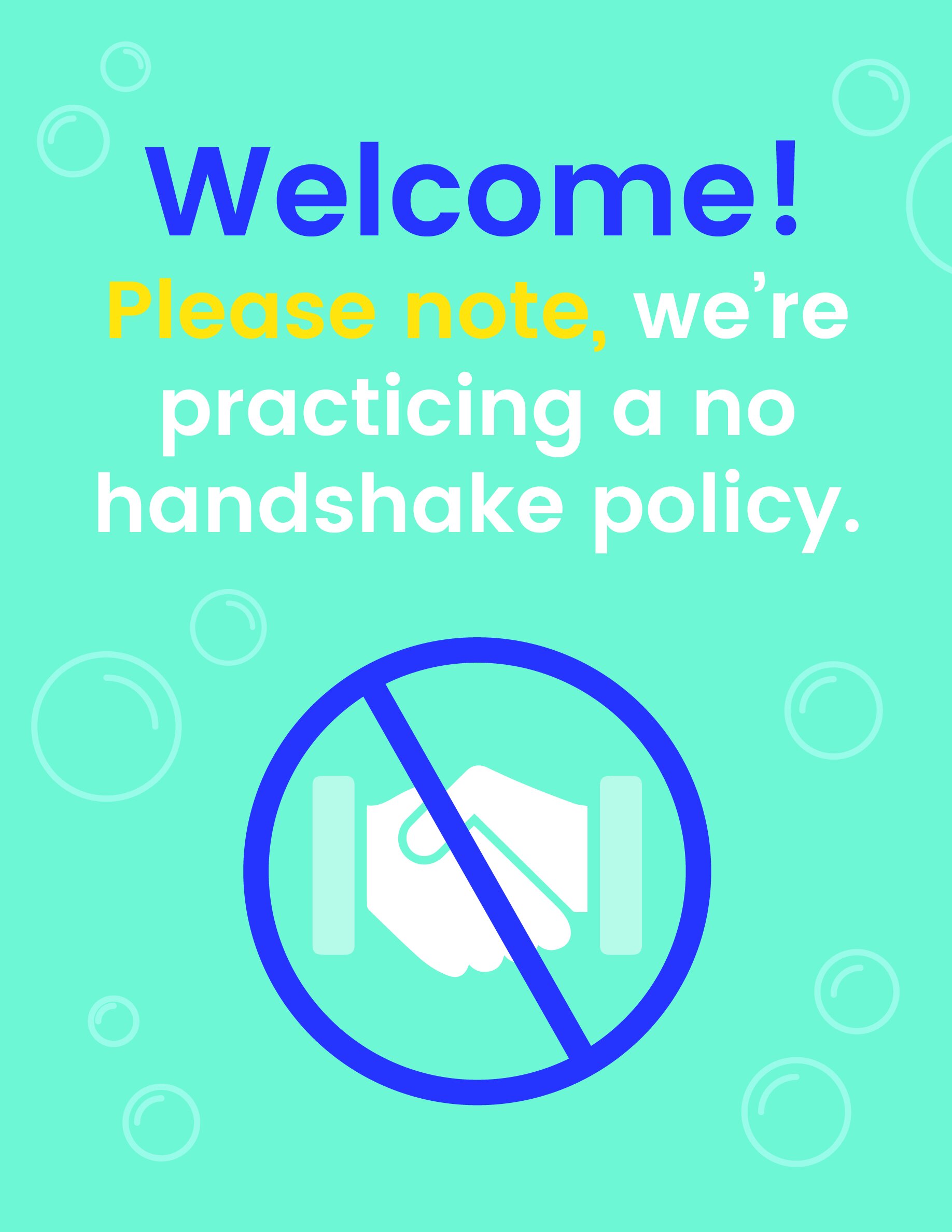
Free Download: COVID-19 Office Signs

Preparing for your employees to gradually start returning to the office? Posting helpful reminders about appropriate social distancing measures can help create a safe environment.

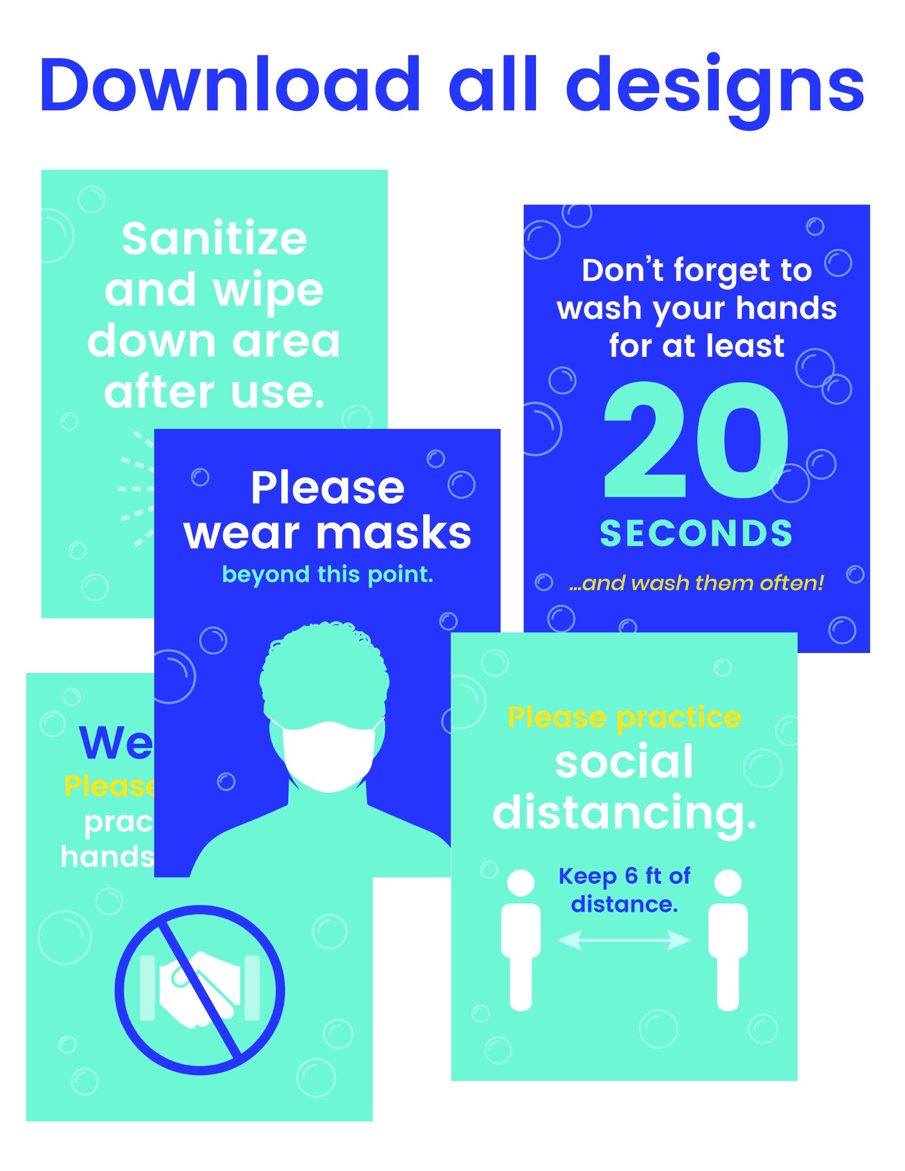
Select from 5 designs, or download all 5 of them. These signs are formatted to be 8.5x11 so you can easily put them in standing sign holders, or tape them up.  

If you’re looking for more detailed posters, the CDC has a selection of downloadable signs. Or, if you’re looking to share custom guidelines with your office, reach out – we can help design any signage you might need.

Click the sign you would like to download, or download all five designs here.

Five Years of Hue & Tone & Hope for Greensboro’s Small Business Community
LR_WebRes2_V2 copy.jpg

A note from Hannah Pomphrey, Owner of Hue & Tone Creative 


Five years ago, I took a deep breath and hit publish on this blog’s first-ever post. I was announcing that I was chasing my dream of opening a small business and founding Hue & Tone, a creative-services firm focused on all things design, marketing, multimedia, web and social. 

A half-decade later, we are facing an uncertain, deeply challenging time throughout the world. As I continue to work on behalf of my clients – from a safe social distance – I am reflecting on all the last five years have brought.

It’s been quite a journey: we set up shop in Revolution Mill, one of the most exciting reclamation projects in Greensboro’s history, and later made the move to the vibrant center of downtown Greensboro (once we’re able to be safely out and about again, you can find us at 301 South Elm Street). 

We’ve helped major corporations, small businesses, startups, nonprofits, government and advocacy organizations, and individuals upgrade their branding, hone their message, reach their audience and tell their story. We’ve created everything from brochures to bus wraps. 

But during this time of physical distance and social solidarity, what matters most to me are the relationships we’ve been able to build. 

From working with the Chamber to volunteering for nonprofits I’m passionate about, seeing Hue & Tone become part of the fabric of this community has been the most rewarding part of the job. We’ve had the privilege of providing design assistance for organizations that do enormous good in the Triad and beyond. 

We’ve been able to participate in the growth and revitalization of this city we call home, working with clients like the Self-Help, Greensboro Downtown Parks, and Triad Local First. On a personal level, this has been a time when I’ve put down roots – I purchased my first home in Greensboro in 2017 – and Hue & Tone has put down roots in Greensboro, too. 

It’s been our honor, for the last five years, to work with Greensboro business owners and nonprofit leaders of all stripes – from law firms to ASL interpreters to our local universities. 

I am so proud to be part of Greensboro’s business community and, despite the many uncertainties of this time, I am confident this city full of creative, adaptable, and open-hearted people will rebuild and rebound from the challenges we’ve facing.

We’re looking forward to the next five years, and being part of that rebuilding along with our friends in Greensboro’s business community.

The view from Hue & Tone’s office.

The view from Hue & Tone’s office.

Our 5 Most Read Posts of 2019

Every once in a while we like to take a break from sharing a new post to recap some of our most popular posts. For the last few years, we’ve kicked off January with a rundown of some of our best posts from the previous year.

To start off 2020, we’ve compiled our 5 most read posts from 2019!

Our most read posts of 2019  |  Hue & Tone Creative

Top Read of 2019: 5 Ways to Incorporate Social Media Into Your Placemaking

It’s time to figure out how to marry your social media strategy with more traditional placemaking efforts. That’s called Digital Placemaking – and PPS defines it as “the integration of social media into Placemaking practices, which are community-centered, encouraging public participation, collaboration, and transparency.”


More Great Free Fonts to Download

Finding the perfect font is no easy feat. For starters, there’s an unfathomable number of options to choose from. Even once you select a font, there’s a ton of variables that can interfere with what does and doesn’t work - but if none of those are speaking to you, we’ve pulled together another list of ten great free and easy to download fonts.

Our most read posts of 2019  |  Hue & Tone Creative

Our most read posts of 2019  |  Hue & Tone Creative

Belief In Business: 2019 is the year of Woke Advertising

Is there a place for advertisers to take a moral, ethical, or political stance in their marketing? Historically, brands have avoided contentious topics for fear of upsetting, disgruntling, or outright alienating their audience. But, in an increasingly polarized political climate, playing on identity and political belief can lead to a big buy-in. 


4 free welcome email templates

Why are welcome emails so important? If done right, they engage new customers straight away by prompting recipients to start the next stage in their customer journey -- and they also provide a means for you to follow up on any value propositions you promised (a new customer discount, for example). 

Our most read posts of 2019  |  Hue & Tone Creative

Our most read posts of 2019  |  Hue & Tone Creative

Back to Basics: Google My Business

Need a new way to aid your organic traffic efforts? Then look no further. Google My Business is a free, easy, and proven method that will help improve your site’s visibility in search results, make key information more accessible, and enable your company to cut through the crowd with a competitive edge.


Most read of all time: 7 Squarespace Font Pairings

This post has made our lists of favorite or most read posts quite a few times! Still the number one most read article of all time, is our article on Squarespace font pairing suggestions. Although it may be tempting to stick with the default settings of your template, taking the time to select the right fonts adds depth and personality to your site.

Our most read posts of 2019  |  Hue & Tone Creative

Hue & Tone Creative: Creative consultants in greensboro, nc

We specialize in all things design and color-related. Let us help you set up your marketing plan and then execute each piece of it with precision and accuracy. Hue & Tone is a creative graphic design agency specializing in logo design, web design, social media management, and more.

Client Spotlight: Drive Moodboards
Triad Local First

Drive’s mission statement: Current and future women business leaders, connecting and building community through networking, mentorship and education. 

 More information here

When we connected with our friends at Triad Local First about their new women’s networking group, we couldn’t wait to be a part of what they were doing. Not only have we gotten to be a part of this amazing group – but we were also brought on to design the program’s new logo! 

Completed in May of 2019, we worked with the TLF team to create a logo, color scheme, and font palette that would speak to women entrepreneurs. Feminine, but not girly, TLF was looking to create a versatile and simple brand mark. 

Our logo design process typically involves 8 main steps: 

  1. Initial Consultation 

  2. Branding Questionnaire

  3. Moodboard Design

  4. Initial Logos (in black & white)

  5. Tweaks and revisions (typically, 2-3 rounds)

  6. Color Options

  7. Tweaks and revisions (typically, 1-2 rounds)

  8. Compilation of all final elements in a brand board or brand book (this includes the logo in multiple formats, patterns, web elements, icons, color palette, and font palette)

Quick tip: The moodboard a client picks can serve as a helpful visual guide for when you are selecting imagery for your website or social media.

One of the most underrated steps of this process is the creation of the moodboards. The moodboard stages helps us turn the adjectives the client has been giving us into a visual and helps ensure we’re on the same page. By designing them as the first step in the process our client has a chance to give us feedback before we get too deep into the designing process. If we’ve had a miscommunication during the consultation or questionnaire stage, we’ll know before we even start designing the first round of logos. 

After the TLF team had completed our initial client consultation and branding questionnaire, we were ready to jump into designing a series of moodboards for TLF to respond to.  

We typically present 2-3 moodboards to our client: each with a different look, feel, and color scheme. During this part of the process, we're looking to nail down which of the options feels most on brand -- it's about figuring out the general feel and energy that the logo will have. 

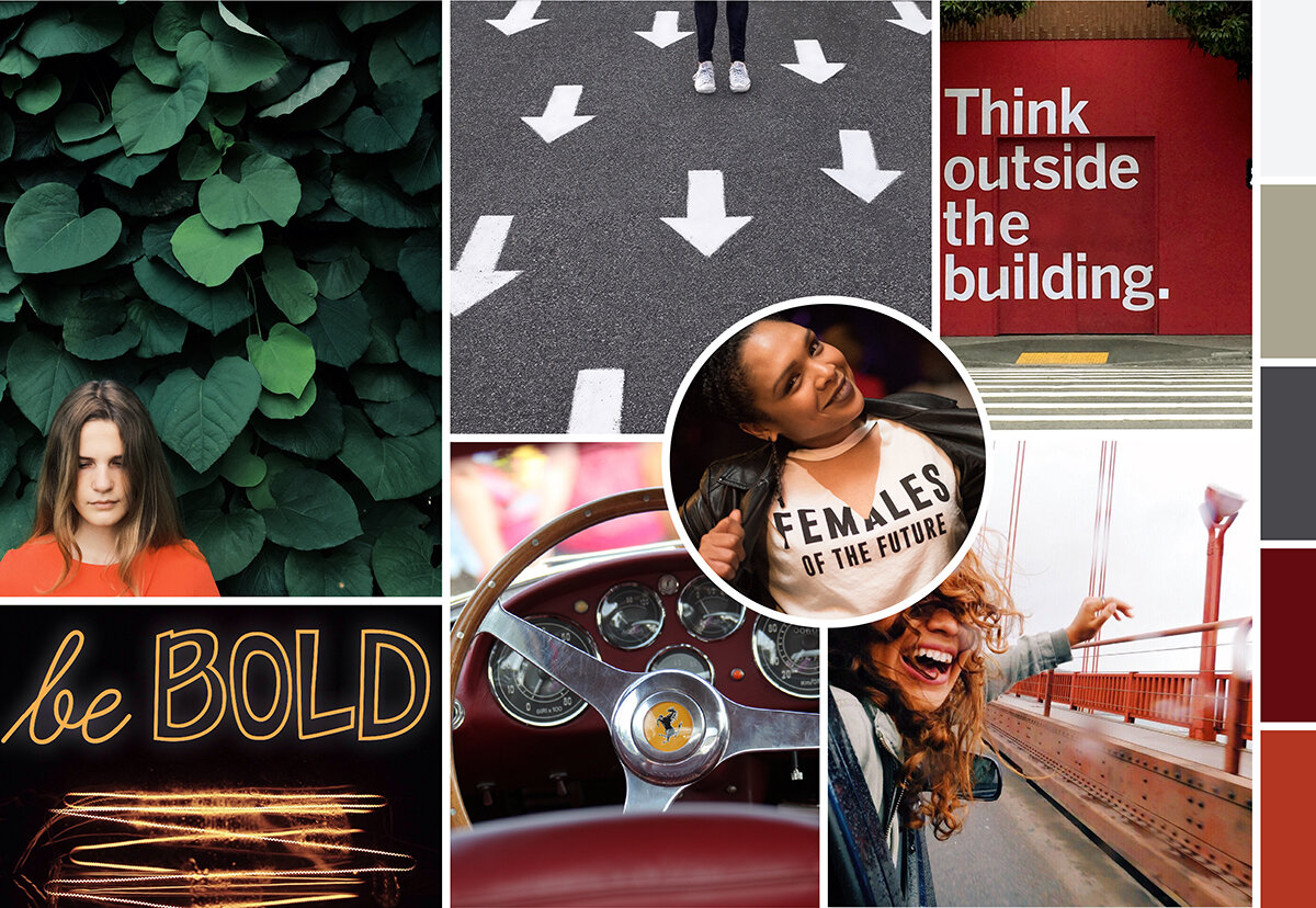
The four moodboards we presented to TLF incorporated a wide range of colors, textures, and wording that all related to the adjectives we received on the branding questionnaire. We weren’t sure which look was our favorite – and neither was the client! After a few days of deliberation, they finally landed on their favorite moodboard:  

Drive Moodboard  |  Hue & Tone Creative

Featuring bold women -- and even bolder typography – this moodboard connected with the powerful and playful vibe that the team was looking for.  

Here’s a sneak peak of the other three moodboards that were in the running: 

Using the chosen look as guidance, we started designing our first round of logos. Rather than interpreting the chosen moodboard literally, we used the feel of the imagery to help guide the first step of our logo creation. 

From there, we completed the other stages of the process: logo options, tweaks, color choices, more tweaks, and the final branding sheet. While we want to focus this blog specifically on the moodboard part of the process, we’ll go ahead and give you a sneak peak at the final logo: 

 
Drive Moodboard | Hue & Tone Creative
 

Have a question about the process? Want to see how we ended up at this final logo?

Don’t hesitate to email us and ask! We love sharing what we do with past clients, potential clients, or even just interested individuals. To connect, contact us here.


Hue & Tone Creative: Your Branding Experts

Whether you have a new business — or are looking to rebrand your existing business — we can help. From logo development to creating custom social media packages, we’ll work with you to create a brand you can be proud of and brand elements that are easy to use.

How often should you blog? (And, a big change to our posting schedule)
How Often Should You Blog?  |  Hue & Tone Creative

Be sure to read to the bottom of this post to learn more about why we’re switching up our blogging frequency!


Here at Hue & Tone Creative, we’re big proponents of blogging. We believe it’s one of the best ways to connect and grow your potential audience…and in turn, your revenue. 

Blogging gives you a regular (and free) platform to discuss your ideas, your business, and your expertise. By amplifying your content on social media (which is also free!) you’ve got the beginnings of a very successful marketing toolkit.  

The most important thing we tell people about blogging is that it’s part of playing the long game – if you don’t see big results immediately, stick with it. Even if you’re doing everything right, it can take months, even years, to see a big return on blogging. 

The more you blog, the more traffic you will see – and the more opportunities you will have to connect with your audience. Over time, you’ll get to know what they want and what questions they have.  

Still not convinced you need to make the long-term investment that is blogging? Growing your audience isn’t the only reason should post regularly, you’ll also: 
 

  • Earn more exposure/SEO Benefits: As you post more, you gain new opportunities to show up in search queries. Every time you blog you create additional pages. Additional pages tell Google what your site is all about and helps them know who they should serve your site to. 

  • Share your knowledge: Your readers might not be ready to hire you yet – but your blog will help keep your name front of mind and you’ll be the first person they call when they are ready to buy. 

  • Try out new ideas: While evergreen content provides your blog with longevity, sharing exciting new ideas and concepts on your blog can spark excitement with your audience. 

  • Help educate your clients and customers: Save yourself the time of constantly having to explain things by creating an easy to reference database for your audience. 

  • Build your professional network: Blogging is a great way to connect with potential clients/customers, other leaders in your industry, and community figures. 

  • Get to know your target audience: As your blog audience grows, you’ll get more and more questions from your target audience, which can help you shape and grow your future offerings. 

How Often Should You Blog?  |  Hue & Tone Creative


Blogging Frequency 

Once you’ve decided that you want to invest time into blogging, you have to decide how often you’ll be posting. Maintaining a regular frequency is important because it offers your readers consistency, and also helps with your internal organization. 

But, how often you should post is a very personal decision – one that should be informed by your industry, and how much time you have available to write quality content.  

Many businesses experience a boost in their profitability once they’ve amped up their blogging efforts, but other business owners may find they get more leads when they spend their time marketing their posts through social (while blogging less often). 

Ilfusion explains why blogging more is typically considered to be more effective:

“In general, the more blog posts you publish, the better the chances of capturing more traffic. Research shows that companies who blog 3 to 5 times a month, or around once a week, get twice the web traffic than those who don’t blog at all. This doesn’t conclude the ideal number of blog posts per month; rather, it bolsters the fact that, overall, businesses who commit to posting regularly on their blogs tend to reap the biggest rewards in terms of web traffic. The more you post, the more exposure your blog gets—and, over time, the results continue to pay out as your blog builds more traffic and consequently boosting your SEO ranking.”

Blogging frequently (more than once a week) is only a valuable use of your time if you can maintain high-quality content, avoid repetitive topics, and continually appeal to your target audience.  

About four years ago, we started out by blogging twice a week. Once we had built up a valuable backlog of content (after about six months) we moved to posting once a week – and we’ve maintained that frequency for a little over three years. 

Now, we’re planning to make the shift to blogging every other week. We’ll still be bringing you valuable content on everything marketing, graphic design, and social media related – but we’ll only be posting about twice a month. This will allow us to put more time into each post, so you can expect longer, more in-depth posts starting the first week of October, 2019. 

Curious why we’ve made this choice? There are a few big reasons that pushed us to make this decision:

  • We need more time to focus on client work: Our calendar is booking a few months out these days, and we want to free up as much time as possible to focus on the projects we’ve got booked. 

  • We want our blogs to be the highest quality possible: Less posts means we’ll be able to produce higher quality (and more in-depth) content. 

  • We want more time to spend on content promotion: Writing less gives us more time to focus on marketing and promotion for both new and old content.

Now that we’ve explained our rationale behind how often we post, tell us: How often do you blog? What drove the decision behind your posting frequency?  


Hue & Tone Creative: Marketing, Design, and Beyond

Need help getting your social media and blog calendar on the right track? We’re here for that! We don’t write your copy – we help you develop your strategy. From social media to blogging we’ll help you determine everything from the right posting frequency to the topics you should be posting about. Contact us to get started.

Pros and cons: DIY Web Design vs. Hiring a Web Designer
Pros and Cons: DIY Web Design Vs. Hiring a Web Design  |  Hue & Tone Creative

We’ve all seen commercials for web builders like Wix, Squarespace, and Wordpress. They lead with a promise of creating a great website at lightning fast speed... even if you have no previous experience. It almost sounds a little too good to be true, right? 

It all depends on your needs. While web site builders make it easier than ever for non-designers to pull together their own website, they don’t work for everyone. If you’re a tech savvy business owner who needs a simple site, they might be a great option. But, if you’re tech-challenged, short on time, or in need of a more custom site you probably need to consider hiring a web designer.

Anyone can point out a website they like or select a template – but designers are the ones who can identify and execute all the elements needed for an on-brand, functional website. From color palettes and font pairings to white space and photography, there are some things a novice just won’t be able to execute on their own. 

Before you decide which route to take, let’s run through some of the pros and cons of DIYing or outsourcing your design: 


Outsourcing design: pros

Professional end product

There’s no denying that the end result of hiring a web designer is inevitably going to be stronger than what you’ll be able to create on your own. A strong website design will inevitably help you achieve your website goal, no matter if it’s more email opt-ins, a higher conversion rate, or more brand exposure.  

Functionality aside, did you know that 75% of consumers judge a brand’s credibility based on their site’s design? Web users are savvy, and they can sniff out a homemade website from a mile away – which in the long run could translate to a lot of missed opportunities. 
 

Saves you time and stress

Pulling together a list of your website needs and handing it over to a third party saves you immeasurable amounts of time and stress. You’ll be able to skip the hassle of doing background research, brainstorming concepts, refining ideas, finding your way around unknownsoftware, and making endless tweaks to the site. 

You can simply put your wish-list together, pass it on, and then get on with the rest of your to-do list while your designer handles the creative.
 

It’s a long term investment

Every business’ end goal is to generate revenue. But every good business owner knows that sometimes you have to spend money to make money. While you’ll pay a greater upfront cost to hire a web designer, you’re going to be walking away with a high quality final product that will serve your business for years to come. 

Creating your website yourself has the potential to open you up to issues with data security, mobile responsiveness, search optimization, and more – which long-term could lead to spending more than the cost of hiring a web designer.  


Pros and Cons: DIY Web Design Vs. Hiring a Web Design  |  Hue & Tone Creative

Outsourcing design: cons

It’s more expensive

The price you pay will vary from designer-to-designer (we would estimate anywhere from $500-$8,000 based on the complexity of your site) but it’s certainly more expensive than what a DIY tool will cost you. If you’re a brand new business or start-up with a limited marketing budget, the cost of hiring a web designer may feel prohibitive.  

Although we’ve listed this as a con, we urge you to think of the bigger picture, and your return on investment down the line.
 

Less insider info about your business

Every business has their own way of working, their own personal preferences, and their own knowledge of what’s worked in the past. Understandably, an outsider won’t possess nearly as much knowledge about your business as what you have. It make take a few meetings to educate them on the ins and outs of your business so that they’re able to create an effective website for you. 

If you feel like your designer isn’t listening or doesn’t have the time to talk through the backstory of your business, we suggest finding someone else who will. 
 

Finding the right fit

You do your research, talk to a number of potential designers, and still you feel like you can’t find the right fit. Keep on looking! 

Settling for the wrong designer is going to cost you more time and money in the long run, so be sure to do your research and settle on a clear scope of work before agreeing to anything. 

A good designer should ask you a lot of questions before providing a quote, should explain the process to you, be able to answer your questions, and will outline a clear scope before the project kicks off. If you feel like you’re in the dark about what you’ve agreed to or you feel like they just don’t get your business, then we suggest looking elsewhere. 

Ask for referrals, get the designer to provide ample work samples, and check out the quality of their online presence to get a good idea of their working style and final products. 


DIY design: pros

Save money

There are lots of online tools that let you create artwork for free, or offer additional features for a low fee. Either way, it’s likely to be cheaper than onboarding a designer. 
 

Total control

Working with a designer means having to make compromises based on their expertise, and we’ve seen first-hand how hard this can be for some business owners. If you think you’ll be unable to work with an outside party on your website, you may want to consider keeping the project in house. 


DIY design: cons

Compromised quality

Design is a skill like any other. The same way you can’t waltz onto a construction site and expect to be a builder, you can’t start using software and expect to be a designer.

Imagine you had to build a brick wall right now. Now imagine what the end result would look like. Compare that to what a professional mason would be able to build. The world of design is no different.
 

brooke-lark-609902-unsplash.jpg

More time, more limits

We’ve already mentioned that there are various cheap and/or free design tools around. But with their cost-saving benefits come limitations – both on what free software can do and what you’ll be able to execute with your limited skill set. 

There’s only so much you can do on basic design tools, and by limiting the flexibility of your designs, you’re essentially putting a cap on the potential quality of your finished product.


Tunnel vision

After working solo on your marketing for so long, you think you know exactly what works best and what your customers want. In some cases this might be true, but in a lot of cases there’s value for bringing in a fresh perspective – especially someone who is a marketing expert. Bringing in a web designer will help you get a fresh perspective and some new ideas. 

An expert designer will be able to take your marketing materials to a new level that you’ll never be able to execute with in house design, making you more competitive and more likely to stand out from the crowd. 
 

Loss of expertise

Last but not least, is the loss of experienced, tried and tested expertise. Let’s stick with our construction analogy. If someone asked you to build a skyscraper, you wouldn’t know where to start, or what best practices you need to follow, would you? Nor would you be expected to.

Professional designers have spent years mastering their trade. They’re hot on the heels of current and emerging trends. They’ve had past success and failures to learn from. And, they’ll be able to translate your ideas into something that works well for you while still fitting in with current trends. 

What does all that mean for you? A stand-out final website.


Hue & Tone Creative: Web Design for the Triad

Now convinced you need to hire someone to help with your new website? Give us a call so we can see if we're a good fit for designing your new site or sprucing up your existing one. From web mockups to executing the final design, we want to be your go to partner for all things web and design.

6 branding mistakes to avoid

Branding is made up of the values that guide you, the visuals that communicate who you are, and the language you use to communicate with your customers. 

If you’re a regular reader, the number one thing you’ve probably learned from our blog is how important branding is. That’s because it’s essential to attracting, converting, and keeping your customers. It builds loyalty, brand recognition, and acts as a touchstone for consumers. 

We believe branding should be flexible and fun. And, while consistency is important, that doesn’t mean all of your assets should be identical. No matter what your industry or offering, there's a few things we think you should avoid. Here’s our top six: 
 

6 branding mistakes to avoid  |  Hue & Tone Creative


1.  Sea of sameness

Think outside of the box and make sure your logo, values, and messaging differentiate you from what’s already out there.  

Everyone has competitors -- and chances are they sell similar or identical products/services. Don’t fall into the trap of trying to imitate what they do! Work with a designer to create a strong brand identity for yourself and then stick with it. It may take time, but you want to establish your identity separate from the competition. 


2. Behind the times

Don’t let your branding give off a less-than-contemporary vibe. In the customer’s eyes outdated branding translates to inferior products and subpar service. 

Just because you went through the branding process when you first started your business, that doesn’t mean you’re set for life. Your business’ branding should be periodically reviewed and tweaked to reflect the constantly evolving digital landscape.


3. Inconsistency

Consistency is key. Your market needs to be able to identify you across every channel and it’s counterproductive to have an entirely different look and feel across different mediums. Whether it’s on social media, direct mail, a billboard ad, or website banner, your brand should be instantly recognizable across everything you produce. If it’s not, you could miss out on brand awareness and the benefits of an omni-channel campaign.


4.  It’s not all about you

When you’re establishing your branding, it’s imperative to remember that what you’re aiming for isn’t about you and your personal preferences -- it’s about your potential customers or clients, so try to avoid getting too personal. 

Just because a color isn’t your favorite, doesn’t mean it won’t connect with your potential customers. If you're having trouble separating your emotions from the process, consider putting some data behind your decisions by conducting market research to gain valuable guidance.


5.  Lack of clarity

Your branding should quickly and effortlessly communicate what you do -- and it should easily grab your potential customer’s attention. In a world where time is a highly valued commodity, it’s essential you snag people’s attention quickly.

If your branding’s unclear, you run the risk of not being memorable…which may send them running to your competitors. 


6. Not following through

Never, ever make false promises. If you are a delivery company and your tagline is “always on time,” make sure you’re always on time! If you fail to deliver on your promises, your branding is irrelevant, and you leave yourself open to complaints and lost customers


Hue & Tone: Branding for the Piedmont Triad

Branding doesn't have to be hard -- in fact, with the right people in your corner it can actually be fun! Let us turn marketing into something you enjoy doing -- not something you dread. We can help you with everything from your initial branding to your day-to-day social media needs.

How to give honest feedback without frustrating your designer

You’ve chosen your designer, you’ve briefed them on your needs, reached an agreement on terms, and you’re eager to see what they’ve come up! Then, their name lands in your inbox along with the much anticipated attachments – but then you click to find that...they’re not quite what you were after. Now what?

If you do it right, giving feedback won’t be perceived as negative. In fact, it’s an important part of the design process – and it’s something that your designer is anticipating. But giving feedback in an unproductive way can lead to an overall unproductive relationship between you and the creative you hired. 

As designers, we’re here to let you know that we’re used to feedback – we even enjoy it because it helps us do our job better. But, it can be frustrating when clients are constantly giving you negative feedback and not giving you the information you need to do your job properly. 

It’s easy for miscommunications to happen – especially if you’ve never worked with a designer before. But with just a few small tweaks to your approach we believe you can communicate with your designer better than ever – and land on a superb final product! 
 

How to give honest feedback to your designer  |  Hue & Tone Creative


Step back and ask questions

Before mindlessly shooting off negative feedback, take some time to marinate on what they sent you. Let them know you received the proofs and are putting together some notes. Then, go through the examples and guidelines you provided your designer. What varies from what you asked for? What’s in line with what you asked for (even if it’s not your favorite)? 

Put together a list of questions to better understand where your designer is coming from. The answers to your questions may change your mind on a certain concept or help you distinguish the direction you want to go. 

Creating an open dialogue will go a long way in helping you both understand each other’s point of view. 


Be professional, calm and controlled

We know it can be hard to stay calm when you feel like a project isn’t going right – but like any other professional situation it’s important to stay calm. Keep your communication -- whether it’s over the phone or on email – calm and clear is key. Be sure to politely explain why what they’ve produced isn’t quite up your alley.

Just saying “I don’t like it,” “it’s not what I asked for,” or “it’s not for me” isn’t constructive, and it doesn’t give your designer a fair chance to fix it. So, be as specific as you can so that they can understand what does and doesn’t work. That way they’ll be able to take your feedback and turn it into a stronger second draft. 

If you can, show them examples of the kind of thing you dolike from other organizations, so that they have a solid idea of the kind of design they need to be working toward. 


Explaining the why

When you’re highlighting elements of a project you’re not quite keen on, explaining the why is super important. Whether it’s because it goes against the guidelines you sent them, it’s too similar to what you’ve done in the past (and found to be ineffective), or it aligns too closely with one of your major competitors, give them a bit of context to help them understand the thinking behind your rationale.

Keep in mind, your designer has probably spent a lot of time on what you’re seeing – if you don’t like it, there was clearly a miscommunication – and it’s on both of you to fix it!


Keep it in perspective

Perfection takes time. Just because they didn’t deliver exactly what you wanted the first time around, don’t hold it against them, patronize, or start micro-managing them. You hired a designer because you don’t know how to do it yourself – so stand back and let them do their work. Keep in mind they are an expert at what they do – just because you don’t like something doesn’t mean it’s not quality work. 

Their job is to bring your vision to life. Your job is to equip them with the information they need to understand your vision.


Put your personal preference to one side

When you’re critiquing their work, remember that design is often a personal preference. Be sure to separate your personal taste from your brand image. A designer might be able to see the bigger picture in a way you can’t – so just because it doesn’t connect with you doesn’t mean it won’t connect with your target demographic. The taste of your audience is probably going to be different than yours, so be sure to talk through your designer’s rationale before shooting down a concept – they might know something you don’t.


Balance negatives with positives

It’s the old compliment sandwich trick. And this tip isn’t just to make them feel better! As we touched on earlier, the positives will help them really get a feel for what you dolike so that they can keep developing quality concepts. 

If there really aren’t any positives, you can still be complimentary about their work, but just be clear that it’s not right for your brand or this particular project. If this is the case, be crystal clear you’d like to see a totally new direction – don’t try to sugar coat it too much or they probably won’t realize that what they showed you is a complete wash. 


Keep in mind what you agreed too 

Be conscientious of when you’re asking to go above and beyond the terms of your contract. If you agreed to three rounds of revisions, you may need to pay an additional fee to go beyond that. 

Both parties of this contract are on equal footing – it’s not an employee/employer relationship. 

You can’t expect free revisions just because you don’t like something. If they’ve met the terms of the contract and you still don’t have something you like you may need to renegotiate. Keep in mind the contract is in place to protect both parties. 

Checking in on time and expectations can go a long way in demonstrating that you respect a designer’s time. It’s a great way to show you value their work, even if you haven’t come to a final product yet. 


Remember...

Rome wasn’t built in a day -- if you want a rushed job, give a rushed timeframe. It’s important you give your designer time to go back to the drawing board and really take everything in you’ve said so that you can keep working toward a high quality final product. 


Hue & Tone Creative: Your creative team

Let us help you get your project designed right! We're ready to communicate with you on your marketing needs -- whether they're big or small. To take a look at what we've done in the past, be sure to check out our design portfolio. Don't see the type of samples you're looking for? Get in touch, we can email you additional work samples!

5 things we need to know before designing your website
5 things designers need to know before designing your website  |  Hue & Tone Creative

You want a brilliant website. We want you have to a brilliant website. But, to make that happen, there’s the small matter of distinguishing between what you think you want and what your business really needs.

Before we get going, here are a few quick facts for you. Did you know:

  • 38% of people say they’d leave a website if its content/layout was unattractive?

  • 94% of people gave poor web design as the reason for mistrusting or rejecting a website?

  • 46% of mobile users face difficulties interacting with a web page?

If anyone who’s reading this post doubts the importance of a good website, hopefully we’ll be able to clear up any confusion!

Whether you’re looking for a brand spanking new website or a revamp of your existing site, here are five things we need to know before helping you embark on your web design or redesign.


1.  What's the purpose of your site?

There’s a reason we’ve started with this question: it’s probably the most important one. Why? Because your end goal will heavily determine your website’s look, feel, navigation and layout.

Is your aim to sell a product or a service? Or both? Are you B2B or B2C? Are your offerings low or high value? Or do you exist to ply people with knowledge and information? Are you on the web to raise awareness? Or are you after a personal portfolio? There are endless options. All we need know is which goal is applicable to you – and the more specific the goal the better.


2. Who's your target audience? 

Your audience and their persona also play a large part in engineering your website, and this is where collecting data comes in handy. Examples of persona information include


Need help building your audience personas?

We've got a blog for that

  • Age bracket

  • Employment status

  • Living arrangements

  • Education

  • Hobbies and interests

  • Salary

  • Online behaviors

  • Pain points

  • Motivators

  • Personality traits

All of these elements (and more) will influence how people interact with a website and what makes them tick, which is why it’s essential the behavior of your ideal end user is incorporated into your design.


3. What kind of content will you be using?

You can’t have design without words, right? So who’ll be writing those words: you or us? If it’s us, do you have tone of voice guidelines? 

And, do you plan on having a blog? Try and think of the long game for this one. Even if you don’t think you’re in the position to have one in the immediate future, is it in the pipeline? If so, it makes sense to factor it into the design stage from the get go.


4.  What kind of branding do you already have established?  

If this isn’t your first stab at a site, it’s likely you’ll already have some form of branding guidelines established – for both your on and offline brand elements. So, the question is, are there elements of that branding you’re adamant on keeping? And if so, why? We need to know the why to help us build a robust picture of how you want your brand to look.

What have you learned about your existing brand since you started using it? How are customers responding – good or bad? Knowing this will help us to make any necessary tweaks to your branding so you can reach your maximum potential. 

Bonus question: If we’re making tweaks to your branding on the website, do you also need help updating things like your emails, social media, brochures, and letterhead?


5.  Do you have any no-go's?

Whether it’s from an old website of yours, your competitors’, or the local store you buy your groceries from -- are there any color palettes, page layouts, fonts or image styles you absolutely do not like? If so, let us know! 

This’ll help us to build only the elements you like into our wireframes and reduce unnecessary back and forth. The end result? You get your polished, finished product as soon as possible!


Hue & Tone: Your Greensboro Marketing Team

Know your website needs improvements, but not sure what they are? Need a fresh set of eyes on your content and design? Give us a call. We're here to help you with all your web and graphic design needs -- no matter how big or small.

15 Questions to Ask Your Designer Before Hiring Them
15 questions to ask your designer before hiring them   |  Hue & Tone Creative

“You’re hired,” maybe two of the greatest words ever uttered. These babies mean rising employment rates and new beginnings and additional human resources helping to further your professional dreams. The human resource in this case being the much sought-after web designer.

Entrusting your business’s online presence to a trained professional is an excellent choice.  However, before journeying any further, there’s something you must consider: you’re the boss. Like with any other hire, it’s your responsibility to find the right talent to perform the task. Here are 15 questions you should ask a designer before shouting, in boss-like fashion, “you’re hired!”


1. What are your qualifications/professional background?

Your designer will work for you; at least for a time. It’s not unreasonable to seek more information about this person or the company in question. Inquiries regarding past work, training, and experience are all fair game and a good start.


2. How are your services priced?

This may not seem like an important matter upfront, but it’s one that you want to clarify early. The designer probably can’t provide a complete quote at this stage, especially if you haven’t yet articulated all the specifications for your site. This question pertains to how the designer arrives at the total. Does she prefer to work hourly or is the work charged as a flat-fee? Are some items only available a la carte, such as a logo design, or are packages offered? Understanding how the project will be priced will allow you to decide if you’re comfortable with the arrangement and moving forward, and may help you to more knowledgably consider the final quote later.


3. What services do you offer?

The web landscape is changing. While having a professional website is better than not having one, web design is more than just domain names and eye-catching pages. Maybe the designer is qualified to perform analytics once the site has launched or search engine optimization. There may be functions and additions that you’ve not considered. Asking what a designer can do is a great way to discover your options. It can also highlight what services aren’t available.


4. Who owns what?

Once you enlist the assistance of a third party, it’s best to get clear on ownership. If you don’t already own your domain name, who owns it if the designer or company obtains it as part of the web building process? Who maintains possession of any graphics, artwork, content, and the website as a whole once the site is built? What about when your professional relationship ends? It’s best not to assume the answer to these questions and prudent to ask during the vetting stage.


5. What platform will you be using?

Assuming that your designer is constructing a site from scratch, the building medium is key. Are they partial to using a blank slate platform like WordPress or do they favor Squarespace which offers beautiful templates? (If you’re unfamiliar with the latter, see our helpful post, To Squarespace or not to Squarespace?).

The answer to this question will affect everything from costs to curation options.


6. Do you outsource any work?   

The answer here is neither good nor bad. It’s just essential that you know who is working on your project. Being informed helps you better assist in the process and it’s good to know what to expect along the way.


7. What are my hosting options?

Hosting is basically where your web files are kept on the net. You may not want to get this technical, but the answer, depending on how much traffic your site experiences, could mean the difference in site speed, SEO, and accessibility. Also, if the designer self-hosts, questions regarding future accessibility can be discussed here.


8. Do you provide content?

Websites need a consistent flow of updated or new content. If you’re interested in having someone else do this for you, your designer may be your solution. Web design and content production go hand in hand and some designers have begun offering this special service.  Be sure to ask if this is an option.


9. Will I be able to update my site’s content?

Say your company wins a prestigious award, as it should, and you want to add the accolade to your site right away. Will you be able to access the intended page and update your site yourself or will you need to contact your designer each time? Having the ability to easily add and update content is something you definitely want, and knowing if it’s possible is super important.


10. What kind of clients have you worked with in the past?

Your similarity to past clients may mean a more seamless move from building their websites to creating yours. If your designer is used to working with much larger or far smaller companies, this isn’t an indication that they can’t perform the work, but similar practice makes perfect.


11. Do you have a portfolio or examples of previous work?

Taking a gander at a designer’s portfolio can communicate much more than words. Asking to look at completed sites is a quick and easy way to familiarize yourself with the designer’s capabilities.


12. What is your design process?

Ernest Hemingway, Maya Angelou and Eat, Pray, Love author, Elizabeth Gilbert, all expressed very similar writing processes. These masters having like methods is less the point, but there being a process at all is what matters. How does your designer get from point A to point Z? Is there a plan? As stated earlier, knowing what to expect allows you to better assist in your site’s development and eliminates unnecessary uncertainty.


13. What is your timeline?

Will the site be up and running in 3 weeks or 3 months? Get clear on how much time your designer needs to complete their plan. With this info, you can design a marketing campaign around the launch date or if you’re having an existing site revamped, you’ll have a timeframe for maintenance and testing; either way, you’re in the know.


14. What happens if I need additional work once it’s complete?

Your site is not static. It’s a living, breathing organism that will require changes and maintenance from time to time. You may need future support from your designer and working out the logistics now is certainly the way to go.


15. Can you help me, help you?

Designers are usually pretty busy. Juggling several clients and multiple projects with strict deadlines isn’t unusual. While they essentially work for you, they probably aren’t able to be at your beck and call.

You want to understand their best forms of communication and best times to be contacted. This simply allows them to be as responsive to you as possible while allowing space and time to build an amazing product. Openly and honestly communicate any concerns or needs like you would with any other part of your team. Professional courtesy goes a long way in a situation like this and treating your designer with due respect may result in a better product. Asking questions could certainly aid in you confidently uttering those two special words, “you’re hired,” they may also lead to you hearing the beautiful response, “I happily accept.”

WEB MARKETING CONSULTANTS  |  GREENSBORO, NC

We're happy to answer all of these questions...and more! Hue & Tone Creative will take the stress out of developing a new website. Check out our design portfolio to see clients we've helped in the past, and then give us a call -- we can't wait to get the conversation started.

Our 7 Favorite Posts of 2017

As we were planning out our 2018 content calendar, we got thinking about all the great content we posted over the last year: a total of 51 blog posts (to be exact).

From social media and font pairing to color inspiration and web design, we ran the gamut on everything marketing and design related. But out of all of our content, there’s a few posts that stand out among the rest. We’ve rounded up our top 7 -- here's what they are + why: 

6 SIGNS IT’S TIME TO UPDATE YOUR COMPANY LOGO  |  Hue & Tone Creative

Best branding post: 6 Signs it’s Time to Update Your Company Logo

Your logo is your company’s primary visual symbol, and one of your brand’s most important assets. If you haven’t changed it in a while, we’ve put together 6 signs that should kick-start a rebrand.


HOW TO CREATE CUSTOMER PERSONAS  |  Hue & Tone Creative

Best post for finding new customers: How to Create Customer Personas

Customer personas are detailed representations of your customers’ demographics, likes, dislikes, traits, and buying behaviors. These traits are not made up, you need to discover them through comprehensive research. Here’s how.


HOW TO CURATE YOUR INSTAGRAM FEED  |  Hue & Tone Creative

Most popular social media blog post: How to Curate Your Instagram Feed

Ever stumble across a gorgeous Instagram feed and suddenly come down with a major case of account envy? We’ve all been there. Creating a lust-worthy Instagram account is more than just slapping on a filter and a handful of hashtags. 


MOOD BOARDS: HOME SWEET HOME  |  Hue & Tone Creative

Our favorite design post: Mood Boards: Home Sweet Home

A compelling image can capture attention, tell a story, and help you connect with your viewer.  But inexpensive, non-cheesy stock photos can sometimes be hard to come by. To save you the hassle of hunting for decent photos, we’ve narrowed our top 10 (mostly free) stock photo sites.


Our pick for must read: 4 Elements for a Killer Landing Page

When it comes to lead generation, landing pages count. We've broken down our four must have elements for a lead generating landing page. 


7 SQUARESPACE FONT PAIRINGS  |  Hue & Tone Creative

Our most read blog post: 7 Squarespace Font Pairings

We've taken the guesswork out of selecting the perfect fonts by putting together 7 suggestions that will revive your favorite Squarespace template.


THE 6-STEP CONTENT CALENDAR  |  Hue & Tone Creative

Our most stress relieving blog post: The 6-Step Content Calendar

Creating a content calendar will save you time, provide consistency, and help you manage your communication channels. Avoid stress and get organized with this 6-step process.


Web Marketing + Design in Greensboro: Hue & Tone

Looking to market your business in Greensboro, Winston Salem, or the surrounding areas? Hue & Tone is a creative graphic design agency specializing in logo design, web design, social media management, and more.

Should you ever work for free?

There’s a Twitter Page entitled Don’t Work For Free where freelancers can “out” companies and individuals requesting free labor. With over 16,000 likes and just under 2,000 followers, it’s evident that there’s a faction of society who considers working for free sacrilegious. As for me, I was torn on this issue. Then I began writing this article. As a freelancer, I understand the difficulty in locating work then asking for and receiving sufficient pay for the time, enery and training that went into creating my product. Even after earning billions and billions of dollars, Oprah Winfrey, Warren Buffett and Bill Gates still demand that mean green, so why should any of us ever work for no pay? Well, there is one reason working for free is justifiable and even beneficial. I’ll explore that first, then I’ll tackle the common reasons people use to rationalize working gratis and briefly discuss the resultant dangers associated with doing so.

twenty20_ebab27b5-7075-40bd-8d2e-acc3ebe3fd82.jpg


To Gain Real-Life Experience

Working for free is a great method to gain experience in a field in which you’re interested, but have no prior knowledge. This is especially true if you’re about to invest years of your life in school or lots of money on training. Working for free could provide access to a field it would be challenging to penetrate otherwise. Take me for instance. My senior year of high school, my father arranged an unpaid gig on my behalf. The gentleman for which I worked, was an attorney. It had been my hope and intention, since the age of 3, to pursue the same profession. With unwavering doubt, I knew that law was what I wanted to do with my life. My Father wasn’t so sure and suggested an internship. Turns out, my Pop was right.
 

I discovered that while Matlock and Law & Order’s Jack McCoy spent much of their time making lofty speeches in courtrooms, actual criminal attorneys spend long hours in solitude completing paperwork. There were other discrepancies between what I thought being a lawyer was like and the reality. Working for free saved me hundreds of thousands pursuing a career that was nothing like I thought. Thanks Dad and thanks to the opportunity working for free afforded me.


Exposure

Defined as the act of exposing, laying open, or uncovering. As research for this article, I wanted to find out what my spiritual leader, Oprah, had to say about all this. This is where exposure as pay entered the conversation. Instead of an inspiring Ted Talk or an enlightening interview with Shonda Rhimes, I found hula hoop sensation, Revolva. In 2014, the performer penned an open letter to Oprah Winfrey, admonishing her for an invite to perform pro bono at Oprah’s Live Your Best Life tour. Revolva was offered compensation in the form of exposure.
 

Let’s be honest, exposure is essential for any business. How can people patronize you, if they don’t know you exist? But those in the market to live their best life, are not necessarily in the market for a hula hooper. Exposure doesn’t guarantee future earnings. Working guarantees future income, which is why we work and for it, we are paid. Exposure is not legal tender.


Resume and Relationship Building

I toyed with the idea of working for free in order to forge a connection with a truly impressive business mogul based in New York. I wanted this connection so badly that I was willing to do most anything to jumpstart the relationship. I figured that rubbing shoulders with this person and being able to say I worked for their company would be like steroids to my puny career. Unfortunately, I couldn’t afford to move to New York and live in New York or feed myself in New York if I were working for free. Even if I could swing it, my plan bordered on the absurd. Folly aside, what’s important is how I arrived at that thinking.


The Truth

I had never had my talents or skills valued in a traditional workplace or compensated at the level at which I performed. As a result, I struggled with my sense of worth and hoped to happen upon a benefactor that, after I’d demonstrated my worth for less, would happily offer me more.
 

After years of following this strategy, I found that it rarely works. No one or very few will give you what you’re worth, even if your value has been demonstrated. You must know your worth and ask for, some would argue, demand due compensation. Why is this essential? Because, it’s your contribution. It’s what you have to offer the world. It’s what will be left when you are no longer here. That, in itself, is invaluable. Your essence, your legacy, your mark. Don’t discount or give it away, unless it directly helps sustain your momentum or motivation towards delivering your contribution to whom it is meant. Exposure alone just won’t do. It can be a remarkable perk in addition to income. Relationship building doesn’t justify, unless that relationship is truly symbiotic where both entities are actually benefitting. Impressive resume additions are great, but if you’re in doubt over your own greatness, it won’t be enough and you may continue compromising in the future. Relish in your worth, stand in it, marinate on it, reach for it, rise from it, and then boldly and unapologetically ask for your check, please.


Tamika Page  |  Hue & Tone Creative

MEET THE WRITER:

Tamika Page works as a marketing assistant and instructor in Atlanta, GA. Her first words were “increase market share.” Although her first words were far less remarkable than previously stated, she does have extensive experience in helping small businesses grow and discover their unique identities.

Want to chat with Tamika directly? TamikaMPage@gmail.com

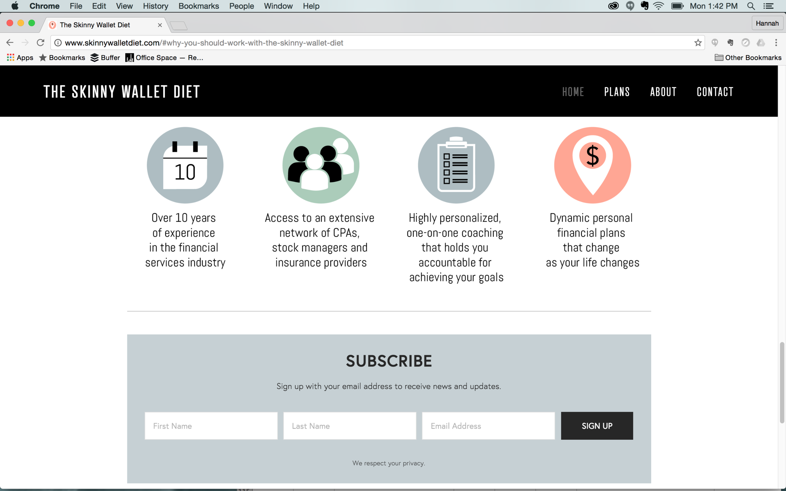
Client Spotlight: The Skinny Wallet Diet

The Skinny Wallet Diet is financial planning for the average person. Most people don’t need a stockbroker or expensive financial advisor... they need to know how to start saving and spending responsibly. With 10 years of experience Mary Edwards is the perfect person to help you do that.

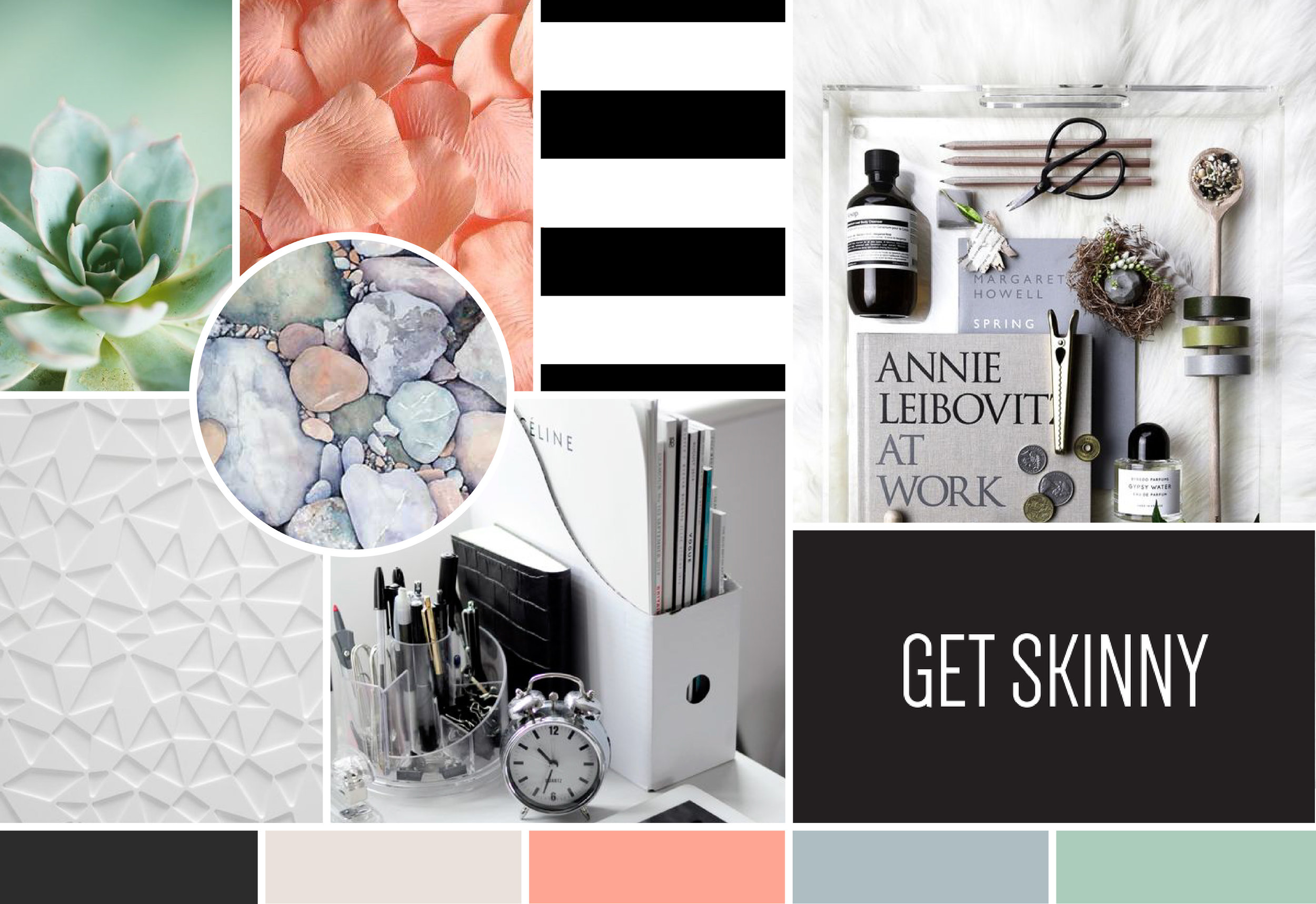
That’s where we come in -- when Mary Edwards was looking for a new website to take The Skinny Wallet Diet to the next level we were ready to jump into action. Most of the Skinny Wallet Diet’s clients are female -- so we knew we could pull in some fun, girly colors. We started with different shades of pinks and toned them down to keep them from looking goofy (this is finance after all). 

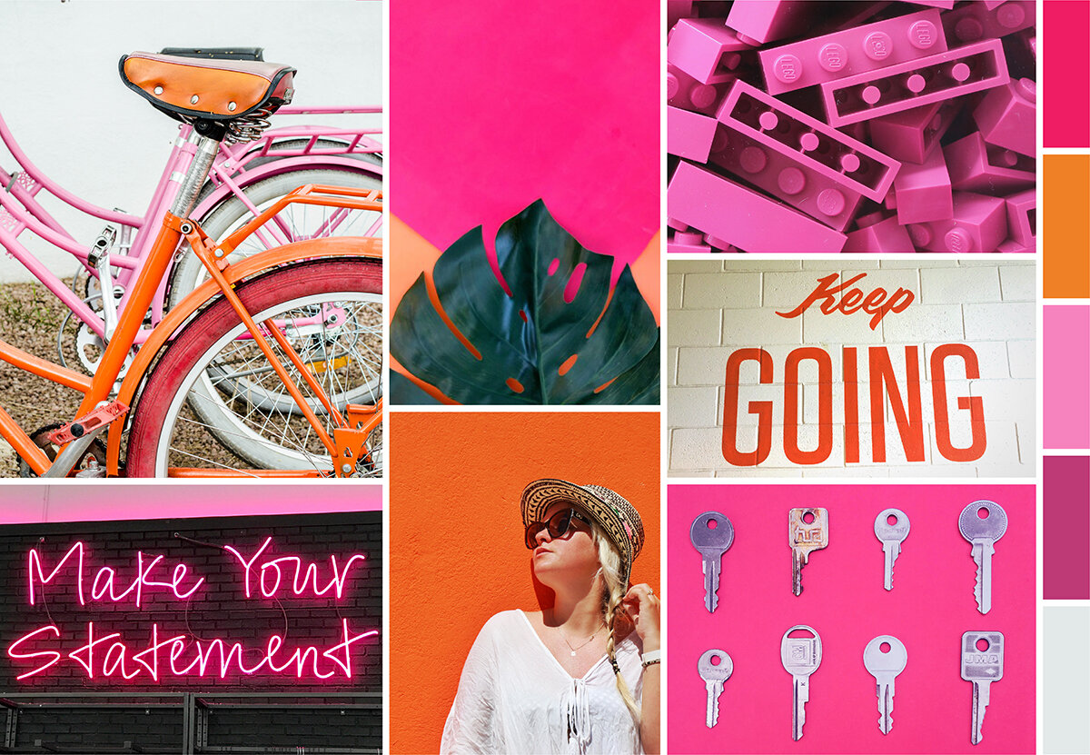
Here's the moodboard we put together to inspire the website:  

We won't bog you down in the little details of our process, but from there we worked with Mary to develop the content for each page. We created custom graphics, set up all the technical details, and made things like these little graphics:

Screen Shot 2016-09-13 at 6.18.28 PM.png

As The Skinny Wallet continues to develop we wanted to set Mary up with a site that would draw potential clients in, but would also be easy to update in the future.

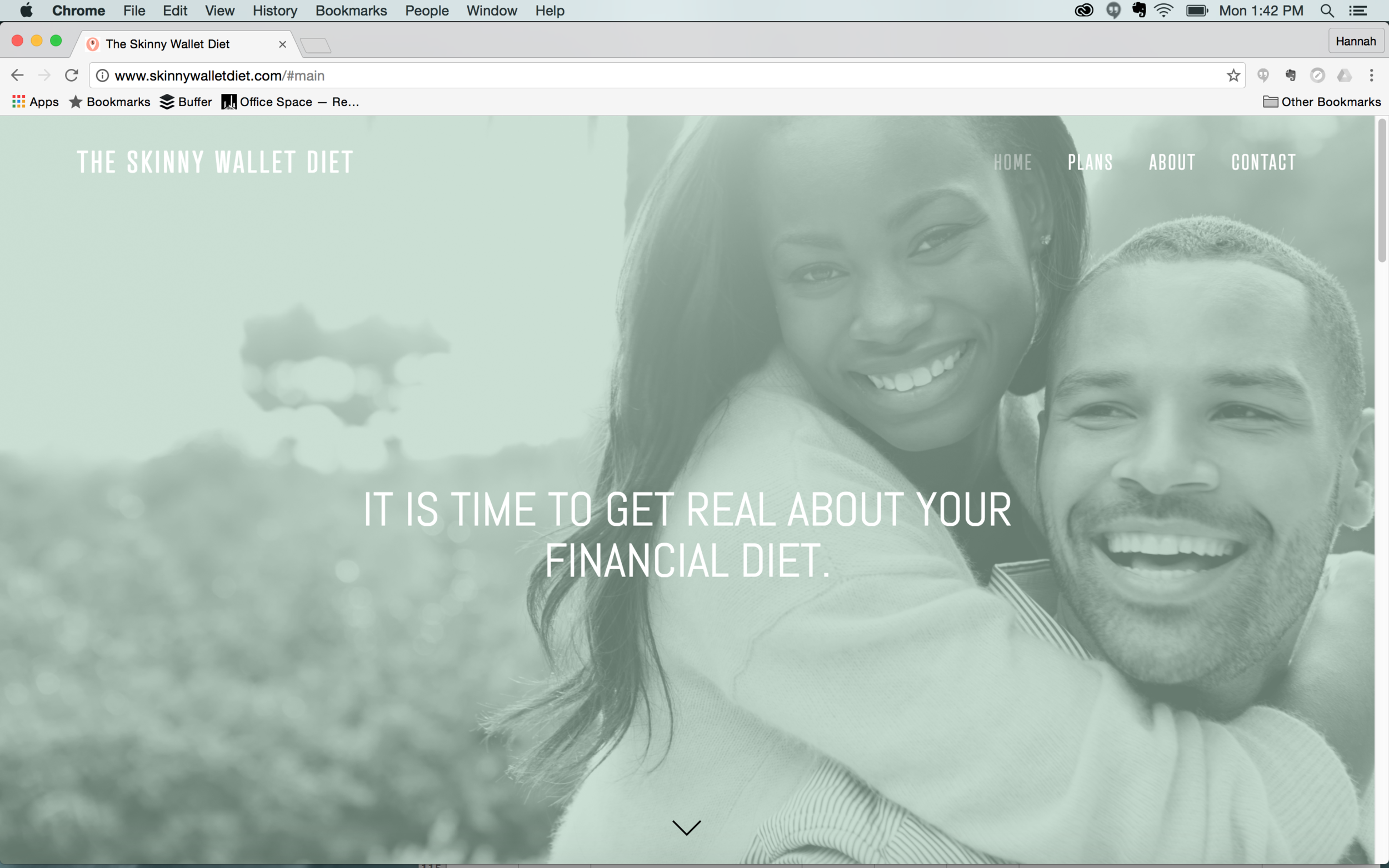
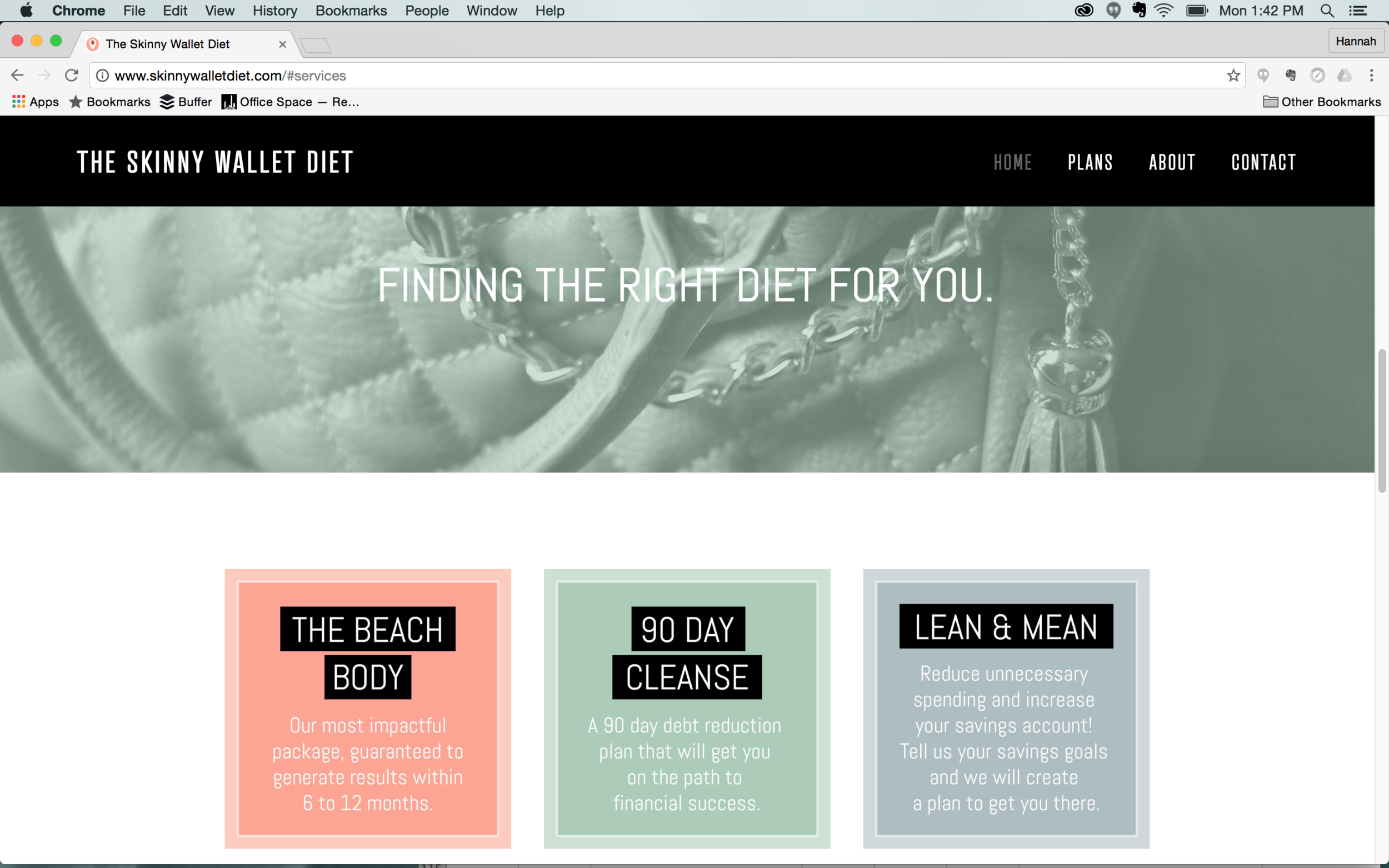
Take the new site for a spin HERE or flip through some screenshots of the homepage:

Our favorite thing about this site is the unconventional color scheme -- it's the perfect blend of serious and creative. We can't wait to see The Skinny Wallet use their new website continue to grow! 

Want a regular little dose of the Skinny Wallet? Follow their brand new account on Twitter at @theskinnywallet.

Meet Karissa: SCAD Grad + Design Lover

Hi everyone!

I’m Karissa Johnson and last week I began my social + web internship at Hue & Tone Creative! I first started my creative education after becoming obsessed with Project Runway. I started studying fashion right away – but, after making a lopsided shirt in my fashion tech class, I made the *smart* choice to study Fashion Marketing instead.

I graduated from the Fashion Marketing and Management program at the Savannah College of Art and Design, and I’m currently studying Graphic Design and Advertising online at Wake Tech. My interest in graphic design was piqued when I started using Photoshop to create mood boards for my marketing projects. Even though my interest in graphic design was sparked during my SCAD days, I didn’t make the leap to graphic design until recently. I’m excited about this new internship because it will give me the opportunity to learn and experience a new field that I’m passionate about.

There’s a lot that inspires me, but I wanted to start off by giving everyone a sense of my design aesthetic. Here’s a mood board I created – it’s a bit of a visual representation of some of the things and styles I love.

Meet Karissa Moodboard -- Hue & Tone Creative

If you want to know even more about my favorite things, I’ve got a few inspiration recommendations for you:

Favorite Movies/Shows: The list could go on forever! Some of my favorites are Penny Dreadful, Amelie, and Game of Thrones.  I’ve also always loved Wes Anderson movies -- his strong use of color and symmetrical composition never fails to impress me.

Hobbies: I love to work with my hands and am happiest when I can use my creative energy making something. Drawing, painting, and baking are some of my favorite outlets. I also recently made a succulent terrarium with a friend. (Succulents are so pretty!)… But, unfortunately, only two of my four plants are still alive. Even though my grandma is an amazing gardener, I seem to have a black thumb.

My top sources of inspiration:

  • This Is Colossal has an amazing collection of design, illustration, and photography from artists around the world. I’m always amazed by what people are capable of creating. But, don’t take my word for it, browse for yourself: www.thisiscolossal.com
  • I was introduced to Design Sponge during my internship with Anthropologie. It’s a beautifully curated blog filled with DIY projects, home interiors, and guides for creative professionals. www.designsponge.com


Now that I’ve told you a little about me, leave us a comment telling us what inspires you! And, follow Karissa on Instagram to stay up-to-date on all her creative endeavors!