Posts tagged Tips & Tricks
Four tips for growing your small business
Four tips for growing your small business  |  Hue & Tone Creative

A NOTE FROM HANNAH POMPHREY, OWNER OF HUE & TONE CREATIVE 

Anyone who has started a small business has probably heard a lot of scary statistics about the chance of their business’s survival. 

20% of small businesses fail in their first year, 30% of small business fail in their second year, and 50% of small businesses fail after five years in business. Businesses fail for a lot of different reasons including lack of demand, limited financial resources, and being outpaced by the competition. 

After five years of owning Hue & Tone, I feel like I’ve learned a lot of dos and don’ts about how to grow revenue and thrive as a small business. Growth doesn’t happen overnight, and it’s important to build connections with your community and nurture yourself as your business expands. 

One of my strongest values as a business owner is the importance of reaching out a hand to those on the same path. If I could give a few pieces of advice to other entrepreneurs – or to myself five years ago! – here’s what I’d share. 

Four tips for growing your small business  |  Hue & Tone Creative

Network, network, network. Even in the digital age, small businesses thrive on word of mouth. Taking the time to build strong connections will form the foundation of your success.  

Never hesitate to set up a coffee or grab a drink with someone (even if it’s digital). It might be a bit awkward at first, but the only way to learn more about someone’s business is to talk to them about it. Start by learning more about what they do… and then let things develop naturally from there! 


Focus on your strengths. Don’t feel you have to offer the same services as your competitors or fit within the mold of other businesses around you. Play to your strengths, and don’t offer a service or product if you can’t add value and ensure quality.

Your unique service offerings are what make your business distinctive to you. While it’s smart to take a strategic look at your competition, don’t be swayed what you see. Offer the services you can really deliver on – and, if you hate doing something, don’t advertise it heavily. Leave services you could offer (but don’t want too) off of your website – if someone inquires, offer them then, but don’t lead with something you aren’t passionate about. 


Don’t be afraid to take the lead. Whether it’s teaching a course, serving on a board, or lending your expertise to a local non-profit, the opportunity to lead in your community is one of the best perks of running a local business. 

Don’t hesitate to build some flexibility into your schedule so you have time to partake in things you’re really passionate about. Volunteering is a great way to give back – but also a great way to make new connections with industries or organizations you’re passionate about. 


Keep seeking inspiration. Working 24/7 without taking time to nurture your personal life drains you of the inspiration that led you to start your business in the first place, especially if you’re a creative entrepreneur. No matter what fuels you, be sure to set time aside for yourself. 

Keep taking time to travel, cook, create – whatever fuels your ingenuity and imagination! Block off time or days on your calendar to do the things that inspire you and you’ll come back to the office even more productive than if you never left. 


Hue & Tone Creative: Your partner is business and marketing 

Overwhelmed with all the functions of owning a business? Let us take the marketing off of your hands. Outsource your creative work and get more time back to do what you really love. We’re here to help you get your time back, help you maximize your bottom line, and increase your reach. Let’s connect and work out the specifics of how we can help.

7 tips for successful app design and development

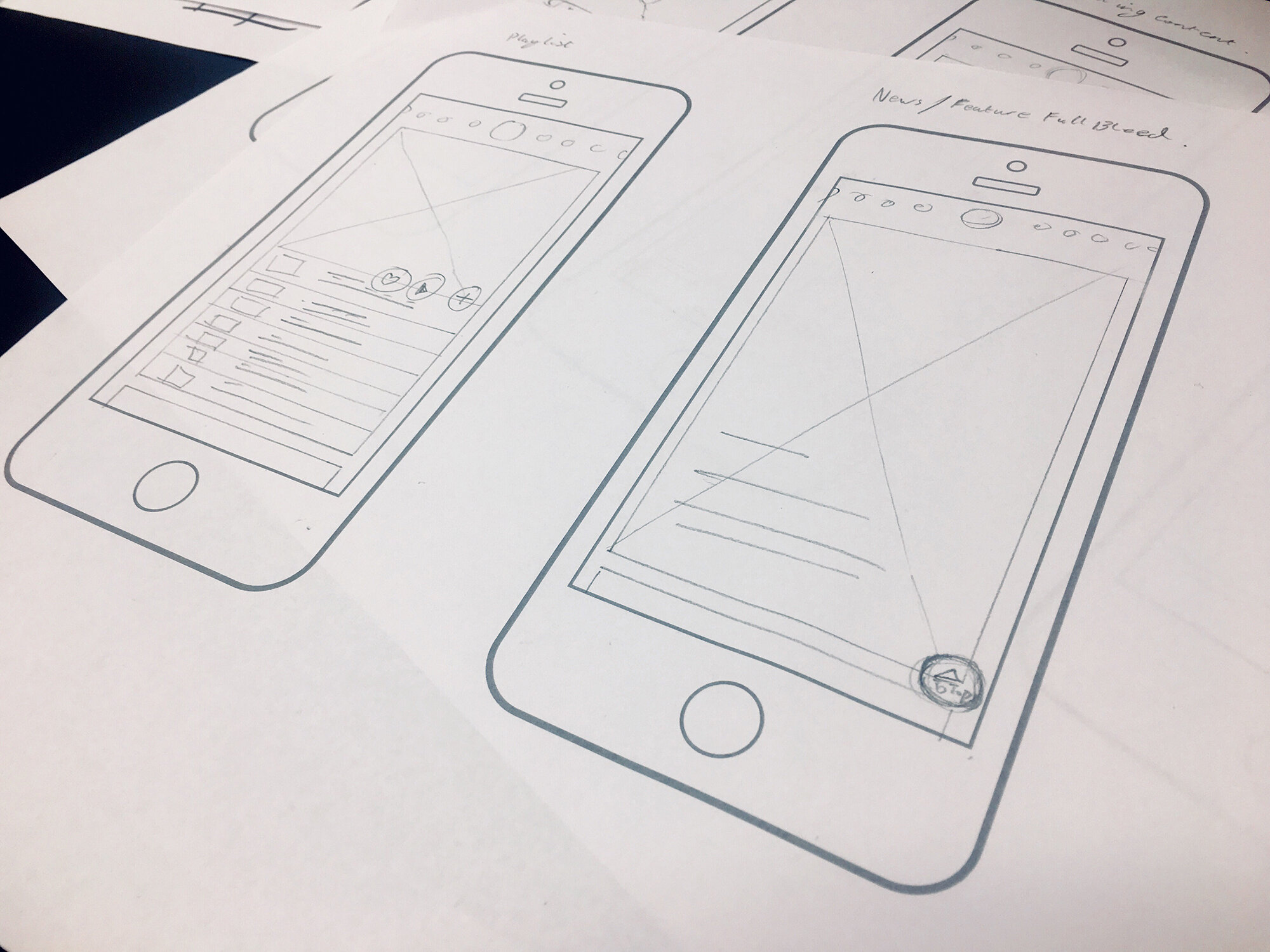
The difference between a successful app design and a failure isn’t just an app that looks sleek and well-designed. When it comes down to it what makes an effective app is user experience.  

Before we get into specific design tips, it’s worth sharing our biggest development tip of all: focus your app on doing one thing well. Overloading your app with features makes it hard to market to potential users. Home in on the one thing you want your app to do really well, and once you’ve achieved success there you can begin to add on additional features. 

Once you’ve determined the sole focus of your app, you’ll be able to determine who your audience is and design for them. But no matter what your target demographic, there’s a few design considerations you’ll want to keep in mind during the development process. 

7 tips for successful app design and development  |  Hue & Tone Creative


1. Keep navigation simple 

If your app has a narrow focus, this tip will be easy to execute. You want to keep your app navigation streamlined and intuitive for users. Limit the number of options people have available and use common terms and design elements. Avoid thinking outside of the box on your navigation design – you want to stick to easily recognizable symbols.   

Most importantly, navigation should be available at ALL times, not just when you think the user might need it. 


2. Accessibility is important 

Designing an accessible interface means thinking about how people with vision loss, hearing loss, and other disabilities will use your app.  

For example, don’t make red and green the only indicator of a successfully filled out form. Add an “x” next to incorrect fields and a check mark by correct fields to serve as additional visual indicator so that people with red/green color blindness can still easily and successfully use your app. Similarly, consider adding transcripts to video or sound clips to aid those with hearing loss. 


3. Use familiar icons

Familiar icons work best when designing an app with widespread use. Use a magnifying glass to represent your search feature, a house to represent your home page, a printer to represent printing. Whatever you’re trying to communicate, your icons should have universal recognition from users – icon design is simply not the place to get creative. 

In addition to familiar visual icons, stick with simple text labels. Use intuitive terms like “Home, Search, and Back” to avoid confusing users.  

 4. Minimize user input and error

7 tips for successful app design and development  |  Hue & Tone Creative

No one would willing choose to write a novel on their phone – it’s hard to see, hard to type and people typically end up misspelling a lot of words. 

If your app includes a form or survey element, be sure to keep it as short as possible. Think hard about what fields you really need to include and ask the bare minimum you can without losing effectiveness.

Make sure you use smart features (like autocomplete) to help reduce user error and ensure accuracy. You’ll also want to make sure the correct keyboard type will pop up when a user goes to fill out a form – they shouldn’t have to navigate to their number keyboard when filling out a phone number, the numeric keyboard should just automatically pop up.


5. Respect platform guidelines 

Each mobile operating system has a set of standard guidelines to help you provide a high-quality app. Your app users are already familiar with the standard operating guidelines of each system, so it’s important to keep your design in line with customary procedures. 

Keep in mind that these guidelines constantly evolve – it’s important to stay on top of the ever-changing trends and guidelines for mobile app design.  

6. Include screen titles

 Users often forget what page they’re on, or they might just not have a good sense of where they’re at in the app. Including a simple title at the top of the page is a great way for users to get a better sense of the app and helps avoid them repeatedly navigating to the same page. 

And as an added bonus, screen titles often give a page design a polished look! 


7.  Keep branding consistent 

Your mobile app should share similar characteristics with your main website. In addition to being an important extension of your branding, visual inconsistency may lead users to be suspicious of your app or cause them confusion. 

You not only want to match the look of your app to the rest of your branding, but you also want to keep elements in the app cohesive throughout your interface. For example, typefaces, buttons, and colors should be consistent on every page of the app. Every element should have both a native and branded feel to encourage user trust. 


About Hue & Tone Creative

Hue & Tone helps businesses of all sizes build credibility and connection with intentional design. Whether you’re looking to create a mobile app or a traditional website, we’re here to help your business grow through thoughtful design. Contact us to get started. 

12 tips for a successful webinar

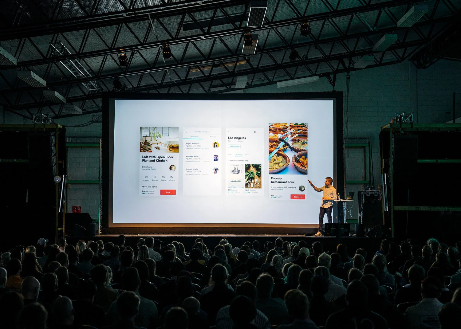
If done right, webinars are a great way to engage your audience, add credibility to your name, build meaningful relationships, and raise your brand awareness. But if things go poorly, you’ll be funneling a lot of time and energy into a failed presentation. 

Not sure what “getting it right” looks like? Well, we’ve put 12 tips together to help guide the creation of your webinar.  

12 tips for a successful webinar  |  Hue & Tone Creative


1. Make sure the speaker’s engaging 

If you’re expecting your audience to tune in for 10, 20, 45 or 50+ minutes, make sure the person delivering the webinar has a voice for it. You need someone who has an enthusiastic tone and, most importantly, is clear with their delivery. 


2. Sound out the sound quality 

There’s nothing more annoying than trying to intently listen to something that’s too quiet, keeps crackling, or has irritating background noise behind it. Do a few test runs before you go live so that you can ensure your sound quality is top notch.


3. Don’t forget about the design

As with any collateral you produce, your webinar slide design needs to be high-quality and on brand. Use easy to read brand typefaces, don’t cram too much on one slide, and don’t go overboard on graphics or photos. 


4. Analyze the length

There’s no golden rule when it comes to the length of your webinar. If you’ve got past recordings to learn from, see what time people tend to drop off and take it from there. If this is your first ever webinar, we would suggest never going over 60 minutes. 


12 tips for a successful webinar  |  Hue & Tone Creative

5. Rehearse, rehearse, rehearse

No matter how confident you are with your delivery skills, always do a test run. Fine tune the order of the slides, practice tongue-twisting lines, and work out all the glitch with your transitions –it’s better to work these things out now rather than later.   

It’s a good idea to have someone sit in on the practice run too - their fresh perspective might help you uncover issues you hadn’t previously picked up on.


6. Keep it conversational

Unless you’re delivering your webinar to robots, keep it conversational. It’ll make it easier for people to keep up with and digest, and itwill bring that all-important human element to it.


7. Introduce Q&As

Allowing a forum for Q&A’s is a great way to involve your audience, keep them engaged, and provide them with key takeaways that are tailored to them. 


8. Speak in second person

Refer to your audience as ‘you’. This’ll help submerge them into what you’re saying, build interaction, and make the entire webinar feel as though it’s being delivered to them on an individual level.


9. Bring it to life

Refer to real-life experiences throughout your webinar. In doing this, you’ll instantly make the information more relatable –and, the power of storytelling often makes details easier to remember.


10. Keep mobile in mind 

When you’re doing your test run, bear in mind that people might be watching your webinar on either their desktop, tablet, or mobile. So, make sure it works and streams easily on all types of devices. 


11. Your personal plug 

Don’t forget to mention your product or service at least one point - after all, the goal (whether now or in the future) is a sale. Just make sure you don’t go overboard. If your pitch is toosales-y you run the risk of listeners zoning out.


12. Don’t forget time differences

Last but not least, if you’re targeting people from different countries or time zones, factor these variances into the date and time you’re hosting your webinar –no matter what you’re sharing, people probably won’t wake up at 2am to see it. 


Hue & Tone Creative: Marketing for Greensboro, NC and beyond

If you feel like your webinar isn’t connecting, we can help you take your content to the next level. We can work with you on every marketing project, no matter what the format. To get an idea of what we can do, see some of the projects we’ve worked on in the past or get in touch.

5 signs you need help with your content
5 signs you need help with your content  |  Hue & Tone Creative

Your content is at the core of everything you do. Every part of your business relies on strongly written content – everything from your website and welcome emails to business cards and online ads. 

But how do you know if your content is connecting with potential and future customers? We’ve put together a list of 5 key signs that you need to revamp your content or bring in some outside help to revive it. 


1.  Your traffic isn’t converting

Plenty of people are landing on your website, but your conversion rates are way below what you’d expect them to be. There are a whole load of factors that could be contributing to this, but content tends to be one of them – along with page design, graphics, and mobile compatibility. 

Across industries, the average landing page conversion rate was 2.35%, yet the top 25% are converting at 5.31% or higher. Ideally, you want to break into the top 10% — these are the landing pages with conversion rates of 11.45% or higher. 

Ask yourself -- does your content do your product or service justice? Does it clearly explain what you’re about? Does it speak to your audience in a way they want to be spoken to? Is it accurate and engaging? Does it give people a reason to choose you over your competitors? If you just answered with a stream of no’s, there’s plenty of room for improvement.

If you’re not sure how your content is being received, consider sending out a survey or asking a few key customers for their thoughts. Sometimes an outside perspective is needed!


2.  Your website it stale

When’s the last time you added a piece of content to your site? So long ago you can’t remember? Well, therein lies your problem.

Google likes to see fresh content, and places greater value on up-to-date, newsworthy articles. In a nutshell, if you don’t have fresh content, this means you could be impeding your efforts to gain organic traffic. A simple way to overcome this is by adding a blog section (and actually posting on it!) which will help improve your SEO (find out more about that here).

In addition to a blog, consider setting a calendar reminder that goes off every 6 months to prompt you to review and update the content on your static web pages.


3.  Social media struggles

If you’re constantly grasping for ideas of what to post on social media, it’s probably because you don’t have anything to shout about, and the reason you don’t have anything to shout about is probably because you haven’t published anything new – or, worse, you’re out of touch with your audience.

Regular, relevant content will bring your social media streams to life, give you something to talk about, get your audience engaging with you, and drive traffic to your website.


4.  People aren’t talking about you

If you want people to talk about you, you need to give them something to talk about. Producing great content will get people sharing it on social media, encourage other websites to link to your material, and can help get your audience engaged in new ways. 

The end result? Brand awareness, word of mouth advertising, more inbound links (which will benefit your SEO efforts) and inevitably more leads.


5.  No internal linking opportunities

Internal linking aids your website’s navigation, help you define the architecture and hierarchy of your site, and plays a part in building your website authority. 

When it comes down to it, the more relevant content you have, the more opportunities you have to add internal links. For example, we sent you to this article about SEO earlier in our blog post – but because we have so much relevant content we also could have linked you to this article or this article… or even this one! See? Relevant content builds linking opportunities. 


When it comes down to it, having a bank of relevant content not only makes your marketing more effective – it also makes things easier on you in the long run. Having a deep well of articles and posts to send people to gives you more to promote – as well as the behind-the-scenes SEO benefits of establishing authority. 

If you’re stuck on what to post about, we’ll leave you with this blog series for a little further reading. 


HUE & TONE: TRIAD BASED MARKETING SOLUTIONS

Completely stumped on what kind of content to post? Not even sure who your customers are? Or maybe you're just not sure how to reach them? We can help you answer all these questions -- and help you plan and enact solutions for all your marketing woes. Shoot us an email or give us a call.

Brand your social media images like a pro

We are living in the Golden Age of social media. Today, you can post a picture of your artisan avocado toast on Instagram, pin your imaginary dream wedding, or simply tweet about whatever random thing your cat just did. Although these things can seem silly, social media is incredibly powerful if used the right way. Utilizing social media is especially fantastic for brands -- you can reach audiences around the world or just expand your reach locally.
 

1.     Who are you?

Before you start posting, it is crucial to have a clear sense of your brand. Is your look sleek, modern, and polished? Are you bold, artistic, and experimental? Taking the time to research and understand who you are as a brand allows you create a look that is entirely your own.

If you’re feeling a little stumped a mood board is a great way to start your research. Use Pinterest, Photoshop, or even a paper collage to gather whatever images speak to your brand. Anytime you feel lost for inspiration, go back to your mood board as a reminder of what your brand represents.
 

2.     Color & Fonts

In addition to color, your brands choice of fonts and lettering are also important. Anthropologie often uses fonts that look handwritten to capture the whimsy of their merchandise. Alternatively, Target uses clean minimalistic lettering that pairs well with the brand’s simple and crisp aesthetic.
 

3.     Filters & Photo Editing

Along with ready to use filters, adjusting your brightness and saturation can make your images more eye catching. Bright clean images with bold pops of color are perfect for brands with a youthful and playful aesthetic.

Muted colors with strong saturated hues work well for brands with a modern sophisticated style.

Although filters are fun to use, you don’t want your social media accounts to look like a confused medley of styles. Pick a look and stick to it.

One last tip,

It’s easy to obsess about achieving perfection, but it’s ok to mess up. You might discover a filter you like better or find some unexpected inspiration. Growing, learning, and evolving is much more valuable than staying predictable and stagnant. Have fun and don’t be afraid! 

5 Easy to Accomplish Do's + Don'ts of SEO

One of the most common questions we hear is “How do I make my website come up first on Google?”

SEO Do's + Don'ts -- Hue & Tone Creative

That’s a great question -- one with a complicated answer. The short answer is SEO, but the long answer requires diving into what SEO is. It’s important to understand that there are a number of ways to improve your SEO, some of which require a developer or paying for ranking -- but the ideas we’ve compiled here are meant to be easy to execute, no matter what your skill level.

First things first, what does SEO even stand for? SEO means Search Engine Optimization. It can refer to anything that helps increase the authority and relevancy of your site.

Let’s let Cristers Media explain more about how that process works:

“The way Google and other search engines display websites is this: Google has automated computer systems working around the clock that randomly visit websites all over the Internet, take snapshots of each page, and file them away in a massive database.

As part of taking a snapshot of each web page, Google's system reads every word and other content on a web page in order to determine the specific subject of the page. Google uses this collected data to determine which web pages to show, and in what order, for a particular keyword search.

In other words, Google's computer algorithms dynamically determine which web page on the Internet is the most relevant for a specific keyword or key phrase and displays it first. It then displays the second most relevant page, and so on. The resulting list of web pages is known as a Search Engine Results Page (SERP).”

So now that you know what SEO is, how do you improve it? And what should you avoid doing?

DO:

  1. Do keep your content fresh with high quality content. The more frequently you update the content on your site, the happier your customers (and Google) will be with you. Providing customers + clients with original content on a regular basis ups the frequency with which a search engine will crawl and recatalog the pages on your site. The more frequently your pages are cataloged, the more opportunities you have to rise in the search rankings. To provide a frame of reference, a site that is updated daily, or at least 2-3 times a week, is considered a frequently updated site.  
     
  2. Do include keywords where it counts. Keywords are words or phrases in your content that people will search for in order to find your site -- it’s how the search engine matches up a query with your specific website. You’ll want to do research on which words to use, because you have to think like your customers in order to narrow down the proper search terms. Keep in mind that people will often perform a search using general or plain language terms instead of technical jargon.
     
  3. Do get social. Social media serves as a way to push your content out -- this puts it in front of more eyes, increasing the chance of getting an external link to your site. An external link is simply any other website (hopefully one with high authority) that points to your site. External links demonstrate and increase the credibility of your site.

    Secondarily, if your content is widely shared on social media it can contribute to a website's authority just like external links can (more on that in a minute). It’s another way that Google validates your content, leading to a small bump in domain authority.
     
  4. Do utilize Google Webmaster Tools. Google Webmasters is a free toolset by Google, for, well...webmasters. They help you do things like track your website’s search presence, see subscriber stats, and measure your overall website performance. Specifically, Search Console will help you make sure Google can access your content, hide content you don’t want show in the results, and monitor any malware issues.
     
  5. Do include outbound links. Practically the opposite of an external link, outbound links refer from your site to someone else's. When you link out to other domains, it helps the search engine to understand your “niche” and it helps increase the perceived quality of your site.

DONT:

SEO Do's + Don'ts -- Hue & Tone Creative
  1. Don’t have a slow load speed. A faster page speed (the time it takes for each individual page to load) is show to lead to a higher rank and conversion rate. Google’s also indicated that site speed (the speed of a sampling of all the pages together) is an influencing factor on page rank. Plus, no one likes waiting around for a website to load, so your customers will be happy too.
     
  2. Don’t use paid links. Google is firmly against manipulation of their site results -- specifically people sneakily buying their way to the top. Things like display ads are fine, because they’re a regular tool of marketing, but just regular linked text can come across the wrong way to Google. If you want a search engine to ignore something that really is a paid link, you should use a “nofollow” tag -- but, we promised this wasn’t an article for developers, so if you need to learn more about that check this out.
     
  3. Don’t keyword stuff. When you’re blatantly cramming tons of keywords in the content of your article, or in the meta tags of your site it’s called keyword stuffing. It’s obvious you’re trying to up your rankings (in a way that isn’t valuable to the reader) and it can lead to your site being penalized -- or even banned.
     
  4. Don’t duplicate content. Content that appears on the Internet more than once is called duplicate content. When there are multiple pieces of identical content on the Internet, it’s hard for search engines to decide which is more relevant. It’s important to note that there is no penalty for duplicate content, but rather rewards for original content (source).
     
  5. Don’t have broken links. In addition to harming the user experience of your website, broken links can stop a webcrawler from seeing the rest of your site. Web crawlers function by moving from the root of your site (main page) down to the different pages, subpages, and blog entries. When they hit a broken link they can’t crawl any further -- and might end up missing other pages on your site.

As you can see from all these do’s and dont’s, SEO can be pretty complicated. But the impact of doing things right can mean transforming your site from a deserted corner of the innerwebs to one of the most popular Internet hangouts around.

Looking to read more on SEO? We’ve got even more in-depth reading for you here and here.

Create a smoother working relationship: 8 tips for working with a designer

Bringing a brand to life is no small task, and a bad working relationship can steer a project off-the-rails before it even gains momentum. As designers, we know that understanding a client's business and personal taste is key to being able to properly brand a business. In order to appeal to potential customers, we need to have all the right information to create effective logos, websites, promotional materials, and social media posts.

If you’re nervous about working with a designer for the first time, or you feel like you aren’t on the same page about a certain project, these 8 tips will hopefully get you back on the track to a stellar end result:

  1. Make sure you’ve found the right fit. Don’t hesitate to reach out to a few different designers -- grab coffee with them and make sure you find someone that’s easy to talk to, is willing to listen, and understands your business goals.

  2. Explain in your own words. Communication is key -- don’t hold back from expressing yourself just because you don’t know what the technical term for something is. Your opinion is crucial to creating a quality final product -- and one skill no graphic designer has is mind reading.

  3. Provide examples. Bring pictures, prints, ideas, drawings, mood boards, color palettes and more to help your designer get a feel for what you want. Lacking inspiration? Hit up Pinterest.

  4. Be specific with your feedback. Ask questions, tell your designer how you feel, and explain what it is you like or dislike.

  5. Trust the process. The first draft is just the beginning. Do not get discouraged when it is not “perfect.” Your graphic designer is there to work with you through rounds of revisions to reach a finished product you love.

  6. Don’t be afraid to ask questions. If you’re ever unsure about why something was done, don’t hesitate to ask. Your designer wants you to have the best final product possible and is usually happy to explain their creative process.

  7. Think about it like a partnership. If a designer explains a technical reason for why they did something chances are you should listen. You hired a designer because you needed help -- acting like you’re the boss might land you with a less than effective final product.

  8. When you love a piece, say it! There’s nothing better than being acknowledged for your hard work and designers want to hear when they're on the right track. When you love the final result be sure to speak up so that they can get you more of what you love!


Have any additional tips? Encountered a particularly difficult situation you'd like advice on?  Share with us in the comments below!

Friday Links: Solving problems like a designer and developing blog post ideas

It's Friday once again! Here's our weekly roundup of links on a few of my favorite things: design, creativity, and entrepreneurship...plus anything else that strikes my fancy! 

Solving problems like a designer and developing blog post ideas -- Hue & Tone Creative

One | Love this rundown from Fast Company on six myths about creativity. I love number five (click on over to see what it is).

Two | Good design is really about solving problems. Here's how to solve them like a designer

Three | Maybe it's a little meta to mention this on the blog, but I love this guide to blog post ideas. It's not a list of pre-formed ideas (those are helpful, but everywhere) -- it's a framework for developing your own. 

Four | Another on the service-y/helpful side of things: how to change your domain name without losing SEO.

Five | Can we talk about this gorgeous lettering?! Love.

Roundup of this week's blog posts: 

Hue & Tone Tips: Easy, do-it-yourself stock photography

I have a confession to make: when I post on the Hue & Tone Instagram, I don't actually reach out to snap a photo of the office supplies (in branded colors) already artfully arranged on my desk. Those are stock photos -- at least in the sense that I shot them all in one batch and stockpiled them for later. But I didn't have to spend a ton of money on them, since I took them myself.

If you want to keep your business photography on-brand and avoid spending a ton of $$ on stock photos, here are a few tips I've picked up from trial-and-error experience.

Hue & Tone Tips: Easy, do-it-yourself stock photography -- Hue & Tone Creative

Buy props that match your brand.

This doesn't have to be expensive -- if you go with office props like we did, check out the dollar section at Target and the clearance sections of office supply stores. And, in my case, none of these are solely a prop...I just kept an eye out, when I was buying functional office supplies, for a few that matched Hue & Tone's bright look.

Hue & Tone Tips: Easy, do-it-yourself stock photography -- Hue & Tone Creative

Get outside.

Unless you have professional lighting equipment or a ton of well-placed windows, heading outdoors is your best bet for well-lit, appealing photos that don't require a lot of editing. Wait for a sunny day, pack up your supplies, pick a spot without too much shade and head out for a photoshoot.

Hue & Tone Tips: Easy, do-it-yourself stock photography -- Hue & Tone Creative

Use a solid background.

Keep it clean and sharp by shooting props arranged on a solid-color background. I used a sheet of white posterboard and it worked out great -- just make sure to use the matte side so you don't wind up with a glare in your photos.

Hue & Tone Tips: Easy, do-it-yourself stock photography -- Hue & Tone Creative

Get creative.

Bring a bunch of different props and shoot them in every angle and combination you can dream up. Write something out. Try neat lineups and jumbled-up piles. You'll want variety, and you'll have to take a ton of photos for every one you'll actually like, so give yourself options!

Hue & Tone Tips: Easy, do-it-yourself stock photography -- Hue & Tone Creative

Keep it simple + make minimal edits.

For me, at least, clean, uncomplicated photos were easier to shoot on the front end, and easier to use in a variety of projects. This meant staying away from over-complicated setups and keeping the post-shoot Photoshop party to a minimum -- just brightening and sharpening where it was needed.

If this isn't for you, there are some good places to find royalty-free, non-cheesy stock photography. But, personally, I find that creating my own on-brand, simple stock photography is the way to go. If you decide to try it out, I'd love to know how it goes! hannah@hueandtonecreative.com, or comment below.

Hue & Tone Tips: Small changes that'll make a big difference in your visual branding
Hue & Tone Tips: Small changes that'll make a big difference in your visual branding -- Hue & Tone Creative

I've said this a time or two on the blog -- your organization's visual brand is really, really important. In most cases, it's your first chance to make an impression on a potential customer or client, some of whom aren't going to take a risk on your business or organization if you don't have professional, cohesive branding.

If you're interested in a more in-depth look at the importance of branding, including how-tos on establishing your brand, you can check out my branding series. Today, though, I want to offer a few quick action steps that will improve your branding in a big way, without requiring a huge time investment. 

Invest in good-quality photography. 

Using clear, bright, well-composed photos -- rather than the "just okay" photography most organizations wind up with-- instantly elevates the quality of any branding collateral. This might mean investing in professional photography services or equipment, but it could be as simple as getting outside with your smart phone and a white-posterboard background and taking advantage of some good, natural light.

If you've seen that font before, stay away from it!

When you're choosing a logo font, go the extra mile and look for a font that's not commonly used by other organizations in your niche. This is often as simple as avoiding the default fonts on your computer (for a few places to download free or inexpensive fonts, check out Tuesday's blog post). 

Add texture to your graphics.

Particularly in graphics involving text, it's easy to think type and color are the only elements you need to pull in. But those flat graphics don't draw the eye. Even the simplest graphics need some form of texture to create visual interest -- take a look at the Hue & Tone post graphics for an example. 

Establish a consistent look on social media.

If you post graphics on social media, have an idea of which fonts, colors, and textures you're going to use in that space. These should be consistent with your overall brand identity. If there's a certain type of content you post often -- quotes, for example, or opening and closing dates for your business -- you can develop a consistent graphic template for that content and rotate in colors and textures. 

What's worked for you as you work to brand & define your business? Let me know in the comments. If you have questions about your branding, or want to discuss ideas, drop me a line here.


Branding (Part 1): 5 Questions to Help You Name Your Business
Branding1Graphic-01.jpg

Of all the elements of branding your business, selecting a name may be one of the strangest, most challenging parts.

In my first round of owning a creative business, I was just “Hannah Pomphrey Graphic Design.” It became pretty clear to me by the second time around that I wanted a distinct name for my business…but I wasn’t sure yet what that name was going to be.

As you know, I eventually settled on Hue & Tone Creative – which I LOVE – but it took a while to get there. If you’re lucky, your first idea will be a totally original one, and no existing businesses will have a similar name. That’s not quite how it happened over here, though.

If you’re starting the process of narrowing down a name, here are a couple of questions to ask yourself to help streamline the process.


1: Should I use my name?

Whether or not you want to use your own name for your business is one of the first things to consider. Often businesses start organically and individuals naturally fall in to using their given name. If you’ve already built your business using your own name, and have significant recognition in your community, chances are you should keep it that way.

Not liking your name, having a super generic name or having a name that’s a little tricky to spell are considerations if you’re starting a brand-new business, but they’re iffy justifications for changing the name of an already-thriving operation.

Tip: Not sure about your name? How about your initials?

If you’re starting from square one and aren’t sure which route to go, think about where you want to position yourself in your market. If you’re running a web based business and your name’s Anna Smith, you’re making it hard for potential clients to find you. If you’re aiming to reach local clients only, this might not be a problem.

Take into account whether you plan to remain a one-person operation long-term. If you’re looking to grow your business quickly or might acquire a partner, you may want to go ahead and incorporate and build your business under a less personal name.

Tip: If you’re in a small town market and want to keep business local, a corporate-sounding name risks making clients think you’re going to be charging corporate rates.


2: What are my services?

Make sure your business name reflects the services you’re offering to customers. It sounds obvious, but you’ve only got a few words to communicate to clients what you do and it won’t serve you to mislead them.

Make a list of your services and see what fits best. Should you be New Name Creative, New Name Social, New Name Marketing, or New Name Studio?

For example, if you’re really looking to work primarily with social media clients, you’re going to confuse people by using the word “Creative” in your business name. Likewise, if you’re a broader creative business you shouldn’t be “New Name Social.” Some words might be catchier or trendier, but if they don’t reflect what you do, you’re going to miss out on potential clients.

If you’re not sure what fits best, go back to the drawing board and figure out who your ideal client is before naming your business. You can’t appeal to everyone – so don’t try. Tailor your branding to the clients you hope to attract.


3: What are some things people might associate with me or my business?

Is there something you’re known for? Do you always wear pink; do you have a well known nickname? Are you obsessed with a certain animal?

Make a list of words people may associate with you, interests and hobbies. Star the ones that would be most relevant to your business’s services and see what you can do with that!

Exhausted those ideas? Move on to making a list of qualities you’d like people to associate with your business or a list of industry terms.

Tip: Try to keep your name around or under 13 characters. 


4: Is this name taken?

Once you have a list of potential names, use GoDaddy to see if a similar domain is available. Then, conduct a Google search to see if anyone else has the same name. Next, make sure there is something that works available on all the major social media networks. People need to be able to find you as easily as possible – and consistency is key.

Things like being consistent with the editorial aspects – for instance, whether you use a numeral “4” or spell out the word “four” – will only increase your brand cohesion. The shorter the better – we opted for “@hueandtone” on our social media, even though our website also has the word creative (www.hueandtonecreative.com). 

Tip: Ask yourself -- is this name clear, concise, compelling and consistent? 

I was originally obsessed with the idea of “Top Knot Creative,” but someone had recently purchased the domain and claimed the Facebook page. Instead of getting stuck on trying to make one thing work (I then got fixated on Top Knot Studio) keep looking around and trying new names.

Can’t seem to find anything that’s available? Don’t get discouraged. Keep trying different combinations until you find something that works. You’ll get there!


5: What do other people think?

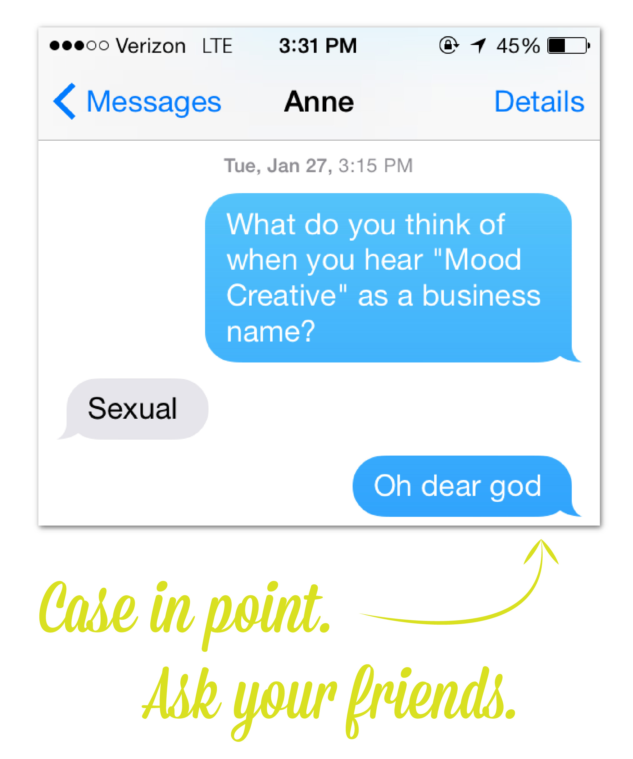
When you finally think you have a winner, conduct a quick focus group with your friends and family and see what they think. I’d originally decided on “Mood Creative” – I even had the domain in my GoDaddy Cart – when all my friends told me it made them think of tie-dye and drugs. After hearing this from four different people, I realized I should probably move on.

If your friends and family who love you don’t like your new name, imagine how hard it’s going to be to get complete strangers on board. 


After making my way through these steps (some more than once), we are now Hue & Tone Creative – and I couldn’t be happier with the name.

If you already own a creative business, how did you come up with its name? If you’re making business plans for the future, what other branding info would be helpful to you?

Ways to Develop Your Portfolio as a College Student
Ways to Develop Your Portfolio as a College Student -- Hue & Tone

If you’re a creative in college, you probably have your eye on what comes next. You may choose to start a business, like I did. Maybe you’ll try your hand at a corporate job. Either way, you’ll need a strong portfolio to get there. Read on for a few ways to make that happen.

1. Join your campus newspaper. Or magazine. Or anything.

I can’t even lie about it…I lived at my college newspaper. And my high school newspaper. Because of that, I had the opportunity to shoot and edit video, design print pages, start a blog, be the boss, draw a paycheck, write editorials, make infographics…basically, a little of everything. That’s the biggest plus of working for a college organization. There’s nothing you can’t try.

2. Offer pro-bono services

What are you passionate about? What keeps you awake at night? Whatever it is, there’s a nonprofit (or 20) serving the cause. Reach out and offer your services -- yes, for free. You’re giving back and honing your skills at the same time!

3. Do internships. Do a ton of internships.

I spent my college years trying my hand at any internship that sounded appealing, from a small design firm to a daily newspaper to a nonprofit solely focused on building a solar house. And I couldn’t recommend that strategy more. You may be noticing a theme here, and that’s – try a little of everything. You’ll diversify your portfolio, and you’ll know what you really love doing.

4. Team up with your friends

When your best friend’s hosting an event and needs a flyer designed, say yes! In return, she can teach you how to shoot a photo, or compose a perfect Tweet, or whatever she does best. Building relationships with other smart, creative people, working together and sharing skills, is a great way to build your body of work and learn new skills.

Looking to gather your work together in a portfolio site, or develop your personal branding materials? Let’s talk! hannah@hueandtonecreative.com.

To office or not to office?
                      Hue & Tone's New Space

                      Hue & Tone's New Space

Anyone following my start-up journey on social media has probably noticed I’ve been posting almost non-stop about my new office – that’s because I’m insanely excited about it! After freelancing from home part-time for the past few years one of my biggest hesitations working for myself full-time was the prospect of having to work from home.

Now, everyone’s different. But for me, a brief stint of working from home (when I was in between jobs) left me scarred for life – I literally went a few days without human interaction, my outfits had devolved into mismatched athletic wear and I was working completely irregular hours.

If you’re as extroverted as me, renting office space or looking into a local co-working space is going to be a major factor in your ability to be successful. If you’re just starting out, the low commitment option of co-working may be a better fit – your own office often means committing to a 12-month lease for both the space and the Internet. 

I’ve tried co-working in the past and was ready to try out my own space, but after weeks of searching I was worried my own space would be completely out of my price range. While the sticker price looked completely doable at first, there are a few additional costs to take into consideration: 

1-  Business Internet: Pricing for Business Class Internet is considerably higher then residential service. For a creative business that typically deals with large files, we needed a slightly higher speed -- this started in the $140 range and was priced into the $200s for turbo speeds. 

2- Commercial Renter’s Insurance: Expect commercial renter’s insurance to cost significantly more than the $10/month policy for your apartment. Before signing a lease, ask the leasing company for a copy of the minimum insurance requirements (these will be different everywhere) and be sure to price out a few different policies. Depending on the company, you may be able to get a lower rate if you use the same company you already have a policy with.

Be prepared to answer questions about your equipment, how many clients will be visiting and your day-to-day business operations so you can receive an accurate quote.

QUICK TIP: If your office is smaller, make sure to take careful measurements to make sure that the furniture you have will even work in the space. Having to crawl under your desk to get to the printer gets old…

3- Furnishing your office: Thrifting and shopping for furniture at Goodwill can take a considerable amount of time and luck. Before committing to a space, be sure to take stock of what you have or can borrow. If you have to start from scratch, thrifting, Ikea or Walmart are probably your best bet! Take into account the cost for a few basic decorations, window coverings, rugs and consider if you need a lockable filing cabinet for confidential billing information.

4- Office supplies: Working in your own space means you’ll need to purchase everything from sticky notes and pens to a new printer. These costs can add up to hundreds of dollars for even the thriftiest, most selective shoppers.

5- Common Areas: Find out whether your office building will be offering a break room or shared kitchen. Eating out every day is a major expense when you’re just starting out – so you may be looking at making the investment in a mini fridge, microwave, bottled water, dishes, plastic silverware, or a coffeemaker.

After weeks of crunching the numbers, I was able to find a cozy, 230-square-foot office to split with another start-up business. Halving the costs of everything with an officemate left me with a much less intimidating monthly cost. For me, having my own office space was a necessary investment in my happiness and the long-term success of business, but like everything else, it’s necessary to weigh the cost and make the best decision for you.