Posts tagged photography
How to Curate Your Instagram Feed
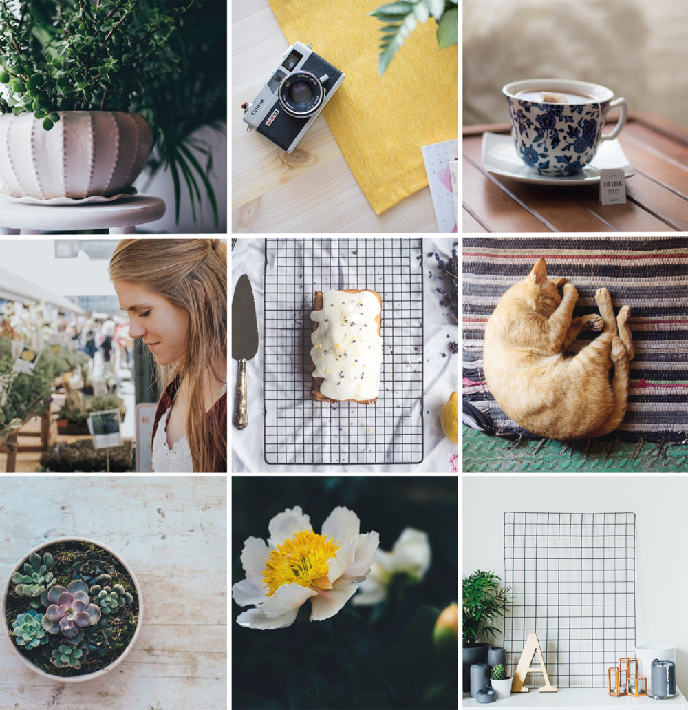
We all want our feed to look like this!

We all want our feed to look like this!

Ever stumble across a gorgeous Instagram feed and suddenly come down with a major case of account envy? We’ve all been there.

Creating a lust-worthy Instagram account is more than just slapping on a filter and a handful of hashtags. It’s about telling a story and understanding your own unique style.

Whether you’re trying to revamp your feed for yourself or your brand, we’ll give you the scoop on how to create an account your followers will love. 


Choose a Theme

Found the perfect filter or editing settings? Keep your feed cohesive by using it on your other images. 

All successful Instagram accounts have something in common. They all have a look. Finding your own theme takes a lot of research and self-discovery, so don’t get discouraged if it takes some time to get your feed where you want it to be.

Start by studying your favorite Instagram accounts, creating color stories on Pinterest, or simply writing down a list of adjectives that describe your brand. Think about what emotions you want your followers to feel when they scroll through your feed and brainstorm how you can express that visually.

For instance, a feed for a yoga studio could use relaxing colors, natural light, or motivational quotes. An account for a café might use vibrant colors or flat lays of ingredients... Once you get rolling the ideas are endless!

After you’ve decided on a style, use that as a guideline for all your future posts. 


Spice it Up

Now that you’ve found your look, keep your interesting by varying what you post. No one wants to follow an account that posts virtually the same images all the time.

Get creative by telling your story in different ways:

  • Piece a mosaic of individual images

  • Celebrate a holiday

  • Change your setting

Still need more examples of what to post? We’ve got even more ideas to help you get inspired.


Quality over Quantity

Never post a subpar picture just for the sake of likes. It’s much better to have a small number of great images than hundreds of blah ones. Always post high quality images that reflect your brand’s vibe and overall style. If it doesn’t fit your look, don’t post it.


Pro tip: Use a social media scheduler to help you preplan your Instagram content. We recommend giving Buffer or Hootsuite a try! 


Try an App

Although Instagram has a huge array of filters to choose from, don’t be afraid to venture outside of the app! There are tons of (mostly free) photo editing apps on the market with beautiful color stories and editing features.

VSCO- subtle effects and presets

1967- filters with a vintage feel

Foodie- perfect for lovers of food photography

A Color Story- lovely collection of filters and light effects

Adobe Lightroom- a high quality on the go photo editor


One last takeaway…

Creating a cohesive look takes time so don’t rush the process! Post frequently and try not to overthink it. 


Social Media Marketing in Greensboro, NC

Running out of ideas on what to post? Can’t seem to increase your number of followers? Take a breather and leave it to the experts. Whether you’re trying to get the word out for an event or are preparing to launch a hot new product, Hue & Tone Creative can help you ramp up likes, retweets, and mentions on all of your social channels.

Photography Terms: A Glossary for Beginners
Photography terms for beginners  |  Hue & Tone Creative

With the evolution of iPhone photography, just about anyone can make a shot look artistic. But artistic isn't the same as high quality. While we can appreciate a nice shot on our Insta feed, there’s still a big lane for professional photography in advertising and marketing.

If just bought your first DSLR, or if you're looking to learn to go from a  beginner to a professional, there’s a few terms you should know. 


Aperture

Aperture is the adjustable opening in the lens where light travels. This is one of the three elements that creates exposure. When it comes to shutter speed, fast speeds need large apertures for more light. Slow shutter speeds require smaller apertures with less light passing through.

Aperture sizes are marked by f-stop numbers:

f/1.4 (largest)

f/2

f/2.8

f/4

f/5.6

f/8 (smallest)


Autofocus

This allows your camera to focus on the subject automatically. There are two types of autofocus: single or continuous. Continuous focus is best for moving subjects, and single focus works best stationary subjects.  


An example of bokeh

An example of bokeh

Bokeh

Have you ever noticed the tiny balls of light in filtered pictures? When lights are out of focus and the picture is taken with a wide exposure, it creates an effect called “bokeh.”


Color Depth

Basically, color depth is the amount of color that can be captured by a camera. Color depth is measured in bits, and varies from camera to camera. Higher bits allow for higher quality images with more variations of color. Most DSLR cameras have a color depth of 24 bits of color variation (about 16.7 million colors). 


Exposure

Exposure is the lightness or darkness of a photo.  Three factors determine the outcome of exposure: ISO, shutter speed, and aperture. If you’ve heard that an image is “overexposed”, it means that it is too washed out or too light. “Underexposed” means that it’s too dark.


Flash

Most people probably equate flash with blinding bursts of light and embarrassing school pictures. Flash is usually used to help add light to dark scenery, but it can also be used to create artistic effects.


Focus

Focus involves the clarity of a picture. Typically the main subject in a picture is sharp, and the background behind them is blurred.  It’s all dependent on angles and perspective, but the important thing is keeping the subject of your photo in focus. 


White Balance

Learn more about each white balance setting on Nikon’s site. 

You think you can determine if an object is white by looking at it, but sometimes cameras have difficulty. Color can change because of different lighting conditions: too much sun, a cloudy day, or a dim room.

There’s a white balance setting on cameras that usually solves this problem, but sometimes it’s better to adjust it manually. To do this, you just choose the appropriate setting: PRE, Kelvin color temperature, flash, incandescent, fluorescent, sunny, open shade, or cloudy. 


ISO

ISO stands for the International Organization for Standardization. ISO measures how sensitive your camera is to light. The measurements range from 200 to 1600. Typically, lower numbers require more light for a good exposure. 


RAW

RAW is essential to digital photography. This file format records every bit of image data without processing it. RAW files are the key to creating high quality images, because they can capture more information, levels of brightness, and detail than JPEGs.


An example of the rule of thirds.

An example of the rule of thirds.

Rule of Thirds

This is a basic rule of thumb for strong compositions. Basically, you want to imagine a three-part grid across your image to create a sense of balance.    


Shutter Speed

Every time you take a picture; the shutter of your camera opens and closes. Shutter speed measures how long the camera sensor is exposed to light in seconds or fractions of a second. Higher shutter speeds simply mean that the sensor was exposed for a shorter time.

Shutter speed is important to different areas of photography. For instance, if you’re tyrying to capture an action shot at a football game, a lower shutter speed will make your pictures come out blurry. Low shutter speeds work better for subjects with less movement, because you usually need use a tripod.


Creative Services in Greensboro & Winston-Salem

Don't exactly have an artistic eye? Or, maybe you just need a second set of eyes? Hue & Tone can help you with all your photography, graphic design, and web needs. 

What size should my photo be? Tips on photo resolution for print and web
What size should my photo be? Tips on photo resolution for print and web  |  Hue & Tone Creative

Every new designer has been there – you upload a photo to your site and it looks a little blurry. Or, maybe you get a proof back from the printer and things are looking a little off.

Not understanding photo and file resolution is a quick give away that you don’t know what you’re doing. Don’t let a great design get categorized as a “fail” because of a resolution issue -- arm yourself with a little knowledge and you’ll never again have to cross your fingers when you send something off to the printer.


Key Terms

Let’s start with a quick primer of some important terminology. Whether you’re working by yourself or with a designer these terms are bound to come up.

  • Resolution: Refers to the number of pixels in your image. The number of pixels determines the quality and clarity of your image.

  • Pixel: Defined as “a minute area of illumination on a display screen, one of many from which an image is composed.” Hundreds or thousands of pixels make up every raster image.

  • DPI (Dots per Inch): The amount of dots printed in a square inch.

  • PPI (Pixels per Inch): The amount of pixels in a square inch displayed on a screen.

  • Raw file: A collection of unprocessed and uncompressed data that can be turned into an image. Similar to photography negatives, the RAW image is not directly usable as an image, but has all the information needed to create an image. Many photographers choose to shoot in RAW.

  • Physical Size: The width and height of an image measured in pixels. A large physical size generally causes a longer time to download.

  • Down-sampling: To decrease the resolution of an image. It’s always best to shoot high resolution images so that you have the option to down-sample if needed.

  • Display Size: The size an image is displayed on a screen (monitor, tablet, phone, etc.)


Need a refresher on HOW TO SAVE your files? Revisit our file formatting guide.


Check your image resolution in Photoshop by clicking Image > Image Size.

Check your image resolution in Photoshop by clicking Image > Image Size.

Resolution Standards

Every time you set up project in Photoshop, InDesign, or an alternative design program, stick to these guidelines to ensure clear high quality images.

  • Brochures & Flyers: 300 DPI

  • Digital and Web: This varies. 72- 96 PPI is recommended for quick load times.

  • Large format print graphics: 100 DPI


Converting inches to pixels for print

Curious how many pixels you need for a clear print? Here’s a handful of common print sizes and the corresponding file dimensions you would need to get a 300dpi print.

  • 4”x6” = 1200 × 1800pixels

  • 5”x 7” = 1500 × 2100 pixels

  • 8” x 10” = 2400 × 3000 pixels

  • 8.5” x 11” = 3300 × 4200 pixels

High resolution images are the key to a quality product. But, after you’ve converted your RAW photo files and selected a photo, it’s important to work with an appropriately sized image.

A high quality picture is great – but when you’re working with web files load speed is important and a smaller file is necessary. The higher the resolution, the bigger the file size.

Get in the habit of saving your files at the resolution you need, and you’ll make every project look like a cake walk!


Marketing & Creative Services in Greensboro: Hue & Tone Creative

Need high quality presentation graphics, a fresh new logo, or an updated website? Hue & Tone has you covered. Work with a creative professional that will take the time to listen and bring your vision to life. Contact us today to get the conversation started.

Brand your social media images like a pro

We are living in the Golden Age of social media. Today, you can post a picture of your artisan avocado toast on Instagram, pin your imaginary dream wedding, or simply tweet about whatever random thing your cat just did. Although these things can seem silly, social media is incredibly powerful if used the right way. Utilizing social media is especially fantastic for brands -- you can reach audiences around the world or just expand your reach locally.
 

1.     Who are you?

Before you start posting, it is crucial to have a clear sense of your brand. Is your look sleek, modern, and polished? Are you bold, artistic, and experimental? Taking the time to research and understand who you are as a brand allows you create a look that is entirely your own.

If you’re feeling a little stumped a mood board is a great way to start your research. Use Pinterest, Photoshop, or even a paper collage to gather whatever images speak to your brand. Anytime you feel lost for inspiration, go back to your mood board as a reminder of what your brand represents.
 

2.     Color & Fonts

In addition to color, your brands choice of fonts and lettering are also important. Anthropologie often uses fonts that look handwritten to capture the whimsy of their merchandise. Alternatively, Target uses clean minimalistic lettering that pairs well with the brand’s simple and crisp aesthetic.
 

3.     Filters & Photo Editing

Along with ready to use filters, adjusting your brightness and saturation can make your images more eye catching. Bright clean images with bold pops of color are perfect for brands with a youthful and playful aesthetic.

Muted colors with strong saturated hues work well for brands with a modern sophisticated style.

Although filters are fun to use, you don’t want your social media accounts to look like a confused medley of styles. Pick a look and stick to it.

One last tip,

It’s easy to obsess about achieving perfection, but it’s ok to mess up. You might discover a filter you like better or find some unexpected inspiration. Growing, learning, and evolving is much more valuable than staying predictable and stagnant. Have fun and don’t be afraid! 

Friday Links: Surprises + Simple Strategies

This week we couldn’t decide on just one topic, so we have a little bit of everything -- from taking pictures to social media facts and standing out -- we’ve got something for everyone this week.

One | Taking pictures with your smartphone can be a pain (trust us, we know!), but these 17 tips and tricks will help you take better iPhone pictures. It’s amazing the results you can get with just a few simple tricks!

Two | Did you know that your biggest advocate on Twitter is most likely someone with a low number of followers? This is just one of the 10 most surprising social media facts

Three | “Look around you right now, I guarantee you can see at least one brand mark somewhere.” Ever wonder how big brands leave a lasting impression? Creating a brand that is consistent and thoughtfully executed will leave a lifetime mark. Here are 12 simple strategies all memorable brands use.

Four | Over the course of the day, almost 5 million pins are shared on Pinterest! So... now you’re probably wondering “How can I stand out and make sure people are seeing my pins?” Implement these 4 simple tweaks to help stand out.

Five | If you checked out our post earlier this week, you know we talked about GSO inspiration. And, we couldn’t resist adding one more local business to our list! Vivid Interiors (located Downtown) has been sharing some of their favorite Hygge and West wallpapers on their blog. Not only would they look great in your home or office, but these snapshots also make cute iPhone wallpapers!

If you’re in Greensboro this weekend, check out the 100 for 100 art sale or National Trails Day. See you on the blog Tuesday!

Friday Links: Brainstorming + Andy Warhol

We’re tempted to say it’s been a busy week around the office… but aren’t they all busy? Without further adieu, here's our round-up of Friday links. 
 

One  |  We love our office and wouldn’t want to have our business anywhere else… but full disclosure, we’re drooling over these shots of Code and Theory’s new office. Maybe it has something to do with our Andy Warhol obsession?


Two  |  This list of 10 ways to brainstorm new ideas comes in handy -- when you do creative work all day you’re bound to run out of steam every now and then. Our go-to method when we need to brainstorm is to take nothing but a blank legal pad (no phone) to our favorite coffee shop, set a timer for 30 minutes and see what we can come up with! 


Three  |  Death to the Stock Photo is one of the first sources people mention for cheap + not-tacky + actually useful stock photos. We see it mentioned constantly, and have even highlighted it a couples of times ourself -- but Death to Stock has come in handy so many times this week that we want to give them another shout out.  


Four  |  While doing research for the latest e-Book cover project, we ran across this custom Book Illustration Competition -- and now we’re stoked to see the submissions/winners.

Hue & Tone Tips: Easy, do-it-yourself stock photography

I have a confession to make: when I post on the Hue & Tone Instagram, I don't actually reach out to snap a photo of the office supplies (in branded colors) already artfully arranged on my desk. Those are stock photos -- at least in the sense that I shot them all in one batch and stockpiled them for later. But I didn't have to spend a ton of money on them, since I took them myself.

If you want to keep your business photography on-brand and avoid spending a ton of $$ on stock photos, here are a few tips I've picked up from trial-and-error experience.

Hue & Tone Tips: Easy, do-it-yourself stock photography -- Hue & Tone Creative

Buy props that match your brand.

This doesn't have to be expensive -- if you go with office props like we did, check out the dollar section at Target and the clearance sections of office supply stores. And, in my case, none of these are solely a prop...I just kept an eye out, when I was buying functional office supplies, for a few that matched Hue & Tone's bright look.

Hue & Tone Tips: Easy, do-it-yourself stock photography -- Hue & Tone Creative

Get outside.

Unless you have professional lighting equipment or a ton of well-placed windows, heading outdoors is your best bet for well-lit, appealing photos that don't require a lot of editing. Wait for a sunny day, pack up your supplies, pick a spot without too much shade and head out for a photoshoot.

Hue & Tone Tips: Easy, do-it-yourself stock photography -- Hue & Tone Creative

Use a solid background.

Keep it clean and sharp by shooting props arranged on a solid-color background. I used a sheet of white posterboard and it worked out great -- just make sure to use the matte side so you don't wind up with a glare in your photos.

Hue & Tone Tips: Easy, do-it-yourself stock photography -- Hue & Tone Creative

Get creative.

Bring a bunch of different props and shoot them in every angle and combination you can dream up. Write something out. Try neat lineups and jumbled-up piles. You'll want variety, and you'll have to take a ton of photos for every one you'll actually like, so give yourself options!

Hue & Tone Tips: Easy, do-it-yourself stock photography -- Hue & Tone Creative

Keep it simple + make minimal edits.

For me, at least, clean, uncomplicated photos were easier to shoot on the front end, and easier to use in a variety of projects. This meant staying away from over-complicated setups and keeping the post-shoot Photoshop party to a minimum -- just brightening and sharpening where it was needed.

If this isn't for you, there are some good places to find royalty-free, non-cheesy stock photography. But, personally, I find that creating my own on-brand, simple stock photography is the way to go. If you decide to try it out, I'd love to know how it goes! hannah@hueandtonecreative.com, or comment below.