Posts in Beginner's Guide
19 marketing terms you need to know

Let’s be honest. We’ve all been sat in a meeting at one point or another, heard a term we’ve never come across before, not wanted to put our hand up to ask what it means, and instead sat there nodding along, not entirely sure what’s going on... hey, it happens to the best of us.

So, to help you bridge that gap and wave goodbye to your unknowing head nods, we’ve put together a glossary of 19 common marketing terms and what they mean - without the jargon. 

19 Marketing Terms You Need to Know  |  Hue & Tone Creative

1. A/B testing

A/B testing involves creating two variations of one element and running tests to compare which version works best. A few examples of when you would use A/B testing:

  • Email subject line text

  • Colors used for call-to-action (CTA) buttons

  • Content placed on landing pages

  • Imagery used in social media ads

The end goal of A/B testing is to figure out which assets are most successful and, ultimately, improve conversions.

2. Bounce rate

This number can be found in Google Analytics and it represents the percentage of visitors who land on any given page of your website, but then leave without clicking through to any other areas of your site. 
 

3. Buyer personas

buyer persona is a breakdown of what characteristics are typically present within certain clusters of your customer base, for example their:

  • Age, gender and geographic location

  • Professional and/or education status

  • Personality traits - i.e. comfort seekers, impulse buyers, worriers, confident, highly skilled, etc.

It’s worth noting that you can have several different types of buyer personas for a single product or service.


4. Click-through rate (CTR)

This is the number of visitors who visit a webpage and proceed to the next desired step - i.e. they click from your homepage through to a marketing advertisement. Or, they open your email and click through to your landing page.

5. Content management system (CMS)

The majority of us aren’t able to build a website from scratch, which is where CMS’ come in. Quite simply, a CMS is a facility created by web development experts, that allows non-technical users to create, edit and manage their very own site.  

It also helps with things like:

  • Making content SEO-friendly

  • Ensuring content is indexable

  • Automatically generating navigational elements

  • Setting up user permissions


6. Conversion rate

What defines a conversion can vary. For some businesses it might be a newsletter sign-up, for others it’s filling in a form, and for another it could be completing a purchase. So, your conversion rate is the percentage of people who follow through and complete yourdesired action.

A page with a high conversion rate can be classed as well-performing, while pages with a poor conversion rate might be an indication that work needs to be done to improve your numbers.

7. Dynamic content

Dynamic content enables you to present visitors with different content, based on what information you already have on them. 

For example, in the email world, this could be sending the same email to your entire customer base, but sending one cluster to a landing page promoting product X, another to product Y, and another again to product Z, because each item is best suited to their needs and spending history.

8. Evergreen content

Unlike things like news articles and seasonal blogs, evergreen content doesn’t have a sell-by date. It infinitely provides rich, useful information to its readers, and, if done well, it can add a great deal of SEO value to your site. 

For a flavor of what evergreen content looks like, here are a few great examples: 

9. HTML

Short for HyperText Markup Language, HTML is a type of language used to build webpages. It’s the foundation of every single site - regardless of its complexity, and works in conjunction with things like CSS and JavaScript.

11. Landing page

Landing pages are designated pages that are designed for lead generation purposes. Their content will vary from business-to-business, but some examples include offering an ebook, webinar, white paper or event. One element that tends to remain consistent though, is the presence of a form to capture important lead-generating information - like names, job titles, company information and contact details.

12. Microsite

You could say a microsite is a halfway house between a regular website and a landing page. They’re commonly used when companies want to create a unique experience for their audience, and one that’s distinct from their typical style. Because of this, microsites typically have their own domain name and a whole new look and feel design-wise.

13. On-page optimization

This is one of your site’s SEO elements, and it refers to things like your content, title tags, URL and image tags. Basically, it’s the practice of ensuring all the aforementioned areas are optimized for your desired keywords, to help bolster your organic rankings. 

14. Off-page optimization

Another segment that makes up your SEO efforts. Off-page optimization is often much more difficult to obtain success in because it’s usually out of your control, but if you master it, it can be incredibly fruitful.

A few ways to optimize your website off-page include:

  • Link building

  • Social media engagement

  • Social bookmarking

  • Guest blogging

15. PPC

PPC is short for pay-per-click. Quite simply, it involves paying a publisher (like a search engine, social media site or website owner) each time your ad is clicked on. 

19 Marketing Terms You Need to Know  |  Hue & Tone Creative


16. Responsive design

This refers to websites that are built to mould around the device they're being viewed on. So, for example, if you go to a website on your desktop and then again on your mobile, the content will automatically be optimized for both screens’ dimensions, ensuring ease of readability and accessibility.

17. User experience (UX)

UX encompasses everything your organization does from a prospect’s discovery all the way through to an existing customer’s renewal. A good UX can aid your conversions and a bad UX can do quite the opposite. To really get under the skin of a customer’s experience, you have to put yourself in their shoes and bethe customer - market research (like focus groups) can help with this.

18. Viral content

Viral content is the ultimate goal for most. It’s a piece of content that takes the internet by storm and spreads like wildfire through social sharing and re-publishing. Check out these examples for some inspiration. 

19. XML sitemap

Last but certainly not least, an XML sitemap is a file that hosts all your website’s relevant URLs. It helps search engines a) get to grips with your site’s structure, and b) crawl your pages more efficiently.

Although XML sitemaps don’t guarantee your pages will be indexed, they are still the best way to put your website out there and in front of search bots. 

Keywords form an important part of your SEO strategy and they play a key role in getting your pages ranked in search engines, such as Google, Yahoo, and Bing.

The keywords you target should be relevant to your product or service, in sync with what your target audience are likely to search for, and optimized both on-page (i.e. within a blog post or on a product page) and off-page (i.e. in your meta descriptions).


Hue & Tone Creative: Your marketing partners

So now you’ve come to grips with the jargon – but do you know how to truly utilize some of these tactics and trends If you don’t, don’t stress – that’s where we come in! To see how we can fulfill everything from your design and branding to social media and blogging needs, contact us today at (336) 365-8559 or hannah@hueandtonecreative.com

Back to basics: Google My Business
Back to basics: Google My Business | Hue & Tone Creative

Need a new way to aid your organic traffic efforts? Then look no further. Google My Business is a free, easy, and proven method that will help improve your site’s visibility in search results, make key information more accessible, and enable your company to cut through the crowd with a competitive edge.

The proof is in the results — for example, websites with a business listing get 25-35 percent more clicks than those without? If you’re sold by the stats and want to get the wheels in motion, read on for the all-important ‘what’, ‘why’ and ‘how’.

What is Google My Business?

Google My Business lets you take control of how your business appears in Google search and maps, by letting you specify things like your name, description, location, opening hours and busy periods.

In addition, it enables you to monitor and reply to your customers’ reviews, add photos, and get more intel into how and where visitors are searching for you.

This is what Google My Business looks like in search results:

Back to basics: Google My Business | Hue & Tone Creative

And here’s how it looks in maps:

Back to basics: Google My Business | Hue & Tone Creative


Google My Business: the benefits

There are endless benefits to making the most of Google My Business, but here are our top seven:

  1. It’s free - so what’s there to lose?! 

  2. It helps your current and prospective customers find your physical location more easily

  3. It enhances your search visibility

  4. It makes genuinely useful information more accessible

  5. Your Google My Business profile opens another communication channel to talk with customers

  6. It equips you with useful analytics and insights into your visibility, engagement and audience, which can be used to shape future strategies

  7. Reviews are relied upon by many, so getting customers to leave them is key. Fortunately, Google My Business makes this easy, allowing customers to rate your business by simply googling your name (they must have a profile themselves, though)

How to create your Google My Business listing


Step 1: create your profile

First things first, you need to set your business’ listing up. To do this, either create a new Google account, or, if you already have an account you’re happy associating with your company, log in using that.

Step 2: Fill out key information

Then head to google.com/business and hit the “Start now” button towards the top right corner of the page. Once you’ve done this, you’ll be prompted to fill in all the details of your business. Be prepared to fill out the following:

  • Your name

  • Address - there are two additional options with this one:

    • You can hide your address if you don’t have a physical store

    • If you deliver your product or service to your customers rather than them coming to you, you can check a box to tell people this

  • Next you need to give delivery details by either telling Google you deliver within a region, city or postcode, or by pre-setting a specific number of miles from your business. The two choices will look like this:

 
Back to basics: Google My Business | Hue & Tone Creative
 

Step 3: Pick a business category

You’ll be asked to specify your business’ category. Your response to this will help determine who Google displays your listing to, so it’s really important your category closely reflects your offering.

Step 4: Contact info

The penultimate step is dropping in your phone number or website URL.

Step 5: account verification

And last but not least, you’ll need to pick how you want to verify your account (if you’re not quite ready to verify, you can opt to do this at a later date). Whether it’s now or later though, your options are:

  • Postcard: To verify your business listing by mail, enter your business address in Google My Business. They’ll send you a postcard with a verification code. 

  • Phone: If your business is eligible to get a verification code by phone, you'll see the Verify by phone option when you request verification. If you don't see it, verify your listing by mail instead.

  • Email: Not all businesses can verify their listing by email. If you don't see this option, try another verification method. Before trying to verify your listing by email, make sure you can access the email address shown in the verification screen.

  • Instant verification: If you’ve already verified your business’s website with Google Search Console, you may be able to verify your listing instantly.

  • Bulk verification: If you manage 10 or more locations of the same business, your business listings may be eligible for bulk verification. 

For more information on how to navigate your way through each verification method, head here.


Making the most of your account

To optimize your profile and make the most of all the fancy features we listed at the beginning of this article (like opening hours, reviews and photos), once you’ve verified your account, make your way to your Google My Business dashboard and select “Info.”

 You should then be presented with a screen that looks like this, for you to work your way through and edit the relevant sections:

Back to basics: Google My Business | Hue & Tone Creative

Hue & Tone Creative: All things marketing in Greensboro, NC

Whether you’re looking for help with branding, design, social media management, or email campaigns — or you just want to learn how our experts can help with your Google My Business listing — give us a call (336) 365-8559. We’re ready to connect and learn more about how we can help support you and your business.

Photography Terms: A Glossary for Beginners
Photography terms for beginners  |  Hue & Tone Creative

With the evolution of iPhone photography, just about anyone can make a shot look artistic. But artistic isn't the same as high quality. While we can appreciate a nice shot on our Insta feed, there’s still a big lane for professional photography in advertising and marketing.

If just bought your first DSLR, or if you're looking to learn to go from a  beginner to a professional, there’s a few terms you should know. 


Aperture

Aperture is the adjustable opening in the lens where light travels. This is one of the three elements that creates exposure. When it comes to shutter speed, fast speeds need large apertures for more light. Slow shutter speeds require smaller apertures with less light passing through.

Aperture sizes are marked by f-stop numbers:

f/1.4 (largest)

f/2

f/2.8

f/4

f/5.6

f/8 (smallest)


Autofocus

This allows your camera to focus on the subject automatically. There are two types of autofocus: single or continuous. Continuous focus is best for moving subjects, and single focus works best stationary subjects.  


An example of bokeh

An example of bokeh

Bokeh

Have you ever noticed the tiny balls of light in filtered pictures? When lights are out of focus and the picture is taken with a wide exposure, it creates an effect called “bokeh.”


Color Depth

Basically, color depth is the amount of color that can be captured by a camera. Color depth is measured in bits, and varies from camera to camera. Higher bits allow for higher quality images with more variations of color. Most DSLR cameras have a color depth of 24 bits of color variation (about 16.7 million colors). 


Exposure

Exposure is the lightness or darkness of a photo.  Three factors determine the outcome of exposure: ISO, shutter speed, and aperture. If you’ve heard that an image is “overexposed”, it means that it is too washed out or too light. “Underexposed” means that it’s too dark.


Flash

Most people probably equate flash with blinding bursts of light and embarrassing school pictures. Flash is usually used to help add light to dark scenery, but it can also be used to create artistic effects.


Focus

Focus involves the clarity of a picture. Typically the main subject in a picture is sharp, and the background behind them is blurred.  It’s all dependent on angles and perspective, but the important thing is keeping the subject of your photo in focus. 


White Balance

Learn more about each white balance setting on Nikon’s site. 

You think you can determine if an object is white by looking at it, but sometimes cameras have difficulty. Color can change because of different lighting conditions: too much sun, a cloudy day, or a dim room.

There’s a white balance setting on cameras that usually solves this problem, but sometimes it’s better to adjust it manually. To do this, you just choose the appropriate setting: PRE, Kelvin color temperature, flash, incandescent, fluorescent, sunny, open shade, or cloudy. 


ISO

ISO stands for the International Organization for Standardization. ISO measures how sensitive your camera is to light. The measurements range from 200 to 1600. Typically, lower numbers require more light for a good exposure. 


RAW

RAW is essential to digital photography. This file format records every bit of image data without processing it. RAW files are the key to creating high quality images, because they can capture more information, levels of brightness, and detail than JPEGs.


An example of the rule of thirds.

An example of the rule of thirds.

Rule of Thirds

This is a basic rule of thumb for strong compositions. Basically, you want to imagine a three-part grid across your image to create a sense of balance.    


Shutter Speed

Every time you take a picture; the shutter of your camera opens and closes. Shutter speed measures how long the camera sensor is exposed to light in seconds or fractions of a second. Higher shutter speeds simply mean that the sensor was exposed for a shorter time.

Shutter speed is important to different areas of photography. For instance, if you’re tyrying to capture an action shot at a football game, a lower shutter speed will make your pictures come out blurry. Low shutter speeds work better for subjects with less movement, because you usually need use a tripod.


Creative Services in Greensboro & Winston-Salem

Don't exactly have an artistic eye? Or, maybe you just need a second set of eyes? Hue & Tone can help you with all your photography, graphic design, and web needs. 

What size should my photo be? Tips on photo resolution for print and web
What size should my photo be? Tips on photo resolution for print and web  |  Hue & Tone Creative

Every new designer has been there – you upload a photo to your site and it looks a little blurry. Or, maybe you get a proof back from the printer and things are looking a little off.

Not understanding photo and file resolution is a quick give away that you don’t know what you’re doing. Don’t let a great design get categorized as a “fail” because of a resolution issue -- arm yourself with a little knowledge and you’ll never again have to cross your fingers when you send something off to the printer.


Key Terms

Let’s start with a quick primer of some important terminology. Whether you’re working by yourself or with a designer these terms are bound to come up.

  • Resolution: Refers to the number of pixels in your image. The number of pixels determines the quality and clarity of your image.

  • Pixel: Defined as “a minute area of illumination on a display screen, one of many from which an image is composed.” Hundreds or thousands of pixels make up every raster image.

  • DPI (Dots per Inch): The amount of dots printed in a square inch.

  • PPI (Pixels per Inch): The amount of pixels in a square inch displayed on a screen.

  • Raw file: A collection of unprocessed and uncompressed data that can be turned into an image. Similar to photography negatives, the RAW image is not directly usable as an image, but has all the information needed to create an image. Many photographers choose to shoot in RAW.

  • Physical Size: The width and height of an image measured in pixels. A large physical size generally causes a longer time to download.

  • Down-sampling: To decrease the resolution of an image. It’s always best to shoot high resolution images so that you have the option to down-sample if needed.

  • Display Size: The size an image is displayed on a screen (monitor, tablet, phone, etc.)


Need a refresher on HOW TO SAVE your files? Revisit our file formatting guide.


Check your image resolution in Photoshop by clicking Image > Image Size.

Check your image resolution in Photoshop by clicking Image > Image Size.

Resolution Standards

Every time you set up project in Photoshop, InDesign, or an alternative design program, stick to these guidelines to ensure clear high quality images.

  • Brochures & Flyers: 300 DPI

  • Digital and Web: This varies. 72- 96 PPI is recommended for quick load times.

  • Large format print graphics: 100 DPI


Converting inches to pixels for print

Curious how many pixels you need for a clear print? Here’s a handful of common print sizes and the corresponding file dimensions you would need to get a 300dpi print.

  • 4”x6” = 1200 × 1800pixels

  • 5”x 7” = 1500 × 2100 pixels

  • 8” x 10” = 2400 × 3000 pixels

  • 8.5” x 11” = 3300 × 4200 pixels

High resolution images are the key to a quality product. But, after you’ve converted your RAW photo files and selected a photo, it’s important to work with an appropriately sized image.

A high quality picture is great – but when you’re working with web files load speed is important and a smaller file is necessary. The higher the resolution, the bigger the file size.

Get in the habit of saving your files at the resolution you need, and you’ll make every project look like a cake walk!


Marketing & Creative Services in Greensboro: Hue & Tone Creative

Need high quality presentation graphics, a fresh new logo, or an updated website? Hue & Tone has you covered. Work with a creative professional that will take the time to listen and bring your vision to life. Contact us today to get the conversation started.

Inbound Marketing: A Crash Course

If you’re like most, commercial breaks are usually spent browsing your phone or grabbing a quick snack before your favorite show comes back on. Banner ads and popups are quickly ignored, and you probably change the station quickly when you hear an annoying radio ad.

Purchase Funnel

  • Awareness: customer is aware of product or service

  • Interest: customer is going out of their way to seek the product

  • Desire: customer wants or aspires to brand/ product

  • Action: customer is planning to purchase product/ service

People have grown tired of traditional in-your-face marketing tactics. We can tell when a company is trying to get us to buy something. Seriously, who looks that excited about going to Walmart on Black Friday? In an effort to connect to consumers and gain trust, more and more businesses are utilizing inbound marketing. 


What is it?

Inbound marketing is the promotion of a business through blogs, newsletters, podcasts, social media, videos, and SEO. Inbound marketing is all about being found naturally. You want potential customers to come to you, rather than having to hunt for them yourself. Customers spread awareness about the brand by reblogging content, sharing posts, and discovering the company naturally during regular search inquiries.


Generating Leads

The main key to successful inbound marketing, is creating content tailored specifically to your target customer.  You then want to make sure to post content on the appropriate channel so that your potential lead can find it and become a customer. For example, if your target client is a parent looking for healthy recipes or school supplies, you wouldn’t want to post them on Tumblr, because those tips would probably never be found.


93% of buying cycles start with an online search and 66% of marketers are focusing on improving SEO and growing their organic presence.  


It’s crucial to do your research and to think like your customer. Where do they go for information? What social media platforms do they use? What key words would they use to search online? When and how often do they make a purchase? Understand your demographics and do your homework so that future leads can find your business organically and eventually become long term customers.


Inbound vs Outbound Marketing

Outbound marketing is quickly becoming outdated and costly. In fact, inbound marketing costs 62% less per lead and 79% of businesses with a blog report that they’ve experienced higher returns when using this marketing tactic.


4 Step Inbound Marketing Strategy

Inbound marketing may sound complicated and difficult to implement, but it can be fairly simple. We’ve broken down the 4 steps to help you get started.

#1. Attract: The best way to attract customers is through blogs, tailored SEO tactics, well-designed websites, and social media. 

Remarketing-Keep your visitors engaged by reminding them about a specific product they showed interest in. 

#2 Convert: After you gain exposure and traffic, the next step is to convert those visitors into customers. Make sure to provide many opportunities for potential customers to connect by providing their email address and contact information. Incentives help, as people are more likely to give out their information in exchange for a free download or a discount code.

#3 Close: Customer Relationship Management or CRM helps keep track of all of the contact information you collect, and allows you to tailor email and newsletters specifically to each customer. Complex and in depth software typically costs hundreds to thousands of dollars, but HubSpot offers a simple version for free. 

#4 Engage/Retain: Keep your customers wanting more by providing a great experience after they’ve made a purchase. Keep track of what products or features your customers respond best to, send out surveys, and continue to send personalized emails.


Hue & Tone Creative

Now that you have a basic understanding about inbound marketing, start working on your own strategy. Why spend time and unnecessary money hunting for possible leads, when you can help them come to you?  

Need tailored assistance with your inbound marketing campaign? Let’s team up! Reach out to Hue & Tone today: 336-365-8559 or hannah@hueandtonecreative.com.

Type: A brief guide on typography

What do Chanel, Target, and Harley Davidson have in common? They all use Helvetica. This versatile Swiss typeface speaks to us every day. It’s on street signs, album covers, paper coffee cups, and even the shopping bags of our favorite stores.

Helvetica is just one of many expressive typefaces available to us today. If you’re a business owner that needs an introduction or a designer in need of a brief refresher to typography and font selection, we’ve put together a little guide. We won’t get too in depth- just some basics of typography, different type families, and some recommendations on our favorite typefaces. Sound good? Let’s jump in!


Typography

Typography is the art of arranging letters and characters in creative ways without impacting legibility. Typography isn’t just selecting an interesting font, it’s the art of adjusting the size, spacing, and placement of text in creative ways that captures the viewer’s attention. (source).

Typefaces vs Fonts

One common misconception is that typefaces and fonts are the same thing. The key difference is that font is what you use and a typeface is the creative style you see. In the early days of manual printing, individual metal blocks were used to print each character. If you wanted to use the typeface Baskerville, you would need to purchase the font in the desired point size, style, and weight separately.

Leading, Kerning & Tracking

Leading is the vertical spacing of lines of text. When dealing with several lines of text, you may need to adjust the leading. Kerning is the spacing between two letters to produce an aesthetically pleasing result. You never want your viewer to struggle to decipher tight letters that are smashed together, or to see loose awkward spacing that distracts from the message you’re trying to convey. Not to be confused with kerning, tracking is the adjustment of spacing throughout an entire word.  


Type Categories

Because of its rich and lengthy history, there are several different type families. We’ve included a few examples, but if you’re eager to learn about more in detail, you can read more here.  

SERIF:

SANS SERIF: 

SLAB SERIF: 

Serif

Typefaces in this family utilize serifs, which are the small decorative lines attached to the stroke of a letter. Serifs are like extensions or finishing strokes at the end of characters. Serifs are often used in print media like books, magazines, and newspapers.  Some examples of this type are: Garamond, Times New Roman, and Baskerville. 


Sans Serif

In the early 1900’s, San Serif was criticized as being ugly because they lacked the elegance of the classic Serif style.


Derived from the French word sans, meaning “without”, this typeface does not use decorative finishing strokes associated with its formal counterpart. Because of its simplicity and clarity, Sans Serif typefaces are usually used for websites, signage, and government documents. A popular example that is used almost universally is Helvetica. 

Slab or Square Serif

Developed in the early 19th century, this style implies a heavy block-like serif. Slab Serifs are more geometric in style and have a strong square-like appearance than traditional Serif fonts. Rockwell, Aleo, and Courier New are a few examples of this mechanistic style.


In the early 19th century, Slab Serif was extremely popular for newspapers. The bold style was eye-catching and held up well is mass printing. 


Our Favorite typefaces

There are endless styles to choose from. Here are some of our favorite styles that we think would work well for different areas.

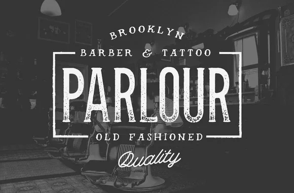
Parlour

We love this rustic and masculine typeface, and think it would be perfect for menswear brands, barbershops, and tattoo shops. 

Hermes

This style is a popular choice for designers because it’s minimalistic, yet strong.

Oraniembaum

We like the retro feel of this stylish serif typeface, and think it would be great for blogs, headlines, or logos.

ADAM

Clean and easy to read, this modern San Serif style provides a futuristic feel to websites and logos.

Knubi

This serif typeface is delicate yet memorable. It would work well for magazines, brochures, books, and most printed media.

Zefani

Zefani has a sophisticated feel and would be perfect for luxury projects.

Rockwell

This thick slab serif is a great choice for eye-catching titles and headlines.  
 

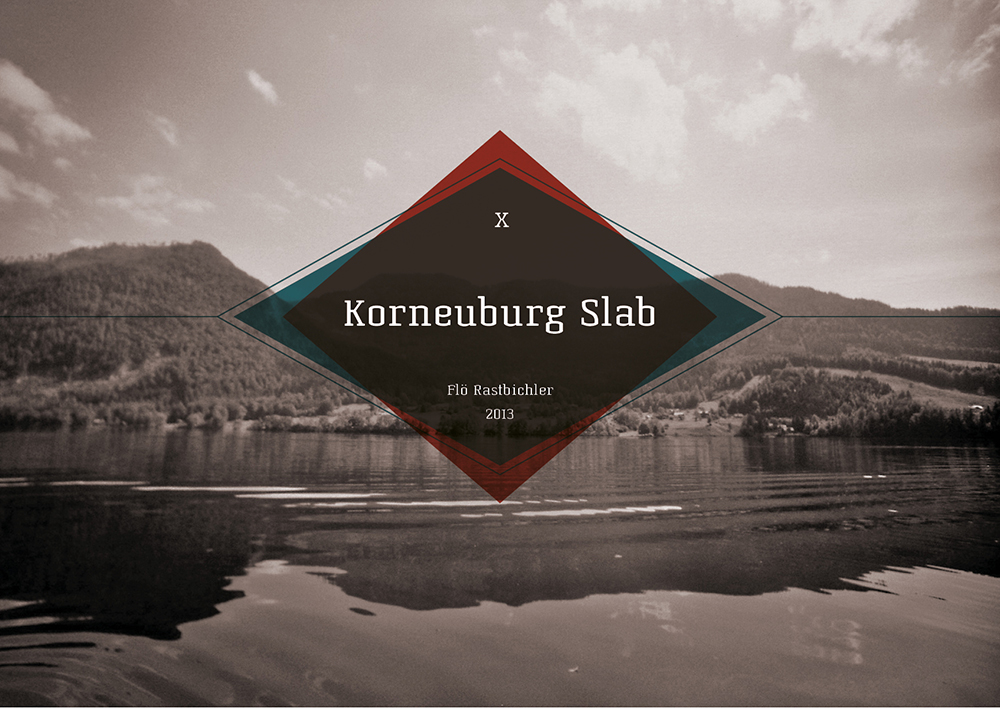
Korneuburg Slab

We love the old world feel of this eye-catching serif typeface. 
 

Julep

We love this versatile typeface, and think it would be perfect choice for fashion brands, coffee shops, or bakeries.
 

Moderne Sans

This typeface was inspired by 1920’s typography. This minimalistic style pairs well with images. 


Shepia

This script adds a fun vintage feel to fashion labels, signage, packaging, and logos. We like that this typeface isn’t gender specific, so it would work well for both menswear and women’s fashion. 


Not sure where to find different typefaces? We’ve got you covered. Here are a few of our favorite sources- several of them offer free downloads:

Dafont

Visual Hierarchy

Hype For Type
 

Great typography can elevate the quality of a design and transform it into something remarkable. It takes time, patience, and a lot of trial and error to develop this skill, so don’t get discouraged! Play around with spacing, placement, and color until you find the best fit for you.  Don’t try to force it - great typography speaks for itself.

What do you want to know about typography? Leave a comment! 


SOURCES:
Source 1  |  Source 2  |  Source 3  |  Source 4  |  Source 5  |  Source 6  |  Source 7  |  Source 8  |  Source 9

Type Rules! The Designer’s Guide to Professional Typography, by Ilene Striver

A Beginner's Guide to Finding a Job: Interview Tips
Hue & Tone Creative - A Beginner's Guide to Finding a Job

If you read our Beginner's Guide to Finding a Job series this summer, you may be wondering what happened to Intern Kelly.

Kelly's tips and tricks for the job search worked well -- so well that she found and accepted her first post-grad job! We're sharing the final post in Kelly's series here today.

It covers all aspects of the interview preparation process. And if there's one aspect of pre-freelance life I remember most vividly, it's job interviews. 

They can be completely nervewracking...but I've learned that being completely, carefully prepared is the best possible way to stave off nerves. There's no such thing as being too prepared for an interview. 

Kelly's tips, which cover everything from initial prep to follow-up, are below. 

Whether you have a phone, Skype, or face-to-face interview, being confident and prepared is crucial. In most cases, phone interviews are the first step in landing a face-to-face interview—so it’s important to nail it! Here are a few ways to make sure the interview process goes smoothly: 

1. Prepare.

Know your stuff. Research the company before the interview so that you're comfortable discussing the services, culture, and expectations of the company. During my own job search, these questions were often asked right out of the gate -- usually during phone interviews. 

2. Ask questions.

Make sure to ask questions during the interview process.  Asking questions demonstrates your genuine interest in the potential position and your engagement with the process, and shows the interviewer you're eager to learn more. A few of my favorite questions to ask are: 

What are the biggest challenges the person in this position will face?

What would a successful first year in the position look like?

What are the qualities someone in this position need to succeed?

3. Show off your previous work.

For phone or Skype interviews, attach a link to your online portfolio when you confirm the interview time, or when you send your resume.  Print out samples for in person interviews – it’s always better to be overly prepared, and having printed samples can help guide the conversation if you find yourself forgetting your accomplishments.

4. Look the part.

Interviewers will take in how you look before you even start talking – and Skype interviews are no exception! It is important to look your best. While the attire that's considered professional varies depending on the industry, for men it generally involves wearing a tailored suit, with nice shoes.  A dark colored suit will also do the trick for women, with a short close-toed heel. When in doubt, wear business professional dress, pay attention to what others in your industry are wearing, and keep makeup and jewelry to a minimum.  

5. Follow up.

Chances are you won’t be the only one interviewing for a position – don’t let the interviewer forget about you! Immediately after your interview, jot down notes in the car about your conversation. Nothing is too insignificant – write down everything from position specifics and project details to the names of your interviewer's children. While these smaller details may not be useful in the short-term, you’ll be glad you have them if you go back for a second interview or end up getting the position. Add your interviewer on LinkedIn and follow-up with a well-thought-out email.

Thanks for following along with this series! If you're an interviewing pro, I'd love to know your tips. What calms your pre-interview jitters? What's your answer for "what's your biggest weakness"? Let me know in the comments below.