Posts in Web
How to make the most of your 2021 Holiday Marketing Efforts

It’s that time of year again: holiday campaign season! Most customers don’t realize it, but the heavy lifting for small business holiday campaigns is typically completed sometime in August through October. Larger businesses might even be planning their holiday marketing out as early as spring or summer. But, if you’re just starting to think about holiday marketing for this year, there’s nothing to fear – you still have plenty of time to get caught up to have a successful winter season. 

There are a lot of ways to capitalize on the holidays, but this post is specifically geared toward small businesses. Whether you have a brick & mortar store or are primarily operating through e-commerce, you can find a way to adapt these tips to your business model! 


Email Campaigns: 

  • Start marketing early! Now is the time to start marketing to your customers – while many people wait until the last minute to shop, others get started far ahead of schedule. With shipping delays and product shortages in several industries, we suggest you encourage customers to start shopping even earlier than usual. Motivate shoppers to get started ahead of schedule by offering exclusive pre-season discounts! 

  • Include a gift guide: To help streamline online shopping and reduce decision making, give customers a quick and simple way to find gifts for their loved ones. Consider categorizing these guides by personality, relationship, or demographic. This will allow people to quickly locate (and purchase) an appropriate gift without endless scrolling. 

  • Don’t forget to include the gift giver: You know the customer you’re emailing loves your brand. However, you don’t know if your products are a good fit for the customers family and friends. Capitalize on your existing relationship by targeting the customer themselves! Even when they’re shopping for other people, people will be drawn to the idea of rewarding themselves. Promote special coupons and play around with a “treat yourself” message. 

Website: 

  • Consider a flash sale: Use limited time offers to spike sales and offload slow moving products. Putting the pressure on to buy is a great way to motivate people to make a purchase. You can host a flash sale for a few hours – or an entire week. In general, the shorter the sale the higher the chance that people will jump on making a purchase. 

  • Make shipping deadlines clear:  Don’t risk having to deal with a disgruntled customer because their order arrived late – feature any key shipping deadlines on your website to set expectations for when orders need to be placed. Update your messaging to let people know if they need to select ground, two-day, or one-day shipping to get their items on time. 

Offline: 

  • Create a special unboxing or gift-wrapping option: Enhance a great product by creating a special unboxing experience – you’ll take some of the work off the customer by pre-wrapping their gift and you’ll enhance their brand experience. Utilize high quality materials and remember that no detail is too small. Color coordinate everything and brand wherever possible with stickers, packaging, and handwritten or branded notes. An added bonus? A beautifully packaged gift might just land you a tag on social media! 

General tips: 

  • Holiday Bundles: Whether online or in person, consider offering holiday gift bundles to your customers. This is a great way to move more products without offering incredibly deep discounts. Bundle like products together for a small discount and package them well. This kind of collection is great for hard-to-buy-for individuals or last minute gifts — it also gives the customer the impression that they’re getting a great deal.

  • Holiday return policy: With many people shopping early for the holidays, a 30-day return period is often inefficient. We suggest considering offering free returns throughout the month of January -- but no matter what your policy is, make sure it’s clear to the customer and gift recipient. Offering a gift receipt with a purchase is a great way to clearly communicate your policy. 

  • Don’t just think about holiday campaigns for Christmas: Educate yourself on other culturally important holidays and tailor your message to fit a wider range of customers. For reference, here are some key dates to consider: 

    • Diwali – 11/4

    • Thanksgiving Day – 11/25

    • Black Friday – 11/26

    • Small Business Saturday – 11/27

    • Hanukkah – 11/28-12/6

    • Cyber Monday – 11/29

    • Giving Tuesday – 11/30

    • First day of Winter – 12/21

    • Christmas Day – 12/25

    • Kwanzaa – 12/26 – 1/1

    • New Year’s Eve – 12/31

Our last tip? No matter what medium you are utilizing, keep a positive customer experience front and center. Do what you can to alleviate the stress of your customers – this might mean providing free wrapping or flexible delivery options. Or maybe it comes in the form of producing content that takes the guesswork out of the shopping experience (think gift guides or recipe suggestions). 

Now, go get started on prepping your holiday cards, planning customer loyalty events, rolling out gift lists, and putting the final touches on your annual giving campaigns!

4 ideas for gathering more online reviews
4 ideas for gathering more online reviews  | Hue & Tone Creative

In the competitive world of digital marketing and web-based sales, customer reviews are a powerful tool. They’re easy to solicit, low or no cost to acquire, and they do the selling for you! What’s more is that reviews offer a genuine perspective that no direct to consumer marketing can provide. 

Seeing a friend review a product online is a powerful form of personal recommendation. These reviews help consumers find new products and help businesses find qualified leads. 

A few benefits to consider: 

  • They can serve multiple purposes -- positive reviews get visitors to your website, help you attract potential new leads, and can be used to market to your existing customers. 

  • Reviews can be embedded on your website or used on print materials to up the exposure of your brand.

  • They’re especially helpful for new businesses who are looking to establish credibility in the marketplace.  

Many customers are willing to provide a review, but you have to make the process easy and be sure to ask your customers at the right time. You’ll want to watch out for signs that your customer is happy with their experience so far. A few tip offs that might write a good review? They’ve referred someone else to you, they’ve repurchased a product, they’ve tagged you on social media, or they’ve spent a lot of time browsing on your website.

To make sure you get it right, here’s four ideas to help you gather more online reviews: 

1.     Leverage social media. Social capital is a powerful tool – if your friends or acquaintances are using a product you’re more likely to give it a try. In addition to the built in referral network social media provides, most platforms provide a great channel for soliciting and sharing reviews. Don’t just ask for new reviews, be sure to share the positive ones you’ve already received! In addition to providing free promotion, they’ll also help give your customers ideas on what to post in their own reviews.

People who have purchased or repurchased products are the perfect target for reviews. Tailor an email or social media campaign directly to these customers so you can don’t miss out on the chance to collect high-quality reviews.  

 2.     Ask more than once. Asking for a review once isn’t always enough – you don’t want to bug people, but you do want to give them ample opportunity to share their thoughts. Different people will want to share their reviews on different platforms and at different times, so be equipped to ask for reviews in a number of ways. Train your team to solicit reviews, add a link into your email campaigns, and incorporate review options into your website pop-ups and landing pages.

3.     Make a direct appeal. If you work as an account manager, are a B2B sales rep, or have a one-on-one relationship, ask your customers directly for a review. Keep it conversational, but inquire how they’re enjoying their experience with your product or service so far. If the response is positive, see if they wouldn’t mind sharing their feedback online. If they have a negative response, see what you can do to fix the problem before inquiring about them giving public feedback. 

 4.     Create Incentives. Offer a future discount, add a bonus product to their order or enter them in a drawing in exchange for their feedback. Be careful you don’t compromise the integrity of the review – you shouldn’t force people to leave a positive review, rather an honest review. 


A few additional tips:

  • Accept reviews on multiple platforms like Yelp, Facebook, Google Business, Zillow and more. Everyone has a favorite method of reviewing, so don’t loose out on a good review by limiting people’s platform options. But keep in mind that people tend to trust Facebook reviews more because they’re connected to individual profiles that people can verify the legitimacy of. 

Further Reading: Want to learn more about how to handle a bad review? We’ve got a separate post that goes in-depth on the topic. Check it out here.

  • Be sure to respond to all reviews – especially the negative ones! Respond thoughtfully (without getting defensive). In addition to improving the relationship with that individual customer, you’ll also be demonstrating good customer service that shows potential buyers you care and are willing to listen. 

  • Make it easy! Cut out additional steps wherever possible and it will up the chances that your customers will take the time to leave a review. Include a direct link so they can head straight to the product page, make login seamless, and provide them with sample writing prompts. 

Have a tip that we should have included? Drop us a comment below – we’d love to learn more about what’s worked for you in the past (and what hasn’t). 


Hue & Tone Creative: Social Media + Graphic Design

Need someone to take the headaches out of your automated emailing and social media planning? We’re here to help. Whether you’re looking to increase your views or simply need a break from handling your account, Hue & Tone Creative has you covered for all things social. 

Will Apple’s Privacy changes hurt your small business?
Will Apple’s Privacy changes hurt your small business?  |  Hue & Tone Creative

Back in June 2020, Apple announced it would be making some substantial changes to how iPhone’s collect your data. The changes include enabling people to share an approximate location (instead of a precise one), adding summaries to the App Store that explain what data each app collects, and requiring third party apps to ask users before sharing their data. 

Facebook swiftly responded to these changes with displeasure, specifically taking issue with the consent driven data sharing. By requiring iPhone owners to grant apps explicit permission, Facebook fears the possibility that most users will block them from collecting detailed information. Facebook uses that data to build out detailed profiles that they market to advertisers (including both small and large businesses). 

The type of data sharing that is specifically being referred to is IDFAs (Identifier for Advertisers). IDFA’s are unique identifiers for mobile devices and are used to target and measure the effectiveness of advertising on a user level across mobile devices. Currently, about 70% of IOS users share their IDFA with app publishers, after this change it’s estimated that this number will drop to 10% to 15% (source). Currently, users can opt of data sharing, but it’s a buried feature that you have to search out.

If people are blocking Facebook from collecting their data, the value of advertising on their platform may significantly decrease. And with it, Facebook’s revenue may take a severe hit. In 2019, about 98.5 percent of Facebook's global revenue was generated from advertising, whereas only around two percent was generated by payments and other fees revenue (source). Much of that revenue is generated by small to medium sized businesses who count on social media advertising as an important part of their marketing strategy. 

It’s important to note these changes aren’t specifically targeted at Facebook – they’re simply one of the biggest companies that may suffer and the company that’s made the most noise about them. The fact of the matter is that every third-party app will have to ask your permission before tracking you. 


What does the timeline for these changes look like? 

Apple originally outlined these changes in June of 2020 in anticipation of a Fall 2020 rollout. The changes were delayed and in December 2020 the pushback from Facebook intensified. 

The changes will begin to take effect as users install or update to the new iOS. When you install those updates a prompt will appear alerting you to opt-in or opt-out of the sharing of this information. 


How did Facebook respond? 

These latest changes are only the most recent development in a tense relationship. Apple and Facebook have been fighting for years, with their CEO’s often aiming comments at each other (more on that here). In December, Facebook launched an all-out offense campaign to try and combat the proposed Apple changes. 

They announced their displeasure on the website/app, took out print ads, and created a subsite for business owners to “voice their displeasure.” Instead of focusing on the potential loss to their own ad revenue, the focus of their latest campaign is that they’re sticking up for small business owners. 

The messaging on their website reads: 

Here’s what’s at stake with the iOS 14 update. 

Apple’s policy could limit your ability to use your own data to show personalized ads to people who are likely to be interested in your business. Now that 44% of small businesses are turning to personalized ads to adapt to the outbreak of COVID-191, this update will be especially hurtful to small businesses in already challenging times. 

Apple’s iOS updates make it harder to reach current and future customers.

Measurement of campaign performance will be disrupted, making it harder to determine the effectiveness of ads.


How will this affect my business advertising?  

Will Apple’s Privacy changes hurt your small business?  |  Hue & Tone Creative

If you rely heavily on Facebook advertising to meet your regular sales goals, there’s a good chance that these updates will impact you. After all, the personal information that Facebook collects is what allows you to target customers with creepily specific ads. Apple allowing people to opt out also ups the chance that people will see ads that are less relevant to them. 

Most major platforms are still working through exactly how they will address these major changes – but Facebook confirmed they will not collect IDFA’s on their own devices and will begin updating their SDK to support the SKAdNetwork option. More on that here.

In the immediate future, your advertising may be impacted in two major areas:

  • Retargeting: Retargeting to users will no longer be possible for people that have opted out. Platforms like Google and Facebook can still identify users through information like their email or phone number, but other platforms will see a drastic reduction in targetable audiences. 

  • Measurement: Ad measurement is built around customers IDFA identifiers – and while Apple has announced a replacement API that will allow for conversion data at the campaign level, there will still be a reduction in the reliability of the data. 


What should you do?

As a consumer, we like that Apple is protecting our data and paving the way for further consumer protections to be enacted. As a digital advertiser and social media company, we understand why business owners are frustrated. But don’t let frustration paralyze you! 

 Now is the perfect time to revisit and revamp your social media advertising strategy. Invest some time into thinking through how these changes might negatively impact your customer acquisition numbers and shift your strategy accordingly.  


Hue & Tone Creative: Your Social Media Partner 

Not sure what shifting your strategy looks like? Reach out – we can help you create a plan to handle these changes and to futureproof your strategy for future changes. From content creation to analyzing your reach, we’re your partner in everything social media related. 

Graphic Design Trends for 2021

In 2021, we anticipate companies messaging will be all about authenticity and simplicity. As brands become more and more social media savvy, the competition is becoming even fiercer. In addition to looking for eye-catching graphics, consumers are more conscious than ever of trying to support ethical brands that align with their values. 

What makes a brand stand out has become about more than just a company’s products and marketing – it’s also about the cause a brand represents and the lifestyle they support. 

After a long year of trying to fight for attention and having to pivot business models, we anticipate that many brands are in for another intense year. Many scrappy businesses were able to distinguish themselves in 2020, and we think pulling to the forefront in 2021 will hinge on strong and distinctive marketing. 


1. Authentic Representation + Socially Conscious Design

Graphics featuring “Stop the spread” and “Black Lives Matter” messaging took center stage in 2020, and we foresee this trend continuing well into 2021 (and, hopefully, beyond). Whether it’s putting an activist message front and center or paying closer attention to representation, brands are being held more accountable for their role in our culture. In addition to socially conscious messaging, marketers are paying closer attention to the representation in their work and featuring a wider array of races, sizes, and ages in their advertising. 

As brands rally around a cause, we suggest making sure the cause makes sense for your brand – and feels authentic. The only thing worse than tone-deaf messaging is the overwrought and inauthentic messaging that comes from a brand trying to co-opt a cause to turn a profit. 

2. Gold, Terrazzo, and Texture 

The trending textures we anticipate in 2021 are similar to what we saw in 2020. When it comes to home décor, gold and an all-white aesthetic have been reigning for years – in 2021 we anticipate gold will continue to trend… but with hints of soft pinks, dark navy, and other pops of color. We also think terrazzo will continue to appeal in millennial-targeted product photography. 

3. Muted Color Palettes

Bright colors and intense duotones have been reigning since early 2017. That’s why we anticipate a shift toward more muted color palettes this year. 

Muted colors are soothing – they can also evoke feelings of nostalgia, safety, comfort, and nature. We saw many health brands using a more muted scheme in 2020, but we think the trend will reach a wider array of industries this year. 


4. Data & Text Heavy Video

Working remotely has ushered in a new phase of more text heavy video design. In addition to clearly communicating a message, these videos work well for people using smaller teams, working remote, or those on a limited budget. 

We see this shift toward text heavy video also working well with current data trends. Gone are the days of complicated infographics – these days big, bold, simple statistics reign. They’re easily shareable and grab people’s attention on the ever-more-crowded internet. 

5. Black and white branding

Black and white branding allows product photography to really stand out. This isn’t a new trend, but it’s certainly something we’re seeing an uptick in. Clean, minimal branding is a great way to stand out from the noise and colorful landscape of social media. As products try to distinguish themselves from the crowd, we think we’ll see more and more colorless branding in 2021. 

Screen Shot 2021-01-08 at 9.15.28 AM.png

6. Dark Mode

This trend relates back to designing for accessibility and ease of use – something we covered in more detail in 2020

Dark mode has been gaining reach in online product advertising this year – and we think this shift is going to impact brand design trends in 2021. Apps and operating systems are all offering dark mode options and these dark mode user interfaces help highlight design elements. It’s worth considering how the dark mode experience impacts your users and then tweaking your designs accordingly. 

For example, white fonts on a dark background tend to appear bolder –  does that impact the way people interact with your app? Do your design elements work well at all screen brightness’s?


7. Authentic Photography

Genuine messaging isn’t the only authentic content audiences are looking for – they’ve also got an eye for spotting posed or ersatz stock photography. 

We’ve been a long-time proponent of investing in a branded stock photography shoot. Take a few hours to collect shots that will represent your business for the year to come – you’ll invest a bit more than you will for a stock photo subscription, but the result will be authentic photos that you can use across all of your digital and print advertising.

A few examples of more authentic stock photography from Twenty20.

A few examples of more authentic stock photography from Twenty20.

noah_t20_W7rj3Y.jpg

Hue & Tone: Your partner in design for 2021

Realizing your brand needs to get with the times? Let’s use more impactful marketing to make 2021 your highest grossing year yet. Reach out to set up an initial consultation now.

Key accessibility features for your app or website
Key accessibility features for your app or website  |  Hue & Tone Creative

Not designing with accessibility in mind means possibly alienating a ton of potential app or website users. Roughly 15% of the world’s population has some form of disability – which means you could be excluding over 1 billion people from using your app. 

In May, we highlighted 7 tips for successful app design. One of the tips we got the most questions about was the importance of designing for accessibility. Here’s a quick excerpt from that post: 

Designing an accessible interface means thinking about how people with vision loss, hearing loss, and other disabilities will use your app.  

For example, don’t make red and green the only indicator of a successfully filled out form. Add an “x” next to incorrect fields and a check mark by correct fields to serve as additional visual indicator so that people with red/green color blindness can still easily and successfully use your app. Similarly, consider adding transcripts to video or sound clips to aid those with hearing loss.

That quick overview left us wanting to share more about accessible design. Accessibility features should address both permanent and temporary impairments by utilizing simple and intuitive designs that address a wide range of potential impairments. Inclusive design focuses on four main areas: cognitive, visual, hearing/aural, and physical/dysmotility.

There’s a lot of in-depth research available on how best to address the challenges each type of disability may face – but there’s a handful of simple things that any designer can do to increase the usability of their app. 

Keyboard Control

Keep in mind that some users may only be interacting with your site or app through keyboard commands. You want to provide multiple ways to interact with controls. Providing keyboard shortcuts and letting users navigate your app with tab and arrow keys will allow those who are visually impaired to use your app. Once you’ve thoroughly tested the accessibility of the site or app, consider putting instructions or a video online showing people how best to navigate the site with keyboard commands only. 

intuitive navigation

Intuitive navigation will make your UI better for every user, but is also incredibly helpful for those using screen readers or keyboard controls. To increase ease and speed of use, think about what people will need to access most easily and ensure that’s front and center.

high contrast colors

When using colors, make sure you stick to a high contrast color scheme. There should be clear contrast between background and foreground, and any text should have a sharp contrast with the background color. Don’t forget to take your phone for a spin in greyscale to see how everything looks! 

Key accessibility features for your app or website  |  Hue & Tone Creative

Resolution Options

People with difficulty seeing may view your app at up to 200% zoom. Keep this in mind when you design and be sure to test your design out at multiple different zoom levels.


Limit needed gestures

People with limited physical mobility may have a hard time making complicated gestures. To ensure everyone can use your app, you’ll want to make sure that gestures and button sizes are configurable in your app. 


People that have physical motor limitations might encounter problems while navigating a mobile application. Tapping or other forms of gestures need to be configurable so that a user is not bound to a specific gesture. Also, a gesture should never be a mandatory event since physical motor limitations should not restrict the navigational behavior of an app. Both Android and iOS offer users the ability to configure shortcuts for frequently used phrases or words, as well as timing between presses on the screen. The size of buttons (or other touchable triggers in apps) are also configurable.” (Source)


Visual indication

Don’t rely on colors as the sole indicator on any element of your app. Your content should be perceivable in a variety of ways – for example, hyperlinks should be underlined as well as different a color. Checkmarks or “X”s should indicate if a form field has been accepted. 

Alternate text or descriptions

For images or videos that don't contain information, provide alternative text that briefly describes the content. If the image contains data a user needs to know, include a brief description of the data, chart, or diagram. 

Screen readers

Content can be optimized to enhance the experience of those who use screen readers or will be experiencing a text-only version of your app. Screen readers will verbalize both visible and hidden content and read it out loud to the user. It’s important to keep in mind that screen readers rely on the top-down structure of HTML. 

Informative alt text

For more on how to properly write your alt text check out this guide

Screen readers will also read the alt text of your images to help translate a visual experience into a text based one. Alt text is a short label (up to 125 characters) in the code that describes an image for users who are unable to see them. As a bonus, properly tagging and describing images in your alt text can also enhance your SEO! 

Provide alternatives to sound

When it comes to critical audio elements, text alternatives should be provided. Video transcripts, video captioning or audio transcriptions should always be included with video or sound elements. In addition to supporting those with hearing loss, many prefer to view videos without sound or would prefer to quickly skim the content of the video.


Feel like your app is accessible to everyone? Don’t stop there! Be sure you do extensive user testing before hitting the market. And, even after your app is released ensure that users can easily provide feedback. Use customer feedback and analytics to continually analyze and improve your app. 


Hue & Tone Creative

Not sure how to translate your brand into the perfect app or website? That’s what we’re here for. We’ll help you remove the guesswork from developing your brand — and everything you need to communicate it. Contact us today.

7 tips for successful app design and development

The difference between a successful app design and a failure isn’t just an app that looks sleek and well-designed. When it comes down to it what makes an effective app is user experience.  

Before we get into specific design tips, it’s worth sharing our biggest development tip of all: focus your app on doing one thing well. Overloading your app with features makes it hard to market to potential users. Home in on the one thing you want your app to do really well, and once you’ve achieved success there you can begin to add on additional features. 

Once you’ve determined the sole focus of your app, you’ll be able to determine who your audience is and design for them. But no matter what your target demographic, there’s a few design considerations you’ll want to keep in mind during the development process. 

7 tips for successful app design and development  |  Hue & Tone Creative


1. Keep navigation simple 

If your app has a narrow focus, this tip will be easy to execute. You want to keep your app navigation streamlined and intuitive for users. Limit the number of options people have available and use common terms and design elements. Avoid thinking outside of the box on your navigation design – you want to stick to easily recognizable symbols.   

Most importantly, navigation should be available at ALL times, not just when you think the user might need it. 


2. Accessibility is important 

Designing an accessible interface means thinking about how people with vision loss, hearing loss, and other disabilities will use your app.  

For example, don’t make red and green the only indicator of a successfully filled out form. Add an “x” next to incorrect fields and a check mark by correct fields to serve as additional visual indicator so that people with red/green color blindness can still easily and successfully use your app. Similarly, consider adding transcripts to video or sound clips to aid those with hearing loss. 


3. Use familiar icons

Familiar icons work best when designing an app with widespread use. Use a magnifying glass to represent your search feature, a house to represent your home page, a printer to represent printing. Whatever you’re trying to communicate, your icons should have universal recognition from users – icon design is simply not the place to get creative. 

In addition to familiar visual icons, stick with simple text labels. Use intuitive terms like “Home, Search, and Back” to avoid confusing users.  

 4. Minimize user input and error

7 tips for successful app design and development  |  Hue & Tone Creative

No one would willing choose to write a novel on their phone – it’s hard to see, hard to type and people typically end up misspelling a lot of words. 

If your app includes a form or survey element, be sure to keep it as short as possible. Think hard about what fields you really need to include and ask the bare minimum you can without losing effectiveness.

Make sure you use smart features (like autocomplete) to help reduce user error and ensure accuracy. You’ll also want to make sure the correct keyboard type will pop up when a user goes to fill out a form – they shouldn’t have to navigate to their number keyboard when filling out a phone number, the numeric keyboard should just automatically pop up.


5. Respect platform guidelines 

Each mobile operating system has a set of standard guidelines to help you provide a high-quality app. Your app users are already familiar with the standard operating guidelines of each system, so it’s important to keep your design in line with customary procedures. 

Keep in mind that these guidelines constantly evolve – it’s important to stay on top of the ever-changing trends and guidelines for mobile app design.  

6. Include screen titles

 Users often forget what page they’re on, or they might just not have a good sense of where they’re at in the app. Including a simple title at the top of the page is a great way for users to get a better sense of the app and helps avoid them repeatedly navigating to the same page. 

And as an added bonus, screen titles often give a page design a polished look! 


7.  Keep branding consistent 

Your mobile app should share similar characteristics with your main website. In addition to being an important extension of your branding, visual inconsistency may lead users to be suspicious of your app or cause them confusion. 

You not only want to match the look of your app to the rest of your branding, but you also want to keep elements in the app cohesive throughout your interface. For example, typefaces, buttons, and colors should be consistent on every page of the app. Every element should have both a native and branded feel to encourage user trust. 


About Hue & Tone Creative

Hue & Tone helps businesses of all sizes build credibility and connection with intentional design. Whether you’re looking to create a mobile app or a traditional website, we’re here to help your business grow through thoughtful design. Contact us to get started. 

How to handle a bad social media review
How to handle a bad social media review  |  Hue & Tone Creative

Negative social media reviews can feel like a nuisance – but if they’re mishandled they can turn into a much bigger problem. But, handle them properly and you can even turn a doubter into a return customer. With the right response, you’ll have the opportunity to turn a bad situation into an opportunity – and you’ll be able to keep negative reviews from harming both your reputation and bottom line.  

It can be easy to get emotional when your business is being slammed online, but these days it is just part of doing business. Ghosting negative reviews or retaliating with something less-than-business-like just won’t do, and here’s why:

  • 97% of customers read reviews before buying

  • 89% see them as an essential pre-purchase resource

  • 85% of all consumers actively look for negative reviews

  • And 91% of consumers 18 to 29-year-olds look for negative reviews 


1. Take the emotion out of it

The bad review isn’t a personal attack on you and thinking that it is will only rile you up further.  So, put on your business cap and get in a good frame of mind before you start typing. 

We suggest thinking of online interactions just like you would in-person customer service interactions. Just because you’re not face-to-face with a customer, doesn’t mean you should treat it as any less important of interaction. In fact, your digital comments have much more potential to amplify than your in-person discussions, making it that much more important to treat them carefully. It’s not just the customer who sees your response, it’s their friends, your friends, and people who like your page. 

2. Act promptly

Want to take your good reviews one step further? Here’s how to create a killer case study.

We get everyone is busy, but it’s crucial that you make time to respond to your negative reviews -- and the sooner the better. This is important for a couple of reasons: 

  1. It gives the customer less time to stew on their complaint and get even more worked up

  2. Fewer people will come onto your page and see just their side of the story

  3. It shows that you’re responsive and invested in their thoughts 

Don’t replace quality with speed of response though: It’s better to take 10 minutes to put together a well-thought-out message then it is to publish the first thing you think of. 


3. Restate the complaint

One of the first things the reviewer wants to know is they’ve been heard, so be sure to rephrase their complaint in your response. For example, if their review was something along the lines of “I was really unhappy with how long it took for my package to arrive.”

You could start yours with “Hi [name], We’re sorry to hear you weren’t happy with the delivery time for your package…”


4. Don’t play the blame game

It’s natural for your first instinct to be to give a reason behind why. Avoid responses like this:  

  • “We were short-staffed because John was feeling poorly.”

  • “One of our vans broke down so we were playing catch-up.” 

  • “It was an unexpectedly busy period for us.” 

The reality is people don’t usually care why it happened and if you go down this road, they might think you’re just making up excuses. Instead, counter with something like: “This isn’t the standard of service we’re known for and we’d like to do everything we can to make up for it.”

5. Weave in some positives

It’ll give onlookers a reason to still choose you. Sticking with the delivery issue, this could be something like “We pride ourselves on timeline delivery – in fact, we delivered over 100,000,000 packages on time last year. We’re sorry to hear you didn’t receive the same punctual service we’re known for and we hope it won’t stop you from trying out our service again.” 

How to handle a bad social media review  |  Hue & Tone Creative

6. Offer a solution 

Tip: So that people don’t think you’ve gone silent, reply in the thread saying “We’ve heard your complaint and are going to send you a private message so that we can collaborate on a solution for this issue.”

Take the discussion offline to work out a resolution -- you don’t want to air it in public and for everyone to think that your answer is standard. And, if you say you’re going to do something, do it, otherwise, you’ll just end up with another angry review.


7. Ask them to edit it

If you’ve worked the situation out with your customer, it may be worth the risk of asking them to edit or update their review. We don’t suggest asking them to remove it completely, because you run into the risk of them broadcasting that you tried to keep them quiet. 

Also, remember to make this kind of request in private too, it’s not necessarily the type of thing you want either existing or prospective customers to see.


Hue & Tone Creative: Partners in social, design, and marketing

Need some social support? Just can’t handle one more bad review? You can count on us. From planning out your content to boosting your online presence, we’ll get your social media pages back on track. Get in touch at (336) 365-8559 or hannah@hueandtonecreative.com to figure out how we can partner together.

How to correctly size images for your website
Don’t let your website slow down because of incorrectly sized images!

Don’t let your website slow down because of incorrectly sized images!

Sizing images incorrectly for your website can have a number of negative ramifications. Size them too small and they might look pixelated, but size them too large and they might impact the SEO for your site. Images that are too large can lead to slow load times, a higher bounce rate, and a lower SEO ranking.  

Putting time into figuring out the correct image resolution is worth your time, because high-quality visuals and a high-ranking site can say a lot about your brand. 

The trickiest part is there’s no such thing as a set size. Your feature images won’t necessarily match the dimensions of your homepage banner, full-width visuals won’t mirror blog post images, carousels will differ from collages...and so on.

 So, here are a few helpful hacks to help you figure out just what size your images need to be:

Use an extension

Tip: Chrome’s favored by most web developers and designers – if it’s not already your default browser, we suggest giving it a try! It’s especially handy if you’re in the process of building a new website.

For this trick, you’ll have to download and utilize Chrome as your Internet browser. If you don’t already use Chrome, you can download it here!

Once Chrome is downloaded and installed, you’ll also need to download Chrome’s image size extension. Once installed, you’ll be able to find out the size needed for every single element of your site.


Use the inspector tool

Another way to determine image size using Chrome is the inspector tool. This tool is built in, no extension or download needed. 

Step 1: Hit F12 or right click your mouse and go to “Inspect Element.”  

Step 2: Click on the image you’re looking to determine dimensions for, and you’ll be shown the information you need. Note that the first number is always the width.

 If you’re using another browser, you can still use this method, the process might just vary slightly -- here are a couple of video tutorials for Safari and Firefox users.


Bigger isn’t always better

 New to resolution? Read up on it in this blog.

Not sure which file format to use? Get the lowdown here.

In the world of print, the higher the image resolution the better. It results in a high-quality end product and has zero negative implications. When it comes to web that philosophy is flipped on its head. 

In the online world, large file sizes can hurt you --  they can slow your page load speed down, interfere with your visitors’ user experience and even damage your organic SEO rankings. You’ll want to use an image size that still appears crisp and clear – but isn’t so large that it negatively impacts your site. Here’s a few tips for striking that balance: 

  • Find out the exact dimensions you need, and resize your images in Photoshop or Canva for a tailored photo size. 

  • Try not to let large images or full-screen backgrounds exceed 1MB -- if it does, it could be a sign your dimensions or resolution are unnecessarily high.

  • The recommended width for full-screen backgrounds is 2000px.

  • Smaller images around your site - like thumbnails, blog headers and in-content pictures, should be no more than 300MB.

  • If you’ve got the option in Adobe Suite, always ‘Save for web’ -- this will ensure your image’s saved at a web-friendly resolution by default. 


Hue & Tone Creative: Websites for Greensboro and beyond

Already feeling overwhelmed? Let us handle your web design for you. Whether you want support finding the right photography for your site, resizing what you’ve already got, or building your website from the ground up, we’ve got the solution. Reach out at (336) 365-8559 or hannah@hueandtonecreative.com to get the process started!

Real estate: marketing tips to win more business

In every city there are tons of realtors vying for the same business and that makes getting customers to seal the deal that much harder -- so don’t put yourself at a disadvantage by missing prime marketing opportunities.

For example, listings with high quality photos sell at or above their listed price 44% of the time? And, that 70% of homeowners prefer to list with someone who uses video marketing?

These five simple but seriously effective tips you could start sticking it to your competitors and winning more business right now.

Real estate: marketing tips to win more business | Hue & Tone Creative


1. Make your properties easy to share

New to social? Here are a whole load of real estate-specific tips.

By adding social sharing buttons (Facebook, Twitter, Pinterest and Instagram) to all your listings. Even if only a handful of searchers go ahead and share you’ll potentially open yourself up to 100s, if not 1,000s, of new prospects -- for free. 

Remember to make your sharing buttons super easy to see and use, because the harder you make it to find them the more chance people will click away from your site without taking action. 

2. Set up a referral program

Let past customers market for you by incentivizing them to recommend you to their friends with something like a $200 referral fee. If you decide to start a referral program remember to:

  • Make it clear the fee’s only applicable if the person they referred actually buys or sells with you

  • Promote your scheme across your email, social media and website campaigns, as well as on-site and in-person too


3. Support the community

Whether it’s a local athletics club, school or charity, get your name out there and support the community with some good old-fashioned sponsorship. 

Not only will you boost your brand’s awareness, but you’ll show people you’re a company who cares too -- and that can do wonders for your reputation, putting you a cut above your competition.


4. Don’t just use images

Not sure where to start? Check out part onetwo and three of how to make professional videos on your iPhone.

With the starting stat in mind, think about branching out into the video world for your listings. It’ll:

  •  Give you a chance to show your personality

  • Cater to what you know people want

  • Better showcase your listings

  • Give you a competitive advantage (if your competition’s not already taking the lead)


5. Partner with a local organization

If you don’t ask you don’t get. So, see if you can open yourself up to new audiences by teaming up with, say, your local coffee shop and asking if you can buy them a new set of takeout containers with your branding on the front.

They’ll benefit from the free supplies and you’ll benefit from more exposure. Just remember to include key information like your:

  • Name

  • Logo

  • Contact details 

And make sure the end finish looks top-notch -- after all, the quality of your marketing materials says an awful lot about your business, so if you’re going to do something (and want awesome results), do it properly. 


Hue & Tone Creative: Your Marketing Partners

The problem with all of the above? It requires time, resources, and expertise you might not have in-house. But don’t worry, we can fill those gaps for you. Get in touch at hannah@hueandtonecreative.com or (336) 365-8559 to see how.

75 great promotional words to use
75 great promotional words to use  |  Hue & Tone Creative

The words you use have a direct impact on the actions people take. They’re the difference between someone looking at your advert and thinking “hmm, sounds interesting” and “wow, I’m going to give them a call right now.”

Needless to say, every single organization out there is striving for the latter. 

Take a look at this line for example:

  1. Start earning money today

  2. Start making money today

Both deliver the same message, but the second is more impactful. Why? Because making money sounds simpler than earning it, and in a dog eat dog world where everything’s about maximizing profit - easily, that’s exactly what people are after.

Boosting your conversion rates really could be as simple as tweaking the odd word here and there, so, let today be the day you go through your websiteoffline collateral and online adverts and see where you could be making the most of stronger alternatives.


Words that create reassurance

If you want to convert a prospect into a customer you need to give them a reason to believe what you’re saying and trust what you’re selling. So, here are some words that incite just that:

  1. Promise

  2. Guarantee

  3. Risk-free

  4. Unconditional

  5. Proven

  6. Tried and tested

  7. Protected


Words that create a sense of urgency

Whether you’ve got a promotion that’s due to expire or you just want to encourage your audience to buy now, these words will give them a nudge in the right direction. One thing worth mentioning though is not to over-use these kinds of words, if you do, over time, they’ll lose their effectiveness. 

7. Now

8. Last chance

9. Flash sale

10. Call today

11. Quick

12. Expires

13. Soon

14. Immediately

15. Hurry

16. Ending

17. Going-fast

18. Limited

19. Last

20. Don’t miss out

75 great promotional words to use  |  Hue & Tone Creative


Words that promote ease

People are busy. They don’t have time to faff around and they want products and services that make their life easier, so let them know yours does just that with words like:

21. Easy

22. Simple

23. No-fuss

24. Hassle-free

25. Smooth

26. Painless

27. Straight-forward


Words that invoke value

As a society, we’re a demanding bunch; we don’t just want ease, we want value for money and deals too. You can cater for all these needs with words like:

29. Bargain

30. Free

31. Discount

32. Freebie

33. Sale

34. Value

35. Save

36. Buy one, get one

37. Elite

38. Premium

39. Effective

40. Popular

41. Market-leading

42. Best-seller


Words that give off a personal touch

People aren’t naive. When you send out a promotional email they know they’re not the only one on the receiving end of it, but that doesn’t mean you can’t still make it personal. Here are a few words to achieve this:

43. Invite-only

44. Hand-crafted

45. Just for you

46. You told us

47. We thought you might like

48. Thank you


Words that offer exclusivity

It’s a time-old problem, people want what they can’t have. As soon as we know something’s off the table we want it more, and the same goes for the world of business. Make your products and/or services more desirable by saying things like: 

49. Secret

50. Rare

51. Few

52. Limited edition

53. Unique

54. Select

55. One-off

56. One of a kind

57. Sought-after


Words that promote luxury 

If you’re offering something lavish and your target market’s after the finer things in life, here’s how to up-sell what’s on your shelf:

58. State-of-the-art

59. Luxury

60. Finest

61. Delux

62. Plush

63. Magnificent


Words that inspire 

Saying your service’s ‘really great’ is hardly inspiring, is it? You need attention-grabbing words that motivate people to want to take action, like:

64. Mind-blowing 

65. Incredible

66. Remarkable

67. Life-changing

68. Amazing

69. The new way to…

70. The new you


Words that create curiosity

Finally, if you want to pique people’s interest, stop them in their tracks, and lure them into what you’re saying, start with:

71. Introducing

72. Coming soon

73. Did you know…

74. Discover

75. Stop 


Hue & Tone Creative: Campaign experts

So you’ve got the promotional words you need, but do you know what to put before and after them to make your next campaign really work for you? No? Don’t worry, we can help with that. Get in touch at hannah@hueandtonecreative.com or (336) 365-8559 to see how.

All About Email Marketing

Check out all our email marketing posts here.

Over the last few months, email marketing has been the topic of our most popular blogs — and with a low up front investment and great conversion rate, we can see why.

We’ve compiled a few of our favorite email marketing blogs into an easy to reference list. From the basics of what kind of emails to send to templates for upselling emails, we hope you’ll find what you need here.

Don’t see what you’re looking for? Leave us a comment letting us know what we should post about!

Email Basics

4 types of emails you need to be sending

You can send a wide variety of different emails to your marketing list, but if you’re just getting started with email marketing, there’s a few types of emails we suggest you start with. These four types are all great to engage both new customers and old leads.

Learn more here >

4+types+of+emails+you+need+to+be+sending++|++Hue+&+Tone+Creative.jpeg

How+to+write+a+subject+line+that+gets+clicks+|+Hue+&+Tone+Creative.jpeg

How to write a subject line that gets clicks

If you’re struggling to see the click through rate your campaigns need to succeed, we’ve got a bank of ideas to help give them a boost.

Get the details here >


6 reasons to send a company newsletter

Newsletters can, and should be, a staple lead-generating part of your marketing activity. They add credibility. They add value. And, most importantly, they add revenue to your books.

Read it here >

6+reasons+to+send+a+company+newsletter++|++Hue+&+Tone+Creative.jpeg

_t20_294nR6-2.jpg

6 ways to spruce up your email signature

By leveraging your email signature you could drive more traffic to your site, increase your social following and promote current or upcoming sales.

Learn more here >


Email Templates

If you’re just getting started with email campaigns, these quick and customizable templates will help you get things off on the right foot.

3 cross-sell emails that convert

There’s endless potential sales out there to To help improve the chance of upselling, we’ve compiled three proven cross-sell templates for you to tweak and use.

Get the templates here >

3+cross+sell+email+templates+that+convert++|++Hue+&+Tone+Creative-2.jpeg

event+emails+that’ll+increase+attendance+rates+|+Hue+&+Tone+Creative.jpeg

4 event emails that will increase attendance rates

If your attendance levels aren’t as high as you’d hoped this four-stage email marketing plan will help you hit your event’s overarching key performance indicators.

Learn more here >


4 free welcome template emails

According to Salesforce’s benchmark study, welcome emails are the third most popular type of email sent by businesses. If done right, they engage new customers straight away by prompting recipients to start the next stage in their customer journey.

Learn more here >

4+Free+Welcome+Email+Templates++|++Hue+&+Tone+Creative-2.jpeg

Hue & Tone Creative: your Email Marketing Partners

Need a hand writing or designing your very own emails? Look no further - we’ve got you covered from content development to design. To discuss our email services and more, contact us at (336) 365-8559 or hannah@hueandtonecreative.com.

How to write a meta description that gets clicked
Be bold and stand out from the crowd with a good meta description.

Be bold and stand out from the crowd with a good meta description.

When you’re creating an email campaign you probably put a lot of thought into your subject lines, right? Because you want as many people as possible to open them.

Well, when you write a blog post or product page, do you put just as much effort into your meta description?

No? Then you might as well just tell organic visitors to check out the next search result down.

What’s a meta description?

A meta description is a snippet of text (usually around 155 characters) that appears below your page’s title in search results. It advertises the content on that page and it’s your chance to tell people why they need to click through to your site - and not your competitors. 

Time and time again though, people leave their meta descriptions down to chance, banking on Google picking a killer excerpt from their page. But, if you want to smash your SEO targets, that just won’t do. 

A properly put together meta description can:

  • Improve organic click-through rates

  • Increase SEO-lead visits

  • Reduce bounce rates

  • Support conversion targets

How to write a click-worthy meta description

1. Keep an eye on your length: Make sure all your important information is in the first 155 characters. After that, there’s a good chance whatever you write will get truncated and no-one will see it. As with any type of writing, short, snappy and to-the-point wins every time.


2. Inspire action: Let searchers know what they’ll walk away with if they enter your site by clearly communicating key benefits and inducing a sense of urgency. 

For example, if it’s a blog on ‘Why meta descriptions are important’ don’t just start summarizing the page’s content, dive straight in with the benefits, a bit like this:


Increase your organic traffic, leads and conversions today by understanding and implementing the power of your page’s meta descriptions.


3. Include a call-to-action (CTA): Remember, your meta description is your sales pitch for the page it’s linked to, so make use of CTAs like you would with any other type of advert. Phrases like ‘learn more’, ‘get it now, ‘come on in’, and ‘try for free’ ought to do the trick.


4. Use relevant keywords: Don’t go keyword crazy by adding keywords into every other word because you think keywords are the answer to your keyword problems. See what we did there? Keep it natural. 

Generally speaking, Google’s more likely to use a meta description that includes text that matches all or part of a searcher’s query. 

As an added bonus, they’ll also highlight corresponding keywords making your listing even more compelling, like this:

Meta-description-bold-keywords.png

 5. Make sure it matches your content: Luring people into your site with misleading meta descriptions won’t work; Google’s smarter than that and they’ve been known to penalize people for it.

It’s not just for Google’s sake though. Enticing visitors in under false pretences will just irritate them and result in more bounces straight back out as soon as they realize they’ve been taken for a ride, and that won’t do your reputation any favors.


Hue & Tone Creative: greensboro graphic design

If you know what you need to do but you don’t have the manpower to do it, we can help. We’re pros when it comes to creating copy and design that converts. Get in touch with the team at (336) 365-8559 or hannah@hueandtonecreative.com to take the first step.

6 ways to spruce up your email signature

How many emails do you reckon most people receive a day? 20? 40? 60? All wrong. On average, we receive 77 legitimate emails every single day, along with 19 spammy ones too.

Of those 98 emails though, how many do you think put much more than a second’s thought into their email signature? Not many. They’re a commonly missed, free marketing opportunity. 

By leveraging that space at the foot of your email you could:

  • Drive more traffic to your site

  • Increase your social following

  • Promote current or upcoming sales, referral schemes, etc.

  • Boost your inbound leads

Want your email signature to start making money for you? We don’t blame you. Whether it’s a company email to target prospects or employee correspondence to an existing client, here’s how to do it.

_t20_294nR6.jpg


1. Basic contact details

  • Your full name

  • Your contact number

  • Your email address

  • The company’s name

  • The company's website

  • The company’s postal address

These are the absolutely basics, but you’d be surprised by how many people sign off their emails with none, like this:

6 ways to spruce up your email signature | Hue & Tone Creative

For starters, it doesn’t exactly ooze professionalism. But it also blocks the recipient from quickly learning more about you and your company. In a dog eat dog world it’s all about ease, so save your readers a click or two by serving them all your information on a plate.

Added bonus: it’ll also save you time by reducing the number of people who respond asking questions like ‘What’s your phone number’ or ‘Do you have a website?’.


2. Inject a bit of color 

Color attracts attention, solidifies your branding, and just looks better. Be honest, which looks more eye-grabbing out of these two?


Example 1:

Image via rocketseed.com

Image via rocketseed.com

Example 2:

6 ways to spruce up your email signature | Hue & Tone Creative


3. Include your logo

Not sure about your logo? See if you need a refresh here.

Your logo is your organization’s footprint. It should be on your site, social media profiles, business cards, digital ads, flyers and…your email signature.

Whether you’re contacting new prospects or lifelong suppliers, placing your logo at the foot of your email will enable them to quickly and easily recognize where you’re from and add a layer of trust to what you’re sending. 


4. Add your social links

By including social media icons and linking out to your feeds you’ll:

a) increase your social following
b) give recipients an opportunity to learn more about you
c) add credibility to your email (people will see you’re a legit business…with legit branding)

If you’re going to point people to your social profiles though, remember to make sure you’re regularly updating them. Sending someone to a Facebook page that hasn’t seen a new post in 12 months is a wasted lead.


6 ways to spruce up your email signature | Hue & Tone Creative

5. Spread your tagline 

Okay so you’re probably thinking this is an awful lot to fit in your email signature, but don’t worry, if you get the design right it won’t look over the top.

Your tagline is a snappy summary of what your company is all about. It’s something to be proud of and it’s something to shout from the rooftops. So, do just that by seizing the opportunity in your email signature.

The benefit? People will instantly get a very good idea of your values and understand what to expect from you.


6. Promote any sales or schemes

Last but not least, if you’ve got a current or upcoming flash sale, referral scheme, or discount offer, let everyone you email know about it. Even if you only get one more referral or purchase from it, it’s worth it, because it doesn’t cost you a single cent. 


Hue & Tone Creative: Your partners in email marketing

Worried your email signature’s going to start looking more clumsy than qualified? When it comes to creating professional, slick, and stylish designs we know what will get your audience ticking. Contact the team at (336) 365-8559 or hannah@hueandtonecreative.com to see how we can collaborate. 

Everything you need to know about your site’s bounce rate
Don’t let people say “peace” to your web page.

Don’t let people say “peace” to your web page.

Your website traffic isn’t quite where you hoped it would be. You were way off last month’s email sign-up target. Your conversion rates are looking a little lackluster. And your blogroll of posts just isn’t getting read. Sound familiar?

When numbers aren’t being met most people jump straight to loading more money into PPC or churning out an extra email campaign a week. But have you ever tried putting the spotlight on your bounce rate? 

Get this metric right and you’ll set yourself up for the ultimate business journey: more traffic > more conversions > more money. Get it wrong though, and you may as well just point your visitors to your competitor’s site.


What does bounce rate mean?

The term bounce rate refers to the number of people who enter your site - either from Google, a social media ad, email campaign or otherwise, and exit before exploring any of your website’s other content. 

For example, someone types “real estate advice Greensboro” into Google. They land on a blog about house-hunting tips. After they’ve finished reading it, they hit the back button or close out of the browser without clicking through to any others pages. They’ve ‘bounced’ right back out.

Now you know what it is, to help you keep your bounce rate low and conversions high, we’ll be looking at:

  • How it’s calculated

  • How to find it

  • Analyzing your data

  • What a high and low bounce rate means

  • How to improve your numbers

  • Tracking your progress

So, let’s get started.

How is bounce rate calculated? 

The formula’s simple: the number of one-page visits on your site divided by the total number of visitors.

For Example: Yesterday, 2,000 people landed on your website’s homepage. Of those visitors, 700 left without interacting with any other of your site’s pages. Your homepage’s bounce rate would be 35%.

How to find your bounce rate

You can quickly and easily access the bounce rate of any or all of your site’s page on Google Analytics. Here’s how:

  1. Sign-in to your account and select the site you want to look at.

  2. From the homepage, you’ll see your site-wide bounce rate straight away:

3. To delve deeper and see your bounce rate for individual pages, head to the menu down the left of the screen and go to Behavior > Site Content > All Pages / Content Drilldown / Landing Pages. Once you’ve done that, you should see a screen a bit like this: 

Google-Analytics-site-pages.png

Within here you can start to get specific and fiddle with things like the date range, acquisition type, URLs, device, browser, location, gender, age, and more.

For a really detailed look at all the ways you can slice up your data, check out this in-depth guide.

bounce_t20_x6KY7l.jpg

Diving into the stats

Numbers are only the start of what you need to know — once you’ve located your bounce rate data, you need to root around to discover some trends and see what is and isn’t working for you. When you’re investigating your page numbers, ask yourself things like:

  • Does the time of day impact bounce rates?

  • Do certain sections of the site receive higher bounce rates than others?

  • Does social media traffic receive higher bounce rates than organic?

  • Are there any on-page patterns across low-performing pages?

After you’ve armed yourself with this type of intel you’ll be ready to start putting plans in place to boost your numbers - but we’ll talk about that in more detail a little later on.

What does a high or low bounce rate mean?

What constitutes a ‘good’ bounce rate varies from industry-to-industry and site-to-site. Here’s a rough guideline of what’s accepted as the norm though:

Type of website: Benchmark average bounce rate %

  • Content websites: 40 - 60%

  • Lead Generation: 30 - 50%

  • Blogs: 70 - 98%

  • Retail Sites: 20 - 40%

  • Service Sites: 10 - 30%

  • Landing Pages: 70 - 90%


And here are some figures by industry:

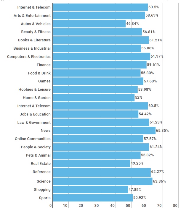
Bounce-rate-by-industry.png
 

High bounce rates

Generally speaking, high bounce rates aren’t great. Think about it, if you were consumed by something you’d seen or read on someone’s site, you’d probably poke your nose around a few more pages, right? Well, that should be the aim of every single page of your site, and a high bounce rate could be a sign you’re not delivering. 

If you’re not sure where to start looking, here are a few things that could be contributing to your numbers:

  1. Slow page load times - according to research, a two-second delay can equate to a 100%+ increase in bounce rate.

  2. You’ve provided the visitor with everything they could possibly want and need on that one page alone. To see if this is likely to be true, check out the ‘Average time on page’ stats.

    If visitors have spent a decent amount of time on the page (say a couple of minutes) then they probably did spend the time needed to digest everything and get what they need. If it’s low though, say 10 - 15 seconds, they probably didn’t get past the first paragraph.

  3. Luring people in with misleading title tags and/or meta descriptions and not giving them what they’re actually looking for.

  4. Technical errors. If a visitor lands on a 404 page, for example, there’s not much encouraging them to stick around.

  5. If the content on your page(s) is weak people will bounce straight back out and look for a stronger alternative - which is why quality is so important.

  6. Poor user experiences (UX) can also be a deterrent. Whether you’re bombarding visitors with adverts, pop-up surveys, and/or subscription options, or your navigation set-up isn’t intuitive, both will make it harder to keep people on your site.

Low bounce rates

While low bounce rates on the whole are a good indicator your page(s) are performing well, if it’s suspiciously low (say 10%) it could be a sign there’s a technical error - usually, duplicate analytic codes are the cause.

What are duplicate analytic codes? 

Basically, this just means you have two sets of the same code on your site which results in two page view requests. The effect is Google Analytics then thinks two separate actions took place, disqualifying it from being called a bounce. 

Of course, you should celebrate successes and take credit where credit’s due, but just remember, if something looks too good to be true, it usually is.


How to improve your bounce rate

If you’ve identified a site-wide or specific-page problem with your bounce rate, here are 10 tips to give it a nudge in the right direction.

  1.  Make your content more readable by looking at things like your font, paragraphs, and quantity of text.

  2. Don’t bombard people with interstitials. They’re irritating.

  3. Make your next desired action glaringly obvious. If visitors can’t see your call-to-action, they’re unlikely to click it.

  4. Take a look at your design and branding. If your site looks naff, people might assume your brand’s naff.

  5. Target the right keywords and write compelling - and accurate - meta descriptions. If you’re enticing the wrong type of organic traffic to your site, it’ll instantly impact your bounce rate.

  6. Revisit your email, social, referral etc. databases, and make sure you’re attracting the right visitors. You can have the best website in the world, but if you’re not reaching your target market it won’t work.

  7. Take whatever steps are required to reduce your page load speed; people don’t have time to sit around and wait.

  8. Make sure every single element of your website oozes quality. If it’s not adding value, get rid of it.

  9. Set any external links to open in new windows to minimize the risk of visitors not returning to your content.

  10. Invest in a mobile-friendly site. Desktop versions can be a pain in the ass to navigate around on mobile, and that’s a one-way ticket to losing visitors. 

  11. Introduce relevant landing pages that target high volume keywords. According to a study by HubSpot, companies with 40+ landing pages earn 12x more leads than those with five or less.

Track your progress 

Last but by no means least, don’t forget to track and analyze any changes you make. This will help you further hone in on what does and doesn’t work – then you can harness what you learn to improve other pages of your site.

 To keep your analysis orderly, it might be worth setting up a spreadsheet and recording things like:

  • The URL of the page(s) you’re working on

  • Bounce rates before any on or off-page modifications

  • The date any changes were made

  • What changes were made

  • The bounce rate after your tweaks - just make sure you leave yourself a meaningful amount of time to get a true picture of whether or not it’s helped

 Try not to get too caught up on industry averages either. When determining what success means for you, keep on top of peaks and troughs and focus on your trends over time.


Hue & Tone Creative: Marketing for Greensboro and Beyond

Need some support with your site’s bounce rate? We’ve got you covered from every angle. Get in touch with the team at (336) 365-8559 or hannah@hueandtonecreative.com to see how our design, content, and campaign services could help. 

3 cross-sell email templates that convert

Picture this: you head to your local sports store to grab a new pair of sneakers. One of the assistants comes over and asks if you need help. You accept. While showing you the shoes, they point out their range of high-performance socks, insoles, and foam rollers. 

You walk out of the shop with the shoes you originally came for…and a three-pack of new socks too.

You probably didn’t realize it at the time, but you were just the subject of up-selling and cross-selling in person.

This tactic works well in person, but it works just as well online. There’s endless potential sales out there to seize -- but if you’re not grabbing these cross-sell opportunites with both hands, your business’ bottom line could be missing out.

To help improve the chance of upselling, we’ve compiled three proven cross-sell templates for you to tweak and use.

3 cross sell email templates that convert  |  Hue & Tone Creative

Opportunity #1: Right after a sale

Your very first cross-sell opportunity comes right after a new customer has made a purchase. We recommend sending out a thank you email — while you’re still fresh in the customer’s mind, offer them some complementary products.

For example, if you’re a DIY company and someone’s just bought a gallon of paint, why not highlight your paint brush, roller, and trays range? If they don’t already have them, odds are they’ll need them very soon… 

Sticking with the paint example, here’s some sample copy:


Hi [insert name],

Thanks a bunch for choosing us for your next DIY project. 

Your order’s been sent to the warehouse and should be on your doorstep in the next 2-3 business days.

If you need some more tools for the job, check out our range of [paint brushespaint rollers, and paint trays]

If there’s anything else we can help you with, get in touch with our customer service team on [insert number].

Thanks again,

[Company X] team


Opportunity #2: when asking for a review

It’s good practice to check in with customers down the line and ask for a review. The review itself will not only help you attract more new customers, but it could help you improve your product or service too.

So, if you’re already doing this, take the opportunity to kill two birds with one stone and steer them towards some more of your offerings. Here’s how you could do it:


Hi [insert name]

Thanks for shopping with us recently. 

Here at [company name] we take what you think to heart, and we’re always looking for ways to build on what we’ve got. If you have just a minute to spare, we’d love to hear what you thought about your recent purchase. 

>LEAVE A REVIEW< 

If you liked what you got, these might just be up your street too:

[Reel of relevant product names and images]

We look forward to hopefully seeing what you say soon.


Thanks,

[Company X] team

3 cross sell email templates that convert  |  Hue & Tone Creative


Opportunity #3: promotional pitch

Your cross-sell efforts don’t always have to piggyback onto another of your email activities. You can also send emails when you have a sale happening, you want to promote a new product, or offer a discount on a certain service. You can send cross-sell pitches whenever you want, just make sure you don’t bombard your database with emails — and be sure to keep the products or service offers relevant.

Here’s an example to steal some inspiration from:

Hi [insert name]

So, you’ve taken out our [insert service name] service, but have you ever considered our [insert service name] offering too?

If the answer’s yes then now’s the time to make your move, because we’re exclusively offering 15% off to existing customers!

By taking out our [insert service name]service, you’ll benefit from:

  • Benefit #1

  • Benefit #2

  • Benefit #3

  • Benefit #4

To claim your discount today, just use the code SUMMER2019 at checkout.

Thanks,

[Company X] team 


Hue & Tone: Email Design and Marketing

So, you’ve got the words, but do you have the design? Don’t worry if not, we can help you create kickass email templates that complement your content and encourage customers to re-convert. Interested? Then get in touch at (336) 365-8559 or hannah@hueandtonecreative.com.

4 event emails that’ll increase attendance rates
event emails that’ll increase attendance rates | Hue & Tone Creative

Organizing an event is no easy feat -- it’s time intensive, resource intensive, and financially intensive. So, if you’re investing your efforts into pulling an event together, you’ll want to make sure you’re squeezing every bit of benefit out of it as you can.

If your attendance levels aren’t as high as you’d hoped, hopefully, this four-stage email marketing plan will help you hit your event’s overarching key performance indicators (KPIs).


Phase #1: the invite

First things first, you need to pique peoples’ interest, and to do this, you need to feed them with the facts that will benefit them. What will they come away knowing that they don’t know now? How will this information benefit them? And what do you have to offer that others don’t? 

And, of course, as with any email, this all needs to be said in as few words as possible; easier said than done, we know.


The template 

Hi [insert name],

Do you want to build your business’ brand awareness? Attract more people to your site? Overtake your competitors? And increase that all-important profit margin?

Yes, yes, yes, and yes?

Then you NEED to come to our next event: [insert event name].

This event is being hosted by [insert speaker’s name] and he/she brings a whole load of knowledge to the table. He/she’s:

  • Reason #1 (e.g. number of years’ experience)

  • Reason #2 (e.g. qualifications)

  • Reason #3 (e.g. big brands they’ve helped)

Interested? Here are the details:

  • Date:XX/XX/XXXX

  • Time:XX.XX

  • Duration:XX hours

  • Location:XXXXXXXX


To secure your spot today, just RSVP to this email and let us know how many of you will be joining us.

Thanks,

[Company X] team


event emails that’ll increase attendance rates | Hue & Tone Creative

Phase #2: confirmation 

This one doesn’t need to be long at all, but don’t leave people guessing; let them know - right away - they’ve successfully signed up to your event. It’s a nice added touch, shows your professionalism, and saves them accidentally signing up twice.


The template

Hi [insert name],

Thanks for signing up for our [insert event name]event!

We’re really looking forward to meeting you there and we can’t wait for you to see what we’re all about. 

We’ll touch base with you again soon, but if you need anything from us between now and then, get in touch with our team at [insert number].


Thanks again,

 [Company X] team


Phase #3: Keep them keen 

Once you’ve got a bunch of people on board, let them know they’ve not slipped off your radar – and, as an added bonus, arm them with even more valuable information. We suggest sharing content like a blog article or guide that is relevant to the topic(s) covered in the event.


The template

Hi [insert name],

It’s only one week until our [insert event name]event - eek! We hope you’re as excited as we are for the big day.

To give you a flavor of what’s to come, we’ve put together a free guide on [insert event topic(s)]for you - just click hereto read it.

See you very soon!

Thanks,

[Company X] team


Phase #4: the reminder

The fourth and final stage of your pre-event build-up is your reminder. This one is important because, let’s be honest, everyone’s human and we all forget things now and then - especially at work when we’ve got to-do lists as long as our arm! So, give your attendee list a polite prod the day before. That’s how you can ensure your event is fresh on their mind.


The template

Hi [insert name],

We can’t wait to see you tomorrow!

To save you crawling through your emails, here’s all the info you need to get to the venue:

  • Location:XXXXXXXX

  • Time:XX.XX

  • Duration:XX hours

  • Directions:XXXXXXXXXXX

See you tomorrow, 

[Company X] team


Hue & Tone Creative: Let’s work together

If you need help with your email event marketing, presentation graphics, branding, business cards, or more, that’s exactly what we’re here for. Get in touch at (336) 365-8559 or hueandtonecreative.com to see what exactly we can do for you.

4 common web design mistakes - and how to fix them

You can have the best product on your shelves, the best customer service around, the best words on your webpages, and the best advice on your blogs, but, if your website’s design isn’t up to par it can all fall flat. 

Getting your website’s aesthetics just right can be a tough nut to crack - especially if it’s not your area of expertise. Small mistakes here and there can wreak havoc with your conversion rate. Many of these web design blunders are easily avoidable – or can be quickly corrected. 

4 Common Web Design Mistakes -- and how to fix them  |  Hue & Tone Creative

All you need is the knowledge about how to correct them, and then you can get your design quickly back on track. If you’re not sure where you might be going wrong, here are four common mistakes we come across and how to overcome them:

1. Hidden contact details

Getting people to land on your website is one half of the battle, getting people to take action is the other. So, make it as easy as possible for visitors to find your form, email, or number.

All too often, organizations leave their contact details buried in their footer or three links deep into their navigation, making it hard to get in touch. 

The fix: Task someone who doesn’t know your site inside and out with tracking down your contact details. If they report back it took them more than a second or two, it’s time to look at your placement. A couple of easy-to-see suggestions include: 

  • At the top right of your main navigation bar, so it’s instantly visible on every page

  • Within your main navigation bar, clearly labelled - something like ‘Contact us’ or ‘Get in touch’

2. Cluttered pages

4 Common Web Design Mistakes -- and how to fix them  |  Hue & Tone Creative

The phrase “less is more” couldn’t be more true when it comes to designing a clean and easy to navigate web page. Lots of sites out there are guilty of cramming each and every page with images, buttons, text, and widget – but all these elements are competing for your visitor’s attention and can quickly become overwhelming. 

People don’t know where to look, what to read, or what’s most important, and they certainly can’t skim your content - all of which can be a big turn-off.

The fix: Go through your website page-by-page and really question what the value of each element is. If there isn’t a motivation behind a certain element, go ahead and remove it. Once you’ve whittled your on-page items down to the essentials, start strategizing about each page’s hierarchy. Make sure you’re incorporating clear call to actions and plenty of whitespace.

Shameless plug: hiring a designer might help with this.

3. Fatal contact forms

Complicated contact forms can be fatal to your conversion rates. If you’ve got lines and lines of fields to fill in, there’s a good chance your visitors will take one look, race to the back button, and exit your site altogether. After all, time is of the essence for everyone on your website or social media. 


The fix: Similar to your site’s pages, go through all your forms field-by-field to see what info is and isn’t needed. For example, you probably don’t need a prospect’s address until they’re further down the funnel – so don’t ask for it, because it could deter people from filling out your form.

In most cases, we recommend keeping forms to just a name and email address. Often, even just an email address field will suffice. 

By the end of this process you should be left with concise, tidy forms, and a clear plan for your data collection strategy.

After some extra advice? Here’s more on how to design a user-friendly form.

4. Absent search boxes

Quick tip: Another quick and easy workaround could be Google Custom Search.

If your site’s relatively big (more than 10 - 20 pages including regular pages, products, blogs, etc.) it’s probably a good idea to add a search box. It makes your site easier to navigate and ensures people will be able to find the content they’re looking for. No more worrying about people leaving the site because the blog post they were looking for was buried in your archives! 


The fix: The solution will depend on your CMS. Some will have a search box feature built-in for you to download, but for other platforms you might have to source a developer to help create a custom one. 


Hue & Tone Creative: Your Website Design Expert

If you’ve not got the time or experience to give your website’s design the attention it needs, then we’re here to give it the TLC it deserves. To see what we can do for you, get in touch today at (336) 365-8559 or hannah@hueandtonecreative.com.

How to conduct A/B testing

Colleague #1:“Lets change the layout of this landing page.”

Colleague #2: “What’s the reason for the change?”

Colleague #1:“Just because. Maybe it’ll work better.”


How many times have you had or heard a conversation along these lines? It’s the marketing equivalent of shooting in the dark and hoping for the best. 

software-developer-and-ux-ui-designer-are-designing-mobile-application_t20_gopNPx.jpg

Spoiler: there’s a better way to make big business decisions.

A/B testing, also sometimes referred to as ‘split testing’, is a type of experiment used by marketers to gauge which variation of a campaign works best. 

The concept itself has been around for a long time, but is particularly relevant in the worlds of email and web marketing. It’s an inexpensive and reliable method to really understand whatworks for the correct audience. 

When it comes to what you can test the possibilities are almost endless, but some common examples include:

  • Landing page copy

  • Call to actions (CTAs)

  • Email subject lines

  • Headlines

  • Product descriptions

  • Advertisement imagery and colors

  • Email sender names

  • Personalization options

How to conduct A/B Testing  |  Hue & Tone Creative

The benefits of A/B testing

How many times have you or a colleague made a decision based on instinct, a gut feeling, or best practice? It’s impossible to predict how people will react, and A/B testing will help you remove some of that guess work.

If done right, it can give you tangible insights that increase web traffic and conversions -- and decrease bounce rates and missed opportunities. 

If done wrong, inaccurate results can be extracted which can result in performance-damaging decisions being made. So, let’s make sure you get it right! 

How to get started 


1. Pick your variable

First things first, you need to pick which variable you want to test. It’s important to focus your efforts on only one element or change at a time, otherwise you won’t know which is responsible for your surge or slump in performance.

For example, if you were focusing on improving the conversion rate of an email and changed the color of your CTA and the template, how would you know which change was behind the results?

That doesn’t mean you can’t fiddle with various elements of a single campaign, it just means they can’t be measured concurrently. Sticking with the email example, you’d need to make your CTA change, analyze your results, take action accordingly, and then experiment with your template

2. Set your goals

Once you’ve settled on your variable, you need to set its primary goal. Let’s say your experimenting with the text on a landing page, your primary goal could be to either: 

  • Reduce the page’s bounce rate

  • Increase the average time spent on the page

  • Increase the page’s conversion rate

3. Create your variables

Next up, you need to create your two variations. Your control version is either what you already have (i.e. current webpage copy) or what you’d normally use (your standard email template, for example).

Your second variation - the ‘challenger’ - is the same asset, but with the isolated change you’re looking to test. For example, let’s pretend your testing if changing the color of your ‘Buy now’ button increases conversions.  

Your control version would be simply leaving the webpage unaltered, and your challenger version would involve using the exact same page, but changing the color of the button to X, Y or Z. It’s as simple as that.


4. Split your data

When it comes to splitting your data, it’s important to divvy it up equally - i.e. 50/50. The reason for this, is that it’s the quickest and most reliable way to get statistically significant results.

To make a decision on which variable is more effective, each has to be viewed the same amount of times. So, if you were to split your data 30/70 (with 30% going to your challenger version and 70% to the original), for example, it’d take much longer for your challenger to rack up the numbers needed to complete your experiment.

If you’re not sure where to start with this bit, here are some of the best rated A/B testing tools to help you:

5. Set your sample size

This one will vary depending on what you’re testing and which A/B testing tool you use. If you’re testing a webpage, for example, you might want to set yourself a target number of visitors to base your experiment on.

Or, if you’re measuring a social media ad, you might choose to set your campaign to run until each variation has earned 3,000 impressions, for example.

For help on how to determine your sample size, check out this guide.


6. Analyze your results

Last but not least, you need to take the time to carefully read and understand your results. During the analysis stage, it’s important to keep your primary goal in mind and not get distracted by other metrics.

By this, we mean if your main goal was to improve email conversions by changing your template, try not to get too caught up with things like open rate, click through rate (CTR), and bounce rate.

Important things to remember

Before you get going with your A/B tests, here are a few final points to bear in mind:

  • Run both your variations at the same time

  • Run your tests for the same amount of time

  • Only run one test at a time

  • Give your experiment enough time to produce meaningful results


Hue & Tone Creative: Your Marketing Partner

If you need help producing your A/B testing assets, you know where we are. To discuss your needs, goals and requirements, contact the team at (336) 365-8559 or hannah@hueandtonecreative.com.

Inbound marketing: 8 tips for design that converts
Inbound marketing: 8 tips for design that converts  |  Hue & Tone Creative

Are your inbound marketing efforts failing to secure the numbers you projected? Are you confident in your concept and scratching your head to figure out where it’s going wrong? Well, perhaps it’s time to look in the direction of your design. 

Design possesses the power to convert spectators into engaged customers. It’s the first and last thing people see when engaging with your business. And it should be a key focus when working to increase your conversions.

So, without further ado, here are eight design tips to give your inbound conversion rate a nudge in the right direction.

1. Hick’s Law

Hick’s Law is a popular theory that suggests the time it takes someone to make a decision is directly proportionate to the number of possible choices they have. So, in layman’s terms, the more options you give your visitors, the less likely they are to perform the desired action.

To implement this theory, take a look at your site’s design and structure and ask yourself (and honestly answer!) whether you’ve got too much going on. If the answer’s yes, see how you can hone things down to give consumers one or two key choices. 


2. Don’t be afraid of white space

To a degree, the phrase “less is more” couldn’t be truer. Don’t cram your designs with color, text, and imagery out of the fear of being ‘bland’. White space can contribute to clean and clear designs that emphasize the content you want visitors to focus on… which, in turn, increases conversions. 


3. Choose your colors carefully

Color can evoke emotion. Emotion can result in action. Action can result in conversion. Use contrast to ensure your text, headlines and call to actions stand out, and experiment with your color choices to see which returns the best results.


4. Remember the 8-second rule 

It’s true what they say, the human attention span is less than that of a goldfish - a mere eight seconds, in fact. That means you’ve got limited time to grab a visitor’s attention.

Think about using: 

  • Large and snappy headlines

  • Eye-catching imagery

  • Clear call to actions

  • Power words


5. Use real faces

Using natural imagery and real people can improve your brand’s authenticity and in turn portray you as more trustworthy, human, and familiar. 

If you’ve got an ‘About us’ section with a breakdown of your employees, put a photo of them next to their bio. And, instead of buying stock photos for everything, consider organizing a photoshoot that shows off your product or office. 


6. Quality is key

Poor quality pictures don’t make a good first impression. They reflect badly on your brand and lead onlookers to associate the quality of your imagery with the quality of your product or service - after all, if you can’t master your pictures, how can you follow through on the other things your website promises? Now we know that’s not necessarily true, but it’s a conclusion people can jump to.

If you’ve got pictures on your site that are pixelated, distorted or just plain tacky, it’s time to go ahead and replace them.


7. Optimize your forms

Having trouble designing a form that converts? We can help with that

When it comes to conversions, your forms are key – because it’s where the action takes place. So, don’t let yourself fall flat at the final hurdle. Keep your form simple and concise, include a clear CTA, make sure the fields are clearly labelled, and use a large submit button. 

To see where there’s room for improvement, we suggest trying out some A/B testing (more on that here).


8. Don’t leave out your logo

This one might seem obvious, but it’s not unheard of for people to overlook the most obvious element of their website.   

Whether it’s a landing page, flyer, brochure, business card or online ad, you need to always include your logo. That’s how you reinforce your branding for people – and while it doesn’t have to be the focal point of your page, it does need to be strategically placed so people know where they are and who’s talking to them.


Hue & Tone Creative: Marketing in Greensboro

Don’t have the magic touch when it comes to design? Not need to worry, that’s where our creative team comes in. To see what we can do for you, get in touch today at (336) 365-8559.

4 free welcome email templates

According to Salesforce’s benchmark study, welcome emails (42%) are the third most popular type of email sent by businesses, trailing only to newsletters (66%) and promotional content (54%). Of the marketers who send them, three quarters rated them as highly effective.

But why are they so important, we hear you wonder? If done right, they engage new customers straight away by prompting recipients to start the next stage in their customer journey -- and they also provide a means for you to follow up on any value propositions you promised (a new customer discount, for example). 

young-woman-using-mobile-phone_t20_ZVNKKR.jpg

One last important thing to note before we dive right in with our templates, are these six golden rules: 

  1. Send your welcome email ASAP

  2. Remember to stamp your branding on it

  3. Include social links to encourage further engagement

  4. Track your email analytics and act on any concerning metrics

  5. Keep them short and to the point

  6. Only use personalization if you’re 100% confident your data is correct

Now, on to what you came for, the all-important templates to get you going…


Example 1: Product Purchase

Hi [insert name]

Thanks for choosing Company X for your Product Y needs - we’re so happy you chose us!

We’ve been delivering our goods to customers - like you - for X years now, and we can’t wait for you to see what all the fuss is about.

As our welcome gift to you, we’d like to offer you 15% off your next purchase with us. To claim your discount, simply enter the code WELCOME19 at checkout.

And if you want to keep up-to-date with our activity (including exciting giveaways!), don’t forget to follow us on FacebookTwitter and Instagram

Thanks again, 

[Company X] team


4 Free Welcome Email Templates  |  Hue & Tone Creative

Example 2: Service Sign-Up 

Hi [insert name],

Welcome to the team!

We’re delighted to have you on board and we can’t wait to start supporting you with our [insert service name].

The next steps are super simple:

  1. Your dedicated service manager will be in touch soon to talk you through the set-up process.

  2. Our Finance Team will invoice you on every [insert date] of the month.

  3. If you have any questions, our customer service team will be available on [insert phone number] between [insert hours and days].

It really is that easy. 

For regular updates, news, hints and tips off our experts, don’t forget to check into our blog every now and then, and if you’re feeling social, why not hit us up on FacebookLinkedIn or Instagram

Thanks again, 

[Company X] team


Example 3: Newsletter Sign-up

Hi [insert name],

Thank you for signing up to our monthly newsletter.

It’ll land in your inbox on the second Tuesday of every month, and it’ll be brimming with useful tips, guides, videos, resources, and more.

If, at any point, you have any feedback on our newsletters, we’d love to know what you think at [insert email address].

To hear more from us, head over to our social profiles and give us a follow:

[Social media icons]

Thanks again,

[Company X] team


Example 4: Event Registration

Hi [insert name],

Congratulations, you’ve successfully signed up to our [insert event name] event - we already can’t wait for you to join us on the big day!

Just so you have them handy, here are the details:  

  • Date:

  • Time:

  • Location: 

Don’t worry, we’ll send a reminder email over a few days before, just to be safe. 

If you have any questions between now and then, you can reach the team on [insert number] or [insert email address].

And so the countdown begins!

See you soon,

[Company X] team


Hue & Tone Creative: Marketing in Greensboro and Beyond

Need a hand writing or designing your very own welcome email? Then look no further - we’ve got you covered. To discuss our email services and more, contact us on (336) 365-8559 or hannah@hueandtonecreative.com.