Posts in Social Media
Facebook Tools: Business Suite vs. Business Manager vs. Creator Studio

In addition to the three primary management options, Facebook offers Brand Collabs Manager. This is a tool to help brands and creators find, learn more about, and connect with each other. You can even set an audience match to see the percentage of each creator's audience that matches yours.

When you manage a business page on Facebook, the posting and management options can seem endless. With updates being rolled out on a regular basis, it’s easy to feel like things are constantly changing. 

If you’ve ever been confused about which tool to use, you’re not the only one. In September 2020, Business Suite was rolled out without much warning, confusing users and causing Facebook to bring back Page Manager (after already disabling it completely).

Then, Facebook distributed a message via Business Suite noting that posts and videos are moving to Creator Studio, including a warning that “soon, those tools will no longer be available here.” This ended up not being true, but scheduled and draft posts were temporarily gone. 

All this to say, if you’re confused, it’s not just because you’re a social media newbie. Facebook has greatly contributed to the confusion by releasing multiple new tools with little explanation and then changing their strategy mid-product rollout. 

Now that product rollouts and new features have stabilized for the past few months, we’re going to do our best to provide an overview of Facebook’s three main page management tools. 


Business Manager 

Business Suite vs. Business Manager vs. Creator Studio  |  Hue & Tone Creative

We’ll start with the least powerful tool in your Facebook toolbox. Business Manager has been around the longest of these three tools and is the most high-level tool. Instead of focusing on creating content or communicating with customers, Business Manager is used to manage your page’s assets and settings. 

You can manage pages, ad accounts, product catalogs (basic actions only), apps, and properties from here. You can also manage Pixel, events, and users, registration, and payment options. 

If you’re a long-time user of the Business Manager, it can feel time consuming to switch products – but we recommend starting to familiarize yourself with Manager as soon as possible. Facebook Analytics goes away completely after today, and our feeling is that Business Manager will quietly be phased out in favor of the two other tools we’re about to review. Not all features are offered on both tools just yet, so it may take some time to full migrate your workflow to Business Suite… but the sooner you start the better! 

Business Suite

Business Suite was rolled out in late 2020 to replace the Page Manager app. Its goal is to streamline all communication with your followers – this includes interaction on posts and private messages. 

As per Facebook, Business Suite enables users to:

  • Save time: Post to Facebook and Instagram at the same time and manage posts in one place to stay connected to both communities. 

  • Stay up-to-date: Get all of your Facebook and Instagram messages, notifications and alerts in one place so you can stay up to date and respond to all of your customers more easily. 

  • Business results:  See what’s working with Facebook and Instagram insights and learn what your customers are looking for.

A few of the key new features for Facebook Business Suite include the following: 

  • View your business at a glance: From your home screen, you can see an overview of your Facebook Page and Instagram account. You’ll see updates, recent posts and ads, and insights. You can also create a post or promote your business from here.

  • View Activity: You'll see new notifications for your Facebook Page and Instagram account.

  • Use Inbox: You can read new messages and comments from your Facebook Page, Messenger and Instagram accounts. You can also create Automated Responses to help save time when responding to questions people commonly ask.

  • Create Posts and Stories: You can publish or schedule new posts and stories for your Facebook Page and Instagram account.

  • Access Commerce Manager: If your business account has a Commerce Account, you'll be able to access it from Business Suite desktop. You can also create a new Commerce Account for your business if you don’t have one.

  • Create Ads: You can create new ads and place them on Facebook and Instagram, boost your posts, and promote your Page.

  • View Insights: You can see details about your business’s performance, such as trends, activity on the content you share and more information about your audience.

  • Access More Tools: On Business Suite desktop, you'll find other Facebook tools and settings you might use to manage your business presence in the More Tools section. This includes other tools, such as Ads Manager, Business Settings and Page Settings. You can also go to your Facebook Page from here.

Facebook has also stated that they plan to make Business Suite "the main interface for businesses of all sizes who use Facebook, Messenger, Instagram and WhatsApp." That being said, we anticipate Business Suite becoming the most powerful of these three tools. Familiarizing yourself with the current functionality will make it easier to adjust as new features are introduced. 

Business Suite is a great tool to use no matter what size or type of business you operate – and using it in conjunction with Creator Suite will give you the most powerful collection of options. 

Business Suite vs. Business Manager vs. Creator Studio  |  Hue & Tone Creative

Business Creator Studio 

While originally introduced as a tool for building and managing your video business, Creator Studio also has quite a few features that overlap with Business Suite. In addition to the core video features, you can see insights about your business pages, read and respond to messages, and create/schedule/post new content to Instagram/Facebook. 

The main difference between the two platforms is that Creator Studio offers additional post setup options and creative tools. These features include:  

  • Post testing to see what videos best perform for your audience. 

  • Detailed insights on video performance, view times, loyalty, and retention.

  • Instant Articles: A mobile publishing format that enables news publishers to distribute articles to Facebook's app that load and display 4 times faster than the standard mobile web.

  • Monetization tools: Content creators and publishers can use a variety of different monetization tools to earn money on Facebook. Depending on your audience and the kinds of content you produce, you need to meet eligibility criteria to use monetization tools, and some tools might have additional requirements. Review which Pages are eligible and apply for access. You'll receive an email after your application has been reviewed.

  • Sound collection: An exclusive collection of original tracks and sound effects that you can use on Facebook and Instagram.


Hue & Tone Creative: Social Media ManageMENT 

Have a question about a recent update? Logging on and unable to locate the tool you’re looking for? We can help! From social media training and content creation to social media management, Hue & Tone can help you effectively use your social media to reach new and niche audiences. We’re here to help you use your social media strategically, effectively… and, of course, creatively!  

Behind the Facebook Ad Review Process

Check out the Facebook Ads Guide for the design specifications and technical requirements across each format and placement. You’ll find information on dimensions, file sizes, character limits and more.

On May 20, Facebook released additional detail about how their ad review process works. This new explainer article provided additional context about how errors or missteps may play into your ads being rejected. 

Facebook’s ad policy has long been a cause for confusion – you may spend some serious time digging into their ad guidelines before you submit an ad… only for it to be rejected. The confusion only grows when you see other ads that are obvious scams but have made it through the approval process. 

One of the biggest things Facebook’s new ad guidelines overview focuses on is that the ad review process is largely automated. That information alone better helps advertisers understand why there may be some discrepancies between the ads that are accepted and those that are rejected. 

What qualifies as an ad?  

Before we dive into the specifics of the ad guidelines, let’s make sure we’re all using the same definition of ads. Ads are considered to be any paid content that appears on Facebook apps or services. This includes ad content on Facebook, Instagram, Messenger and the Audience Network. Ads include original content that has been boosted as well as ads created from scratch in the Ads Manager. 


What rules should ads follow? 

Getting an ad approved is a multistep process and requires following more than one set of guidelines. 

The first step in the process is making sure your advertising content meets the community standards. It’s important to make sure you meet these basic requirements before jumping into the details of Facebook’s advertising rules. Facebook’s community standards are essentially a list of guiding principles that state content posted on Facebook should be authentic, non-threatening, protect people’s privacy, and be free of harassment. More on that here. 

Once you ensure that your ads meet community guidelines, it’s time to move on to the advertising specific policies. Facebook’s Advertising Policies provide guidance on what types of ad content are allowed. There are a lot of these guidelines, so it’s important to review the table of contents to see where you might run into an issue. Some of the most common points of confusion? Personal AttributesSexually Suggestive ContentFacebook's Brands.

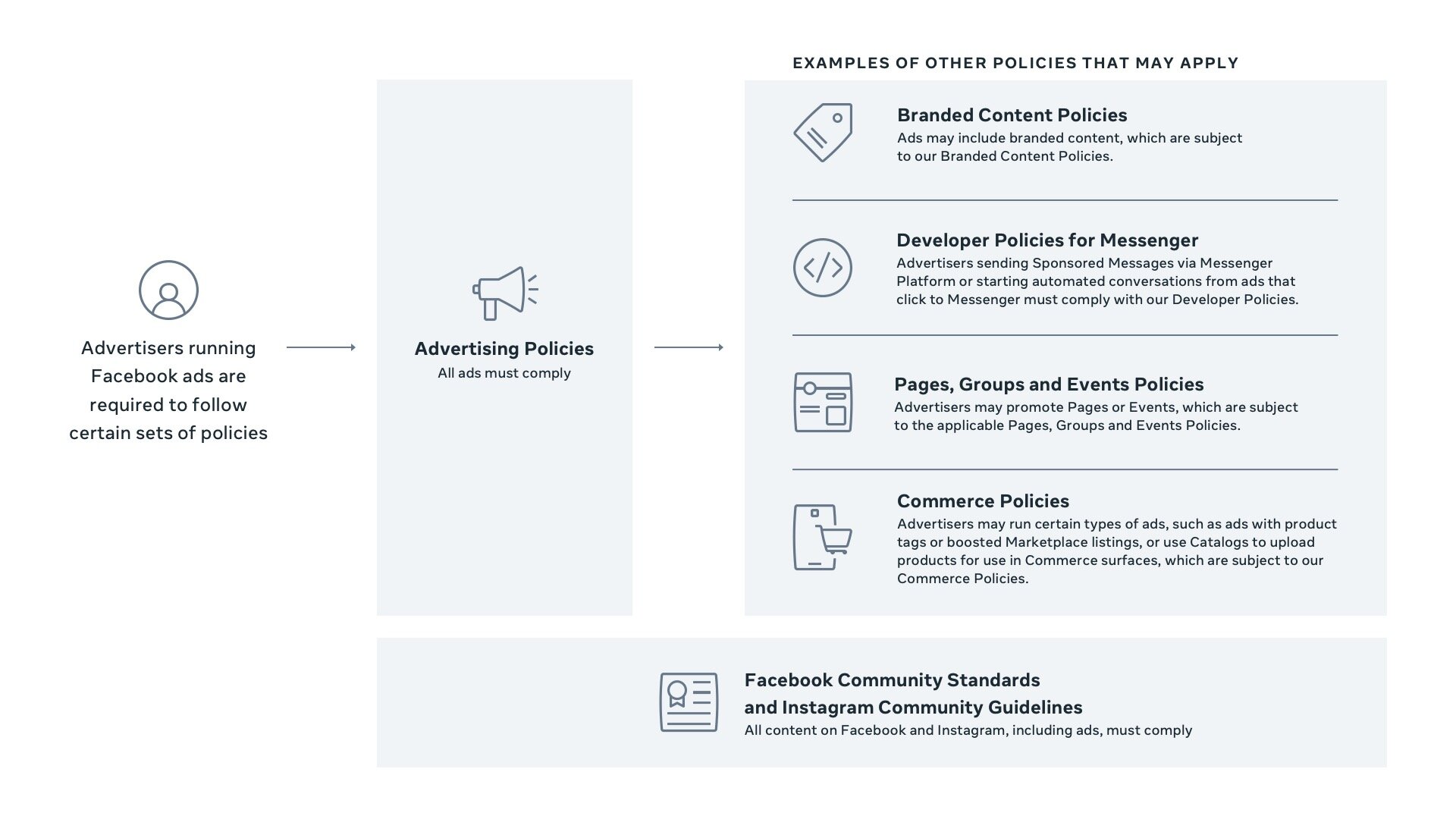
As part of the new explanation of rules, Facebook reminds us that your ads may be subject to further sets of rules beyond the basic advertising guidelines. See the graphic below to review the hierarchy of policies -- you need to check to ensure that each ad complies with branded content policies, commerce policies, event policies, and more (if applicable).

182833438_218616089670274_6500981562177284658_n.jpg

Review process

Facebook’s ad review system automatically reviews all ads before they go live – and as we suspected, the May 20 guidelines reaffirm that the system is largely automated. However, sometimes manual review of ads is used – typically for rereviews instead of initial reviews. While ad review is typically completed within 24 hours, it may take longer, and ads can be reviewed again, including after they’re live. 

Based on the results of the review, an ad is either rejected or allowed to run. If an ad is rejected, an advertiser can create a new ad — either with new ad creative or by revising the rejected ad — or request another review if they believe their ad was incorrectly rejected. 

In addition to the standard review, Facebook may choose to investigate overall advertiser behavior such as the number of previous rejections, the severity of those violations, and any attempts to get around the review process. Too many violations and you may lose the ability to run ads on Facebook permanently. 

While this new guidance from Facebook certainly doesn’t answer all of our questions about the process, it does help give some valuable insight into how the process works.

For the full ad review release from Facebook, head here.


Hue & Tone Creative: Your Social Media Partners 

Struggling to get your social media ads published? Instead of spending all your time reviewing pages and pages of advertising guidelines, let us take the work of writing, creating, and scheduling ads off of your hands.

Your 2021 Guide to Instagram’s 5 Types of Videos

Video is the perfect format for sharing more in-depth content with your audience because it allows for story telling in a way that a single photo never will. And, you no longer need a big budget to be successful at video marketing — because so many of Instagram’s formats emphasize authenticity and spontaneity, marketing through video is easily accessible to businesses of all sizes. 

Over the years, Instagram has expanded their upload options to a mind-boggling 5 formats: Stories, in-feed video posts, Reels, Live and IGTV. If you’re confused about the differences between these different types of videos, you’re not alone!  

Each of these 5 video types has an intended purpose and limitations on its upload format. But before we look at each video format, let’s review a few stats on why utilizing video is a marketing must: 

  • Video ads were the #1 way consumers discovered a brand they later purchased from. (Animoto)

  • 85% of marketers say that video is an effective way to get attention online.  (Animoto)

  • 94% of video marketers say video has helped increase user understanding of their product or service. (Wyzowl)

  • 93% of brands got a new customer because of a video on social media. (Animoto)

Now, it’s time to get knowledgeable about each type of Instagram video – and make sure to scroll to the end of this post for a quick reference guide of the different upload specs! 


Instagram Stories

These Snapchat inspired stories are what you see on the top of your home feed. These short 15-second clips disappear after 24 hours and are a great place for spontaneous content or short updates. Stories are the perfect place for off the cuff content – and because their aesthetics are separate from the rest of your feed you can be as creative as you want with them.  

One of the upsides of Stories is that you can include interactive elements such as voting, tags, stickers, and links. This is a great place to take a poll, tag a product, or get your customers to vote on something. For larger brands – those with 10k or more followers -- stories are one of the few places you can post direct links to help drive organic leads and conversions. 

Once stories have expired you can save them to the Highlights section and organize them into categories with custom cover photos (you’ll find this positioned above the grid on each profile).


Feed Instagram Videos

The original video format, feed videos have been around since 2013. They show up when you’re scrolling the main feed or explore section. They can be uploaded using Instagram’s built-in camera or by adding a file from your photo library. Feed videos tend to be the spot for your most planned out and professional content. All posts have to be 3-60 seconds in length, so this isn’t the place to go behind the scenes or to share much detail.  

Similar to an image post, these feed video posts can include a filter, location, caption, as well as user, location, and product tags. Once posted, people can engage with likes, comments, and sharing public videos in Stories and direct messages.


Reels

Reels are the newest video format on Instagram. These Tik Tok inspired clips have to be shot in portrait mode (9:16) and max out at 15-30 seconds. While these may sound a lot like Stories, Reels offer a variety of additional editing options including timed text, AR filters, green screen mode, timer and speed controls, and access to an audio library.

Reels can be shared to Explore and Stories. When you upload a reel, you can also choose to post it in your Feed. All the reels you create will also appear in a dedicated section of your profile, similar to IGTV posts

Live Instagram Videos

Instagram Live lets you broadcast a live video stream (from your built-in camera only) to your followers and is a great way to interact in real-time.

Live streams can last up to four hours and can be hosted by one or two accounts. When an account starts broadcasting live it appears at the front of the Stories bar with a Live icon. Once finished, Instagram Live videos can be saved to IGTV or shared for 30 days before being deleted.

This is the perfect place for deepening custom relationships with spontaneous video. Don’t worry about polish – live videos are all about authenticity. You’ll be able to see how many people are watching in real time and people can engage by adding comments or emoji reactions. 

We suggest going live for things like workshops, interviews, or Q&As. Live video also supports live shopping (businesses can tag relevant products) and allows for in-app donations (perfect for non-profits). 

Your 2021 Guide to Instagram’s 5 Types of Videos  |  Hue & Tone Creative
 

94% of video marketers say video has helped increase user understanding of their product or service. (Wyzowl)

IGTV

IGTV is Instagram’s format for in-feed videos longer than one minute. This video format is truly intended for long format content, similar to what you would post on YouTube. IGTV posts can go up to 60-minutes and must be pre-recorded (and uploaded via camera roll/photo stream).  

When you go to post an IGTV video you can create previews to post on your feed and sort your videos into series. All IGTV video appears in a dedicated section of your profile. 

Your IGTV channel is intended for complete, polished content that is well-planned and professional. These longer videos mean a longer engagement time and more potential for participation. You should consider all types of creative and educational content for this part of your feed. 


Looking for a quick reference guide that breaks down the specs of each of these formats?  

Now that we’ve broken down the different types of content, let’s review the nitty gritty for creating these different video formats. You’ll notice there are no specs for Instagram Live, and that’s because those videos can’t be created ahead of time and can only be recorded using your camera. 


Instagram Stories specs

  • Length: Up to 15 seconds per Story (longer videos can be clipped into multiple Stories)

  • Maximum video file size: 30MB

  • Recommended file type: .MP4 or .MOV format

  • Ratios: 9:16 and 16:9 to 4:5

  • Minimum width: 500 pixels

  • Minimum aspect ratio: 400 x 500

  • Maximum aspect ratio: 191 x 100 or 90 x 160

  • H.264 compression recommended

  • Keep about 250 pixels at the top and bottom of the video free from key content. In this area, it could be obstructed by the profile photo or call to action.


Instagram feed video specs

  • Length: 3 to 60 seconds

  • Recommended file type: .MP4 or .MOV format

  • Maximum file size 30MB

  • Maximum frame rate 30fps

  • Minimum width: 500 pixels.

  • H.264 compression recommended


Instagram Reels

  • Should be shot in Portrait mode (9:16 aspect ratio)

  • Will view on feed in 4:5 aspect ratio 

  • Minimum res: 600 x 1067 pixels

  • Maximum res: 1080 x 1920 pixels

  • 4K not supported


IGTV specs

  • Minimum length: 60 seconds

  • Maximum length: 15 minutes when uploading via mobile and 60 minutes when uploading from the web

  • File type: MP4 file format (required)

  • Vertical video aspect ratio: 9:16

  • Horizontal video aspect ratio: 16:9

  • Minimum resolution:720 pixels

  • Minimum frame rate: 30 frames per second

  • Maximum file size (for videos 10 minutes or less): 650MB

  • Maximum file size (for videos up to 60 minutes): 3.6GB

  • Recommended cover photo size: 420px by 654px (1:1.55 ratio)

What else do you want to know about Instagram video? Drop us a comment about what we should review in our next post! 


Hue & Tone Creative: Your social media partner 

Let us help you create a social media feed that shows off your brand and lets you reach new prospects! Whether you’re looking to increase your views or simply need a break from handling your account, Hue & Tone Creative has you covered for all things social.

10 social media ideas for residential realtors

A few weeks ago, we tackled some general content ideas for kitchen and bath designers. In that post, we mentioned our belief that it’s impossible to run out of content ideas! We’re here to continue to prove that theory right by sharing a handful of outside the box social media ideas for residential realtors. 

As a realtor, it’s important to post about more than just new listings. Social media is a great place to show off what you know about the home buying and selling process – and it helps to give potential prospects an idea of what it would be like if they work with you. By offering up content of value, you raise the chances of engaging a potential client. 

Once you start posting high-quality content, it’s also crucial to engage with a wide and diverse audience. Don’t just chat with other realtors, connect with potential prospects, community figures, and other businesses.

1. Break down different neighborhood personalities: A series of posts with details about different neighborhoods is sure to engage people that are new to the area. Break down the personality and reputation of each neighborhood, but also include hard data like average home price, amount of available stock, school system data, and average commute times. For an added bonus, highlight a few key landmarks in each neighborhood – this could be restaurants, local art, parks, or trails. This is the perfect way to establish yourself as a local guide! 


2. Break down terminology: APR, ARM, appraisals, equity, escrow, FMV, MLS, trust sales, and seller disclosures… the list of confusing terms goes on and on. Help new buyers (or even seasoned pros) expand their knowledge of the market by breaking down common or confusing terms. This shows off how knowledgeable you are and shows you want potential buyers to be empowered… whether they work with you or not! 


3. Show us your style: Have a style of home you love? See a beautiful wallpaper or garden that you idolize? Take us on a visual journey by sharing photos that show off your personal taste. This could be décor you see out at a showing or inspiration that you’ve been coveting on Pinterest. This helps create a visually appealing feed and is a fun way to break up more factual posts. 


4. Community Events: Demonstrate that you’re plugged into the community by sharing local events or updates from community organizations. Bonus points for attending the events you promote and sharing behind-the scenes updates!


5. DIY Tips: New homeowners often need all the help they can get – especially when it comes to DIY projects and getting acquainted with regular home maintenance. Show them that your relationship with buyers doesn’t end when your check clears by providing useful resources for new and current homeowners. 


6. Inspection Preparation: The home inspection can be one of the most stressful steps in buying a new home. Help potential buyers get a better idea of what to expect by breaking down the process, explaining potential resolutions for any repairs, and sharing how to find a good inspector. This is a great time to highlight the home inspectors you often work with…because who doesn’t love some good cross promotion?


7. Buying Anniversary: Posting when a client first closes on a house makes them feel special – but take it a step further by also remembering their buying anniversary. This is a wonderful way to pop up on people’s timelines a year (or more) after you’ve worked with them. Chances are they’ll share your post, giving you the opportunity to get in front of their connections as well. This is a positive way to keep your feed house-centric even when sales are slow, or you’re stuck on what to post. 


8. Community Service: Sharing about causes and local organizations that you support is a great way to show people that you’re invested in the community. This works best (and feels most genuine) if you focus on an indirect sell – instead of making the post about you and your philanthropy, keep the attention on the cause or organization. Be sure to include a link for people to learn more, donate, or get involved. 


stephen-leonardi-XKIO6ZgCObo-unsplash 2.jpg

9. Dream Listing: People love looking at crazy-expensive listings, even if they’ll never be close to able to afford them. Share some of your most expensive or luxury listings – just be sure to link them to your website. The idea here is to get people browsing the photos so that they end up looking at homes they can actually afford! 


10. What sets you apart: In a competitive market, it’s important to have a highly qualified and dedicated realtor. Show off the accomplishments of your team by sharing some statistics on how you’ve helped sellers and buyers. This could be average selling times, negotiating for perks, or helping people close quickly. Avoid bragging and let the numbers (or testimonials) speak for themselves! 


Hue & Tone Creative: Looking to reach a new audience?

Let us help you create a social media that shows off your brand and lets you reach new contacts. Whether you’re looking to increase your views or simply need a break from handling your account, Hue & Tone Creative has you covered for all things social.

Will Apple’s Privacy changes hurt your small business?
Will Apple’s Privacy changes hurt your small business?  |  Hue & Tone Creative

Back in June 2020, Apple announced it would be making some substantial changes to how iPhone’s collect your data. The changes include enabling people to share an approximate location (instead of a precise one), adding summaries to the App Store that explain what data each app collects, and requiring third party apps to ask users before sharing their data. 

Facebook swiftly responded to these changes with displeasure, specifically taking issue with the consent driven data sharing. By requiring iPhone owners to grant apps explicit permission, Facebook fears the possibility that most users will block them from collecting detailed information. Facebook uses that data to build out detailed profiles that they market to advertisers (including both small and large businesses). 

The type of data sharing that is specifically being referred to is IDFAs (Identifier for Advertisers). IDFA’s are unique identifiers for mobile devices and are used to target and measure the effectiveness of advertising on a user level across mobile devices. Currently, about 70% of IOS users share their IDFA with app publishers, after this change it’s estimated that this number will drop to 10% to 15% (source). Currently, users can opt of data sharing, but it’s a buried feature that you have to search out.

If people are blocking Facebook from collecting their data, the value of advertising on their platform may significantly decrease. And with it, Facebook’s revenue may take a severe hit. In 2019, about 98.5 percent of Facebook's global revenue was generated from advertising, whereas only around two percent was generated by payments and other fees revenue (source). Much of that revenue is generated by small to medium sized businesses who count on social media advertising as an important part of their marketing strategy. 

It’s important to note these changes aren’t specifically targeted at Facebook – they’re simply one of the biggest companies that may suffer and the company that’s made the most noise about them. The fact of the matter is that every third-party app will have to ask your permission before tracking you. 


What does the timeline for these changes look like? 

Apple originally outlined these changes in June of 2020 in anticipation of a Fall 2020 rollout. The changes were delayed and in December 2020 the pushback from Facebook intensified. 

The changes will begin to take effect as users install or update to the new iOS. When you install those updates a prompt will appear alerting you to opt-in or opt-out of the sharing of this information. 


How did Facebook respond? 

These latest changes are only the most recent development in a tense relationship. Apple and Facebook have been fighting for years, with their CEO’s often aiming comments at each other (more on that here). In December, Facebook launched an all-out offense campaign to try and combat the proposed Apple changes. 

They announced their displeasure on the website/app, took out print ads, and created a subsite for business owners to “voice their displeasure.” Instead of focusing on the potential loss to their own ad revenue, the focus of their latest campaign is that they’re sticking up for small business owners. 

The messaging on their website reads: 

Here’s what’s at stake with the iOS 14 update. 

Apple’s policy could limit your ability to use your own data to show personalized ads to people who are likely to be interested in your business. Now that 44% of small businesses are turning to personalized ads to adapt to the outbreak of COVID-191, this update will be especially hurtful to small businesses in already challenging times. 

Apple’s iOS updates make it harder to reach current and future customers.

Measurement of campaign performance will be disrupted, making it harder to determine the effectiveness of ads.


How will this affect my business advertising?  

Will Apple’s Privacy changes hurt your small business?  |  Hue & Tone Creative

If you rely heavily on Facebook advertising to meet your regular sales goals, there’s a good chance that these updates will impact you. After all, the personal information that Facebook collects is what allows you to target customers with creepily specific ads. Apple allowing people to opt out also ups the chance that people will see ads that are less relevant to them. 

Most major platforms are still working through exactly how they will address these major changes – but Facebook confirmed they will not collect IDFA’s on their own devices and will begin updating their SDK to support the SKAdNetwork option. More on that here.

In the immediate future, your advertising may be impacted in two major areas:

  • Retargeting: Retargeting to users will no longer be possible for people that have opted out. Platforms like Google and Facebook can still identify users through information like their email or phone number, but other platforms will see a drastic reduction in targetable audiences. 

  • Measurement: Ad measurement is built around customers IDFA identifiers – and while Apple has announced a replacement API that will allow for conversion data at the campaign level, there will still be a reduction in the reliability of the data. 


What should you do?

As a consumer, we like that Apple is protecting our data and paving the way for further consumer protections to be enacted. As a digital advertiser and social media company, we understand why business owners are frustrated. But don’t let frustration paralyze you! 

 Now is the perfect time to revisit and revamp your social media advertising strategy. Invest some time into thinking through how these changes might negatively impact your customer acquisition numbers and shift your strategy accordingly.  


Hue & Tone Creative: Your Social Media Partner 

Not sure what shifting your strategy looks like? Reach out – we can help you create a plan to handle these changes and to futureproof your strategy for future changes. From content creation to analyzing your reach, we’re your partner in everything social media related. 

Is Facebook advertising really worth it?

On the surface, Facebook ads seem like a great value. With startup costs as little as $5/day, most business owners jump on the opportunity to start advertising for such a minimal expenditure.  

Looking for a low cost alternative to social advertising? Maybe email marketing is the right fit for you. Learn more about it here.

The truth is that advertising on Facebook can work for almost any type of business – but the catch is that it takes a well-planned campaign, a clear objective, and an appropriate budget to make it worth the investment. Before starting your first campaign, you’ll want to:

  1. Learn how to properly use the Facebook Ads Manager (or hire someone who knows how to use it)

  2. Determine a clear budget 

  3. Narrow down an objective for your campaign

  4. Set a timeline for your campaign, including check-in points where you can retool your creative if needed

  5. Design and write your ad creative (don’t forget to consider A/B testing for your creative)

  6. Carefully target your ads before launching them 

Is Facebook Advertising Really Worth it?  |  Hue & Tone Creative

How much do they cost? 

While it’s true that you can start advertising for just a few dollars, that doesn’t necessarily mean that this is money well spent – or that social advertising will be more cost effective than traditional advertising in the long run. 


The real questions you should be asking here are:

  • How much do I have to spend? 

  • What are my goals? 

  • What cost per click (CPC) do I need to make this worthwhile? 

The fact of the matter is that $5 is going to buy you nothing… in fact, if done poorly a low budget campaign may even hurt your brand. At a bare minimum, we suggest setting aside $500 -$1k for each product or service campaign you plan to do (and this doesn’t include creative development costs). The appropriate budget will be influenced by your objectives, how large of a target audience you want to reach, and the length of your campaign­­. 

Setting a goal

While direct sales goal is one clear cut way to make sure you’ll be able to measure your investment, it’s not the only metric that’s worthwhile. In addition to social media sales (for products), you can also measure:  

  • New page “Likes”

  • Post-level engagement

  • Email opt-ins

  • Website click-throughs

  • On-site sales or lead generations

Picking the proper objective is going to depend on your specific business. If you’re a new business, brand awareness may be an important piece of your marketing strategy. But if you’re a tried and true brand who is looking to boost sales, you should hone in on conversions or direct sales.  


6 mistakes to avoid

Is Facebook Advertising Really Worth it?  |  Hue & Tone Creative
  1. Use little to no text on your ad creative. Facebook’s 20% text rule has been the rule of thumb for as long as any social media marketer can remember. In general, the less text means the higher the reach. 

  2. Using the wrong ad format. Using the wrong ad format is typically a newbie mistake. The ad manager has numerous options and if you don’t know what you’re doing, there’s a good chance you may not be using the most effective format. Let your objective guide your ad format – and be sure to do plenty of research on the different options before even kicking off your first campaign!  

  3. Boosting a post and calling it advertising. While boosting a post may get a few extra eyes on it, this is not the same thing as creating a Facebook campaign. You won’t have any of the targeting or format options available through the ads manager if you simply boost a post.

  4. Not regularly monitoring and retooling. Facebook advertising isn’t a set it and forget it medium. You should plan to regularly check-in on your campaigns to measure their success. If something’s not working or performing the way you expected, don’t be afraid to rework it and try again. Live monitoring is one of the benefits of social advertising because it ensures you won’t continue to spend money on something that isn’t working… so don’t let this important feature go to waste! 

  5. Only running one ad. Facebook Campaigns are based around sets of ads which are made of individual ads. Limit ad sets to no more than 5 ads so you can compare and contrast what’s working well. 

  6. Targeting a wide range. Targeting a broad audience is a big mistake – by casting a wide net, you lower the chances that people are going to respond positively to your ad or engage with it at all. Facebook’s unparalleled targeting is what makes it such a successful platform – and not utilizing these features practically ensures you won’t see a return on your investment.  

The bottom line: are they worth it? 

Want to learn more about Facebook’s targeting options? Facebook has a number of valuable resources available for your use!! 

It’s important to not view Facebook as a silver bullet that will fix all your advertising woes for a minimal cost and labor investment. If done well, your Facebook campaigns will require a lot of careful planning, research, and investment. 

Social advertising should be just one part of a carefully planned and comprehensive digital marketing strategy – and they require as much care and attention as everything else that bears your brand name. 


Hue & Tone Creative: Your digital marketing partner

Feeling overwhelmed by all the options? Don’t worry – that’s what we’re here for. We’ll help you determine how best to spend your digital marketing budget. Once we’ve decided on the right fit, we can help you take the plan from idea to reality. We’ll help you write, design, and launch everything you need to boost sales.

How to get more email sign-ups
How to get more email sign-ups  |  Hue & Tone Creative

Cultivating an email list is an important element of any cohesive digital marketing plan. It’s fast, flexible, and cost effective. It allows you to directly connect with past, current, and future customers in a tailored and carefully targeted way. 

Like all digital marketing, email marketing has undergone changes in past years – but it’s as relevant in 2020 as it’s ever been. Reasonably priced and highly flexible, email marketing shows a great return on investment:

  • Emails are 6x more likely than tweets to get higher click-through rates (source)

  • Email is 40 times more effective at acquiring new customers than Facebook or Twitter (source)

  • 81% of online shoppers who receive emails based on previous shopping habits were at least somewhat likely to make a purchase as a result of targeted email (source)

  • 72% people prefer to receive promotional content through email, compared to 17% who prefer social media (source)

  • Email marketing has an ROI of 3800% (source)


Who should be on your list 

Avoid spamming people – don’t send emails to people who haven’t actively signed up for your email communications. 

How you organize your email lists will vary greatly based on your goals, but we encourage you to gather every email you can (even if it’s someone you are not ready to market to just yet). Your email list should consist of email addresses from past/current customers and qualified leads. You can use email to communicate everything from company information and product updates to discounts and exclusive content. 

 In order to derive the maximum benefit from your email list, it’s important that you continue building your list over time. The more subscribers you gain, the more valuable your email list becomes – and the more potential revenue you can gain from utilizing it. 


Places to build your email list

  • Call to Action (CTA) buttons/links: Every landing page and blog page on your website should have a CTA for your email list. Embed them in the text of the page and be sure to add a sign-up at the bottom of every post.

  • Gather sign-ups through social media: No matter the size of your budget, Facebook is a great place to capture new leads. The advanced targeting allows you to connect with fairly qualified leads and cultivate them over time through email. 

  • Cart opt-in: Someone who is already checking out on your website is clearly interested in your product – making it a perfect time to ask them to opt into emails. When a customer places an order and gives you their information, you’ll want to capitalize on the opportunity by asking them if they want to receive promotional emails. 

  • Contact forms: Similar to the cart opt-in strategy, allow people who are sending a general inquiry to opt into your email list. 

  • Integrate with your CRM: Do you utilize an existing customer relationship management tool like Hubspot? Using an integration with your existing CRM can be a great way to automatically add new contacts to your email database.  

  • Free Content Offers: Have gated content or a freebie you could use to drive email sign-ups? Share it on social media! If you have a free printout or digital download you want to offer people, make it an exclusive for new email subscribers and deliver it directly to their inbox (which means you’ll capture their email address in the meantime). 

  • Referral Programs: Someone who loves your product is the best ambassador for it – get existing customers to refer folks to your brand. Offer cash rewards, discounts, or points and build a full-on loyalty program that will keep the referrals rolling in. 

  • Exit intent pop-ups: This is a pop up that appears right when you’re about to click to a new page or ex out of the tab. As visitors are about to leave, offer them something that will make them become an email subscriber. This will allow you to continue to engage with them. Just make sure to use cookies to track returning visitors so that you don’t repeatedly show them the same pop-up.

Tailor for maximum benefit 

How to get more email sign-ups  |  Hue & Tone Creative

No matter what stage of the buying process a lead is in, you can create a targeted email that appeals to them. 

Automations that are triggered by a specific action can save you time and allow you to have a more personalized interaction with a customer. Automated triggers also allow you to respond to your customers interest in real-time. Did they abandon a shopping cart full of goods? Send them an email reminding them to check out… or, enticing them with a discount for completing the purchase!

Other Benefits

  • Measurable: Tracking the success of a promotion is easy with the built-in analytics that email software offers. Track delivery rates, bounce rates, click through, and open rates easily and effectively.

  • A/B Testing: Testing the effectiveness of different elements of your email (like photos, copy, colors, or calls to action) will ensure your email is as effective as possible. 

  • Targeted messaging: We’ve already touched on this a bit, but the ability to highly tailor and nurture a lead is a capability almost no other type of marketing can offer. 

  • Everyone uses it: Almost 91% of all consumers use email, which gives email marketing widespread appeal. 

  • Environmentally friendly: In addition to being cheaper, digital mailings save trees. A huge bonus if your business is sustainably minded! 


One last tip: Do you have a list of older or less interested contacts? Reinvigorate it by sending a message to re-engage these contacts. Let them know you’ll be removing anyone who doesn’t respond – and you’ll be pleasantly surprised how many people choose to opt in and stick around. 


Hue & Tone Creative: Your partner in email marketing

Completely overwhelmed by all the emails you have to send out? Outsource the work to an expert and get the full return on investment that email marketing has to offer. We’re here to help you develop a strategy for your digital marketing: from identifying target demographics to crafting emails and targeting social media ads. Get in touch with us today to find out how we can help.

How to find your voice on social media (and why it matters)
How to find your voice on social media (and why it matters)  |  Hue & Tone Creative

The internet is a crowded space and it can be hard to make your brand stand out. But one of the best ways to stand out is to create authentic connections on social media. 

A key element in forging these genuine connections is establishing your brand voice. Your brand voice makes your brand feel like a person that your customers can connect with and allows you to build a deeper relationship with your audience. No one likes to feel like their favorite company thinks of them as just a dollar sign – and when people feel valued by your brand, they tend to spend more and be more loyal.  

Formalizing this brand voice in a set of guidelines ensures everyone posting from your account is using a consistent tone to communicate with the audience. This ensures that you stay on brand in even the stickiest customer service situations… and they can even help you turn an aggrieved customer into a loyal follower. 

Finding your social media voice is not one thing, but rather a set of defined characteristics that come together to establish your overall brand voice. 

  • Character: Who does your brand sound or talk like? Are you an expert informing a customer, or do you talk to a client like they are your friend? 

  • Tone: What is the general vibe of your brand? How does your voice change based on audience, situation, and channel?  Are you fluffy or direct, personal or professional? 

  • Language: What kind of words do you use often? What kind of words do you try to avoid? Do you speak in a complex and jargon-filled way or do you like to keep things more simple? 

  • Purpose: Why are you on social media? Do you want to engage, inform, sell… or something else altogether? 

Why social media voice matters 

Creating a consistent tone lets people get to know your brand and allows you to build a strong relationship with customers and clients. Delighted customers talk positively about your brand, which means them creating new content, driving leads your way, and spreading your brand message. 

Establishing your voice can be complicated and require some trial-and-error. Unlike tracking your web analytics, this marketing project won’t be a one and done task. If something isn’t connecting with people, don’t be afraid to do more research and reorient your tactics. 


Steps to get started 

How to find your voice on social media (and why it matters)  |  Hue & Tone Creative

Stumped on where to get started? Here are a few simple steps to get you going when developing your brand guidelines. 

  1. Research your audience’s habits online. What platforms do they use, what words do you see often, and what do they seem to value? 

  2. Examine your existing brand guidelines. What brand resources do you have to work with? Do your guidelines for print work for social media? Do these words fit with what you’re seeing from your audience?

  3. Determine your purpose. What do you want to do for your audience online? How will you achieve these goals? 

  4. Brainstorm words you want your audience to associate with your company. Make a list of adjectives you want your audience to use – and then words that you think will help elicit those feelings.

A few tips as you develop your voice 

Now that you’ve got a jumping off point, here’s a few additional tips to keep in mind as you put your brand voice to work online. 

  • Define your audience. It’s important to keep in mind that certain types of messaging resonate with certain audiences. Taking your audiences communication style, interests, and online behavior into account will help you better connect with them. Be sure to explore how your customers act online before solidifying your brand voice. 

  • Be transparent and admit mistakes. Instead of trying to hide mistakes, use transparency and openness to your benefit. Admitting when you make mistakes and letting people see behind the scenes at your business will build trust and loyalty from your customers. 

  • Trust your customers. Whatever you do, don’t delete comments from people who are criticizing you – this will just make them angrier and may push them to launch a full-scale campaign against your brand. Instead, comment on their posts and show your other customers how reasonable and responsive you are. Your customers are smart enough to distinguish between a rightfully aggrieved customer and a lunatic. 

  • Keep it consistent. If your brand voice isn’t usually funny, don’t suddenly try to make a joke. Trust is built through keeping a consistently high-quality presence. Think of your brand like a person – you don’t want to leave users feeling like your personality is anxiety inducing or erratic. 

  • Be clever with purpose. It’s okay to be clever or sassy with your social media voice, but only if it fits your brand. Don’t try to emulate Wendy’s unless there’s a well rationalized reason for it. Use funny or clever responses sparingly – and be aware that they may fall flat (and create a secondary issue). 

  • Don’t forget it’s a conversation. Social media shouldn’t be used to talk at your audience – it should be used to communicate directly with them. Authentic interactions can create lifelong loyal customers – and ignored messages can lose them. 

  • Take customer service seriously. Put time into developing a plan for customer service and responding to inquiries. Ensure consistency and timeliness by creating sample responses for your team and empowering them to take action when there is a valid complaint. 

  • No platform is exempt from your brand voice. Your brand voice isn’t just important in your posts – it should be consistent across every element of social media. This includes Facebook message replies (including the automated ones), calls to action, Instagram captions, direct messages, cover photos, bios, and post graphics/visuals. 

  • Keep responses usable. Responses to people’s questions or inquiries shouldn’t be long or overly complex – keep in mind that users are most likely responding from their mobile device. Answers or responses to people should be short, to the point, and easily accessible. 


 Hue & Tone Creative: Social Media in Greensboro, NC

Completely stumped about how to connect with your audience? Let us take the work out of it. We can help you put a social media strategy in place – or we can take over the posting and day-to-day management of your channels. Reach out to learn more about what kind of plans we offer. 

How to handle a bad social media review
How to handle a bad social media review  |  Hue & Tone Creative

Negative social media reviews can feel like a nuisance – but if they’re mishandled they can turn into a much bigger problem. But, handle them properly and you can even turn a doubter into a return customer. With the right response, you’ll have the opportunity to turn a bad situation into an opportunity – and you’ll be able to keep negative reviews from harming both your reputation and bottom line.  

It can be easy to get emotional when your business is being slammed online, but these days it is just part of doing business. Ghosting negative reviews or retaliating with something less-than-business-like just won’t do, and here’s why:

  • 97% of customers read reviews before buying

  • 89% see them as an essential pre-purchase resource

  • 85% of all consumers actively look for negative reviews

  • And 91% of consumers 18 to 29-year-olds look for negative reviews 


1. Take the emotion out of it

The bad review isn’t a personal attack on you and thinking that it is will only rile you up further.  So, put on your business cap and get in a good frame of mind before you start typing. 

We suggest thinking of online interactions just like you would in-person customer service interactions. Just because you’re not face-to-face with a customer, doesn’t mean you should treat it as any less important of interaction. In fact, your digital comments have much more potential to amplify than your in-person discussions, making it that much more important to treat them carefully. It’s not just the customer who sees your response, it’s their friends, your friends, and people who like your page. 

2. Act promptly

Want to take your good reviews one step further? Here’s how to create a killer case study.

We get everyone is busy, but it’s crucial that you make time to respond to your negative reviews -- and the sooner the better. This is important for a couple of reasons: 

  1. It gives the customer less time to stew on their complaint and get even more worked up

  2. Fewer people will come onto your page and see just their side of the story

  3. It shows that you’re responsive and invested in their thoughts 

Don’t replace quality with speed of response though: It’s better to take 10 minutes to put together a well-thought-out message then it is to publish the first thing you think of. 


3. Restate the complaint

One of the first things the reviewer wants to know is they’ve been heard, so be sure to rephrase their complaint in your response. For example, if their review was something along the lines of “I was really unhappy with how long it took for my package to arrive.”

You could start yours with “Hi [name], We’re sorry to hear you weren’t happy with the delivery time for your package…”


4. Don’t play the blame game

It’s natural for your first instinct to be to give a reason behind why. Avoid responses like this:  

  • “We were short-staffed because John was feeling poorly.”

  • “One of our vans broke down so we were playing catch-up.” 

  • “It was an unexpectedly busy period for us.” 

The reality is people don’t usually care why it happened and if you go down this road, they might think you’re just making up excuses. Instead, counter with something like: “This isn’t the standard of service we’re known for and we’d like to do everything we can to make up for it.”

5. Weave in some positives

It’ll give onlookers a reason to still choose you. Sticking with the delivery issue, this could be something like “We pride ourselves on timeline delivery – in fact, we delivered over 100,000,000 packages on time last year. We’re sorry to hear you didn’t receive the same punctual service we’re known for and we hope it won’t stop you from trying out our service again.” 

How to handle a bad social media review  |  Hue & Tone Creative

6. Offer a solution 

Tip: So that people don’t think you’ve gone silent, reply in the thread saying “We’ve heard your complaint and are going to send you a private message so that we can collaborate on a solution for this issue.”

Take the discussion offline to work out a resolution -- you don’t want to air it in public and for everyone to think that your answer is standard. And, if you say you’re going to do something, do it, otherwise, you’ll just end up with another angry review.


7. Ask them to edit it

If you’ve worked the situation out with your customer, it may be worth the risk of asking them to edit or update their review. We don’t suggest asking them to remove it completely, because you run into the risk of them broadcasting that you tried to keep them quiet. 

Also, remember to make this kind of request in private too, it’s not necessarily the type of thing you want either existing or prospective customers to see.


Hue & Tone Creative: Partners in social, design, and marketing

Need some social support? Just can’t handle one more bad review? You can count on us. From planning out your content to boosting your online presence, we’ll get your social media pages back on track. Get in touch at (336) 365-8559 or hannah@hueandtonecreative.com to figure out how we can partner together.

How to create great images for shoppable posts

New to shoppable posts? Head over to our step-by-step guide here.

Month-over-month and year-over-year, more and more consumers are making purchases directly on social media. One digital marketing company found that in the last 12 months, there’s been a 38% increase in the number of users who placed high importance on being able to discover and purchase products directly through Facebook, Instagram, and Pinterest.

When it comes to social shopping and visual content, here are a few stats you need to know:

  • 91% of brands agree visual content creates more engaging shopping experiences

  • 86% say their imagery enhances their discoverability

  • 73% said visual content increases conversions

  • 77% confirmed it deepened brand trust

How to create great images for shoppable posts  |  Hue & Tone Creative

Allowing users to buy directly on social media should be part of an integrated, multi-platform approach. When used in conjunction with good data, well-targeted ads, and great organic social content, you’re sure to have a winning strategy in place. 

One of the most important elements of that winning strategy is strong images. And, while the guidelines for each social platform are a little different, there’s one thing that’s true across every platform: high quality photography is a must. 

With that in mind, read below for details on how to tailor your images to each platform. 


Facebook

Regardless of what you’re selling, there are a couple of requirements your images must follow:

1. Each product must be supported by at least one image

2. The photo you use has to be of the product itself -- no creative interpretation allowed!

Once you’ve met those two guidelines, we also recommend you:

  • Make sure your images are easy to understand and that they capture the whole of the product. That’s not to say you’ll be penalized if the corner of your wallet is cropped out of the picture, but clarity is key and consumers want to see exactly what they’ll be buying. 

  • Use an image resolution of 1024px x 2024px or higher for a clear display resolution.

  • If you’re worried your images don’t have a cohesive look, consider placing your photo on a white background. It’s a clean and simple approach that works well for almost every product.

  • Take shots of your product in real-life scenarios. For example, someone wearing a handbag gives an idea of scale and also provides the opportunity to show off your brand aesthetic. It’s a win-win!

  • Use the following image ratios to ensure your ad will display properly: 

    • Ad images on the computer: 470 x 246 pixels.

    • Images of ads for mobile: 560 x 292 pixels.

    • Images in ads with a vertical column: 254 x 113.


Instagram

Next up is Instagram – and whether you’re dabbling in shoppable posts or stories here’s what you need to know to ensure your images convert:

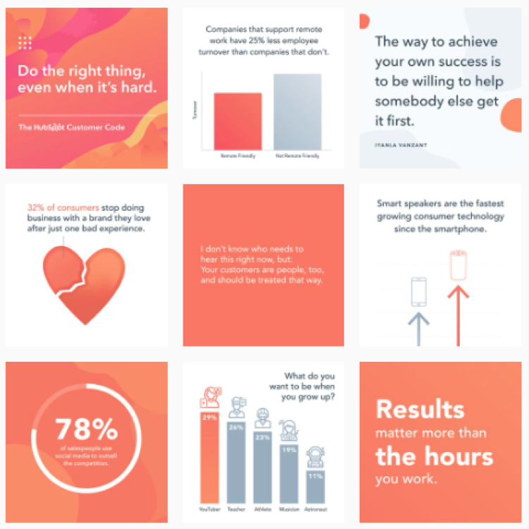
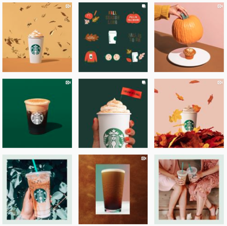
  •  Consistency is key so make sure your photos reflect your brand’s personality. Users should instantly know it’s you when they scroll by! For example, here are two feeds that have a clear and recognizable look: 

Hubspot

Hubspot

Starbucks

Starbucks

  •  Brush up on different composition techniques and experiment with them in your shoots. You’ll want to establish your own style over time, but if you’re just getting started there’s a few things that are usually a hit on social: 

    • Rule of thirds: Divide your photo into thirds (horizontally and vertically) and sit your product on the intersecting lines. More on that here

    • Rule of odds: Put five bracelets in the frame instead of four, it’s usually more appealing. 

    • Negative space: Ensure the space surrounding the product takes up more space than the product itself. 

    • Centered composition: Place your product in the middle of the frame. This will ensure your image crops well no matter where it’s being previewed. 

  • Play with your exposure until your photos find the right balance. Or, play around with under and over exposure to give your images a signature style!

Pinterest 

Need tips on creating a branded look? We can help with that – check out this post

On Pinterest, image quality reigns! Like Pinterest, Instagram is a visual platform – but Pinterest offers even less context than an Instagram post. Think of your picture as the preview for your whole webpage – even though you can create a long pin, you’ll want to get key text and a few grabby images up above the fold. 

  • Pinterest recommends a 2:3 aspect ratio (ex: 1000 x 1500 pixels). Other ratios may cause your Pin to truncate and may negatively impact performance.

  • Just like Instagram, you’ll want to bring consistency to your feed by establishing clear and consistent branding. 

  • The images you pick should help people understand why your product or idea is the right fit for them. Pick images that show context and bring your topic to life. Clearly show how someone might use your product, try your project, etc.

  • Text overlay can make your Pins stand out, adds context, and enhances your message. Keep text concise so it’s easy for people to read on their phones.


Hue & Tone: Let’s Get Social Together

Need help overhauling the look of your social media? Whether it’s your creating custom images or finding the perfect photo, we’ve got the solution that fits your needs. Get in touch at (336) 365-8559 or hannah@hueandtonecreative.com to find out more.

5 tips for your LinkedIn business page

LinkedIn is by far the biggest lead-generating platform for businesses -- and it has been for quite some years. While Twitter (12.73%) and Facebook (6.73%) have their place, the professional networking site brings in 80% of all B2B social media leads.

Wondering why you’re yet to see this type of return from your page? It could be because you’re not maximizing all the opportunities it offers. As well as the standard tips — posting regularly, liking other people’s stuff, and replying to comments — there’s lots more that can be done to:

  • Improve your engagement

  • Boost your brand’s awareness

  • Increase your followers

  • Generate more leads

  • Secure more conversions

There’s no point in doing something if you’re not going to do it right though, so here are five pointers to help you get the most out of your LinkedIn page.

5 tips for your LinkedIn business page  |  Hue & Tone Creative

Tip 1: Follow the 1-3-1 rule

In general, social media accounts should follow the rules of thirds: 1/3 promoting your product or services, 1/3 interacting with others, and 1/3 sharing industry news.

Now you don’t have to take these numbers as gospel, but the point is, don’t just make your page all about you. For every post you create that’s centred around something you sell or you’ve written, share a couple of valuable pieces or tips from around the web before you make it all about you again.

For example:

  • Post #1: an interesting stat from a third-party source 

  • Post #2: an article from your blog

  • Post #3: a promotional post about an upcoming sale

  • Post #4: a link to your latest whitepaper

  • Post #5: a thought-provoking read from a relevant author

Tip 2: Use tracking links

When you do link back to your site use a custom URL so you know it’s come from your LinkedIn page, that way you can start to get an understanding of what type of posts a) drive people back to your site and b) convert.

Not sure how? Here’s a campaign URL builder to help you.


Tip 3: Focus on the first line 

The first few words of your posts determine whether or not people stick around and read the rest or carry on scrolling, so if you want to keep people engaged make it all about them.

For example, instead of saying “We’ve got 10 tips on how to train for a marathon” say “ Here’s how you can smash your marathon training 10 different ways.”

If you’ve lured your audience in that doesn’t mean you can start going off on a tangent though. Make your updates short and sweet and keep the desired end action in mind throughout. For example, if it’s for someone to read more about service X, do you give them ample encouragement and resources to do just that?


4. Incorporate visual elements

Did you know? Video posts are five times more likely to get comments.

You’re probably sick of hearing about this one but it’s so important and something many businesses forget to do. Complementing your words with a catchy image or video helps to bring your feed to life, grab your audience’s attention, and give people an instant flavor of what your posts are about.

And remember, neither has to cost a fortune. You can make smart looking videos on your smartphone nowadays (find out how herehere and here) and there are a whole load of free photo sites out there (Pixabay and Unsplash just to name two). 


5. Optimize your page

The same way Google ranks your website’s content, LinkedIn ranks your company page based on the information you include — especially in your ‘About Us’ section. So, take your time to write something compelling and remember to include key terms people are likely to search for.


Hue & Tone Creative: Your Marketing Partners

With a million other things on your to-do list, giving your LinkedIn page the TLC it needs can soon slip off the radar -- we get that and we can help. Whether you need support with your words, images, or the whole platform, get in touch at hannah@hueandtonecreative.com or (336) 365-8559 to see what we can do for you. 

Improve your LinkedIn engagement by following these steps
twenty20_b8bdcee6-5261-42ef-962b-ddae20688226.jpg

More than 500 million people use LinkedIn every single day. On average, two professionals join the platform every second. Two-fifths of B2B social media leads come from LinkedIn. And 91 percent of executives rate it as their first choice for professionally relevant insights. 

What does all that mean? It means that there are a whole lot of people and organizations who are thirsty for your content and ready to connect.

But too often, LinkedIn users prioritize quantity over quality. Here’s one common misconception:

More posts = more visibility = more leads.

 Wrong. 

Your mindset should alwaysbe quality over quantity. After all, you’d rather have one post a week that generates 15 leads than seven a week that return nothing, right?

Here are some pointers to help you create lead-winning LinkedIn posts.

Tip 1: Don’t always include links

They take people away from the platform and LinkedIn doesn’t like that, and if LinkedIn doesn’t like something their algorithm is more likely to penalize your post. 

Remember, this also applies to videos. Instead of pointing people to your YouTube page upload it as a native video to please the platform you’re publishing on. 

New to videos? Here’s how to get started on your smartphone.


Tip 2: Focus on your length

The general consensus among users and LinkedIn professionals is that longer posts tend to perform better, so don’t be afraid of using your full 1,300 character limit. 

Not sure what to talk about? Steal some ideas here.


Improve your LinkedIn engagement by following these steps  |  Hue & Tone Creative

Tip 3: Use emojis

They stand out from the rest of your text and catch people’s attention as they’re scrolling down. But remember, moderation is key. Going emoji crazy every other word will just a) make your post hard to read, b) turn people off, and c) look a little childish.


Tip 4: Like what you post 

Of course you like it, that’s why you published it! But that’s not the reason. Liking your own comments and posts can help spread your content further around the platform.


Tip 5: Give a little, get a lot

Don’t expect an encore of engagement if you don’t ever do the same to others. Like and comment on other people’s posts and they’ll be more likely to return the favor.


Tip 6: Stick to text-only

Keep it simple with text-only posts. On average, they earn more comments and views than their image and video counterparts. 


Tip 7: Speak directly to your audience

Refrain from starting your post with words like “we” and “I”. Some better alternatives include:

  • You

  • Your

  • How to

They put the focus onto the reader and show it’s all about helping them.


Tip 8: People do business with people

Give your audience a bit of insight into who you are and what you’re about - just be careful not to let these posts overpower your lead-generating ones.


Tip 9: Pick the right time

Sprout Social says the best time to post on LinkedIn is either between 9-10am or at 12pm on Wednesday...but don’t get too derailed by that. Different audiences have different behaviors, so before you get too stuck in a routine that may or may not be working do a bit of trial and error to see what works best for you.


 Hue & Tone: Social Media and Graphic Design

Whatever stage of social experience you have, whichever platform’s you are on and no matter what your goals may be, we’ve got the ingredients you need for social media success. Drop us a line on hannah@hueandtonecreative.com or give us a call on (336) 365-8559 to start improving your engagement today.

Belief in business: 2019 is the year of woke advertising

You’ve likely seen and heard about Gillette’s ‘The Best Men Can Be’ ad. This ad reignited the debate on whether or not there’s a place for advertisers to take a moral, ethical, or political stance in their marketing. While the Gillette ad is the latest ad to provoke this debate, it certainly isn’t the first of its kind. Cause marketing ads have been around for some time – for example, Procter & Gamble’s ‘The Talk ’and Nike’s ‘Dream Crazier' promos.


What is woke advertising?

Woke storefront art, anyone?

Woke storefront art, anyone?

The slang term ‘woke’ refers to awareness around “important facts and issues - especially issues of racial and social justice.” Woke advertising doesn’t promote a product, instead, it focuses on real-life, political or moral topics.

Historically, brands have avoided contentious topics for fear of upsetting, disgruntling, or outright alienating their audience. But, in an increasingly polarized political climate, playing on identity and political belief can lead to a big buy-in. 

And, as a rule, we’ve seen it works. 

After Nike’s use of Colin Kaepernick in their ‘Just Do It’ ad, the company reported a 6.25 per cent increase in their stock post-campaign, which equated to a healthy $6.38 billion boost to the business’ overall value. 

It’s not always rosy though. Let’s take a look at Pepsi’s attempt to get in on the social justice action with their 2017 ad featuring Kendall Jenner, which took place against the backdrop of the Black Lives Matter movement. The soda company was criticized for trivializing such a sensitive subject, and they received some very frank feedback on social media as a result. 


Is there a place for it? 

When it comes to whether or not there’s a place for woke advertising, opinions are split. Personally, we see brands taking a stand on something as a positive step… but only if they back up their words and advertisements with their actions.

While consumers are practically demanding companies believe in something other than boosting their sales, promoting a political agenda in a country that thrives on call out culture is risky business. While relating to your consumers on a value level is a great way to stand out, if you don’t back your beliefs up with brand culture and moral business activity, you risk consumers writing you off forever. 

To us, successful woke advertising means aligning your beliefs to your brand’s culture and ethos, and going out of your way to support the cause you’re rallying around. It’s not enough to take an empty stand on a talked-about political topic for the sole purpose of boosting brand awareness. It’s transparent and empty. Most customers are attuned to the fact that woke advertising is a strategic plan to support sales, and it’s unlikely they’ll be easily fooled by hollow words.

Here’s a few examples of companies that put their money where their mouth is --

Belief in business: 2019 is the year of woke advertising  |  Hue & Tone Creative
  • TOMS: One for one. For every TOMS product that’s purchased, the company helps a person in need. You can find out more about their model here.

  • Cora: Cora’s an organic tampon company, and they put aside a percentage of their monthly revenue to provide people in India with sustainable period management solutions.

  • Patagonia: One of the first defenders of environmental ethics, Patagonia uses recycled materials and organic cotton, and, working with Fair Trade Certified factories in India, Sri Lanka and Los Angeles, is an advocate of labor ethics too. 

  • IKEA: For starters, IKEA sources 50% of their wood from sustainable foresters and 100% of their cotton from farms that meet Better Cotton standards. Secondly, they use hundreds and thousands of solar panels to power their stores, and strive to be powered by 100% renewables by 2020.

It’s not for the faint hearted

Keep in mind it’s impossible to please everyone - even the woke ads that positively boosted business revenue received negative backlash. 

They used to say there’s no such thing as bad publicity – but in the age of social media, that’s obviously not true. If you’re thinking about taking a bold political stance, make sure you’re fully educated on the issue and that you actually consult with the group or cause you’re talking about.

Don’t assume you know how others will feel or react – and don’t make your marketing choices in an echo chamber of homogenous decision makers. If you look around the room, and you’re staring at all white men, you probably shouldn’t put out an ad about the black community. If you do, we would suggest brushing up your crisis communication plan.  

Speaking of crisis communication plans, let’s see what happened when Pepsi decided to release their ad with Kendall Jenner… 

“Lmao Pepsi’s new ad Kendall Jenner ‘end racism’ by handing police men a Pepsi - way to degrade 50 yrs of black/minority struggle” @HanorahHardy tweeted.

And another Twitter user posted:

Once Pepsi realized the errors of their ways, they soon pulled the ad and released a statement explaining their intentions and apologizing for the damage done: 

“Pepsi was trying to project a global message of unity, peace and understanding,” they commented to the Associated Press. “Clearly we missed the mark, and we apologize.” 

There was nothing published to suggest the soda company suffered long-term financial repercussions, but there’s also good chance that kind of intel would be kept behind closed doors. 

Big brand names like Nike, Gillette and Pepsi can afford to take a gamble. If things don’t go as planned and their sales take a hit, they won’t go out of business. But is this true for you? Before you make a bold proclamation about the beliefs of your business, make sure you have a solid fall back strategy in place. 

What’s your opinion when it comes to woke advertising? We’d love to hear your thoughts in the comments below or on our Facebook and  Twitter pages!


Hue & Tone: Your Marketing Partners

Whether you’re looking to make a big splash or just build your online community, we would love to help you fine tune your digital presence. If you need a fresh set of social templates, help with your general messaging, or a full-time community manager, we believe Hue & Tone Creative might be a good fit for you.

Real Estate: How to effectively use social media to market your listings
How to Effectively Use Social Media to Market Your Listings  |  Hue & Tone Creative

Most real estate agents have a social media presence – but having an account and using it effectively are two totally different things. 

If used properly, social media can help you create connections with potential buyers or sellers, help you share your expertise, and let people get a sense of your personality. It’s also a great way for new realtors to let buyers, sellers, renters, and other realtors know you’re joining in the game. 

Whether you specialize in working with first time buyers or seasoned investors, defining and refining your social media strategy will always benefit your business. From stories to geo-targeting and anti-spamming, we’ve got five on-trend tactics to help you give your presence a boost.


Use pictures to pique interest

Our pet peeve? Realtors who put the property listing link in their Instagram caption! That link isn’t clickable – and including it there not only annoys your followers, it makes it obvious you don’t know best social media practices. Need to include a lot of links? Check out Linktree 

Golden rule number one: don’t just post the link to your listing and expect people to click it. But equally, don’t forget to include the link altogether! If there’s one way to irritate your followers, it’s to post an awesome looking property, without a link, and expect them to trawl through your site to find it themselves.

To really catch peoples’ eye, get creative with your photography and consider venturing into the realm of videos. Instead of just sharing the property’s location and price, share your personality, throw in fun community facts, and highlight what’s unique about the house. 


Start sharing social stories 

Social stories are big no matter what business sector you’re in -- but in real estate, they provide the perfect platform to bring your properties and brand to life, give exclusive behind the scenes insights, and drive both engagement and authenticity with real-time content. 

The beauty of social stories is that they needn’t require cutting edge technology or editing skills, either. Raw footage can often be more relatable, so next time you’re checking out a property, why not grab some footage on-the-go and give your followers a bit of a teaser?


Don’t be a social spammer

This might seem contradictory given this article is all about marketing your listings, but don’t justpost about your listings on social media. If you do, you run the risk of overbearing your followers with relentless sales-lead content, which could result in them hitting that dreaded unfollow button.

Instead, mix up your feeds with a blend of listings, blogs, tips, advice, guidance, fun facts, ideas, and testimonials. It’ll ensure your feed doesn’t start looking stale, and will allow you to provide your audience with a variety of genuinely useful content.


Don’t forget to be…social

Social engagement is a two-way street. Whether it’s on Facebook, Twitter, Instagram or Pinterest - and every other platform in between, if someone’s made the effort to comment on one of your posts or send you a message, always reply - promptly.

Replying is especially important if you’ve received a negative comment – instead of ignoring the question, engage and stop a negative interaction in it’s tracks. Thoughtful feedback can often clear up a misunderstanding – and if nothing else, it will show that you’re responsive and reasonable. 


Tap into geo-targeting

If you’re looking to promote posts and you operate across a wide geographic area, be sure to utilize geotargeting with your ads. Instead of bombarding your entire base with listings that aren’t in the same city, take a strategic approach and target your audience based on their location. 

 It’ll increase your engagement ratio on the posts, and ensure you don’t become a nuisance by sharing irrelevant content. If you’re new to the world of geo targetinghere is a simple guide talking you through how to do the doing.


Hue & Tone Creative: Serving Greensboro and beyond

If you’re not sure where to start or simply don’t have the time to execute your business’ social media strategy, then we’re here to help. Contact us today at (336) 365-8559 or hannah@hueandtonecreative.com to see where we can fit into your business strategy.

Expand your sales by selling on Instagram
Expand your sales by selling on Instagram  |  Hue & Tone Creative

Sales are down, and you’re looking for creative marketing strategies to help boost them. Enter shoppable posts.

As Instagram’s grown in influence, so has the sophistication of its sales funnel. Shoppable posts take Instagram’s selling cycle one step further, streamline the user’s journey, and boost your business’ odds of converting followers into customers. 

With around 90 million Instagram accounts tapping on a shoppable post every month, they might just be that sweet spot your business has been missing.

Not sure how or where to start? Not to worry. We’ve covered the A to Z of everything you need to know to get going.


What are shoppable posts?


In a nutshell, shoppable posts enable Instagram users to complete the entire purchase journey - from discovery all the way through to checkout - without ever leaving the app. The benefit to you? Less steps. Less chance of distraction. Less chance of losing customers.

On or off Instagram, your customer journey is crucial. For starters, almost three quarters (76%) of consumers cite it as an important pre-purchase factor. But did you also know, 86% of customers say they’re actually willing to pay more for a great user experience?

Looking at Instagram alone, here are some successful case studies from brands who use shoppable posts as part of there social strategy:

  • Spearmint LOVE witnessed a 25% increase in traffic and 8% uplift in revenue

  • Tyme saw their web traffic rise by 44%

  • Lulus attributes more than 100,000 site visits and 1,200 product orders to shoppers who started on Instagram

Here’s what it looks like in practice:


With more than 200 million Instagram accounts viewing at least one business profile per day, shoppable posts unlock the door to a whole load of opportunities.

A few quick-fire facts:

  • You can tag up to five products per image or video

  • A maximum of 20 products can be tagged per carousel

  • When you tag products in Instagram, they’re shared on the explore section (where 200 million accounts visit daily) as well as with your immediate audience

  • Products can be tagged within stories too, by using what’s called a ‘product sticker’. We’ll delve into the detail of how this differs a little later on, but below’s a snapshot of how product stickers vary from shoppable posts

A step-by-step guide

So, let’s get started with the details of how to actually create your own shoppable Instagram posts. 


1.  Account requirements 

To be able to make the most of shoppable posts, there are a few boxes you need to tick:

  • Your business must be located in certain countries (if you’re in the US, don’t worry, you’re covered). For a full list of countries that are and aren’t included, head here

  • Your Instagram account must primarily sell physical goods

  • You must convert your account to a business profile

  • You must comply with Instagram’s commerce policies

  • Your Instagram business profile must be hooked up to a Facebook catalog

  • Your Facebook profile (which must also be a business page) can’t have any country or age restrictions attached to it


2. Facebook catalogs

As we just touched on, to enable shoppable posts, your Instagram account must be associated with a Facebook catalog. In its simplest form, a Facebook catalog is a hub containing information on each of the items you want to sell - like their name, price, condition and category, and looks like this:

Image via facebook.com

Image via facebook.com

Now, there are one of two ways you can go about setting your Facebook catalog up:

  • Option A: Add a shop to your Facebook page. Find out how to do this in five simple steps here.

  • Option B: Use a catalog on Business Manager. This guide will walk you through the set-up process.

3. Account review

Once you’ve hooked your Instagram profile up to a Facebook catalog it’s a bit of a waiting game because, before you can start exploring Instagram’s shopping feature, your account has to be reviewed - this’ll happen automatically. Typically, it takes a few days for the review to complete, however, it may take longer if your account needs to be reviewed in more detail.

It’s worth noting that if you’re creating your very first Facebook catalog, the catalog itself will need to be reviewed before your automatic review can commence.


4. Start adding tags and/or stickers

The penultimate step revolves around actually adding your product tags and/or stickers on Instagram. Before you get going, here are a couple of points to bear in mind:

  • Before you can add tags or stickers, your Instagram account must be approved for shopping. If it’s not, you’ll hit a dead end; and

  • Make sure you’re using the latest version of Instagram’s app to ensure you’re utilizing all its latest updates.

If you’re up to speed with everything you ought to be at this point, then you’re ready to turn on your product tags. To do this, just work your way through these easy-to-follow steps:


1.  Head to your Instagram business profile

2. At the top right of your screen, you should see an ellipsis (…) - click on it

3. Look out for the ‘Shopping’ option under the ‘Business settings’ tab and tap into it

4. Hit ‘Continue’

5. See which product catalog you want to use within your shoppable posts and select it

6. Voila. You’re set-up and ready to start tagging products in your posts and/or stories.


5. Creating the actual post

So, you’ve got all the ingredients you need to create a shoppable post or story, now it’s time to pull the final concoction together. 

Shoppable posts 

As we touched on earlier, you can tag up to a maximum of five products per single picture and 20 products per carousel (i.e. a series of images within one post). 

Each tag will show the name and price of the item in question, and if you want, you have the option to go back and add tags into old posts, too.

Shoppable stories

Instagram stories work slightly differently. For starters, you use what’s called a ‘product sticker’ which showcases the product’s name - but not the price. You are, however, given a bit more personalization flexibility with stickers, in that you can edit their color and text. 

Unlike with shoppable posts, you can’tadd product stickers to already published stories. If you want to add a sticker to an already-published story, you’ll have to delete and re-publish it with the product sticker.


The creation process: 

1.   Create your Instagram post or story as you normally would.

2a. If you’re pulling a post together, click ‘Tag products’ on the ‘Share’ screen.

2b. If you’re making a story, tap the sticker icon and then hit the product sticker option.

3. Whether you’re following the instructions for a post or a story, you’ll be presented with your product catalog - choose which one you want to tag and drop it on or close to the item you want to promote.

4. Share your post or story and prepare to monitor the traction you get from your product tags or stickers - you can do this by heading to the ‘Insights’ section of the app (for posts, tap ‘View Insights’ on your chosen shopping post, and for stories just swipe up once you’re in the story).


Hue & Tone: Your Social Media Partners

Overwhelmed just reading this guide? Ready to see your business' Instagram sales shoot up? See how we can help amplify your efforts today by getting in touch with the team at (336) 365-8559. 

Forecasting for 2019: Social Media Trends

Social media continued to dominate the world of marketing through 2018. From an increase in live streaming and Instagram stories to customized chatbots and an ever-increasing emphasis on social listening, brands all over the globe have been improving their tactics by carefully tracking each platform’s changing trends.

Because social media’s constantly evolving, what works today won’t necessarily work tomorrow -so let’s take a look at what we predict is on the horizon for 2019.

Forecasting for 2019: social media trends  |  Hue & Tone Creative

Authenticity

Social scandals were rife last year. From fake news to personal data breaches, social media made the headlines for all the wrong reasons, causing users to really question who they could trust.

As a direct result, 2019’s expected to bring a change in what kind of content is popular. Instead of focusing on social reach, brands are likely to shift their focus to creating genuinely meaningful, transparent and personalized content. This’ll inevitably increase the time it takes to create quality social media content, but the level of engagement that comes as a result will likely justify the time investment.


Social stories

Social media stories grew at an exponential rate in 2018 and there’s no sign of that growth slowing down in 2019. According to findings published by Block Party, social stories are growing 15 times faster than feed-based updates, and some believe they’re set to surpass it completely in the not-too-distant future.

 If you’re not already on the social stories bandwagon, it’s certainly time to hop on board. But remember, stories require a different approach to be effective. Instead of being static updates (like with your feed), they should be live (even raw), provide a narrative, be personal, and give your followers a glimpse behind the scenes.


Instant messaging

 Facebook Messenger and WhatsApp now boast 2.8 billion users between them. That’s a whole load of potential interaction. The jury’s still out on whether instant messaging intrudes customers’ personal space, but there’s no denying that it’s worth trying out with your customer base. 

In an almost completely digital world, 89% of consumers are crying out for businesses to branch out into instant messaging apps for their customer service. However, the same study uncovered only 48% of companies are equipped to do so. That’s a lofty gap to close in order to meet consumers’ expectations – and we expect the gap will begin to close in 2019.


Dimensional ads

Over the years, social media ads have become saturated. Whether it’s a sponsored story, promoted post, or suggested follow, the majority of businesses invest in them, which has lead to increase in prices and a chance in consumer mindset. 

Social ad overload has begun turning audiences off – and many social media users are so inundated they’re starting to become oblivious.

Big brands like Spotify and Netflix have already taken their paid social approach to the next level by building them into full-fledged campaigns that incorporate videos, motion graphics, and narratives. These multichannel platforms are focused on driving engagement, upping discussion, and building trust. In 2019, it’s expected many other businesses will follow suit to stand out from an increasingly competitive crowd.


Groups 

1.4 billion Facebook users tap into the platform’s groups every month, and their usage saw a 40% uplift in the last year alone. Groups are valued by consumers for their intimacy, and because they allow consumers to hold more meaningful discussions in a relatively private forum.

Tapping into this trend requires additional patience and planning – but those who put in the work can expect to see big gains in trust in 2019. 


Hue & Tone Creative: Social Media Services

If you need a hand getting your business’ social media in shape for 2019 (and beyond), then you’ve found the right site. Get in touch with our team today at (336) 365-8559 to see what we can do for you.

5 ways to incorporate social media into your placemaking
5 ways to incorporate social media into your placemaking  |  Hue & Tone Creative

Here at Hue & Tone Creative, we love working on projects that contribute to a sense of place – especially if that place is our hometown of Greensboro, NC. 

Throughout our work with spaces like Revolution Mill, we’ve developed an interest in all things placemaking, economic development, and real estate related. Whether you’re a marketing generalist or, like us, you strive to take on more economic development projects, we believe placemaking is a concept every marketer should be familiar with. The methods used in effective placemaking can be applied to a number of campaigns across a wide range of industries. 

The Project for Public Spaces (PPS) defines placemaking as “a collaborative process by which we can shape our public realm in order to maximize shared value. More than just promoting better urban design, placemaking facilitates creative patterns of use, paying particular attention to the physical, cultural, and social identities that define a place and support its ongoing evolution.” 

Placemaking is all about creating spaces and places that people want to be – places where citizens feel comfortable living, learning, working, and playing. These places are people friendly, visually interesting, accessible, and memorable. 

Robert Steuteville, editor of Public Square: A CNU Journalargues that a Quality Place possesses the following features: 

  •  A mix of uses

  • Effective public spaces

  • Broadband capability

  • Multiple transportation options

  • Multiple housing options

  • Preservation of historic structure

  • Respect community heritage

  • Arts, culture, and creativity

  • Recreation

  • Green space

  • Quiet, unless they are designed to be otherwise

Now that you know what placemaking is, it’s time to figure out how to marry your social media strategy with more traditional placemaking efforts. That’s called Digital Placemaking – and PPS defines it as “the integration of social media into Placemaking practices, which are community-centered, encouraging public participation, collaboration, and transparency.”

As you start to incorporate social media into your placemaking efforts, here’s 5 ideas you can use as a springboard for your brainstorming: 


1. Use social to amplify temporary placemaking efforts

Temporary placemaking is the bootstrap version of true placemaking – and it’s perfect for activating areas people perceive as unsafe. It allows you to experiment with a variety of ideas on a smaller scale, and then grow what worked.  

Good examples of this are an interactive art project, an activity or game, or an event. Even something small like an Instagram-able mural or photo background can help transform an otherwise unused wall. 

 Once you have your project in place, set up a hashtag and a sign or photobooth that will encourage people to use and share their experience. 

5 ways to incorporate social media into your placemaking | Hue & Tone Creative

2. Use social media to establish your city/space as a tastemaker

Instead of hiring influencers, it’s time to set your own trends -- start utilizing your social accounts to amplify your subject matter expertise. That means using your accounts to show off your expert knowledge about a place – Where do you get the best Pho? What boutique do visitors need to check out? What downtown city corner has an incredible history?  

Answer those questions for your followers and you won’t have to hire someone to show off what’s cool about your city or space.

Hashtagging properly and regularly interacting with followers will help activate people who already live in your city -- and long term you’ll be enticing new people to visit your neck of the woods.


3. Establish transparency using open source data

Did you know City of Greensboro does a good job of making public data available? Their open data program, “Open Gate City” was launched in 2016 to facilitate transparency, promote community engagement, and stimulate innovation. Open Gate City is a collaboration with Bloomberg Philanthropies' "What Works Cities Initiative."

Check it out here.

The idea behind open data is that data should be readily and freely available to the general public to use and republish as they wish. Additionally, the idea of open government means that access to government documents and proceedings allows for effective public oversight and protects against extensive state secrecy.  

City governments and public agencies can leverage open data to help build positive relationships with the public. In addition to building general good will, these open data efforts are a treasure trove of potential content for municipal marketing efforts. 

4. Create a hashtag campaign that encourages citizens to share their views  

Create a unique hashtag and use it as the central sharing point of your campaign. Embed the hashtag across all your touchpoints – social, web copy, print collateral, direct mail, email advertising, and online ads -- and encourage people to use it when they’re talking about your campaign (or your city).  

Don’t just sit behind your screen though! Hit the streets with merchandise, handouts, spray paint, or banners, and get to know the people you’re targeting. In-person marketing efforts are sure to connect with a new group, not just the same old group of active users that are constantly retweeting you. 


5. Use social media channels as a tool for crowdsourcing data 

With its exponential reach, social media is an incredibly powerful - and free - tool for crowdsourcing. If you’re stumped on what the public wants to see in a space, use social media to start running polls, start discussions, or gather feedback. 

The insights you gain can then be built into future stages of your placemaking campaign! 


Hue & Tone Creative: Your placemaking partner

Ready to brainstorm some fresh ideas? Or, maybe you just need the creative muscle to execute your ideas? Let’s talk and see if we make a good fit: 336-365-8559.

How to do a social media audit

Managing your businesses social media channels is a daily, if not hourly, endeavor. You get into the groove of posting regularly, and it makes it easy to forget about the big picture: your overall social media strategy.

If you’re finding it hard to remember the last time you reviewed your overarching social media strategy, it’s probably time to step back and do a social media audit.

In fact, routine audits should be an important element of your social media strategy. Regular audits will help you identify any weak points in your approach, give you more detailed information about your audience, and help you retool your strategy to match current trends. 

We would suggest doing an in-depth audit at least once a year in addition to a monthly or quarterly mini-audit. Doing a monthly check-in will give you a real-time idea of where you’re at with your goals, making it easier to pivot and adapt as you go. 

How to do a social media audit |  Hue & Tone Creative


Set goals for yourself

If you don’t have a set of measurements to grade yourself against, how will you know if your social media has been successful? 

Before you jump into your first social media audit, set some guidelines for what success looks like. There are many third party templates available – like this one from Sprout Social– or you can set your own goals. 

You’ll want to review the following for each profile: 

  • Engagement numbers

  • Publishing frequency

  • Consistency

  • Audience demographics

  • Referral sources

  • Social media budget/ROI

  • Channel specific metrics 


Delve into the numbers

Whether you use built in analytics or an outside platform, you’ll want to make sure you’re checking in regularly to gauge the health of your social media channels. Analytics are invaluable in terms of steering your future strategy and ensuring you are tailoring your content to what works best for each platform.

A few basic things to be looking for:

  • Are you on the right platforms? There’s little value in investing time into daily Facebook posts if the majority of your audience uses LinkedIn. Even if you’ve already done this in the past, behaviors change, so make sure you’re up-to-date with current trends. Do some digging to find out where your audience actually is and refocus your efforts accordingly. 

  • Who is on your page? Thought you were marketing to young women, but most of your traffic is middle aged men? That’s good information to have so you can tailor your strategy accordingly. 

  • What content is most popular? What content is really connecting with you audience – and what isn’t? Consider cutting what isn’t connecting – especially if it’s content that’s taking up the bulk of your content creation time. 

  • When is your audience online? Built in analytics make it so you no longer have to guess about peak posting times. 

  • Don’t forget to track these stats all the way through to your web traffic. When people come over to your site from social media, how long are they staying? Are they happy with the links you’re serving them?

other MAINTENANCE steps

Once you’ve outlined the metrics you’ll use, there’s a few more things we suggest you do:

Need to display more than one link in your Instagram bio? LinkTree is the solution! Check it out here

1.    Go back to your bios

If you don’t regularly check in on your social media bios, you’ll probably be surprised how much has changed since you last updated it. Business objectives change, taglines get updated, and advertising campaigns shift focus – and your social media bios should reflect every one of these significant changes.

Your bio should be tailored to each platform, and no matter where it’s displayed your social bios should be short, snappy, and on-brand. You’ll want to make sure you’ve included an overview of your services, your location, and who you work with/for.


A great example of an Instagram bio

Trendy and affordable clothing boutique for professional women of all ages. Charlotte and Greensboro locations open M-F, 7a-5p. #BoutiqueName

Why it’s good: This bio tells you who this boutique is for, where they’re located and when they’re open. Chances are, that info covers most of the questions first time visitors would ask. Hashtags in Instagram bios are live links, making #BoutiqueName is a valuable use of space. 


A bad example of an Instagram bio

Great clothes, great prices. Founded in 2002, open daily. Visit www.URL.com for more. 

Why it’s bad: When you were founded is pretty much irrelevant information. And, this bio isn’t properly tailored for Instagram – that hyperlink should only be listed in the website field, because that’s the only place a URL is clickable.

How to do a social media audit |  Hue & Tone Creative

2. Refresh your imagery

Visual branding evolves over time – and your cover photos should evolve as well. Bonus points if you update them to fit the seasons, your most current advertising campaign, or special events. 

When it comes to cover photo quality, make sure you’re up to date with the latest trends. For example, most major brands have swapped out a high res image in favor of a video cover photo. If you opt to make the switch, you’ll want to make sure your video looks clear and loads quickly. 


3. Scan the web

Do a quick Google search and make sure there aren’t any profiles out there claiming to be you -- or that you don’t have any old profiles of your own lingering around. If there are, you could be losing out on some business-winning followers.  

If you do come across your own old profile, delete it. And if it’s someone else impersonating you, ask them to remove the page - if they don’t, report it.


4. Create new goals

Now that you’ve tracked and measured your goals, how are you going to improve and change them? Once you’ve concluded your social media audit be sure to set new goals that you hope to achieve in the next month, quarter, or year.  


Hue & Tone: Social Media Solutions for every business

If you need help refining or maintaining your social media strategy, you’ve made it to the right place! No matter what state your social media plan is in, we can help you get your profiles back on track. We can even do the posting for you! To learn more, get in touch with us.

10 accounts every designer needs to follow on Instagram

When it comes to finding design inspiration, Instagram can serve as your personal playground — it’s a gold mind for great content and inspiration… if you follow the right people, that is.

Whether you’re looking to get inspired for an upcoming photoshoot or you need to find a new font to try out, here are 10 awesome Instagram accounts every designer should tap into from time-to-time.


1.  logoinspirations 

If you’re stuck in a rut trying to create that standout logo, logoinspirations curates all the best identities out there to save you trawling the web. If you check out their highlights, you’ll find lots of tips, inspiration and tools.


2.  logonew

Sticking with the logo theme, logonew shares a healthy blend of sketches and digital concepts. From drones and eagles to bitmojis, bees and beer, their feed is brimming with variety that’s sure to set your creative wheels in motion.


3.  neil_a_stevens

Specializing in poster design, Neil’s Instagram illustrations are nothing short of ingenious. Whether you’re looking for digital or online inspo, his masterpieces will get your inspiration flowing -- and your jaw dropping.

eaters-collective-129481-unsplash.jpg

4.  darias88

In his own words, the owner of this account, Daniel Aristizábal, “brings forward new technologies to create stunning and inspiring artworks.” He’s constantly experimenting with new styles and is known for his mastery of turning everyday objects into something abstract, original, and colorful.


5.  mrseaves101

Run by an Australian artist called Gemma O’Brien, this account is packed with bold lettering, illustrations, andtypography. It’s vibrant, it’s edgy, and it encompasses a mix of bold artwork and beautiful snapshots from around the world.


6. handmadefont

Finding a font is no easy feat, but if it’s variety you’re after, handmadefont has you covered. From industrial, futuristic and floral looks, to street art, 3D and foodie feels, it curates a whole load of forward-thinking concepts. 


7. interaction_design_foundation

This one’s less actual artwork, more practical tips -- to help you achieve that perfect piece. With posts on everything from introducing lean UX and conducting heuristic evaluations to information visualization and color emotion, there’s something for everyone.


8. heystudio

Heystudio focuses on brand identity, editorial design, illustration, geometry, color and direct typography. All these topics are at the heart of what they do and their feed has a quirky and contemporary look. With clients like Apple, Vodafone and Oxfam on their books, they must be doing something right…


9. uiuxgifs

GIFs are on the up. If you’re looking to incorporate some on your site or in your social media and email campaigns but just can’t map out what you want, this feed’s full of animated inspiration.


10. velvetspectrum

Last but by certainly means not least, Velvet Spectrum houses a mix of typography, illustration and motion graphics. Oozing with dynamic color and careful composition, the updates are nothing short of electric.


Hue & Tone Creative

If you’ve hit a creative wall, we can help you take your artwork to the next level. We can work with you on every design project, no matter what the medium — no print or digital job is too small. To get an idea of what we can do, see some of the projects we’ve worked on in the past or get in touch.

When + why + how to create a new hashtag

Hashtags are everywhere on social media. You’ll see them tacked on to the end of Instagram posts, incorporated into the body of a tweet, and sparingly used on Facebook. They’re key for discovering and organizing social media posts – they make it easy for you to find additional posts on a related topic so that you can more easily contribute to the conversation on a topic.

 But, why should you start your own hashtag(s)? The easy answer is to group your posts together so that people can find more of your content. However, you don’t want to start randomly making hashtags with no rhyme or reason – that will only confuse people and further bury your content.  

Let’s dive into the why – and when – you start your own hashtag. 

When + why + how to create a new hashtag  |  Hue & Tone Creative

The why

Some hashtags are overused -- meaning they get a lot of reach – but after a while the content associated with them may turn into spam. Piggybacking off already popular hashtags can help get you a lot of reach, but your posts may also get lost in the shuffle. 


By creating your own, you can help convert a follower of a more general topic (for example, #marketing), into someone that follows you (#hueandtone). When people discover your content using a general hashtag, the theory is that they’ll want to see more, leading them click on your branded hashtag to see what else you have to offer.  

By creating your own hashtag, you’ll be able to: 

  • Stand out from the crowd

  • Cement credibility and establish authority

  • Increase your engagement and reach

  • Create cross-channel awareness (if you use it consistently) 

  • Be able to track posts other people make about your brand

The when

While there should be a solid reason beyond creating a new hashtag, we also suggest you have fun and play around with them. See what sticks before making it part of your brand identity. As an example, #ShareACoke, has become a staple part of Coca Cola’s social strategy. It works well, because it encourages recurring interaction and tagging. 

That said, some popular reasons for creating custom hashtags include:

  • Launching a new product, service, or campaign

  • Posting live updates from an event

  • Hosting a live chat or Q&A session

  • Running a competition

  • Establishing a general hashtag for your brand 

In each of the above instances, using previously and frequently used hashtags can cause havoc. Not only do they make it difficult for you to monitor, but it can confuse your audience. You don’t want to put your followers in the position of having to scroll through irrelevant content just to find what they’re looking for. 


How to create a hashtag in 5 simple steps 

When + why + how to create a new hashtag  |  Hue & Tone Creative

1.  First things first, define your goals. Some fairly common ones include increasing:

  • Brand conversations

  • Visibility

  • Total link clicks

  • Total reach

  • Mentions

  • Followers

  • Likes

Behavioral patterns vary on different networks, so if you’re using your new hashtag across multiple social channels, you should set goals specific for each one.


2.  The fun part - get creative! But make sure your hashtag’s the right balance between engaging and easily understandable -- if people don’t instantly grasp it, the effect’s kind of lost.

Here are some simple tips to start you off: 

  • Keep it short and snappy

  • Make it easy to remember

  • Ensure it’s relevant to your brand

  • Don’t make it too generic

  • Check it doesn’t have any obscure double meanings -- let’s not forget the #susanalbumparty fail!

3. Do your research. Make sure it’s not already in use on anysocial media networks, and double-check it doesn’t, for whatever reason, have any potentially offensive roots or connotations. 


4.  Make it actionable. At the end of the day, every marketer’s end goal is to drive revenue. Even if your hashtag’s goal is to increase social follows, the bigger picture is more sales. So, if you can, put an actionable spin on your new hashtag -- ask a question, play on an emotion, encourage engagement, or incite urgency, for example.


5.  Last but certainly not least, triple check your hashtag for typos and post it! See what kind of reaction you get, and if you feel like the tag falls flat after a handful of posts, then don’t be afraid to try out a new one. 


Hue & Tone Creative: SOCIAL MEDIA Services for Greensboro and beyond

Struggling to keep up with the comments, likes, and mentions on your posts? Can’t come up with a creative hashtag? Stumped for original content ideas? We can handle all of that for you. From multi-channel audits to content generation and social media monitoring, Hue & Tone is the solution for all your social media woes.