Posts tagged Economic Development
5 Economic Development Marketing Mistakes to Avoid
5 Economic Development Marketing Mistakes to Avoid  |  Hue & Tone Creative

If you work in the field of economic development, you already know what information is important to prospective companies, site selectors, and CEOs. But when you’re focused on selling your city, county, site, or state it can be easy to get entrenched in what you’re doing and make missteps on how you market your area. 

You may read a lot about best practices for your field – but what are the common blunders and worst practices in your industry? We’ve pulled together five mistakes we often see in economic development marketing. 


Mistake #1: Not defining your target industry 

Clearly marketing to a specific target industry shows that you know your area and have a solid understanding of what companies will best succeed there.  

Prospects want to know what kind of supply chain and workforce are available, and focusing on a specific industry allows you to better convey how your community will be able to serve their company. Back up your marketing towards a target industry with highlights from your labor market analysis, data, and maps that show the supply chain available to a prospective company. 


Mistake #2: Losing site of what makes you unique 

What’s truly unique about your area? Many regions promote themselves as pro-business or tout the benefits of their workforce… this message isn’t inherently bad, but it’s worth figuring out how to distinguish yourself from other areas that are promoting the same things. If you’re saying your area is pro-business, back it with specifics about the types of incentives being offered, state tax information, and information on local labor laws. 

But don’t stop there, really think outside the box about what sets you apart and then explain why potential investors should care. Quality of life, business climate, and workforce benefits are just the first step in attracting investors and talent – and they’re the same things that many other municipalities are touting. 


Mistake #3: Putting too much emphasis on your logo and tagline

Hue & Tone’s primary service is graphic design, so we feel confident saying no one thinks design is more important than us. That being said, we think it’s important to recognize that graphic design is only one piece of your marketing puzzle.  

While a strong, polished, and professional logo design is important, you can’t depend on it to do all the marketing for you. Strong messaging is a must when you’re asking people to invest the future of their company in your region. Let design complement well developed copy, a sound strategy, and well researched data, but don’t invest a disproportionate amount of your time and marketing budget into a logo and tagline. It would be misguided to expect a jazzy logo design to net you a big project. 

nasa-1lfI7wkGWZ4-unsplash.jpg5 Economic Development Marketing Mistakes to Avoid  |  Hue & Tone Creative

Mistake #4: Leaving the state out

Don’t make the mistake of assuming people know where you’re located – or even what state you’re in. Be sure to provide context for where you are and put your state name on everything. This extends to providing maps that show your city, site, or county in context of your state and the country. This is especially important if you’re dealing with international companies that may not know your country’s geography as well as you do.


Mistake #5: Not sourcing from existing companies

You’ve already got one of the most valuable resources at your fingertips – existing business. The best way to learn what will work for your marketing is to simply talk to the people have already decided to invest in your area. Grow your knowledge of what attracts companies to your city or state by speaking to the people that are already there and by building relationships with local corporate leaders. 

Developing these close relationships and improving your rapport with local companies will also open the door for future expansion projects. Ask local companies what services or products they would love to have closer – you may even find that some creative problem solving satisfies the needs of both existing and future investors.


These are just five of our top tips – what are yours? Do you disagree with any of the practices we’ve listed out here? 


Hue & Tone Creative: YOur partner in economic development marketing

Realize you’ve been making all of these blunders? Never fear — we’re here to help you get your region’s marketing back on track. Whether you’re trying to attract investors or tourists, we can give you the polished look you need to hold people’s attention.

8 cities with great branding

Think branding is just a logo? Think again — let us break it down for you here.

Behind every good-looking package or ad is a carefully investigated backstory, fastidiously selected colors, and meticulously outlined brand guidelines. While branding businesses is nothing new, businesses aren’t the only entities that need high-quality branding. Cities, townships, and entire countries have also begun branding their space in an effort to lure in tourists, new citizens, and potential business. 

8 cities with great branding  |  Hue & Tone Creative

Elements of place branding can include culture, visual symbols, slogans, mission, vision and values.

No matter what size your city is, branding can help put your place on the map. From America all the way over to Australia, here’s a look at some of the best: 

1. NYC

Milton Glaser’s ‘I <3 NY’ artwork is inarguably one of the most iconic city graphics around, but their branding doesn’t stop at one iconic t-shirt.

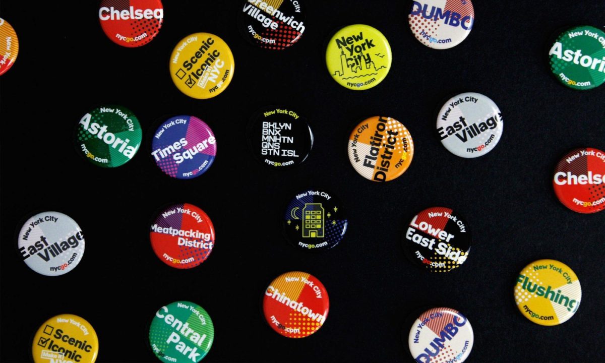
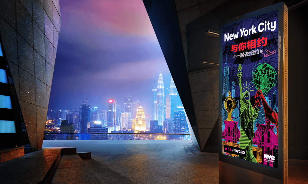
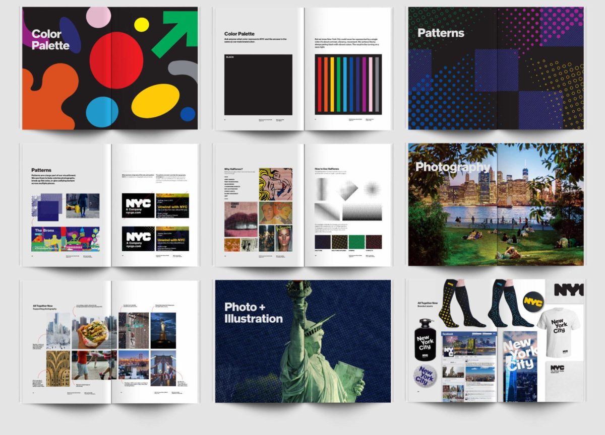
Bellweather was in charge of creating NYCgo’s official identity – and it reflects NYC’s personality with it’s bright colors, diversity and motion. Attracting more than 60 million visitors a year, the city clear doesn’t have a tourism problem – but this diverse and complex brand brings a life and continuity to the city’s visuals. 
Images via Bellweather and logoworks.com


2. Melbourne

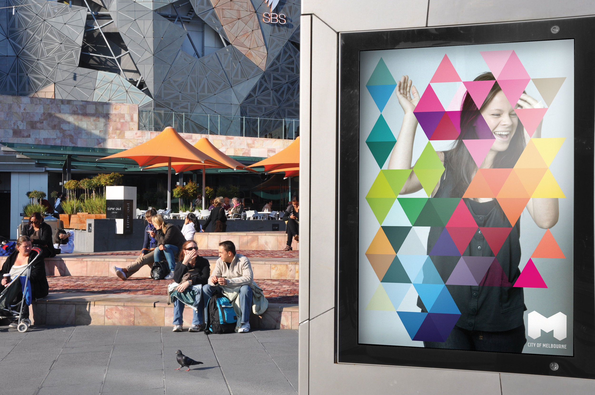
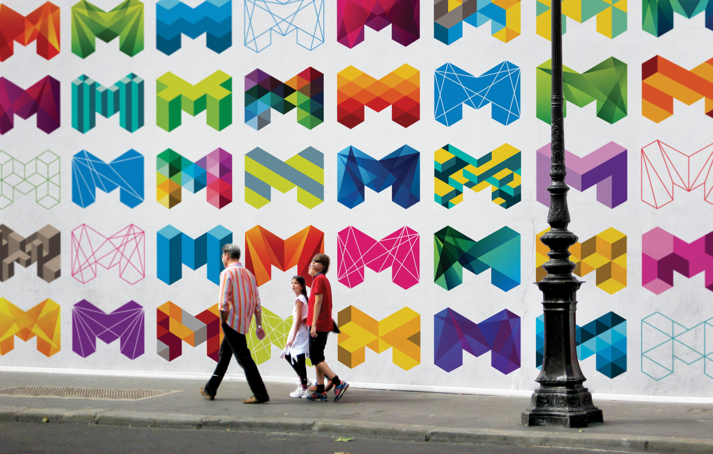
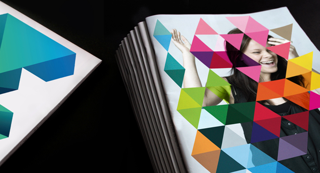
Developed by Landor, Melbourne’s logo is fresh, energetic, and memorable. Despite being around for a few years, this brand still feels modern and fresh — the sign of a well thought out and designed identity. Encompassing a wide variety of colors and patterns this vibrant brand is a reflection of all that Melbourne life has to offer.

Images via Landor.


3. Paris

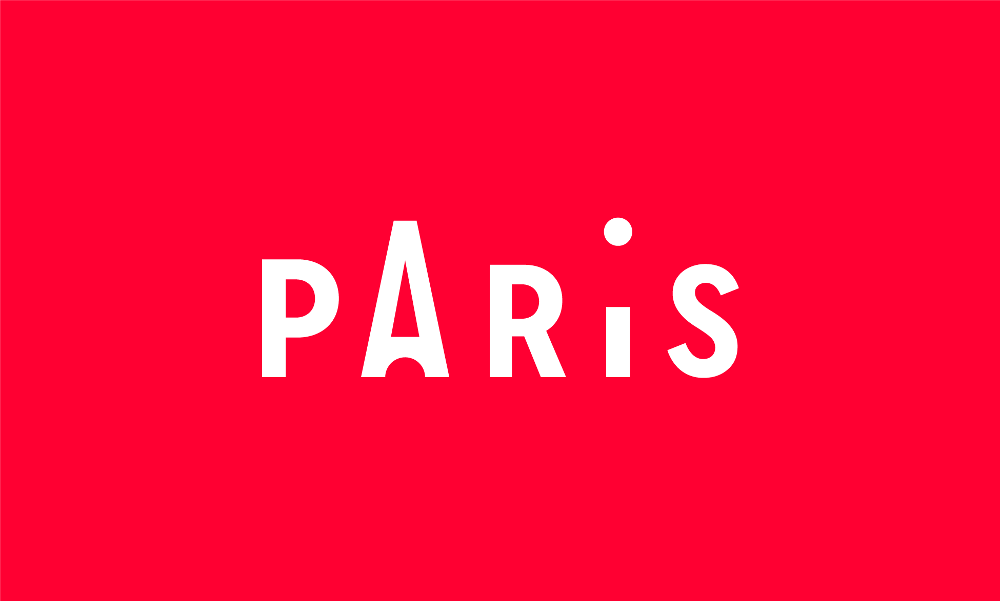
Paris’ most memorable brand doesn’t come from city government, but rather from their tourism organization, the Paris Convention and Visitors Bureau. Grapheine’s typographic masterpiece subtly incorporates the French capital’s most famous landmark. And, in our opinion, everything about the color, spacing, and typography are expertly executed… in addition to making Paris look pretty cool!

 Images via Graphiene.


4. I Amsterdam

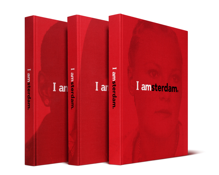
Renowned for sex, drugs, and canals, this 2004 campaign helped put Amsterdam back on the map for more than just a fun weekend away. This branding effort was born out of an effort to appeal not only to tourists, but also to those already living in the area.

Despite simple graphics, Kesselskramer’s message is incredibly complex and versatile.

Images via Kesselskramer.


5. Las Vegas

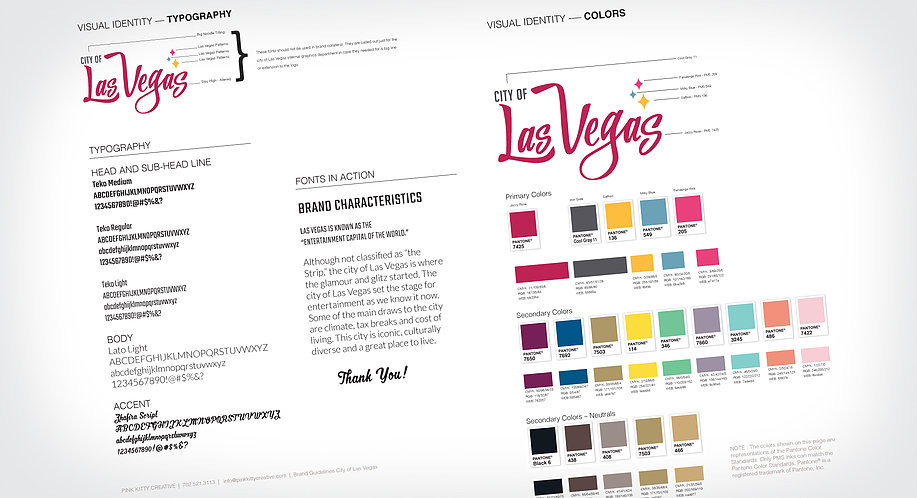
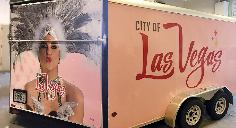
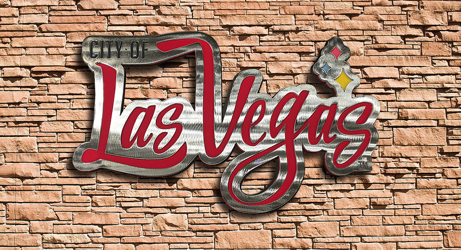
Funky, fun and full of color, Pink Kitty Creative’s city government branding depicts everything Las Vegas stands for in one: bright lights, late nights, and lots of laughter. While we find the “City of” typography a bit weak, we enjoy the color palette and playfulness of the logo. 


6. London

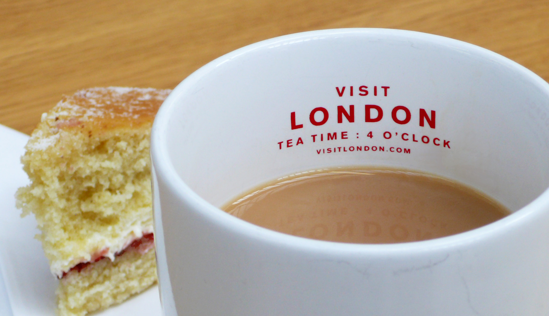
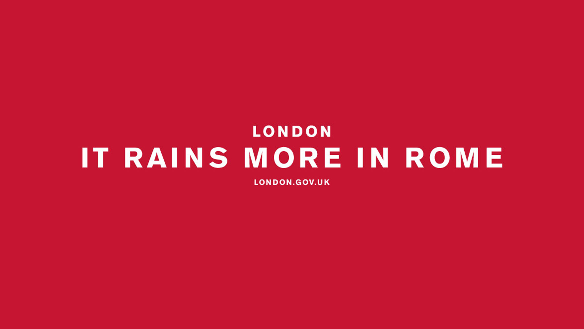
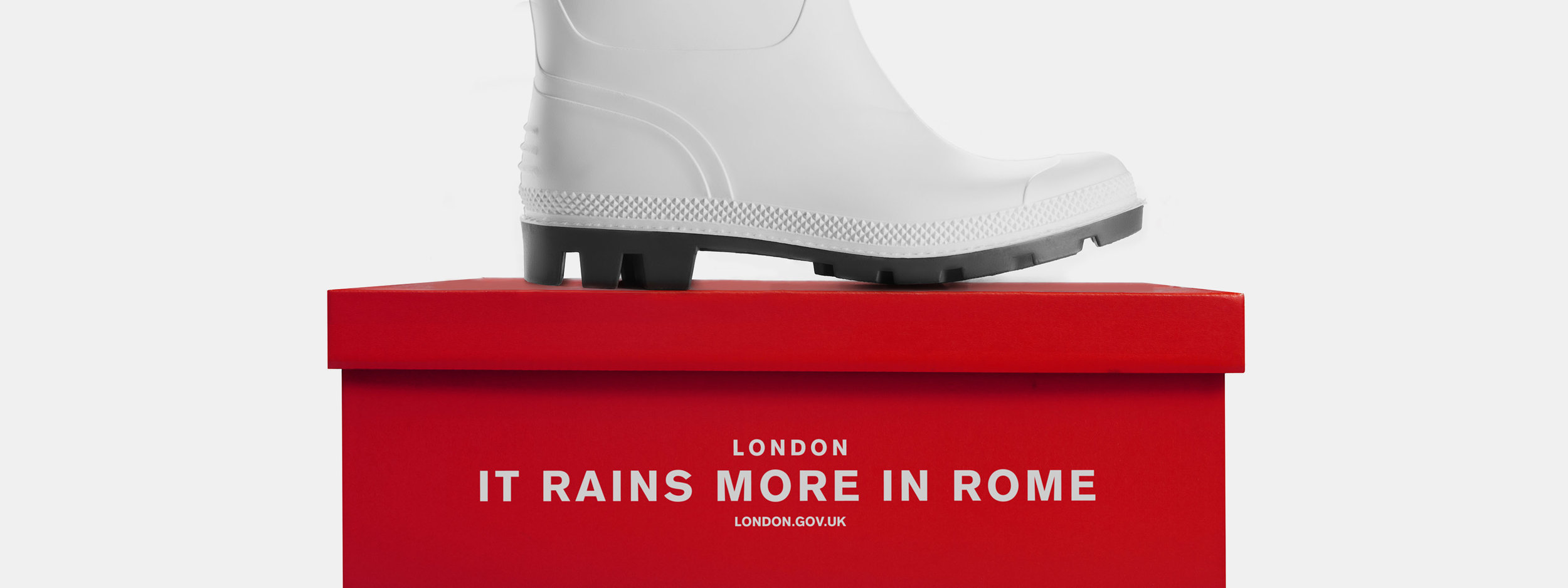
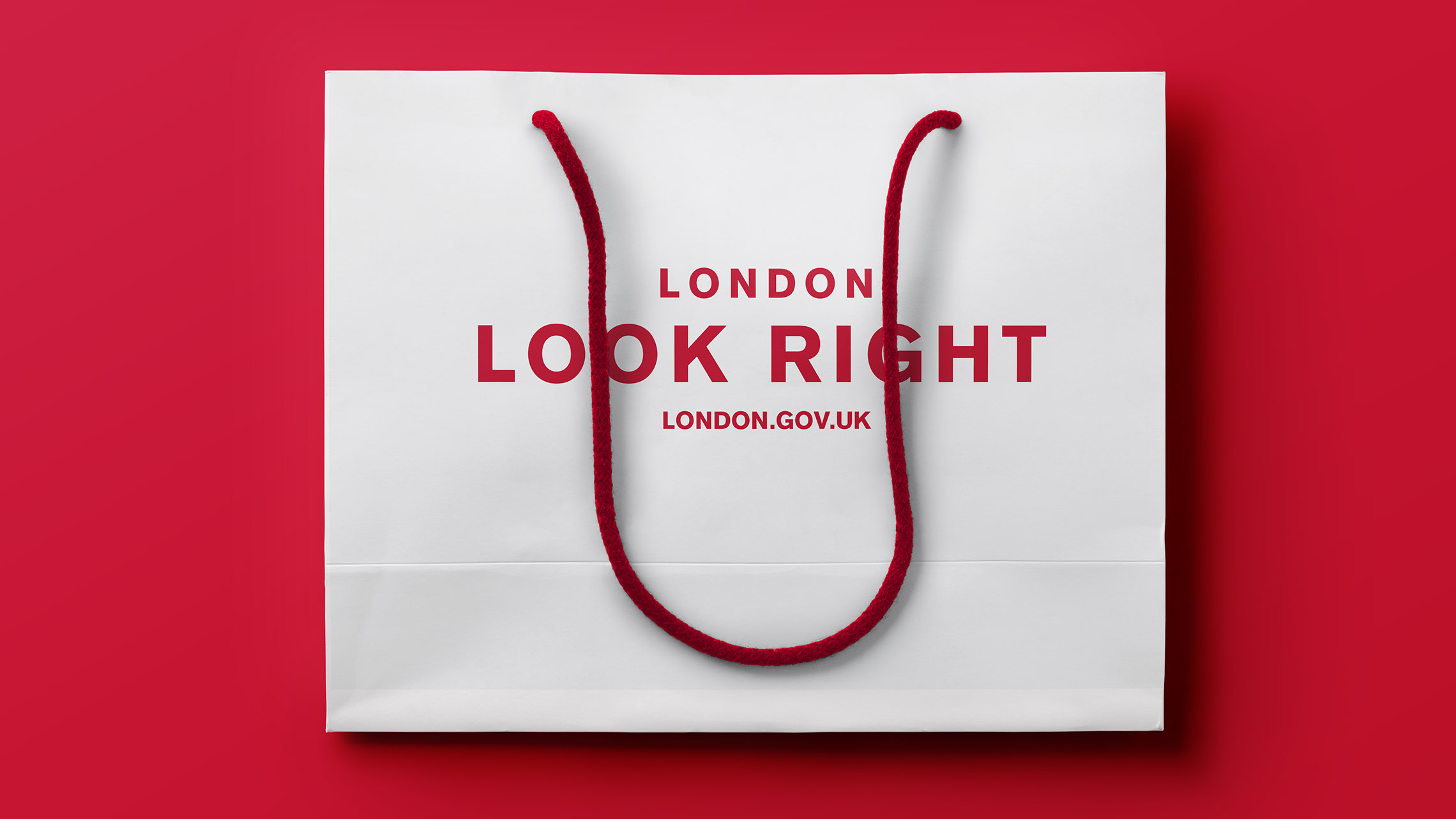
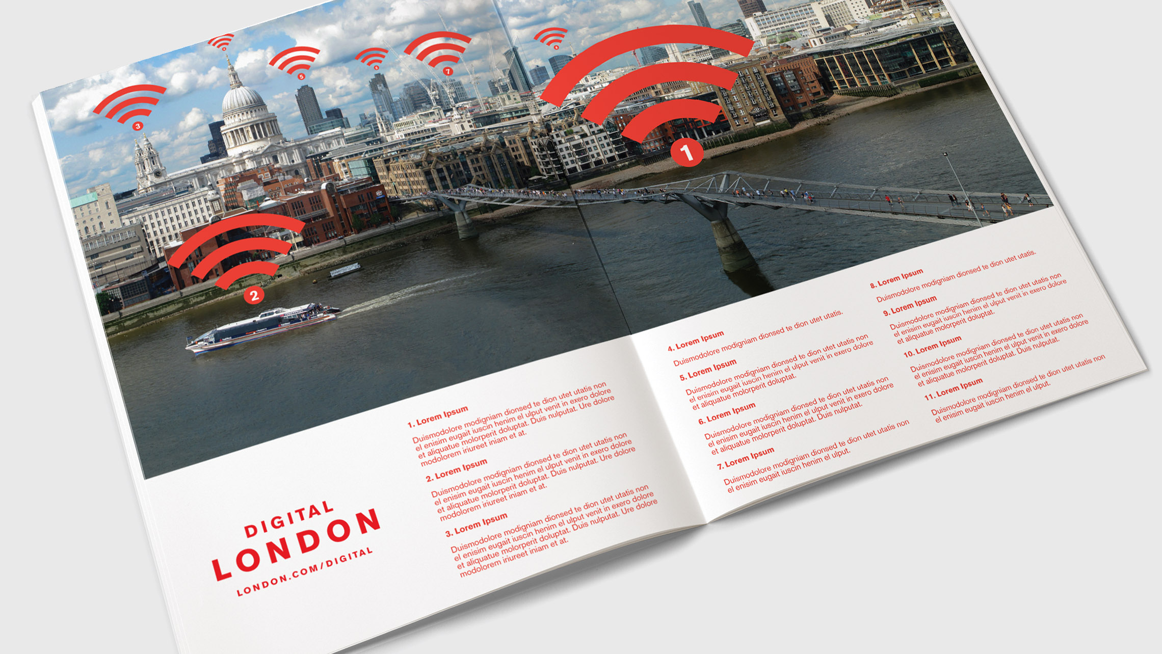
London has a lot of rich roots and landmarks. From Big Ben and the London Eye to the monarchy and 2012 Olympics, London is known for a lot of things — but lacks a central message. Their latest rebranding, which was led by Saffron, cleverly includes a taste of the River Thames with the royal red of the union jack. It’s very simple yet incredibly commanding. 

From Saffron’s website: “So, people pick up their ideas about London from books, television, social media and a wide variety of other influences – none of which can be controlled and many of which are misleading. Rocked by the financial crisis, security threats and even street riots London needed a concerted effort to bounce back and regain its confidence as the world’s leading global city.”

Images via Saffron


7. Porto

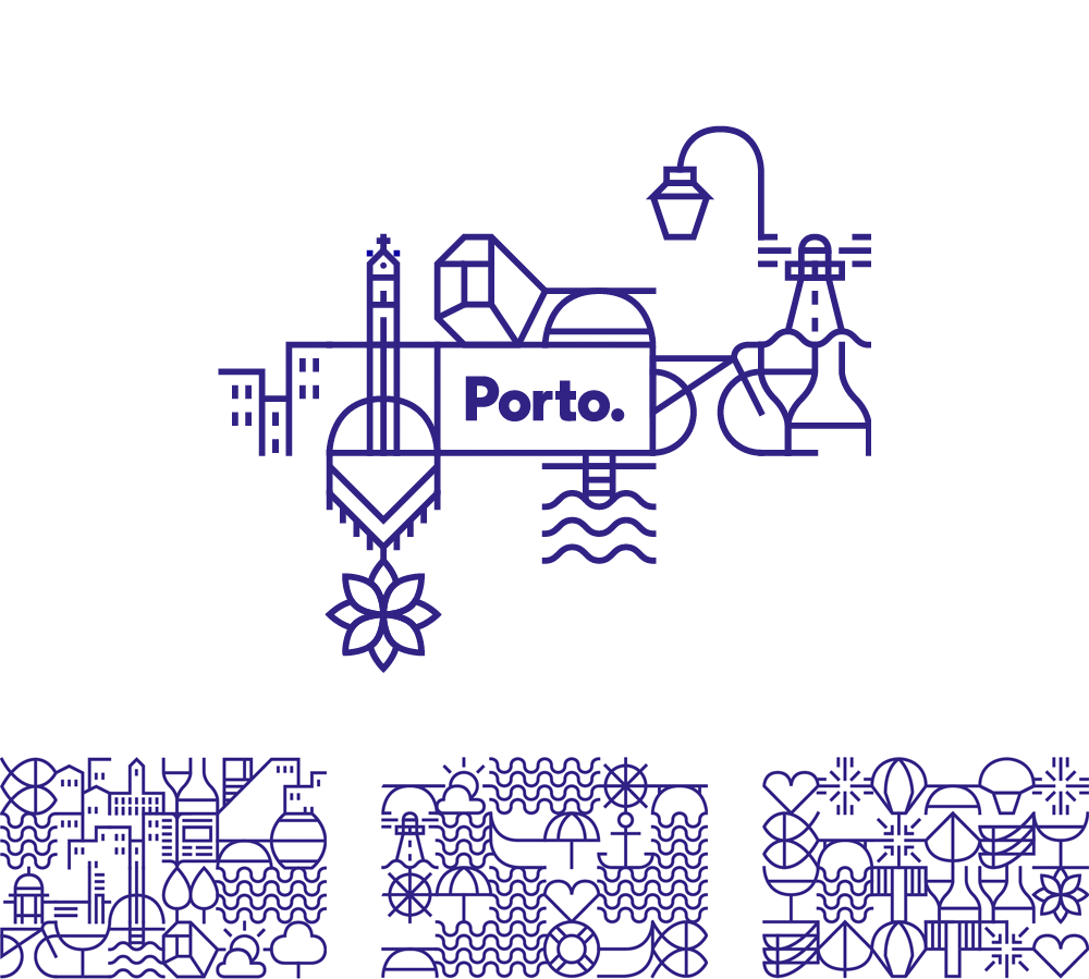
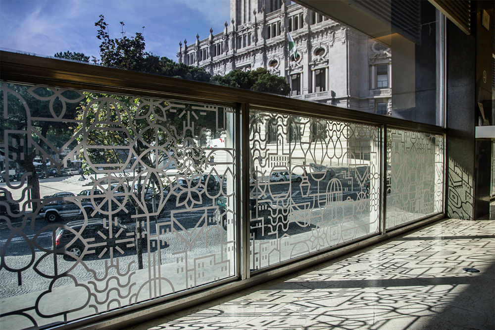
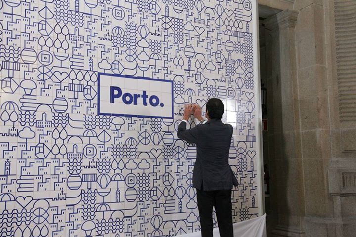
Redesigned by White Studio in 2014, Porto’s branding is bold, unique and intricate. Without even stepping foot in Portugal, you can get a feel for the vibrance and life that the city has. It gives people a real feel for what the city is about – and the creativity 

 Images from underconsideration.

8. Colorado

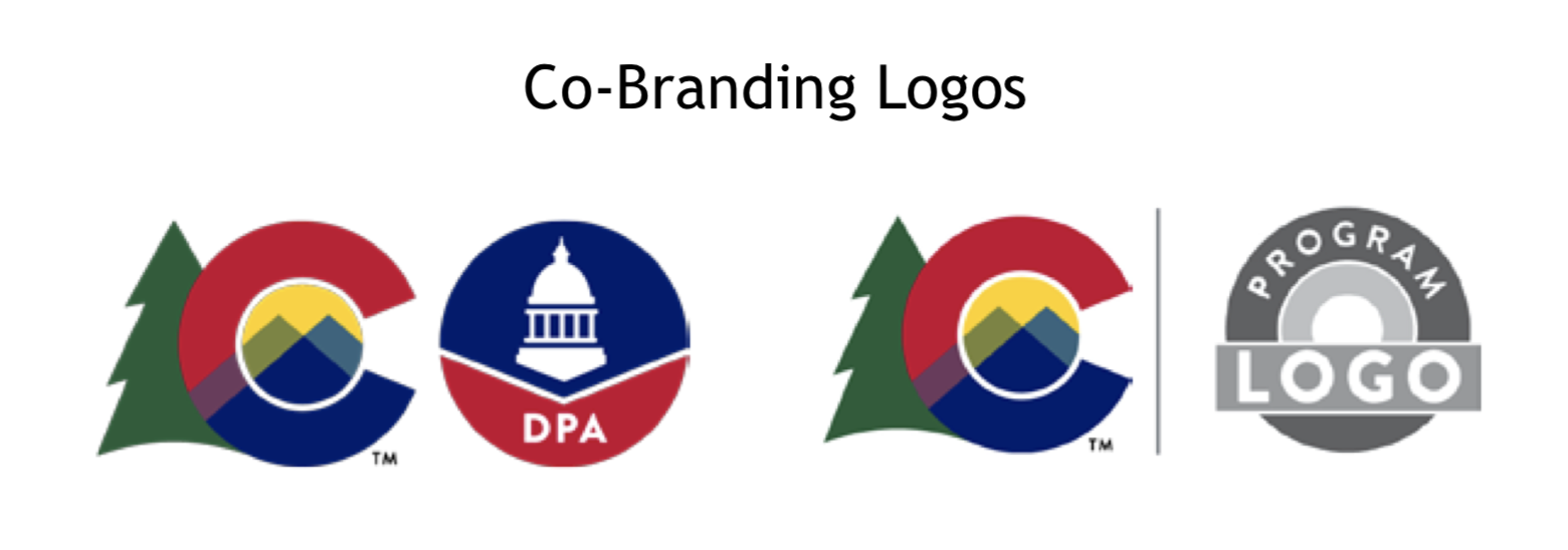
Designed in-house to showcase how spectacular the state is, Colorado’s ‘C’ symbolizes their strength and friendliness while simultaneously bringing their famous and stunning backdrops into the frame. This is a recent rebrand (rolled out in July 2019) so while we’re cautiously optimistic about what the entire brand will look like, we’re holding our breath until full brand guidelines are released.


Hue & Tone Creative: City Branding Partners

Let’s make your place stand out. Whether you’re a city, state, business, or charity, we can help. Get in touch at (336) 365-8559 or hannah@hueandtonecreative.com to start your rebranding journey today. We’ll get everything from your new logo to print collateral overhauled — on time and on budget.

5 ways to incorporate social media into your placemaking
5 ways to incorporate social media into your placemaking  |  Hue & Tone Creative

Here at Hue & Tone Creative, we love working on projects that contribute to a sense of place – especially if that place is our hometown of Greensboro, NC. 

Throughout our work with spaces like Revolution Mill, we’ve developed an interest in all things placemaking, economic development, and real estate related. Whether you’re a marketing generalist or, like us, you strive to take on more economic development projects, we believe placemaking is a concept every marketer should be familiar with. The methods used in effective placemaking can be applied to a number of campaigns across a wide range of industries. 

The Project for Public Spaces (PPS) defines placemaking as “a collaborative process by which we can shape our public realm in order to maximize shared value. More than just promoting better urban design, placemaking facilitates creative patterns of use, paying particular attention to the physical, cultural, and social identities that define a place and support its ongoing evolution.” 

Placemaking is all about creating spaces and places that people want to be – places where citizens feel comfortable living, learning, working, and playing. These places are people friendly, visually interesting, accessible, and memorable. 

Robert Steuteville, editor of Public Square: A CNU Journalargues that a Quality Place possesses the following features: 

  •  A mix of uses

  • Effective public spaces

  • Broadband capability

  • Multiple transportation options

  • Multiple housing options

  • Preservation of historic structure

  • Respect community heritage

  • Arts, culture, and creativity

  • Recreation

  • Green space

  • Quiet, unless they are designed to be otherwise

Now that you know what placemaking is, it’s time to figure out how to marry your social media strategy with more traditional placemaking efforts. That’s called Digital Placemaking – and PPS defines it as “the integration of social media into Placemaking practices, which are community-centered, encouraging public participation, collaboration, and transparency.”

As you start to incorporate social media into your placemaking efforts, here’s 5 ideas you can use as a springboard for your brainstorming: 


1. Use social to amplify temporary placemaking efforts

Temporary placemaking is the bootstrap version of true placemaking – and it’s perfect for activating areas people perceive as unsafe. It allows you to experiment with a variety of ideas on a smaller scale, and then grow what worked.  

Good examples of this are an interactive art project, an activity or game, or an event. Even something small like an Instagram-able mural or photo background can help transform an otherwise unused wall. 

 Once you have your project in place, set up a hashtag and a sign or photobooth that will encourage people to use and share their experience. 

5 ways to incorporate social media into your placemaking | Hue & Tone Creative

2. Use social media to establish your city/space as a tastemaker

Instead of hiring influencers, it’s time to set your own trends -- start utilizing your social accounts to amplify your subject matter expertise. That means using your accounts to show off your expert knowledge about a place – Where do you get the best Pho? What boutique do visitors need to check out? What downtown city corner has an incredible history?  

Answer those questions for your followers and you won’t have to hire someone to show off what’s cool about your city or space.

Hashtagging properly and regularly interacting with followers will help activate people who already live in your city -- and long term you’ll be enticing new people to visit your neck of the woods.


3. Establish transparency using open source data

Did you know City of Greensboro does a good job of making public data available? Their open data program, “Open Gate City” was launched in 2016 to facilitate transparency, promote community engagement, and stimulate innovation. Open Gate City is a collaboration with Bloomberg Philanthropies' "What Works Cities Initiative."
Check it out here.

The idea behind open data is that data should be readily and freely available to the general public to use and republish as they wish. Additionally, the idea of open government means that access to government documents and proceedings allows for effective public oversight and protects against extensive state secrecy.  

City governments and public agencies can leverage open data to help build positive relationships with the public. In addition to building general good will, these open data efforts are a treasure trove of potential content for municipal marketing efforts. 

4. Create a hashtag campaign that encourages citizens to share their views  

Create a unique hashtag and use it as the central sharing point of your campaign. Embed the hashtag across all your touchpoints – social, web copy, print collateral, direct mail, email advertising, and online ads -- and encourage people to use it when they’re talking about your campaign (or your city).  
Don’t just sit behind your screen though! Hit the streets with merchandise, handouts, spray paint, or banners, and get to know the people you’re targeting. In-person marketing efforts are sure to connect with a new group, not just the same old group of active users that are constantly retweeting you. 


5. Use social media channels as a tool for crowdsourcing data 

With its exponential reach, social media is an incredibly powerful - and free - tool for crowdsourcing. If you’re stumped on what the public wants to see in a space, use social media to start running polls, start discussions, or gather feedback. 

The insights you gain can then be built into future stages of your placemaking campaign! 


Hue & Tone Creative: Your placemaking partner

Ready to brainstorm some fresh ideas? Or, maybe you just need the creative muscle to execute your ideas? Let’s talk and see if we make a good fit: 336-365-8559.

8 elements of a great economic development website
8 elements of a great economic development website  |  Hue & Tone Creative

Creating a strong online presence for your development project allows you to widen your reach and share information with interested people and businesses. In addition to capturing the essence of your city or surroundings, your website should also follow a few marketing best practices in order to enhance your effectiveness. 

The things that make an economic development website great are the same things that make any website a dream: intuitive navigation, on-trend branding, and clear messaging. But what else can really help your website stand out from the pack? 

Whether you’re starting from scratch or looking to overhaul what you’ve currently got, here are eight useful tips to help you get the most out of your economic development website.


1. Make your mission clear 

If you want to stand out, your mission needs to be clear, inspiring and distinguishable from the competition. The overarching goal for any economic development campaign is to connect with prospective companies about why you’re a good fit for their company.  

To lure potential job creators to your area, you’ll need to thoroughly develop your mission statement and make sure it’s clear who you’re targeting, how your site or area will benefit them, how you plan to engage them, and what the next steps will be. 


2. Show off your support

No one does economic development alone –chances are you have a handful of partner organizations and public or private financial backing. People should easily be able to determine who is involved with your project, and what portions of the project they are involved with.

However, just adding this information to your website isn’t enough –you’ll want to keep people updated as your project progresses. It can take years for a project to go from the idea stage to groundbreaking, and staying active on social media or sending out a monthly newsletter can help keep people bought in to your project. 


3. Use statistics sensibly 

If you are using statistics to support something you’ve said or to support the value of your mission, make sure they’re up-to-date, accurate, and applicable. If you try engineering semi-relevant stats to fit your message, you’ll just end up confusing your audience. 

 Use tailored statistics and use them sparingly to make the most impact on your audience. 


4. Disclose individual contacts

Don’t use generic email addresses like info@mywebsite.com or contact@mywebsite.com. Potential site consultants will want to be able to do research on all parties involved and want to know they’re about to build a personal connection with someone. 

We suggest including the name, job title, email address, contact number and photo of each of your employees.


5. Stick to the three-click rule

You might have lots of really great content on your website, but if your visitors can’t find it, it’s not going to be doing you any good. The less clicks visitors have to make the better!

As a general rule, you don’t want to make pertinent information further than three clicks away from any given location on your site.


6. Don’t cut corners on imagery

The look and feel of your online presence is clearly important –but it’s not just about branding. When you’re choosing your imagery, don’t cut corners on the quality. 

There will be times when you’re selling a vision for a mid-construction project, which means you may have to use stock photography. If that’s the case, look for images that feel authentic. Try to target stock images that all have a similar style so that your site looks cohesive. 

If you’re in the early stages of a project, we suggest incorporating lots of placemaking imagery to give prospects a better sense of your community. Photos of lively town centers will help balance out the sterile feel of elevation drawings and floorplans.


7. Boast about your buy-in

If you’re in the early stages of a project or are searching for an anchor tenant, community buy-in matters. Showing off major backers will definitely turn heads -- but if you’re stretched for valuable web content don’t limit yourself to just the big names. 

Consider compiling a semi-exhaustive directory of all the small businesses and civic leaders who are engaged with your project. Pull quotes that highlight public support to convey a feeling of success…before you’ve even broken ground. 


8. Keep it fresh

Keeping your stats up-to-date is one thing, keeping the rest of your content fresh is another. When a project is in a construction lull, or you’re waiting for permits to come through, it can be easy to let your content get stale. 

To make sure you don’t fall into a rut, we suggest putting together a content calendar together that highlights key developments for the next year. This will help you brainstorm relevant content for the down times and force you to think outside of the box. Just be sure to keep revisiting your content calendar as construction schedules change! 


Let’s get into business: together.

If you need a partner to help you optimize your website, help you develop a campaign, or maintain your social media efforts, get in touch at 336-365-8559 or hannah@hueandtonecreative.com.