Think branding is just a logo? Think again — let us break it down for you here.
Behind every good-looking package or ad is a carefully investigated backstory, fastidiously selected colors, and meticulously outlined brand guidelines. While branding businesses is nothing new, businesses aren’t the only entities that need high-quality branding. Cities, townships, and entire countries have also begun branding their space in an effort to lure in tourists, new citizens, and potential business.
Elements of place branding can include culture, visual symbols, slogans, mission, vision and values.
No matter what size your city is, branding can help put your place on the map. From America all the way over to Australia, here’s a look at some of the best:
1. NYC
Milton Glaser’s ‘I <3 NY’ artwork is inarguably one of the most iconic city graphics around, but their branding doesn’t stop at one iconic t-shirt.
Bellweather was in charge of creating NYCgo’s official identity – and it reflects NYC’s personality with it’s bright colors, diversity and motion. Attracting more than 60 million visitors a year, the city clear doesn’t have a tourism problem – but this diverse and complex brand brings a life and continuity to the city’s visuals.

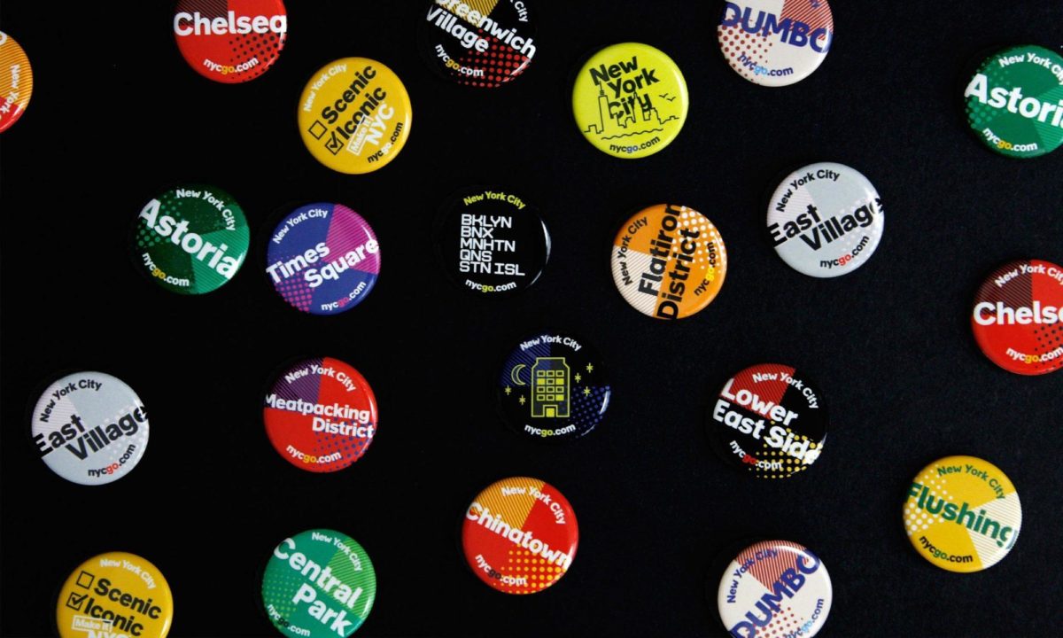
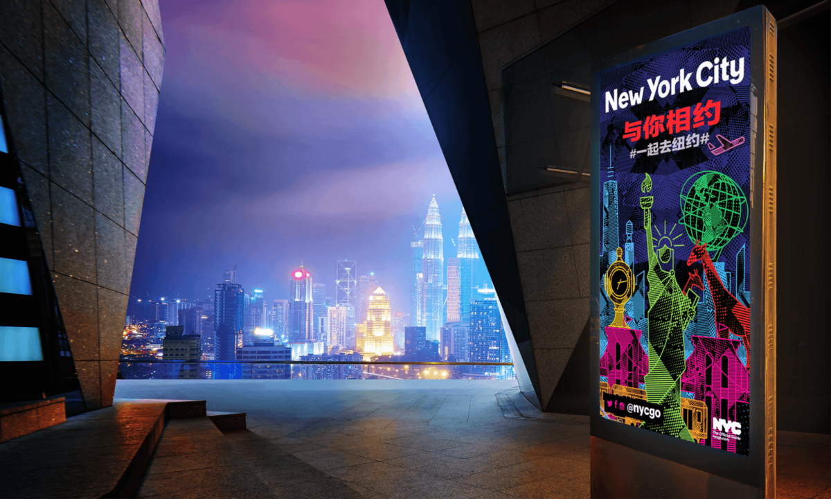
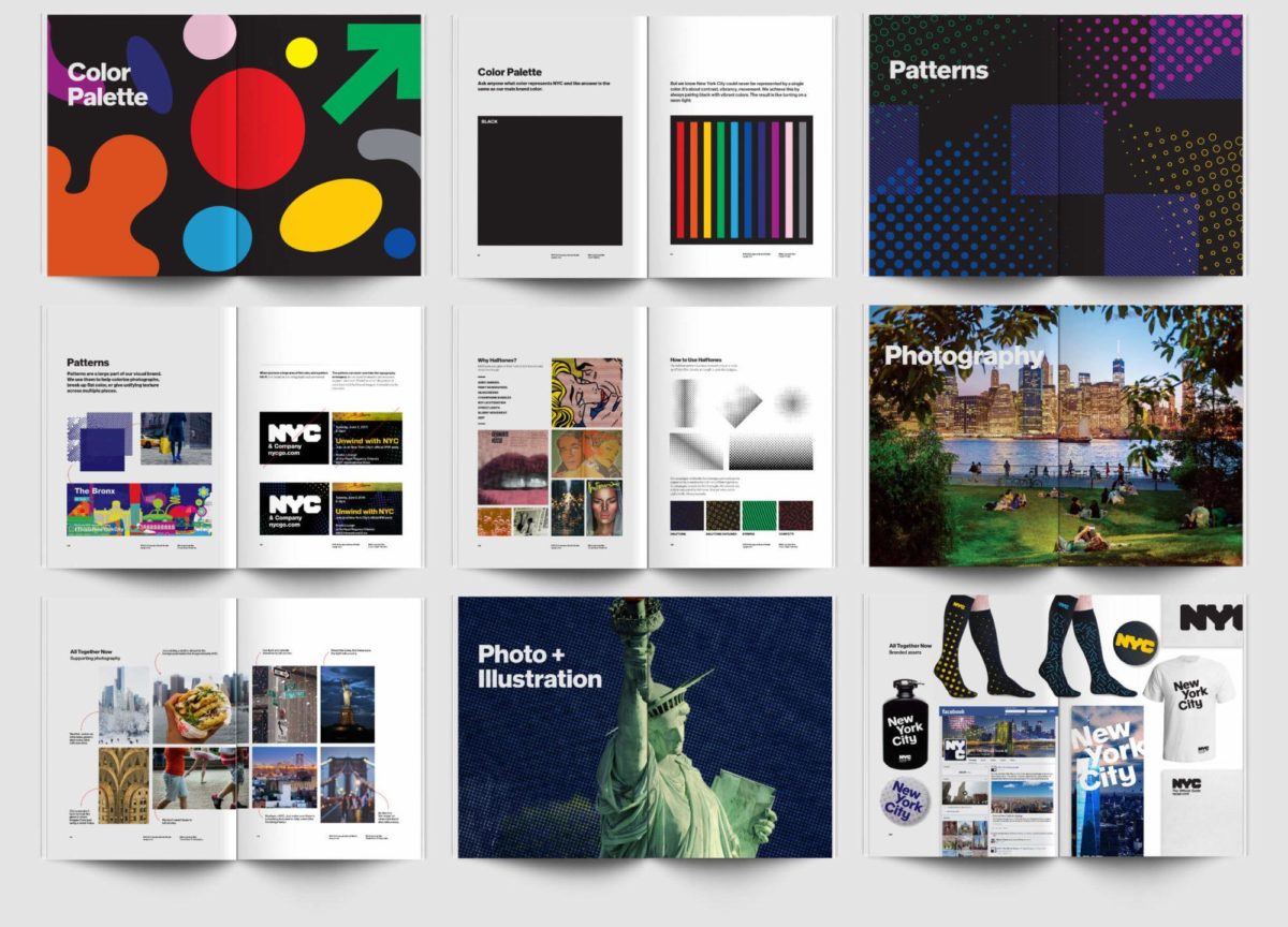

Images via Bellweather and logoworks.com
2. Melbourne
Developed by Landor, Melbourne’s logo is fresh, energetic, and memorable. Despite being around for a few years, this brand still feels modern and fresh — the sign of a well thought out and designed identity. Encompassing a wide variety of colors and patterns this vibrant brand is a reflection of all that Melbourne life has to offer.
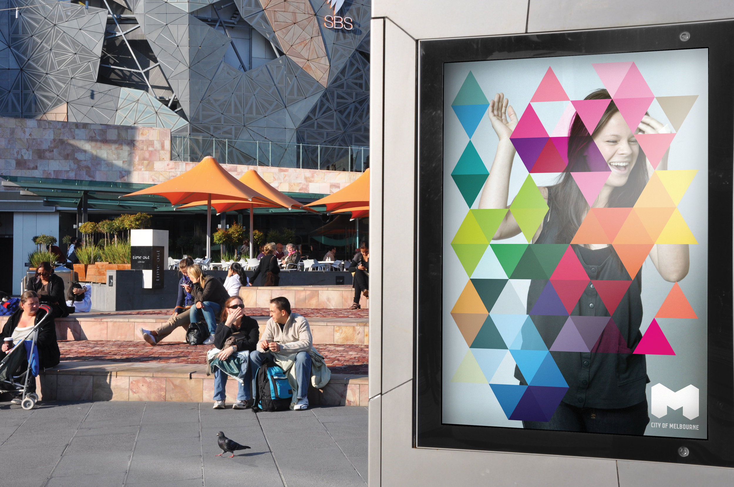
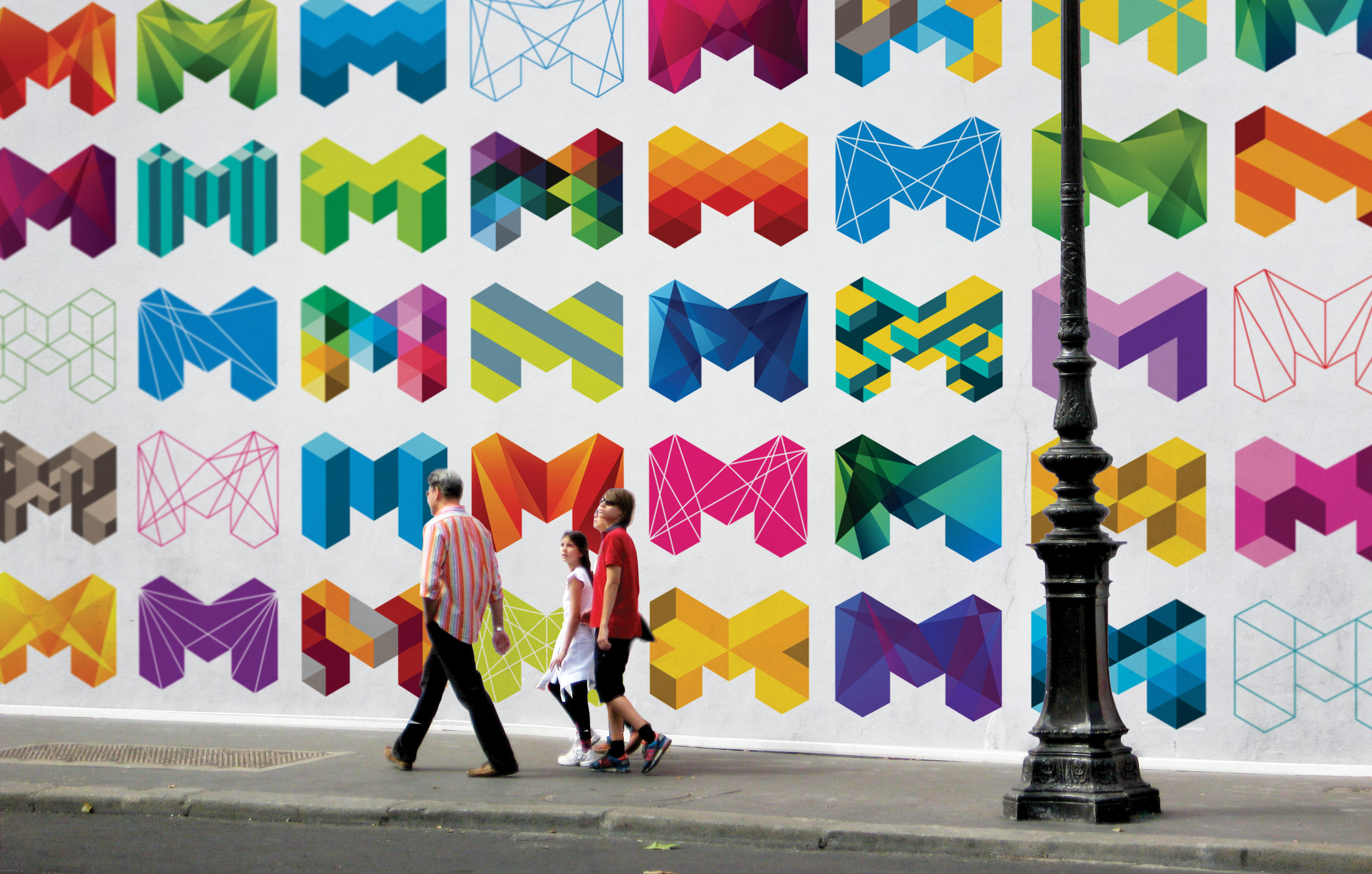
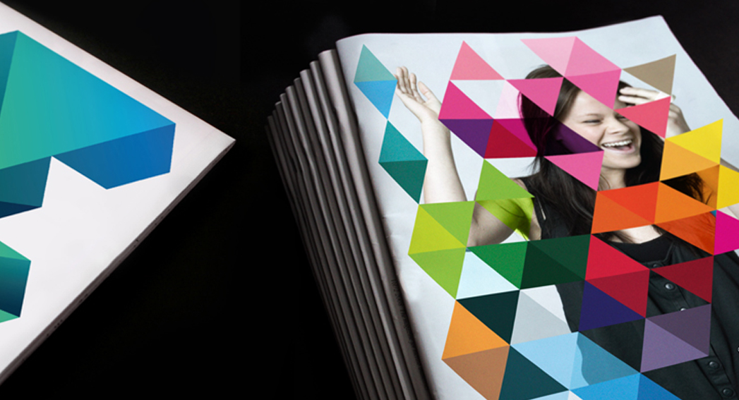
Images via Landor.
3. Paris
Paris’ most memorable brand doesn’t come from city government, but rather from their tourism organization, the Paris Convention and Visitors Bureau. Grapheine’s typographic masterpiece subtly incorporates the French capital’s most famous landmark. And, in our opinion, everything about the color, spacing, and typography are expertly executed… in addition to making Paris look pretty cool!
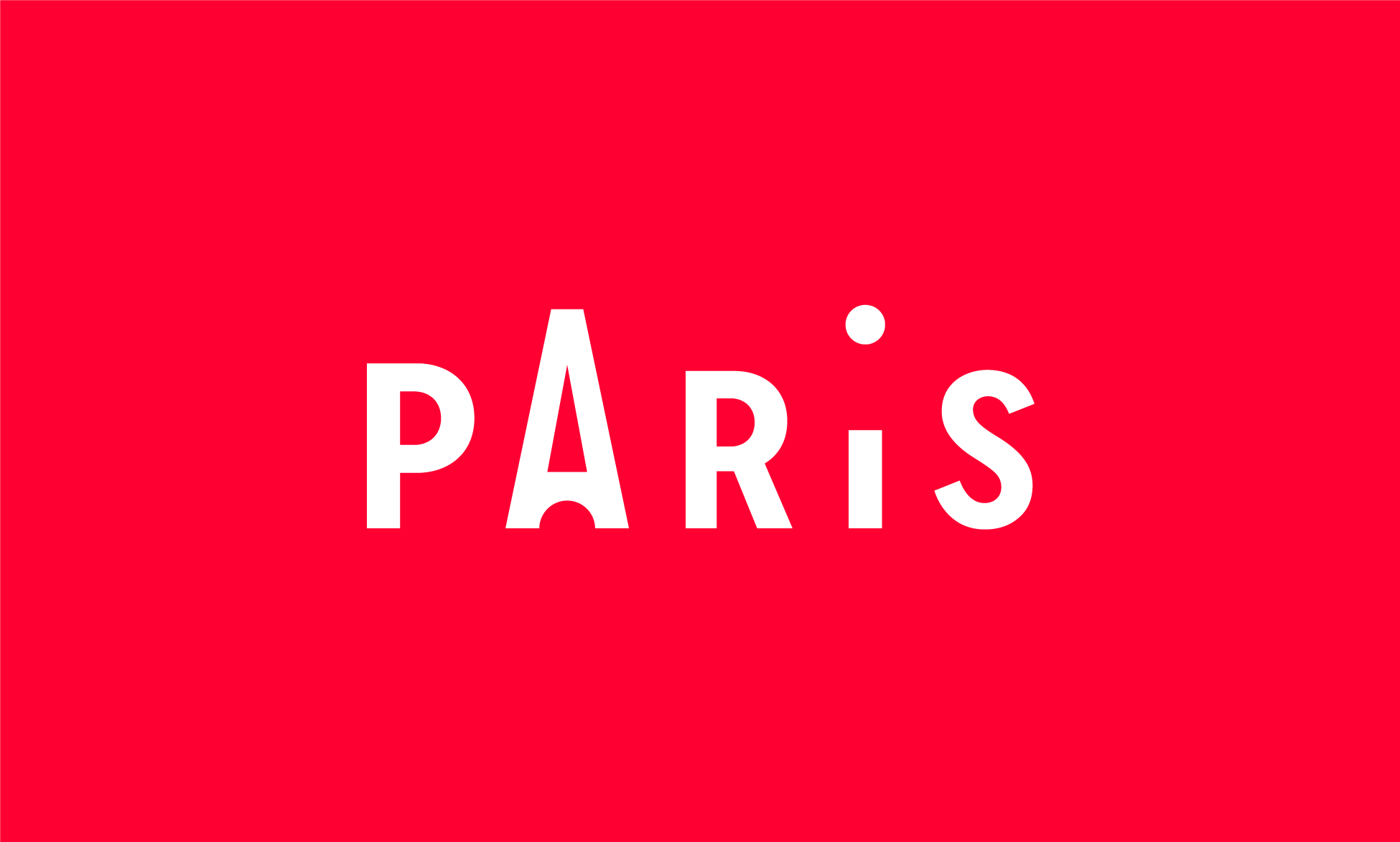


Images via Graphiene.
4. I Amsterdam
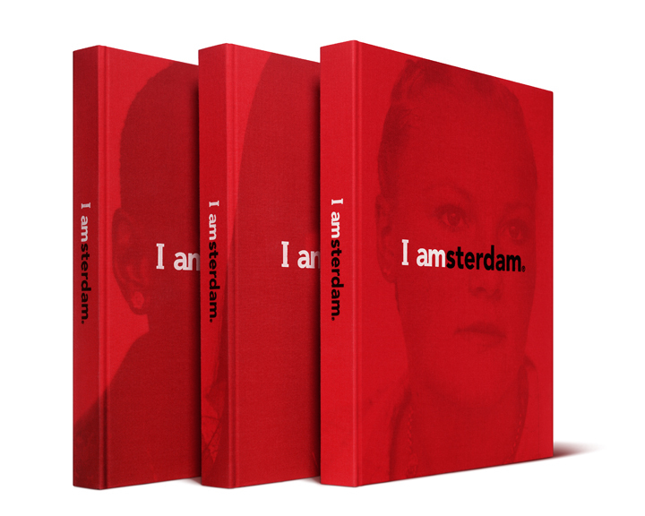
Renowned for sex, drugs, and canals, this 2004 campaign helped put Amsterdam back on the map for more than just a fun weekend away. This branding effort was born out of an effort to appeal not only to tourists, but also to those already living in the area.
Despite simple graphics, Kesselskramer’s message is incredibly complex and versatile.


Images via Kesselskramer.
5. Las Vegas
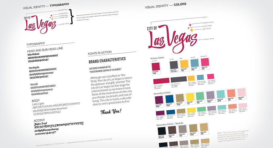
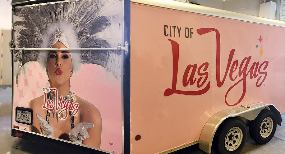
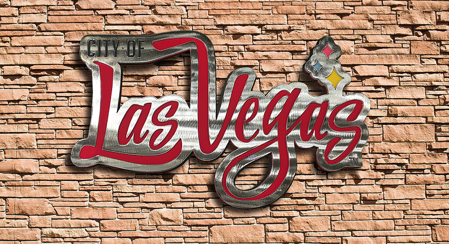
Funky, fun and full of color, Pink Kitty Creative’s city government branding depicts everything Las Vegas stands for in one: bright lights, late nights, and lots of laughter. While we find the “City of” typography a bit weak, we enjoy the color palette and playfulness of the logo.


Images via brandberries.com and underconsideration.
6. London
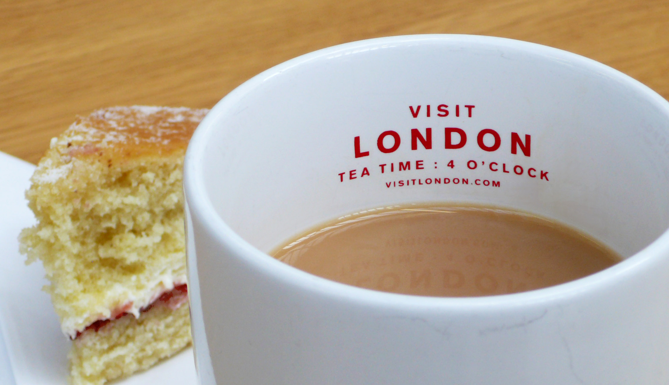
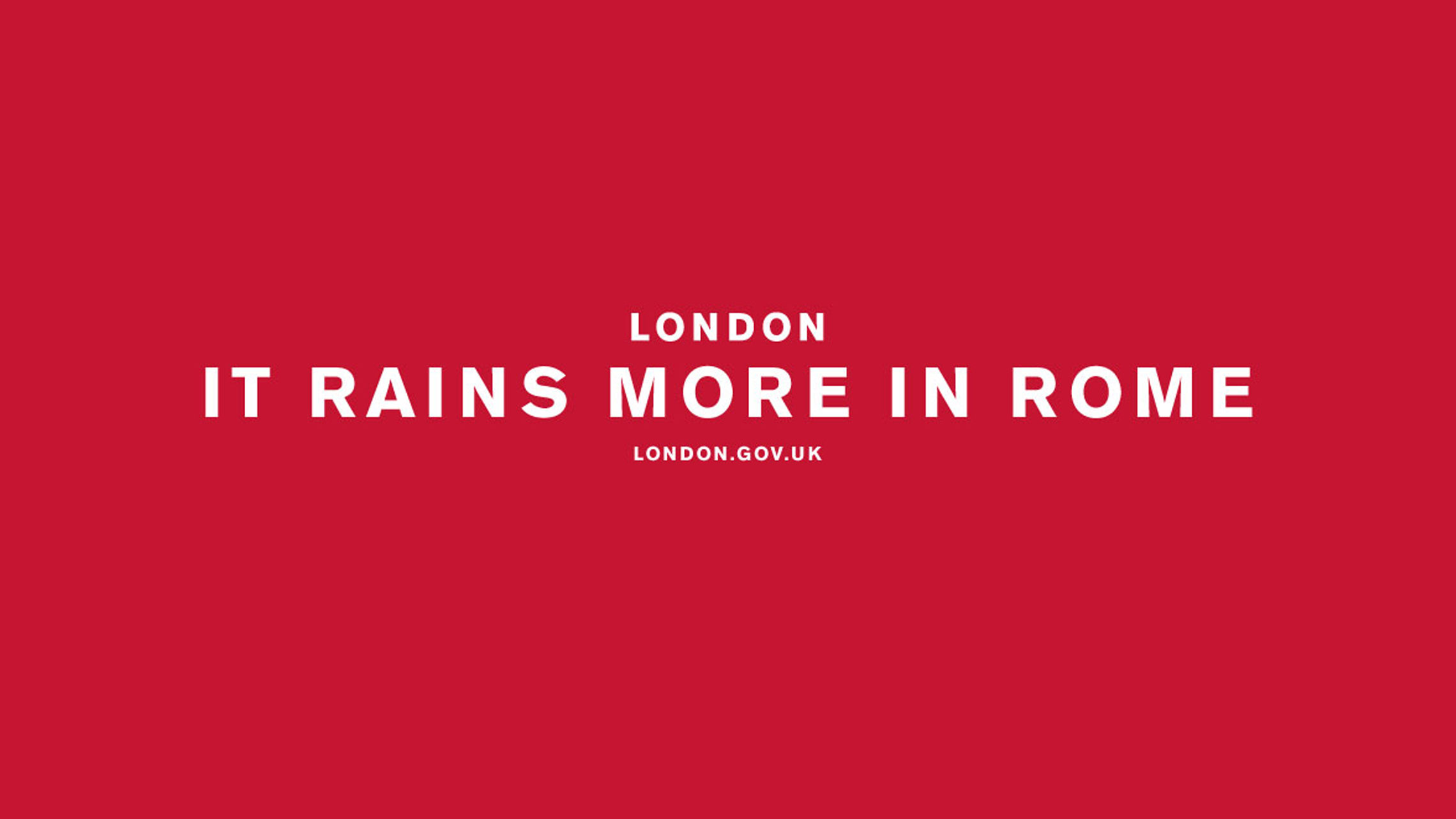
London has a lot of rich roots and landmarks. From Big Ben and the London Eye to the monarchy and 2012 Olympics, London is known for a lot of things — but lacks a central message. Their latest rebranding, which was led by Saffron, cleverly includes a taste of the River Thames with the royal red of the union jack. It’s very simple yet incredibly commanding.
From Saffron’s website: “So, people pick up their ideas about London from books, television, social media and a wide variety of other influences – none of which can be controlled and many of which are misleading. Rocked by the financial crisis, security threats and even street riots London needed a concerted effort to bounce back and regain its confidence as the world’s leading global city.”

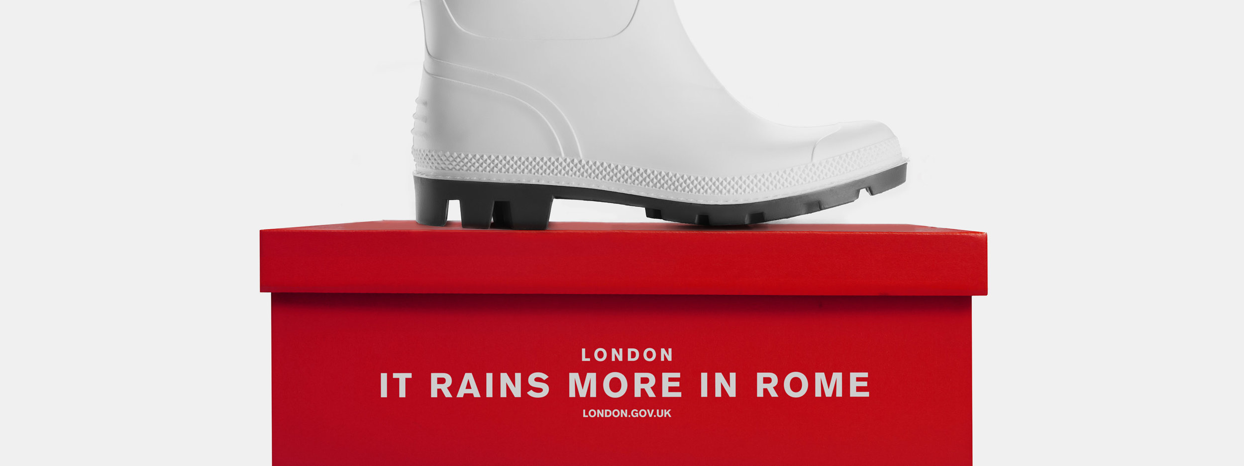
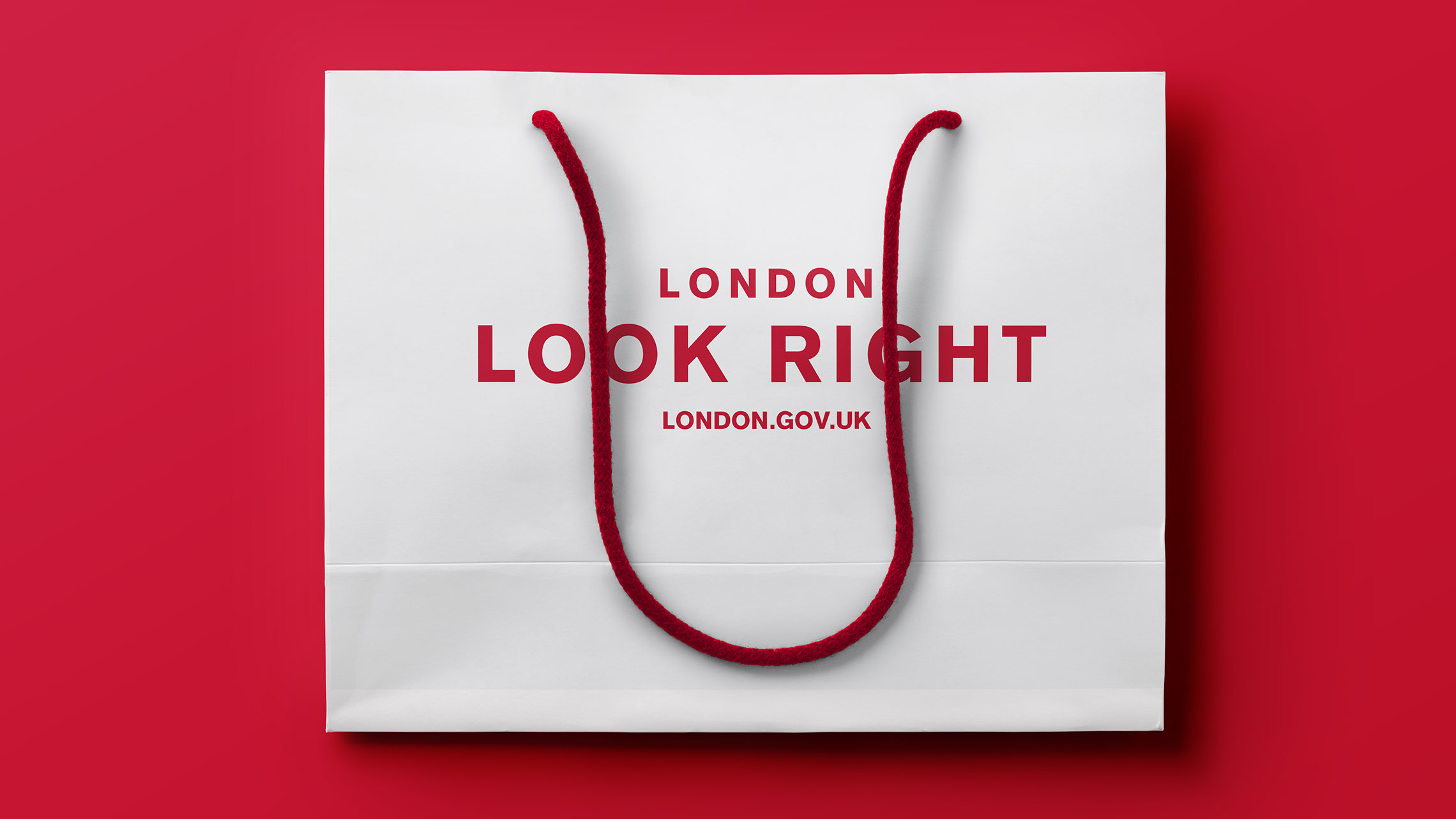
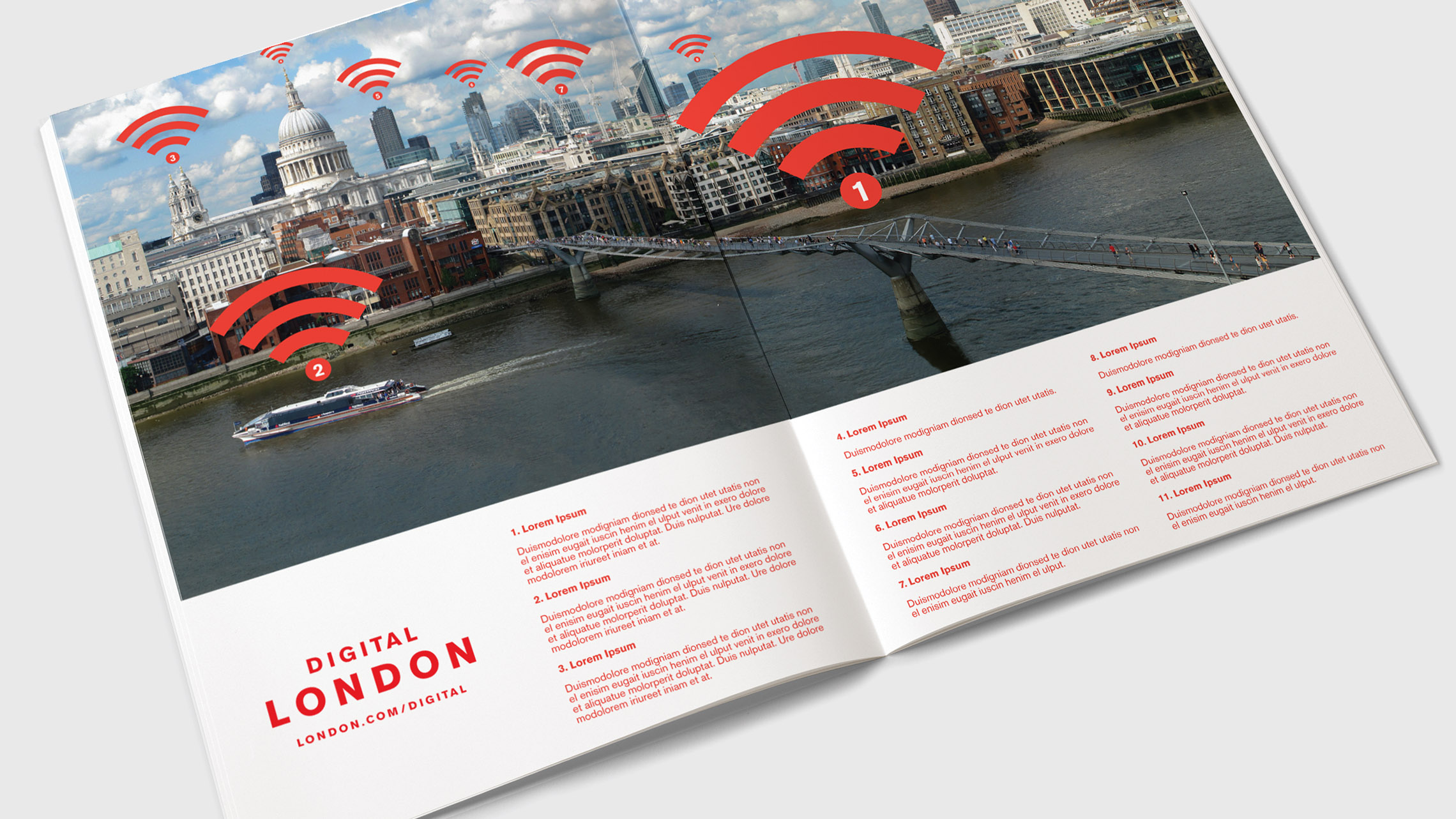
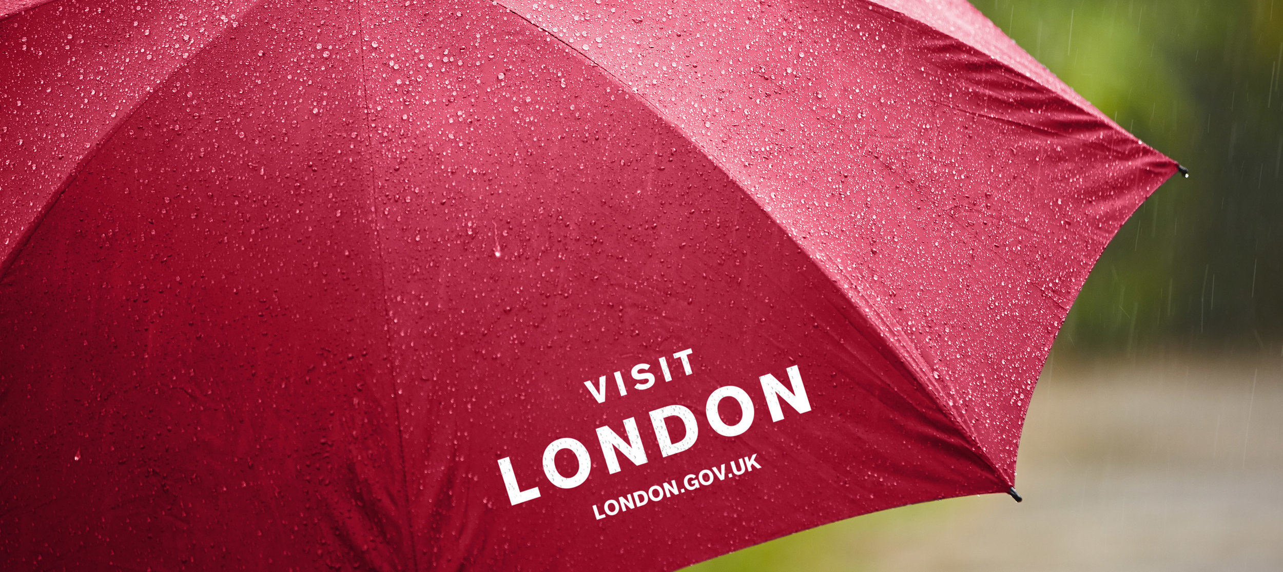
Images via Saffron.
7. Porto
Redesigned by White Studio in 2014, Porto’s branding is bold, unique and intricate. Without even stepping foot in Portugal, you can get a feel for the vibrance and life that the city has. It gives people a real feel for what the city is about – and the creativity
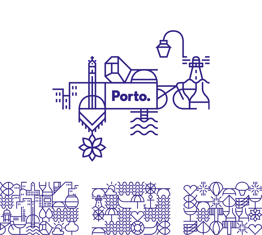
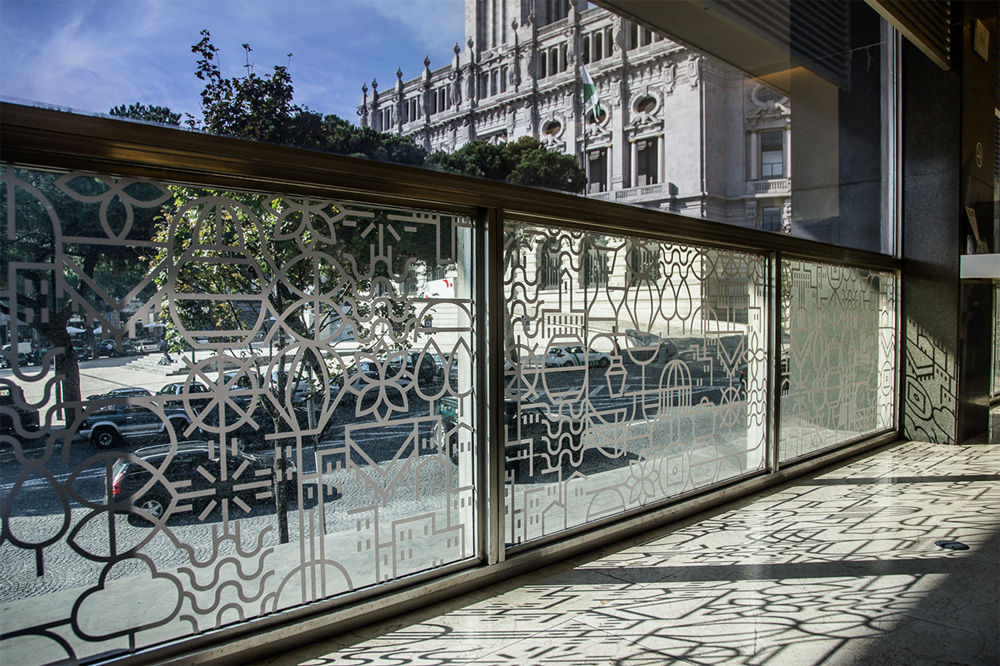
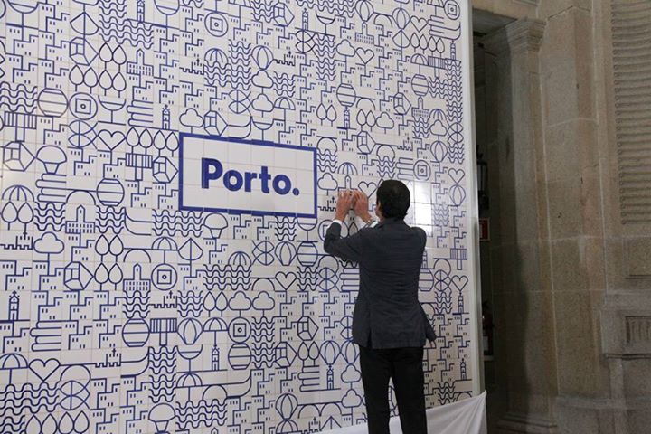

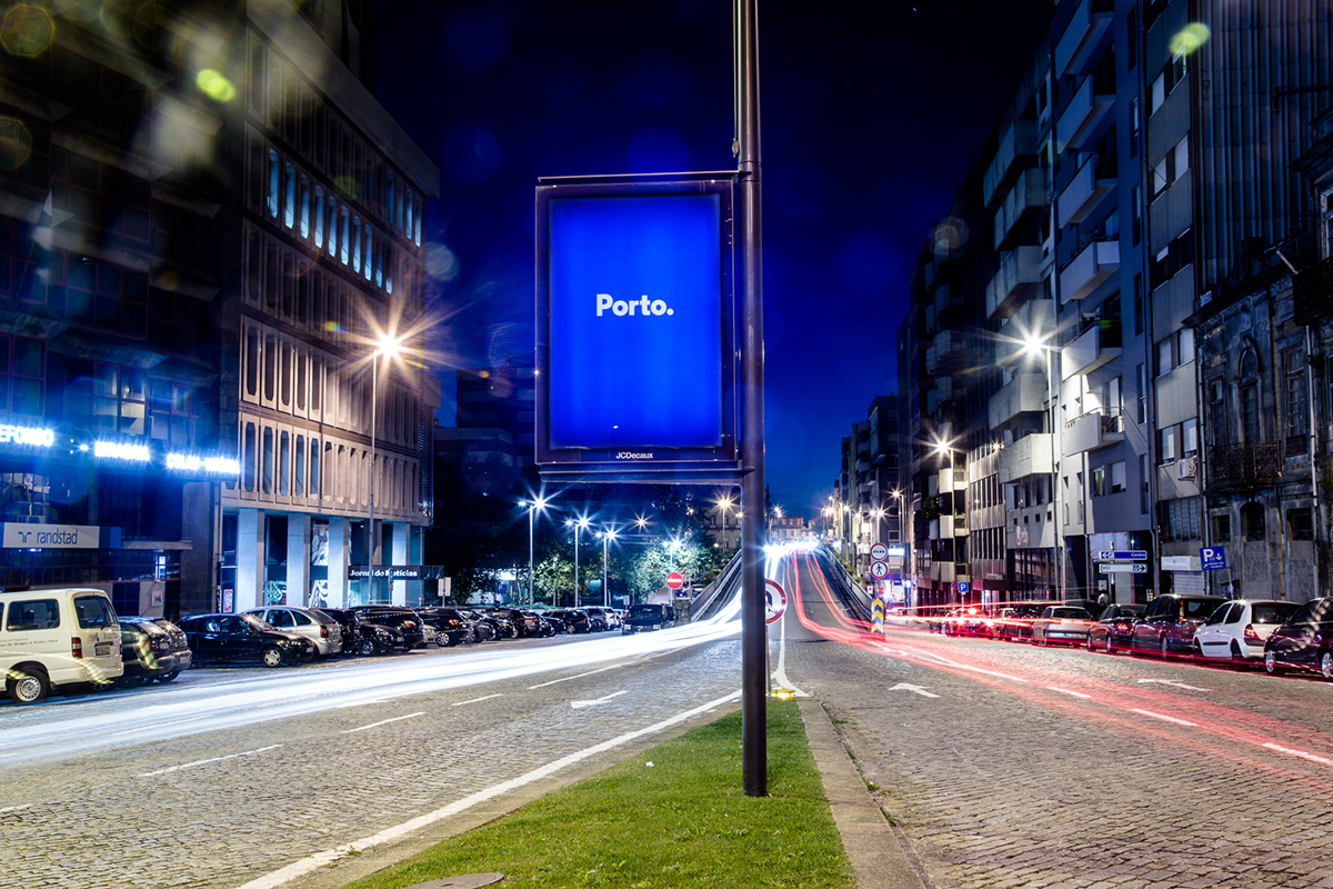
Images from underconsideration.
8. Colorado
Designed in-house to showcase how spectacular the state is, Colorado’s ‘C’ symbolizes their strength and friendliness while simultaneously bringing their famous and stunning backdrops into the frame. This is a recent rebrand (rolled out in July 2019) so while we’re cautiously optimistic about what the entire brand will look like, we’re holding our breath until full brand guidelines are released.


Hue & Tone Creative: City Branding Partners
Let’s make your place stand out. Whether you’re a city, state, business, or charity, we can help. Get in touch at (336) 365-8559 or hannah@hueandtonecreative.com to start your rebranding journey today. We’ll get everything from your new logo to print collateral overhauled — on time and on budget.


