Client Spotlight: SoLocal Life
In the fall of 2019, we partnered up with local lover Luck Davidson to brand her new blog. Named “SoLocal Life,” her new platform focuses on highlighting local people, places, and indie businesses. With a home-base of Greensboro, Luck builds community while eating, drinking, shopping, dog walking, and asking lots of questions.
We set out to help her build her community with a brand she could be proud of. Before we could start designing logos, we needed to narrow down the feel of Luck’s brand.
The best way to do this? Setting forth a series of five mood boards that all demonstrate a different feel and energy.
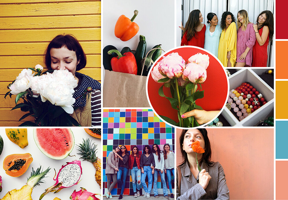
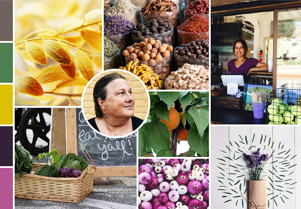
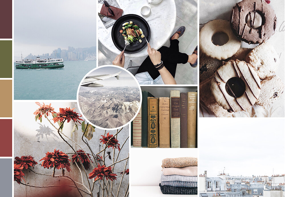
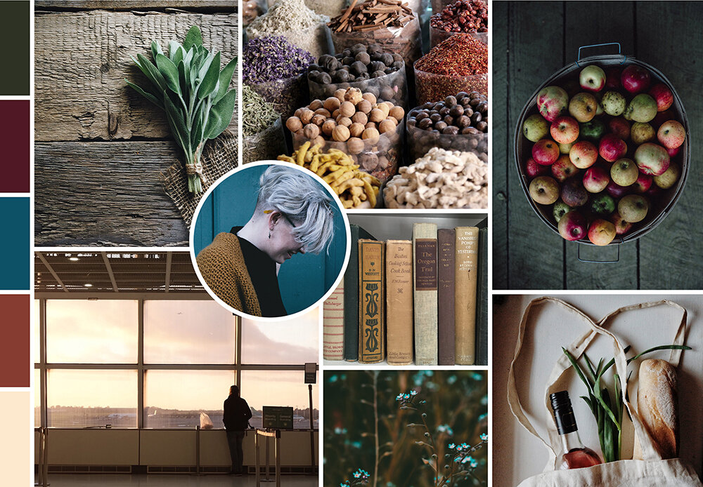
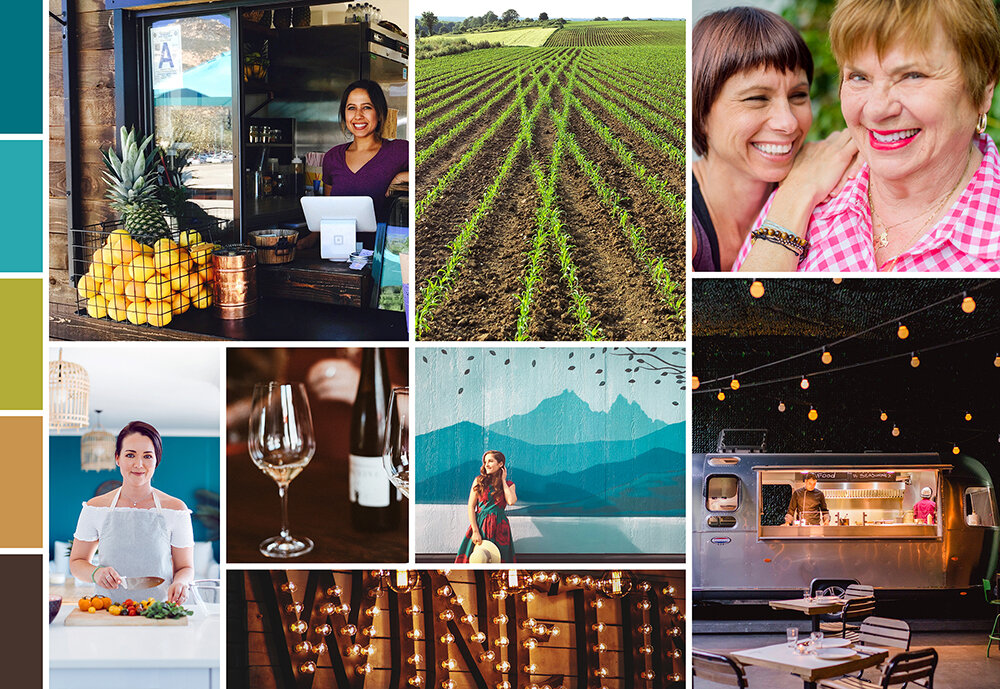
The winner? The below mood board… but with one request — we incorporate even brighter colors! Less earth tones and livelier hues.
Once we got to the logo development stage, we kept Luck’s preference for brighter colors in mind. But first, we had to narrow down a concept. We toyed around with a variety of fun fonts, organic elements, and playful ideas. Here’s a sampling of some of the black & white concepts we considered:
Ultimately, we ended up with a seal logo that incorporated the tagline “All Things Local.” Our final logo incorporated a bright pop of pink, a saturated green, and a vibrant blue. Deep grey and a soothing tan ground this color scheme.
Four variations of the logo ensure that there’s a mark to fit every space!
SoLocal Life launched earlier this year into — and while COVID has thrown many local businesses into flux, Luck’s support and online presence haven’t wavered. With local businesses working to make it through the pandemic, there’s no better person to follow for updates on all your favorite Boro businesses.


