Posts tagged Moodboards
Color Schemes: Scenes from Greensboro

This week, we’re taking time out from talking marketing to celebrate a few vignettes from our city. From muted downtown streets to the Bicentennial Gardens, we’re finding color inspiration in some of our favorite Greensboro spots.

We’re big believers that every city offers inspiration – sometimes you just have to stop and notice it. With a bustling downtown and expansive trails, Greensboro offers the best of both city and nature views. No matter where you are in Greensboro, we guarantee that there’s a dynamic color scheme somewhere in your view.

Artboard 18.jpg

Dappled Depot

Soft blues, purples and pinks are diffused by the fog drifting in over the J. Douglas Galyon Depot in Downtown Greensboro. We love the soft hues of this nighttime scene.


 Botanical Brights 

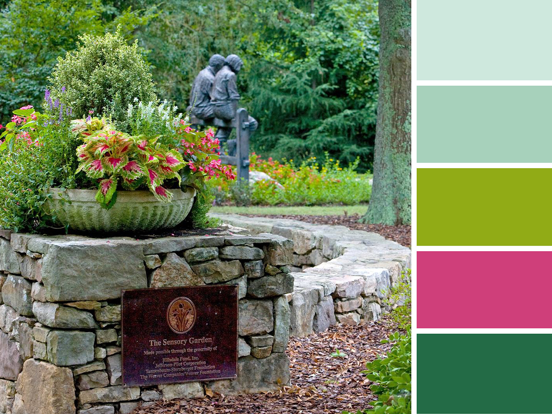
Great for a short walk, quiet reflection, or reading on a comfy park bench, the Tanger Bicentennial Garden is one of our favorite spots in Greensboro. Rich colors line the pathways, and a variety compelling sculptures can be found tucked among the foliage. For more secluded scenery, pop right across the road to the Bog Garden. 


Clear Skies over Kress

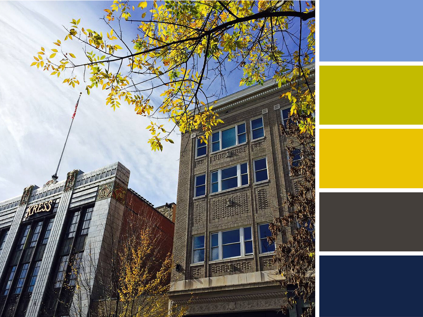
Crisp blue skies highlight the pristine facades of the Kress and Meyers Buildings’ on South Elm Street. Changing leaves provide small touches of green and yellow to this palette.


Retro Revolution

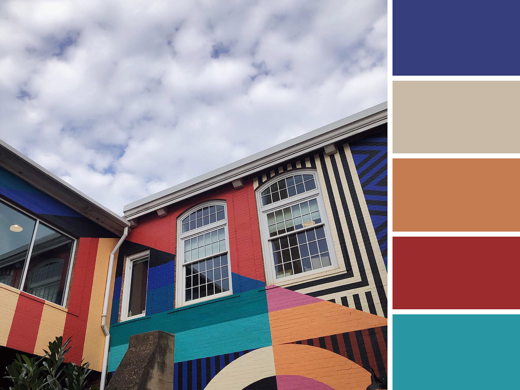
Tucked in a quiet corner of Revolution Mill’s courtyard, this retro mural installation is a bright pop of color among a sea of brick. These colors are bright and muted all at once!


Artboard 12.jpg

Lite Brite LeBauer 

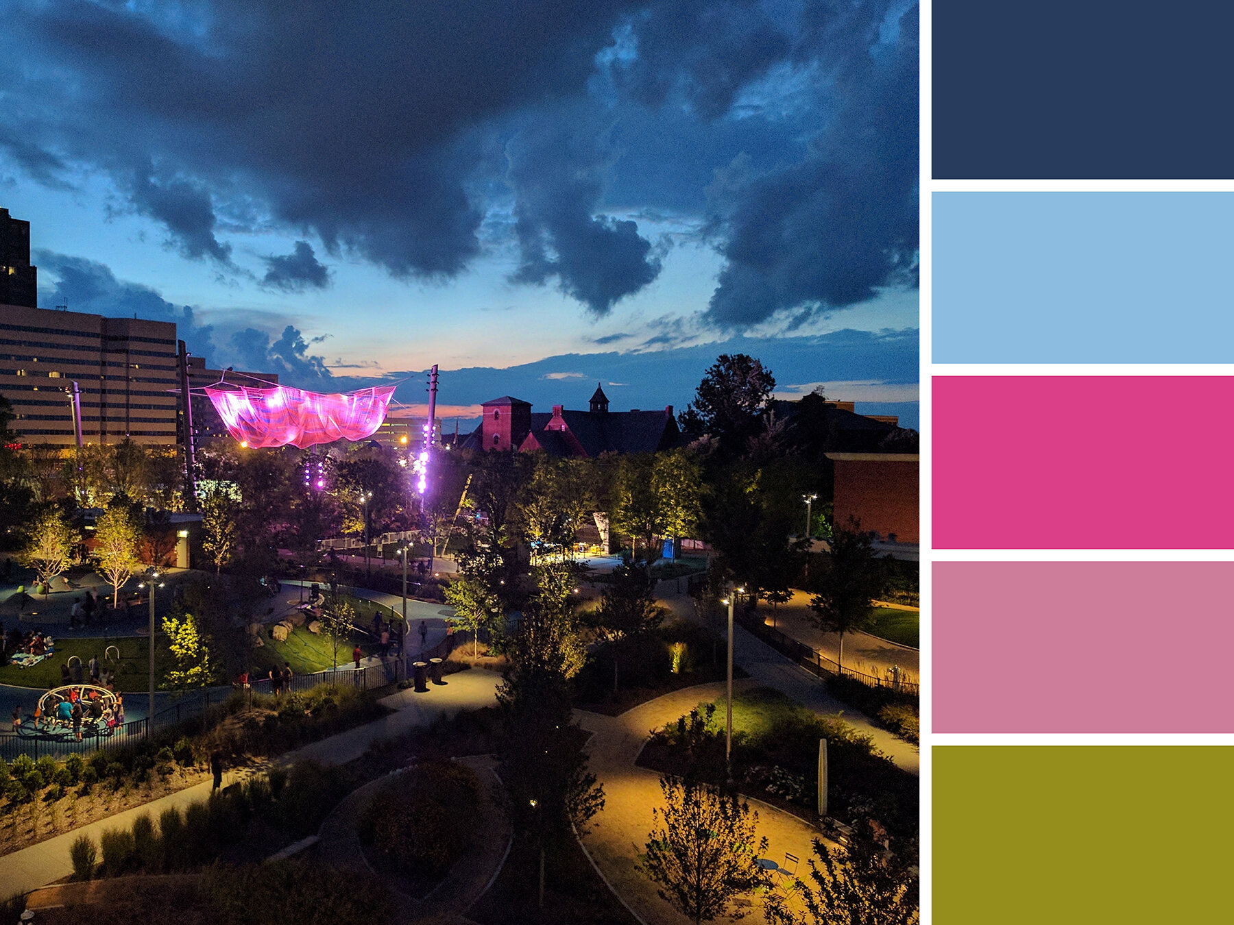
The sky is illuminated over LeBauer Park by Janet Echelman’s Where We Met installation. Our two downtown parks provide a great place to gather, celebrate, and play while immersing yourself in all the city has to offer. Bright colors are especially present in these fun and family-friendly spaces!


Artboard 2.jpg

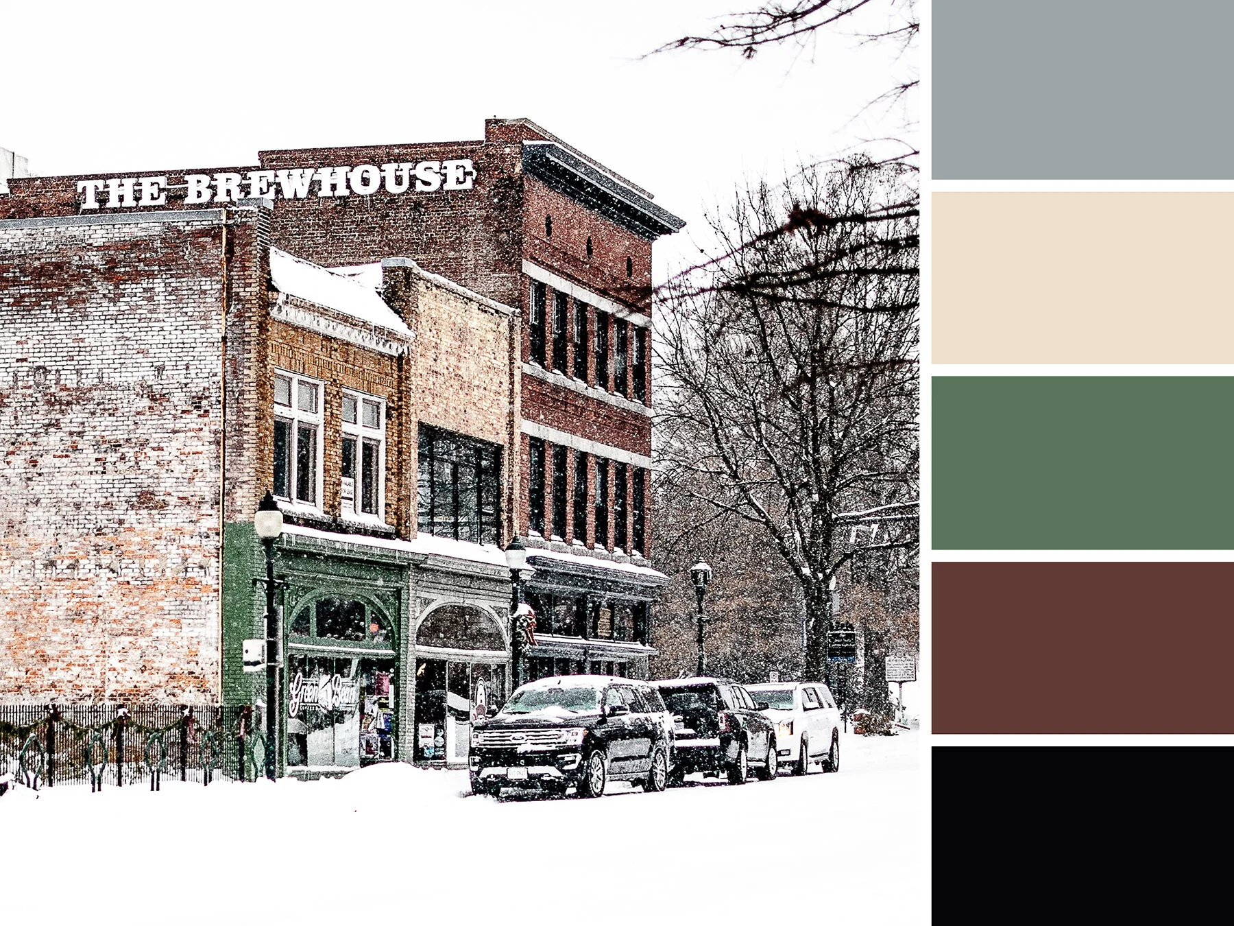
South Elm Snow

On an all white day, the Green Bean’s bright facade offers a pop of color among an otherwise muted look at South Elm Street.


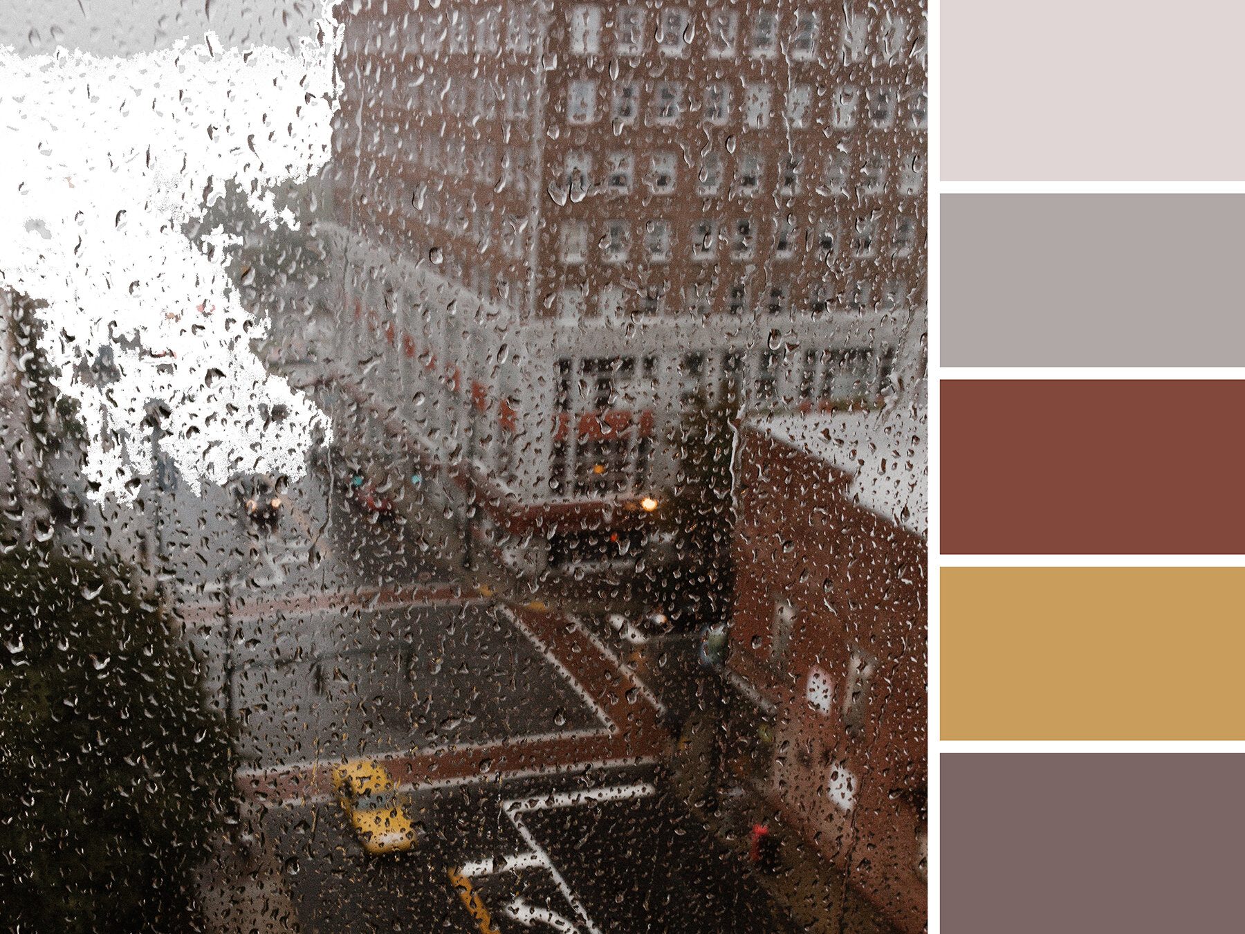
Guilford Grey 

On a rainy and grey day, the heart of downtown has mostly subdued tones to offer up. But this mood board is a favorite because you can see the Guilford Building in the upper right portion of the photo… can you spot us waving from our office windows in the top right corner? Just kidding…


Hue & Tone Creative: Inspiration and Color in Greensboro, NC

Whether you’re based in Greensboro or beyond, we’ll help breathe new inspiration into your brand. Let us help you refresh your visual branding, website, and print collateral today. Schedule a meeting to get your next project started.

Client Spotlight: SoLocal Life

In the fall of 2019, we partnered up with local lover Luck Davidson to brand her new blog. Named “SoLocal Life,” her new platform focuses on highlighting local people, places, and indie businesses. With a home-base of Greensboro, Luck builds community while eating, drinking, shopping, dog walking, and asking lots of questions.

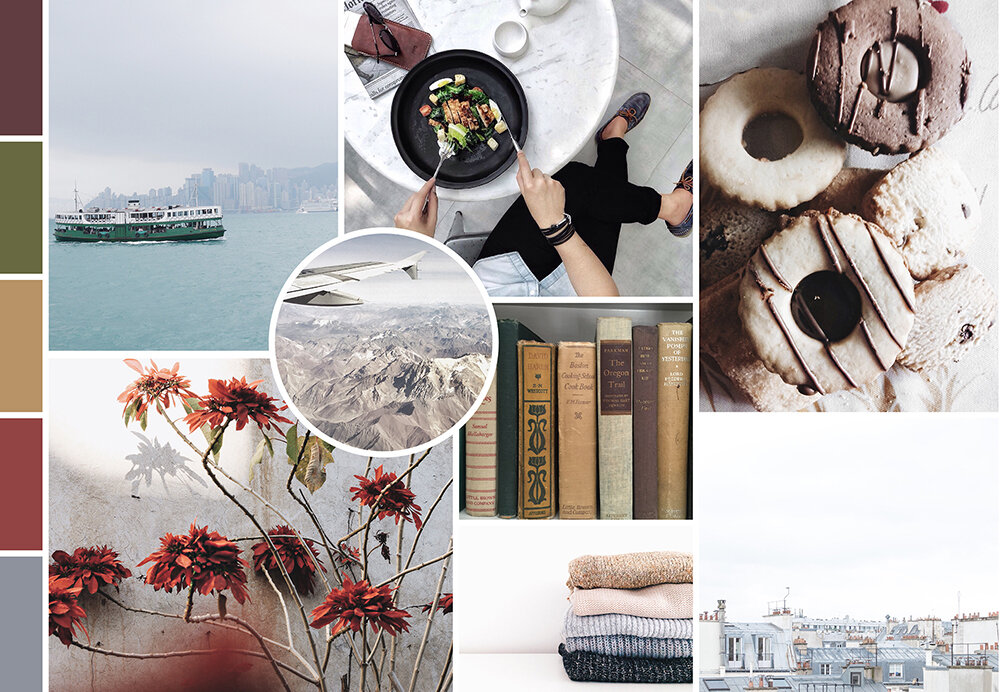
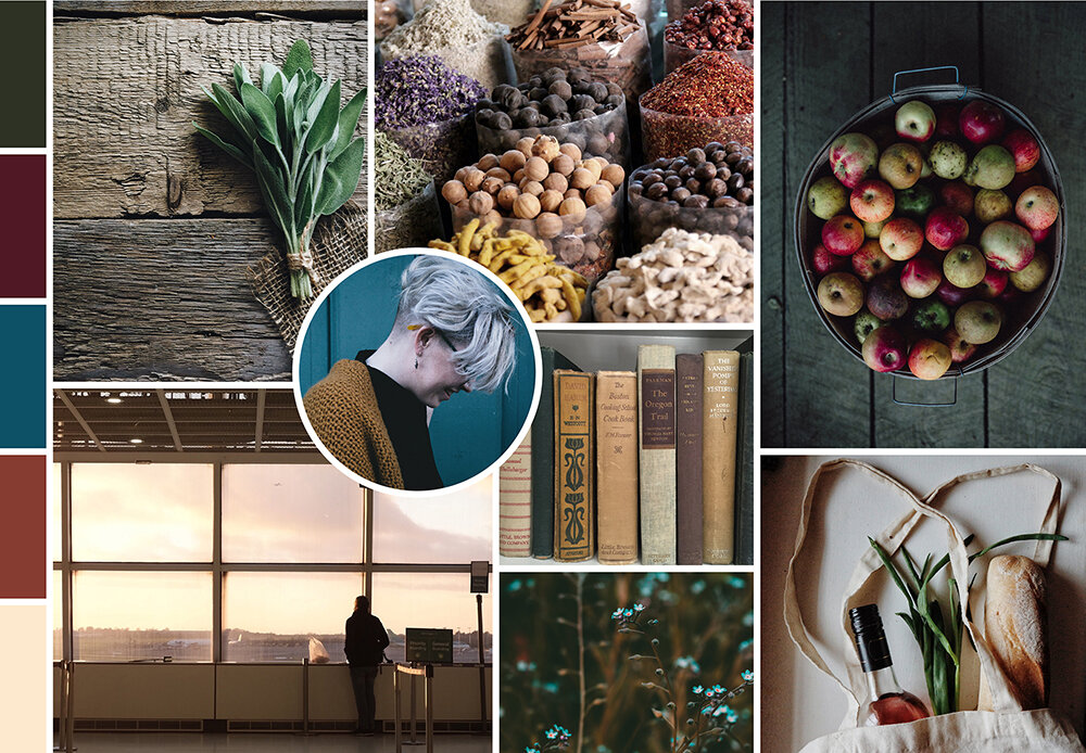
We set out to help her build her community with a brand she could be proud of. Before we could start designing logos, we needed to narrow down the feel of Luck’s brand.

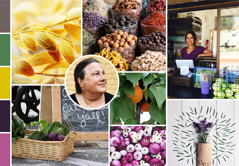
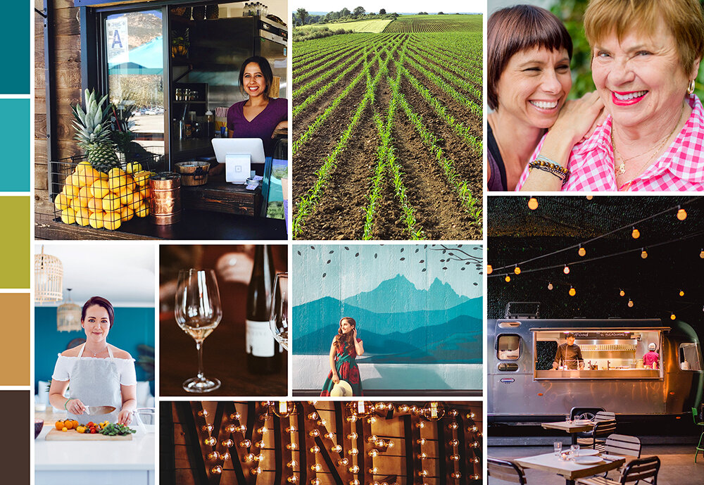
The best way to do this? Setting forth a series of five mood boards that all demonstrate a different feel and energy.


The winner? The below mood board… but with one request — we incorporate even brighter colors! Less earth tones and livelier hues.

 
Moodboard1.jpg
 

Once we got to the logo development stage, we kept Luck’s preference for brighter colors in mind. But first, we had to narrow down a concept. We toyed around with a variety of fun fonts, organic elements, and playful ideas. Here’s a sampling of some of the black & white concepts we considered:

Artboard 1.png

Ultimately, we ended up with a seal logo that incorporated the tagline “All Things Local.” Our final logo incorporated a bright pop of pink, a saturated green, and a vibrant blue. Deep grey and a soothing tan ground this color scheme.

Four variations of the logo ensure that there’s a mark to fit every space!

SoLocal Life launched earlier this year into — and while COVID has thrown many local businesses into flux, Luck’s support and online presence haven’t wavered. With local businesses working to make it through the pandemic, there’s no better person to follow for updates on all your favorite Boro businesses.

Follow Luck + SoLocal Life on Facebook, Instagram, and Twitter. And, stay up to date with her website here!

Mood Board: CMYK Inspired
Source 1  |  Source 2  |  Source 3  |  Source 4  |  Source 5  |  Source 6  |  Source 7

Source 1  |  Source 2  |  Source 3  |  Source 4  |  Source 5  |  Source 6  |  Source 7

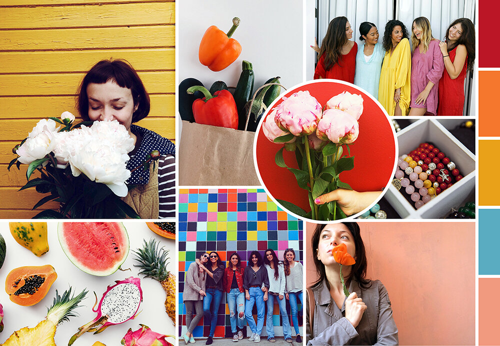
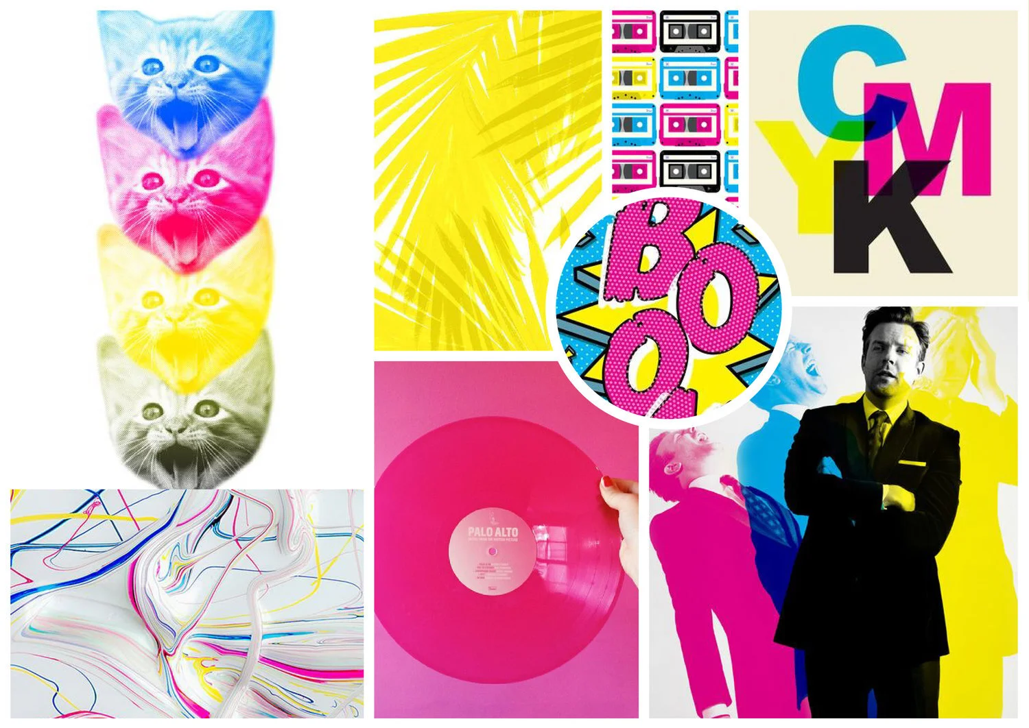
If you work in the design or printing industry, you're probably familiar with the CMYK color mode. But for those who have never heard of it, the CMYK color model is a subtractive color model used in color printing. CMYK refers to the four inks used in some color printing: cyan, magenta, yellow, and key (black).

This color blending mode is responsible for most of the printed materials you see and interact with every day... that's why we thought it deserved a little attention! Even though we're surrounded by beautiful colors every day, we rarely stop and think about what goes in to them. 

This funky, pop-art inspired mood board is our visual ode to the CMYK printing process. We know it's nerdy... but, hey, what can we say -- we love design and color! 


Hue & Tone Creative: Color + design lovers

Does the idea of picking colors for your website stop you in your tracks? Or maybe you just can't tell the difference between two shades of blue? That's what we're here for. At Hue & Tone Creative, we can help with everything from logo design to web development to print collateral. Want to see what we've done for our other clients? Take a look at our portfolio.

Mood Boards: Home Sweet Home

We have a confession to make...  We have a bit of an addiction to browsing home decor on Pinterest. But instead of adding to our already over flowing “dream home” board, this week we decided to channel our energy into some shareable content!

If you love day dreaming about how you're going to decorate your house, this little collection of "Home Sweet Home" moodboards is just for you!

Moodboards: Home Sweet Home  |  Hue & Tone Creative

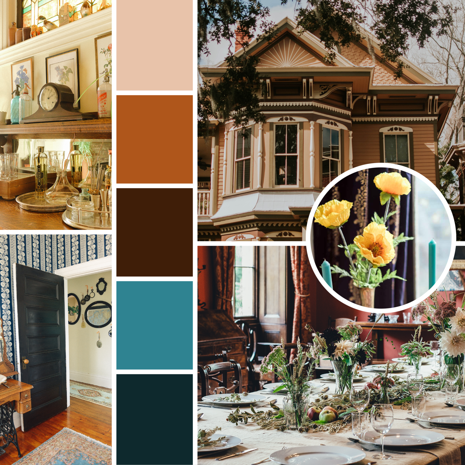
Victorian

During the Victorian era, plain jane décor was a major faux pas. Burgundy, burnt orange, and teal hues create a modern spin on the classic style. 


Artboard 2@5x.png

Ranch

For this color scheme, we were inspired by golden fields of wheat and rustic simplicity.  


Moodboards: Home Sweet Home  |  Hue & Tone Creative

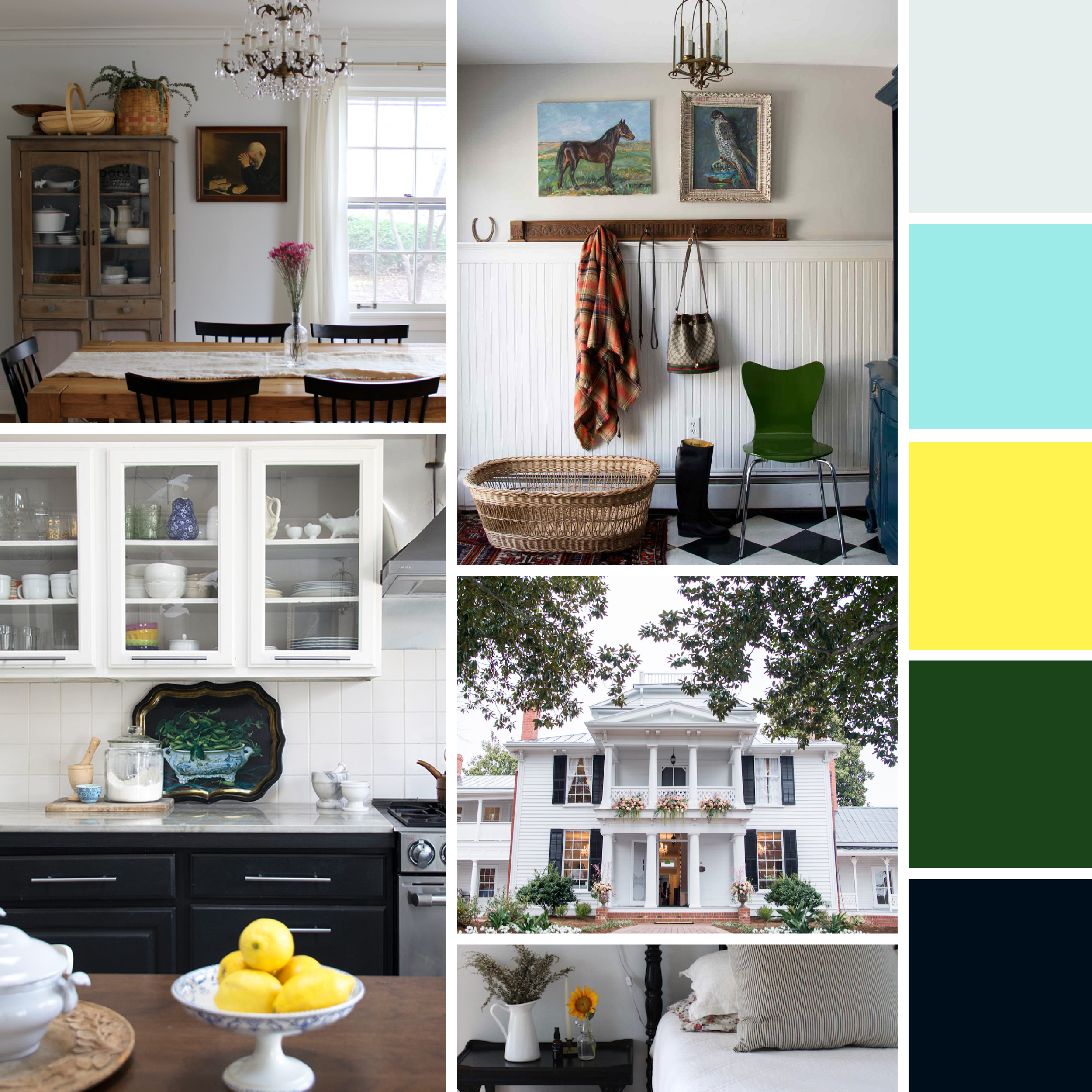
Colonial

Our collection wouldn’t be complete without one of the most popular American styles. Lemon zest, forest green, and robin’s egg blue add a nice contrast to a black and white canvas.


Moodboards: Home Sweet Home  |  Hue & Tone Creative

Cottage

We know it’s cheesy, but we’ve always loved Miss Honey’s teeny tiny cottage in Matilda. For this shabby chic palette, we chose muted shades reminiscent of tea roses, ivy, and aged stone.


Moodboards: Home Sweet Home  |  Hue & Tone Creative

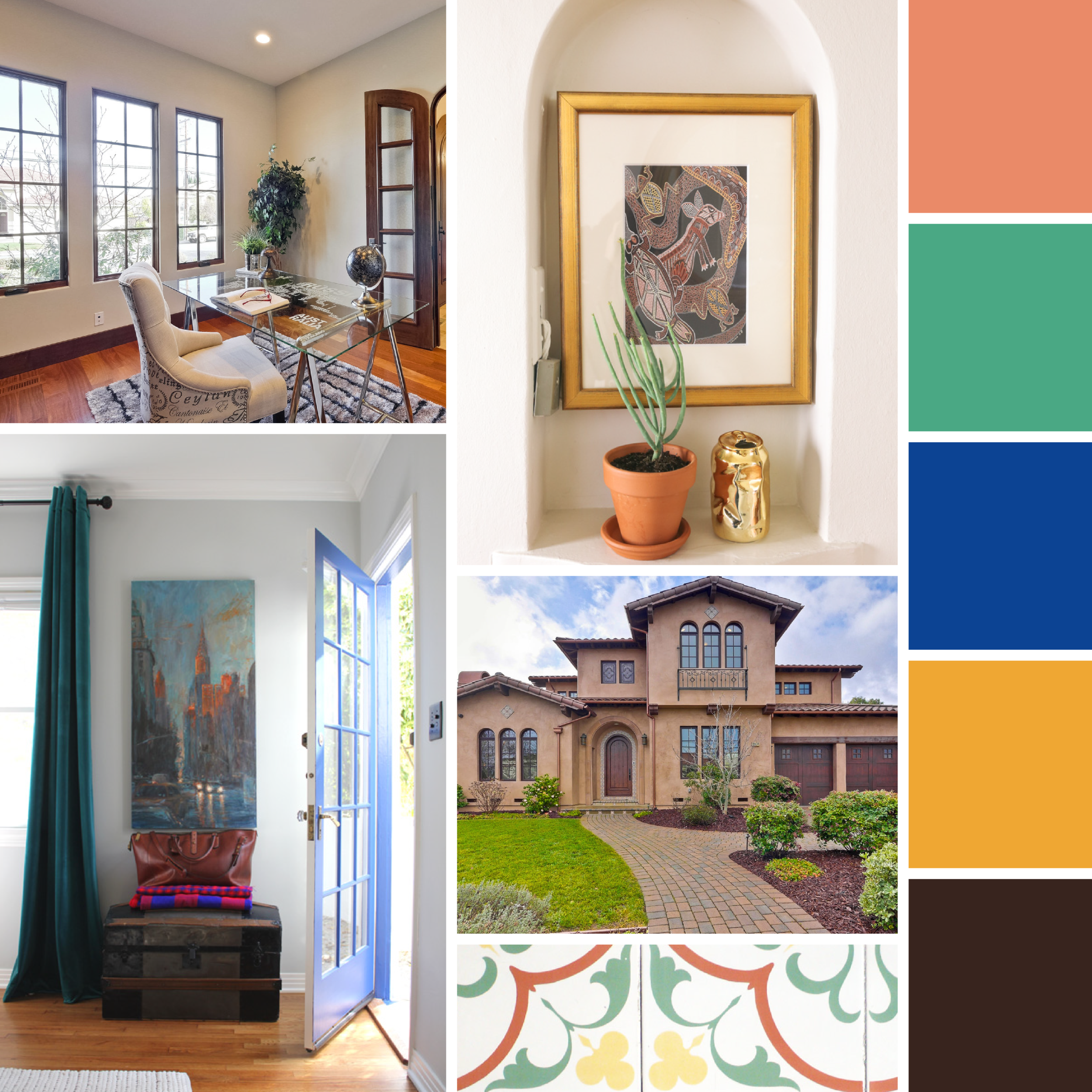
Spanish

For this rich scheme, we combined warm hues like papaya and goldenrod with a bold hint of sapphire.


What’s the style of your dream house? Share it in the comments!


Creative Services & Graphic Design in Greensboro, NC

In a creative slump? Take a break and leave it to the pros! Whether you’re looking to spice up a lackluster landing page or create a lookbook for your brand, Hue & Tone can add an artistic touch to any project.

Mood Boards: Museum Favorites

Creative inspiration can be found anywhere, from a scene in a movie to a trip to the museum.

This week, we cracked open our forgotten art history textbooks and found inspiration in the works of Impressionist, Post-Impressionist, and Art Nouveau masters.

No need for an artistic background- simply peruse through our collection of mood boards to find a little inspiration of your own.


Cezanne.png

Paul Cézanne

This rich mix of cool and warm tones can add a strong pop of color to websites, resumes, or business cards.    


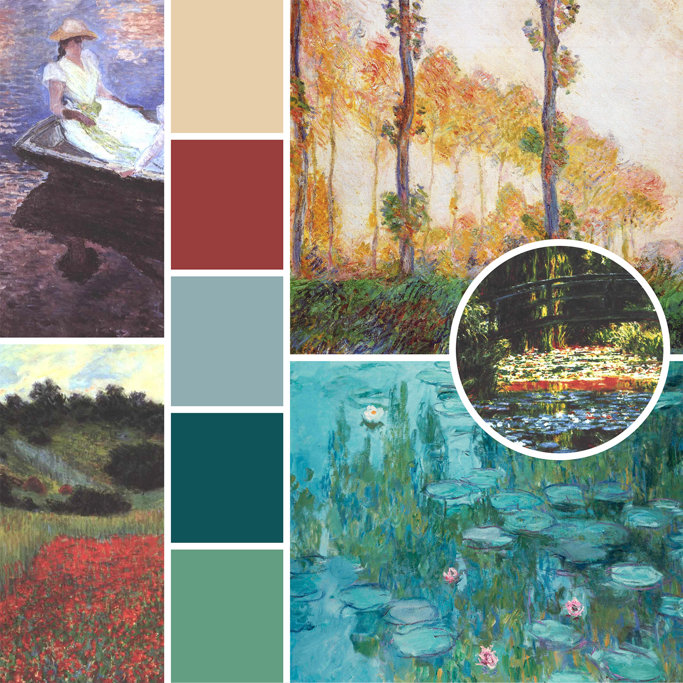
monet.png

Claude Monet

A bold punch of crimson adds an unexpected contrast to these lily pad greens.


Lautrec.png

Henri de Toulouse-Lautrec

For this color scheme, we channeled the fast-paced energy of Parisian dance halls filled with quirky partygoers.


degas.png

Edgar Degas

We loved the soft romantic feel of Degas’ delicate scenes. Adding a mossy green helped keep this pastel palate from feeling too girly.


klimt.png

Gustave Klimt

For this expressive color scheme, we channeled Klimt’s mosaic-like portraits and floral landscapes.


Mary Cassatt.png

Mary Cassatt

Although Cassatt’s Impressionistic scenes were inspired by Degas, she had a style all her own. Lively bursts of yellow and ochre standout against blue and green hues.


Who are your favorite artists? Let us know in the comments!


Graphic Design and Creative Marketing in Greensboro, NC & Winston-Salem

At a loss for design inspiration? Let us give you a hand! From brand boards to personal branding, Hue & Tone Creative can help add color and artistic flair to any project.

Mood Boards: Around the world

Summertime is just around the corner and we’ve been bitten by the travel bug.

To quench our recent wanderlust, we used some creative energy to build a few mood boards inspired by beautiful destinations around the world.
Ready? Let’s go!

Around the world moodboards  |  Hue & Tone Creative

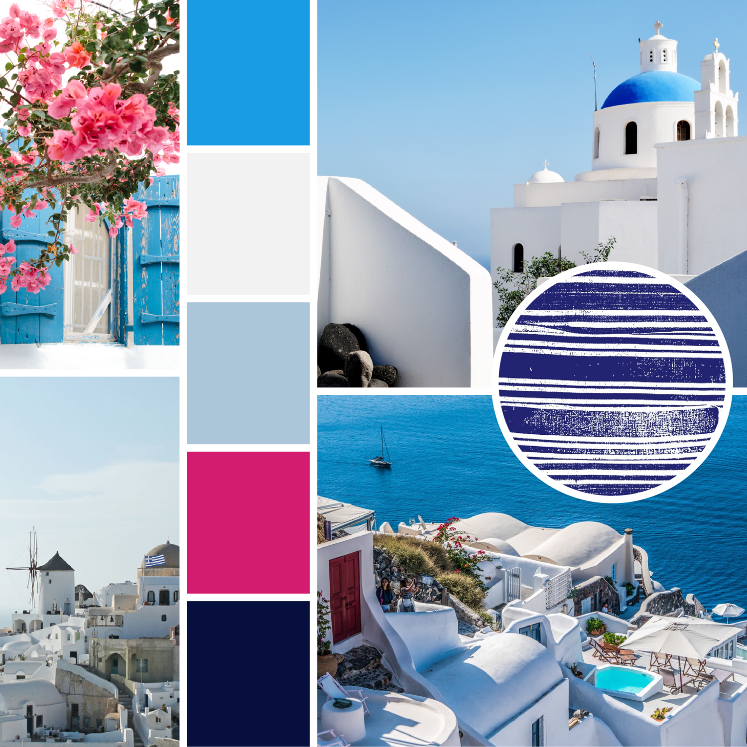
Greece

Craving a trip to the sea? Relax on the warm shores of Mykonos and explore the winding cliffside villages of Santorini.
 

Around the world moodboards  |  Hue & Tone Creative

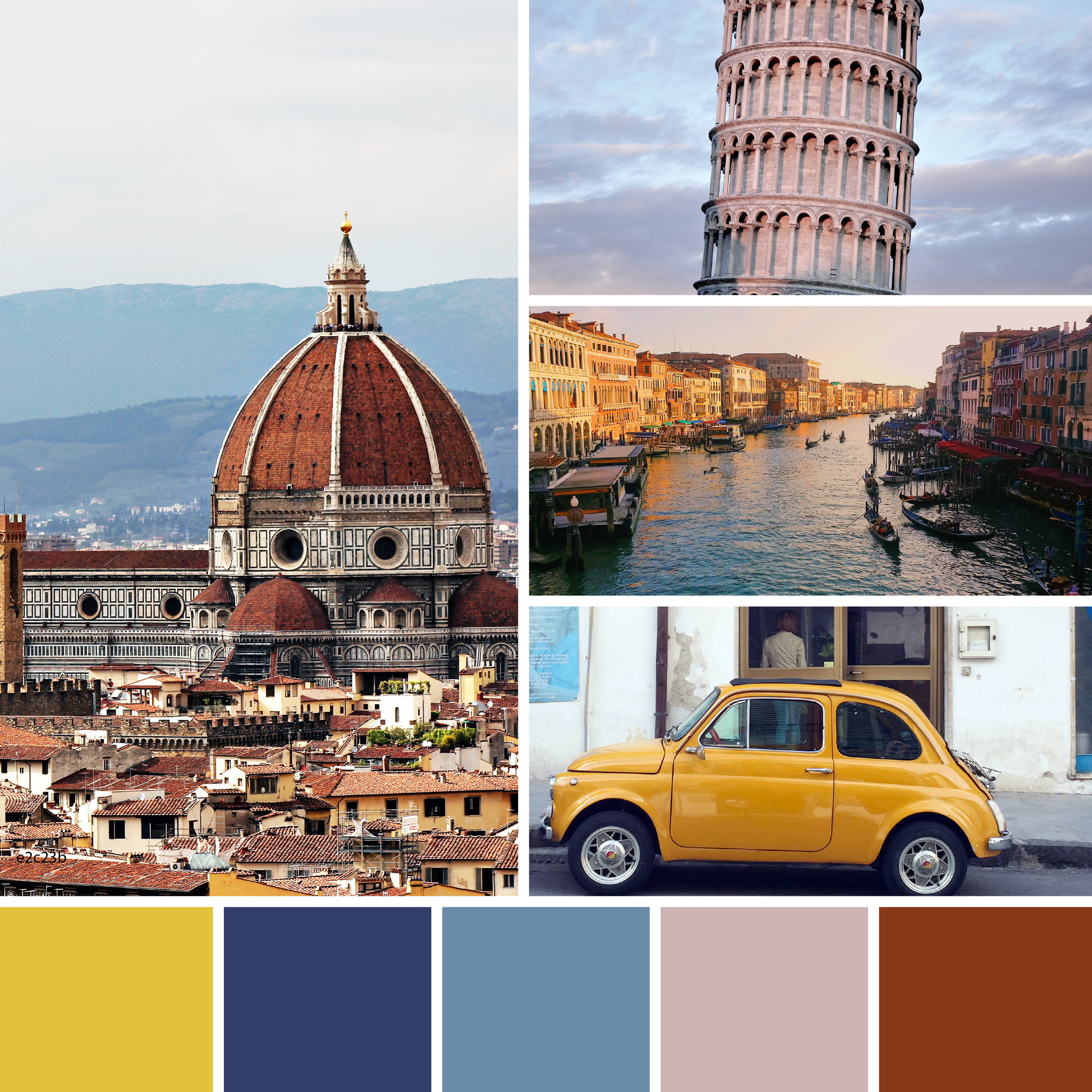
Italy

From famous works of art to incredible food, Italy never fails to impress. We channeled the country’s rich culture and ancient landmarks for this warm and earthy mood board.


Around the world moodboards  |  Hue & Tone Creative

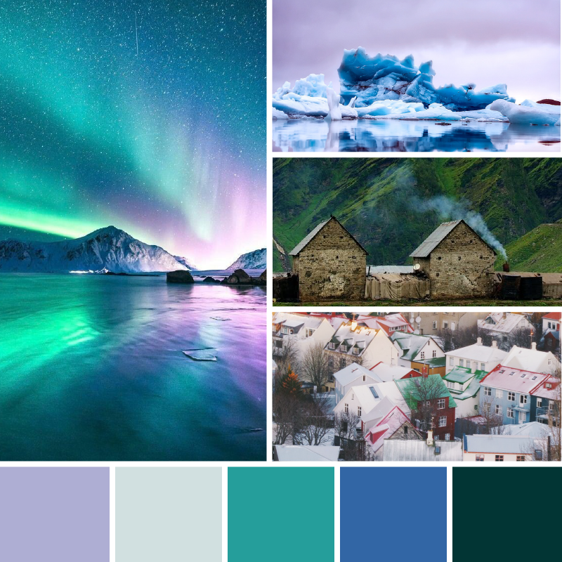
Iceland

Even though the Northern Lights are most visible in the wintertime, summertime in Iceland is full of natural beauty.


Around the world moodboards  |  Hue & Tone Creative

The South of France

Fragrant lavender, picturesque beaches, and charming hillside villages helped inspire this airy color scheme.


Around the world moodboards  |  Hue & Tone Creative

England

Whether you’re wandering the busy city of London, or enjoying the simplicity of the countryside, England is full of things to do and places to visit.


Around the world moodboards  |  Hue & Tone Creative

Spain

Spain is the perfect destination for creative spirits and nomads alike. The vibrant streets and whimsical architecture sparked this bold and quirky palate.


Want even more inspiration? Revisit our past mood boards here.  


Creative Services & Graphic Design in Greensboro, NC

In need of a creative refresh? We’ve got you covered. From look books to blog design and everything in between, Hue & Tone can help bring your vision to life.