Posts tagged mood board
Color Stories: Fall Looks for 2018

What can we say? We love fall! We know it’s still hotter than heck, but we can’t help but get excited about the impending pumpkin spice, fall leaves, and chunky sweaters. 

In fact, we also got really excited about fall last year on the blog ... and the year before … and the year before that. Basically, creating fall inspired mood boards is becoming a regular thing for us. However, this year we’re pushing ourselves to go beyond red, orange, and yellow to come up with a more out of the box set of fall palettes.  

We’ll admit, a few traditional fall colors worked their way into our mood boards – but overall we stuck to less traditional hues to keep things fresh. 

Take a look at what we came up with here – and, let us know which is your favorite in the comments!

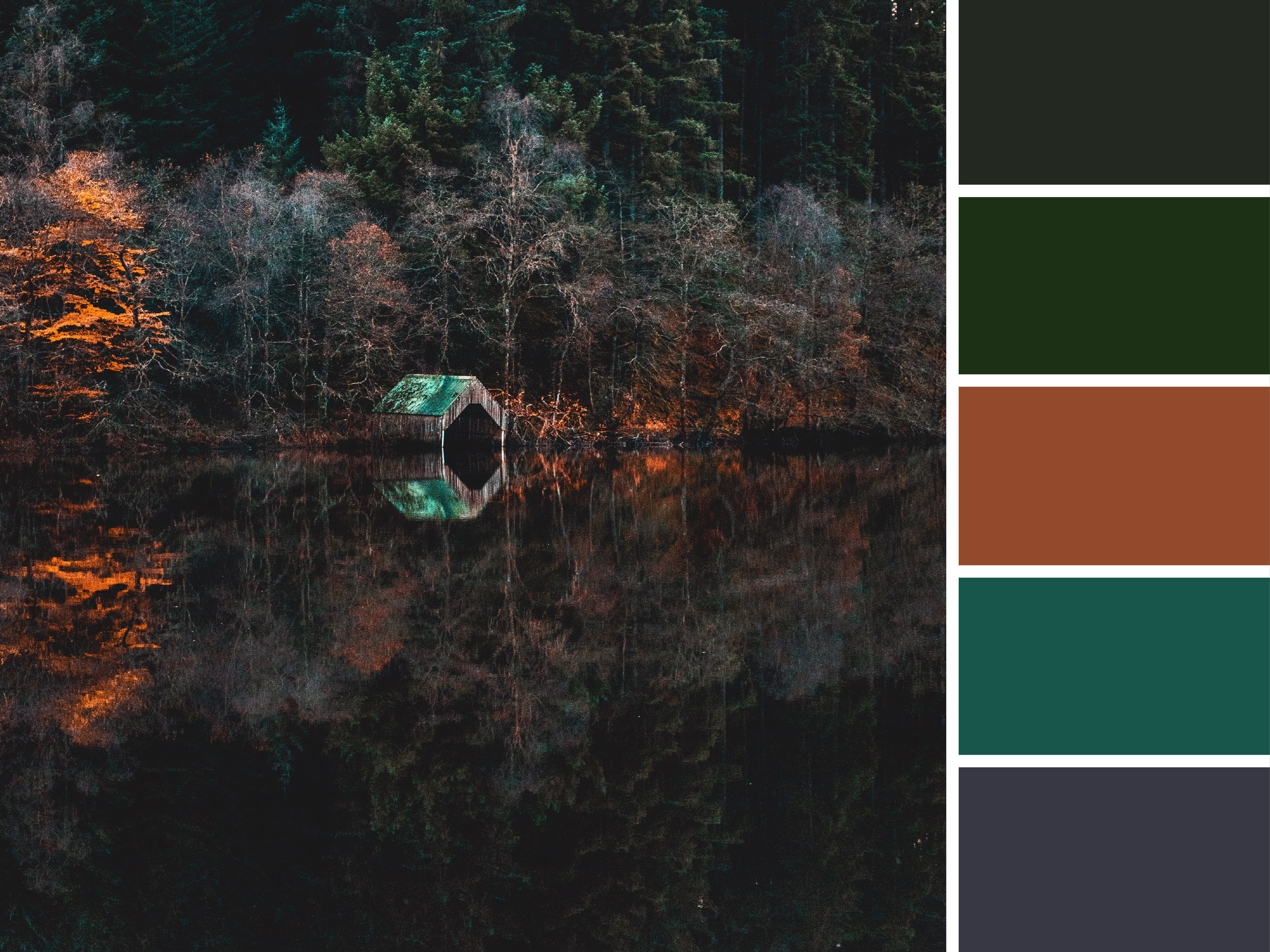
Luscious Lake

The lake in this photo looks peaceful, but these deep colors evoke a feeling of something a little darker. Deep, rich jewel tones gives off a luscious feel. 


Moodboards_Urban-02.jpg

Crisp and Clean

Fall is all about baking and enjoying the outdoors. That’s why this tasty close up was a perfect fit for us. Cool greens and a muted ice blue speak to winter being right around the corner. 


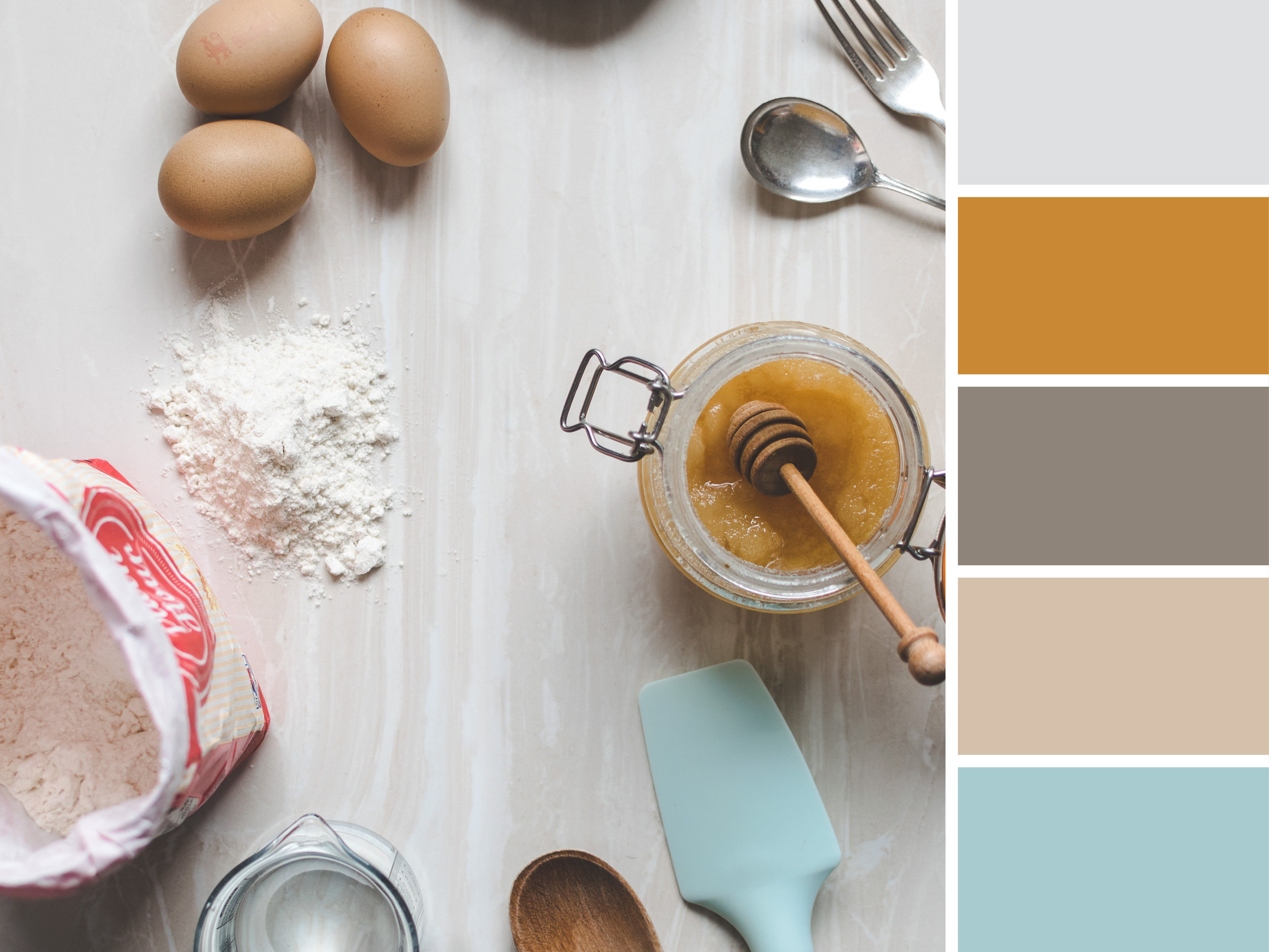
Culinary Creativity

Family recipes abound in autumn, making it the best time to draw inspiration from your culinary supplies. Warm honey, flour, and a few kitchen tools informed this color scheme. 


Bold Bounty

This plenitude of heirloom tomatoes was perfect for a more primary color scheme. These brighter hues are a fun alternative to the soft side of fall. 


Moodboards_Urban-05.jpg

Dusty Detritus

Downed leaves make for some beautiful colors. We loved pulling inspiration from this fallen foliage. Muted lavender, subdued peach, and an understated charcoal have a soothing effect. 


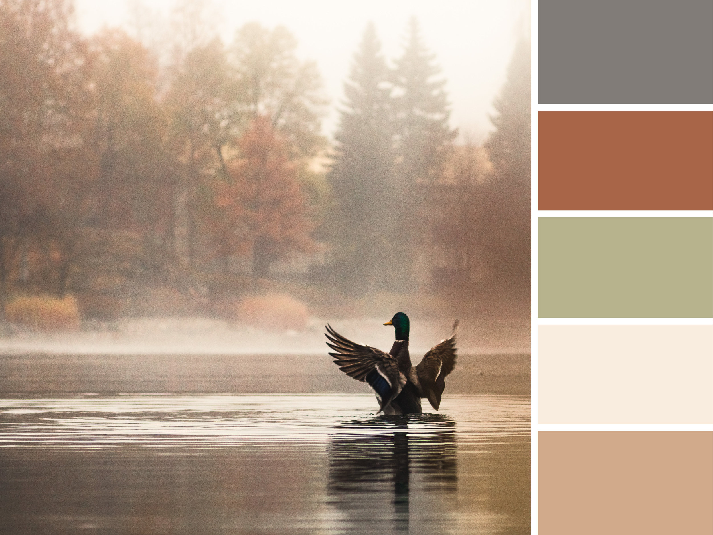
Foggy Fowl

Soft lighting sets the mood here with creamy taupe, a soft sage, and a rusty brown.  


Design + Branding for Greensboro, NC and Beyond

Color scheme need an update? Brand feeling stale? Logo looking outdated? We can fix all of that -- and more! Based out of the Triad, our team can help you refresh and revitalize your flagging brand. More than just an outside team, we'll become your partner in all things visual and marketing related. Sound like what you're looking for? Give us a call.

Mood Board: CMYK Inspired
Source 1  |  Source 2  |  Source 3  |  Source 4  |  Source 5  |  Source 6  |  Source 7

Source 1  |  Source 2  |  Source 3  |  Source 4  |  Source 5  |  Source 6  |  Source 7

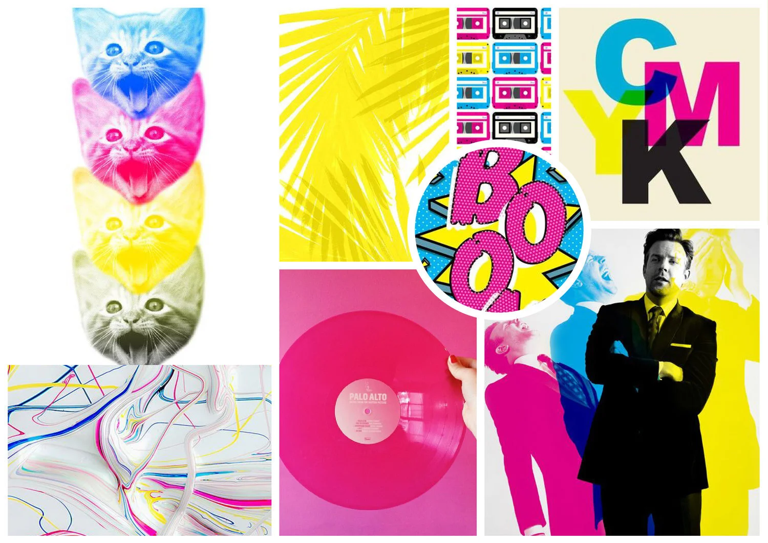
If you work in the design or printing industry, you're probably familiar with the CMYK color mode. But for those who have never heard of it, the CMYK color model is a subtractive color model used in color printing. CMYK refers to the four inks used in some color printing: cyan, magenta, yellow, and key (black).

This color blending mode is responsible for most of the printed materials you see and interact with every day... that's why we thought it deserved a little attention! Even though we're surrounded by beautiful colors every day, we rarely stop and think about what goes in to them. 

This funky, pop-art inspired mood board is our visual ode to the CMYK printing process. We know it's nerdy... but, hey, what can we say -- we love design and color! 


Hue & Tone Creative: Color + design lovers

Does the idea of picking colors for your website stop you in your tracks? Or maybe you just can't tell the difference between two shades of blue? That's what we're here for. At Hue & Tone Creative, we can help with everything from logo design to web development to print collateral. Want to see what we've done for our other clients? Take a look at our portfolio.

Mood Boards: Falling into Fall

October is finally here and we’re ready for all things fall. It’s time to trade in our summer sandals for boots, grab our favorite cardigan, and eat ridiculous amounts of pumpkin flavored baked goods.
In the spirit of the new season, we’ve put together a little collection of autumn inspired mood boards: 

Mood Boards: Falling into Fall  |  Hue & Tone Creative

Pumpkin Spice

Yes, we know all things pumpkin spice are a bit overrated, but we couldn’t resist! It just wouldn’t be fall without it.


Mood Boards: Falling into Fall  |  Hue & Tone Creative

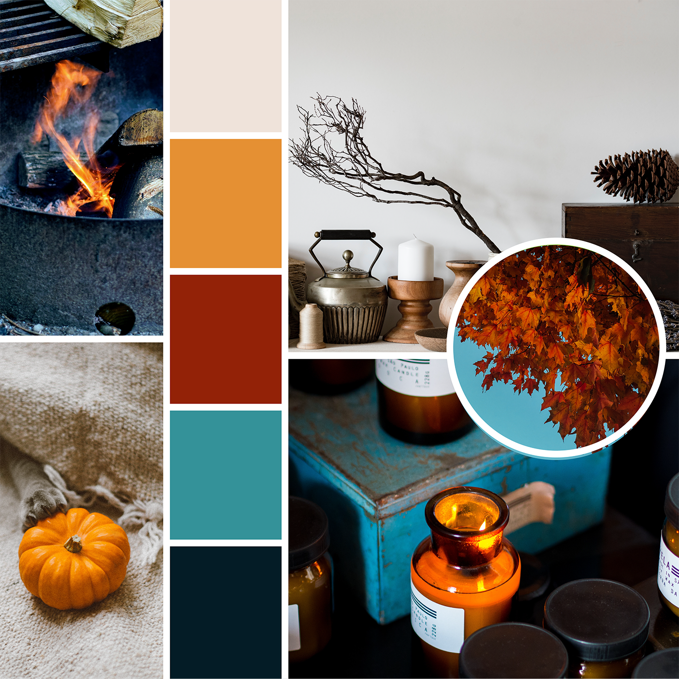
Ember

This color scheme was inspired by the warm glow of seasonal candles and the relaxing crackle of a campfire. 


Mood Boards: Falling into Fall  |  Hue & Tone Creative

Woodland Escape

There’s nothing better than going on a walk on a crisp autumn day. We love the feel of a cool morning breeze and the sound of leaves as they crunch with each step. 


Mood Boards: Falling into Fall  |  Hue & Tone Creative

Cozy Cabin

Fall is the perfect time to enjoy freshly picked apples and endless mugs of hot chocolate. 


Mood Boards: Falling into Fall  |  Hue & Tone Creative

Autumn Leaves

Our final board was inspired by the simple beauty of the changing leaves. A soft touch of yellow and green add a subtle dash of color to chocolate brown.


What do you love most about fall? Let us know in the comments!


Social Media Marketing & Graphic Design in Greensboro, NC

New season, new look. Fall is the perfect time to give your brand a little refresh. From business cards to websites, Hue & Tone Creative can help give your brand’s look an upgrade.

Mood Boards: Blast from the Past

Lately, we’ve been feeling a little nostalgic. Since we don’t have a DeLorian to help us hop back in time, we decided to get a little creative.

Take a trip to the past with our collection of retro mood boards: 

1960’s 

Moodboards: Blast from the Past  |  Hue & Tone Creative

Listening to Pandora’s 60’s French Pop station helped put us in the mood to create our first board. We love the graphic prints and classic style of this iconic decade.


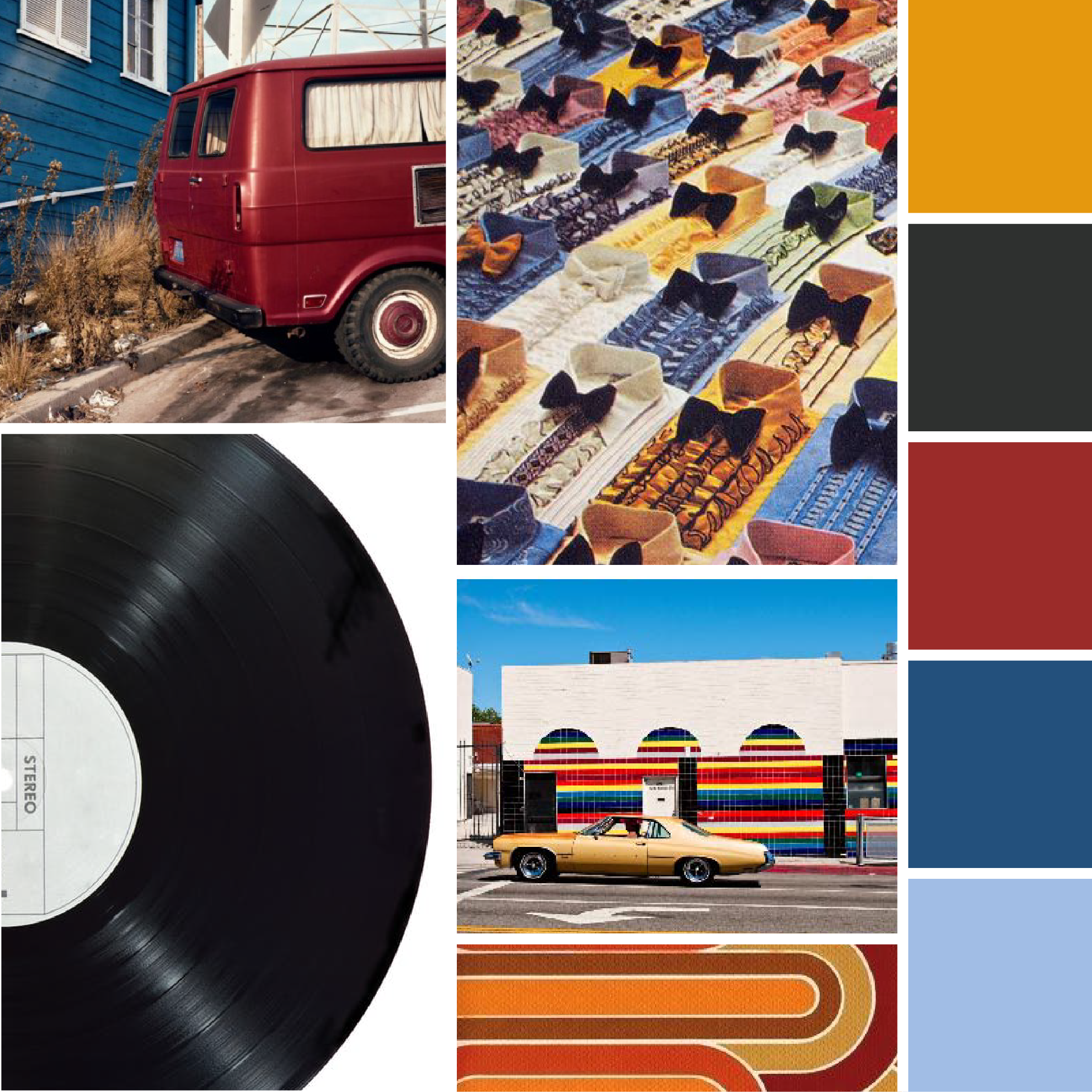
1970's

Moodboards: Blast from the Past  |  Hue & Tone Creative

While we like the look of ruffled shirts in the 70’s, we’re happy they haven’t made a comeback.


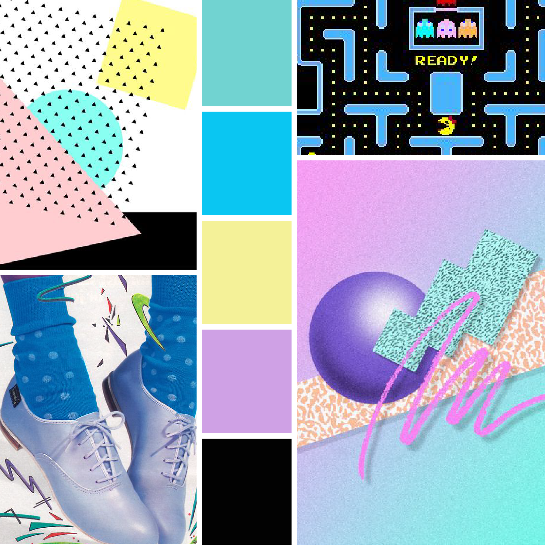
1980's 

Moodboards: Blast from the Past  |  Hue & Tone Creative

This bright color scheme may have fueled an 80’s movie marathon on Netflix… 


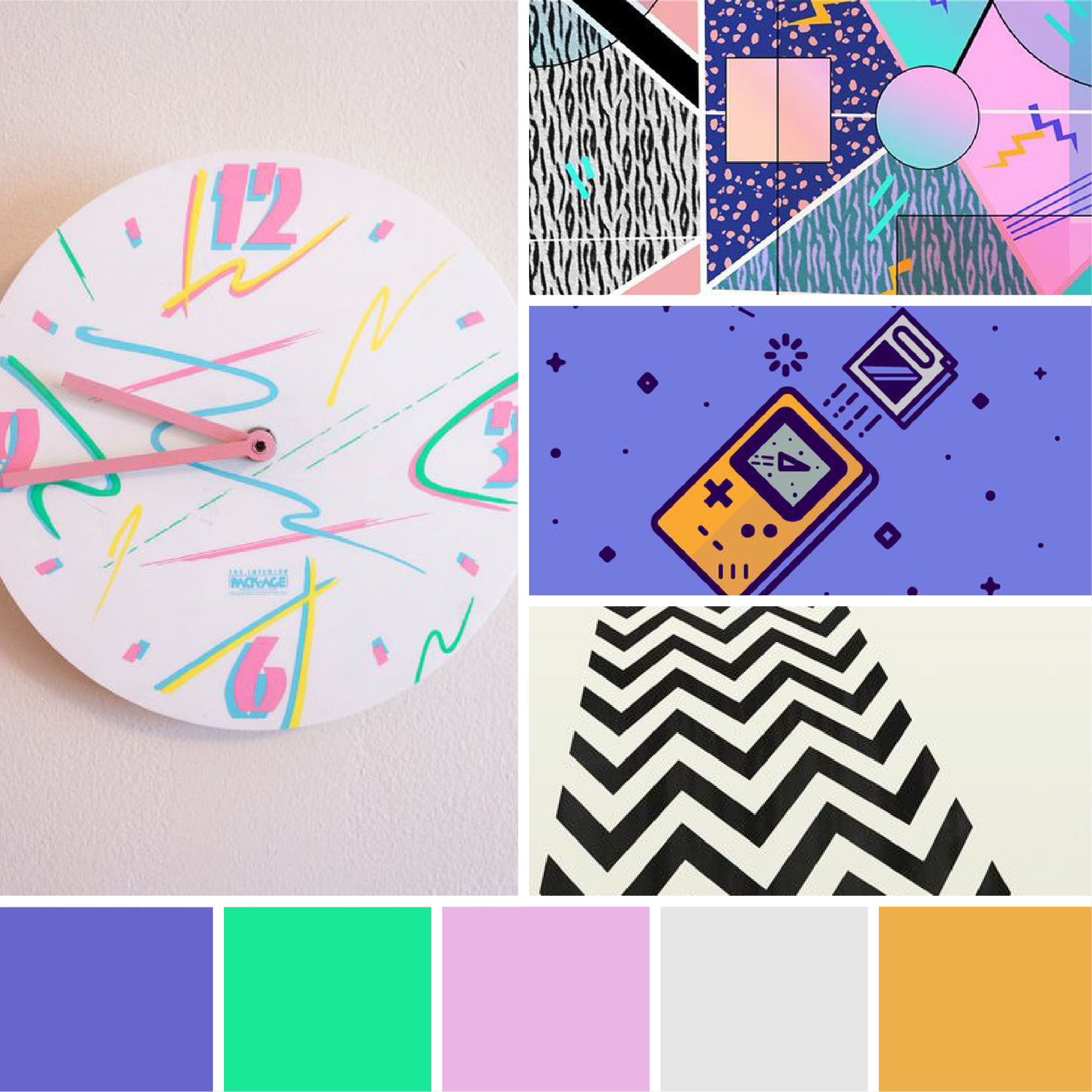
1990's

Moodboards: Blast from the Past  |  Hue & Tone Creative

90’s style has definitely found its way back in recent years. We’re loving these bold geometric patterns and energetic colors. 

What’s your favorite decade? Let us know in the comments!


Greensboro Graphic Design Company: Hue & Tone Creative

In need of a little inspiration? Hue & Tone can help supercharge your creativity. From graphic design to social media management, we’ve got you covered. 

Mood Boards: Autumn Inspiration

Autumn is (finally really) here! Many celebrate this change in season with chunky sweaters, holiday music, and pumpkin-spiced everything (seriously, why is everything flavored with pumpkin?!).

At Hue & Tone, we like to celebrate fall with a little visual inspiration.  Lately, we’re craving rich tones, warm textures, and natural aesthetics.  Want to peak into our minds? Check out our collection of mood boards below:

Blue & Citrus

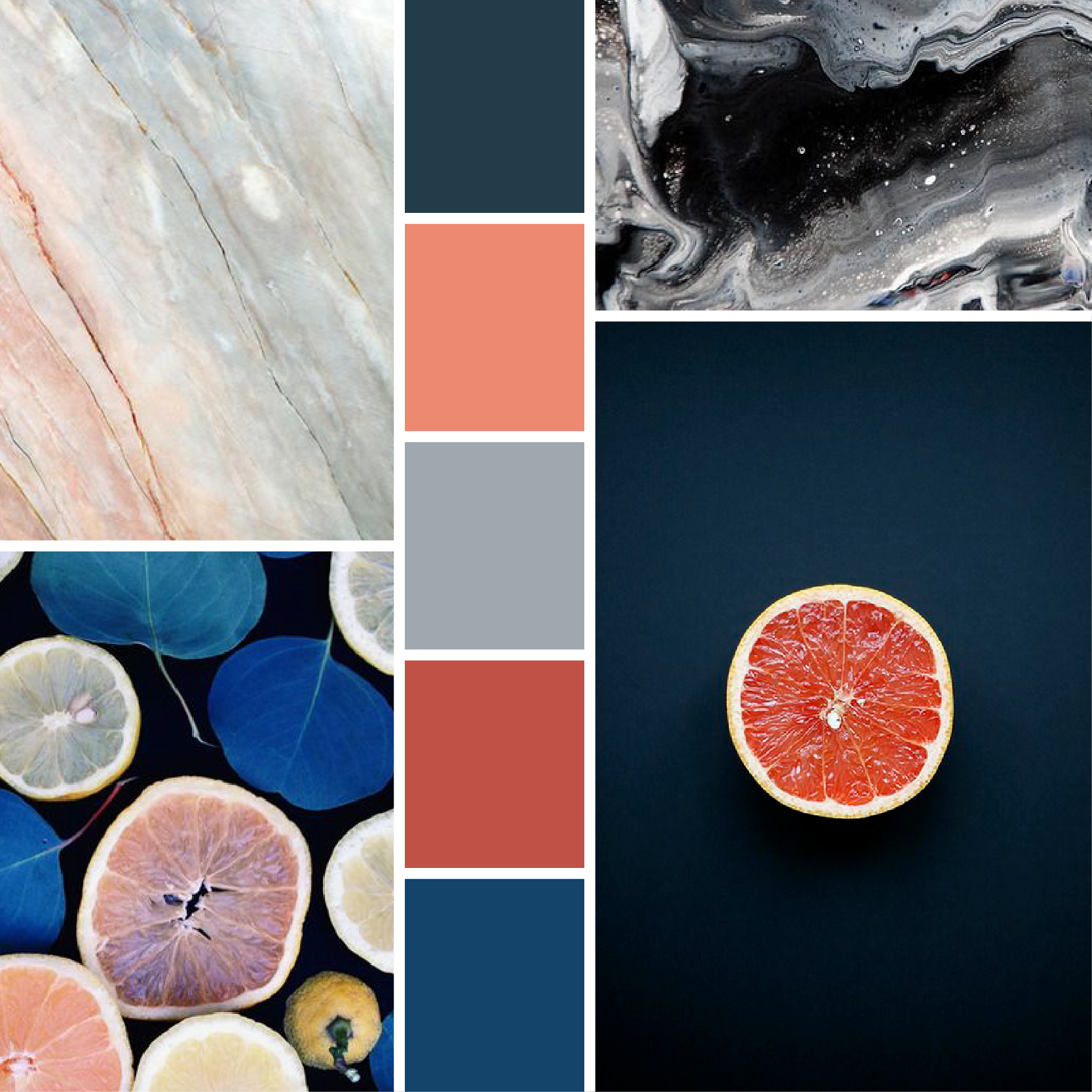
We’ve been seeing a lot of navy and coral lately. Teal and grey provide a refreshing update to this color trend.


Rustic Warmth

This chilly autumn air makes our hearts long for a log cozy cabin, campfires, and misty morning sunrises. 

MoodBoard-02.jpg

Flora & Fauna

A change in temperature justifies a Netflix binge. Princess Elizabeth’s visit to Africa on The Crown inspired this prim and natural color scheme.  


Desert Rose

These hazy muted colors and cacti imagery make us want to take a road trip to the South West.


Pomegranate Wine

We’re loving deep plum hues paired with rich neutral textures.


Vibrant & Crisp

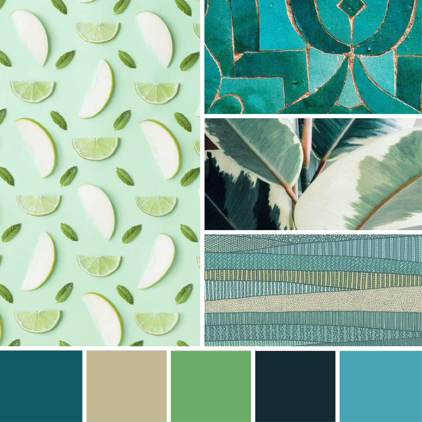
Playful green hues paired with geometric patterns. 


Muted Sea

Calm blues and soft neutrals.


What are your favorite color combos? Let us know in the comments!  

From Camille: My mood board experiment

Hi all, Camille (the new intern) here!

This week I’ve decided to try my hand at making a mood board. While looking for design inspiration, I'd been seen tons of inspiration mood board. Not only did they look fun to make, I felt like they were a perfect first project for Adobe Illustrator! I’ll preface by saying, I've never made a mood board before. I decided to walk you through the step-by-step process of creating my first one!  I should also mention that I am a beginner with Adobe Illustrator, so this is all a learning process for me. So...*finger’s crossed.*

My first real step was to find pictures, but before that -- a theme! Pinterest is always my go to for inspiration of any kind, especially pictures. I chose to do a summer theme (because who doesn’t have summer on the brain right now?) and I love looking at bright, colorful colors... so, that’s the theme for the day!

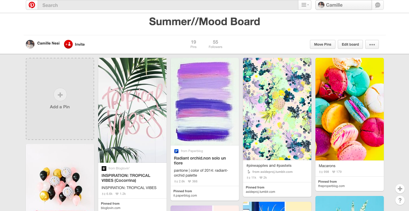
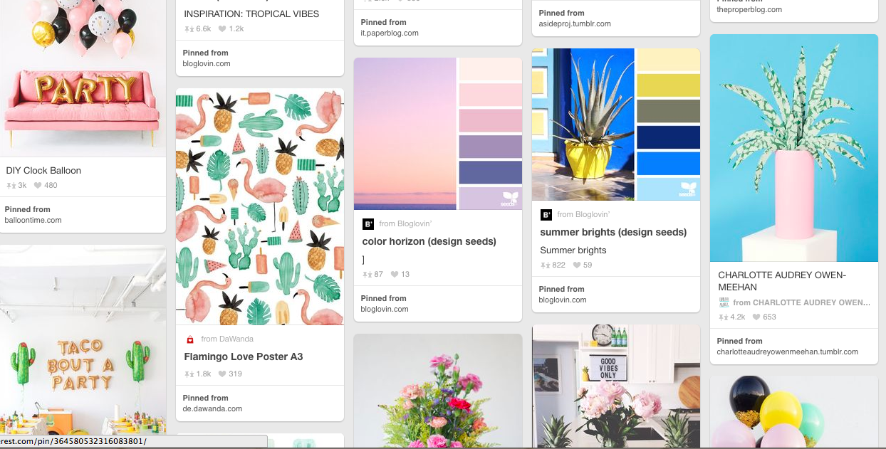
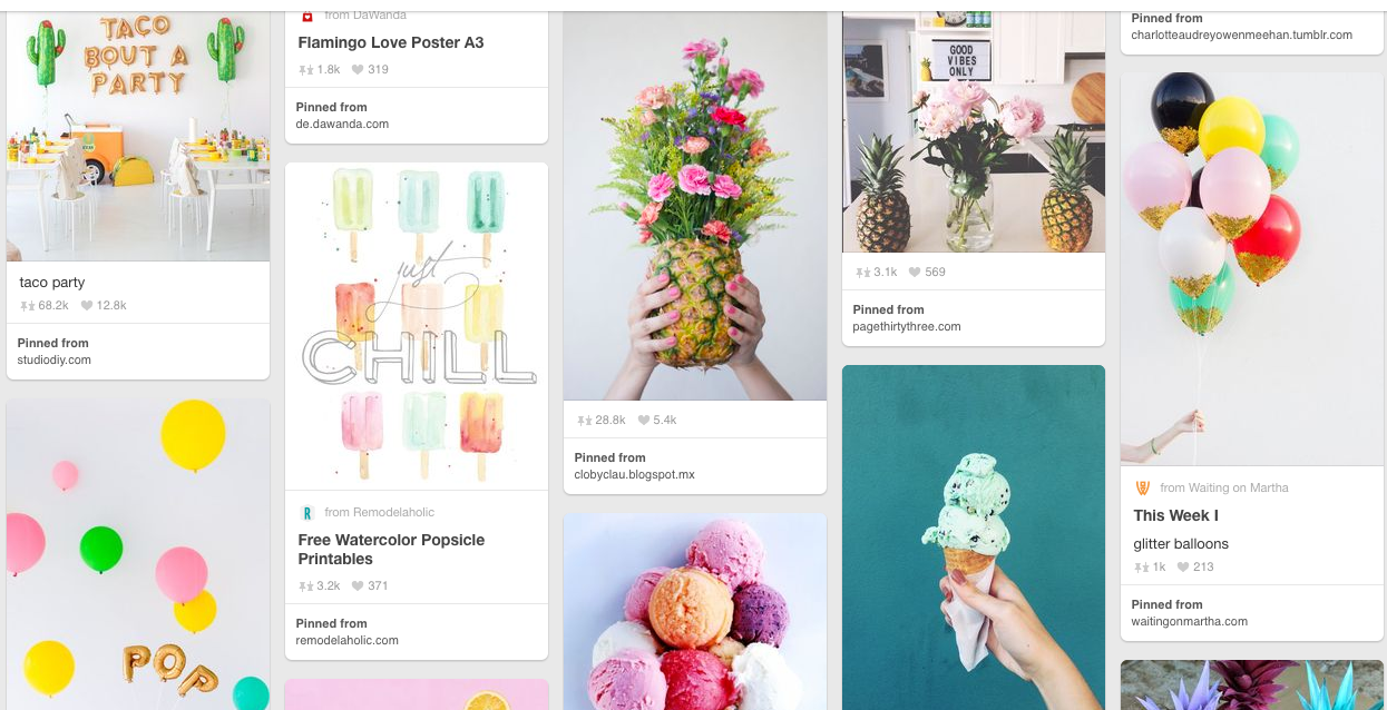
STEP ONE: PINTEREST BOARD. First, I made a summer mood board on Pinterest, and began to search “summer” items. I pinned about 19 images to this board (I got a little excited!)

I planned to only use about 10 of the 19 images, but it’s always great to have extras. I was looking for images that not only had a common theme, but that had similar colors so that they would mesh well together for the final mood board.

STEP TWO: CHOOSING IMAGES. I chose about 10 images that I thought was the most “summer inspired” images   

STEP THREE: MOOD BOARD TEMPLATE. I found a few mood board templates to use here here and here. If you’re ever in need of a template these are great to use! I used one of these template to get started on my board.

STEP FOUR: PLACE IMAGES. ‘File’ → ‘Place’ → Locate images.

STEP FIVE: IMPORT TEMPLATE. Repeat the same steps above to import your template! (This one was perfect for me because it even came with instructions!)

Step Seven

Step Seven

STEP SIX: LAYOUT PHOTOS. Next, I spent some time playing around with the position of the images.

STEP SEVEN: CLIPPING MASK. Once I had the images all lined up with my template I clipped them to fit the space. Just draw a box over the image → select the image and box → ‘Object’ → ‘Clipping Mask’ → ‘Make’. This will crop the image to fit in the box you just made.

STEP EIGHT: REPEAT. I continued to do this with all of the images, and felt like I was starting to get the hang of it! At this point, it was looking better than I had thought it might… and so far it was even easier than I expected.

Borders!

Borders!

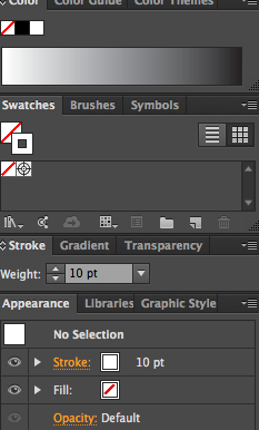
STEP NINE: BORDERS. I could see the finish line at this point! Now that all the pictures were imported I wanted to put white borders around each picture. Not going to lie, I had to Google how to do this. It turned out to be pretty simple -- just not very intuitive to a first time user. For my first attempt, I added a border around each of my images, but this ended up making the lines uneven. Some of them were overlapping, or uneven.

So, I pulled all the borders off and drew regular lines in the pattern of mood board. This made a much more even end result!

STEP TEN: VOILA! Finished product. My first ever mood board, complete.

Sources: One  |  Two  |  Three  |  Four  |  Five  |  Six  |  Seven

The best part of this process was definitely pinning the pictures and watching the whole thing come together. Who knew a bunch of random pictures I pinned on Pinterest could form into something so cohesive? Something that could actually inspire a project?  A lot of googling was involved, but I know I’ll remember what I’ve learned and be able to build off of it for next time.

Thanks for following along, until next time,

 
Mood Board: Vivid + Modern Retro

Spring has officially sprung -- and with it so has our love of bright colors. Oh wait.... we have that year round. 

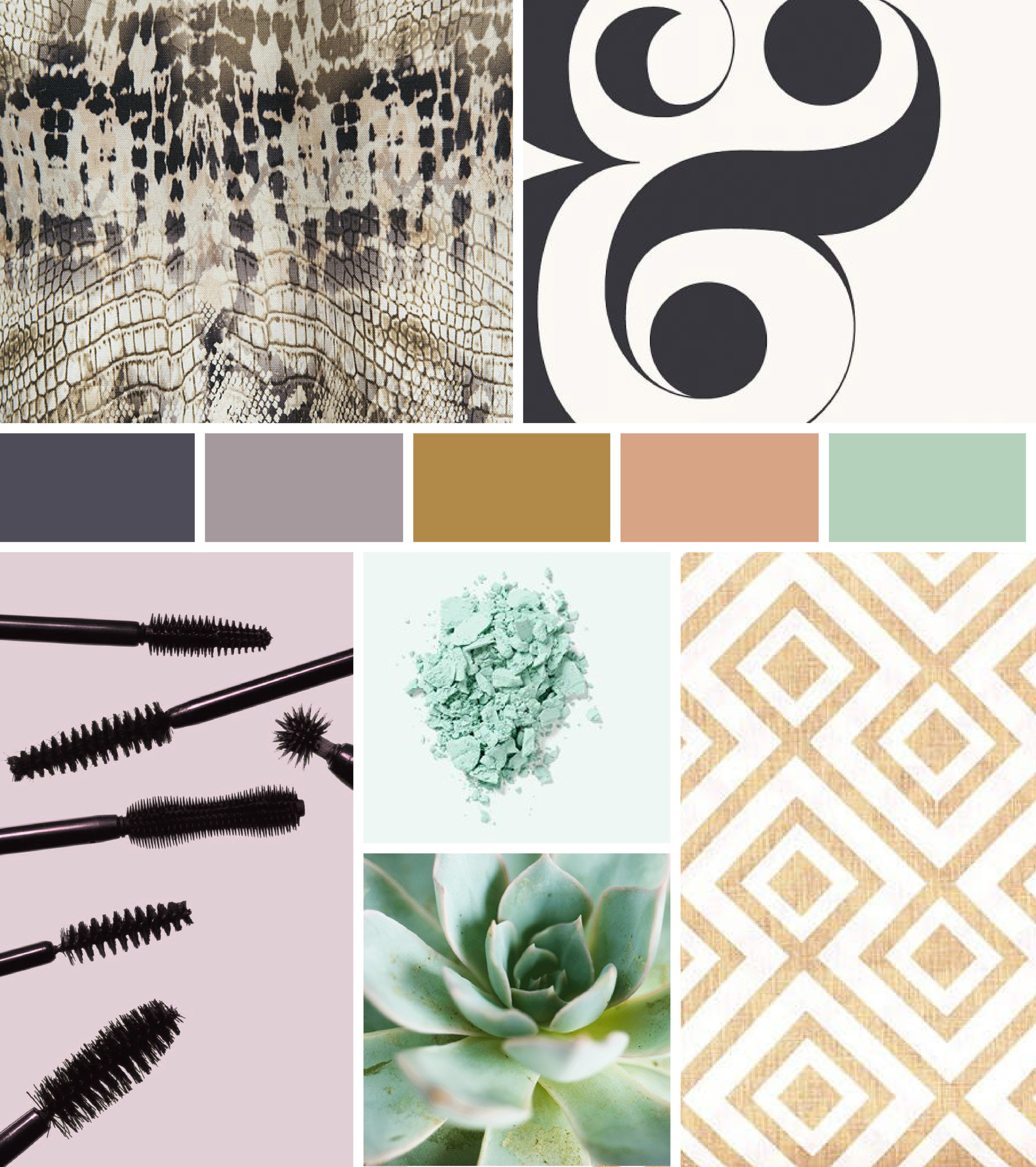
This mood board uses bright colors to break the mold of what might be considered retro. Instead of a totally throw back style, we're fans of including retro elements -- hints of more muted colors (like the seafoam), groovy lines and streamlined styles. 

Mood Board: Peach in Paradise

It's been a week since we posted our spring-inspired color schemes and the approaching warm weather is still at the front of our mind... 

It's been a busy month, and we've needed an extra bit of inspiration. For us, that means browsing Pinterest + design books + local art galleries. Putting together a mood board allows us to draw on an image we find inspiring and see where it takes us... and that was exactly our process for this "Peach in Paradise" mood board!

MoodBoard-01.png

One  |  Two  |  Three  |  Four  |  Five  |  Six 

Where do you look for inspiration? Is there an image you want us to build a mood board around?

Mood Board: Everything isn't black and white

“Its not easy taking your own advice, accepting what you don't like hearing, & seeing the grey amongst the black & white.” 
― April Mae Monterrosa

During an especially busy week, it's important to remember that everything isn't black and white. This mood board is inspired by the idea that when it comes to a design problem there's no right or wrong answer -- only different potential solutions. 

MoodBoardBW-01.jpg

One  |  Two  |  Three  |  Four  |  Five  |  Six