In an ideal world, your website visitors would never find themselves faced with a 404 page. But, suffice it to say, this isn’t an ideal world — people type things in wrong, links break, and technical difficulties happen.
Although your first plan of action should be ensuring there are no broken links on your site in the first place, there are ways you can make the most of a bad situation. If a visitor finds themselves facing a 404 page, you can turn their irritation into an opportunity to entertain them, sell yourself, or provide them with valuable resources.
Here’s a few people we think will delight their customers with their weird and wonderful 404 pages:
Pixar
It’s clean. It’s simple. It’s on-brand. It’s a complete over-exaggeration of the reaction you probably had. And in our opinion, it completely works.
Bluepath
Funny and relevant: the best combination! Bluepath’s a data strategy company, so they aptly designed a data-driven map to show their lost visitors where they stood.
Lego
Like Pixar, Lego let their 404 page serve as an extension of their existing brands. They capitalized on a few favorite characters to illustrate the situation visitors have found themselves in.
HubSpot
Not every brand necessarily has a set of iconic characters to bring their 404 page to life. But, as HubSpot have shown, this doesn't have to stop you from having a bit of fun.
They’ve also smartly reinforced their audience’s love of their services and cleverly tried to redirect them to a handful of other, selected pages - win, win!
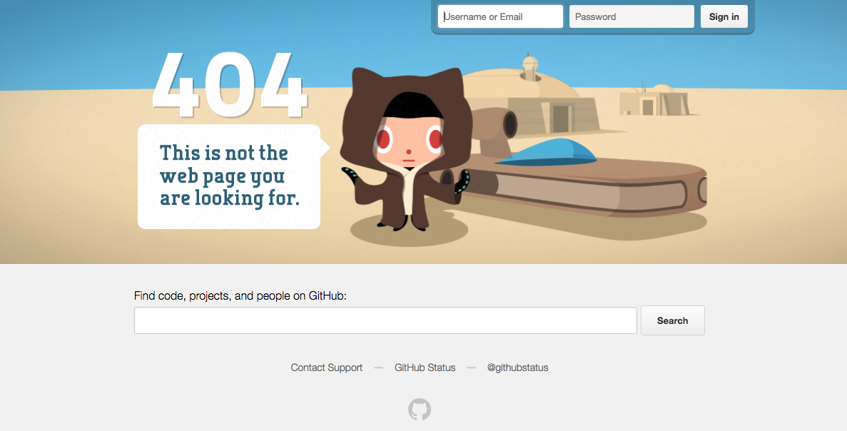
GitHub
If all else fails, state the obvious. Super simple, but just as on brand.
Emirates
Everyone loves a good pun, right? The beauty of Emirates’ 404 result is that it puts their people on the page and capitalizes on a very obvious but on brand, pun-filled message.
eHarmony
Another superb example of how your 404 page’s message can wittily relate back to your organization’s core message.
NPR
Now there’s a lot more text on NPR’s 404 page than most, but it totally works. They do a lot here: in addition to giving you an alternative way to find what you’re looking for, they work in a little foolproof humor and even point you to a few other articles.
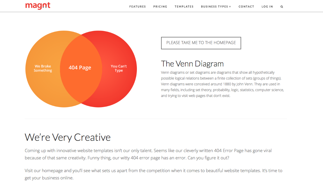
Magnt
There’s two elements on this page that we absolutely love:
1) It puts some of the onus on the visitor - after all, 404s aren’t always the website’s fault!
2) They’ve maximized on every single opportunity and managed to turn their 404 page into a sales pitch for their product
A couple of 404 basics…
Now that we’ve taken a look at a few great examples, it’s time to create your own awesome 404 page. Daring 404 page designs aren’t for everyone, but even the most basic of templates must include:
Key links - make it easy for visitors to navigate their way back to live pages on your site. Ideally, you should make sure your main navigation bar is prominent on your 404 pages.
Branding - just because your 404 page isn’t a page you intentionally want to drive traffic to, doesn’t mean it isn’t important. Keep the look and feel of it consistent to that of your site so people know you’re still close by.
Hue & Tone Creative: Custom design and marketing
When it comes to web design, we know what we’re doing. For help creating a killer 404 page or an entire website, make the first move toward better web marketing today: 336-365-8559 or hannah@hueandtonecreative.com.


