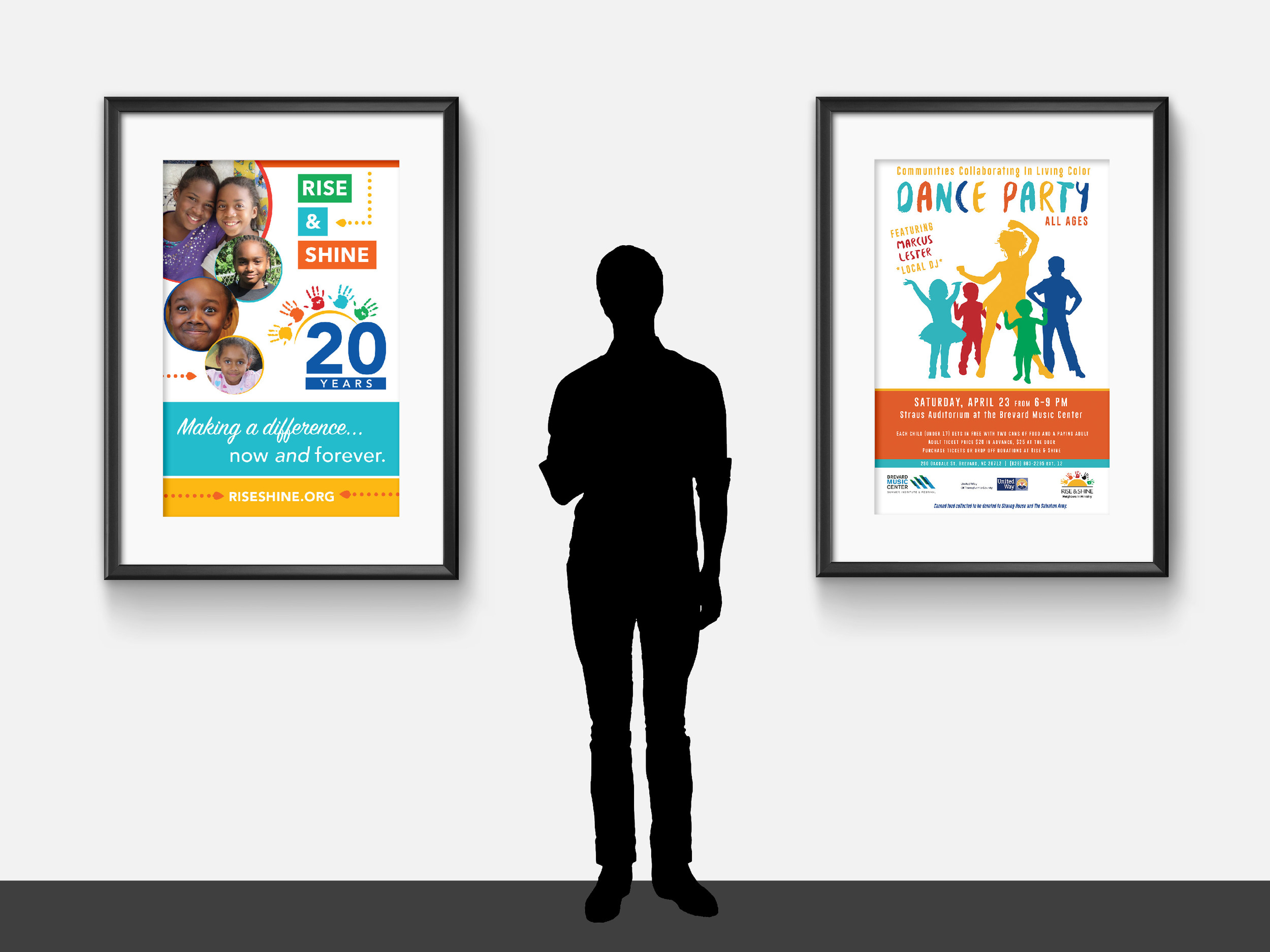
We know, we know -- we’ve highlighted Rise & Shine before… but when your clients just keep doing great work, it never gets old showing it off.
Throughout 2016, Rise & Shine has been hosting a series of events to celebrate and raise awareness for their organization. An afterschool program with a mission of promoting racial justice and equality, we loved being able to collaborate on collateral that's helping drive their mission forward.
All of our work for Rise & Shine features bright colors, eye-catching layouts, and vibrant photography of the program participants. We work to keep the focus on the facts and figures that demonstrate the program's efficacy, as well as highlight the organization's values.
Take a look at the colorful collateral below!
Below, starting clockwise at top left: One-page infographic (front + back), homepage web slider, event program, Facebook graphics, and bookmark.
Below, left: Booth signage
Below, right: Event poster for the "In Living Color" Dance Party
Below: Local Movie Theater Ad
Working with non-profits is a passion of ours, and we're always eager to dive into a new partnership. If your organization's marketing needs a boost, don't hesitate to reach out to us!


