It’s easy to spot a bad logo once it’s been created, but what should you be on the lookout for before the design process even begins?
We see poorly designed logos every day – sometimes as a result of shoddy design work and sometimes as a result of miscommunication between client and designer. No matter what the reason, it’s important to know what makes a good quality logo before the design process even begins.
If you’re just beginning to consult with a designer – or, you’re a novice designer just getting into brand design – we’ve got 7 common mistakes for you to look out for.

1. Not considering black and white
If your logo relies heavily on gradients, 3-D effects or a specific color then you’re setting yourself up for failure. No element of your logo should only be distinguishable or in context when the logo is in full color. A properly designed logo will have a strong form and be recognizable as your brand even when printed in black and white.
You don’t want to embroider your logo on hundreds of shirts only to find that it’s no longer identifiable. If you make sure to create a black and white version of your logo in the very early stages of the branding process, you’ll save yourself from any unhappy surprises down the road.
2. Not designing for all formats
Every good logo needs to work for something as large as a billboard, but should also be able to printed on something as small as a lapel pin.
Your logo should be future-proofed – meaning that no matter where it needs to be printed in the future, it will still work well. If your business needs a new branded product, you shouldn’t need to engage a designer to update the logo to make sure it works well on a new product.
However, designing for all formats may mean that you have multiple variations of your logo. That doesn’t mean your main logo isn’t effective, it just means that your designer has thought through all the possible applications and designed something that will work for every medium.
3. Getting too trendy
A properly designed logo might not look exactly like everyone else’s – and that’s a good thing. Your designer should be creating an original graphic based on your business and it’s unique appeal to customers.
While you might want an ultra-sleek mark that mirrors what you see Google or Facebook doing, that doesn’t mean it’s the right look for your business. Your logo should be distinct and unique to your business and you shouldn’t get caught up in what everyone else is doing. If you do, chances are you’ll have to update things a few years down the road when the rest of the design hivemind sets its sights on a new trend.
4. Utilizing raster images
A professional logo requires professional software – any logo you’re able to create using freeware or that is delivered to you in a JPEG format isn’t going to work down the road.
When you engage a designer be sure you request your logo in a .EPS or .Ai format – these are vector file formats, meaning they can be scaled to ANY size down the road. Beware, a Photoshop file is a raster image, meaning there’s a limit to the size it can be scaled.
5. Tacky symbols and excessive inclusions
There’s no need to include copyright symbols, “LLC”, “Inc.” or registration symbols in your logo. They clutter up the final design and are often distracting from the rest of the logo. Other than on tax forms, you should leave these designators out.

6. Not investing in a quality designer
Whether you hold a contest, ask a friend to design your logo, or utilize somewhere like Fiverr, you can expect to get what you paid for…. or didn’t pay for.
Logos are important, which is why they typically cost thousands of dollars. If you don’t budget accordingly, you can expect to cost yourself money down the road when you run into problems with your file formats, scaling… or even issues like plagiarism.
7. Creating a logo, but not a brand
While your logo may be a crucial building block for your brand, it’s not your whole brand. Don’t make the mistake of stopping the design process after your logo has been created, because it’s just one piece of the puzzle.
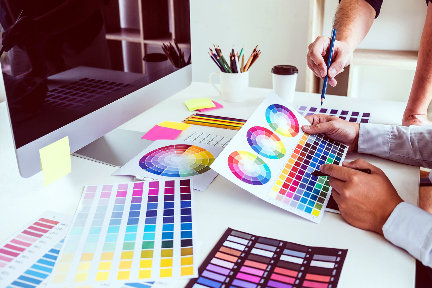
A well thought out set of brand colors, typography, alternate marks, and brand symbols are all crucial to creating a full brand identity. Before you engage a designer, make sure they can help you with the whole branding process and don’t intend to send you on your way with just a logo.
We suggest asking for a brand guide or brand sheet that outlines all the elements of your brand and how to use each.
Hue & Tone Creative: Your logo and branding partner
Your logo is a major investment – so pick the right design firm to invest in. Hue & Tone Creative is a boutique design firm specializing in all things visual, and we would love to partner up with you on your next big rebrand.