Posts in Branding
Everything you should include in your brand guide

Quick tip: Brand guidelines coming in at over 50 pages? Consider creating an abbreviated version that can serve as a quick reference guide.

Brand guides are essentially an instruction manual for how to communicate both your visual and written brand. Depending on the size of your organization, your brand guide may come in at 100+ pages, or you may decide to utilize a more simplified sheet style. No matter how complex your brand guidelines are, we advocate for making them as clear and easy to understand as possible. 

Remember, branding is the personality of a commodity and your brand guide serves to translate that brand to outside parties. You want to include everything needed to communicate the feelings and expectations that are connected to the goods, services and even people your brand represents (read more on that here). 

Further reading: If you want to learn more about all the marketing collateral your new business should consider, check out this post.

If you’re unsure what you should include, we’ve put together the reference guide below. If you’re hiring an outside agency or freelancer to compile your brand elements, this quick reference guide will help you determine everything you should expect to be included. 

Everything you should include in your brand guide  |  Hue & Tone Creative

The basics:

Brand Story/Mission/Vision: First up, you’ll want to tell people what your brand is all about. This might come in the form of a vision statement, positioning statement, elevator pitch – or, maybe it’s a more fully formed brand story. No matter the form, it’s important to give people background information about your company.  

Quick tip: Always include a table of contents in your brand guide. Trust us, every agency or freelancer that has to use your brand guide will thank you. 

Key messaging: Have a tagline or key message you repeat over and over? This can be word for word phrases or simply big picture ideas you want to see repeated.

Personality: List out all the characteristics of your brand by describing the feeling and impression people will have when they interact with you. One way to do this is to make a list of things that your brand is, and a list of things that it is not. These words will help set the tone for your copy writing and guide the written communication of your brand.

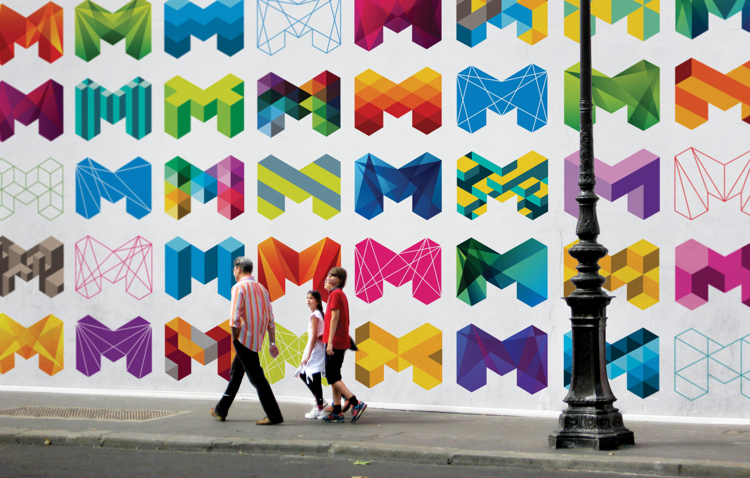
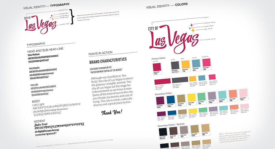
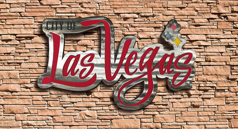
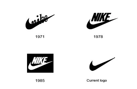
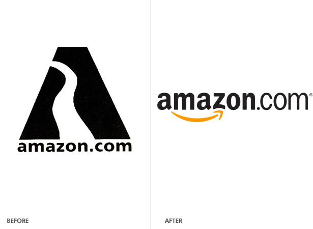
All logo variations: Once you’ve carefully outlined the personality and verbal tone of your brand, it’s time to move on to the visuals. The first (and most obvious) thing you’ll want to include is your logo. But, don’t stop there, be sure to include every version of your logo including horizontal uses, vertical, watermarks, and special stamp versions. 

Logo usage: Once you’ve outlined the logo variations you have, you’ll want to give guidance on how to use them. How close can your logo be to other elements? Is there a minimum size it should be printed in? What version of your logo do you use where? Are there limits on what colors it can be printed in? Think through all the digital and print uses of your logo and do your best to carefully outline the rules for each potential use. 

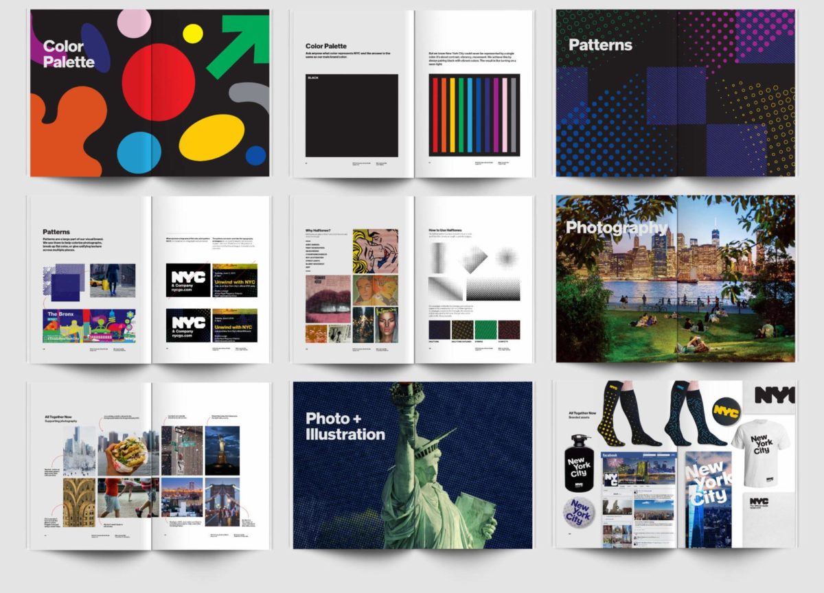
Color Palette: Outline all the colors that can be used in your brand – this includes your primary and secondary color palettes. Be sure to include guidance on how/when to use each color. For easy reference, include the Pantone, RGB, CMYK, and Hex codes for each color. 

Font Palette (for web and print): Once you’re done with colors, outline which fonts should be used where. We suggest including an example of the fonts in use, details on where people can get the fonts, and any restrictions on kerning, alignment, leading, and color usage. If your fonts are expensive and you don’t plan to provide a license to every external party, we suggest including easily accessible open source alternatives. This will up the chances that your brand guidelines are followed and increase the ease of use.  

Image Guidelines:
Whether you purchase stock photos or have your own brand photography, it’s important to include visual examples of acceptable and unacceptable photography. How should photos be edited? How should your staff or customers be represented? What kind of office environment do you want to portray? 

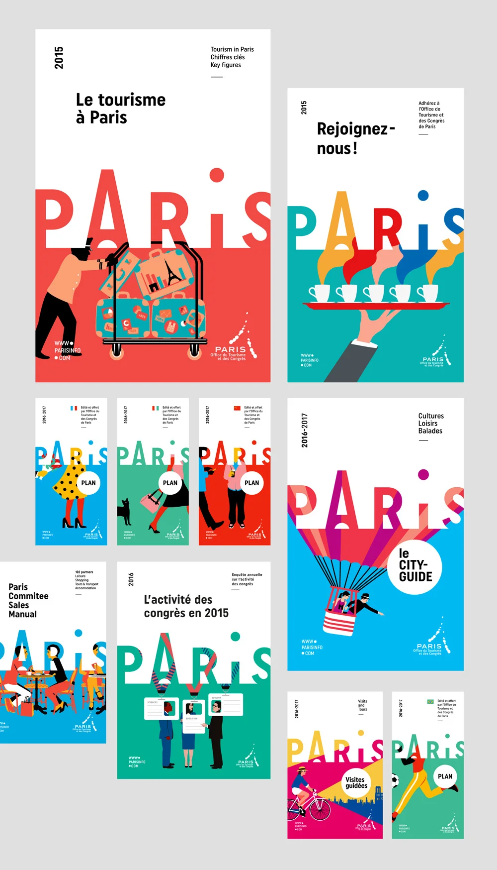
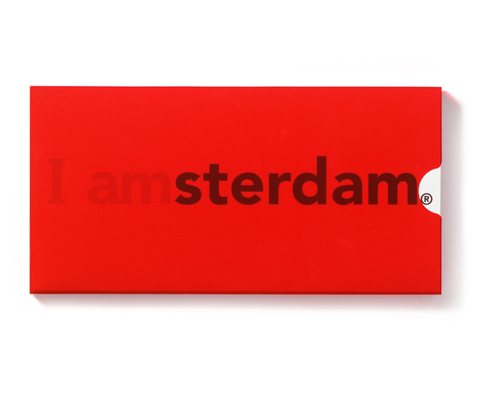
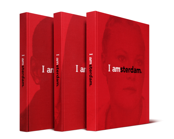
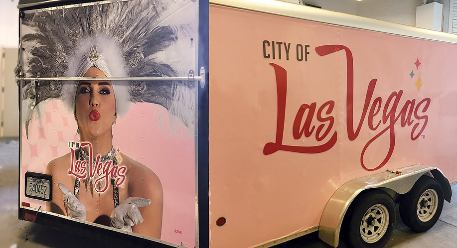
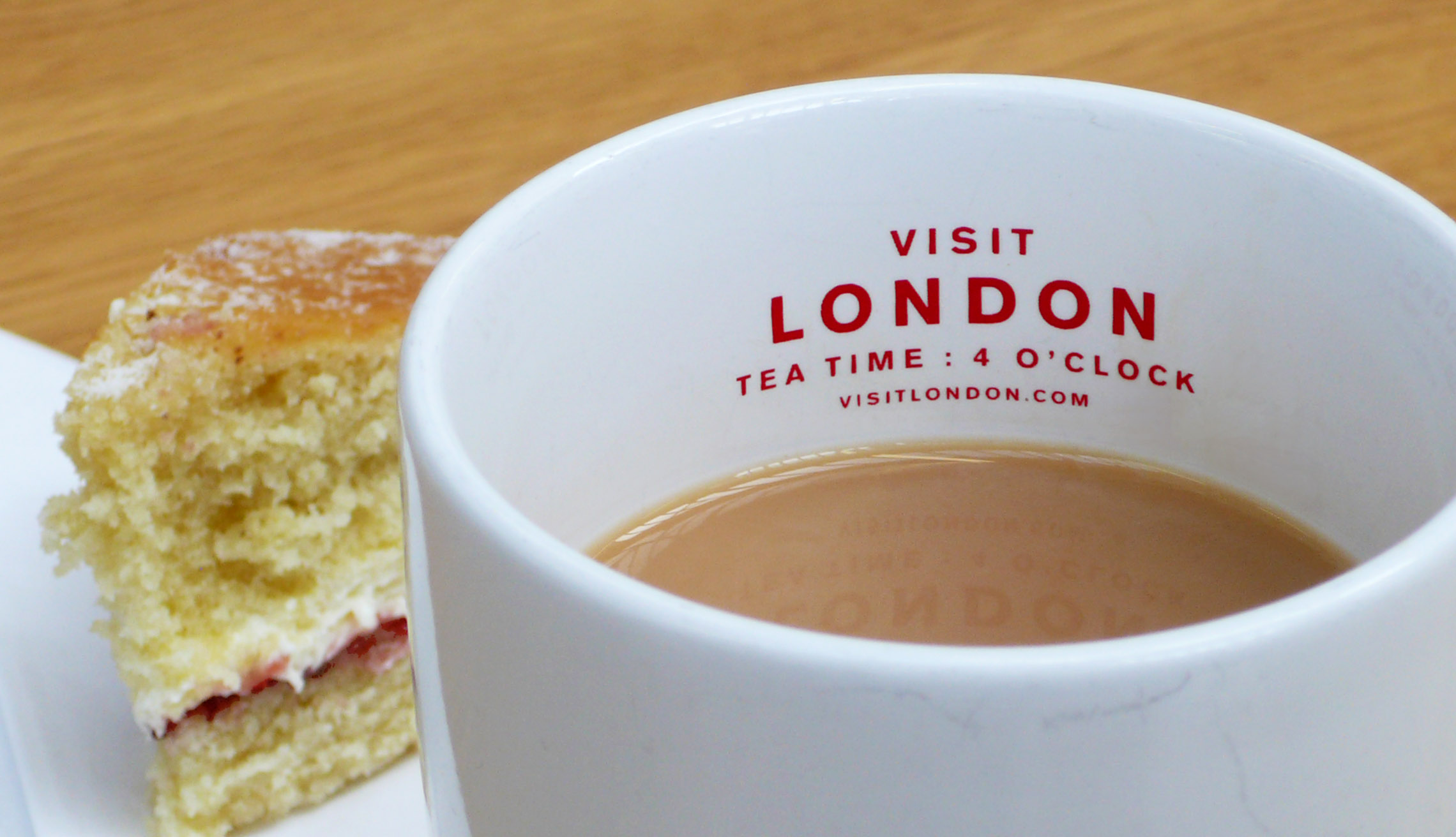
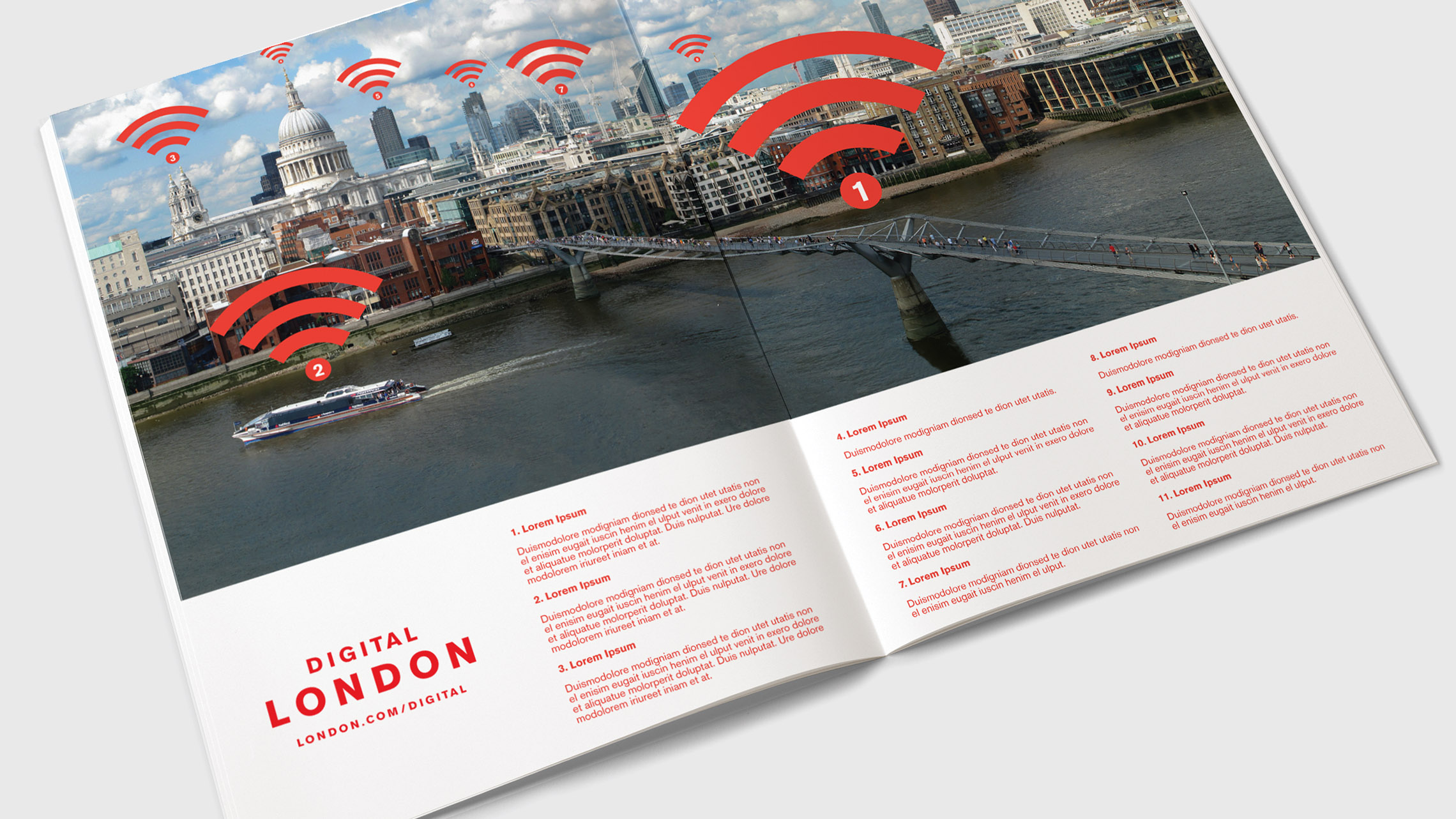
Sample collateral: Even after you’ve outlined all these basic elements, it’s important to show examples of your visual brand in action. The interaction of all these elements together will be valuable samples that designers will need if you want them to emulate your brand closely. The more collateral examples you can include, the better idea they will have of how your brand should look. We suggest including a letterhead, business card, sample ads, website screenshots, vehicle wraps, promotional swag, and social media ads or posts.  

Include point of sales and packaging examples in your brand guide.

Include point of sales and packaging examples in your brand guide.

Suggested inclusions

Now that we’ve covered the basics, we want to point out a handful of other items you should consider including in your brand guide. Here’s a list of our suggested inclusions:  

Target Audience: This is a valuable inclusion if you ever plan to outsource your marketing. Don’t be afraid to dive into nitty gritty information about your target demographics – this will be invaluable for anyone targeting ads or creating a media plan.

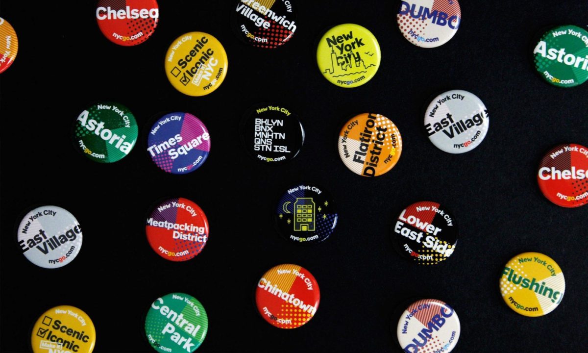
Additional graphic elements: Do you have additional graphic elements besides your logo? For example, do you have an iconic swoosh or divider bar? Include additional guidance on how to use each of these supplementary elements. 

Icon sets: Have a standardized set of icons you use on print or social media collateral? Include the full set of vectorized icons so designers can easily grab and use them. Include usage guidelines and make it clear whether it’s okay for people to create additional icons or not. 

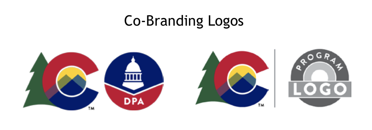
Campaign graphics: Does your business have spinoff brands, specific subsidiaries, holiday campaigns, or additional product lines? Including a snapshot of any ancillary brands will give designers or agencies a more holistic picture of your entire brand.  

Packaging/Store Signage: Do you sell a physical product? Include samples of the packaging, as well as examples of point of sale signage, sample displays and sample promotions. 

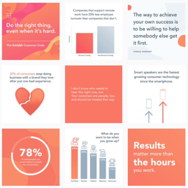
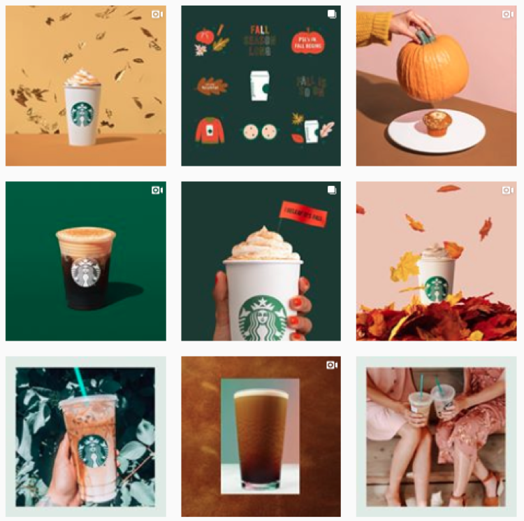
Sample social media posts: Including more in-depth illustrations of how your visuals and verbiage are paired together on social media can provide valuable guidance on how you like to communicate with your audience. 

Video/Motion Graphics: If video – prerecorded or live – is a major part of your marketing plan, you’ll want to create some guidelines for how and where it should be shot. Talk about content, tone, guidelines for overlaying text, backgrounds, and filters.

Customer Service Examples: Your brand is a conversation, and your customers need to get to know you as a brand. Including examples of your outward facing dialogue can help get your whole company on the same page about how they should be communicating. 

Website: Is there a phrase or product you never want to see featured on your homepage? Do you have a specific plan for what first time visitors need on your website? Consider getting into more detail about what you should and shouldn’t include on your website. 


This list is by no means exhaustive, but we hope it provides a solid jumping off point for brainstorming your brand guide. See something we should include on this list but didn’t? Drop us a comment and let us know what you think is crucial for a comprehensive brand guide.


Hue & Tone Creative: Your branding partner

Completely overwhelmed by this list? We get it. We’ve worked with numerous businesses to establish clear branding and brand guidelines – and we’d like you to be the next business we support. We can help you get all your visual brand elements organized and easy to use – whether you’re starting from scratch or want to build around an existing brand. 

How to find your voice on social media (and why it matters)
How to find your voice on social media (and why it matters)  |  Hue & Tone Creative

The internet is a crowded space and it can be hard to make your brand stand out. But one of the best ways to stand out is to create authentic connections on social media. 

A key element in forging these genuine connections is establishing your brand voice. Your brand voice makes your brand feel like a person that your customers can connect with and allows you to build a deeper relationship with your audience. No one likes to feel like their favorite company thinks of them as just a dollar sign – and when people feel valued by your brand, they tend to spend more and be more loyal.  

Formalizing this brand voice in a set of guidelines ensures everyone posting from your account is using a consistent tone to communicate with the audience. This ensures that you stay on brand in even the stickiest customer service situations… and they can even help you turn an aggrieved customer into a loyal follower. 

Finding your social media voice is not one thing, but rather a set of defined characteristics that come together to establish your overall brand voice. 

  • Character: Who does your brand sound or talk like? Are you an expert informing a customer, or do you talk to a client like they are your friend? 

  • Tone: What is the general vibe of your brand? How does your voice change based on audience, situation, and channel?  Are you fluffy or direct, personal or professional? 

  • Language: What kind of words do you use often? What kind of words do you try to avoid? Do you speak in a complex and jargon-filled way or do you like to keep things more simple? 

  • Purpose: Why are you on social media? Do you want to engage, inform, sell… or something else altogether? 

Why social media voice matters 

Creating a consistent tone lets people get to know your brand and allows you to build a strong relationship with customers and clients. Delighted customers talk positively about your brand, which means them creating new content, driving leads your way, and spreading your brand message. 

Establishing your voice can be complicated and require some trial-and-error. Unlike tracking your web analytics, this marketing project won’t be a one and done task. If something isn’t connecting with people, don’t be afraid to do more research and reorient your tactics. 


Steps to get started 

How to find your voice on social media (and why it matters)  |  Hue & Tone Creative

Stumped on where to get started? Here are a few simple steps to get you going when developing your brand guidelines. 

  1. Research your audience’s habits online. What platforms do they use, what words do you see often, and what do they seem to value? 

  2. Examine your existing brand guidelines. What brand resources do you have to work with? Do your guidelines for print work for social media? Do these words fit with what you’re seeing from your audience?

  3. Determine your purpose. What do you want to do for your audience online? How will you achieve these goals? 

  4. Brainstorm words you want your audience to associate with your company. Make a list of adjectives you want your audience to use – and then words that you think will help elicit those feelings.

A few tips as you develop your voice 

Now that you’ve got a jumping off point, here’s a few additional tips to keep in mind as you put your brand voice to work online. 

  • Define your audience. It’s important to keep in mind that certain types of messaging resonate with certain audiences. Taking your audiences communication style, interests, and online behavior into account will help you better connect with them. Be sure to explore how your customers act online before solidifying your brand voice. 

  • Be transparent and admit mistakes. Instead of trying to hide mistakes, use transparency and openness to your benefit. Admitting when you make mistakes and letting people see behind the scenes at your business will build trust and loyalty from your customers. 

  • Trust your customers. Whatever you do, don’t delete comments from people who are criticizing you – this will just make them angrier and may push them to launch a full-scale campaign against your brand. Instead, comment on their posts and show your other customers how reasonable and responsive you are. Your customers are smart enough to distinguish between a rightfully aggrieved customer and a lunatic. 

  • Keep it consistent. If your brand voice isn’t usually funny, don’t suddenly try to make a joke. Trust is built through keeping a consistently high-quality presence. Think of your brand like a person – you don’t want to leave users feeling like your personality is anxiety inducing or erratic. 

  • Be clever with purpose. It’s okay to be clever or sassy with your social media voice, but only if it fits your brand. Don’t try to emulate Wendy’s unless there’s a well rationalized reason for it. Use funny or clever responses sparingly – and be aware that they may fall flat (and create a secondary issue). 

  • Don’t forget it’s a conversation. Social media shouldn’t be used to talk at your audience – it should be used to communicate directly with them. Authentic interactions can create lifelong loyal customers – and ignored messages can lose them. 

  • Take customer service seriously. Put time into developing a plan for customer service and responding to inquiries. Ensure consistency and timeliness by creating sample responses for your team and empowering them to take action when there is a valid complaint. 

  • No platform is exempt from your brand voice. Your brand voice isn’t just important in your posts – it should be consistent across every element of social media. This includes Facebook message replies (including the automated ones), calls to action, Instagram captions, direct messages, cover photos, bios, and post graphics/visuals. 

  • Keep responses usable. Responses to people’s questions or inquiries shouldn’t be long or overly complex – keep in mind that users are most likely responding from their mobile device. Answers or responses to people should be short, to the point, and easily accessible. 


 Hue & Tone Creative: Social Media in Greensboro, NC

Completely stumped about how to connect with your audience? Let us take the work out of it. We can help you put a social media strategy in place – or we can take over the posting and day-to-day management of your channels. Reach out to learn more about what kind of plans we offer. 

8 simple color palettes for any brand
8 simple color palettes for any brand  |  Hue & Tone Creative

Picking the right color palette is important — whether you’re looking to refresh your logo or just design a social media graphic, selecting the right hues can have a huge impact on the effectiveness of your graphic. Certain colors evoke feelings of action, while others are often identified with calm and serenity.

In a past post, we covered what color theory is and why it’s important to consider it during the design process. Today, we’re putting the rules of color theory into practice with a handful of sample color schemes.

These 8 color schemes are suitable for a wide range of businesses and can serve as a frame of reference for what colors connect with what customers. Copy these colors directly or use them as a jumping off point for designing your own scheme!

For interior design businesses

Light, neutral colors provide a versatile canvas for any room you want to showcase.


Artboard 10purple2.jpg

For businesses who deal with women’s health

Make your female clientele feel cared for with soothing hues of purple. A dusty mauve grounds this scheme, keeping it from feeling too girly.


For businesses who want to give off a corporate feel

If you’re in a corporate or service business, you can never go wrong with basic blues. A pop of orange adds contrast and elevates this scheme to feel more modern.


Artboard 8purple2.jpg

For businesses whose clients are tweens

When appealing to a younger clientele, keep things fun and vibrant with lilac, an aqua blue, and a pear green.


For businesses who deal with art

If you deal with an elevated clientele, these unexpected shades are neutral yet a bit adventurous. Earthy and understated.


For businesses who deal with tech

If you’re looking for something bold and clean, yellow and a deep grey speaks to an action oriented and bold brand.


For businesses whose clients are young kids

If you work with young kids, keep it fun and bright with azure blue, a grassy green and a vivid red.


For businesses whose clients go outside

If you sell outdoor equipment or experiences, branch out from earthy browns and greens and dig into some more unexpected colors. Burgundy, a muted Prussian blue, and a papaya orange are an unexpected but organic combination.


Hue & Tone Creative: Your branding partner

Looking to develop just the right color scheme for your brand? Don’t leave the process of selecting the perfect colors up to chance. Bring in our expert team and we’ll ensure you create a brand that connects with your customers. From naming your business to creating a polished website, Hue & Tone is here to help. Book an initial consultation now to get started.

7 Logo Mistakes to Avoid

It’s easy to spot a bad logo once it’s been created, but what should you be on the lookout for before the design process even begins? 

We see poorly designed logos every day – sometimes as a result of shoddy design work and sometimes as a result of miscommunication between client and designer. No matter what the reason, it’s important to know what makes a good quality logo before the design process even begins. 

If you’re just beginning to consult with a designer – or, you’re a novice designer just getting into brand design – we’ve got 7 common mistakes for you to look out for. 

two-colleagues-creative-graphic-designer-working-on-color-selection-and-drawing-on-graphics-tablet-at_t20_4bjNbR.jpg

1. Not considering black and white

If your logo relies heavily on gradients, 3-D effects or a specific color then you’re setting yourself up for failure. No element of your logo should only be distinguishable or in context when the logo is in full color. A properly designed logo will have a strong form and be recognizable as your brand even when printed in black and white. 

You don’t want to embroider your logo on hundreds of shirts only to find that it’s no longer identifiable. If you make sure to create a black and white version of your logo in the very early stages of the branding process, you’ll save yourself from any unhappy surprises down the road.


2. Not designing for all formats 

Every good logo needs to work for something as large as a billboard, but should also be able to printed on something as small as a lapel pin. 

Your logo should be future-proofed – meaning that no matter where it needs to be printed in the future, it will still work well. If your business needs a new branded product, you shouldn’t need to engage a designer to update the logo to make sure it works well on a new product. 

 However, designing for all formats may mean that you have multiple variations of your logo. That doesn’t mean your main logo isn’t effective, it just means that your designer has thought through all the possible applications and designed something that will work for every medium. 

3. Getting too trendy 

A properly designed logo might not look exactly like everyone else’s – and that’s a good thing. Your designer should be creating an original graphic based on your business and it’s unique appeal to customers. 

While you might want an ultra-sleek mark that mirrors what you see Google or Facebook doing, that doesn’t mean it’s the right look for your business. Your logo should be distinct and unique to your business and you shouldn’t get caught up in what everyone else is doing. If you do, chances are you’ll have to update things a few years down the road when the rest of the design hivemind sets its sights on a new trend. 


4. Utilizing raster images 

A professional logo requires professional software – any logo you’re able to create using freeware or that is delivered to you in a JPEG format isn’t going to work down the road. 

When you engage a designer be sure you request your logo in a .EPS or .Ai format – these are vector file formats, meaning they can be scaled to ANY size down the road. Beware, a Photoshop file is a raster image, meaning there’s a limit to the size it can be scaled. 

5. Tacky symbols and excessive inclusions 

There’s no need to include copyright symbols, “LLC”, “Inc.” or registration symbols in your logo. They clutter up the final design and are often distracting from the rest of the logo. Other than on tax forms, you should leave these designators out.  

7 Logo Mistakes to Avoid  |  Hue & Tone Creative

6. Not investing in a quality designer

Whether you hold a contest, ask a friend to design your logo, or utilize somewhere like Fiverr, you can expect to get what you paid for…. or didn’t pay for. 

Logos are important, which is why they typically cost thousands of dollars. If you don’t budget accordingly, you can expect to cost yourself money down the road when you run into problems with your file formats, scaling… or even issues like plagiarism. 


7. Creating a logo, but not a brand 

While your logo may be a crucial building block for your brand, it’s not your whole brand. Don’t make the mistake of stopping the design process after your logo has been created, because it’s just one piece of the puzzle.

A well thought out set of brand colors, typography, alternate marks, and brand symbols are all crucial to creating a full brand identity. Before you engage a designer, make sure they can help you with the whole branding process and don’t intend to send you on your way with just a logo.  

We suggest asking for a brand guide or brand sheet that outlines all the elements of your brand and how to use each. 


Hue & Tone Creative: Your logo and branding partner 

Your logo is a major investment – so pick the right design firm to invest in. Hue & Tone Creative is a boutique design firm specializing in all things visual, and we would love to partner up with you on your next big rebrand. 

How to create great images for shoppable posts

New to shoppable posts? Head over to our step-by-step guide here.

Month-over-month and year-over-year, more and more consumers are making purchases directly on social media. One digital marketing company found that in the last 12 months, there’s been a 38% increase in the number of users who placed high importance on being able to discover and purchase products directly through Facebook, Instagram, and Pinterest.

When it comes to social shopping and visual content, here are a few stats you need to know:

  • 91% of brands agree visual content creates more engaging shopping experiences

  • 86% say their imagery enhances their discoverability

  • 73% said visual content increases conversions

  • 77% confirmed it deepened brand trust

How to create great images for shoppable posts  |  Hue & Tone Creative

Allowing users to buy directly on social media should be part of an integrated, multi-platform approach. When used in conjunction with good data, well-targeted ads, and great organic social content, you’re sure to have a winning strategy in place. 

One of the most important elements of that winning strategy is strong images. And, while the guidelines for each social platform are a little different, there’s one thing that’s true across every platform: high quality photography is a must. 

With that in mind, read below for details on how to tailor your images to each platform. 


Facebook

Regardless of what you’re selling, there are a couple of requirements your images must follow:

1. Each product must be supported by at least one image

2. The photo you use has to be of the product itself -- no creative interpretation allowed!

Once you’ve met those two guidelines, we also recommend you:

  • Make sure your images are easy to understand and that they capture the whole of the product. That’s not to say you’ll be penalized if the corner of your wallet is cropped out of the picture, but clarity is key and consumers want to see exactly what they’ll be buying. 

  • Use an image resolution of 1024px x 2024px or higher for a clear display resolution.

  • If you’re worried your images don’t have a cohesive look, consider placing your photo on a white background. It’s a clean and simple approach that works well for almost every product.

  • Take shots of your product in real-life scenarios. For example, someone wearing a handbag gives an idea of scale and also provides the opportunity to show off your brand aesthetic. It’s a win-win!

  • Use the following image ratios to ensure your ad will display properly: 

    • Ad images on the computer: 470 x 246 pixels.

    • Images of ads for mobile: 560 x 292 pixels.

    • Images in ads with a vertical column: 254 x 113.


Instagram

Next up is Instagram – and whether you’re dabbling in shoppable posts or stories here’s what you need to know to ensure your images convert:

  •  Consistency is key so make sure your photos reflect your brand’s personality. Users should instantly know it’s you when they scroll by! For example, here are two feeds that have a clear and recognizable look: 

Hubspot

Hubspot

Starbucks

Starbucks

  •  Brush up on different composition techniques and experiment with them in your shoots. You’ll want to establish your own style over time, but if you’re just getting started there’s a few things that are usually a hit on social: 

    • Rule of thirds: Divide your photo into thirds (horizontally and vertically) and sit your product on the intersecting lines. More on that here

    • Rule of odds: Put five bracelets in the frame instead of four, it’s usually more appealing. 

    • Negative space: Ensure the space surrounding the product takes up more space than the product itself. 

    • Centered composition: Place your product in the middle of the frame. This will ensure your image crops well no matter where it’s being previewed. 

  • Play with your exposure until your photos find the right balance. Or, play around with under and over exposure to give your images a signature style!

Pinterest 

Need tips on creating a branded look? We can help with that – check out this post

On Pinterest, image quality reigns! Like Pinterest, Instagram is a visual platform – but Pinterest offers even less context than an Instagram post. Think of your picture as the preview for your whole webpage – even though you can create a long pin, you’ll want to get key text and a few grabby images up above the fold. 

  • Pinterest recommends a 2:3 aspect ratio (ex: 1000 x 1500 pixels). Other ratios may cause your Pin to truncate and may negatively impact performance.

  • Just like Instagram, you’ll want to bring consistency to your feed by establishing clear and consistent branding. 

  • The images you pick should help people understand why your product or idea is the right fit for them. Pick images that show context and bring your topic to life. Clearly show how someone might use your product, try your project, etc.

  • Text overlay can make your Pins stand out, adds context, and enhances your message. Keep text concise so it’s easy for people to read on their phones.


Hue & Tone: Let’s Get Social Together

Need help overhauling the look of your social media? Whether it’s your creating custom images or finding the perfect photo, we’ve got the solution that fits your needs. Get in touch at (336) 365-8559 or hannah@hueandtonecreative.com to find out more.

Client Spotlight: Drive Moodboards
Triad Local First

Drive’s mission statement: Current and future women business leaders, connecting and building community through networking, mentorship and education. 

 More information here

When we connected with our friends at Triad Local First about their new women’s networking group, we couldn’t wait to be a part of what they were doing. Not only have we gotten to be a part of this amazing group – but we were also brought on to design the program’s new logo! 

Completed in May of 2019, we worked with the TLF team to create a logo, color scheme, and font palette that would speak to women entrepreneurs. Feminine, but not girly, TLF was looking to create a versatile and simple brand mark. 

Our logo design process typically involves 8 main steps: 

  1. Initial Consultation 

  2. Branding Questionnaire

  3. Moodboard Design

  4. Initial Logos (in black & white)

  5. Tweaks and revisions (typically, 2-3 rounds)

  6. Color Options

  7. Tweaks and revisions (typically, 1-2 rounds)

  8. Compilation of all final elements in a brand board or brand book (this includes the logo in multiple formats, patterns, web elements, icons, color palette, and font palette)

Quick tip: The moodboard a client picks can serve as a helpful visual guide for when you are selecting imagery for your website or social media.

One of the most underrated steps of this process is the creation of the moodboards. The moodboard stages helps us turn the adjectives the client has been giving us into a visual and helps ensure we’re on the same page. By designing them as the first step in the process our client has a chance to give us feedback before we get too deep into the designing process. If we’ve had a miscommunication during the consultation or questionnaire stage, we’ll know before we even start designing the first round of logos. 

After the TLF team had completed our initial client consultation and branding questionnaire, we were ready to jump into designing a series of moodboards for TLF to respond to.  

We typically present 2-3 moodboards to our client: each with a different look, feel, and color scheme. During this part of the process, we're looking to nail down which of the options feels most on brand -- it's about figuring out the general feel and energy that the logo will have. 

The four moodboards we presented to TLF incorporated a wide range of colors, textures, and wording that all related to the adjectives we received on the branding questionnaire. We weren’t sure which look was our favorite – and neither was the client! After a few days of deliberation, they finally landed on their favorite moodboard:  

Drive Moodboard  |  Hue & Tone Creative

Featuring bold women -- and even bolder typography – this moodboard connected with the powerful and playful vibe that the team was looking for.  

Here’s a sneak peak of the other three moodboards that were in the running: 

Using the chosen look as guidance, we started designing our first round of logos. Rather than interpreting the chosen moodboard literally, we used the feel of the imagery to help guide the first step of our logo creation. 

From there, we completed the other stages of the process: logo options, tweaks, color choices, more tweaks, and the final branding sheet. While we want to focus this blog specifically on the moodboard part of the process, we’ll go ahead and give you a sneak peak at the final logo: 

 
Drive Moodboard | Hue & Tone Creative
 

Have a question about the process? Want to see how we ended up at this final logo?

Don’t hesitate to email us and ask! We love sharing what we do with past clients, potential clients, or even just interested individuals. To connect, contact us here.


Hue & Tone Creative: Your Branding Experts

Whether you have a new business — or are looking to rebrand your existing business — we can help. From logo development to creating custom social media packages, we’ll work with you to create a brand you can be proud of and brand elements that are easy to use.

10 creative swag ideas that will get you seen

In the world of events, corporate swag is becoming more of an expectation than a nice-to-have nowadays, but, with almost every organization out there opting for the staple tote bag or a safe ballpoint pen, how do you stand out from the crowd? 

By doing something different. Whether you’re hosting a conference or running an end-of-summer giveaway we’ve racked our brains to come up with 10 swag ideas that break the norm and keep your swag out of recycling bin. 

No matter what item you opt for, remember the goal is to strike the right balance between splatting your branding over it and creating something useful or trendy that people will actually want to keep.


1. Cookie-cutter

10 creative swag ideas that will get you seen | Hue & Tone Creative

There’s two great options here -- either use a more standard shape (like a heart, star, or gingerbread man) and customize the cutter itself with your colors and logo OR make the shape symbolic to your brand --  such as your logo or a representation of it.

If it fits your brand you could even bring out seasonal iterations of your cookie cutter for Thanksgiving, Christmas, Halloween, Valentine’s Day or Easter.


2. Lunch box

We all need to transport our food in something snazzy -- so why not give people a great lunch box that just happens to boast your logo? This custom container will be seen by all their colleagues and hopefully spark a discussion about your brand over lunch.

If you’re looking to take your trendiness to the next level, consider a branded Bento Box instead! 


3. Stress ball 

Because who doesn’t get stressed from time-to-time?

Not that we’ve not done any research to back this theory up, but there’s certainly a chance that relieving stress while seeing your logo could help people exude positive feelings towards your organization… isn’t that exactly what we’re after? 

10 creative swag ideas that will get you seen | Hue & Tone Creative


Tip: 
If you really want to spark a conversation think outside the box and go for something really unusual -- think avocadoes sipping a pina colada kind of out there!


4. Pool float 

Why not hit the pool with your favorite clients or customers? Whether you go for a flamingo, donut, your logo or something super simple, a custom pool float gives you a wide swath of realty to show your branding off.


5. Reusable straw

Being environmentally friendly has never been more important than it is now so do your part for the planet and your brand image by creating custom stainless steel or silicone straws. You can put them in a branded travel pouch or paint your branding across the whole thing... the color of the straw, your logo on the end, the whole thing! 


6. Christmas tree ornament 

T’is the season to...get your brand in everyone’s homes. If you want this one to work remember to get the right balance between your branding and festive vibes -- if it’s too much of the former and not enough of the latter you might not make it onto the tree.


7. Golf kit 

They say the golf course is where business is done, right? Get your brand in the middle of the conversation with some bespoke tees orballs.


8. Umbrella

On a rainy day your branded umbrella could offer up as much advertising space as a small billboard -- but for a fraction of the cost. This one’s super practical too, making your odds of securing a spot in someone’s handbag all the more likely. 


9. Bottle stoppers

Simple, small, but extremely useful -- and something people would probably be very grateful not having to spend their own money on. You won’t have a great deal of space to work with though, so remember to be sensible with the dimensions you havegot.

Or, consider upgrading to a custom corkscrew and bottle stopper set… all in a handy travel case! 


10. Customized Pop Sockets

When’s the last time you or anyone you know left the house without their phone? Exactly. People don’t go anywhere without it nowadays and, if you get it right, your Pop Socket could be with them every step of the way; opening you up to lots of new eyes every day. 


Hue & Tone Creative: Your Marketing Partners

If you’ve decided you need swag but you’re left with a big design-sized hole in your plans then we’re here to help bridge that gap. Get in touch at hannah@hueandtonecreative.com or (336) 365-8559 to get the ball rolling today. 

8 cities with great branding

Think branding is just a logo? Think again — let us break it down for you here.

Behind every good-looking package or ad is a carefully investigated backstory, fastidiously selected colors, and meticulously outlined brand guidelines. While branding businesses is nothing new, businesses aren’t the only entities that need high-quality branding. Cities, townships, and entire countries have also begun branding their space in an effort to lure in tourists, new citizens, and potential business. 

8 cities with great branding  |  Hue & Tone Creative

Elements of place branding can include culture, visual symbols, slogans, mission, vision and values.

No matter what size your city is, branding can help put your place on the map. From America all the way over to Australia, here’s a look at some of the best: 

1. NYC

Milton Glaser’s ‘I <3 NY’ artwork is inarguably one of the most iconic city graphics around, but their branding doesn’t stop at one iconic t-shirt.

Bellweather was in charge of creating NYCgo’s official identity – and it reflects NYC’s personality with it’s bright colors, diversity and motion. Attracting more than 60 million visitors a year, the city clear doesn’t have a tourism problem – but this diverse and complex brand brings a life and continuity to the city’s visuals. 

Images via Bellweather and logoworks.com


2. Melbourne

Developed by Landor, Melbourne’s logo is fresh, energetic, and memorable. Despite being around for a few years, this brand still feels modern and fresh — the sign of a well thought out and designed identity. Encompassing a wide variety of colors and patterns this vibrant brand is a reflection of all that Melbourne life has to offer.

Images via Landor.


3. Paris

Paris’ most memorable brand doesn’t come from city government, but rather from their tourism organization, the Paris Convention and Visitors Bureau. Grapheine’s typographic masterpiece subtly incorporates the French capital’s most famous landmark. And, in our opinion, everything about the color, spacing, and typography are expertly executed… in addition to making Paris look pretty cool!

 Images via Graphiene.


4. I Amsterdam

Renowned for sex, drugs, and canals, this 2004 campaign helped put Amsterdam back on the map for more than just a fun weekend away. This branding effort was born out of an effort to appeal not only to tourists, but also to those already living in the area.

Despite simple graphics, Kesselskramer’s message is incredibly complex and versatile.

Images via Kesselskramer.


5. Las Vegas

Funky, fun and full of color, Pink Kitty Creative’s city government branding depicts everything Las Vegas stands for in one: bright lights, late nights, and lots of laughter. While we find the “City of” typography a bit weak, we enjoy the color palette and playfulness of the logo. 


6. London

London has a lot of rich roots and landmarks. From Big Ben and the London Eye to the monarchy and 2012 Olympics, London is known for a lot of things — but lacks a central message. Their latest rebranding, which was led by Saffron, cleverly includes a taste of the River Thames with the royal red of the union jack. It’s very simple yet incredibly commanding. 

From Saffron’s website: “So, people pick up their ideas about London from books, television, social media and a wide variety of other influences – none of which can be controlled and many of which are misleading. Rocked by the financial crisis, security threats and even street riots London needed a concerted effort to bounce back and regain its confidence as the world’s leading global city.”

Images via Saffron


7. Porto

Redesigned by White Studio in 2014, Porto’s branding is bold, unique and intricate. Without even stepping foot in Portugal, you can get a feel for the vibrance and life that the city has. It gives people a real feel for what the city is about – and the creativity 

 Images from underconsideration.


8. Colorado

Designed in-house to showcase how spectacular the state is, Colorado’s ‘C’ symbolizes their strength and friendliness while simultaneously bringing their famous and stunning backdrops into the frame. This is a recent rebrand (rolled out in July 2019) so while we’re cautiously optimistic about what the entire brand will look like, we’re holding our breath until full brand guidelines are released.


Hue & Tone Creative: City Branding Partners

Let’s make your place stand out. Whether you’re a city, state, business, or charity, we can help. Get in touch at (336) 365-8559 or hannah@hueandtonecreative.com to start your rebranding journey today. We’ll get everything from your new logo to print collateral overhauled — on time and on budget.

12 great free Google fonts

Looking for more inspo? Here’s our list of MUST download free Google fonts.

12 Great Free Google Fonts  |  Hue & Tone Creative

Google’s got around 915 fonts in its directory. Having a wide selection is great, but this can be a lot to sort through. You’ll probably be able to find the perfect font for your piece, but where do you even start?! 

Aside from the fact that Google Fonts are free, millions of people turn to Google fonts for its simplicity, easy-to-implement set-up, and high quality selection. The fact that a number of these fonts are available for print use is another great bonus. If this is your first time using Google to pick a font, you can find step-by-step instructions on the ‘how’ here.

To save you a bit of time scrolling through pages and pages of typography, here are 12 of our favorite freebies.


Popular choices

Numbers don’t lie. The first six on our list were the most viewed fonts over the last seven days, 30 days, 90 days, and year. 

12 Great Free Google Fonts  |  Hue & Tone Creative

1. Roboto, by Christian Robertson

Roboto’s a sans-serif font and comes in 12 different styles (thin, thin italic, light, light italic, regular, regular italic, medium, medium italic, bold, bold italic, black, and black italic). 

It’s known for its natural reading rhythm and features friendly, open curves.


12 Great Free Google Fonts  |  Hue & Tone Creative

2. Open Sans, by Steve Matteson 

Another sans-serif font, Open Sans has 10 styles to choose from. It’s featured on Google’s sites, and in print/web adverts. This font is endorsed by some of the biggest brands out there.


12 Great Free Google Fonts  |  Hue & Tone Creative

 3. Lato, by Łukasz Dziedzic

When creating Lato, Dziedzic wanted to come up with something transparent enough for body text while comprising unique traits for larger sizes; and he did just that.

With semi-rounded details and strong, structural entities, Lato oozes warmth, stability and seriousness all in one.


12 Great Free Google Fonts  |  Hue & Tone Creative

 4. Oswald, by Vernon Adams, Kalapi Gajjar, and Alexei Vanyashin

Originally created by Vernon Adams, Oswald has seen a number of interactions over the years based on user feedback.

It was designed to be appropriate for use across desktop computers, laptops and mobile devices and comes with six different styles - extra-light, light, regular, medium, semi-bold, and bold.


12 Great Free Google Fonts  |  Hue & Tone Creative

5. Slabo, by John Hudson

Slabo has just two weights. What’s unique about this one is that it’s specifically designed to be used at a certain size -- either 27px or 13px depending on your piece.


12 Great Free Google Fonts  |  Hue & Tone Creative

6. Roboto Condensed, by Christian Robertson

Part of the Roboto and Roboto Slab family, Roboto Condensed refuses to compromise. Its letters are freely positioned to settle into their natural width without encroaching on their neighbors, and it adds impact to body and heading copy alike. 


Hidden gems

Our next batch of fonts are just as easy to use and read but are less well-used, giving you chance to create something a little different.

12 Great Free Google Fonts  |  Hue & Tone Creative

7. Arvo, by Anton Koovit

Best suited to heading and sub-headings, Arvo’s a slightly more edgy font with tints of contrast. Available in regular, regular-italic, bold and bold-italic, you can tailor its impact to your tastes and needs too.


12 Great Free Google Fonts  |  Hue & Tone Creative

8. Bree Serif, by TypeTogether 

Charming, original and versatile by nature, Bree Serif was an instant hit when it first came onto the scene back in 2008 -- and we can see why.


12 Great Free Google Fonts  |  Hue & Tone Creative

9. Sanchez, by Daniel Hernandez

Sanchez is a slab-serif typeface and it’s simple, scannable, and distinguishable. It might not be for everyone but if it fits your organizations feel it can be a solid design choice.


12 Great Free Google Fonts  |  Hue & Tone Creative

10. Hammersmith One, by Sorkin Type

Low in contrast, unique in style, and subtle in curves Hammersmith One was built specifically for web-use. Although it does still work well to smaller sizes, it’s perhaps best limited to titles, sub-headings, and short intro paragraphs.


12 Great Free Google Fonts  |  Hue & Tone Creative

11. Catamaran, by Pria Ravichandran 

With nine different text weights Catamaran’s incredibly versatile and, in the designer’s own words, “strikes a balance between typographic conventions and that bit of sparkle.”


12 Great Free Google Fonts  |  Hue & Tone Creative

12. Playfair Display, by Claus Eggers Sørensen

Used across millions of websites worldwide, this transitional font’s functional and stylistic and pairs well with Georgia for body text. Other popular couplings include a few of our already mentioned Google Fonts: 

  • Lato

  • Roboto

  • Raleway

  • Oswald

  • Open Sans Condensed


Hue & Tone Creative: Your Font Partners

Finding the right font for your website, flyer or social media advert can be really tough -- we get that. If you’re struggling to find a font that gels with your work, we can help. Get in touch at hannah@hueandtonecreative.com or (336) 365-8559 to see how.

6 branding mistakes to avoid

Branding is made up of the values that guide you, the visuals that communicate who you are, and the language you use to communicate with your customers. 

If you’re a regular reader, the number one thing you’ve probably learned from our blog is how important branding is. That’s because it’s essential to attracting, converting, and keeping your customers. It builds loyalty, brand recognition, and acts as a touchstone for consumers. 

We believe branding should be flexible and fun. And, while consistency is important, that doesn’t mean all of your assets should be identical. No matter what your industry or offering, there's a few things we think you should avoid. Here’s our top six: 
 

6 branding mistakes to avoid  |  Hue & Tone Creative


1.  Sea of sameness

Think outside of the box and make sure your logo, values, and messaging differentiate you from what’s already out there.  

Everyone has competitors -- and chances are they sell similar or identical products/services. Don’t fall into the trap of trying to imitate what they do! Work with a designer to create a strong brand identity for yourself and then stick with it. It may take time, but you want to establish your identity separate from the competition. 


2. Behind the times

Don’t let your branding give off a less-than-contemporary vibe. In the customer’s eyes outdated branding translates to inferior products and subpar service. 

Just because you went through the branding process when you first started your business, that doesn’t mean you’re set for life. Your business’ branding should be periodically reviewed and tweaked to reflect the constantly evolving digital landscape.


3. Inconsistency

Consistency is key. Your market needs to be able to identify you across every channel and it’s counterproductive to have an entirely different look and feel across different mediums. Whether it’s on social media, direct mail, a billboard ad, or website banner, your brand should be instantly recognizable across everything you produce. If it’s not, you could miss out on brand awareness and the benefits of an omni-channel campaign.


4.  It’s not all about you

When you’re establishing your branding, it’s imperative to remember that what you’re aiming for isn’t about you and your personal preferences -- it’s about your potential customers or clients, so try to avoid getting too personal. 

Just because a color isn’t your favorite, doesn’t mean it won’t connect with your potential customers. If you're having trouble separating your emotions from the process, consider putting some data behind your decisions by conducting market research to gain valuable guidance.


5.  Lack of clarity

Your branding should quickly and effortlessly communicate what you do -- and it should easily grab your potential customer’s attention. In a world where time is a highly valued commodity, it’s essential you snag people’s attention quickly.

If your branding’s unclear, you run the risk of not being memorable…which may send them running to your competitors. 


6. Not following through

Never, ever make false promises. If you are a delivery company and your tagline is “always on time,” make sure you’re always on time! If you fail to deliver on your promises, your branding is irrelevant, and you leave yourself open to complaints and lost customers


Hue & Tone: Branding for the Piedmont Triad

Branding doesn't have to be hard -- in fact, with the right people in your corner it can actually be fun! Let us turn marketing into something you enjoy doing -- not something you dread. We can help you with everything from your initial branding to your day-to-day social media needs.

Logo Love: 5 of the best big brand redesigns

Most brands, no matter how big or small, evolve their logo at one point or another. It might be a subtle redesign to get on trend, or it might be a total overhaul. No matter how thorough of a rebrand you're looking to do, just make sure the reason you do it is solid -- you don't want to be that company constantly confusing people with a new name or logo. 

A few of the reasons we think you should consider a redesign?

  • It was a DIY project

  • Your business has evolved, but your logo hasn't

  • It uses dated design trends

  • Your company is about to make significant changes

  • It needs to be simplified

In our opinion, a good logo update maintains the integrity of the original brand, while evolving the look. Your first logo will rarely be your last -- and as long as the thought process behind your redesign is strong, there’s no reason not to periodically enhance or revamp your logo. 

To get a better idea of why people update their look, let's look to a few big brands: 

1. Nike

Nike’s refresh couldn’t be a better demonstration that less is more. No color. No words. Just an instantly recognizable, worldwide tick.

Image source: fastsigns.com

Image source: fastsigns.com

2.  Amazon

A rebrand brought on by business changes, Amazon's logo is a great example of a clever design. While Amazon's first version wasn’t exactly irrelevant to Amazon’s name, its current logo is a true reflection of what it stands for.

With a smile for its happy customers pointing to their A-Z offering, there’s a lot that can be learned from Amazon’s slick rebranding.

 
Image source: contested.wordpress.com
 

3.  BBC

Since its inception, the BBC has developed a multifaceted brand. Having many different branches of business means needing a highly versatile and adaptable logo. 

Their simple three box logo coordinates well with other fonts, gels with any color, and has mass appeal. 

 
BBC_logo_(pre97).svg.png


Image sources: tvforum.uk and wikimedia.org

Image sources: tvforum.uk and wikimedia.org


4. Instagram

Instagram’s old logo was incredibly retro -- we'll leave it up to you if that's good or bad. Some folks certainly liked it, because they received a decent amount of pushback when they revealed their updated logo. 

Many compared its background to something seen in WordArt, but it’s since proven that it’s less paint shop and more pro. It’s simple, funky and modern; everything Instagram is as a platform.

 
Image source: obviousgroup.co.uk

Image source: obviousgroup.co.uk


5.  Spotify

Spotify’s logo was fairly streamlined before, but their rebrand took it to the next level. By sticking to one vibrant color and scrapping the gradient, they've stayed in line with design trends while still maintaining the integrity of their brand. 

 
Image source: osmanassem.com

Image source: osmanassem.com


Hue & Tone Creative: Your brand partner

Let us focus on telling your story, so that you can focus on what you do best: running your business. We're your own personal marketing department -- and will handle everything from your brand launch to daily social media needs. If you need to lighten your workload, we're here to help -- reach out today.

The essentials: must have marketing assets for new businesses
Get your new business of to the best start possible with the right marketing materials!

Get your new business of to the best start possible with the right marketing materials!

So, you’ve decided to start a business. You know you need the basics like a logo and business cards – but what other marketing assets should you make a priority?

Marketing materials can encompass everything from websites and letterheads to social media graphics and promotional videos. If you’re just starting out in the small business world, chances are your budget is probably a little tight – but skimping when you start up can mean unnecessary spending down the road.

Think about it: you pick the first business name you think up and print up a bunch of business cards, letterheads, and pens. A few weeks later, you’re hearing from your customers that they can’t remember your business name. Now you’ve confused people, still have to pay for proper branding, and you’ve got to pay to reprint materials you could have gotten right from the start. 

The good news is that we’re here to tell you what you need it, why you need it, when you need it, and how you get it. We hope this run down of essential marketing materials helps empower you when you’re hiring a graphic designer or marketing agency.

Here’s what you need to successfully get your business off the ground:
 

1. Brand Values

Because no physical products come out of this stage of the branding process, it’s often rushed or disregarded – but this is one of the most important stages, and it will influence everything you do from here on out. Your brand values are the set of principles that will dictate every aspect of your business, including the look, messaging, and customer service approach.

Here’s what you’ll want to define:

  • Values: what does your business stand for?

  • Objectives: where do you want to be in 1, 5, or 10 year’s time?

  • Customer personas: who are your talking to and what do they care about?

  • Tone of voice: how will you talk to your customers? And why?

  • Proposition: what will you do for your customers? And how will you benefit them?

  • Tagline/mission statement: how can your brand’s essence be summed up into as few words as possible?

Taking the time to properly develop your brand values will allow you to properly train your workforce and will help you communicate your brand to third parties. We suggest asking your marketing team for a brand book or set of written guidelines that you could hand off to an outside team.

The essentials: Must have marketing assets for new businesses  |  Hue & Tone Creative


2. Brand Identity

Now it’s time to develop the look and feel of your brand. This is where you’ll work with a designer to create a logo and everything that goes with it. You’ll want to come out of this stage with:

  • Primary logo: as well as any alternative logo formats you might need for packaging, online use, or small sizes

  • Logo usage guidelines: what is the smallest size your primary logo should be printed? What do you do when you can only print your color in one logo? Make sure your designer provides you with guidelines for every situation you might encounter.

  • Font palette: what fonts are you going to use on print, web, and in Microsoft Office?

  • Color Palette: what primary and secondary colors will complement your look, logo ad tone?

  • Graphic elements: anything needed to complete your print and web designs.

  • Sample usage: make sure your designer provides examples of how all these elements will come together to create your signature look.


3. Build a winning website

We talk a lot about the importance of a well designed and properly optimized website, so we won’t waste a lot of space here talking through why you need one. Instead, we’ll run through a few key considerations when it comes to building it:

  • Get to the point: you’ve got a limited time to capture visitors’ attention, so get your message across clearly and effectively on every page.

  • Contemporary: outdated websites make your brand look instantly aged and untrustworthy. Take the time to get your website looking slick, and outsource it to a specialist if you need to.

  • Architecture: once you start adding menus and pages, they can be a right pain to change down the line. To make sure you’ve got a great user experience from the outset, map out your site’s architecture before you start building it.

  • Search engine optimization (SEO): with a reputation for being the cheapest marketing method around, it’s crucial that you build and write your website with SEO at the forefront of your mind.

  • Contact: make your call to actions and contact information crystal clear.

  • Host: choose a content management system that’s reliable. Personally, we would recommend Squarespace – here’s why.

  • Domain: be sure to match your domain name to your business’ name.

4. Social media

Did you know, 70% of the US population have at least one social media profile? That’s a whole lot of potential customers to capture.

We suggest selecting just 2-3 platforms to get started on – especially if you’re handling your social media in house. To effectively leverage social media, there’s a few things you’ll need to do:

  • Only use high resolution profile and background images (pixilated pictures make you look untrustworthy and out of touch)

  • Write a succinct and enticing bio

  • Link back to your website

  • Include contact details

  • Keep an eye on your inbox/direct messages

  • Commit to regularly posting

  • Reply to those who engage with you

  • Interact with relevant people and/or profiles

Maintaining social media should be a daily job – if it’s not, you’re not doing it right. We suggest creating a content calendar to stay organized. And, make sure you have a set of templates on hand to save time when you need to create a quick Facebook graphic. 

5. Blogs

Investing in content marketing comes with endless benefits. A well maintained blog boosts your SEO efforts, helps you build backlinks and brand awareness, generates leads, adds brand value, and ups engagement.

Just remember the golden rule: the content you’re publishing must be quality. Churning out subpar articles won’t get you far -- if it even gets you anywhere. Here are a few general post types to get you going:

  • Videos

  • Infographics

  • Webinars

  • Tutorials

  • Whitepapers

  • Presentations

  • ‘How to’ guides

  • Buzzfeed-style listicles

With good content, you need good images. If you’re not in the position to fork out money for sites like iStock and Shutterstock, consider Unsplash, Pixabay and Pexels for good, free alternatives. 
 

The essentials: Must have marketing assets for new businesses  |  Hue & Tone Creative

6. Templates

Next up is templates. The extent of this list will vary depending on the nature of your business, but below is an idea of the types of templates we suggest you think about:

  • Email campaigns - sales, welcome, thank you, updates, or otherwise

  • Newsletters

  • Direct mail

  • Job descriptions

  • Email signatures

  • Powerpoint presentations

  • Social media graphics

  • Letterhead/memos

Your logo should feature on each and every one of them -- which is why it’s important to have a logo that sits well in different settings, and your brand’s look, feel and tone should be encapsulated too. Remember though, your templates don’t need to be uniform to be consistent.

7. Print collateral

We’ve been carrying on about online a lot -- and rightly so! -- but don’t forget about good old offline advertising. Depending on your industry, things like physical brochures and business cards can be an important asset.

If you’re investing in printed materials, remember to:

  • Do your research: spending a bit of time selecting a quality printer.

  • Don’t compromise: poor quality paper reflects badly on your business.

  • Don’t rush: if there’s a proofreading mistake that’s your fault there’s no going back -- without throwing money down the drain.

  • Keep it consistent: print materials still needs to mirror your online presence.

  • Think of the bigger picture: think about how you can make print materials evergreen so that you don’t have to reprint regularly. Consider what really needs a date and what could go without one.

  • Get the right amount of copies: you can easily order more, so don’t go print crazy and order 1000s of copies unless you’re absolutely certain they’ll be used. But, you usually get a discount the more you order, so don’t be afraid to print some extras.


Need a little help?

Getting all your marketing assets together can feel really daunting -- I know, I’ve been there! But here at Hue & Tone Creative, there’s a lot we can help you with. From logo design and letterhead to web design and social media management, get in touch to see how we can support your business’ success.

What does Branding really mean?
ian-dooley-337259.jpg

When the term branding enters a conversation, the word logo usually isn’t far behind. The words have become almost synonymous. Of course, branding is more than the creation of a company’s logo. So, what does branding really mean?


The Definition:

The term changes definitions depending upon whom you consult. For discussion’s sake, we’ll use the Business Dictionary’s version which states “[branding is] the process involved in creating a unique name and image for a product in the consumers' mind, mainly through advertising campaigns with a consistent theme.” Branding is the personality of a commodity. It’s the feelings and expectations that are connected to goods, services and even people based on lived experience and marketing efforts.


The Purpose & Importance:

Businesses use branding for numerous reasons including attracting new customers, securing loyalties, that result in repeat and longtime patrons, and to differentiate themselves from competitors.   

If a business is able to accomplish the above list, it’s safe to assume that it’s at least competitive. With effective branding, it may even be positioned well enough to charge more than market rivals. This increase in value is based largely on consumer perception and is referred to as brand equity. Judging a book, product or service by its metaphoric cover can be extremely advantageous for a company when public opinion is favorable.


How it’s Done:

Going back to our working definition that branding is the process involved in creating a unique name and image for a product, person, or service, keep in mind that there are aspects of this cultivation which are entirely controllable. These include, but aren’t limited to, logos, color schemes, public statements, written communications, social media, packaging, websites, and advertisements. Marketing, public relations, and design firms spend their time becoming masters in these areas, so you may consider using a professional here. So often, companies with quality commodities and excellent reputations find themselves in with injured brands do to ill-advised marketing moves.


The Fairy and Cautionary Tales:

Most people are familiar with the controversial Pepsi campaign starring Kendall Jenner. During a time where clashes between Human Rights protestors and police were constantly in the media and the topic of much debate, Pepsi wanted to weigh in with a message of collaboration. Unfortunately, concerns of police brutality and violent discord were seemingly solved by Jenner handing an officer an ice-cold Pepsi. People were outraged for many reasons. Some felt Pepsi had made too light of serious matters, others railed against Pepsi using a national crisis as a means to sell more soda. Pepsi soon pulled the ad, apologized, and certainly learned from the branding debacle. The lesson here may be to align your brand with matters in the proximity of one’s wheelhouse.

Contrarily, one can take a devastating and embarrassing event like infidelity and use it to boost a brand. Beyoncé, upon discovering her famous husband was allegedly unfaithful, created an album cathartically working through her personal issues. Lemonade went on to become the highest-selling individual album of 2016 globally, according to the International Federation of the Phonographic Industry. The admission helped Beyoncé’s brand by reinforcing her image as a smart and incredibly powerful female force.


Questions to ask Yourself:

  • What message do you want your product or service to convey in the public’s mind?

  • What distinguishes your product or service from anything or anyone else on the market?

  • Are you consistently stacking up to public expectation?

  • In what ways (beyond performance) can you demonstrate that you are what you say you are?

  • Are you choosing marketing opportunities and strategies that align with your current brand identity?

These questions focus not only on what businesses say and do, but also on how people respond to those messages. In this way, branding is quite interactive. It’s not a business cultivating images of self that customers credulously accept, but a continuous dialogue between consumers and companies.


MARKETING & GRAPHIC DESIGN IN GREENSBORO

Starting a new business? Don’t dive in without a little help from the creative experts. From business card design and logos, to social media marketing, Hue & Tone Creative can help you connect with your customers and creating a lasting impression.

5 Must Answer Questions for Any New Brand
5 MUST ANSWER QUESTIONS FOR ANY NEW BRAND  |  Hue & Tone Creative

It’s no secret, strong branding is one of the keys to successful marketing. In fact, 69% of marketers insist that branded content is more compelling than advertising through mail or PR.

When it comes to newer businesses, understanding your own brand will help set you apart from your more seasoned competitors. If you’re totally new to branding or you're just trying to figure out who "you" are, grab a note pad and answer these five essential questions.


1.    What’s your brand story?

From years of hard work to happy accident, every company and product gets its start somewhere. How did your brand get its start? Is there a story that’s uniquely yours? Think of ways to share your humble beginnings and make your company memorable.


2.    Describe your ideal customer?

The most important aspect of opening a business is finding and keeping leads. Taking the time to thoroughly research your target customer will help keep your brand’s aesthetic, feel, and marketing strategies aligned with the wants and needs of your audience.

Because no two customers are alike, we recommend creating personas for three different shoppers. Make detailed lists describing their: age, profession, income, hobbies, where they live, likes, dislikes, etc.


3.    What 5 words describe your brand?

In the early stages of branding, you can never make too make lists! We suggest brainstorming as many words or adjectives that you can think of that define you.

When you can’t think of any more, look over the words you came up with and whittle down your list until only the 5 most meaningful words remain.


4.    What product or services do you want to be known for?

77% of people choose a product because of its brand name. Think about that statistic the next time you reach for a Post-It or a Band-aid!

Like Nike sneakers and Tazo tea, every successful business has a well-known product. When people hear the name of your brand, what will be the first thing they think of? 

It's important to define your signature product or services... before your customer defines it for you. 


5.    What brands do your customers love? 

This can include your direct competitors or brands that are completely unrelated to you. For example, if you’re opening an organic soy candle store, you may have customers that enjoy buying products from Whole Foods, Anthropologie, Etsy, or Earth Fare.

Check out what colors, words, and imagery they use to figure out where you'll fit in with your competition. 


Do you have more branding questions that we didn’t go over? Ask us in the comments!


Marketing & Graphic Design in Greensboro, NC & Beyond

Gearing up for the launch of a new product or business? Don’t dive in without a little help from the creative experts. From business card design and logos, to social media marketing, Hue & Tone Creative can help you connect with your customers and creating a lasting impression.

How to Curate Your Instagram Feed
We all want our feed to look like this!

We all want our feed to look like this!

Ever stumble across a gorgeous Instagram feed and suddenly come down with a major case of account envy? We’ve all been there.

Creating a lust-worthy Instagram account is more than just slapping on a filter and a handful of hashtags. It’s about telling a story and understanding your own unique style.

Whether you’re trying to revamp your feed for yourself or your brand, we’ll give you the scoop on how to create an account your followers will love. 


Choose a Theme

Found the perfect filter or editing settings? Keep your feed cohesive by using it on your other images. 

All successful Instagram accounts have something in common. They all have a look. Finding your own theme takes a lot of research and self-discovery, so don’t get discouraged if it takes some time to get your feed where you want it to be.

Start by studying your favorite Instagram accounts, creating color stories on Pinterest, or simply writing down a list of adjectives that describe your brand. Think about what emotions you want your followers to feel when they scroll through your feed and brainstorm how you can express that visually.

For instance, a feed for a yoga studio could use relaxing colors, natural light, or motivational quotes. An account for a café might use vibrant colors or flat lays of ingredients... Once you get rolling the ideas are endless!

After you’ve decided on a style, use that as a guideline for all your future posts. 


Spice it Up

Now that you’ve found your look, keep your interesting by varying what you post. No one wants to follow an account that posts virtually the same images all the time.

Get creative by telling your story in different ways:

  • Piece a mosaic of individual images

  • Celebrate a holiday

  • Change your setting

Still need more examples of what to post? We’ve got even more ideas to help you get inspired.


Quality over Quantity

Never post a subpar picture just for the sake of likes. It’s much better to have a small number of great images than hundreds of blah ones. Always post high quality images that reflect your brand’s vibe and overall style. If it doesn’t fit your look, don’t post it.


Pro tip: Use a social media scheduler to help you preplan your Instagram content. We recommend giving Buffer or Hootsuite a try! 


Try an App

Although Instagram has a huge array of filters to choose from, don’t be afraid to venture outside of the app! There are tons of (mostly free) photo editing apps on the market with beautiful color stories and editing features.

VSCO- subtle effects and presets

1967- filters with a vintage feel

Foodie- perfect for lovers of food photography

A Color Story- lovely collection of filters and light effects

Adobe Lightroom- a high quality on the go photo editor


One last takeaway…

Creating a cohesive look takes time so don’t rush the process! Post frequently and try not to overthink it. 


Social Media Marketing in Greensboro, NC

Running out of ideas on what to post? Can’t seem to increase your number of followers? Take a breather and leave it to the experts. Whether you’re trying to get the word out for an event or are preparing to launch a hot new product, Hue & Tone Creative can help you ramp up likes, retweets, and mentions on all of your social channels.

6 Signs it’s Time to Update Your Company Logo

The New Year is all about making positive changes: taking up a new hobby, improving your exercise routine, or embarking on another personal journey. Something else you might want to update? Your logo. As your company’s primary visual symbol, your logo is one of your brand’s most important assets. If you haven’t changed it in a while, here are a few signs it’s time for an upgrade.


It was a DIY project.

It’s no secret that fledgling businesses are strapped for cash, and it’s not uncommon for startups to hand the logo design to an artistic friend or family member. Now that your business has had a chance to grow a bit, it may be time to enlist the help of a professional graphic designer. A professional designer will have the best skills and experience necessary to create a modern, polished design that can compete in today’s marketplace.


It was designed for print media.

Ten years ago, company logos were most likely to appear on stationery, in newspapers, and in yellow pages. Nowadays, most consumers are squinting at websites on their phones. If your logo was designed for other times, certain details might not have been taken into consideration.

Ask yourself the following questions: is your logo still legible when shrunk to fit a smaller screen? Does it mesh well with your website design, colors, and fonts? Does it still command attention when placed on a web page with competing information? You might also want a logo that makes an appealing mobile app—think of Apple, whose infamous logo doubles as a desktop icon.


Your business has evolved. Your logo hasn’t.

Almost all businesses grow and change with time, adapting to different marketplace demands. For instance, you may have started a bookstore ten years ago, and expanded to offer coffee and small gift items. Does your logo reflect what you now offer? If not, it may be time for a logo that better represents your current services.


It uses dated design trends.

Many graphic design elements which were once extremely popular can now make a logo look dated. Color gradients, drop shadows, and “glossy” buttons are all design features that are—for lack of a better word—so 1990s. If your business is spelled out in Papyrus font or, heaven forbid, Comic Sans, it’s probably time to refresh.


Your company has made, or is making, significant changes.

Moves, mergers, and acquisitions: there are countless huge changes which can affect businesses. If your company has undergone a huge identity change, a new logo can deliver brand clarification that signifies new, better things are happening for your company.


It’s never been changed. Ever.

Many business owners worry that once their logo changes, their business will lose its brand recognition. But these concerns never stopped Starbucks, Google, or countless other popular brands from pursuing a change. A skilled graphic designer will be able to keep your brand’s core identity while still polishing the logo for a modern audience. A sleeker, more refined logo will signify to the marketplace that your company is present, relevant, and not afraid to embrace new challenges and new techniques—while retaining the core values that it has always held.


Greensboro Graphic Design Company: Hue & Tone

Looking for a graphic designer in Greensboro, Winston Salem or the surrounding areas? Hue & Tone is a creative graphic design agency specializing in logo design, web design, social media management, and more. Be sure to check out our design portfolio to see clients we’ve helped in the past, and give us a call if you’d like us to build you a custom, modern logo that truly tells your story.
Brand your social media images like a pro

We are living in the Golden Age of social media. Today, you can post a picture of your artisan avocado toast on Instagram, pin your imaginary dream wedding, or simply tweet about whatever random thing your cat just did. Although these things can seem silly, social media is incredibly powerful if used the right way. Utilizing social media is especially fantastic for brands -- you can reach audiences around the world or just expand your reach locally.
 

1.     Who are you?

Before you start posting, it is crucial to have a clear sense of your brand. Is your look sleek, modern, and polished? Are you bold, artistic, and experimental? Taking the time to research and understand who you are as a brand allows you create a look that is entirely your own.

If you’re feeling a little stumped a mood board is a great way to start your research. Use Pinterest, Photoshop, or even a paper collage to gather whatever images speak to your brand. Anytime you feel lost for inspiration, go back to your mood board as a reminder of what your brand represents.
 

2.     Color & Fonts

In addition to color, your brands choice of fonts and lettering are also important. Anthropologie often uses fonts that look handwritten to capture the whimsy of their merchandise. Alternatively, Target uses clean minimalistic lettering that pairs well with the brand’s simple and crisp aesthetic.
 

3.     Filters & Photo Editing

Along with ready to use filters, adjusting your brightness and saturation can make your images more eye catching. Bright clean images with bold pops of color are perfect for brands with a youthful and playful aesthetic.

Muted colors with strong saturated hues work well for brands with a modern sophisticated style.

Although filters are fun to use, you don’t want your social media accounts to look like a confused medley of styles. Pick a look and stick to it.

One last tip,

It’s easy to obsess about achieving perfection, but it’s ok to mess up. You might discover a filter you like better or find some unexpected inspiration. Growing, learning, and evolving is much more valuable than staying predictable and stagnant. Have fun and don’t be afraid! 

Seven reasons to get inspired by texture

On your computer screen or in real life, there’s no better place to find inspiration than in natural texture --  there’s an abundance of hues, patterns, and finishes to draw from for inspiration. Whether you’re looking to spark an idea, or looking to make your work pop, textures are the way to go. With the right license you can can even incorporate them into your work!

Not convinced? Here are just a few of the reasons we love textures:

1 - Unique color inspiration. Nobody knows how to blend colors better than Mother Nature does. Next time you’re feeling stuck look to landscapes for creative new color palettes!

2 - Unusual shapes. Textiles are one of our favorite sources for out of the ordinary shapes. Next time you’re out shopping for your home snap a few close-up pictures of different fabrics, throw pillows or hammered metals.

3 - Texture is everywhere. Look around -- from floor to ceiling, you’re surrounded by different textures. Get up and take a walk around your building… or just take a closer look at your corkboard or cracked leather chair.

A sampling of all the textures a few feet from our office!

A sampling of all the textures a few feet from our office!

4 - Bold shapes. Things like fabric swatches are perfect when you need a little logo inspiration! The variation you’ll find is unparalleled -- and textures are easy to play around with, so don’t hesitate to be a little daring!

5 - Simple details. Subtle textures are great if you just need to add little depth to a print ad or graphic. The understated variation in a swatch of linen or a close-up of cork might be all you need to take a Facebook graphic from blah to engaging!

6 - It’s trendy. Texture can help you achieve a trendy, vintage look. While every designer needs to use their own discretion about getting on the vintage bandwagon, if you’re looking to elevate a flat vector to a hipster masterpiece, a little worn concrete overlay might be all you need!

Just a few patterns we've used!

7 - Pattern inspiration. Texture’s manmade cousin, vector patterns are great for everything from branding to print collateral to websites. Use nature’s organic patterns to inspire your sketches or draw inspiration from the patterns you see in a print!

Next time you’re feeling stuck, turn to textures. Consider asking your client what kind of materials they use in their daily work and let it to inspire your design. You never know what you’ll end up with -- once, we created a logo based on a brain scan!

Looking for some inspiration? Check out our “Patterns” board on Pinterest.