Posts tagged design inspiration
Best 404 pages: Designs that stand out

In an ideal world, your website visitors would never find themselves faced with a 404 page. But, suffice it to say, this isn’t an ideal world — people type things in wrong, links break, and technical difficulties happen.

Although your first plan of action should be ensuring there are no broken links on your site in the first place, there are ways you can make the most of a bad situation. If a visitor finds themselves facing a 404 page, you can turn their irritation into an opportunity to entertain them, sell yourself, or provide them with valuable resources.

Here’s a few people we think will delight their customers with their weird and wonderful 404 pages:

Pixar

It’s clean. It’s simple. It’s on-brand. It’s a complete over-exaggeration of the reaction you probably had. And in our opinion, it completely works.

Pixar.png

Bluepath 

Funny and relevant: the best combination! Bluepath’s a data strategy company, so they aptly designed a data-driven map to show their lost visitors where they stood.

BluePath.png

Lego

Like Pixar, Lego let their 404 page serve as an extension of their existing brands. They capitalized on a few favorite characters to illustrate the situation visitors have found themselves in. 

Lego.png

HubSpot

Not every brand necessarily has a set of iconic characters to bring their 404 page to life. But, as HubSpot have shown, this doesn't have to stop you from having a bit of fun.

They’ve also smartly reinforced their audience’s love of their services and cleverly tried to redirect them to a handful of other, selected pages - win, win!
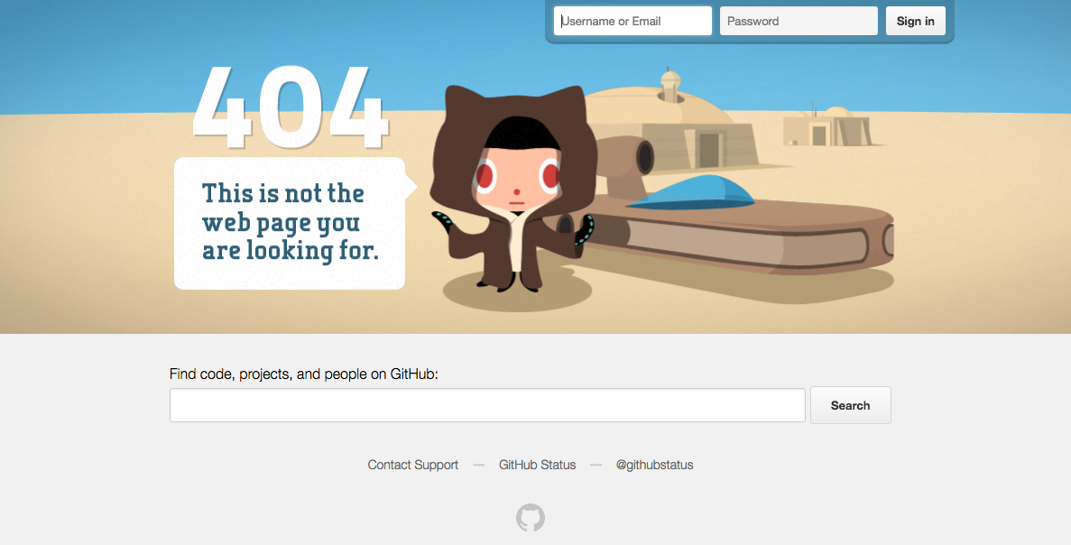

GitHub

If all else fails, state the obvious. Super simple, but just as on brand.


Emirates

Everyone loves a good pun, right? The beauty of Emirates’ 404 result is that it puts their people on the page and capitalizes on a very obvious but on brand, pun-filled message.

Emirates.png

eHarmony

Another superb example of how your 404 page’s message can wittily relate back to your organization’s core message.


NPR 

Now there’s a lot more text on NPR’s 404 page than most, but it totally works. They do a lot here: in addition to giving you an alternative way to find what you’re looking for, they work in a little foolproof humor and even point you to a few other articles.
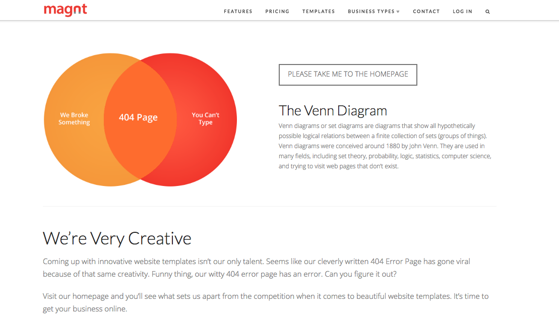

Magnt

There’s two elements on this page that we absolutely love:

1)   It puts some of the onus on the visitor - after all, 404s aren’t always the website’s fault!

2)   They’ve maximized on every single opportunity and managed to turn their 404 page into a sales pitch for their product


A couple of 404 basics…

 Now that we’ve taken a look at a few great examples, it’s time to create your own awesome 404 page. Daring 404 page designs aren’t for everyone, but even the most basic of templates must include:

Key links - make it easy for visitors to navigate their way back to live pages on your site. Ideally, you should make sure your main navigation bar is prominent on your 404 pages.

Branding - just because your 404 page isn’t a page you intentionally want to drive traffic to, doesn’t mean it isn’t important. Keep the look and feel of it consistent to that of your site so people know you’re still close by.


 Hue & Tone Creative: Custom design and marketing

When it comes to web design, we know what we’re doing. For help creating a killer 404 page or an entire website, make the first move toward better web marketing today: 336-365-8559 or hannah@hueandtonecreative.com.

Color Stories: Vintage Vibes

Traditionally, retro colors are all about less saturated hues that have a flat feel. This week we’re taking a little inspiration from the objects of yesteryear and reinterpreting them as modern, fresh color schemes that would work in today’s branding. 

In our eyes, retro and vintage are always in style – whether it’s a throwback to the 70s, 80s, or 90s, the past always serves as a great source of inspiration. We love a nostalgic look when it comes to product packaging, app design, or campaigns graphics. 

Mix these colors with some sleek sans serif fonts and minimal graphic elements, and you’ll have a brand that works perfectly today… even if it was inspired by yesterday. 

Carside Colors

Classic teal pairs well with these packaging inspired reds and oranges. It’s early day fast food meets a classic ride. 


Artboard 2white.jpg

Muted Motel

Forget blue and pink only working for a baby shower – these pale pinks and blues will want to make you stay the night at this vintage motel. The mix of so many soft hues lends itself perfectly to an upscale feel. 


Artboard 12white.jpg

Colorful Camera

A fun take on the Polaroid’s rainbow color scheme, these toned down swatches harken back to an age of roller rinks, disco, and, well…polaroids. 


Artboard 15white.jpg

Resplendent Radio

Bathed in blue light, this shot inspired a monotone musical scheme fit for any brand – past, present, and future. 


Artboard 16white.jpg

Primary Patches

Primary colors can be reinterpreted to fit any decade – and this patch inspired flat lay is no different. Soft grey and a pop of deep emerald help elevate the look.


Monotone Memories   

Browns and taupes may seem dull at first, but when applied fastidiously they can create an elevated look. This scheme is perfect for men’s brands or retro products that truly want to connect with the look of the past. 

Mood Boards: Blast from the Past

Lately, we’ve been feeling a little nostalgic. Since we don’t have a DeLorian to help us hop back in time, we decided to get a little creative.

Take a trip to the past with our collection of retro mood boards: 

1960’s 

Moodboards: Blast from the Past  |  Hue & Tone Creative

Listening to Pandora’s 60’s French Pop station helped put us in the mood to create our first board. We love the graphic prints and classic style of this iconic decade.


1970's

Moodboards: Blast from the Past  |  Hue & Tone Creative

While we like the look of ruffled shirts in the 70’s, we’re happy they haven’t made a comeback.


1980's 

Moodboards: Blast from the Past  |  Hue & Tone Creative

This bright color scheme may have fueled an 80’s movie marathon on Netflix… 


1990's

Moodboards: Blast from the Past  |  Hue & Tone Creative

90’s style has definitely found its way back in recent years. We’re loving these bold geometric patterns and energetic colors. 

What’s your favorite decade? Let us know in the comments!


Greensboro Graphic Design Company: Hue & Tone Creative

In need of a little inspiration? Hue & Tone can help supercharge your creativity. From graphic design to social media management, we’ve got you covered. 

12 Inspiring Font Combination

Whether you’re designing a resume, website, or even a graphic for social media, choosing the right fonts can make a good design even better.  However, the seemingly endless font options available at our disposal can make choosing the right ones a little tricky.

To help alleviate a little stress and confusion, we put together a brief guide on font pairing. 

If you’re interested in the complexities of font typography, you can learn more here. But, if you're just looking to learn a few basics, start with these guidelines: 

  • Try combing a serif with a sans serif.
  • Stick to 2-3 fonts, any more than that can be distracting.
  • Designate rolls to your fonts. Keep headings, subheadings, or body text consistent.
  • Vary the weight to achieve visual hierarchy.
  • Contrast is key! Try not to select fonts that are too similar.
  • Don’t pick fonts that clash with your aesthetic.

Now that you have some basics down, here are a few of our favorite combinations:

Most of the font examples we used below are from Font Squirrel, but you can also find some free or inexpensive downloads from these sites:

These are just a few of our suggestions, so don’t be afraid to branch out and try something different. There are seemingly endless font combinations to choose from! Play around and try out different combinations until you find what works best for you.

What are your favorite font pairings? Let us know in the comments!

Mood Boards: Autumn Inspiration

Autumn is (finally really) here! Many celebrate this change in season with chunky sweaters, holiday music, and pumpkin-spiced everything (seriously, why is everything flavored with pumpkin?!).

At Hue & Tone, we like to celebrate fall with a little visual inspiration.  Lately, we’re craving rich tones, warm textures, and natural aesthetics.  Want to peak into our minds? Check out our collection of mood boards below:

Blue & Citrus

We’ve been seeing a lot of navy and coral lately. Teal and grey provide a refreshing update to this color trend.


Rustic Warmth

This chilly autumn air makes our hearts long for a log cozy cabin, campfires, and misty morning sunrises. 

MoodBoard-02.jpg

Flora & Fauna

A change in temperature justifies a Netflix binge. Princess Elizabeth’s visit to Africa on The Crown inspired this prim and natural color scheme.  


Desert Rose

These hazy muted colors and cacti imagery make us want to take a road trip to the South West.


Pomegranate Wine

We’re loving deep plum hues paired with rich neutral textures.


Vibrant & Crisp

Playful green hues paired with geometric patterns. 


Muted Sea

Calm blues and soft neutrals.


What are your favorite color combos? Let us know in the comments!  

Meet Karissa: SCAD Grad + Design Lover

Hi everyone!

I’m Karissa Johnson and last week I began my social + web internship at Hue & Tone Creative! I first started my creative education after becoming obsessed with Project Runway. I started studying fashion right away – but, after making a lopsided shirt in my fashion tech class, I made the *smart* choice to study Fashion Marketing instead.

I graduated from the Fashion Marketing and Management program at the Savannah College of Art and Design, and I’m currently studying Graphic Design and Advertising online at Wake Tech. My interest in graphic design was piqued when I started using Photoshop to create mood boards for my marketing projects. Even though my interest in graphic design was sparked during my SCAD days, I didn’t make the leap to graphic design until recently. I’m excited about this new internship because it will give me the opportunity to learn and experience a new field that I’m passionate about.

There’s a lot that inspires me, but I wanted to start off by giving everyone a sense of my design aesthetic. Here’s a mood board I created – it’s a bit of a visual representation of some of the things and styles I love.

Meet Karissa Moodboard -- Hue & Tone Creative

If you want to know even more about my favorite things, I’ve got a few inspiration recommendations for you:

Favorite Movies/Shows: The list could go on forever! Some of my favorites are Penny Dreadful, Amelie, and Game of Thrones.  I’ve also always loved Wes Anderson movies -- his strong use of color and symmetrical composition never fails to impress me.

Hobbies: I love to work with my hands and am happiest when I can use my creative energy making something. Drawing, painting, and baking are some of my favorite outlets. I also recently made a succulent terrarium with a friend. (Succulents are so pretty!)… But, unfortunately, only two of my four plants are still alive. Even though my grandma is an amazing gardener, I seem to have a black thumb.

My top sources of inspiration:

  • This Is Colossal has an amazing collection of design, illustration, and photography from artists around the world. I’m always amazed by what people are capable of creating. But, don’t take my word for it, browse for yourself: www.thisiscolossal.com
  • I was introduced to Design Sponge during my internship with Anthropologie. It’s a beautifully curated blog filled with DIY projects, home interiors, and guides for creative professionals. www.designsponge.com


Now that I’ve told you a little about me, leave us a comment telling us what inspires you! And, follow Karissa on Instagram to stay up-to-date on all her creative endeavors!

Friday Links: Pinterest Mania

We’ve mentioned our love of Pinterest before -- we even rounded up 10 of our favorite inspiration boards. This week, we’re back with a link round-up of a few must follow Pinners. We promise we’ll break this obsession soon… well, sooner or later.

One | The Creative Market: our favorite digital design marketplace, The Creative Market’s 'Infographics' board is a creative hodgepodge of all things information design.

Two | Rebecca Finn: Rebecca’s obvious passion for graphic design and art makes her Pinterest one of our favorites. For a wide variety of creative typography and out of the box lettering ideas, check out her ‘Typography’ board.

Three | Design Quixotic: a finalist at the Shorty Awards for best Best Pinner, how could we not love her boars? 'Logos, Marks, and Icons' is our personal favorite, but with 77 boards to follow there’s bound to be a little something for everyone.

Four | Constant Contact: This well-known email marketing company knows their stuff -- their 'Marketing, Stats, and Facts' board is a potpourri of what appears to be pretty much every infographic ever made on digital marketing.

Five | Joy Cho:  a lifestyle blogger with an eye for design, Joy Cho’s boards span a variety of interests from food and fashion to patterns and type. Her 'Pattern' board embodies our taste perfectly!

There’s so many inspiring pinners out there, we know we can’t cover them all. Who did we miss? Who’s your favorite pinner?

10 Pinterest Boards to Spark Design Inspiration

If you think Pinterest is just a site to find cooking recipes, think again!  Think of Pinterest as a site where at the click of a search button, you can find any and everything you’re looking for.  It's perfect for wardrobe tips, photo styling, and design inspiration (of course)!  We love to use Pinterest whenever we get stuck or need a little boost of creativity.

Need your own boost? We’ve picked out our top 10 Pinterest boards to spark design inspiration:

What boards do we need to be following? Leave a comment!

Mood Board: Peach in Paradise

It's been a week since we posted our spring-inspired color schemes and the approaching warm weather is still at the front of our mind... 

It's been a busy month, and we've needed an extra bit of inspiration. For us, that means browsing Pinterest + design books + local art galleries. Putting together a mood board allows us to draw on an image we find inspiring and see where it takes us... and that was exactly our process for this "Peach in Paradise" mood board!

MoodBoard-01.png

One  |  Two  |  Three  |  Four  |  Five  |  Six 

Where do you look for inspiration? Is there an image you want us to build a mood board around?

Seven reasons to get inspired by texture

On your computer screen or in real life, there’s no better place to find inspiration than in natural texture --  there’s an abundance of hues, patterns, and finishes to draw from for inspiration. Whether you’re looking to spark an idea, or looking to make your work pop, textures are the way to go. With the right license you can can even incorporate them into your work!

Not convinced? Here are just a few of the reasons we love textures:

1 - Unique color inspiration. Nobody knows how to blend colors better than Mother Nature does. Next time you’re feeling stuck look to landscapes for creative new color palettes!

2 - Unusual shapes. Textiles are one of our favorite sources for out of the ordinary shapes. Next time you’re out shopping for your home snap a few close-up pictures of different fabrics, throw pillows or hammered metals.

3 - Texture is everywhere. Look around -- from floor to ceiling, you’re surrounded by different textures. Get up and take a walk around your building… or just take a closer look at your corkboard or cracked leather chair.

A sampling of all the textures a few feet from our office!

A sampling of all the textures a few feet from our office!

4 - Bold shapes. Things like fabric swatches are perfect when you need a little logo inspiration! The variation you’ll find is unparalleled -- and textures are easy to play around with, so don’t hesitate to be a little daring!

5 - Simple details. Subtle textures are great if you just need to add little depth to a print ad or graphic. The understated variation in a swatch of linen or a close-up of cork might be all you need to take a Facebook graphic from blah to engaging!

6 - It’s trendy. Texture can help you achieve a trendy, vintage look. While every designer needs to use their own discretion about getting on the vintage bandwagon, if you’re looking to elevate a flat vector to a hipster masterpiece, a little worn concrete overlay might be all you need!

Just a few patterns we've used!

7 - Pattern inspiration. Texture’s manmade cousin, vector patterns are great for everything from branding to print collateral to websites. Use nature’s organic patterns to inspire your sketches or draw inspiration from the patterns you see in a print!

Next time you’re feeling stuck, turn to textures. Consider asking your client what kind of materials they use in their daily work and let it to inspire your design. You never know what you’ll end up with -- once, we created a logo based on a brain scan!

Looking for some inspiration? Check out our “Patterns” board on Pinterest.

Spotlight: Favorite Design Blogs

Working for yourself is not the same as working by yourself -- it takes a ton of meaningful connections with smart, creative people to make it happen. I'm all about in-person connections, but blogging provides a powerful way to learn from people all over who are walking a road similar to yours. 

With that in mind, today I wanted to share a few of my favorite design blogs! check these out if you're looking for new bloggers to follow. And, while you're at it, let's be blog friends. Follow Hue & Tone on Bloglovin'

1. Braid Creative 

The ladies of Braid Creative -- who obviously nailed the search for a fabulous name -- share smart, easily applicable tips on branding, entrepreneurship, and all things creative. 

Favorite Post: When Everyone is Doing the Same Thing

2. Paper & Oats 

Kelsey of Paper & Oats puts a bold, personal spin on posts about productivity and entrepreneurship, and is unapologetic about finding and sticking to her own creative niche. 

Favorite Post: Why I'm Scrapping All My Design Services 

3. Elembee 

When it comes to blogs about nitty-gritty topics like branding and design, there's fun and then there's comprehensive. Elembee is both. It's jam-packed with ideas but never a chore to read -- and the weekly emails are great, too! 

Favorite Post: It Will Never Be Good Enough. Do it Anyway. 

4. Love Plus Color

In addition to a clean, colorful blog design that makes my day every time I see it, Love Plus Color is a great stop for unique, easy-to-consume posts on all things visual. 

Favorite Post: The Mood Board Monday series

What are your favorite blogs? Bonus points if they focus on design, branding, or entrepreneurship.  

Mood Board: She Who Dares

Here's a visual representation of where my mind is lately: 

Constantly focused on the wild risk and dare of running a business. 

Accentuated by bold color and pattern (in complementary combos, of course).

All topped off with a hint of sparkle.

Hue & Tone Creative - 'she who dares, wins' mood board

Hue & Tone Creative - 'she who dares, wins' mood board

Sources: One | Two | Three


Hue & Tone Favorites: Quotes About Design + Creativity

The thing about doing creative work for a living is, there's no such thing as waiting around for your muse. You can't take a break while you wait for an idea to hit. Your work should be inspired, but you can't sit around and wait for inspiration. 

That's not to say that you can't seek out inspiration, though. Making a point to consume good work created by others keeps me inspired and ready to create, whether it's digital and print design, visual art in a gallery...really, any work done passionately and well.

Along those same lines, I can't say I don't enjoy a good inspirational quote or two. If you're a maker for a living, and find yourself in need of inspiration, here are a few of my favorite quotes about creativity and design.

Hue & Tone Creative: Favorite quotes about design and creativity

Hue & Tone Creative: Favorite quotes about design and creativity

"Everything is designed. Few things are designed well." -Brian Reed

"Simplicity is about subtracting the obvious and adding the meaningful." -John Maeda

"Design is the application of intent - the opposite of happenstance, and an antidote to accident." -Robert L. Peters

"You can't use up creativity. The more you use, the more you have." -Maya Angelou

"Eventually everything connects - people, ideas, objects. The quality of the connections is the key to quality." -Charles Eames

"Your ego can become an obstacle to your work. If you start believing in your greatness, it is the death of your creativity." -Marina Abramovic 

"An artist paints, dances, draws, writes, designs, or acts at the expanding edge of consciousness. We press into the unknown rather than the known. This makes life lovely." -Julia Cameron

"If no one's doing the creative work that you want to do, do it yourself." -Kate Baldwin

"Design is an opportunity to continue telling the story, not just to sum everything up." -Tate Linden

"Be a yardstick of quality. Some people aren't used to an environment where excellence is expected." -Steve Jobs

What are some of your favorite quotes about creativity? Where do you turn when you need some inspiration in your work? Let me know in the comments below.