Posts tagged Design
Client Spotlight: Faces of Revolution

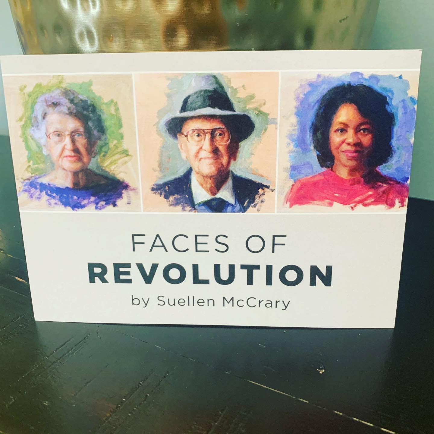
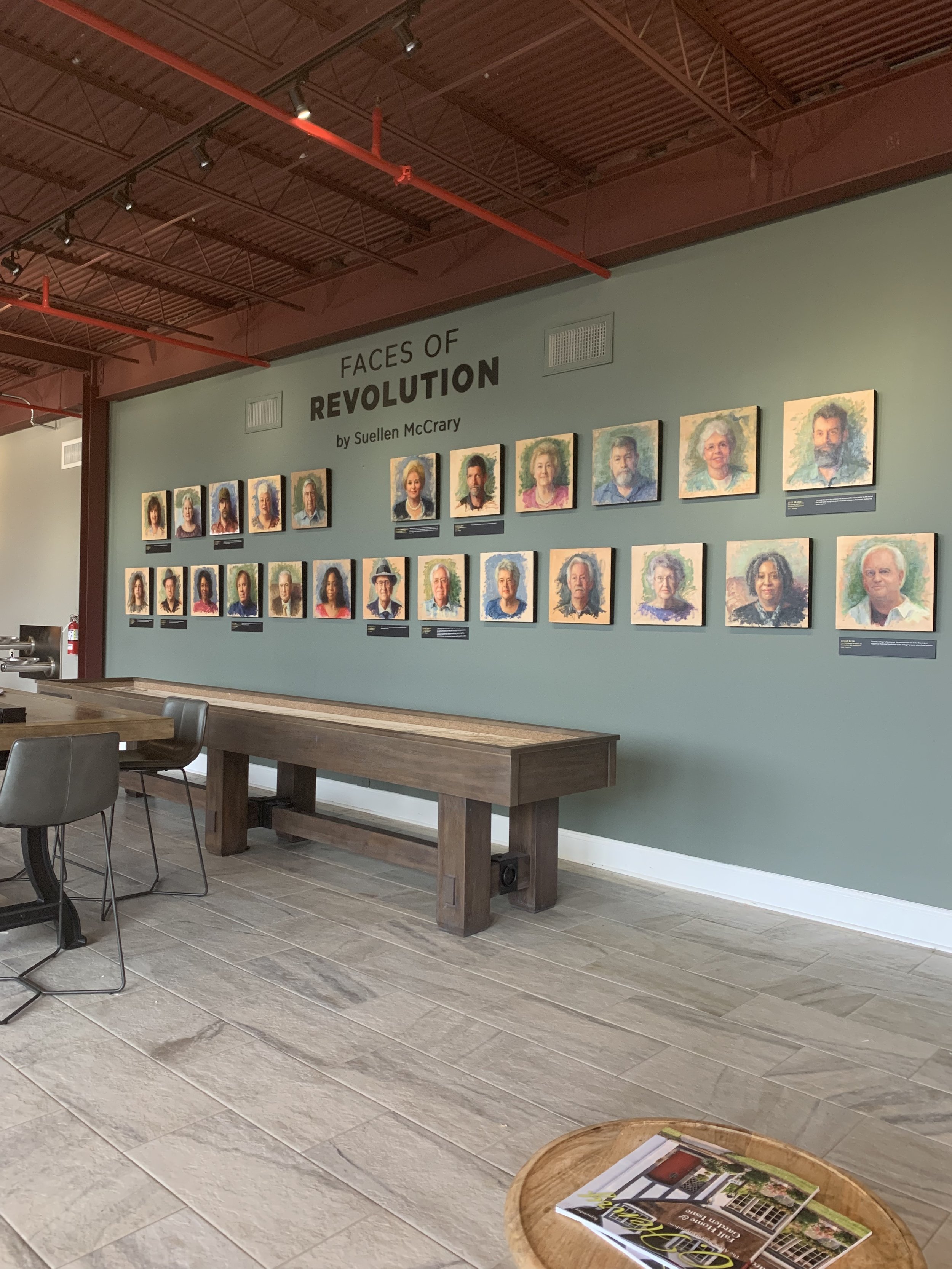
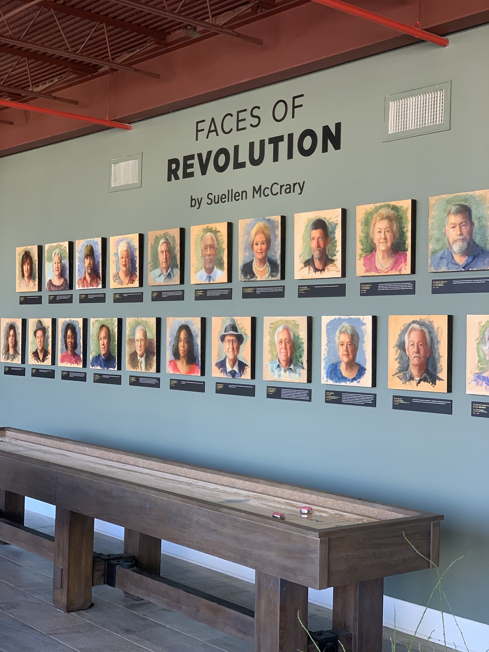
A project that’s been long in the making, the Faces of Revolution exhibit is a series of 25 portraits painted by Suellen McCrary. Featuring subjects with both current and historic ties to Revolution Mill, this exhibit is now part of the permanent historical collection at the mill. 

Started almost 3 years ago, this project was initiated to both document the history of the mill and to democratize portraiture. The subjects include employees and family from the mill’s heyday as the world’s largest maker of flannel to current day tenants of the new multi-use development. The portrait subjects also received free prints of their likenesses, making it possible to obtain an otherwise costly keepsake. The price of an original oil portrait can range from $3,000 to six figures. 

Historic subjects included descendants of the mill co-founders, mill villagers, and dye house employees. In addition to the subjects with historical ties to the mill, the exhibit also features a number of people who keep the Mill running today. Tenants, janitorial staff, and the lead architect of the renovation are among the subjects who were chosen to be included. 

As the portraits neared completion, we became involved with helping design the plaques, signage, print material, and website. After taking measurements and having an initial exploratory meeting, we completed a first mockup of how the exhibit might look:

After some back and forth on the color of the wall and the size of then plaques, a final look for the exhibit was determined. Minimal colors were chosen for all elements of the physical installation and the website, allowing the portraits to take center stage. 

To provide context for each person’s role in the Mill a quote from the participant is featured below each portrait. We designed these plaques at 16x3” for readability. 

These subjects sat for their portraits in Suellen’s Revolution Mill studio, sharing their stories as they were painted. In addition to the experts from their stories that are featured on the plaques, you can read longer comments from everyone on the website at www.facesofrevolution.com.  


Gate City Signs fabricated the exhibit signage from black PVC. The dimensional lettering was chosen over a simple vinyl to provide a more permanent and elevated look. 

You can view the installation in the Hall of Fame at Revolution Mill – located at 1050 Revolution Mill Drive. Learn more about the subjects + exhibit here. 


Client Spotlight: Revolution Mill One Pager
Image Copyright: Joey Seawell Photography.

Image Copyright: Joey Seawell Photography.

In September, our long-term client Revolution Mill asked us to design a refreshed one pager that they could use to market the campus as a whole. Anyone who has visited this revitalized textile mill knows exactly how expansive it is. In total campus boasts 250,000 square feet of Class A Office Space, 150 apartments, three dining options, two event spaces and numerous amenities. 

With so much to potentially highlight, how do you explain everything that’s going on to prospective tenants, potential residents, or campus visitors? That’s where we come in! After working with the Revolution Mill team we were able to summarize the most pertinent details into a digestible one pager that gives an overview of the entire campus. 

With a focus on amenities and commercial spaces, we incorporated some scenic shots from campus as well as condensed wording to describe both current features and future construction. 

The end result is an easy to read piece that coordinates with Revolution’s streamlined and neutral branding. Their branding is tied together with minimal fonts and incorporates the same warm greys, tans, and pops of red that you’ll see around the physical campus. 

To learn more about the campus – and to see their branding in action – check out the one pager below or visit their website (revolutionmillgreensboro.com).


Hue & Tone Creative: Your marketing partner

Inquiries and interest are partly driven by great design — whether you need help designing print materials, assembling a landing page, or running a great social campaign we’re here to help. Set up an initial consult and lets discuss your next project.

How to get more email sign-ups
How to get more email sign-ups  |  Hue & Tone Creative

Cultivating an email list is an important element of any cohesive digital marketing plan. It’s fast, flexible, and cost effective. It allows you to directly connect with past, current, and future customers in a tailored and carefully targeted way. 

Like all digital marketing, email marketing has undergone changes in past years – but it’s as relevant in 2020 as it’s ever been. Reasonably priced and highly flexible, email marketing shows a great return on investment:

  • Emails are 6x more likely than tweets to get higher click-through rates (source)

  • Email is 40 times more effective at acquiring new customers than Facebook or Twitter (source)

  • 81% of online shoppers who receive emails based on previous shopping habits were at least somewhat likely to make a purchase as a result of targeted email (source)

  • 72% people prefer to receive promotional content through email, compared to 17% who prefer social media (source)

  • Email marketing has an ROI of 3800% (source)


Who should be on your list 

Avoid spamming people – don’t send emails to people who haven’t actively signed up for your email communications. 

How you organize your email lists will vary greatly based on your goals, but we encourage you to gather every email you can (even if it’s someone you are not ready to market to just yet). Your email list should consist of email addresses from past/current customers and qualified leads. You can use email to communicate everything from company information and product updates to discounts and exclusive content. 

 In order to derive the maximum benefit from your email list, it’s important that you continue building your list over time. The more subscribers you gain, the more valuable your email list becomes – and the more potential revenue you can gain from utilizing it. 


Places to build your email list

  • Call to Action (CTA) buttons/links: Every landing page and blog page on your website should have a CTA for your email list. Embed them in the text of the page and be sure to add a sign-up at the bottom of every post.

  • Gather sign-ups through social media: No matter the size of your budget, Facebook is a great place to capture new leads. The advanced targeting allows you to connect with fairly qualified leads and cultivate them over time through email. 

  • Cart opt-in: Someone who is already checking out on your website is clearly interested in your product – making it a perfect time to ask them to opt into emails. When a customer places an order and gives you their information, you’ll want to capitalize on the opportunity by asking them if they want to receive promotional emails. 

  • Contact forms: Similar to the cart opt-in strategy, allow people who are sending a general inquiry to opt into your email list. 

  • Integrate with your CRM: Do you utilize an existing customer relationship management tool like Hubspot? Using an integration with your existing CRM can be a great way to automatically add new contacts to your email database.  

  • Free Content Offers: Have gated content or a freebie you could use to drive email sign-ups? Share it on social media! If you have a free printout or digital download you want to offer people, make it an exclusive for new email subscribers and deliver it directly to their inbox (which means you’ll capture their email address in the meantime). 

  • Referral Programs: Someone who loves your product is the best ambassador for it – get existing customers to refer folks to your brand. Offer cash rewards, discounts, or points and build a full-on loyalty program that will keep the referrals rolling in. 

  • Exit intent pop-ups: This is a pop up that appears right when you’re about to click to a new page or ex out of the tab. As visitors are about to leave, offer them something that will make them become an email subscriber. This will allow you to continue to engage with them. Just make sure to use cookies to track returning visitors so that you don’t repeatedly show them the same pop-up.

Tailor for maximum benefit 

How to get more email sign-ups  |  Hue & Tone Creative

No matter what stage of the buying process a lead is in, you can create a targeted email that appeals to them. 

Automations that are triggered by a specific action can save you time and allow you to have a more personalized interaction with a customer. Automated triggers also allow you to respond to your customers interest in real-time. Did they abandon a shopping cart full of goods? Send them an email reminding them to check out… or, enticing them with a discount for completing the purchase!

Other Benefits

  • Measurable: Tracking the success of a promotion is easy with the built-in analytics that email software offers. Track delivery rates, bounce rates, click through, and open rates easily and effectively.

  • A/B Testing: Testing the effectiveness of different elements of your email (like photos, copy, colors, or calls to action) will ensure your email is as effective as possible. 

  • Targeted messaging: We’ve already touched on this a bit, but the ability to highly tailor and nurture a lead is a capability almost no other type of marketing can offer. 

  • Everyone uses it: Almost 91% of all consumers use email, which gives email marketing widespread appeal. 

  • Environmentally friendly: In addition to being cheaper, digital mailings save trees. A huge bonus if your business is sustainably minded! 


One last tip: Do you have a list of older or less interested contacts? Reinvigorate it by sending a message to re-engage these contacts. Let them know you’ll be removing anyone who doesn’t respond – and you’ll be pleasantly surprised how many people choose to opt in and stick around. 


Hue & Tone Creative: Your partner in email marketing

Completely overwhelmed by all the emails you have to send out? Outsource the work to an expert and get the full return on investment that email marketing has to offer. We’re here to help you develop a strategy for your digital marketing: from identifying target demographics to crafting emails and targeting social media ads. Get in touch with us today to find out how we can help.

7 Logo Mistakes to Avoid

It’s easy to spot a bad logo once it’s been created, but what should you be on the lookout for before the design process even begins? 

We see poorly designed logos every day – sometimes as a result of shoddy design work and sometimes as a result of miscommunication between client and designer. No matter what the reason, it’s important to know what makes a good quality logo before the design process even begins. 

If you’re just beginning to consult with a designer – or, you’re a novice designer just getting into brand design – we’ve got 7 common mistakes for you to look out for. 

two-colleagues-creative-graphic-designer-working-on-color-selection-and-drawing-on-graphics-tablet-at_t20_4bjNbR.jpg

1. Not considering black and white

If your logo relies heavily on gradients, 3-D effects or a specific color then you’re setting yourself up for failure. No element of your logo should only be distinguishable or in context when the logo is in full color. A properly designed logo will have a strong form and be recognizable as your brand even when printed in black and white. 

You don’t want to embroider your logo on hundreds of shirts only to find that it’s no longer identifiable. If you make sure to create a black and white version of your logo in the very early stages of the branding process, you’ll save yourself from any unhappy surprises down the road.


2. Not designing for all formats 

Every good logo needs to work for something as large as a billboard, but should also be able to printed on something as small as a lapel pin. 

Your logo should be future-proofed – meaning that no matter where it needs to be printed in the future, it will still work well. If your business needs a new branded product, you shouldn’t need to engage a designer to update the logo to make sure it works well on a new product. 

 However, designing for all formats may mean that you have multiple variations of your logo. That doesn’t mean your main logo isn’t effective, it just means that your designer has thought through all the possible applications and designed something that will work for every medium. 

3. Getting too trendy 

A properly designed logo might not look exactly like everyone else’s – and that’s a good thing. Your designer should be creating an original graphic based on your business and it’s unique appeal to customers. 

While you might want an ultra-sleek mark that mirrors what you see Google or Facebook doing, that doesn’t mean it’s the right look for your business. Your logo should be distinct and unique to your business and you shouldn’t get caught up in what everyone else is doing. If you do, chances are you’ll have to update things a few years down the road when the rest of the design hivemind sets its sights on a new trend. 


4. Utilizing raster images 

A professional logo requires professional software – any logo you’re able to create using freeware or that is delivered to you in a JPEG format isn’t going to work down the road. 

When you engage a designer be sure you request your logo in a .EPS or .Ai format – these are vector file formats, meaning they can be scaled to ANY size down the road. Beware, a Photoshop file is a raster image, meaning there’s a limit to the size it can be scaled. 

5. Tacky symbols and excessive inclusions 

There’s no need to include copyright symbols, “LLC”, “Inc.” or registration symbols in your logo. They clutter up the final design and are often distracting from the rest of the logo. Other than on tax forms, you should leave these designators out.  

7 Logo Mistakes to Avoid  |  Hue & Tone Creative

6. Not investing in a quality designer

Whether you hold a contest, ask a friend to design your logo, or utilize somewhere like Fiverr, you can expect to get what you paid for…. or didn’t pay for. 

Logos are important, which is why they typically cost thousands of dollars. If you don’t budget accordingly, you can expect to cost yourself money down the road when you run into problems with your file formats, scaling… or even issues like plagiarism. 


7. Creating a logo, but not a brand 

While your logo may be a crucial building block for your brand, it’s not your whole brand. Don’t make the mistake of stopping the design process after your logo has been created, because it’s just one piece of the puzzle.

A well thought out set of brand colors, typography, alternate marks, and brand symbols are all crucial to creating a full brand identity. Before you engage a designer, make sure they can help you with the whole branding process and don’t intend to send you on your way with just a logo.  

We suggest asking for a brand guide or brand sheet that outlines all the elements of your brand and how to use each. 


Hue & Tone Creative: Your logo and branding partner 

Your logo is a major investment – so pick the right design firm to invest in. Hue & Tone Creative is a boutique design firm specializing in all things visual, and we would love to partner up with you on your next big rebrand. 

Designing the Perfect Business Card for 2020
Designing the perfect business card for 2020  |  Hue & Tone Creative

The old adage that you don’t get a second chance to make a first impression holds particular relevance when applied to the world of business.

Company representatives are continually vying for the attention of prospective clients and business cards are widely regarded as a quintessential tool for both seasoned pitchers and entry-level rookies, as they strive to broker deals with new customers.

The lure of a well-designed business card shouldn’t be underestimated; a suave, stylish product can instantly grab the attention of a prospective client, while an uninspiring, drab design will be confined to the trash.

Despite digital platforms dramatically altering how businesses communicate, the popularity of business cards has shown no signs of stagnating. There are a staggering 27 million business cards printed daily, with many acknowledging their capability to successfully connect businesses with clients when designed in a compelling, engaging way.


How Can Business Card Design Instill Client Confidence?

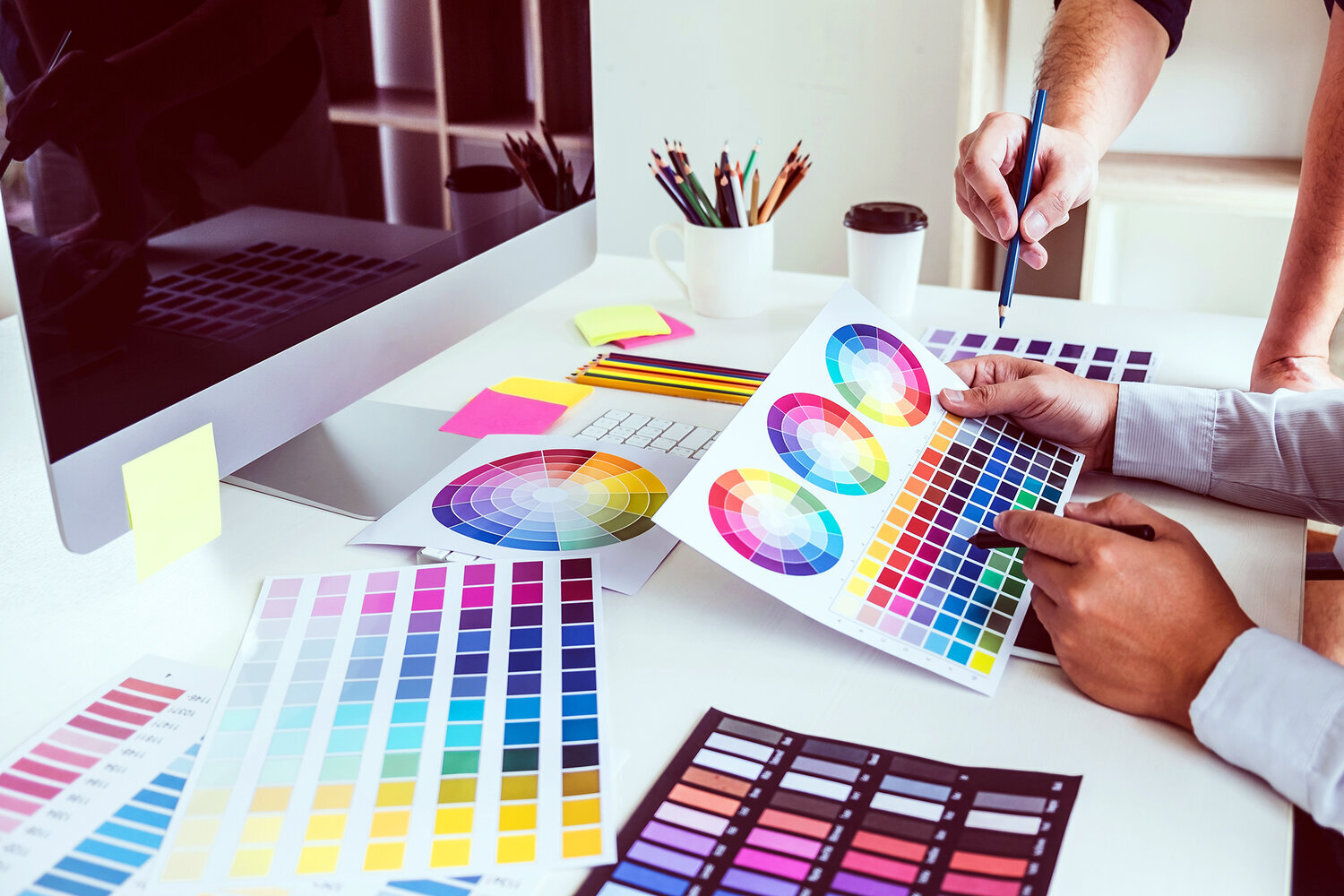
Want your logo to convey a feeling of creativity? Color can help you do that. Find out what colors convey a what emotion here.

Trust is an indispensable element to any business relationship - if a brand doesn’t convey reliability, then this will have a detrimental impact on conversion rates.

A well-designed business card has the potential to set the tone for how you treat your customers, what your business is like, and how you professionally conduct yourself.

When considering the design of a business card, meticulously plan each detail and consider how they reflect both you and your core values. For instance, what are the connotations of the coloring and fonts used? Is the typeface reflective of your personality?

Every detail should hold relevance, communicating to your intended audience what they can expect, should they decide to join forces and collaborate with your firm. 


2020 Business Card Design Trends

While business cards of yesteryear paid homage to simplistic ideas, modern-day entrepreneurs and professionals are continually opting to embrace a variety of cutting-edge designs, using their business cards as a medium to convey their brand identity, as well as communicate their personal contact information.

Research has indicated that over 80% of business cards get thrown away in less than one week, a quandary that can be rectified by paying attention to emerging design trends.

With a whole host of designs available for your company to choose from in 2020, here are a select few that are sure to catch the eye of potential clients at networking events and meetings this year.


Interactive Business Cards 

The days whereby business people are forced to settle for a conventional business card are long gone, with many embracing an interactive alternative.

While contact details are undoubtedly the most significant part of a business card, offering an interactive product is a wonderful opportunity to convey your character, ingenuity, and flair.

From branded seed pouches for gardening companies to perforated designs for divorce lawyers, there are a variety of ways that an interactive card can represent your craft - all it takes is a sprinkle of imagination! 

Designing the perfect business card for 2020  |  Hue & Tone Creative

QR Business Cards 

In 2019, a mind-blowing 5 billion people owned a mobile phone, with many gaining access to the QR code feature.

Given the dramatic growth of digital culture, more companies are deciding to incorporate QR codes into their designs and acknowledging the benefits a QR business card brings to the table.

QR codes enable the distribution of essential information to customers while saving space on the card itself; more information is offered in digital format, without compromising the sleek design. For example, by simply scanning the code, clients can gain access to informative videos about the services that a company offers.

A common downside associated with business cards is the difficulties associated with tracking their effectiveness or their impact on the customer journey. However, QR codes can be tracked with a series of online tools, providing valuable insight into audience behaviors, etc. This data can then be evaluated and used to influence future marketing campaigns, and so forth.

With mobile phone users on-screen time amounting to an average of 35 days per year, stats such as this bode particularly well for businesses who are bridging the gap between reality and the virtual world.


Perforated Cards

The business world is shaped by competition, so what better way to oust your rivals than offer customers an immediate business incentive upon receiving your business card?

A quirky design that’ll grab the attention of potential clientele, perforated cards are split into two parts and are a fantastic way to entice customers with introductory coupon offers that can be torn, without compromising the essential information printed on the other half of the card.


Deviate from the Norm… 

Rule of thumb dictates that business cards are traditionally rectangular, but in the world of design, rules are made to be broken.

Previous years have seen designers create cards that come in a range of shapes and sizes. These alternative designs are set to continue into 2020 and introducing subtleties within your design can introduce an elegance that’ll set your business card apart from the competition.

For instance, rounded edges give a card a sophisticated finish, while a more daring die-cut can make your card particularly striking. 

Furthermore, simple amendments to orientation can make a notable difference, presenting an opportunity to experiment with new typefaces and formats.


Minimalism 

While some may favor the innovative approach when designing their new business cards, a legion of traditionalists will argue: Why fix something that isn’t broken?

A design trend popular during the 20th Century, minimal business cards have survived the test of time and continue to prove popular amongst many businesses, so much so, that this design trend is expected to continue into 2020.

Minimalistic business cards convey key messages in a condensed, yet effective manner. This design is often used to increase visibility and readability, whilst also creating a sense of intrigue, in turn, prompting potential clients to get in touch for more information.


Hue & Tone Creative: Your Business Design Partners

Whether you're a traditionalist or an innovator in need of inspiration, Hue and Tone Creative has a wealth of creativity, ready to be unleashed. Call (336) 365-8559 or email hannah@hueandtonecreative.com and we'll be delighted to help you get your brand back on track. 

How to create great images for shoppable posts

New to shoppable posts? Head over to our step-by-step guide here.

Month-over-month and year-over-year, more and more consumers are making purchases directly on social media. One digital marketing company found that in the last 12 months, there’s been a 38% increase in the number of users who placed high importance on being able to discover and purchase products directly through Facebook, Instagram, and Pinterest.

When it comes to social shopping and visual content, here are a few stats you need to know:

  • 91% of brands agree visual content creates more engaging shopping experiences

  • 86% say their imagery enhances their discoverability

  • 73% said visual content increases conversions

  • 77% confirmed it deepened brand trust

How to create great images for shoppable posts  |  Hue & Tone Creative

Allowing users to buy directly on social media should be part of an integrated, multi-platform approach. When used in conjunction with good data, well-targeted ads, and great organic social content, you’re sure to have a winning strategy in place. 

One of the most important elements of that winning strategy is strong images. And, while the guidelines for each social platform are a little different, there’s one thing that’s true across every platform: high quality photography is a must. 

With that in mind, read below for details on how to tailor your images to each platform. 


Facebook

Regardless of what you’re selling, there are a couple of requirements your images must follow:

1. Each product must be supported by at least one image

2. The photo you use has to be of the product itself -- no creative interpretation allowed!

Once you’ve met those two guidelines, we also recommend you:

  • Make sure your images are easy to understand and that they capture the whole of the product. That’s not to say you’ll be penalized if the corner of your wallet is cropped out of the picture, but clarity is key and consumers want to see exactly what they’ll be buying. 

  • Use an image resolution of 1024px x 2024px or higher for a clear display resolution.

  • If you’re worried your images don’t have a cohesive look, consider placing your photo on a white background. It’s a clean and simple approach that works well for almost every product.

  • Take shots of your product in real-life scenarios. For example, someone wearing a handbag gives an idea of scale and also provides the opportunity to show off your brand aesthetic. It’s a win-win!

  • Use the following image ratios to ensure your ad will display properly: 

    • Ad images on the computer: 470 x 246 pixels.

    • Images of ads for mobile: 560 x 292 pixels.

    • Images in ads with a vertical column: 254 x 113.


Instagram

Next up is Instagram – and whether you’re dabbling in shoppable posts or stories here’s what you need to know to ensure your images convert:

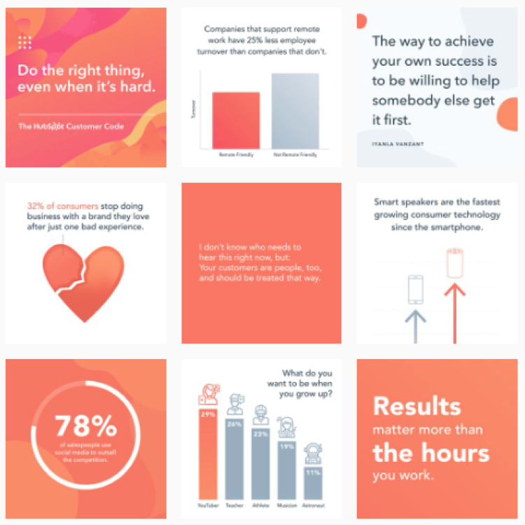
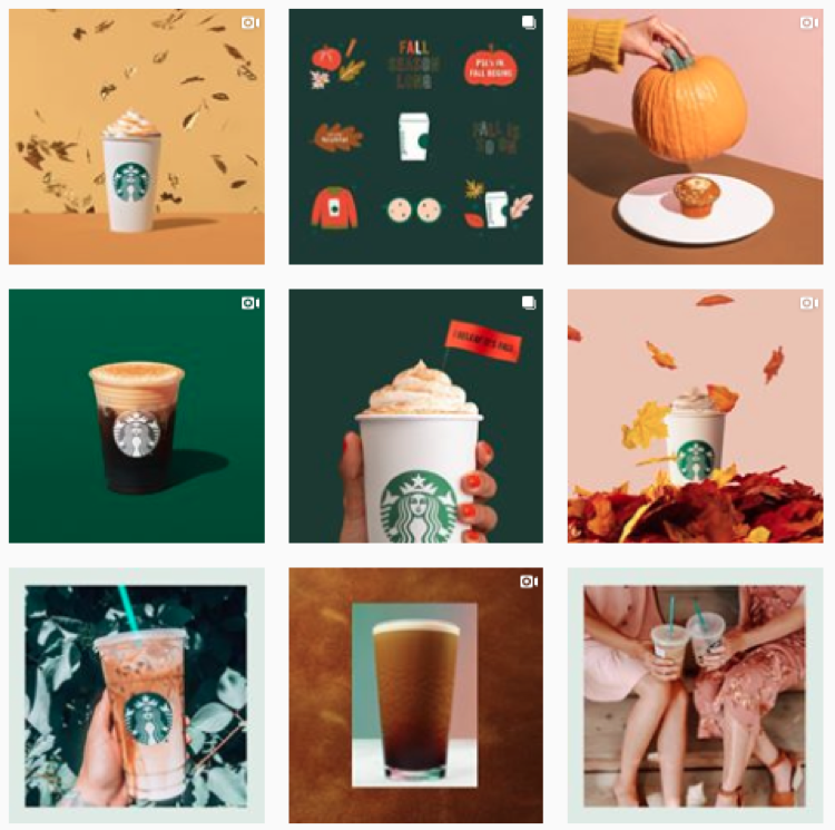
  •  Consistency is key so make sure your photos reflect your brand’s personality. Users should instantly know it’s you when they scroll by! For example, here are two feeds that have a clear and recognizable look: 

Hubspot

Hubspot

Starbucks

Starbucks

  •  Brush up on different composition techniques and experiment with them in your shoots. You’ll want to establish your own style over time, but if you’re just getting started there’s a few things that are usually a hit on social: 

    • Rule of thirds: Divide your photo into thirds (horizontally and vertically) and sit your product on the intersecting lines. More on that here

    • Rule of odds: Put five bracelets in the frame instead of four, it’s usually more appealing. 

    • Negative space: Ensure the space surrounding the product takes up more space than the product itself. 

    • Centered composition: Place your product in the middle of the frame. This will ensure your image crops well no matter where it’s being previewed. 

  • Play with your exposure until your photos find the right balance. Or, play around with under and over exposure to give your images a signature style!

Pinterest 

Need tips on creating a branded look? We can help with that – check out this post

On Pinterest, image quality reigns! Like Pinterest, Instagram is a visual platform – but Pinterest offers even less context than an Instagram post. Think of your picture as the preview for your whole webpage – even though you can create a long pin, you’ll want to get key text and a few grabby images up above the fold. 

  • Pinterest recommends a 2:3 aspect ratio (ex: 1000 x 1500 pixels). Other ratios may cause your Pin to truncate and may negatively impact performance.

  • Just like Instagram, you’ll want to bring consistency to your feed by establishing clear and consistent branding. 

  • The images you pick should help people understand why your product or idea is the right fit for them. Pick images that show context and bring your topic to life. Clearly show how someone might use your product, try your project, etc.

  • Text overlay can make your Pins stand out, adds context, and enhances your message. Keep text concise so it’s easy for people to read on their phones.


Hue & Tone: Let’s Get Social Together

Need help overhauling the look of your social media? Whether it’s your creating custom images or finding the perfect photo, we’ve got the solution that fits your needs. Get in touch at (336) 365-8559 or hannah@hueandtonecreative.com to find out more.

Typography for beginners
Typography for Beginners  |  Hue & Tone Creative

Some web pages and brochures good… and some look terribly unprofessional. If you’re new to graphic design or typesetting it can be hard to determine what makes someone’s branding look good or bad.  

If you’re a beginner – or you’re attempting to brand your own business -- there’s a number of type rules you can follow to give brand a polished look. Following these simple rules will help even the most amateur designer get their webpages and print assets in tip top shape!


1. Less is more when it comes to typeface

If you’re looking for some font pairing inspiration, head over to these two posts about pairing fonts on Squarespace (here and here). 

Choosing the right typeface is key. Get it right, and you’ll set yourself up for stylish, simple and easy-to-read assets. But get it wrong, and you’ll end up with illegible, cluttered and unappealing pages. 

Simple fonts should be used for main body copy, and decorative typefaces should be used sparingly for things like subheadings.

The golden rule in the design world is to stick to a maximum of three fonts in any given piece of artwork - whether that is a website page, social media banner, or hardcopy flyer. However, whittling your fonts down to two can sometimes be even better. 

If you stick to just one or two fonts, you can use varying weights to create a more refined look. 


2. Use a sensible hierarchical structure

Following a logical hierarchy helps to give your site’s pages a clear flow and effortlessly guides readers through the structure of the website. Let’s compare and contrast two examples to give you a better idea of what we mean: 

Good content formatting.png

Exhibit A is a bad example. The website’s name, navigation bar, subheadings, and main body copy are all the same font size. Now there are two issues with that – first, it gives readers no visual indication where they should start reading or what’s most important to look at. Secondly, it makes it really difficult for the reader to skim through the copy.
 

Now, let’s contrast an example of a solid hierarchical structure. The page’s title, navigation bar, subheadings and copy are clearly defined with varying font points, making it much easier on the viewer’s eye.


3. Be creative with contrast

Typography for Beginners  |  Hue & Tone Creative

Being creative is part of being a designer. Now we know we said earlier you should stick to two to three font combinations per project, but that doesn’t mean you can’t mix up your styling by playing around with things like the font’s size, weight, color and style.

Whether you emphasize a key word with italics, change the color of a subead to something more bold, or bump up a term in your tagline to a size that’s more eye-catching, there are endless ways to create contrast within your copy.


4. Keep your alignment neat and tidy

Alignment applies to all your on-page elements - like body text, titles, logos, images, and menu bars. When it comes to alignment, everything should be connected in one way or another. For example, you might want your logo to align with your main navigation bar, your body copy to align with your page’s title, and your images to align with your body copy.

Well thought-out alignment will help prevent your page from becoming disjointed and ensure all your assets create well-measured sizes and distances between each other.


5. Don’t be a stranger to whitespace

Don’t fall into the trap of thinking you need to fill everynook and cranny on your page. Creating whitespace around your words can be incredibly powerful, can help draw attention to text, and will aid you in achieving a simple and trendy look. 


6. Choose your colors carefully

Last but not least is your color choice. The right colors can make or break the look and readability of your copy – there’s nothing worse than colors that make your words a strain to read.

When it comes to color, there are three key components: 

  • Hue - the shade of the color

  • Saturation - the brilliance of the color

  • Value - the lightness or darkness of the color

Source >

When it comes to choosing your colors, the aim of the game is to make your text as easy as possible to read. It’s as simple as that.


Hue & Tone Creative: Let’s work together

Feeling overwhelmed with information? If you’re not a designer, knowing and deciding what does and doesn’t work is easier said than done. If you need a hand with your typesetting - or any other area of design, get in touch with our team today at (336) 365-8559.

Inbound marketing: 8 tips for design that converts
Inbound marketing: 8 tips for design that converts  |  Hue & Tone Creative

Are your inbound marketing efforts failing to secure the numbers you projected? Are you confident in your concept and scratching your head to figure out where it’s going wrong? Well, perhaps it’s time to look in the direction of your design.  

Design possesses the power to convert spectators into engaged customers. It’s the first and last thing people see when engaging with your business. And it should be a key focus when working to increase your conversions.

So, without further ado, here are eight design tips to give your numbers a nudge in the right direction.


1. Hick’s Law

Hick’s Law is a popular theory that suggests the time it takes someone to make a decision is directly proportionate to the number of possible choices they have. So, in Layman’s terms, the more options you give your visitors, the less likely they are to perform the desired action.

To implement this theory, take a look at your site’s design and structure and ask yourself (and honestly answer!) whether you’ve got too much going on. If the answer’s yes, see how you can hone things down to give consumers one or two key choices. 


2. Don’t be afraid of white space 

To a degree, the phrase “less is more” couldn’t be truer. Don’t cram your designs with color, text, and imagery out of the fear of being ‘bland’. White space can contribute to clean and clear designs that emphasize the content you want visitors to focus on… which, in turn, increases conversions. 


3. Choose your colors carefully

Color can evoke emotion. Emotion can result in action. Action can result in conversion. Use contrast to ensure your text, headlines and call to actions stand out, and experiment with your color choices to see which returns the best results.


4. Remember the 8-second rule

It’s true what they say, the human attention span is less than that of a gold fish - a mere eight seconds, in fact. That means you’ve got limited time to grab a visitor’s attention. 

Think about using: 

  • Large and snappy headlines

  • Eye-catching imagery

  • Clear call to actions

  • Power words


5. Use real faces

Using natural imagery and real people can improve your brand’s authenticity and in turn portray you as more trustworthy, human, and familiar. 

If you’ve got an ‘About us’ section with a breakdown of your employees, put a photo of them next to their bio. And, instead of buying stock photos for everything, consider organizing a photoshoot that shows off your product or office. 


6. Quality is key

Poor quality pictures don’t make a good first impression. They reflect badly on your brand and lead onlookers to associate the quality of your imagery with the quality of your product or service - after all, if you can’t master your pictures, how can you follow through on the other things your website promises? Now we know that’s not necessarily true, but it’s a conclusion people can jump to.

If you’ve got pictures on your site that are pixelated, distorted or just plain tacky, it’s time to go ahead and replace them.


7. Optimize your forms

Having trouble designing a form that converts? We can help with that

When it comes to conversions, your formsare key – because it’s where the action takes place. So, don’t let yourself fall flat at the final hurdle. Keep your form simple and concise, include a clear CTA, make sure the fields are clearly labelled, and use a large submit button.

To see where there’s room for improvement, we suggest trying out some A/B testing (more on that here).


8. Don’t leave out your logo

This one might seem obvious, but it’s not unheard of for people to overlook the most obvious element of their website.  

Whether it’s a landing page, flyer, brochure, business card or online ad, you need to always include your logo. That’s how you reinforce your branding for people – and while it doesn’t have to be the focal point of your page, it does need to be strategically placed so people know where they are and who’s talking to them.


Hue & Tone Creative:

Feeling like these design changes are outside of your expertise? Not to worry, that’s where our creative team comes in! To see what we can do for you, get in touch today at hannah@hueandtonecreative.com

Best 404 pages: Designs that stand out

In an ideal world, your website visitors would never find themselves faced with a 404 page. But, suffice it to say, this isn’t an ideal world — people type things in wrong, links break, and technical difficulties happen.

Although your first plan of action should be ensuring there are no broken links on your site in the first place, there are ways you can make the most of a bad situation. If a visitor finds themselves facing a 404 page, you can turn their irritation into an opportunity to entertain them, sell yourself, or provide them with valuable resources.

Here’s a few people we think will delight their customers with their weird and wonderful 404 pages:

Pixar

It’s clean. It’s simple. It’s on-brand. It’s a complete over-exaggeration of the reaction you probably had. And in our opinion, it completely works.

Pixar.png

Bluepath 

Funny and relevant: the best combination! Bluepath’s a data strategy company, so they aptly designed a data-driven map to show their lost visitors where they stood.

BluePath.png

Lego

Like Pixar, Lego let their 404 page serve as an extension of their existing brands. They capitalized on a few favorite characters to illustrate the situation visitors have found themselves in. 

Lego.png

HubSpot

Not every brand necessarily has a set of iconic characters to bring their 404 page to life. But, as HubSpot have shown, this doesn't have to stop you from having a bit of fun.

They’ve also smartly reinforced their audience’s love of their services and cleverly tried to redirect them to a handful of other, selected pages - win, win!


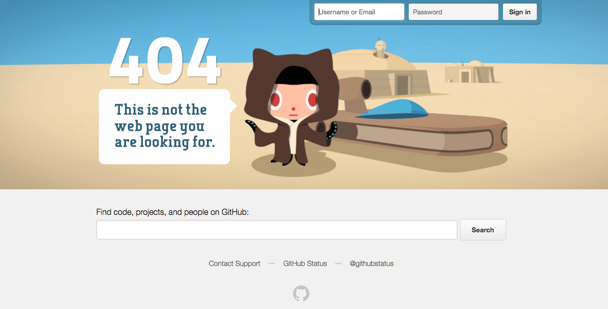
GitHub

If all else fails, state the obvious. Super simple, but just as on brand.


Emirates

Everyone loves a good pun, right? The beauty of Emirates’ 404 result is that it puts their people on the page and capitalizes on a very obvious but on brand, pun-filled message.

Emirates.png

eHarmony

Another superb example of how your 404 page’s message can wittily relate back to your organization’s core message.


NPR 

Now there’s a lot more text on NPR’s 404 page than most, but it totally works. They do a lot here: in addition to giving you an alternative way to find what you’re looking for, they work in a little foolproof humor and even point you to a few other articles.


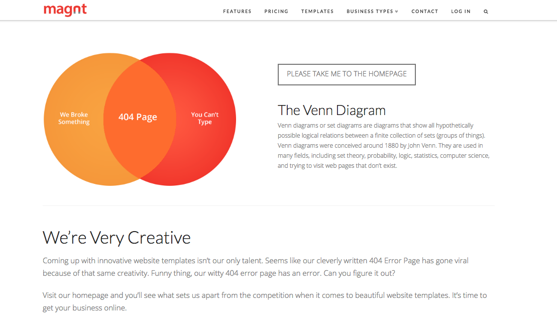
Magnt

There’s two elements on this page that we absolutely love:

1)   It puts some of the onus on the visitor - after all, 404s aren’t always the website’s fault!

2)   They’ve maximized on every single opportunity and managed to turn their 404 page into a sales pitch for their product


A couple of 404 basics…

 Now that we’ve taken a look at a few great examples, it’s time to create your own awesome 404 page. Daring 404 page designs aren’t for everyone, but even the most basic of templates must include:

Key links - make it easy for visitors to navigate their way back to live pages on your site. Ideally, you should make sure your main navigation bar is prominent on your 404 pages.

Branding - just because your 404 page isn’t a page you intentionally want to drive traffic to, doesn’t mean it isn’t important. Keep the look and feel of it consistent to that of your site so people know you’re still close by.


 Hue & Tone Creative: Custom design and marketing

When it comes to web design, we know what we’re doing. For help creating a killer 404 page or an entire website, make the first move toward better web marketing today: 336-365-8559 or hannah@hueandtonecreative.com.

Pros and cons: DIY Web Design vs. Hiring a Web Designer
Pros and Cons: DIY Web Design Vs. Hiring a Web Design  |  Hue & Tone Creative

We’ve all seen commercials for web builders like Wix, Squarespace, and Wordpress. They lead with a promise of creating a great website at lightning fast speed... even if you have no previous experience. It almost sounds a little too good to be true, right? 

It all depends on your needs. While web site builders make it easier than ever for non-designers to pull together their own website, they don’t work for everyone. If you’re a tech savvy business owner who needs a simple site, they might be a great option. But, if you’re tech-challenged, short on time, or in need of a more custom site you probably need to consider hiring a web designer.

Anyone can point out a website they like or select a template – but designers are the ones who can identify and execute all the elements needed for an on-brand, functional website. From color palettes and font pairings to white space and photography, there are some things a novice just won’t be able to execute on their own. 

Before you decide which route to take, let’s run through some of the pros and cons of DIYing or outsourcing your design: 


Outsourcing design: pros

Professional end product

There’s no denying that the end result of hiring a web designer is inevitably going to be stronger than what you’ll be able to create on your own. A strong website design will inevitably help you achieve your website goal, no matter if it’s more email opt-ins, a higher conversion rate, or more brand exposure.  

Functionality aside, did you know that 75% of consumers judge a brand’s credibility based on their site’s design? Web users are savvy, and they can sniff out a homemade website from a mile away – which in the long run could translate to a lot of missed opportunities. 
 

Saves you time and stress

Pulling together a list of your website needs and handing it over to a third party saves you immeasurable amounts of time and stress. You’ll be able to skip the hassle of doing background research, brainstorming concepts, refining ideas, finding your way around unknownsoftware, and making endless tweaks to the site. 

You can simply put your wish-list together, pass it on, and then get on with the rest of your to-do list while your designer handles the creative.
 

It’s a long term investment

Every business’ end goal is to generate revenue. But every good business owner knows that sometimes you have to spend money to make money. While you’ll pay a greater upfront cost to hire a web designer, you’re going to be walking away with a high quality final product that will serve your business for years to come. 

Creating your website yourself has the potential to open you up to issues with data security, mobile responsiveness, search optimization, and more – which long-term could lead to spending more than the cost of hiring a web designer.  


Pros and Cons: DIY Web Design Vs. Hiring a Web Design  |  Hue & Tone Creative

Outsourcing design: cons

It’s more expensive

The price you pay will vary from designer-to-designer (we would estimate anywhere from $500-$8,000 based on the complexity of your site) but it’s certainly more expensive than what a DIY tool will cost you. If you’re a brand new business or start-up with a limited marketing budget, the cost of hiring a web designer may feel prohibitive.  

Although we’ve listed this as a con, we urge you to think of the bigger picture, and your return on investment down the line.
 

Less insider info about your business

Every business has their own way of working, their own personal preferences, and their own knowledge of what’s worked in the past. Understandably, an outsider won’t possess nearly as much knowledge about your business as what you have. It make take a few meetings to educate them on the ins and outs of your business so that they’re able to create an effective website for you. 

If you feel like your designer isn’t listening or doesn’t have the time to talk through the backstory of your business, we suggest finding someone else who will. 
 

Finding the right fit

You do your research, talk to a number of potential designers, and still you feel like you can’t find the right fit. Keep on looking! 

Settling for the wrong designer is going to cost you more time and money in the long run, so be sure to do your research and settle on a clear scope of work before agreeing to anything. 

A good designer should ask you a lot of questions before providing a quote, should explain the process to you, be able to answer your questions, and will outline a clear scope before the project kicks off. If you feel like you’re in the dark about what you’ve agreed to or you feel like they just don’t get your business, then we suggest looking elsewhere. 

Ask for referrals, get the designer to provide ample work samples, and check out the quality of their online presence to get a good idea of their working style and final products. 


DIY design: pros

Save money

There are lots of online tools that let you create artwork for free, or offer additional features for a low fee. Either way, it’s likely to be cheaper than onboarding a designer. 
 

Total control

Working with a designer means having to make compromises based on their expertise, and we’ve seen first-hand how hard this can be for some business owners. If you think you’ll be unable to work with an outside party on your website, you may want to consider keeping the project in house. 


DIY design: cons

Compromised quality

Design is a skill like any other. The same way you can’t waltz onto a construction site and expect to be a builder, you can’t start using software and expect to be a designer.

Imagine you had to build a brick wall right now. Now imagine what the end result would look like. Compare that to what a professional mason would be able to build. The world of design is no different.
 

brooke-lark-609902-unsplash.jpg

More time, more limits

We’ve already mentioned that there are various cheap and/or free design tools around. But with their cost-saving benefits come limitations – both on what free software can do and what you’ll be able to execute with your limited skill set. 

There’s only so much you can do on basic design tools, and by limiting the flexibility of your designs, you’re essentially putting a cap on the potential quality of your finished product.


Tunnel vision

After working solo on your marketing for so long, you think you know exactly what works best and what your customers want. In some cases this might be true, but in a lot of cases there’s value for bringing in a fresh perspective – especially someone who is a marketing expert. Bringing in a web designer will help you get a fresh perspective and some new ideas. 

An expert designer will be able to take your marketing materials to a new level that you’ll never be able to execute with in house design, making you more competitive and more likely to stand out from the crowd. 
 

Loss of expertise

Last but not least, is the loss of experienced, tried and tested expertise. Let’s stick with our construction analogy. If someone asked you to build a skyscraper, you wouldn’t know where to start, or what best practices you need to follow, would you? Nor would you be expected to.

Professional designers have spent years mastering their trade. They’re hot on the heels of current and emerging trends. They’ve had past success and failures to learn from. And, they’ll be able to translate your ideas into something that works well for you while still fitting in with current trends. 

What does all that mean for you? A stand-out final website.


Hue & Tone Creative: Web Design for the Triad

Now convinced you need to hire someone to help with your new website? Give us a call so we can see if we're a good fit for designing your new site or sprucing up your existing one. From web mockups to executing the final design, we want to be your go to partner for all things web and design.

Logo Love: 5 of the best big brand redesigns

Most brands, no matter how big or small, evolve their logo at one point or another. It might be a subtle redesign to get on trend, or it might be a total overhaul. No matter how thorough of a rebrand you're looking to do, just make sure the reason you do it is solid -- you don't want to be that company constantly confusing people with a new name or logo. 

A few of the reasons we think you should consider a redesign?

  • It was a DIY project

  • Your business has evolved, but your logo hasn't

  • It uses dated design trends

  • Your company is about to make significant changes

  • It needs to be simplified

In our opinion, a good logo update maintains the integrity of the original brand, while evolving the look. Your first logo will rarely be your last -- and as long as the thought process behind your redesign is strong, there’s no reason not to periodically enhance or revamp your logo. 

To get a better idea of why people update their look, let's look to a few big brands: 

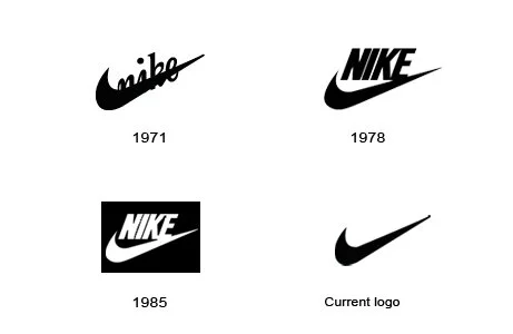
1. Nike

Nike’s refresh couldn’t be a better demonstration that less is more. No color. No words. Just an instantly recognizable, worldwide tick.

Image source: fastsigns.com

Image source: fastsigns.com

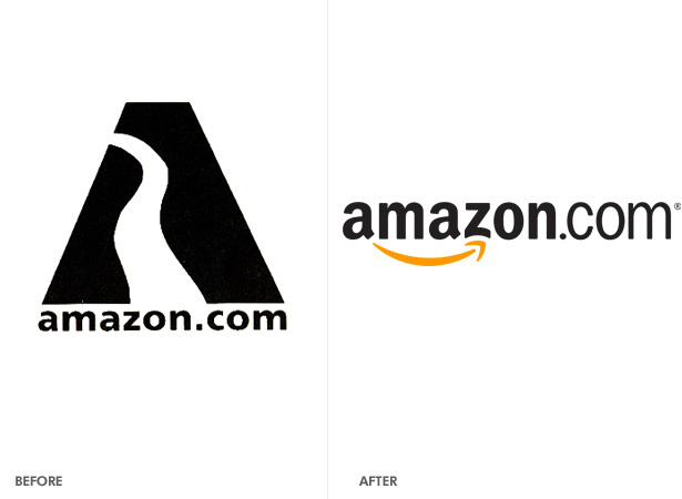
2.  Amazon

A rebrand brought on by business changes, Amazon's logo is a great example of a clever design. While Amazon's first version wasn’t exactly irrelevant to Amazon’s name, its current logo is a true reflection of what it stands for.

With a smile for its happy customers pointing to their A-Z offering, there’s a lot that can be learned from Amazon’s slick rebranding.

 
Image source: contested.wordpress.com
 

3.  BBC

Since its inception, the BBC has developed a multifaceted brand. Having many different branches of business means needing a highly versatile and adaptable logo. 

Their simple three box logo coordinates well with other fonts, gels with any color, and has mass appeal. 

 
BBC_logo_(pre97).svg.png


Image sources: tvforum.uk and wikimedia.org

Image sources: tvforum.uk and wikimedia.org


4. Instagram

Instagram’s old logo was incredibly retro -- we'll leave it up to you if that's good or bad. Some folks certainly liked it, because they received a decent amount of pushback when they revealed their updated logo. 

Many compared its background to something seen in WordArt, but it’s since proven that it’s less paint shop and more pro. It’s simple, funky and modern; everything Instagram is as a platform.

 
Image source: obviousgroup.co.uk

Image source: obviousgroup.co.uk


5.  Spotify

Spotify’s logo was fairly streamlined before, but their rebrand took it to the next level. By sticking to one vibrant color and scrapping the gradient, they've stayed in line with design trends while still maintaining the integrity of their brand. 

 
Image source: osmanassem.com

Image source: osmanassem.com


Hue & Tone Creative: Your brand partner

Let us focus on telling your story, so that you can focus on what you do best: running your business. We're your own personal marketing department -- and will handle everything from your brand launch to daily social media needs. If you need to lighten your workload, we're here to help -- reach out today.

How to give honest feedback without frustrating your designer

You’ve chosen your designer, you’ve briefed them on your needs, reached an agreement on terms, and you’re eager to see what they’ve come up! Then, their name lands in your inbox along with the much anticipated attachments – but then you click to find that...they’re not quite what you were after. Now what?

If you do it right, giving feedback won’t be perceived as negative. In fact, it’s an important part of the design process – and it’s something that your designer is anticipating. But giving feedback in an unproductive way can lead to an overall unproductive relationship between you and the creative you hired. 

As designers, we’re here to let you know that we’re used to feedback – we even enjoy it because it helps us do our job better. But, it can be frustrating when clients are constantly giving you negative feedback and not giving you the information you need to do your job properly. 

It’s easy for miscommunications to happen – especially if you’ve never worked with a designer before. But with just a few small tweaks to your approach we believe you can communicate with your designer better than ever – and land on a superb final product! 
 

How to give honest feedback to your designer  |  Hue & Tone Creative


Step back and ask questions

Before mindlessly shooting off negative feedback, take some time to marinate on what they sent you. Let them know you received the proofs and are putting together some notes. Then, go through the examples and guidelines you provided your designer. What varies from what you asked for? What’s in line with what you asked for (even if it’s not your favorite)? 

Put together a list of questions to better understand where your designer is coming from. The answers to your questions may change your mind on a certain concept or help you distinguish the direction you want to go. 

Creating an open dialogue will go a long way in helping you both understand each other’s point of view. 


Be professional, calm and controlled

We know it can be hard to stay calm when you feel like a project isn’t going right – but like any other professional situation it’s important to stay calm. Keep your communication -- whether it’s over the phone or on email – calm and clear is key. Be sure to politely explain why what they’ve produced isn’t quite up your alley.

Just saying “I don’t like it,” “it’s not what I asked for,” or “it’s not for me” isn’t constructive, and it doesn’t give your designer a fair chance to fix it. So, be as specific as you can so that they can understand what does and doesn’t work. That way they’ll be able to take your feedback and turn it into a stronger second draft. 

If you can, show them examples of the kind of thing you dolike from other organizations, so that they have a solid idea of the kind of design they need to be working toward. 


Explaining the why

When you’re highlighting elements of a project you’re not quite keen on, explaining the why is super important. Whether it’s because it goes against the guidelines you sent them, it’s too similar to what you’ve done in the past (and found to be ineffective), or it aligns too closely with one of your major competitors, give them a bit of context to help them understand the thinking behind your rationale.

Keep in mind, your designer has probably spent a lot of time on what you’re seeing – if you don’t like it, there was clearly a miscommunication – and it’s on both of you to fix it!


Keep it in perspective

Perfection takes time. Just because they didn’t deliver exactly what you wanted the first time around, don’t hold it against them, patronize, or start micro-managing them. You hired a designer because you don’t know how to do it yourself – so stand back and let them do their work. Keep in mind they are an expert at what they do – just because you don’t like something doesn’t mean it’s not quality work. 

Their job is to bring your vision to life. Your job is to equip them with the information they need to understand your vision.


Put your personal preference to one side

When you’re critiquing their work, remember that design is often a personal preference. Be sure to separate your personal taste from your brand image. A designer might be able to see the bigger picture in a way you can’t – so just because it doesn’t connect with you doesn’t mean it won’t connect with your target demographic. The taste of your audience is probably going to be different than yours, so be sure to talk through your designer’s rationale before shooting down a concept – they might know something you don’t.


Balance negatives with positives

It’s the old compliment sandwich trick. And this tip isn’t just to make them feel better! As we touched on earlier, the positives will help them really get a feel for what you dolike so that they can keep developing quality concepts. 

If there really aren’t any positives, you can still be complimentary about their work, but just be clear that it’s not right for your brand or this particular project. If this is the case, be crystal clear you’d like to see a totally new direction – don’t try to sugar coat it too much or they probably won’t realize that what they showed you is a complete wash. 


Keep in mind what you agreed too 

Be conscientious of when you’re asking to go above and beyond the terms of your contract. If you agreed to three rounds of revisions, you may need to pay an additional fee to go beyond that. 

Both parties of this contract are on equal footing – it’s not an employee/employer relationship. 

You can’t expect free revisions just because you don’t like something. If they’ve met the terms of the contract and you still don’t have something you like you may need to renegotiate. Keep in mind the contract is in place to protect both parties. 

Checking in on time and expectations can go a long way in demonstrating that you respect a designer’s time. It’s a great way to show you value their work, even if you haven’t come to a final product yet. 


Remember...

Rome wasn’t built in a day -- if you want a rushed job, give a rushed timeframe. It’s important you give your designer time to go back to the drawing board and really take everything in you’ve said so that you can keep working toward a high quality final product. 

Hue & Tone Creative: Your creative team

Let us help you get your project designed right! We're ready to communicate with you on your marketing needs -- whether they're big or small. To take a look at what we've done in the past, be sure to check out our design portfolio. Don't see the type of samples you're looking for? Get in touch, we can email you additional work samples!

7 Reasons Why You Should Invest In A Professional Logo Design
7 Reasons Why You Should Invest In A Professional Logo Design  |  Hue & Tone Creative

Your logo is an integral part of your brand. It identifies you. It distinguishes you. And it creates consistency across everything you do.


Anybody can design any old logo. A professional can design a logo that has meaning, purpose and power. So, without further ado, here are our top seven cases for putting some investment behind your business’ logo.


1.  First impressions

You only have one shot to make a first impression, and a shoddy logo could shoot you in the foot. Put yourself in consumers’ shoes. If you’re looking to purchase a product or service and you stumble across a brand that has a logo that looks like it was made on Paint, it doesn’t set a very good tone for what’s behind the scenes.


2.  Relevancy

Telling a story through design takes a certain skill. A skill that not everyone (understandably!) has. From the colors, icons, images, fonts and sizes in your logo, to be truly impactful, every single element needs to have a purpose. And that, readers, is what a professional is paid to do.


3.  Trustworthy

The quality of your logo says a lot about you as a business. A poor logo can be construed as a poor brand, and we know that’s not the outcome you’re after.

Whether it’s a misaligned character, pixilated border or crazy color scheme, below par logos look inferior. High quality logos, on the other hand, give you an ora of professionalism, value and authority - all of which can give you one up over your competitors.


4.  Memorable

A strong logo is instantly identifiable. Whether it’s placed on a billboard, letterhead, social media or paid advert (and everything else in between!), it pulls peoples’ eyes to it, and it’s easily recognizable.

Professionals know that less can be more. That outrageous colors aren’t needed to attract attention. And that designs have to gel with a variety of settings. And they incorporate all of that into your finished product.


5.  Evergreen

As with almost everything in life, logos evolve. What might be spot on for your brand right now might feel slightly off in a few years - but that’s okay. You’ll not find many businesses out there that haven’t adapted their logo over the years, but the key is that they’re adaptable.

Entirely revamping your logo can damage your business’ brand awareness, which is why it’s more about continual tweaks than a complete do over. With a professional by your side, you’ll get a solid logo that’s designed to stand the test of time - bar the potential small touch ups now and then.


6.  Showcases your brand

Your logo is a pivotal part of your brand’s story and values. It’s your chance to let your personality shine through and showcase what you're all about! As an example, here are some of adidas’ logo milestones:

7 Reasons Why You Should Invest In  A Professional Logo Design.png

Same brand. Different logo. Completely contrasting messages.


7. Adaptable

Logos are needed left, right and centre. What might work perfectly fine on your website, might not necessarily sit right on your business card. That said, you absolutely don’t want two completely different versions that aren’t in-line with one another.

What you want, and need, is a few variations that fit in any given placement - for example, one that’s for a black background and one that’s for a white background - that are instantly associated with one another.

We could go on and on, but we’ll wrap it up at number seven. If you’re interested in sprucing up an existing logo or are a new brand starting from scratch, why not get in touch to see how we could help?


Hue & Tone Creative: Logo and Branding in the Triad

Are you now convinced that you need professional help with your logo design? We think we might just be the perfect people to help you out. From logos to branding, and everything in between, we can help you create a lasting impression. But if you're feeling a little unsure we'll let our design work speak for itself.

What does Branding really mean?
ian-dooley-337259.jpg

When the term branding enters a conversation, the word logo usually isn’t far behind. The words have become almost synonymous. Of course, branding is more than the creation of a company’s logo. So, what does branding really mean?


The Definition:

The term changes definitions depending upon whom you consult. For discussion’s sake, we’ll use the Business Dictionary’s version which states “[branding is] the process involved in creating a unique name and image for a product in the consumers' mind, mainly through advertising campaigns with a consistent theme.” Branding is the personality of a commodity. It’s the feelings and expectations that are connected to goods, services and even people based on lived experience and marketing efforts.


The Purpose & Importance:

Businesses use branding for numerous reasons including attracting new customers, securing loyalties, that result in repeat and longtime patrons, and to differentiate themselves from competitors.   

If a business is able to accomplish the above list, it’s safe to assume that it’s at least competitive. With effective branding, it may even be positioned well enough to charge more than market rivals. This increase in value is based largely on consumer perception and is referred to as brand equity. Judging a book, product or service by its metaphoric cover can be extremely advantageous for a company when public opinion is favorable.


How it’s Done:

Going back to our working definition that branding is the process involved in creating a unique name and image for a product, person, or service, keep in mind that there are aspects of this cultivation which are entirely controllable. These include, but aren’t limited to, logos, color schemes, public statements, written communications, social media, packaging, websites, and advertisements. Marketing, public relations, and design firms spend their time becoming masters in these areas, so you may consider using a professional here. So often, companies with quality commodities and excellent reputations find themselves in with injured brands do to ill-advised marketing moves.


The Fairy and Cautionary Tales:

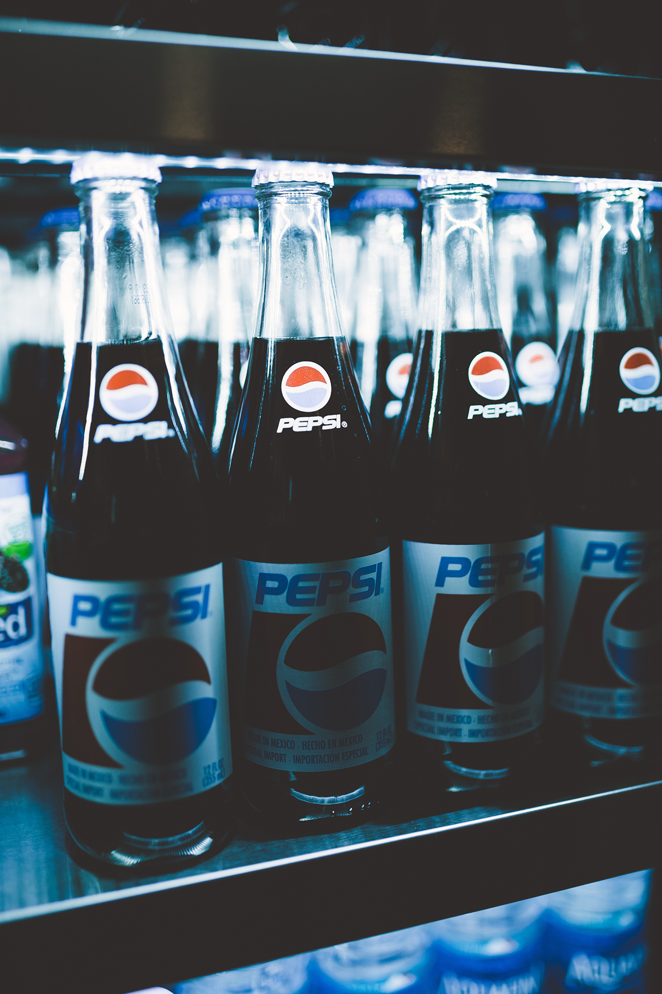
Most people are familiar with the controversial Pepsi campaign starring Kendall Jenner. During a time where clashes between Human Rights protestors and police were constantly in the media and the topic of much debate, Pepsi wanted to weigh in with a message of collaboration. Unfortunately, concerns of police brutality and violent discord were seemingly solved by Jenner handing an officer an ice-cold Pepsi. People were outraged for many reasons. Some felt Pepsi had made too light of serious matters, others railed against Pepsi using a national crisis as a means to sell more soda. Pepsi soon pulled the ad, apologized, and certainly learned from the branding debacle. The lesson here may be to align your brand with matters in the proximity of one’s wheelhouse.

Contrarily, one can take a devastating and embarrassing event like infidelity and use it to boost a brand. Beyoncé, upon discovering her famous husband was allegedly unfaithful, created an album cathartically working through her personal issues. Lemonade went on to become the highest-selling individual album of 2016 globally, according to the International Federation of the Phonographic Industry. The admission helped Beyoncé’s brand by reinforcing her image as a smart and incredibly powerful female force.


Questions to ask Yourself:

  • What message do you want your product or service to convey in the public’s mind?

  • What distinguishes your product or service from anything or anyone else on the market?

  • Are you consistently stacking up to public expectation?

  • In what ways (beyond performance) can you demonstrate that you are what you say you are?

  • Are you choosing marketing opportunities and strategies that align with your current brand identity?

These questions focus not only on what businesses say and do, but also on how people respond to those messages. In this way, branding is quite interactive. It’s not a business cultivating images of self that customers credulously accept, but a continuous dialogue between consumers and companies.


MARKETING & GRAPHIC DESIGN IN GREENSBORO

Starting a new business? Don’t dive in without a little help from the creative experts. From business card design and logos, to social media marketing, Hue & Tone Creative can help you connect with your customers and creating a lasting impression.

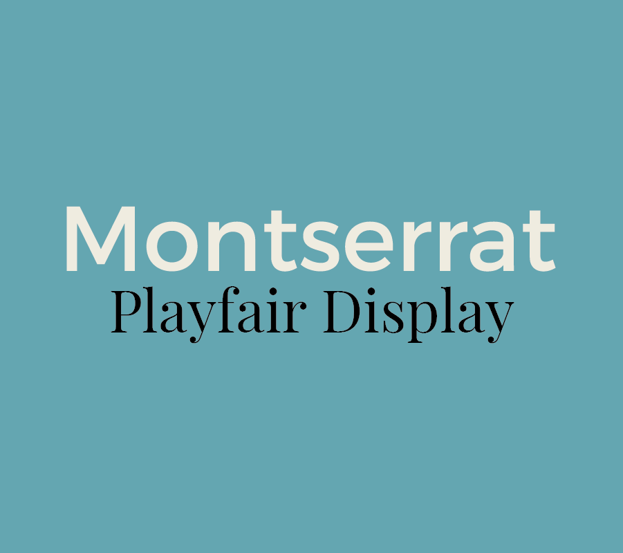
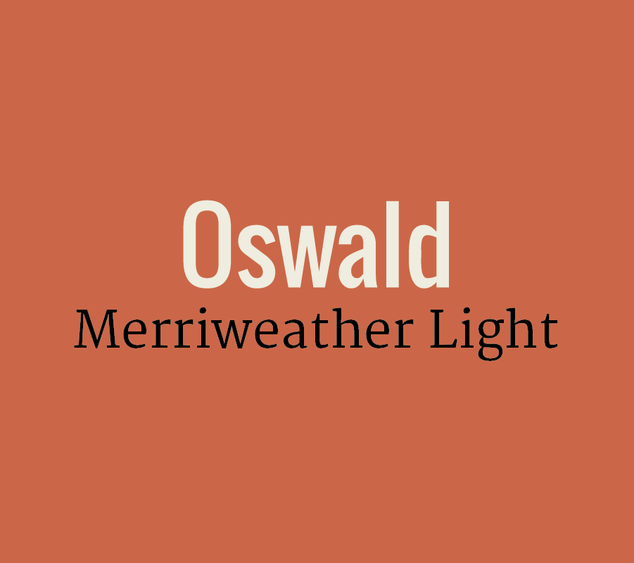
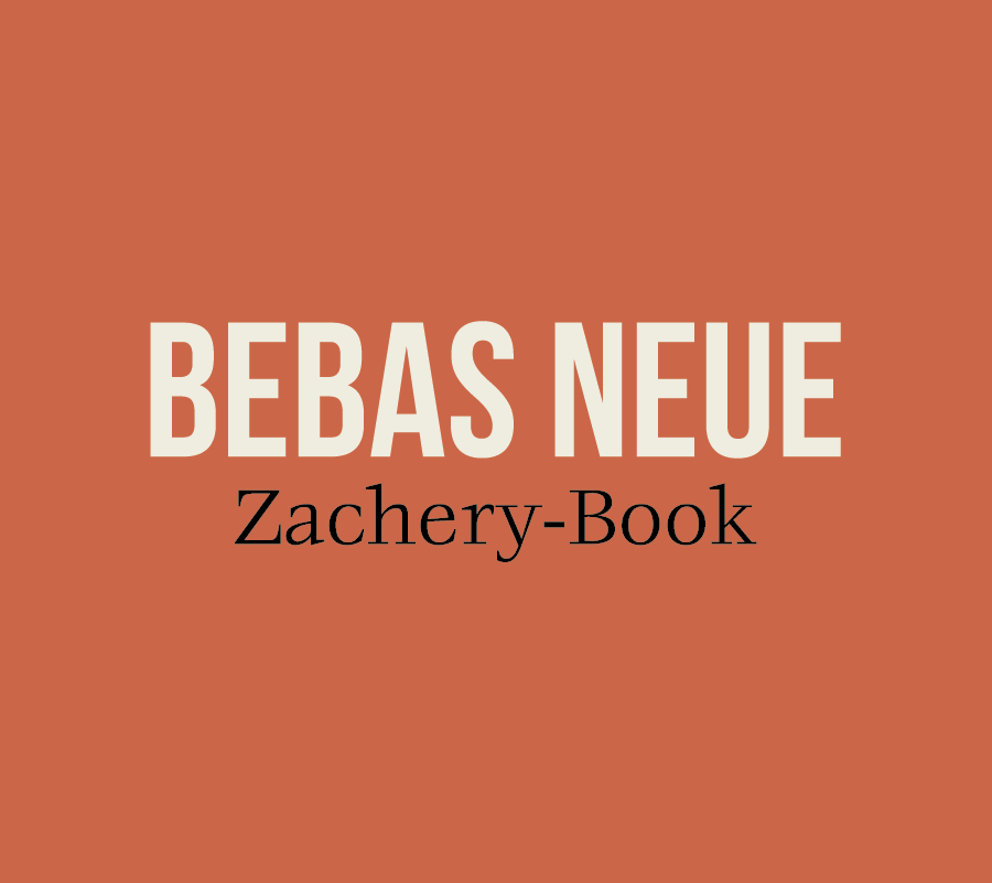
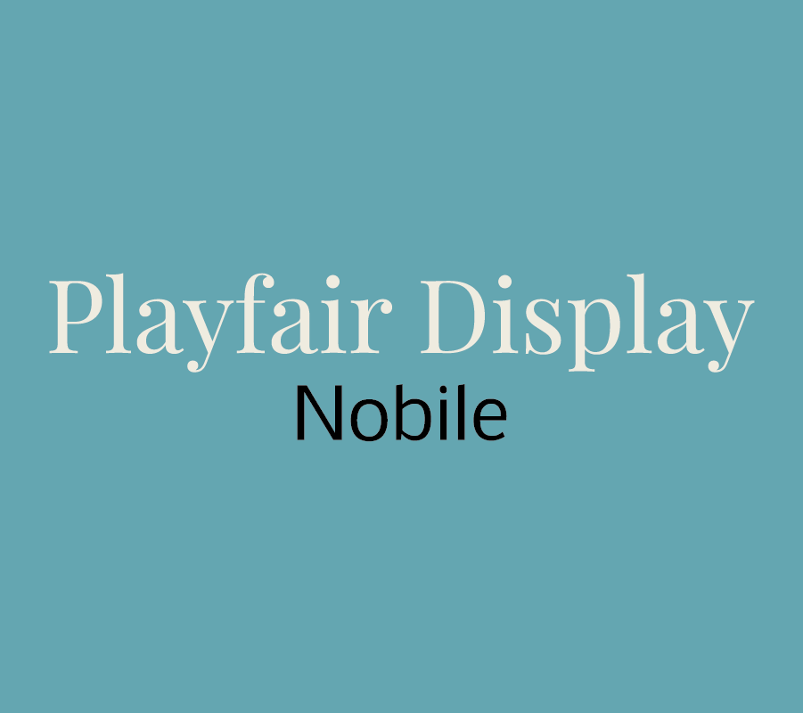
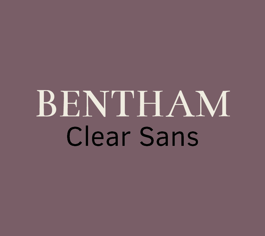
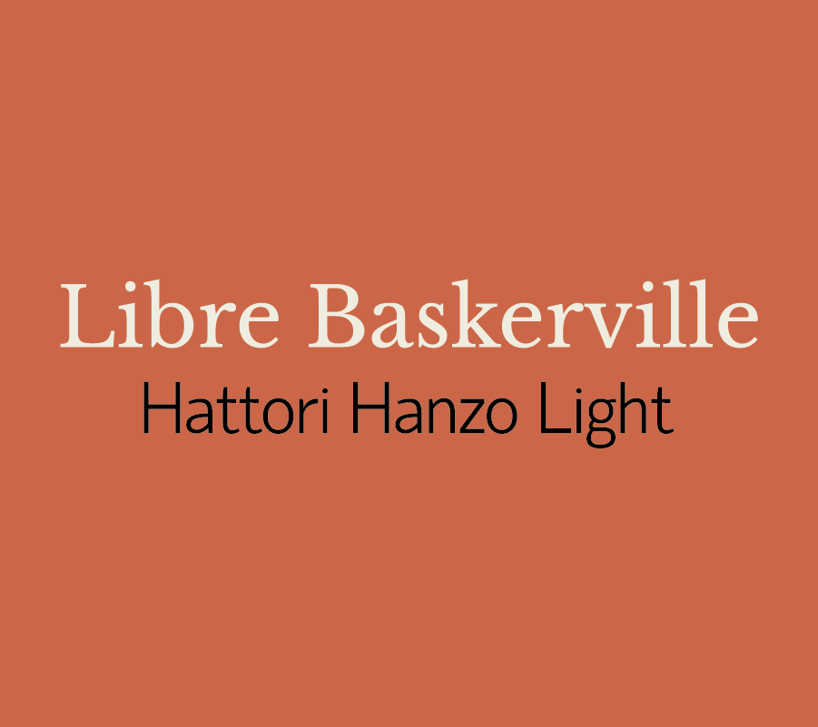
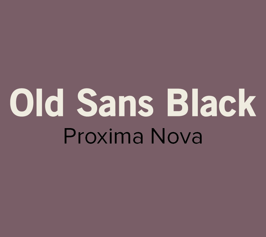
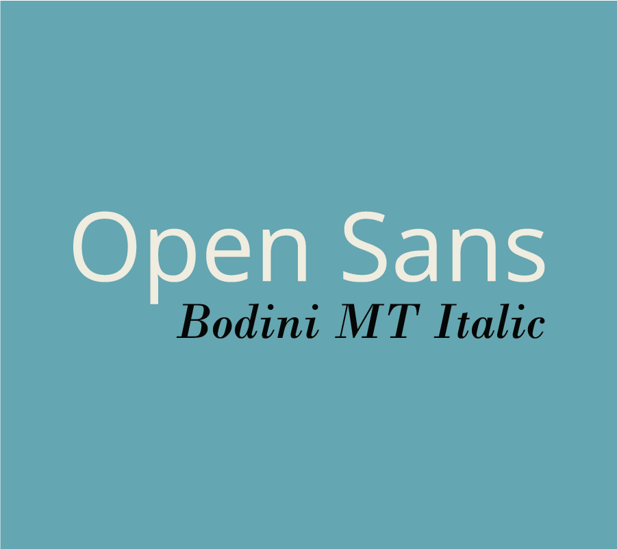
12 Inspiring Font Combination

Whether you’re designing a resume, website, or even a graphic for social media, choosing the right fonts can make a good design even better.  However, the seemingly endless font options available at our disposal can make choosing the right ones a little tricky.

To help alleviate a little stress and confusion, we put together a brief guide on font pairing. 

If you’re interested in the complexities of font typography, you can learn more here. But, if you're just looking to learn a few basics, start with these guidelines: 

  • Try combing a serif with a sans serif.
  • Stick to 2-3 fonts, any more than that can be distracting.
  • Designate rolls to your fonts. Keep headings, subheadings, or body text consistent.
  • Vary the weight to achieve visual hierarchy.
  • Contrast is key! Try not to select fonts that are too similar.
  • Don’t pick fonts that clash with your aesthetic.

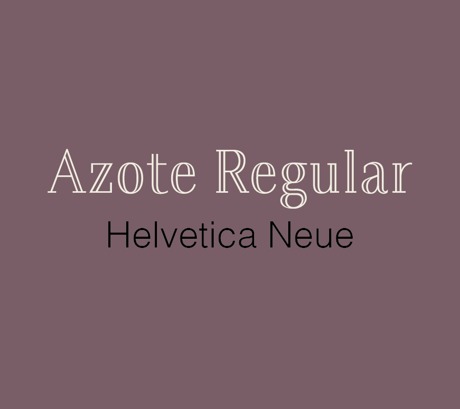
Now that you have some basics down, here are a few of our favorite combinations:

Most of the font examples we used below are from Font Squirrel, but you can also find some free or inexpensive downloads from these sites:

These are just a few of our suggestions, so don’t be afraid to branch out and try something different. There are seemingly endless font combinations to choose from! Play around and try out different combinations until you find what works best for you.

What are your favorite font pairings? Let us know in the comments!

Spotlight: Favorite Design Blogs

Working for yourself is not the same as working by yourself -- it takes a ton of meaningful connections with smart, creative people to make it happen. I'm all about in-person connections, but blogging provides a powerful way to learn from people all over who are walking a road similar to yours. 

With that in mind, today I wanted to share a few of my favorite design blogs! check these out if you're looking for new bloggers to follow. And, while you're at it, let's be blog friends. Follow Hue & Tone on Bloglovin'

1. Braid Creative 

The ladies of Braid Creative -- who obviously nailed the search for a fabulous name -- share smart, easily applicable tips on branding, entrepreneurship, and all things creative. 

Favorite Post: When Everyone is Doing the Same Thing

2. Paper & Oats 

Kelsey of Paper & Oats puts a bold, personal spin on posts about productivity and entrepreneurship, and is unapologetic about finding and sticking to her own creative niche. 

Favorite Post: Why I'm Scrapping All My Design Services 

3. Elembee 

When it comes to blogs about nitty-gritty topics like branding and design, there's fun and then there's comprehensive. Elembee is both. It's jam-packed with ideas but never a chore to read -- and the weekly emails are great, too! 

Favorite Post: It Will Never Be Good Enough. Do it Anyway. 

4. Love Plus Color

In addition to a clean, colorful blog design that makes my day every time I see it, Love Plus Color is a great stop for unique, easy-to-consume posts on all things visual. 

Favorite Post: The Mood Board Monday series

What are your favorite blogs? Bonus points if they focus on design, branding, or entrepreneurship.