Posts tagged Client Profile
Client Spotlight: Crisis Assistance Ministry

This is our last blog post of 2020! After recharging out of the office we’ll be back on January 13, 2021 with fresh blog content. Have a topic request for 2021? We’d love to address any subject you need help with on our blog! Contact us here to share a topic suggestion or leave a comment on this blog post!


For our last blog of the year, we’ve got an impactful and moving holiday campaign from Crisis Assistance Ministries to share with you.

The mission of Crisis Assistance Ministry (CAM) is to provide assistance and advocacy for people in financial crisis, helping them move toward self-sufficiency. They serve as a one-stop shop for Mecklenburg families facing poverty.  Whether providing a coat to a woman who is homeless, a utility payment for a single father who is trying to keep his home warm, or rental assistance for a veteran who has fallen on hard times, they preserves the dignity of customers while preventing homelessness and eviction. 

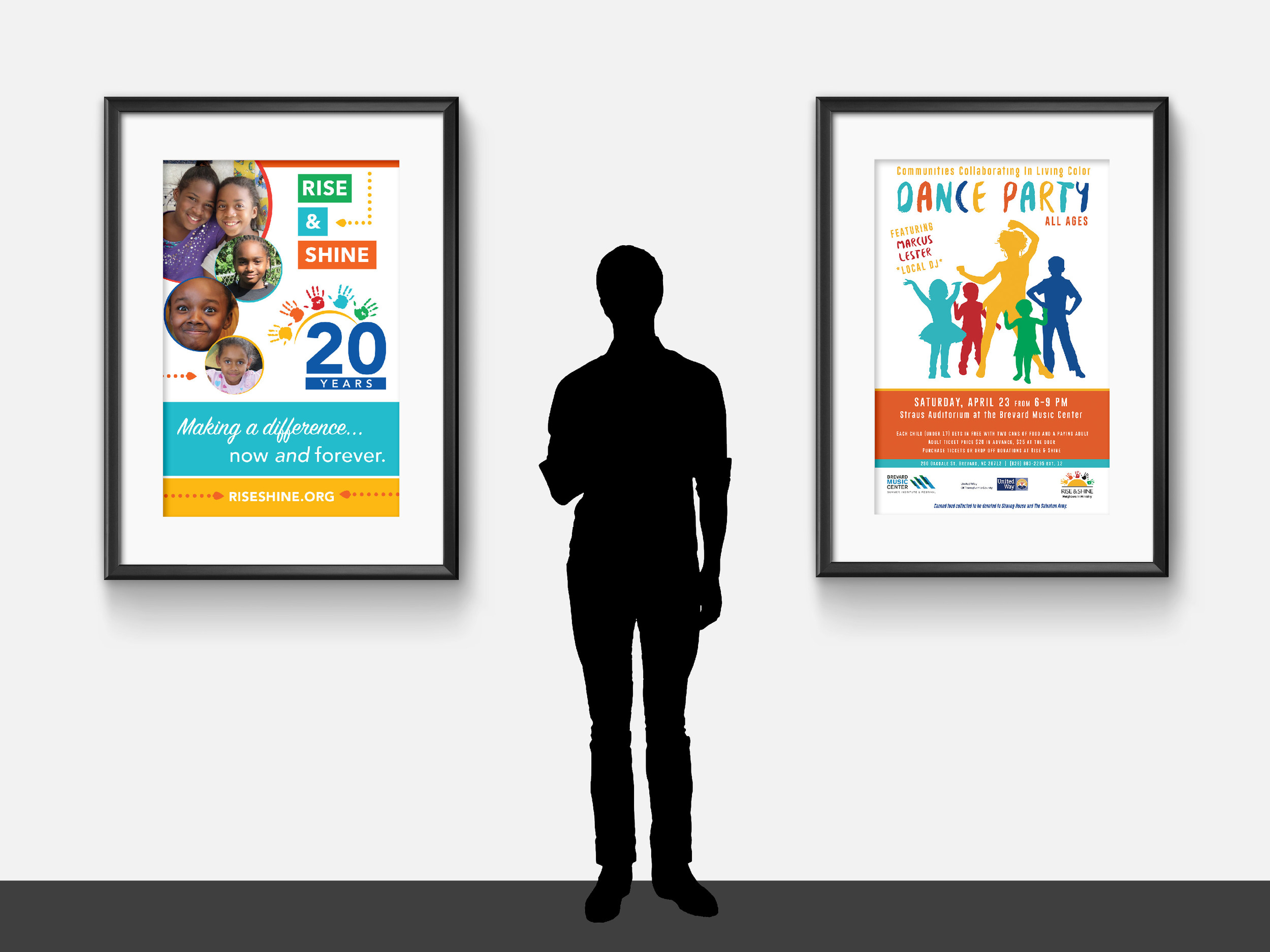
This was our second year working with CAM on their annual holiday campaign, and we were thrilled to get the opportunity to support this important cause. The work we did for this holiday giving campaign included designing a campaign logo, letter, card, and envelopes. 

This year’s campaign focused on a theme of “giving the gift of HOME.” Home stands for Help, Opportunity, Motivation, and Empathy. Early designs of the logo spelled out this acronym, but in the end, we opted for a simple logo design and the cozy imagery of a home decorated for the holidays. 

The campaign logo depicts the silhouette of a home, a heart, a key, and a light to draw a key connection between CAM’s services and the campaign. 

The card design features a caretaker and child looking out into the snowy night from the warmth of their home. Simple, yet classic, this scene evokes a wide range of emotions in the viewer – hopefully inspiring them to provide the gift of HOME to a deserving family. 

Artboard 1Final.jpg

This campaign launched in November and is still going on today! If you’d like to learn mor or make a donation, head over to crisisassistance.org/holiday.


Hue & Tone Creative: Design for non-profits 

Is your non-profit looking to launch a campaign of its own? Hue & Tone offers flexible and creative design solutions for nonprofits of all sizes. Let’s build a purposeful partnership today – reach out to learn more about cost-effective options for 501(c)3 nonprofits. 

Client Spotlight: Revolution Mill One Pager
Image Copyright: Joey Seawell Photography.

Image Copyright: Joey Seawell Photography.

In September, our long-term client Revolution Mill asked us to design a refreshed one pager that they could use to market the campus as a whole. Anyone who has visited this revitalized textile mill knows exactly how expansive it is. In total campus boasts 250,000 square feet of Class A Office Space, 150 apartments, three dining options, two event spaces and numerous amenities. 

With so much to potentially highlight, how do you explain everything that’s going on to prospective tenants, potential residents, or campus visitors? That’s where we come in! After working with the Revolution Mill team we were able to summarize the most pertinent details into a digestible one pager that gives an overview of the entire campus. 

With a focus on amenities and commercial spaces, we incorporated some scenic shots from campus as well as condensed wording to describe both current features and future construction. 

The end result is an easy to read piece that coordinates with Revolution’s streamlined and neutral branding. Their branding is tied together with minimal fonts and incorporates the same warm greys, tans, and pops of red that you’ll see around the physical campus. 

To learn more about the campus – and to see their branding in action – check out the one pager below or visit their website (revolutionmillgreensboro.com).


Hue & Tone Creative: Your marketing partner

Inquiries and interest are partly driven by great design — whether you need help designing print materials, assembling a landing page, or running a great social campaign we’re here to help. Set up an initial consult and lets discuss your next project.

Client Spotlight: Drive Moodboards
Triad Local First

Drive’s mission statement: Current and future women business leaders, connecting and building community through networking, mentorship and education. 

 More information here

When we connected with our friends at Triad Local First about their new women’s networking group, we couldn’t wait to be a part of what they were doing. Not only have we gotten to be a part of this amazing group – but we were also brought on to design the program’s new logo! 

Completed in May of 2019, we worked with the TLF team to create a logo, color scheme, and font palette that would speak to women entrepreneurs. Feminine, but not girly, TLF was looking to create a versatile and simple brand mark. 

Our logo design process typically involves 8 main steps: 

  1. Initial Consultation 

  2. Branding Questionnaire

  3. Moodboard Design

  4. Initial Logos (in black & white)

  5. Tweaks and revisions (typically, 2-3 rounds)

  6. Color Options

  7. Tweaks and revisions (typically, 1-2 rounds)

  8. Compilation of all final elements in a brand board or brand book (this includes the logo in multiple formats, patterns, web elements, icons, color palette, and font palette)

Quick tip: The moodboard a client picks can serve as a helpful visual guide for when you are selecting imagery for your website or social media.

One of the most underrated steps of this process is the creation of the moodboards. The moodboard stages helps us turn the adjectives the client has been giving us into a visual and helps ensure we’re on the same page. By designing them as the first step in the process our client has a chance to give us feedback before we get too deep into the designing process. If we’ve had a miscommunication during the consultation or questionnaire stage, we’ll know before we even start designing the first round of logos. 

After the TLF team had completed our initial client consultation and branding questionnaire, we were ready to jump into designing a series of moodboards for TLF to respond to.  

We typically present 2-3 moodboards to our client: each with a different look, feel, and color scheme. During this part of the process, we're looking to nail down which of the options feels most on brand -- it's about figuring out the general feel and energy that the logo will have. 

The four moodboards we presented to TLF incorporated a wide range of colors, textures, and wording that all related to the adjectives we received on the branding questionnaire. We weren’t sure which look was our favorite – and neither was the client! After a few days of deliberation, they finally landed on their favorite moodboard:  

Drive Moodboard  |  Hue & Tone Creative

Featuring bold women -- and even bolder typography – this moodboard connected with the powerful and playful vibe that the team was looking for.  

Here’s a sneak peak of the other three moodboards that were in the running: 

Using the chosen look as guidance, we started designing our first round of logos. Rather than interpreting the chosen moodboard literally, we used the feel of the imagery to help guide the first step of our logo creation. 

From there, we completed the other stages of the process: logo options, tweaks, color choices, more tweaks, and the final branding sheet. While we want to focus this blog specifically on the moodboard part of the process, we’ll go ahead and give you a sneak peak at the final logo: 

 
Drive Moodboard | Hue & Tone Creative
 

Have a question about the process? Want to see how we ended up at this final logo?

Don’t hesitate to email us and ask! We love sharing what we do with past clients, potential clients, or even just interested individuals. To connect, contact us here.


Hue & Tone Creative: Your Branding Experts

Whether you have a new business — or are looking to rebrand your existing business — we can help. From logo development to creating custom social media packages, we’ll work with you to create a brand you can be proud of and brand elements that are easy to use.

Client Spotlight: The Skinny Wallet Diet

The Skinny Wallet Diet is financial planning for the average person. Most people don’t need a stockbroker or expensive financial advisor... they need to know how to start saving and spending responsibly. With 10 years of experience Mary Edwards is the perfect person to help you do that.

That’s where we come in -- when Mary Edwards was looking for a new website to take The Skinny Wallet Diet to the next level we were ready to jump into action. Most of the Skinny Wallet Diet’s clients are female -- so we knew we could pull in some fun, girly colors. We started with different shades of pinks and toned them down to keep them from looking goofy (this is finance after all). 

Here's the moodboard we put together to inspire the website:  

We won't bog you down in the little details of our process, but from there we worked with Mary to develop the content for each page. We created custom graphics, set up all the technical details, and made things like these little graphics:

Screen Shot 2016-09-13 at 6.18.28 PM.png

As The Skinny Wallet continues to develop we wanted to set Mary up with a site that would draw potential clients in, but would also be easy to update in the future.

Take the new site for a spin HERE or flip through some screenshots of the homepage:

Our favorite thing about this site is the unconventional color scheme -- it's the perfect blend of serious and creative. We can't wait to see The Skinny Wallet use their new website continue to grow! 

Want a regular little dose of the Skinny Wallet? Follow their brand new account on Twitter at @theskinnywallet.

Client Spotlight: Rise & Shine, 20 years of making a difference

We know, we know -- we’ve highlighted Rise & Shine before… but when your clients just keep doing great work, it never gets old showing it off.

Throughout 2016, Rise & Shine has been hosting a series of events to celebrate and raise awareness for their organization. An afterschool program with a mission of promoting racial justice and equality, we loved being able to collaborate on collateral that's helping drive their mission forward.

All of our work for Rise & Shine features bright colors, eye-catching layouts, and vibrant photography of the program participants. We work to keep the focus on the facts and figures that demonstrate the program's efficacy, as well as highlight the organization's values. 

Take a look at the colorful collateral below!


Below, starting clockwise at top left: One-page infographic (front + back), homepage web slider, event program,  Facebook graphics, and bookmark.


Below, left: Booth signage
Below, right: Event poster for the "In Living Color" Dance Party


Below: Local Movie Theater Ad


Working with non-profits is a passion of ours, and we're always eager to dive into a new partnership. If your organization's marketing needs a boost, don't hesitate to reach out to us!

Client Spotlight: Little Toro Designs

When we were approached by Tawney Weir, the creative force behind Little Toro Designs, we were immediately inspired by her southwestern flair. This owner + maker + designer was looking for a place to not only showcase her product, but also Little Toro's modern desert aesthetic. 

As a business owner, there's nothing better than working with someone who is equally passionate about their craft. After our first short conversation, it was clear that Tawney's work was both inspired and sustained by the unique blend of cultures around her. 

Click the image to see the site live!

Click the image to see the site live!

Who Little Toro Is: Metalsmith jewelry handcrafted in Tucson, AZ. Inspired by the nature and culture of the southwestern desert.  

What They Needed: A clean + modern website that embodies Little Toro's desert chic style without distracting from the product. 

What We Delivered: A customized Squarespace site with e-commerce capabilities. By highlighting Little Toro's beautiful editorial photography (by Puspa Lohmeyer Photography) we were able to not only keep the product front and center, but also capture the essence of the brand.

The takeaway? When inspired editorial photography meets clean web design, e-commerce magic happens. 

If you feel like your website could use a refresh, get in touch -- we'd love to do a free assessment of your current website!

Project Highlight: Rise & Shine One Page

We just completed the design of this evergreen one page for Rise & Shine, an afterschool program committed to promoting racial justice and equality. This was an especially fun project for us, because we love working with small non-profits to find creative, cost effective solutions. Our goal here was to create a print piece that would be timeless and appeal to a wide variety of audiences. 

Click the image to get a closer look!