Posts tagged Font sizes
Making the most of Adobe Fonts’ features
Making the most of Adobe Fonts’ features  |  Hue & Tone Creative

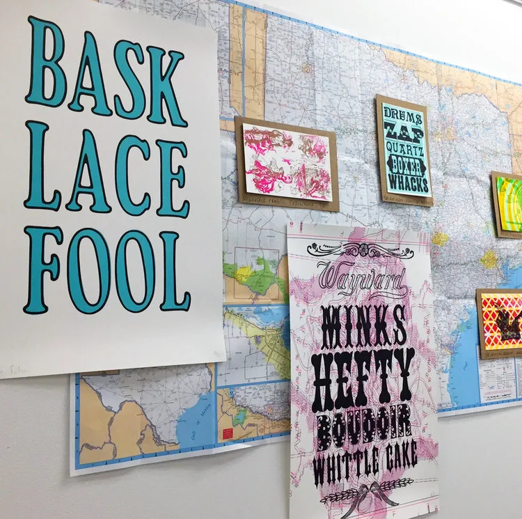
The right font can work wonders for your brand by helping you connect with potential customers, hold peoples’ attention, and convey the right mood or feeling. But the wrong font can do quite the opposite -- allowing letters to get lost, making words difficult to digest, and alienating your artwork from your brand.


First off, What is Adobe Fonts?

In a nutshell, Adobe Fonts (previously Adobe Typekit) is a library of 1,000s of free and paid-for fonts for people to use directly on their website, sync with their Creative Cloud subscription, or both.

If Adobe’s your go-to for design work you’re probably already familiar with Fonts, but are you getting the most out of what it has to offer? Whether you’re a newbie or not, it’s got lots of features to help you save time and personalize your fonts -- and we’ll be covering our favorite features in this post.

Top tip: if you’re after even more recommendations, here are some of our favorites too.

1. Get a headstart with recommendations

If you’re a beginner at type design, Adobe has a recommendation tool to help you decide on fonts that are best suited for paragraphs or headings.

For those that are new to the font-selection world, you need something that’s easily legible across various mediums at a small size for paragraph copy, and for headings you can be more adventurous with bigger, bolder and more decorative styles -- that are still readable, of course.

2. Save time and filter fonts 

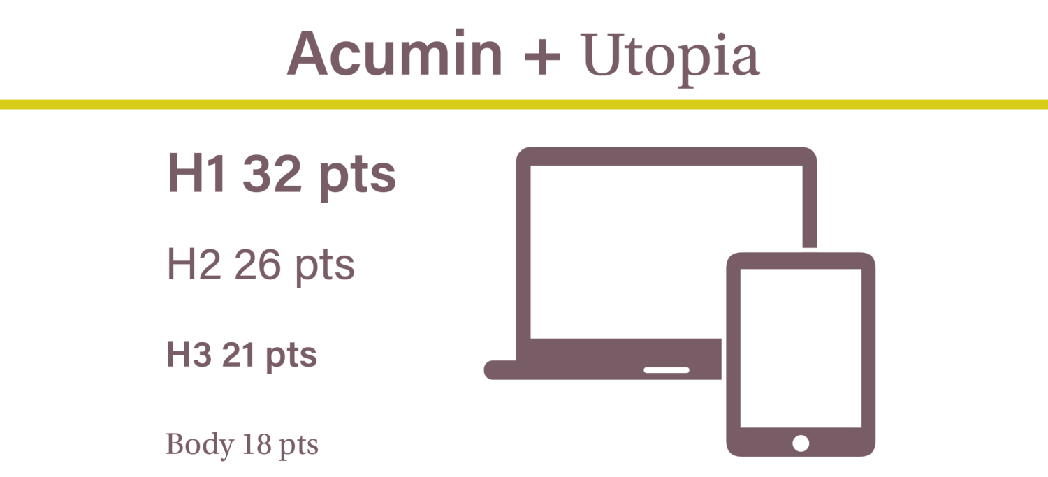
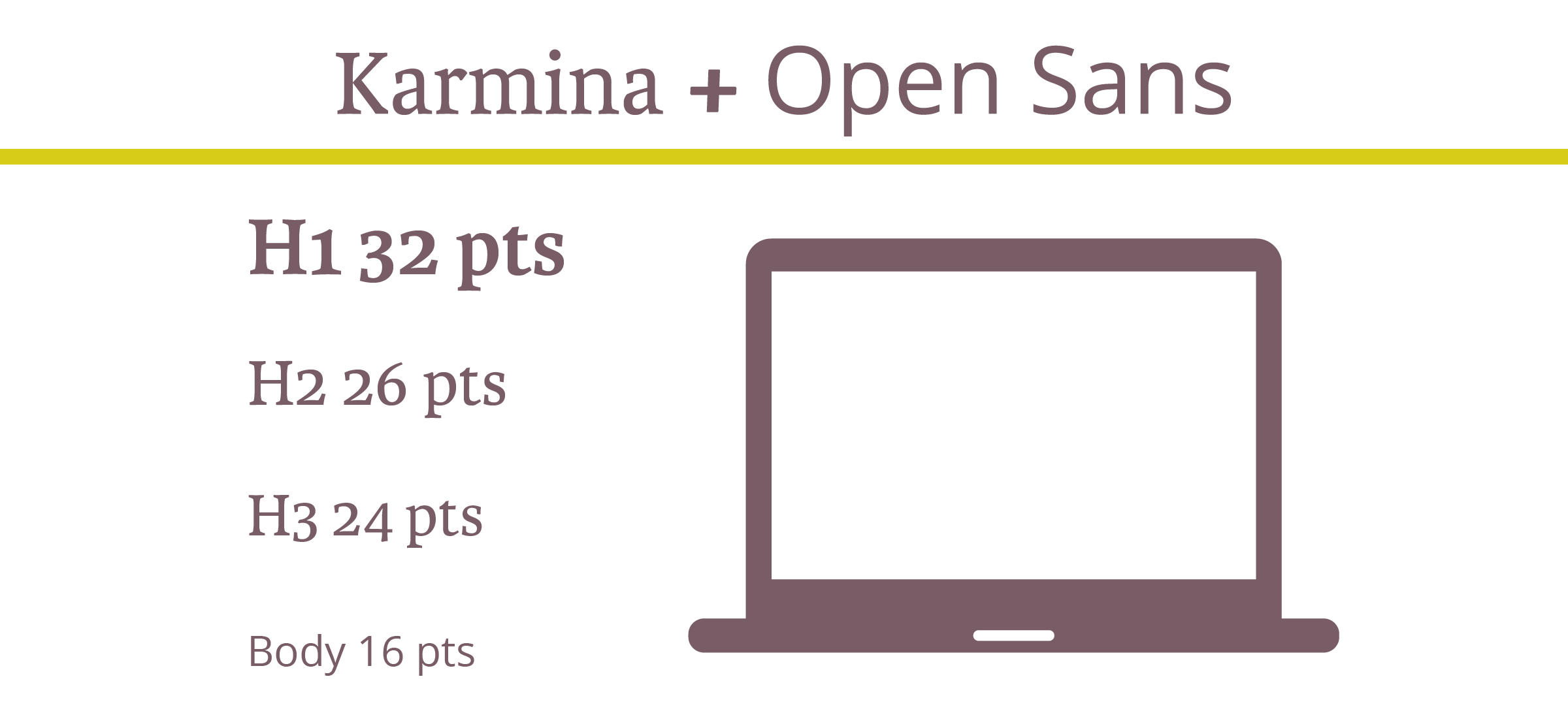
With so much choice at your fingertips scrolling through endless styles can be a pretty tedious and time-consuming task.,If you’ve got a good idea of what you’re after, cut out what you don’t want by filtering specific properties, like: 

  • Weight - the thickness of the stroke

  • Width - the width of the actual letters

  • X-height - the ratio of lowercase letter height to uppercase letter height

  • Contrast - the ratio of thick and thin strokes

  • Standard or caps only - i.e. fonts that use lower and uppercase letters, or fonts that only use capital letters

  • Default figure style - choose between Oldstyle (more old-fashioned) or Lining (more modern) for your numbers

Making the most of Adobe Fonts’ features  |  Hue & Tone Creative


3. Use the right font availability

What’s the difference? Web fonts are used directly on your site, and synced fonts are imported to your Typekit for in-program use on things like Photoshop and Illustrator. Discover how to install fonts here.

Whether your artwork’s for print or web should determine the font you use, which means it’s important you’re clear on the end-use from the outset.

To make choosing the right font easy Adobe differentiates between web fonts and synced fonts, so make sure you pick one from the right category.

4. Test your chosen font

Adobe’s ‘type tester’ feature allows you to see how your chosen font(s) look online before you add them to your kit and invest time into updating your design work.

To put this feature into practice, just head to the main browsing page where it says “Use fonts” and then click the “Web” tab when a pop-up appears. If you like what you see all that’s left to do is to add the font to your Typekit.

5. Use contextual alternates

Sometimes, certain glyphs can be a bit intrusive or distracting and the last thing you want is to jar readers as they’re scanning your copy -- but Adobe’s contextual alternates (calt) feature can help you overcome this.

It’s particularly useful when using script typefaces and it works by replacing default glyphs with better-performing alternatives.

Need help? You can find more about line and character spacing here.

6. Experiment with your spaces

If you’ve selected your font but you’re not 100% happy with the spaces between characters, lines and paragraphs, remember, you don’t have to settle with what you’re given as standard. To create something that gels perfectly with your page experiment with your gaps by opening the ‘Text properties’ box and playing around with the spacing options.


Hue & Tone Creative: Your partners in design

Still confused about what font to pick? If some (or all) of this post went over your head, we can help! Design is our forte and we’re known for helping organizations find their perfect font -- without fail. Drop us a line on hannah@hueandtonecreative.com to find out more.

Typography for beginners
Typography for Beginners  |  Hue & Tone Creative

Some web pages and brochures good… and some look terribly unprofessional. If you’re new to graphic design or typesetting it can be hard to determine what makes someone’s branding look good or bad.  

If you’re a beginner – or you’re attempting to brand your own business -- there’s a number of type rules you can follow to give brand a polished look. Following these simple rules will help even the most amateur designer get their webpages and print assets in tip top shape!


1. Less is more when it comes to typeface

If you’re looking for some font pairing inspiration, head over to these two posts about pairing fonts on Squarespace (here and here). 

Choosing the right typeface is key. Get it right, and you’ll set yourself up for stylish, simple and easy-to-read assets. But get it wrong, and you’ll end up with illegible, cluttered and unappealing pages. 

Simple fonts should be used for main body copy, and decorative typefaces should be used sparingly for things like subheadings.

The golden rule in the design world is to stick to a maximum of three fonts in any given piece of artwork - whether that is a website page, social media banner, or hardcopy flyer. However, whittling your fonts down to two can sometimes be even better. 

If you stick to just one or two fonts, you can use varying weights to create a more refined look. 


2. Use a sensible hierarchical structure

Following a logical hierarchy helps to give your site’s pages a clear flow and effortlessly guides readers through the structure of the website. Let’s compare and contrast two examples to give you a better idea of what we mean: 

Good content formatting.png

Exhibit A is a bad example. The website’s name, navigation bar, subheadings, and main body copy are all the same font size. Now there are two issues with that – first, it gives readers no visual indication where they should start reading or what’s most important to look at. Secondly, it makes it really difficult for the reader to skim through the copy.
 

Now, let’s contrast an example of a solid hierarchical structure. The page’s title, navigation bar, subheadings and copy are clearly defined with varying font points, making it much easier on the viewer’s eye.


3. Be creative with contrast

Typography for Beginners  |  Hue & Tone Creative

Being creative is part of being a designer. Now we know we said earlier you should stick to two to three font combinations per project, but that doesn’t mean you can’t mix up your styling by playing around with things like the font’s size, weight, color and style.

Whether you emphasize a key word with italics, change the color of a subead to something more bold, or bump up a term in your tagline to a size that’s more eye-catching, there are endless ways to create contrast within your copy.


4. Keep your alignment neat and tidy

Alignment applies to all your on-page elements - like body text, titles, logos, images, and menu bars. When it comes to alignment, everything should be connected in one way or another. For example, you might want your logo to align with your main navigation bar, your body copy to align with your page’s title, and your images to align with your body copy.

Well thought-out alignment will help prevent your page from becoming disjointed and ensure all your assets create well-measured sizes and distances between each other.


5. Don’t be a stranger to whitespace

Don’t fall into the trap of thinking you need to fill everynook and cranny on your page. Creating whitespace around your words can be incredibly powerful, can help draw attention to text, and will aid you in achieving a simple and trendy look. 


6. Choose your colors carefully

Last but not least is your color choice. The right colors can make or break the look and readability of your copy – there’s nothing worse than colors that make your words a strain to read.

When it comes to color, there are three key components: 

  • Hue - the shade of the color

  • Saturation - the brilliance of the color

  • Value - the lightness or darkness of the color

Source >

When it comes to choosing your colors, the aim of the game is to make your text as easy as possible to read. It’s as simple as that.


Hue & Tone Creative: Let’s work together

Feeling overwhelmed with information? If you’re not a designer, knowing and deciding what does and doesn’t work is easier said than done. If you need a hand with your typesetting - or any other area of design, get in touch with our team today at (336) 365-8559.

The Optimal Font Size for Web, MailChimp, and Mobile

Earlier this month, Twitter rolled out a new font. Unfortunately, not everyone was a fan

Twitter’s switch from Helvetica Neue, to Segue left users complaining that the slender new font was hard to read and caused way too much eye-strain.

Like Twitter, most businesses are bound to make mistakes when it comes to using the right fonts and sizes. Instead of fumbling through and learning from trial and error, do yourself a favor by learning a few of the best font-size secrets. 

Artboard 3test.png

Websites

Whether you’re designing an online shop, portfolio, or blog, it’s crucial that your fonts look clean, appealing, and easy to read.

For best readability, we recommend that you keep your headers and buttons between 30-32 pts and sub headers between 18-26 pts. Body text usually looks best when it’s between 12-16 pts. 


The Optimal Font Size for Web, MailChimp, and Mobile  |  Hue & Tone Creative

Looking to compare email marketing platforms? Here’s a rundown on a few of our favorites.

MailChimp

Email marketing isn’t going away anytime soon. In fact, email is 40 times more successful at bringing in leads than Twitter or Facebook.

One of our personal email marketing tools, MailChimp, recommends that you keep your body text between 14-16 pts. 16 is best for short emails between 2-3 sentences, while 14 pts us better for more lengthy emails.


The Optimal Font Size for Web, MailChimp, and Mobile  |  Hue & Tone Creative

Mobile

According to MailChimp, it’s best to stick to the “one eyeball, one thumb, and arm’s length” rule when it comes to font sizes. Basically, your viewers should be able to see and scroll through the entire email with ease and clarity. 

With this guide in mind, your body fonts should be between 12-16 pts and your links, CTA, and buttons should be between 34-36 pts.


One last note…

When it comes to selecting fonts, the most important thing is to pick an easily readable font. When in doubt, go back to basics. If you stick to a plain serif or sans serif and use these size guidelines, you'll be on your way to finding the perfect typography for your next web project! 


Web & Blog Design in Greensboro, NC

Not seeing much traffic or engagement on your website? It’s probably time for an upgrade! From landing pages to business blogs, Hue & Tone Creative can help you create a site that matches your style and helps reel in leads.