Posts in Branding
Our Work: Comprehensive branding for CSDHH

I've been so excited for this particular post! It was tough to wait until the work was complete and ready to share.

Our Work: Comprehensive branding for CSDHH -- Hue & Tone Creative

I could keep leading up to it forever, so I'll cut myself off. Here's a look at the website and comprehensive branding we created for CSDHH, a fantastic nonprofit that -- as the acronym suggests -- provides communication services for the Deaf and Hard of Hearing. 

CSDHH just celebrated its 40th anniversary, but had never been branded -- so this was a true start-from-scratch situation, which was a fun challenge to take on. They wanted natural, earth-toned branding that didn't go straight for the obvious -- things like hands or ears. 

The solution: the repeating motif of keys, which represent with the right level of subtlety that this is an organization that's unlocking doors and breaking down barriers for the Deaf and Hard of Hearing community. CSDHH's new tagline -- Opening Doors, Connecting People -- brings that theme full-circle. 

Our Work: Comprehensive branding for CSDHH -- Hue & Tone Creative

Now after 40 years of service to the community, CSDHH has clean, comprehensive branding that communicates, subtly but clearly, what they're about as an organization. That was a cool thing to be a part of -- and it was even better to get to know the people of CSDHH. My gratitude to them for allowing me to be a part of the process, and more than that, for all they do for this community!

If you have questions about your organization's branding, I'd love to talk. Email me at hannah@hueandtonecreative.com, or you can click the contact tab here.

Hue & Tone Tips: Easy, do-it-yourself stock photography

I have a confession to make: when I post on the Hue & Tone Instagram, I don't actually reach out to snap a photo of the office supplies (in branded colors) already artfully arranged on my desk. Those are stock photos -- at least in the sense that I shot them all in one batch and stockpiled them for later. But I didn't have to spend a ton of money on them, since I took them myself.

If you want to keep your business photography on-brand and avoid spending a ton of $$ on stock photos, here are a few tips I've picked up from trial-and-error experience.

Hue & Tone Tips: Easy, do-it-yourself stock photography -- Hue & Tone Creative

Buy props that match your brand.

This doesn't have to be expensive -- if you go with office props like we did, check out the dollar section at Target and the clearance sections of office supply stores. And, in my case, none of these are solely a prop...I just kept an eye out, when I was buying functional office supplies, for a few that matched Hue & Tone's bright look.

Hue & Tone Tips: Easy, do-it-yourself stock photography -- Hue & Tone Creative

Get outside.

Unless you have professional lighting equipment or a ton of well-placed windows, heading outdoors is your best bet for well-lit, appealing photos that don't require a lot of editing. Wait for a sunny day, pack up your supplies, pick a spot without too much shade and head out for a photoshoot.

Hue & Tone Tips: Easy, do-it-yourself stock photography -- Hue & Tone Creative

Use a solid background.

Keep it clean and sharp by shooting props arranged on a solid-color background. I used a sheet of white posterboard and it worked out great -- just make sure to use the matte side so you don't wind up with a glare in your photos.

Hue & Tone Tips: Easy, do-it-yourself stock photography -- Hue & Tone Creative

Get creative.

Bring a bunch of different props and shoot them in every angle and combination you can dream up. Write something out. Try neat lineups and jumbled-up piles. You'll want variety, and you'll have to take a ton of photos for every one you'll actually like, so give yourself options!

Hue & Tone Tips: Easy, do-it-yourself stock photography -- Hue & Tone Creative

Keep it simple + make minimal edits.

For me, at least, clean, uncomplicated photos were easier to shoot on the front end, and easier to use in a variety of projects. This meant staying away from over-complicated setups and keeping the post-shoot Photoshop party to a minimum -- just brightening and sharpening where it was needed.

If this isn't for you, there are some good places to find royalty-free, non-cheesy stock photography. But, personally, I find that creating my own on-brand, simple stock photography is the way to go. If you decide to try it out, I'd love to know how it goes! hannah@hueandtonecreative.com, or comment below.

Hue & Tone Tips: Small changes that'll make a big difference in your visual branding
Hue & Tone Tips: Small changes that'll make a big difference in your visual branding -- Hue & Tone Creative

I've said this a time or two on the blog -- your organization's visual brand is really, really important. In most cases, it's your first chance to make an impression on a potential customer or client, some of whom aren't going to take a risk on your business or organization if you don't have professional, cohesive branding.

If you're interested in a more in-depth look at the importance of branding, including how-tos on establishing your brand, you can check out my branding series. Today, though, I want to offer a few quick action steps that will improve your branding in a big way, without requiring a huge time investment. 

Invest in good-quality photography. 

Using clear, bright, well-composed photos -- rather than the "just okay" photography most organizations wind up with-- instantly elevates the quality of any branding collateral. This might mean investing in professional photography services or equipment, but it could be as simple as getting outside with your smart phone and a white-posterboard background and taking advantage of some good, natural light.

If you've seen that font before, stay away from it!

When you're choosing a logo font, go the extra mile and look for a font that's not commonly used by other organizations in your niche. This is often as simple as avoiding the default fonts on your computer (for a few places to download free or inexpensive fonts, check out Tuesday's blog post). 

Add texture to your graphics.

Particularly in graphics involving text, it's easy to think type and color are the only elements you need to pull in. But those flat graphics don't draw the eye. Even the simplest graphics need some form of texture to create visual interest -- take a look at the Hue & Tone post graphics for an example. 

Establish a consistent look on social media.

If you post graphics on social media, have an idea of which fonts, colors, and textures you're going to use in that space. These should be consistent with your overall brand identity. If there's a certain type of content you post often -- quotes, for example, or opening and closing dates for your business -- you can develop a consistent graphic template for that content and rotate in colors and textures. 

What's worked for you as you work to brand & define your business? Let me know in the comments. If you have questions about your branding, or want to discuss ideas, drop me a line here.


Client Spotlight: Meghan's Resume

While I spend a lot of time working on branding (and accompanying collateral) for businesses, nonprofits, and other organizations, I also really enjoy developing branding, logos, resumes and websites for individuals. 

This week's Client Spotlight (a first for the Hue & Tone blog!) shows what we created for Meghan, a young professional whose career transition required a branding about-face. 

Client Spotlight: Meghan's Resume -- Hue & Tone Creative

Who She Is: A twenty-something working in journalism -- and searching for a role outside that field.

What She Needed: The resume Meghan had been using was colorful, bold, and nontraditional. It worked just fine in her creative field, but was too much for many of the companies and organizations on her "to apply" list. She needed something that was clean and conservative -- without looking like a resume template.

What We Delivered: Meghan's new resume features muted colors, clean typefaces, and simple lines. The result is a look that's appropriate for any industry, while still standing out from the rest of the stack. I'm happy to report that it helped her land her dream job in government.

The takeaway? It's easy to think, especially if you work in a creative industry, that colors and branding in general are off-limits. That's not the case. Making strategic decisions about branding, informed by your knowledge of the industry you're targeting, will help you achieve your career goals. I've seen it happen time and time again!

What decisions have you made about your personal brand? Does it serve your goals & purpose? If you're not sure, let's connect.

Branding Refresh: Hue & Tone's brighter, cleaner new look

As my small business grows, I have a better understanding of who we are and who we’re trying to reach. When I founded Hue & Tone, I went with muted, simple colors – but quickly found that this very basic palette was limiting.

Hue & Tone’s refreshed branding is cleaner, brighter, and better represents who we are and what we do – without being such an overhaul that we’ve become unrecognizable. A wider range of colors and textures, along with an expanded font palette, offer visual flexibility and do a better job of telling our story.

Check out the before and after here: 

Branding Refresh: Hue & Tone's brighter, cleaner new look -- Hue & Tone Creative

Branding Refresh: Hue & Tone's brighter, cleaner new look -- Hue & Tone Creative

How do you feel about your business's branding? Does it tell your story well, or is it time for a refresh?

A Beginner's Guide to Finding a Job (Part 1): Brand Yourself

Hi everyone! Kelly Roberts here -- aka Intern Kelly -- I am a recent graduate of The University of North Carolina at Greensboro and am currently looking for my first "real" job. Through my internship at Hue & Tone I am learning tips and tricks for becoming a more competitive job applicant. Over the next few weeks I'll be updating you on my progress through the blog, so feel free to follow along! 

Intern Kelly -- Hue & Tone Creative
Finding a Job, Part One: Brand Yourself -- Hue & Tone Creative

1.   Reflect on who you are and what you have to offer.
This calls for self-reflection time. This can be very challenging, because there can be many different things that make you, you. It is important to establish the things that you enjoy, and are good at. Not just professionally, but personally as well. What are your best skills? Honesty is key, stay true to yourself – and when in doubt, ask those around you what stands out to them.  

2.   Build a personal website.
Build a site filled with blog entries, a record of your professional endeavors, and work samples. I cannot express the importance of this enough! Especially in the creative industry, it is important to have a portfolio of your work – and an Internet portfolio is the way to go. This gives potential employers the opportunity to get a feel for who you are before bringing you in for a face-to-face interview. It is one thing to tell potential employers about your successful work, but it is another to actually show them.

3.    Clean up your social media accounts.
Make sure you’re projecting a professional persona online. By changing your privacy settings on Twitter, Instagram, and Facebook you can control who can view your posts, pictures, and thoughts. You want to make sure that the way you are presenting yourself on social media is a good reflection of you as a professional. Most importantly, don’t forget to keep your experience up to date on your LinkedIn.

4.   Understand the expectations of your industry.
Each professional industry has its own rules, which your personal brand should follow. Do plenty of research to find out who the major players in your industry are, how much color you should use on your resume, and what kind of salary you should expect. Don’t hesitate to reach out to a favorite professor as you explore your field – they’re there to help. As you build your brand, broadcast a physical appearance that balances your personal style and the expectations associated with the industry or career you plan to pursue.

5.   Use social media to market your new online brand.
Once you have established your brand, you own the right to flaunt it! Use social media to your advantage – post Facebook statuses and tweets letting your followers know that you are in the job market. Brag about your specialties and abilities, and pay the extra money to update your LinkedIn profile! 

6.   Network in-person.
Technology is awesome for making and keeping connections; however, it does not replace face-to-face time. Facial expressions, tone of voice, and body language are just a few of the things that make a huge difference in a conversation. Relationships typically grow stronger when you interact with someone in-person, it’s often easier to relate to them and it shows you're invested in getting to know them as well.

Stay tuned for next week's blog post on how to make your resume stand out from the crowd. Have a question in the meantime? Email me at kerober2@gmail.com

Branding (Part 3): Creating a consistent brand on social media

Note: Today’s installment of the branding series is a guest post from Meghan Frick

You probably don’t need to be told that social media’s a powerful tool for your business – whatever your business is. And social media is important for your business for the same reasons it’s such a force in your personal life – it’s a way to build real friendships and networks, based around pretty much anything.

At its core and at its best, social media is about relationships. You are in the best position to strengthen your business when you are building genuine relationships with potential clients, customers, and partners.

That’s easier to do when your social media accounts are tied together with a consistent visual and editorial brand. When you post and when you interact with other users, people should know – seamlessly, easily – who they’re interacting with. Here are a few easy ways to strengthen your social branding.

1. Brand your images

Watermarking the photos you post to social media is a simple way to include a visual reminder of your business and what it stands for in nearly every post. Here’s how we do this at my day job. There are a ton of different options for branding your photos, but we accomplished this effect by converting our logo into a Photoshop brush preset.

Tip: Unless you’re a photography business – meaning your images are the product you sell – don’t make your watermark so obtrusive that it would deter other users from sharing your images. In most industries, you want people sharing your images on social! The brand is more of a visual cue than a banner proclaiming “this is mine!” 

2. Take advantage of valuable real estate

Any social media account you create comes with some built-in real estate that allows you to communicate your visual brand. Think cover photos, profile images, “about” sections, etc. Don’t let these go to waste. For your cover images, create collages or sharp, appealing graphics. Use sections like your Twitter bio to point to other content, like your most recent blog post or your business’s other social-media accounts. Never leave a profile picture or a bio blank – be strategic in your use of these “built-in” sections.

3. Pay careful attention to consistency of quality

Put another way: if you’re going to put it out there, make it good. Shoot and select sharp photos. Carefully proof your writing – and, if you’re prone to mistakes, let someone else comb through it too. Develop a consistent editorial style (for example, refer to yourself and your business in the same way; no fluctuating between I and we). Develop a reasonable consistency of written tone – many accounts do well with a decidedly untraditional tone, but you don’t want to switch between that and super-seriousness.

I’ll end with a warning, though.

I approach social media – even for business purposes – with an attitude of “inspiration, not rules.” If I’m tweeting live and don’t have time to brand a photo, I post the photo anyway. If a slightly blurry image reflects an exceptional moment, I sharpen it up as much as I can in Photoshop…and then I post it anyway. You don’t want to seem canned, and you don’t want your branding efforts to detract from real communication and opportunities to share what you and your organization are all about.

How do you brand your social media accounts? How has social media been valuable to you as a professional? Let us know in the comments!

Meghan Frick is a communications and social media specialist for the Georgia Department of Education by day, and a blogger and freelancer by night. Connect with her on Twitter, Instagram, or her blog.

Branding (Part 1): 5 Questions to Help You Name Your Business
Branding1Graphic-01.jpg

Of all the elements of branding your business, selecting a name may be one of the strangest, most challenging parts.

In my first round of owning a creative business, I was just “Hannah Pomphrey Graphic Design.” It became pretty clear to me by the second time around that I wanted a distinct name for my business…but I wasn’t sure yet what that name was going to be.

As you know, I eventually settled on Hue & Tone Creative – which I LOVE – but it took a while to get there. If you’re lucky, your first idea will be a totally original one, and no existing businesses will have a similar name. That’s not quite how it happened over here, though.

If you’re starting the process of narrowing down a name, here are a couple of questions to ask yourself to help streamline the process.


1: Should I use my name?

Whether or not you want to use your own name for your business is one of the first things to consider. Often businesses start organically and individuals naturally fall in to using their given name. If you’ve already built your business using your own name, and have significant recognition in your community, chances are you should keep it that way.

Not liking your name, having a super generic name or having a name that’s a little tricky to spell are considerations if you’re starting a brand-new business, but they’re iffy justifications for changing the name of an already-thriving operation.

Tip: Not sure about your name? How about your initials?

If you’re starting from square one and aren’t sure which route to go, think about where you want to position yourself in your market. If you’re running a web based business and your name’s Anna Smith, you’re making it hard for potential clients to find you. If you’re aiming to reach local clients only, this might not be a problem.

Take into account whether you plan to remain a one-person operation long-term. If you’re looking to grow your business quickly or might acquire a partner, you may want to go ahead and incorporate and build your business under a less personal name.

Tip: If you’re in a small town market and want to keep business local, a corporate-sounding name risks making clients think you’re going to be charging corporate rates.


2: What are my services?

Make sure your business name reflects the services you’re offering to customers. It sounds obvious, but you’ve only got a few words to communicate to clients what you do and it won’t serve you to mislead them.

Make a list of your services and see what fits best. Should you be New Name Creative, New Name Social, New Name Marketing, or New Name Studio?

For example, if you’re really looking to work primarily with social media clients, you’re going to confuse people by using the word “Creative” in your business name. Likewise, if you’re a broader creative business you shouldn’t be “New Name Social.” Some words might be catchier or trendier, but if they don’t reflect what you do, you’re going to miss out on potential clients.

If you’re not sure what fits best, go back to the drawing board and figure out who your ideal client is before naming your business. You can’t appeal to everyone – so don’t try. Tailor your branding to the clients you hope to attract.


3: What are some things people might associate with me or my business?

Is there something you’re known for? Do you always wear pink; do you have a well known nickname? Are you obsessed with a certain animal?

Make a list of words people may associate with you, interests and hobbies. Star the ones that would be most relevant to your business’s services and see what you can do with that!

Exhausted those ideas? Move on to making a list of qualities you’d like people to associate with your business or a list of industry terms.

Tip: Try to keep your name around or under 13 characters. 


4: Is this name taken?

Once you have a list of potential names, use GoDaddy to see if a similar domain is available. Then, conduct a Google search to see if anyone else has the same name. Next, make sure there is something that works available on all the major social media networks. People need to be able to find you as easily as possible – and consistency is key.

Things like being consistent with the editorial aspects – for instance, whether you use a numeral “4” or spell out the word “four” – will only increase your brand cohesion. The shorter the better – we opted for “@hueandtone” on our social media, even though our website also has the word creative (www.hueandtonecreative.com). 

Tip: Ask yourself -- is this name clear, concise, compelling and consistent? 

I was originally obsessed with the idea of “Top Knot Creative,” but someone had recently purchased the domain and claimed the Facebook page. Instead of getting stuck on trying to make one thing work (I then got fixated on Top Knot Studio) keep looking around and trying new names.

Can’t seem to find anything that’s available? Don’t get discouraged. Keep trying different combinations until you find something that works. You’ll get there!


5: What do other people think?

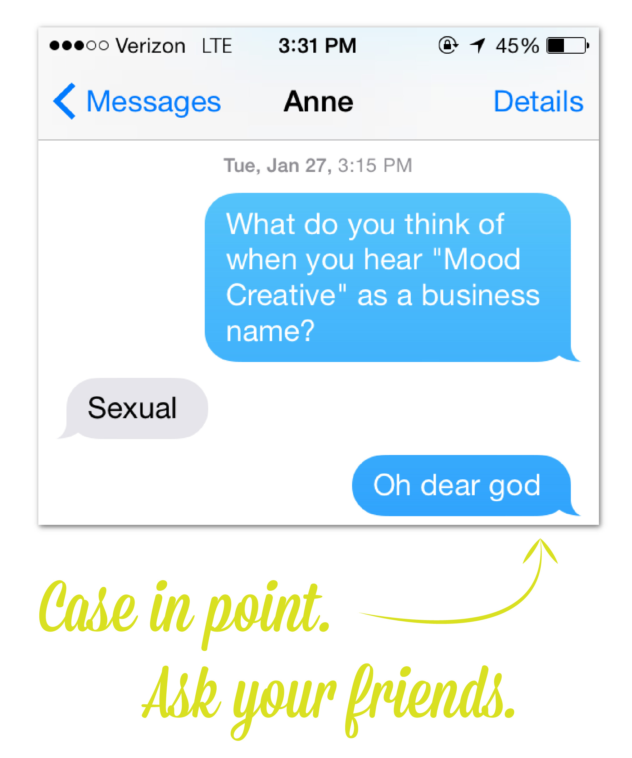
When you finally think you have a winner, conduct a quick focus group with your friends and family and see what they think. I’d originally decided on “Mood Creative” – I even had the domain in my GoDaddy Cart – when all my friends told me it made them think of tie-dye and drugs. After hearing this from four different people, I realized I should probably move on.

If your friends and family who love you don’t like your new name, imagine how hard it’s going to be to get complete strangers on board. 


After making my way through these steps (some more than once), we are now Hue & Tone Creative – and I couldn’t be happier with the name.

If you already own a creative business, how did you come up with its name? If you’re making business plans for the future, what other branding info would be helpful to you?