Posts in Data
Data trends: 7 metrics you need to be measuring

Your data’s essentially the backbone of your marketing efforts. It tells you what is and (perhaps more importantly) isn’t working. It shapes strategic decisions. It funnels your money into the marketing channels that give the greatest return. It helps you prevent dead time, maximize resources, and effectively utilize your budget. 

Knowing which numbers to monitor, and what they mean, is key to properly utilizing the data you’re collecting. Here are seven key marketing metrics you need to be measuring: 


1. Total visits

Your totals visits refer to the number of people who check out your website. You can monitor your total visits on Google Analytics for things like:

  • Your entire website

  • Specific pages of your site

  • Campaign landing pages

 Keeping an eye on this type of data is important when you’re trying to gain an understanding of the effectiveness of your overall marketing efforts or the effectiveness of a specific campaign.

Data trends: 7 metrics you need to be measuring  |  Hue & Tone Creative

2. Acquisition type

Looking for different ways to measure your traffic? Here’s our top four methods.

Acquisition is where your traffic comes from – for example is it direct, referral, email, organic, paid or social? This is a key metric to stay on top of, because it tells you which channels are top performers and which may need to be revisited. Either way, it helps you put your efforts into the areas that actually generate a return for you.


3. Bounce rate

Bounce rates tell you how many visitors enter your website and leave before exploring any other pages. For example, are people making it to your ‘About us’ page and then heading off the website without clicking on any internal links? 

Generally speaking, the lower your bounce rate the better. High bounce rates canbe associated with people not finding the content on your page useful, and low bounce rates are more likely to convert and perform meaningful actions.

Bounce rates can be measured on your overall site or for specific pages.


4. Conversions

 This is arguably one of your most important metrics. A conversion can mean different things depending on what your goals are -- for example, it might be a newsletter sign up, filling out a lead form, and or completing a checkout.  

Your conversion numbers help you measure the profitability of your marketing efforts and they can be tracked either directly on your site (depending on how it’s built) or by setting up goals in Google Analytics. If your conversion numbers are looking pretty low, it might be worth looking at your design, content, user experience or product/service.


5. Cost per lead

Quite simply, this is the amount it costs you to turn a prospect into a customer. Your cost per lead should be calculated on a channel-specific basis, and the numbers you retrieve will give you a good idea of which channels are most profitable.

To calculate your cost per lead, simply work out how much you’ve spent on each medium and compare it to how many conversions it’s earned you. For example, if you invested $1,000 into a PPC campaign and got 15 conversions out of it, your cost per lead would be $66.66. 

This cost per lead needs to be weighed against the cost of creating or delivering your product. If closing a customer costs $100 and it takes $400 to manufacture your product, you need to seriously revisit your marketing efforts. 


6. Open rate

Open rates tell you how many of the emails you’ve successfully sent are actually being opened. For example, if you send 600 emails to prospects and 75 of them are opened, your open rate would be 12.5%.

It’s important to keep track of your open rates to understand how a) far your email campaigns are reaching, and b) you can improve your subject lines. Low open rates mean your emails aren’t being read, which results in missed opportunities. 


7. Customer value

twenty20_34643184-b92e-4852-ba8c-d79fae59854a.jpg

Last but certainly not least, is customer value. This is how much a customer is likely to generate you per year (or whichever cycle is most relevant to you) and can help you determine your overall return on investment. 

If you’re a start-up this figure will be more of a forecast. If you’ve been in business for some years, you can use the past few years’ sales numbers to calculate out the average number of yearly sales, along with the value of those purchases.

You can work your customer value out as an overall average or based on clusters – and your clusters could be anything from age and geography to persona and profession. Knowing your customer value helps you set organizational goals and expectations. 


Hue & Tone: Greensboro Marketing firm

When it comes to your business’ numbers, everything from your design to your social media management plays a part in your success. To see how we can help give your bottomline a healthy boost, get in touch with our team today at (336) 365-8559.

Marketing Trend Alert: Data Visualization
Marketing Trend Alert: Data Visualization  |  Hue & Tone Creative

We’re officially in a data-driven era. Decisions are made on it. Purchases are persuaded by it. And trust is gained through it. But what is data visualization? Where do its benefits lie? And how do you make data visualization truly effective? 
 

What is data visualization?

Qualitative data is information about qualities; information that can't actually be measured. Some examples of qualitative data are the softness of your skin, the grace with which you run, and the color of your eyes.

Quantitative data is information about quantities; that is, information that can be measured and written down with numbers. Some examples of quantitative data are your height, your shoe size, and the length of your fingernails.

In its simplest form, data visualization is the representation of data in a pictorial or graphical format. Displaying information this way allows readers to grasp complex concepts with less effort and makes it easier to summarize a large of data quickly.

Data visualization can be used for both qualitative and quantitative data, but some common business uses include:

  • Breaking down market research results

  • Sharing customer insights and/or feedback

  • Displaying geographical variances

  • Detailing a timeline of events and/or activities

  • Presenting internal trading reports

Data visualization: the benefits

Your data is only as good as its interpretation, which is where visualization is key. For you visualized data to be successful it should have: 

Aesthetically pleasing results: lines and lines of numbers with the odd word interspersed never looks good -- nor does it read well. Data visualization removes the need for all the numbers and brings your pages to life with eye-catching graphics.

Digestible takeaways: data can be a minefield to understand and take several read throughs to understand. By presenting it visually, your audience can quickly and easily skim and digest the information you’ve given them.

Easier processing: by presenting your information visually, you’re upping the chances that people will understand and remember it.


Types of data visualization

When it comes to picking a type of visualization that’s right for your data, there’s no end to the choices. If you're looking for a jumping off point, we've compiled this list of different data styles for you to research and explore: 

Hierarchical

  • General tree visualization

  • Dendrogram

  • Radial tree

  • Wedge stack graph

  • Hyperbolic tree

Network

  • Matrix

  • Node-link diagram

  • Dependency graph

  • Hive plot

  • Alluvial diagram

  • Subway map

Geographical

  • Choropleth

  • Cartogram

  • Dot distribution map

  • Proportional symbol map

  • Dasymetric map

Time-related

  • Timeline

  • Time series

  • Connected scatter plot

  • Gantt chart

  • Arc diagram

  • Stream graph

Multi-dimensional

  • Pie chart

  • Histogram

  • Tag cloud

  • Bar chart

  • Tree map

  • Bubble chart

  • Waterfall chart

Data visualization examples

So, now that we’ve explored the benefits and types, let’s take a look at some great data visualization examples in practice.


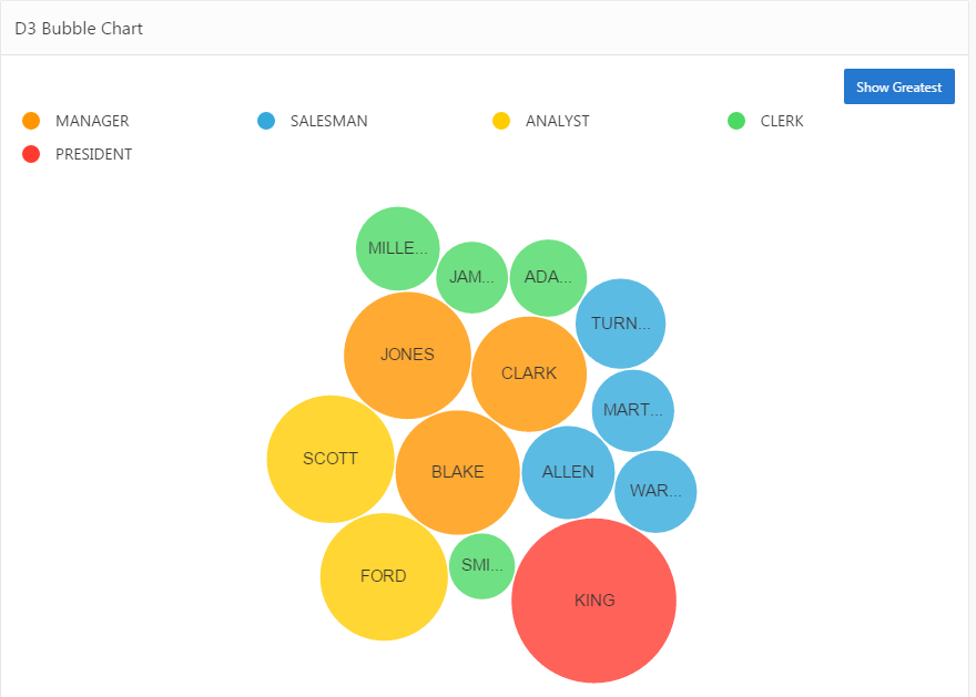
Bubble cloud

Image via Explorer.uk

Image via Explorer.uk

Looks more engaging than a load of words and values dumped in a paragraph, right?


Tag cloud

Image via 4th World Movement

Tag clouds are a great way to bring word-frequency data to life. Like with this example, they can be extra effective if you use your creativity to mould your data into the shape of the topic, too.


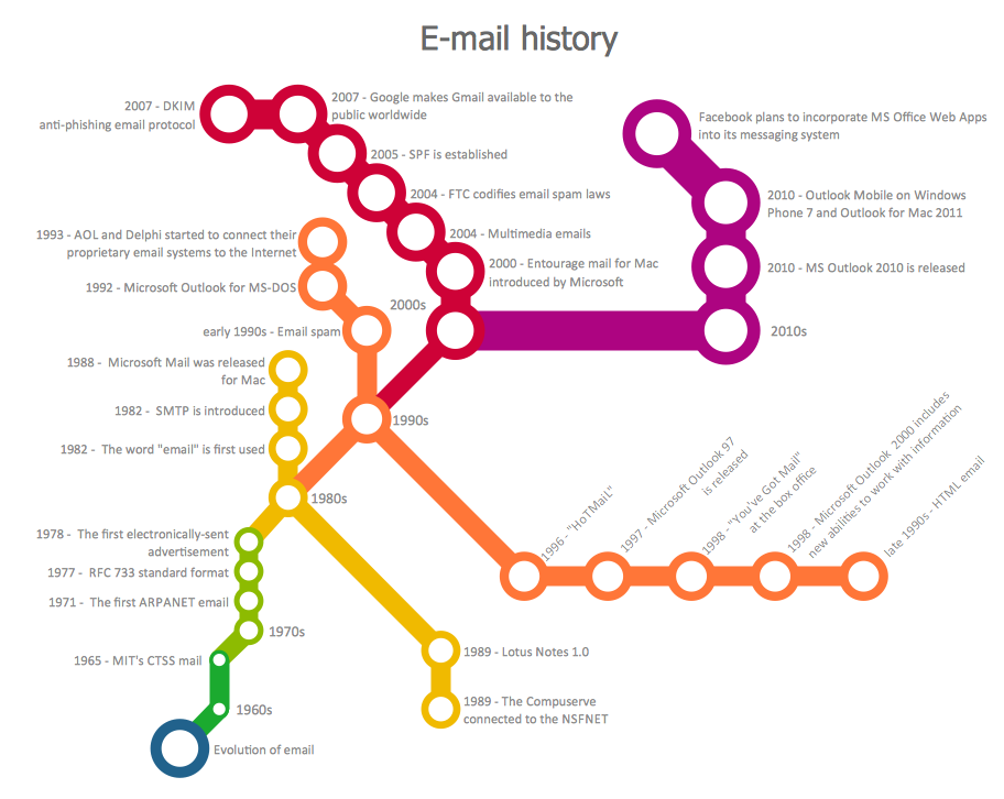
Subway map

Image via Concept Draw

Image via Concept Draw

Subway maps aren’t just for subways...This type’s a great way to attract attention because, odds are, visitors won’t be expecting to find a subway map on your site!


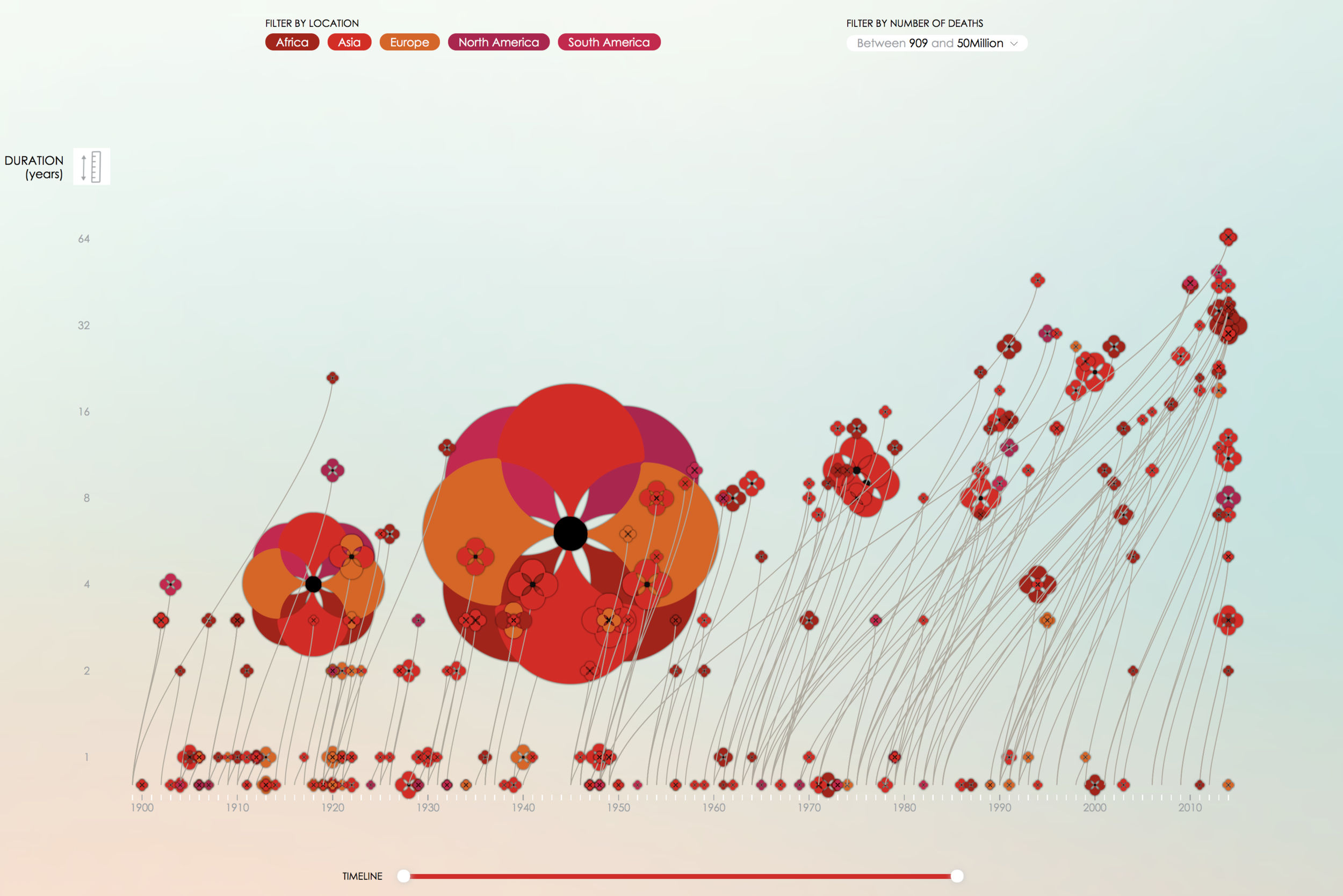
Timeline

Image via PoppyField.org

Image via PoppyField.org

This is a superb example of how a timeline (or really any chart) doesn’t have to be plain to be effective. With a few crafty tweaks, you can brand your charts and infographics to fit your brand! 


Looking for us to dive deeper on data visualization? Or, maybe you want to hear about another topic completely? Leave us a comment letting us know what you would like us to blog about!


Hue & Tone Creative: your marketing partner

Need your own custom infographics, charts, or presentations? We can help with all that and more! We'll help you define your brand and create tailored marketing materials so you can impress each and every one of your stakeholders. To get started, just shoot us an email explaining your needs: hannah@hueandtonecreative.com.

4 methods to measure your web traffic

Having a slick looking website is key. Having quality content is key. Having an SEO strategy is key. Having an enviable UX journey is key. But what use is all of that if you can’t, or aren’t, monitoring your results?

Measuring traffic is a monumental part of running a website - without it, all your efforts are essentially a guessing game. The benefits of meaningfully measuring your traffic are almost endless, but here’s a summary of our top six. It:
 

  • Identifies which pages are and aren’t working for you

  • Shows you where improvements can be made

  • Presents your business’ peaks and troughs

  • Allows you to identify trends and patterns

  • Provides a benchmark to continually evolve

  • Puts tangible data behind future design, journey and content adaptations

If you’re new to this data-driven side of things it can be daunting, but it needn’t be. To help you start your web traffic measurement journey, we’ve got four easy-to-use tools to share with you.

4 methods to measure your web traffic  |  Hue & Tone Creative


1. Google Analytics

Given it’s the leader of the pack, it only seemed natural to start with Google Analytics (GA). GA is a completely free tracking and reporting platform provided by Google, and it’s an absolute beast in the world of web traffic measurement.

So, let’s take a look at some key metrics you need to be getting the most out of:

Sources: Whether it’s email, SEO, PPC, social, referrals or otherwise, with GA, you can keep abreast of exactly which campaigns are driving traffic to your site, and how much of it they’re bringing in. This will help you to understand which campaigns are working, and which ones are falling flat.

Bounce rate: this is the number of people who land on your site and then ‘bounce’ straight back out. With this one, the lower the number the better. The bounce rate is a really good indicator as to how visitors interact with your site.

A high bounce rate could mean that people find the corresponding page difficult to navigate around, that they don’t like what’s on the page, or that the page isn’t what they expected it to be. Conversely, a low bounce rate shows that visitors have engaged with the page, so much so that they’ve gone and had a look elsewhere on your website.

Time on page: this one ties in nicely with what we’ve just been talking about. A high bounce rate and little time spent on page is the worst combo. Why? Because it’s a sign that the visitor is highly disengaged with what they’ve landed on.

On a more optimistic note, long page durations will show you which pages and content types visitors are interested in, which may help steer the direction you take other pages of your site.

Exit pages: quite simply, this’ll show you at what point visitors are abandoning your site. So, why is this so important? Of course, everyone will leave at one point or another, but if there’s a trend emerging that lots of your visitors are leaving on x page before they complete a conversion, it may well be a sign that some form of action needs taking to rectify it.

Such is the size of GA’s traffic tracking capabilities, we could literally go on forever. But hopefully we’ve given you a flavor of how it can steer your overall strategy.


2.  A/B testing

A/B testing lets you change what your traffic sees when it lands on your site - this could be anything from the text on the page to the color of a button.

So, why’s this so great? Because it puts real-life data behind which variations work best, which can subsequently steer your marketing efforts - for the better.

With A/B testing under your belt, you’re no longer sticking your finger in the air and implementing changes based on what you think might work. Instead, you can make informed decisions using a reliable and representative source of data.

One thing worth mentioning is that’s important to be patient and wait until you’ve built up a decent pot of data before coming to any conclusions. As with any type of research, the numbers need to be statistically significant to add value. Not sure what this means? Check out this calculator to help you with the maths. 


3.  Heatmaps

Another method you can use to measure your web traffic is setting up heatmaps: enter Hotjar (they’re big guns in this arena).

Heatmaps are a really handy way to monitor how your traffic interacts with pages on your site, by tallying up numbers for things like clicks, taps and scrolling behavior.

What does this tell you about your traffic? Well, it tells you where on your page visitors are losing interest. It tells you where people are clicking most, which might steer the placement of your page’s assets. It tells you if certain elements on your page are getting lost. And it tells you which part(s) of the page are drawing the most attention.

All of these learnings can form the basis of navigational, design and content decisions.

As with A/B testing, you should wait until you have a meaningful amount of data before interpreting your numbers and coming to conclusions. Heatmaps work by adding a snippet of code onto chosen pages, so if you’re after quick wins, it might be worth starting with sections of your site that you know receive large volumes of traffic.


4.  Visitor videos

Last but not least is the use of visitor recording tools. Admittedly, some of the perks overlap with that of a heatmap, but while heatmaps provide valuable numbers, videos let you actually see your visitors in action.

This helps you monitor and measure your traffic by:

  • Understanding visitors’ movements

  • Seeing how visitors interact on an individual level

  • Getting under the skin of why people get stuck in certain sections

  • Seeing exactly where visitors abandon you and forming a picture of the ‘why’

  • Allowing you to test new designs and journeys and how they impact your user experience.

The end result? Ample learnings to feed into your website strategy. If you’re unsure of where to go for video recording support, tools like UXPin, Inspectlet, Hotjar and Mouseflow do it well.


HUE & TONE: YOUR WEB MARKETING EXPERTS 

Know what you need to improve about your website, but not sure how to do it? Need a fresh perspective on your content and design? Give us a call. We're here to help you with all your web and graphic design needs -- big or small.

Getting Analytical in the New Year
Getting Analytical in the New Year  |  Hue & Tone Creative

A business’s ultimate success has grown increasingly reliant on its web presence; particularly its website. According to an April 2017 survey taken by Statista, 40 percent of internet users in the US stated that they purchased items online, several times per month. Retail e-commerce sales worldwide are expected to nearly double between 2016 and 2020. More people than ever are performing research online before journeying to a brick and mortar store to complete a purchase. With so many transactions occurring online, how can you be certain your website is performing up to par?

Most small business owners can at least determine how much traffic their website solicits. But this can be as beneficial as knowing how many people attended a party without actually talking to anyone. There’s so much more information available. So, if you haven’t already, it’s time to get analytical in 2018.


Conversion

This statistic tells you how successfully your website is completing your intended goal. For example, if you’re Pizza Hut and your website’s primary purpose is for a visitor to complete a purchase, then your conversion statistic will indicate the percentage of visitor’s doing just that. Maybe you’re a real estate company, and your conversion goal is to have web users complete a contact form; this statistic will give you those percentages.


Source Report

Again, most people are familiar with Traffic Acquisition Reports, which measure the amount of traffic your website is getting during any given period of time. But remember, we’re after much more; like, how did they find you in the first place? There’s an analytic for that. A Source Report can tell you if someone arrived at your site by way of a search engine like Yahoo, or a referring site like Pinterest which includes links that route users to a pin’s original site or page. It can even determine how many people typed your url directly into the address bar.


Medium Report

There is also a Medium Report which indicates whether the result was the product of organic search or unpaid search, a paid search result, or via a referring website. All of this information could help influence marketing decisions going forward and guide a strategy for capitalizing on the sources and mediums already generating much of your traffic.


Bounce Rates

This statistic can inform several website elements, because it tracks what happens once a visitor enters your online presence. Do users journey to another page within your site or do they leave it all together? If your bounce percentage is high, you can determine where visitors are landing, which may prompt insight into why they’re leaving. Essentially, this analytic provides valuable insight into what visitors like about your site and what they don’t. Moreover, it empowers you to customize and alter your website accordingly.


Pageviews

This statistic is self-explanatory. It measures how many views a specific page receives. If visitors are returning to the same page again and again, hypothetically, you can formulate content that may garner similar interest. It could also point to other contributing factors like design schemes that users prefer. Using this information to formulate a strategic response can ultimately assist in improving your overall conversion rate.


The world wide web will continue to change and grow to meet human demand and businesses must evolve to keep pace. With the new year, usher in a new marketing strategy with the help of web analytics. It will be the best resolution you’ve ever made.


web marketing consultants  |  Greensboro, NC

Need help getting your website set up? Want a second set of eyes looking over your analytics? Hue & Tone Creative will take the stress out of marketing your business online. Check out our design portfolio to see clients we've helped in the past, and then give us a call to get your web presence ready for the new year.