Posts tagged Data
Marketing Trend Alert: Data Visualization
Marketing Trend Alert: Data Visualization  |  Hue & Tone Creative

We’re officially in a data-driven era. Decisions are made on it. Purchases are persuaded by it. And trust is gained through it. But what is data visualization? Where do its benefits lie? And how do you make data visualization truly effective? 
 

What is data visualization?

Qualitative data is information about qualities; information that can't actually be measured. Some examples of qualitative data are the softness of your skin, the grace with which you run, and the color of your eyes.

Quantitative data is information about quantities; that is, information that can be measured and written down with numbers. Some examples of quantitative data are your height, your shoe size, and the length of your fingernails.

In its simplest form, data visualization is the representation of data in a pictorial or graphical format. Displaying information this way allows readers to grasp complex concepts with less effort and makes it easier to summarize a large of data quickly.

Data visualization can be used for both qualitative and quantitative data, but some common business uses include:

  • Breaking down market research results

  • Sharing customer insights and/or feedback

  • Displaying geographical variances

  • Detailing a timeline of events and/or activities

  • Presenting internal trading reports

Data visualization: the benefits

Your data is only as good as its interpretation, which is where visualization is key. For you visualized data to be successful it should have: 

Aesthetically pleasing results: lines and lines of numbers with the odd word interspersed never looks good -- nor does it read well. Data visualization removes the need for all the numbers and brings your pages to life with eye-catching graphics.

Digestible takeaways: data can be a minefield to understand and take several read throughs to understand. By presenting it visually, your audience can quickly and easily skim and digest the information you’ve given them.

Easier processing: by presenting your information visually, you’re upping the chances that people will understand and remember it.


Types of data visualization

When it comes to picking a type of visualization that’s right for your data, there’s no end to the choices. If you're looking for a jumping off point, we've compiled this list of different data styles for you to research and explore: 

Hierarchical

  • General tree visualization

  • Dendrogram

  • Radial tree

  • Wedge stack graph

  • Hyperbolic tree

Network

  • Matrix

  • Node-link diagram

  • Dependency graph

  • Hive plot

  • Alluvial diagram

  • Subway map

Geographical

  • Choropleth

  • Cartogram

  • Dot distribution map

  • Proportional symbol map

  • Dasymetric map

Time-related

  • Timeline

  • Time series

  • Connected scatter plot

  • Gantt chart

  • Arc diagram

  • Stream graph

Multi-dimensional

  • Pie chart

  • Histogram

  • Tag cloud

  • Bar chart

  • Tree map

  • Bubble chart

  • Waterfall chart

Data visualization examples

So, now that we’ve explored the benefits and types, let’s take a look at some great data visualization examples in practice.


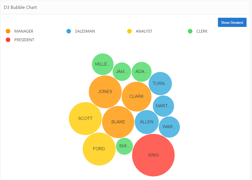
Bubble cloud

Image via Explorer.uk

Image via Explorer.uk

Looks more engaging than a load of words and values dumped in a paragraph, right?


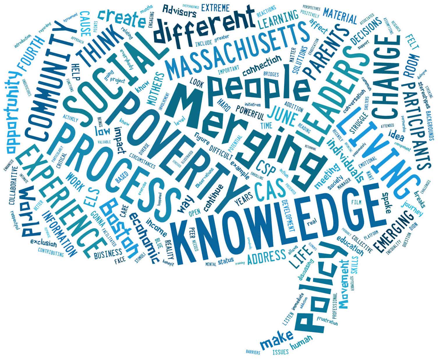
Tag cloud

Image via 4th World Movement

Tag clouds are a great way to bring word-frequency data to life. Like with this example, they can be extra effective if you use your creativity to mould your data into the shape of the topic, too.


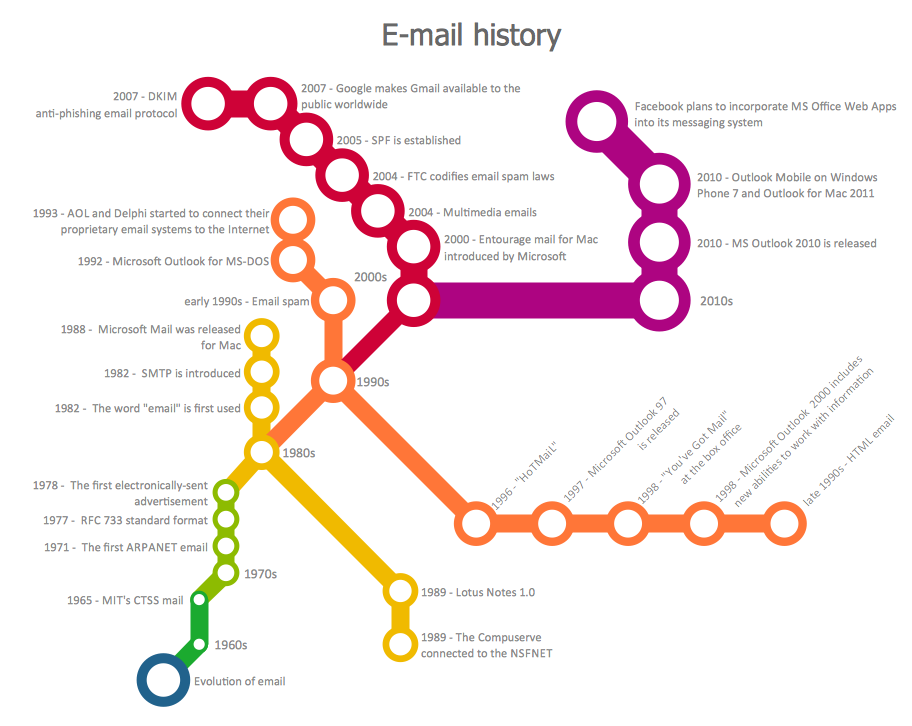
Subway map

Image via Concept Draw

Image via Concept Draw

Subway maps aren’t just for subways...This type’s a great way to attract attention because, odds are, visitors won’t be expecting to find a subway map on your site!


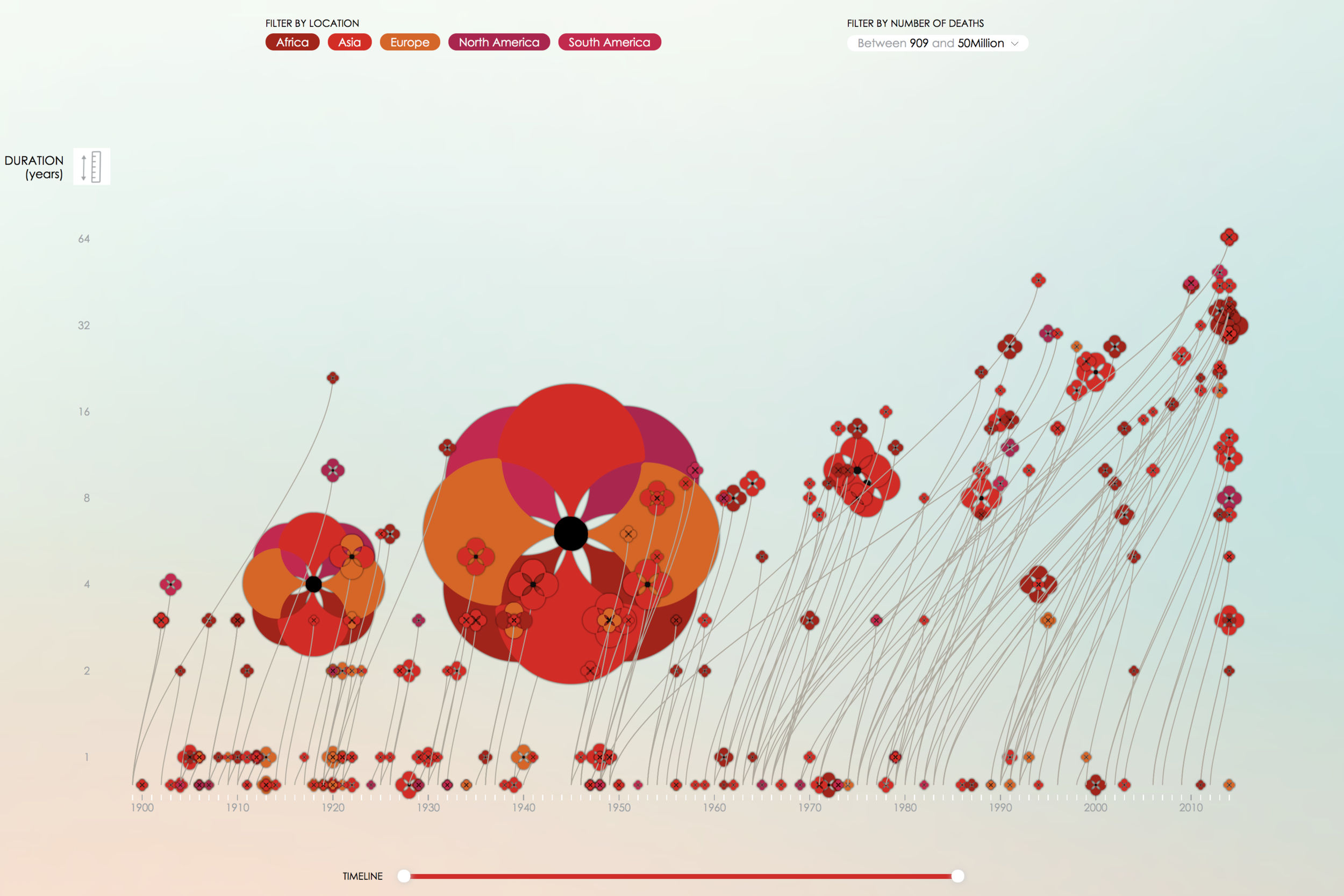
Timeline

Image via PoppyField.org

Image via PoppyField.org

This is a superb example of how a timeline (or really any chart) doesn’t have to be plain to be effective. With a few crafty tweaks, you can brand your charts and infographics to fit your brand! 


Looking for us to dive deeper on data visualization? Or, maybe you want to hear about another topic completely? Leave us a comment letting us know what you would like us to blog about!


Hue & Tone Creative: your marketing partner

Need your own custom infographics, charts, or presentations? We can help with all that and more! We'll help you define your brand and create tailored marketing materials so you can impress each and every one of your stakeholders. To get started, just shoot us an email explaining your needs: hannah@hueandtonecreative.com.

Getting Analytical in the New Year
Getting Analytical in the New Year  |  Hue & Tone Creative

A business’s ultimate success has grown increasingly reliant on its web presence; particularly its website. According to an April 2017 survey taken by Statista, 40 percent of internet users in the US stated that they purchased items online, several times per month. Retail e-commerce sales worldwide are expected to nearly double between 2016 and 2020. More people than ever are performing research online before journeying to a brick and mortar store to complete a purchase. With so many transactions occurring online, how can you be certain your website is performing up to par?

Most small business owners can at least determine how much traffic their website solicits. But this can be as beneficial as knowing how many people attended a party without actually talking to anyone. There’s so much more information available. So, if you haven’t already, it’s time to get analytical in 2018.


Conversion

This statistic tells you how successfully your website is completing your intended goal. For example, if you’re Pizza Hut and your website’s primary purpose is for a visitor to complete a purchase, then your conversion statistic will indicate the percentage of visitor’s doing just that. Maybe you’re a real estate company, and your conversion goal is to have web users complete a contact form; this statistic will give you those percentages.


Source Report

Again, most people are familiar with Traffic Acquisition Reports, which measure the amount of traffic your website is getting during any given period of time. But remember, we’re after much more; like, how did they find you in the first place? There’s an analytic for that. A Source Report can tell you if someone arrived at your site by way of a search engine like Yahoo, or a referring site like Pinterest which includes links that route users to a pin’s original site or page. It can even determine how many people typed your url directly into the address bar.


Medium Report

There is also a Medium Report which indicates whether the result was the product of organic search or unpaid search, a paid search result, or via a referring website. All of this information could help influence marketing decisions going forward and guide a strategy for capitalizing on the sources and mediums already generating much of your traffic.


Bounce Rates

This statistic can inform several website elements, because it tracks what happens once a visitor enters your online presence. Do users journey to another page within your site or do they leave it all together? If your bounce percentage is high, you can determine where visitors are landing, which may prompt insight into why they’re leaving. Essentially, this analytic provides valuable insight into what visitors like about your site and what they don’t. Moreover, it empowers you to customize and alter your website accordingly.


Pageviews

This statistic is self-explanatory. It measures how many views a specific page receives. If visitors are returning to the same page again and again, hypothetically, you can formulate content that may garner similar interest. It could also point to other contributing factors like design schemes that users prefer. Using this information to formulate a strategic response can ultimately assist in improving your overall conversion rate.


The world wide web will continue to change and grow to meet human demand and businesses must evolve to keep pace. With the new year, usher in a new marketing strategy with the help of web analytics. It will be the best resolution you’ve ever made.


web marketing consultants  |  Greensboro, NC

Need help getting your website set up? Want a second set of eyes looking over your analytics? Hue & Tone Creative will take the stress out of marketing your business online. Check out our design portfolio to see clients we've helped in the past, and then give us a call to get your web presence ready for the new year.