A business’s ultimate success has grown increasingly reliant on its web presence; particularly its website. According to an April 2017 survey taken by Statista, 40 percent of internet users in the US stated that they purchased items online, several times per month. Retail e-commerce sales worldwide are expected to nearly double between 2016 and 2020. More people than ever are performing research online before journeying to a brick and mortar store to complete a purchase. With so many transactions occurring online, how can you be certain your website is performing up to par?
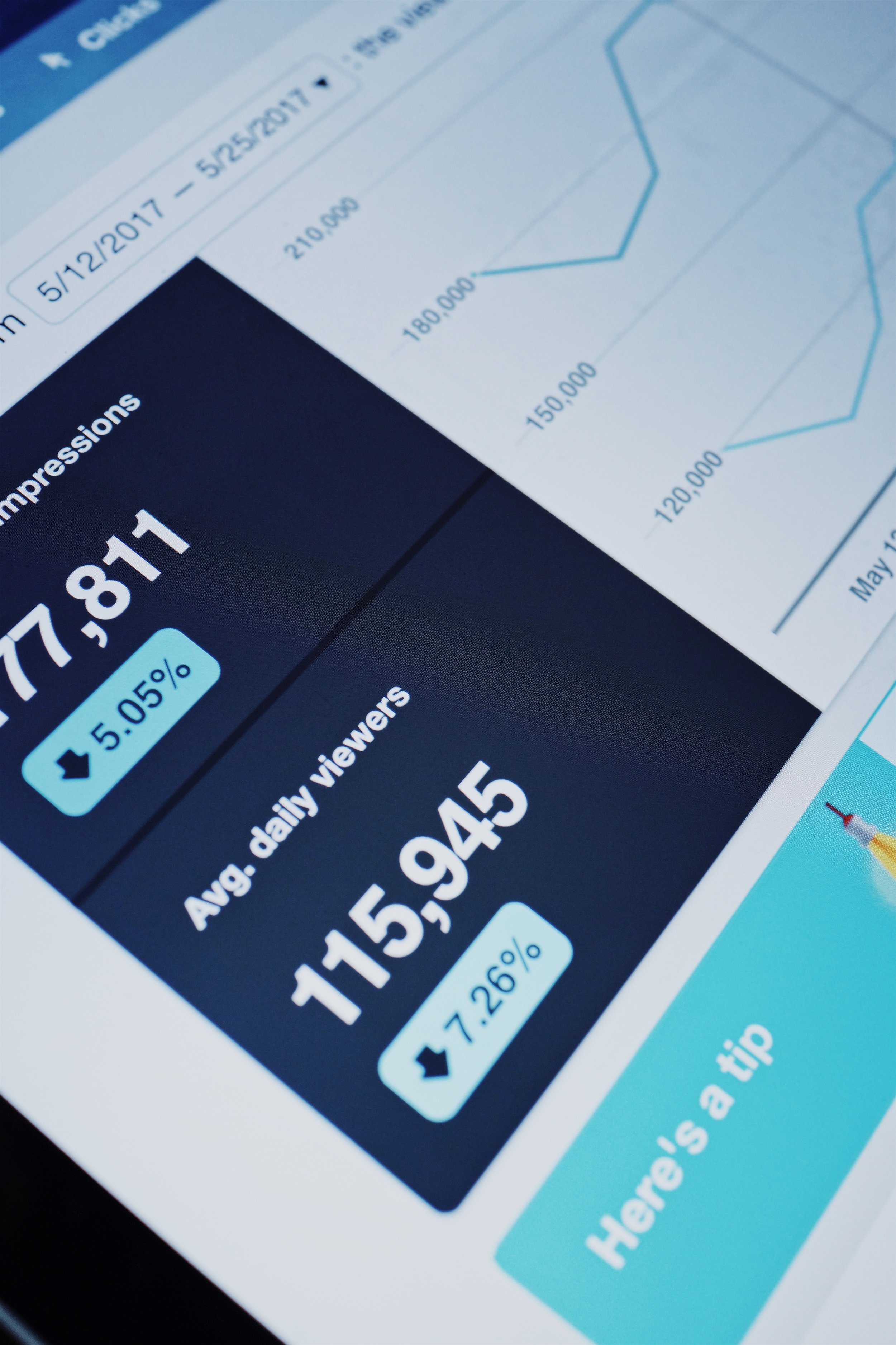
Most small business owners can at least determine how much traffic their website solicits. But this can be as beneficial as knowing how many people attended a party without actually talking to anyone. There’s so much more information available. So, if you haven’t already, it’s time to get analytical in 2018.
Conversion
This statistic tells you how successfully your website is completing your intended goal. For example, if you’re Pizza Hut and your website’s primary purpose is for a visitor to complete a purchase, then your conversion statistic will indicate the percentage of visitor’s doing just that. Maybe you’re a real estate company, and your conversion goal is to have web users complete a contact form; this statistic will give you those percentages.
Source Report
Again, most people are familiar with Traffic Acquisition Reports, which measure the amount of traffic your website is getting during any given period of time. But remember, we’re after much more; like, how did they find you in the first place? There’s an analytic for that. A Source Report can tell you if someone arrived at your site by way of a search engine like Yahoo, or a referring site like Pinterest which includes links that route users to a pin’s original site or page. It can even determine how many people typed your url directly into the address bar.
Medium Report
There is also a Medium Report which indicates whether the result was the product of organic search or unpaid search, a paid search result, or via a referring website. All of this information could help influence marketing decisions going forward and guide a strategy for capitalizing on the sources and mediums already generating much of your traffic.
Bounce Rates
This statistic can inform several website elements, because it tracks what happens once a visitor enters your online presence. Do users journey to another page within your site or do they leave it all together? If your bounce percentage is high, you can determine where visitors are landing, which may prompt insight into why they’re leaving. Essentially, this analytic provides valuable insight into what visitors like about your site and what they don’t. Moreover, it empowers you to customize and alter your website accordingly.
Pageviews
This statistic is self-explanatory. It measures how many views a specific page receives. If visitors are returning to the same page again and again, hypothetically, you can formulate content that may garner similar interest. It could also point to other contributing factors like design schemes that users prefer. Using this information to formulate a strategic response can ultimately assist in improving your overall conversion rate.
The world wide web will continue to change and grow to meet human demand and businesses must evolve to keep pace. With the new year, usher in a new marketing strategy with the help of web analytics. It will be the best resolution you’ve ever made.
web marketing consultants | Greensboro, NC
Need help getting your website set up? Want a second set of eyes looking over your analytics? Hue & Tone Creative will take the stress out of marketing your business online. Check out our design portfolio to see clients we've helped in the past, and then give us a call to get your web presence ready for the new year.


