In 2015, there were a total of 205 billion emails sent and received. According to Marketing Charts, emails sent to Gmail users found that 68.4% of all incoming messages were classified as Promotions; marketing messages sent for the purpose of driving a purchase or conversion. Promotional emails and other forms of direct marketing are made possible when businesses obtain personal contact information. The more leads a company is able to capture increases their potential for a future sale or conversion. There’s a myriad of ways to generate more leads, but here are a few that can be done quickly through your website and social media without a lot of fuss.
Don’t Ask, Won’t Tell
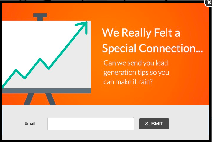
First things first: ask for what you want. Sometimes, just having a place on your site dedicated to requesting a user’s contact info is enough. If you never make the request, you’re much less likely to capture the lead. A good place for such a request is a Landing Page.
Create a Landing Page
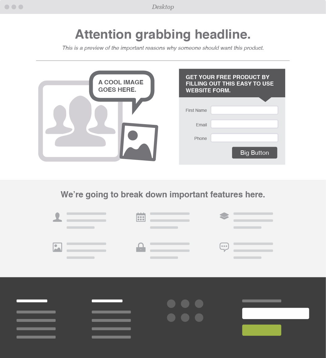
We love this example from VTL Design!
Basically, a landing page is a place on your site that allows you to capture a visitor's information; most typically through a lead form. More technically, it’s a web page that stands alone from the rest of your site and is created for a specific function. Maybe you’re promoting a webinar and are attempting to attract attendees or maybe you want visitors to subscribe to receive your newsletter. Normally, you can’t reach a landing page from your site’s main navigation menu. Your visitors either land on it or it pops up shortly after they arrive. A landing page allows you to put special requests front and center while capturing user data simultaneously if they choose to proceed.
Simple enough, right? Well, asking doesn’t guarantee a yes, but as stated earlier, you have to at least ask and the landing page is where you pop that question.
It’s not what you ask for, but how you ask for it.
“What’s your math,” is the most creative means by which I’ve heard a phone number solicited. The gentleman wanted something, but instead of asking the same way everyone else has, he got creative and, as a result, he got the digits. On your landing page, you have what’s called the Call to Action button or CTA. A CTA is the equivalent of a pickup line. Traditionally that line has been “Submit”. Research has shown that this word has a lower conversion rate than other phrases. Subscribe, Start Your Free Trial, Launch, Download Now, Create a Site, Get Your Free E-Book, Sign Up for Free are more successful alternatives just to name a few. While it makes sense that your conversion goal will dictate what you ask for, the world is your oyster in terms of how you can ask. So, get creative in your request and the lead may be yours.
Social Sharing is Caring
Does your company have a Twitter account, Facebook Page, Instagram, ect? If so, make sure to include social sharing buttons on your website. Visitors who don’t want to fork over contact information may opt to engage with you through these mediums. They can follow you and you can, in turn, follow your followers. It’s a way to gain instant leads. Not only will your social media promotions show up automatically in their feeds, you will have unfettered access to those interested in your service or product and access to their entire social network. Easy peazy.
A business’s success is dependent upon how successfully they attract and keep customers. Lead generation is an essential part of that task. Capitalize on the traffic coming to your site by extending an offer or making a request that may perpetuate the relationship. Don’t be afraid to make the first move. As leads increase, you’ll be happy you did.
WEB MARKETING IN GREENSBORO and WINSTON-SALEM
If your web traffic is stagnant, it's time to give Hue & Tone Creative and a call. We'll work together to help you get your content back on track and your website in front of new eyes. Want to learn what we can do? Give us a call.


