Posts in Squarespace
The essentials: must have marketing assets for new businesses
Get your new business of to the best start possible with the right marketing materials!

Get your new business of to the best start possible with the right marketing materials!

So, you’ve decided to start a business. You know you need the basics like a logo and business cards – but what other marketing assets should you make a priority?

Marketing materials can encompass everything from websites and letterheads to social media graphics and promotional videos. If you’re just starting out in the small business world, chances are your budget is probably a little tight – but skimping when you start up can mean unnecessary spending down the road.

Think about it: you pick the first business name you think up and print up a bunch of business cards, letterheads, and pens. A few weeks later, you’re hearing from your customers that they can’t remember your business name. Now you’ve confused people, still have to pay for proper branding, and you’ve got to pay to reprint materials you could have gotten right from the start. 

The good news is that we’re here to tell you what you need it, why you need it, when you need it, and how you get it. We hope this run down of essential marketing materials helps empower you when you’re hiring a graphic designer or marketing agency.

Here’s what you need to successfully get your business off the ground:
 

1. Brand Values

Because no physical products come out of this stage of the branding process, it’s often rushed or disregarded – but this is one of the most important stages, and it will influence everything you do from here on out. Your brand values are the set of principles that will dictate every aspect of your business, including the look, messaging, and customer service approach.

Here’s what you’ll want to define:

  • Values: what does your business stand for?

  • Objectives: where do you want to be in 1, 5, or 10 year’s time?

  • Customer personas: who are your talking to and what do they care about?

  • Tone of voice: how will you talk to your customers? And why?

  • Proposition: what will you do for your customers? And how will you benefit them?

  • Tagline/mission statement: how can your brand’s essence be summed up into as few words as possible?

Taking the time to properly develop your brand values will allow you to properly train your workforce and will help you communicate your brand to third parties. We suggest asking your marketing team for a brand book or set of written guidelines that you could hand off to an outside team.

The essentials: Must have marketing assets for new businesses  |  Hue & Tone Creative


2. Brand Identity

Now it’s time to develop the look and feel of your brand. This is where you’ll work with a designer to create a logo and everything that goes with it. You’ll want to come out of this stage with:

  • Primary logo: as well as any alternative logo formats you might need for packaging, online use, or small sizes

  • Logo usage guidelines: what is the smallest size your primary logo should be printed? What do you do when you can only print your color in one logo? Make sure your designer provides you with guidelines for every situation you might encounter.

  • Font palette: what fonts are you going to use on print, web, and in Microsoft Office?

  • Color Palette: what primary and secondary colors will complement your look, logo ad tone?

  • Graphic elements: anything needed to complete your print and web designs.

  • Sample usage: make sure your designer provides examples of how all these elements will come together to create your signature look.


3. Build a winning website

We talk a lot about the importance of a well designed and properly optimized website, so we won’t waste a lot of space here talking through why you need one. Instead, we’ll run through a few key considerations when it comes to building it:

  • Get to the point: you’ve got a limited time to capture visitors’ attention, so get your message across clearly and effectively on every page.

  • Contemporary: outdated websites make your brand look instantly aged and untrustworthy. Take the time to get your website looking slick, and outsource it to a specialist if you need to.

  • Architecture: once you start adding menus and pages, they can be a right pain to change down the line. To make sure you’ve got a great user experience from the outset, map out your site’s architecture before you start building it.

  • Search engine optimization (SEO): with a reputation for being the cheapest marketing method around, it’s crucial that you build and write your website with SEO at the forefront of your mind.

  • Contact: make your call to actions and contact information crystal clear.

  • Host: choose a content management system that’s reliable. Personally, we would recommend Squarespace – here’s why.

  • Domain: be sure to match your domain name to your business’ name.

4. Social media

Did you know, 70% of the US population have at least one social media profile? That’s a whole lot of potential customers to capture.

We suggest selecting just 2-3 platforms to get started on – especially if you’re handling your social media in house. To effectively leverage social media, there’s a few things you’ll need to do:

  • Only use high resolution profile and background images (pixilated pictures make you look untrustworthy and out of touch)

  • Write a succinct and enticing bio

  • Link back to your website

  • Include contact details

  • Keep an eye on your inbox/direct messages

  • Commit to regularly posting

  • Reply to those who engage with you

  • Interact with relevant people and/or profiles

Maintaining social media should be a daily job – if it’s not, you’re not doing it right. We suggest creating a content calendar to stay organized. And, make sure you have a set of templates on hand to save time when you need to create a quick Facebook graphic. 

5. Blogs

Investing in content marketing comes with endless benefits. A well maintained blog boosts your SEO efforts, helps you build backlinks and brand awareness, generates leads, adds brand value, and ups engagement.

Just remember the golden rule: the content you’re publishing must be quality. Churning out subpar articles won’t get you far -- if it even gets you anywhere. Here are a few general post types to get you going:

  • Videos

  • Infographics

  • Webinars

  • Tutorials

  • Whitepapers

  • Presentations

  • ‘How to’ guides

  • Buzzfeed-style listicles

With good content, you need good images. If you’re not in the position to fork out money for sites like iStock and Shutterstock, consider Unsplash, Pixabay and Pexels for good, free alternatives. 
 

The essentials: Must have marketing assets for new businesses  |  Hue & Tone Creative

6. Templates

Next up is templates. The extent of this list will vary depending on the nature of your business, but below is an idea of the types of templates we suggest you think about:

  • Email campaigns - sales, welcome, thank you, updates, or otherwise

  • Newsletters

  • Direct mail

  • Job descriptions

  • Email signatures

  • Powerpoint presentations

  • Social media graphics

  • Letterhead/memos

Your logo should feature on each and every one of them -- which is why it’s important to have a logo that sits well in different settings, and your brand’s look, feel and tone should be encapsulated too. Remember though, your templates don’t need to be uniform to be consistent.

7. Print collateral

We’ve been carrying on about online a lot -- and rightly so! -- but don’t forget about good old offline advertising. Depending on your industry, things like physical brochures and business cards can be an important asset.

If you’re investing in printed materials, remember to:

  • Do your research: spending a bit of time selecting a quality printer.

  • Don’t compromise: poor quality paper reflects badly on your business.

  • Don’t rush: if there’s a proofreading mistake that’s your fault there’s no going back -- without throwing money down the drain.

  • Keep it consistent: print materials still needs to mirror your online presence.

  • Think of the bigger picture: think about how you can make print materials evergreen so that you don’t have to reprint regularly. Consider what really needs a date and what could go without one.

  • Get the right amount of copies: you can easily order more, so don’t go print crazy and order 1000s of copies unless you’re absolutely certain they’ll be used. But, you usually get a discount the more you order, so don’t be afraid to print some extras.


Need a little help?

Getting all your marketing assets together can feel really daunting -- I know, I’ve been there! But here at Hue & Tone Creative, there’s a lot we can help you with. From logo design and letterhead to web design and social media management, get in touch to see how we can support your business’ success.

7 (more!) Squarespace font pairings

There’s no denying that deciding which fonts work well together can be (to put it bluntly) an absolute nightmare - but the benefits of fiddling around far outweigh the pain of getting there.

Finding the perfect font pairing can make a massive difference to the look and feel of your website. It changes the way the words on screen gel with your design. It alters the way visitors scan over your copy. And it can impact the overall tone you give off. So it really is key that you hit the nail on the head.

We’ve already shared 7 Squarespace font pairings and, back due to popular demand, now we’re here to give you seven more!

7 (more!) Squarespace font pairings  |  Hue & Tone Creative

Trebuchet MS + Adobe Garamond Pro

Trebuchet’s instantly easy-to-read style coupled with Adobe’s slightly old school slant effortlessly keeps pages engaging.


7 (more!) Squarespace font pairings  |  Hue & Tone Creative

Source Sans Pro + Raleway

Source Sans in simple and sleek -- pair it with Raleway and you’ve got yourself a modern combo!


Artboard 5@2x-8.png

Alfa Slab One + Titillium Web

This font combination isn't for everyone, but Alfa Slab’s bold presence coupled with Titillium’s techno vibe provides a structured, forward-looking style. 


7 (more!) Squarespace font pairings  |  Hue & Tone Creative

Playfair Display SC + Livory

Get straight to the point with Livory's imposing page presence and Playfair's easy-on-the-eye curls.


7 (more!) Squarespace font pairings  |  Hue & Tone Creative

Acier Bat Text Solid + Sanchez

What happens when you combine sharp points and straight edges? This. It’s different, but who said different’s bad?


7 (more!) Squarespace font pairings  |  Hue & Tone Creative

Adrianna + Work Sans

Both wide in style, Adrianna and Work Sans provide a really easy-to-read package.


7 (more!) Squarespace font pairings  |  Hue & Tone Creative

TextBook New + Tondo Signage

Tondo’s stocky style makes it unideal for chunky blocks of text, but paired with TextBook New it’s ideal for shorter snippets that need snippets that need to catch the reader’s eye.


BRANDING + WEB SERVICES IN GREENSBORO: HUE & TONE

Looking for a web designer in Greensboro, Winston Salem or the surrounding areas? Hue & Tone is a creative graphic design agency specializing in logo design, web design, social media management, and more. Give us a call if you’re interested in a custom, branded website that truly tells your story.

To Squarespace or not to Squarespace? The small business’s question.

According to the SBA, small businesses account for a whopping 99.7% of U.S. employer firms. If you’re thinking of starting your own small business or maybe you already have, how do you emerge as the peacock amongst all the other peacocks with the showiest feathers? Well, an aesthetically pleasing and user-friendly website would certainly help. In this DIY climate, only one website builder springs to mind: Squarespace. This week, we’ll explore why Squarespace is the best choice for small businesses.

To Squarespace or not to Squarespace?  |  Hue & Tone Creative

We’ve all heard or seen the commercials for Squarespace, the self-proclaimed “all-in-one solution for anyone looking to create a beautiful website.” And beautiful it is. Squarespace’s landing page is like a mini trip to an art museum. The evocative photographs, set against sleek and colorful backdrops, coupled with drag-and-drop functionality, easily marks its self as the preeminent option. Once there, you’re thrilled and delighted to press the Create A Site button.
 

Inside, you’ll find that Squarespace’s versatility is unmatched. The site currently boasts more than 70 different templates. After exploring and choosing the design of your liking, you can begin adding your own content. One caveat, Squarespace’s polished designs only go so far. Be sure to use high-quality photos when swapping out placeholder images. One of the allures of Squarespace is its sleek, professional design, but even that won’t make up for low quality, grainy photographs.

Squarespace has done a phenomenal job with creating beautiful spaces that you can tailor to fit your needs. Do play around with templates if you can’t seem to settle on just one.  Once you begin customizing, Squarespace provides you the option of previewing other templates without losing earlier work. You can experience what your site looks like with a banner overlay, or at various scale sizes, or with numerous navigation choices, or utilizing page animation or displaying a slideshow. And these are just a few of the design options available to you. Like what you see? Great! Let’s talk pricing: 

Screen Shot 2017-11-15 at 8.11.40 AM.png

Squarespace has the simplest pricing plans than any other web builder; with only two total. $12 per month for personal websites, billed annually or $16 paid month to month, and $18 per month for businesses, billed annually or $26 paid month to month. Two additional pricing plans are available if you want an online store. Your hosting and a custom domain name are included with the purchase of an annual membership and that’s certainly a plus.


Other web builders offer free plans, but with limited features, and sub-domain names. Squarespace permits you to try their service for a 14-day trial, but once expired, you’ll need to choose a paid membership to continue service. All things considered, Squarespace’s pricing is competitive with other web builders and the value you receive is undeniable. It has the tools to set any small business apart by adorning it in the most beautiful of feathers and allowing it to really strut its stuff. 


WEB DESIGN IN GREENSBORO AND BEYOND

Loving Squarespace, but not sure what to include on your website? Or maybe your homepage is just looking a little flat? Hue & Tone Creative will help get your web presence up to speed. Be sure to check out our design portfolio to see clients we’ve helped in the past -- and then give us a call if you’d like us to build you a custom, modern website that truly tells your story.

7 Squarespace Font Pairings
7 Squarespace Font Pairings  |  Hue & Tone Creative

You see a Squarespace template, you love it, you start playing with the fonts... and suddenly you don't love it quite so much. No worries -- it happens to everyone!

Although it may be tempting to stick with the default settings of your template, taking the time to select the right fonts adds depth and personality to your site. With over 600 font options through Google and nearly 1,000 on Adobe Typekit, picking the perfect combo can feel almost impossible.

We're here to take the guesswork out of selecting the perfect Squarespace font combination - here's 7 suggestions to revive your favorite template: 

Merriweather + Roboto Condensed  |  Squarespace Font Pairings  |  Hue & Tone Creative

Merriweather & Roboto

This classic and modern mix of serif and sans serif fonts is perfect for any business. 

Skolar Sans + Domine  |  Squarespace Font Pairings  |  Hue & Tone Creative

Domine & Skolar Sans

Need a clean no-fuss combination? Domine and Skolar pairs nicely with strong graphics. 


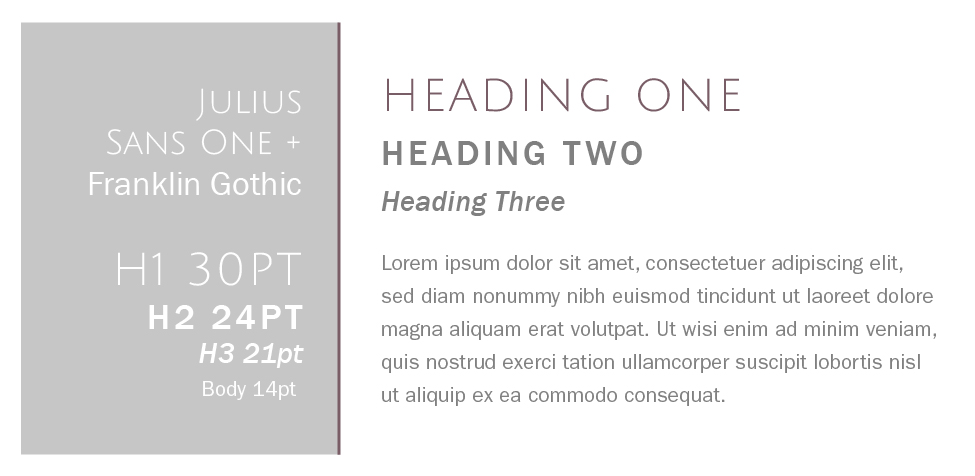
Julius Sans One + Franklin Gothic  |  Squarespace Font Pairings  |  Hue & Tone Creative

Julius Sans One + Franklin Gothic

Franklin Gothic is classic, readable, and approachable -- but add Julius Sans One in and you've got an edgy clean feel.


Rift Soft + Vendetta  |  Squarespace Font Pairings  |  Hue & Tone Creative

Rift Soft & Vendetta

Looking for a sophisticated pairing for an upscale brand? The sleek style of Rift keeps Vendetta from feeling too stuffy. 


Essonnes + Futura  |  Squarespace Font Pairings  |  Hue & Tone Creative

Essones & Futura

This duo feel playful and approachable. We love this serif & sans serif mix for boutiques, portfolios, and blogs. 


Park Lane + Tenso  |  Squarespace Font Pairings  |  Hue & Tone Creative

Park Lane & Tenso

This crisp and versatile combo would work well for real estate, bistros, and trendy salons. 


Lust Script + Sofia Pro  |  Squarespace Font Pairings  |  Hue & Tone Creative

Lust Script + Sofia Pro

Feeling a little edgy? Mixing in Lust Script takes this font palette to the next level. 


branding + web services in greensboro: Hue & Tone

Looking for a web designer in Greensboro, Winston Salem or the surrounding areas? Hue & Tone is a creative graphic design agency specializing in logo design, web design, social media management, and more. Give us a call if you’re interested in a custom, branded website that truly tells your story.
How to pick a Squarespace Template

Building a well-designed website for your business can be an intimidating task. Squarespace is one of our favorite platforms because it allows you to easily create beautiful and professional websites for a reasonable cost. 

Although it can be fun to experiment with all the offerings on Squarespace, it’s important to consider the overall goal of your website. Do you need to show off the menu of your organic coffee shop? Promote your event photography? Sell products for your online boutique?

Squarespace identifies their templates as falling into three main types of websites:

  • Information: “The goal of your site is to provide information to visitors, like business hours, who you are, or an overview of a project. The goal might be passive, where visitors find the information, read your blog, and move on, or active, where they sign up for a newsletter, submit a form, or contact you.”
     
  • Images: “The goal of your site is to display beautiful images. If you're an artist, design studio, or photographer, an image-focused template will help you display your work to prospective clients. Sites for restaurants, weddings, and more can also be very visual.”
     
  • eCommerce: “The goal of your site is to sell products, services, or media. If you're selling a small number of products, you can use a Website template to create a small shop. But if eCommerce is the primary goal for your site, a Commerce template provides advanced features to help your product display match your brand and vision.”

Squarespace also offers a cover page option. Cover pages are single-page sites that can be used as a standalone or integrated into an existing site. They’re also great if you need to get something up while you’re building your website behind-the- scenes!

Every Squarespace template offers the ability to add text, social integrations, photos, search, and gallery features. However, only some offer things like index pages, gallery pages, and blog pages. Do your research and identify any special features you might need! 

To make your search a little easier, we’ve picked out five of our favorite templates -- we’ve also highlighted some of the differences between each template. If you’re overwhelmed by the amount of options, these are a great place to start!


Bedford

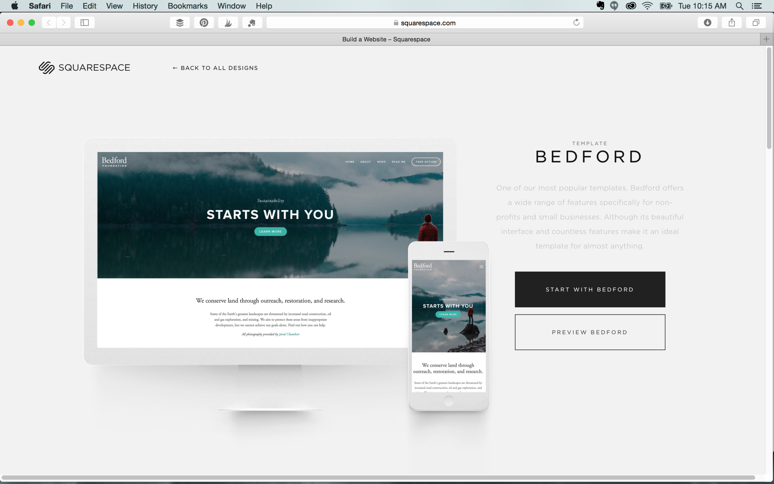
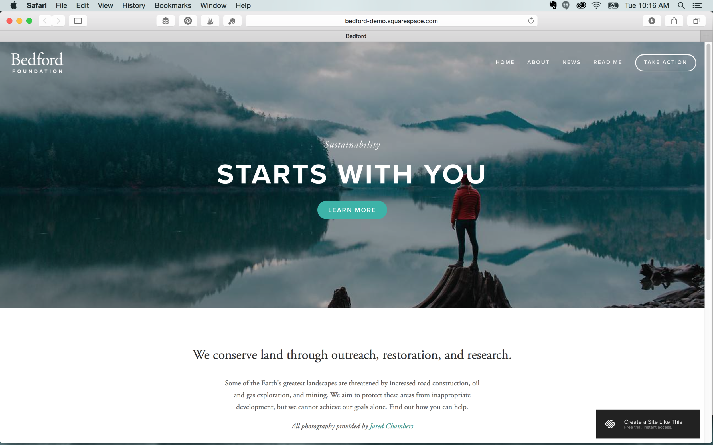
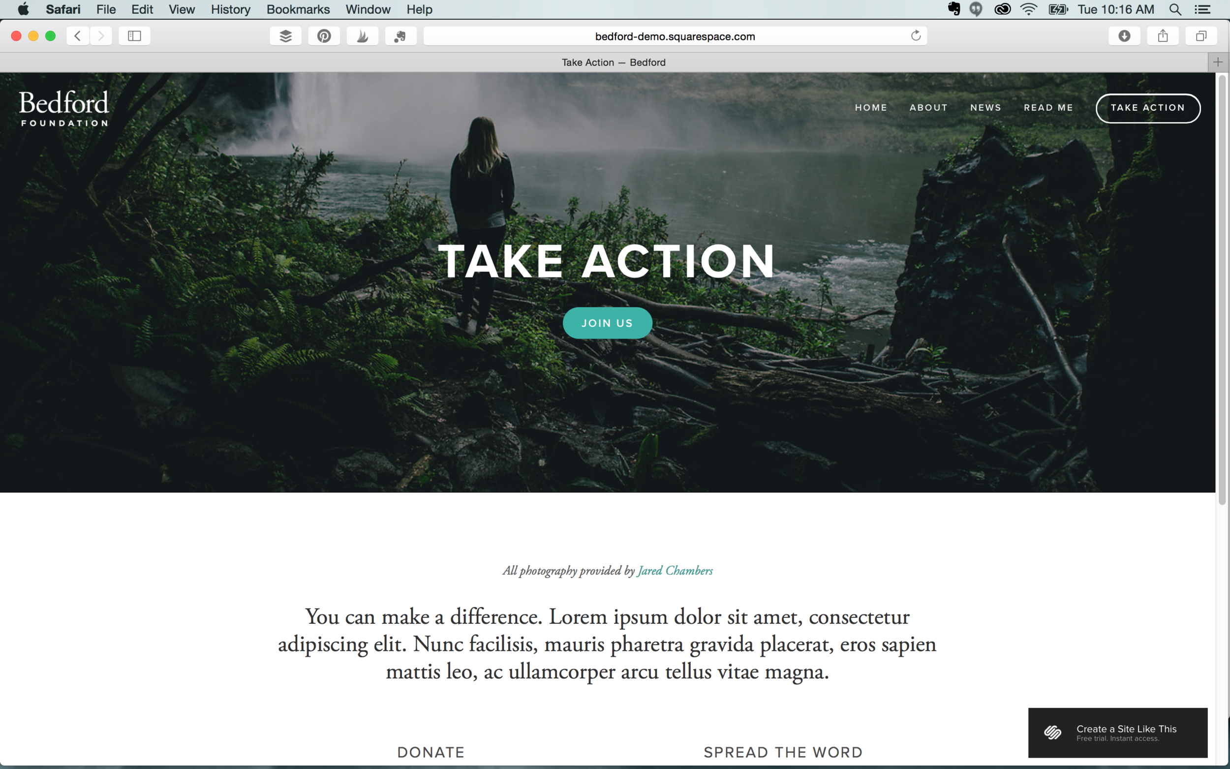
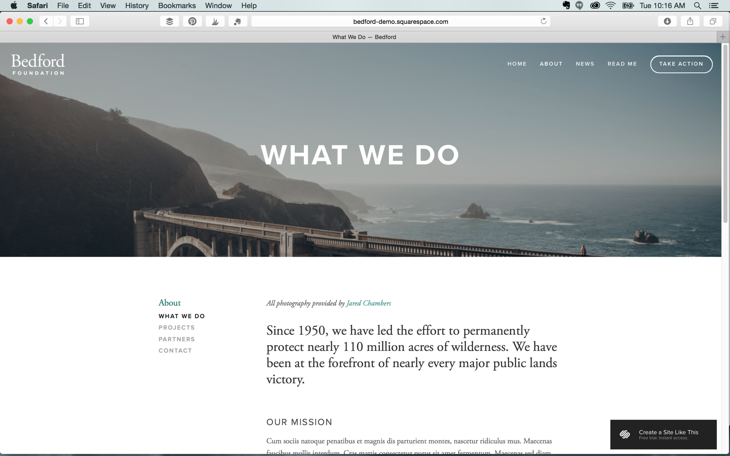
Bedford is the most popular template on Squarespace and it’s also the template HueAndToneCreative.com is built on. This beautiful and clean interface is ideal for just about any small business.  We also love that Bedford offers the option to have a second navigation in the footer.

Features: Index  |  Blog  |  Header image  |  Folder & footer navigation  |  Page titles  |  Grid & slide gallery  |  Cannot display social icons


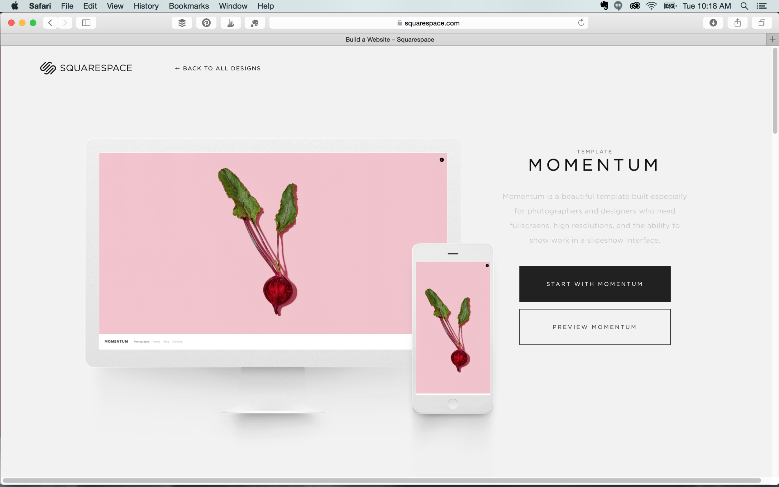
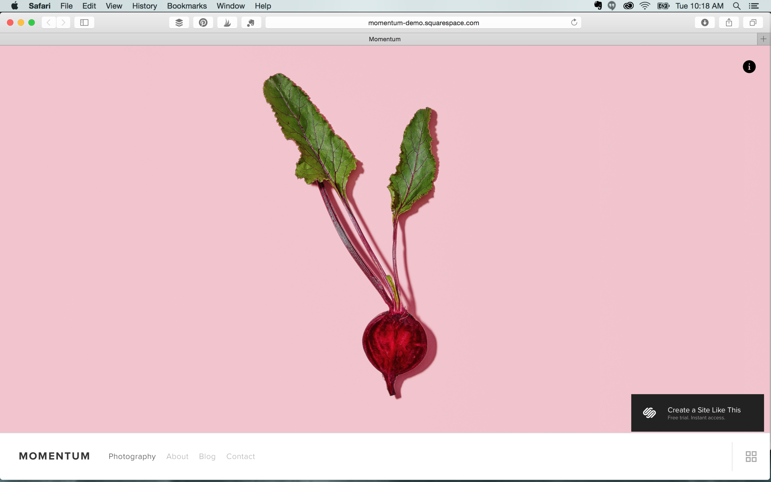
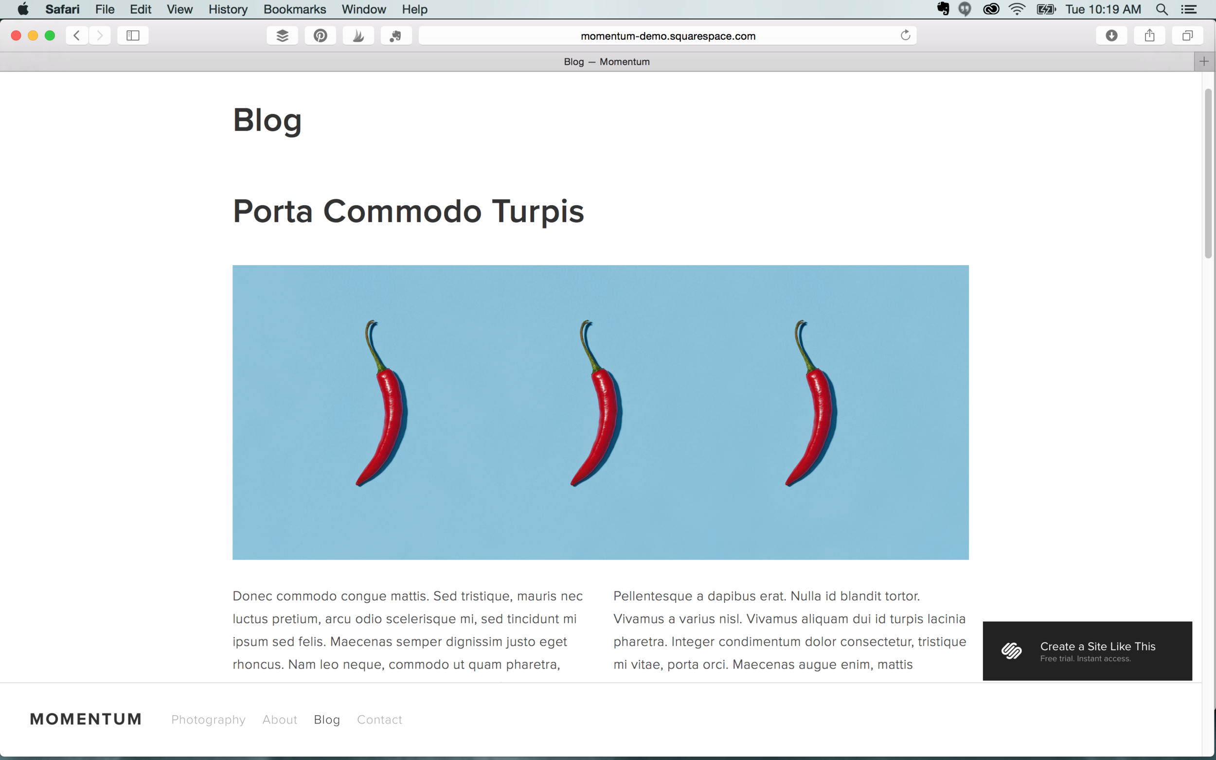
Momentum

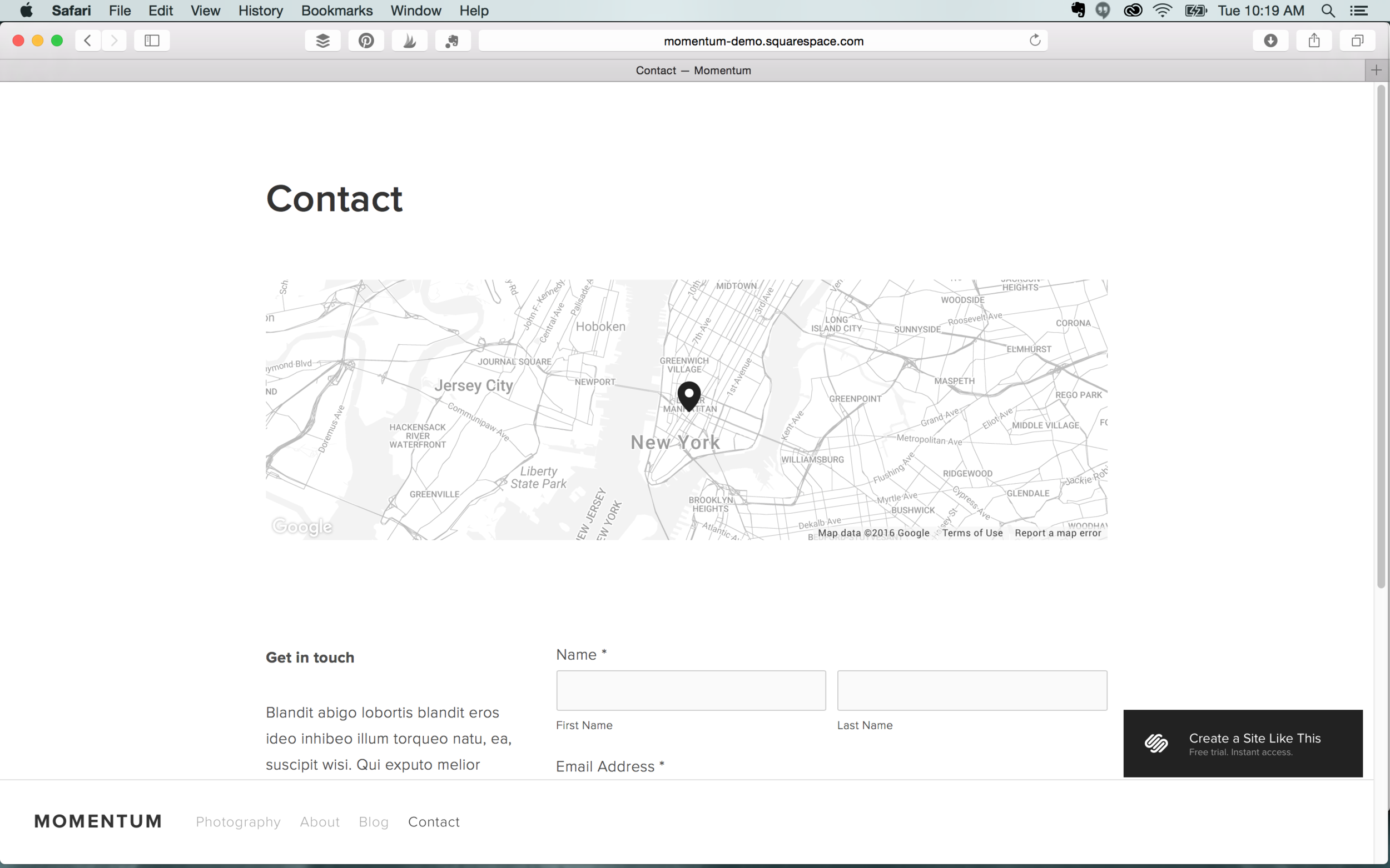
This clean template is perfect for designers and photographers to showcase high resolution images. If you’re looking to create a portfolio site, Momentum features a great slideshow interface and full screen images. This template’s aesthetic also works well to advertise products.
Features: Index/Gallery  |  Ability to display social icons  |  Page titles  |  Slide & grid gallery  |  No side bars  |  Page titles


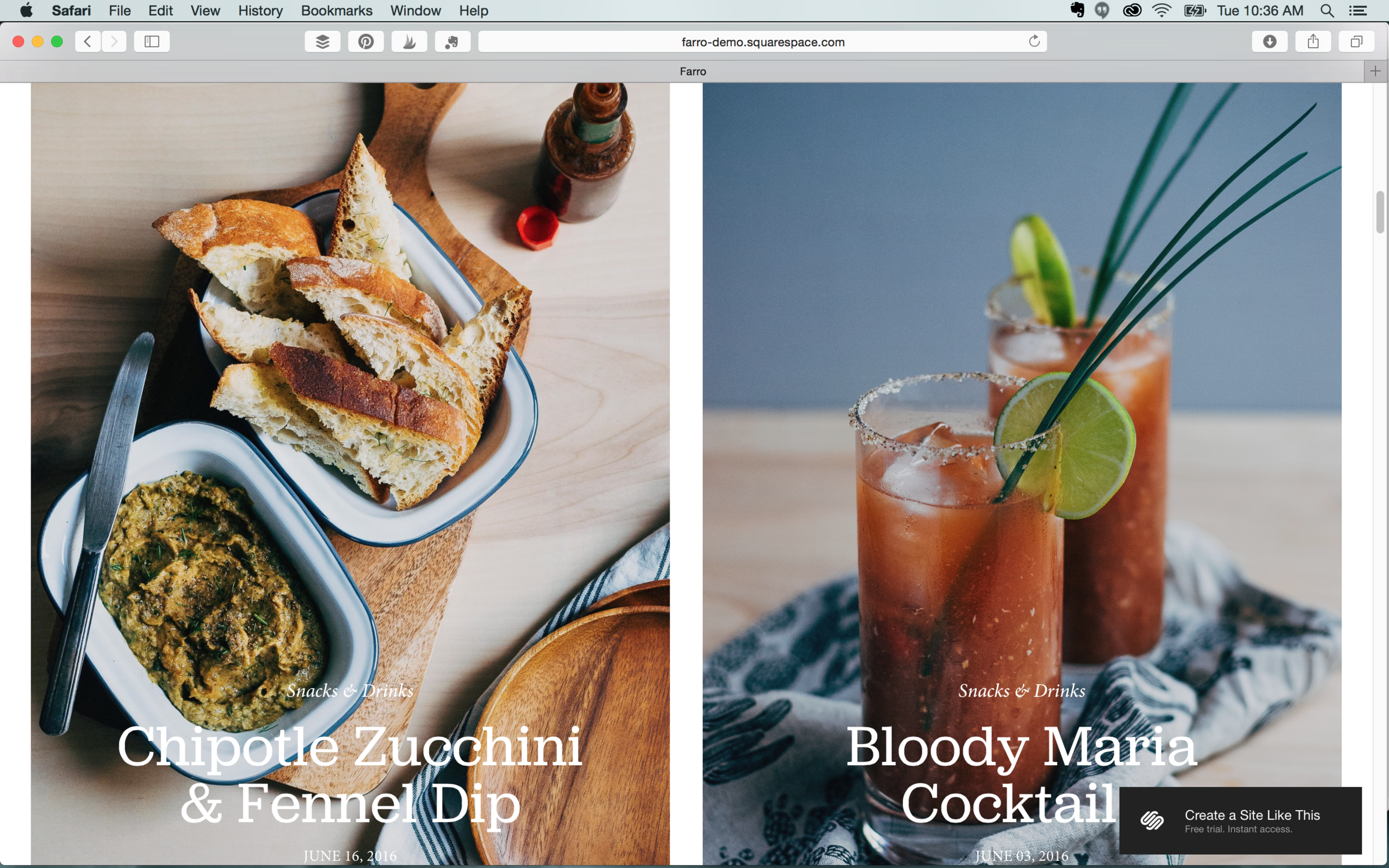
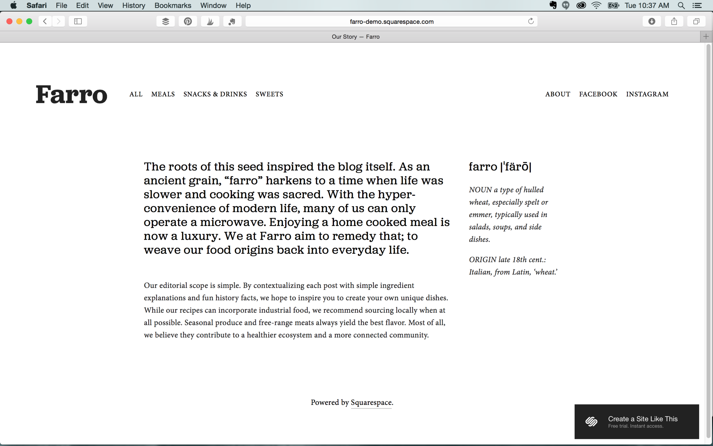
Farro

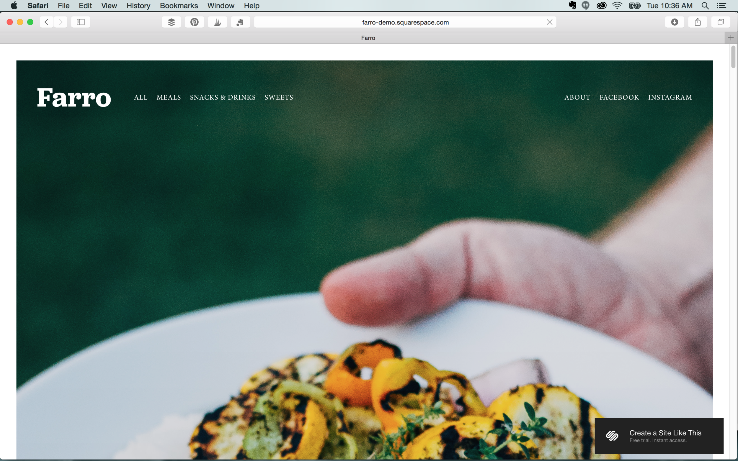
Farro’s sleek editorial style is a great choice for bloggers with strong images or digital publications. This post-like interface could also work well to display the portfolios of photographers.  

Features: Blog  |  Sidebar  |  Ability to display social icons  |  No page titles  |  Grid & slide gallery  |  Secondary navigation


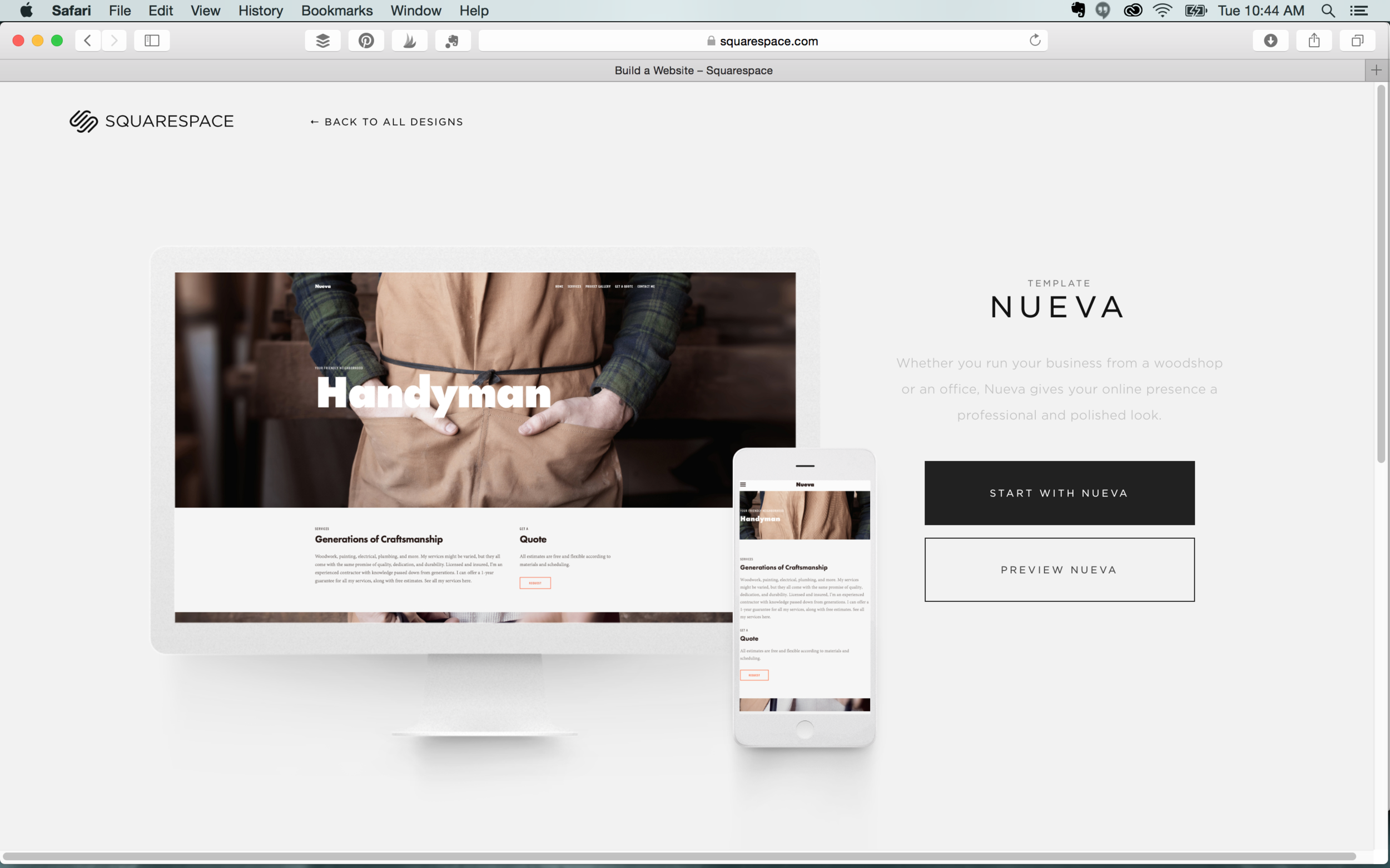
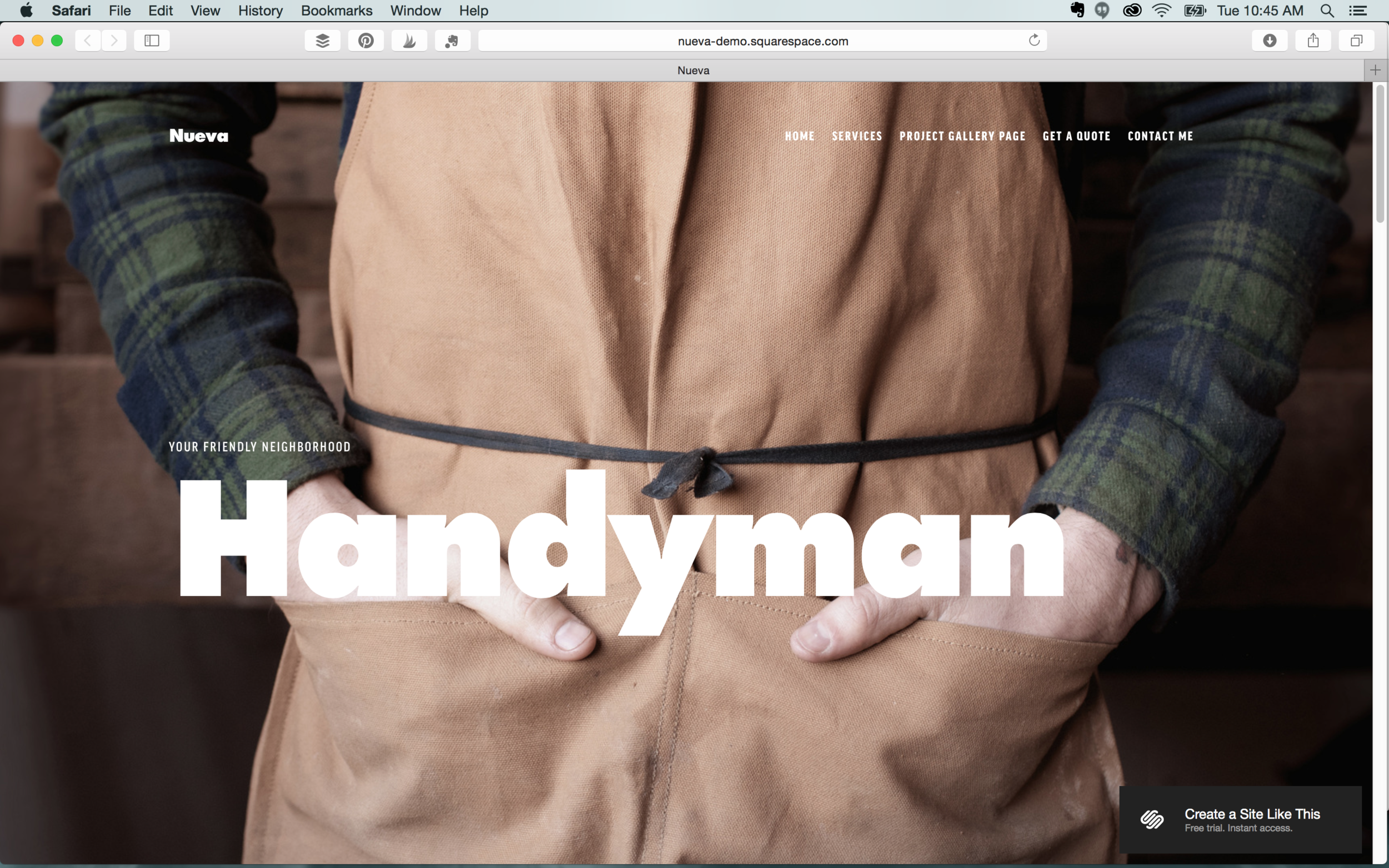
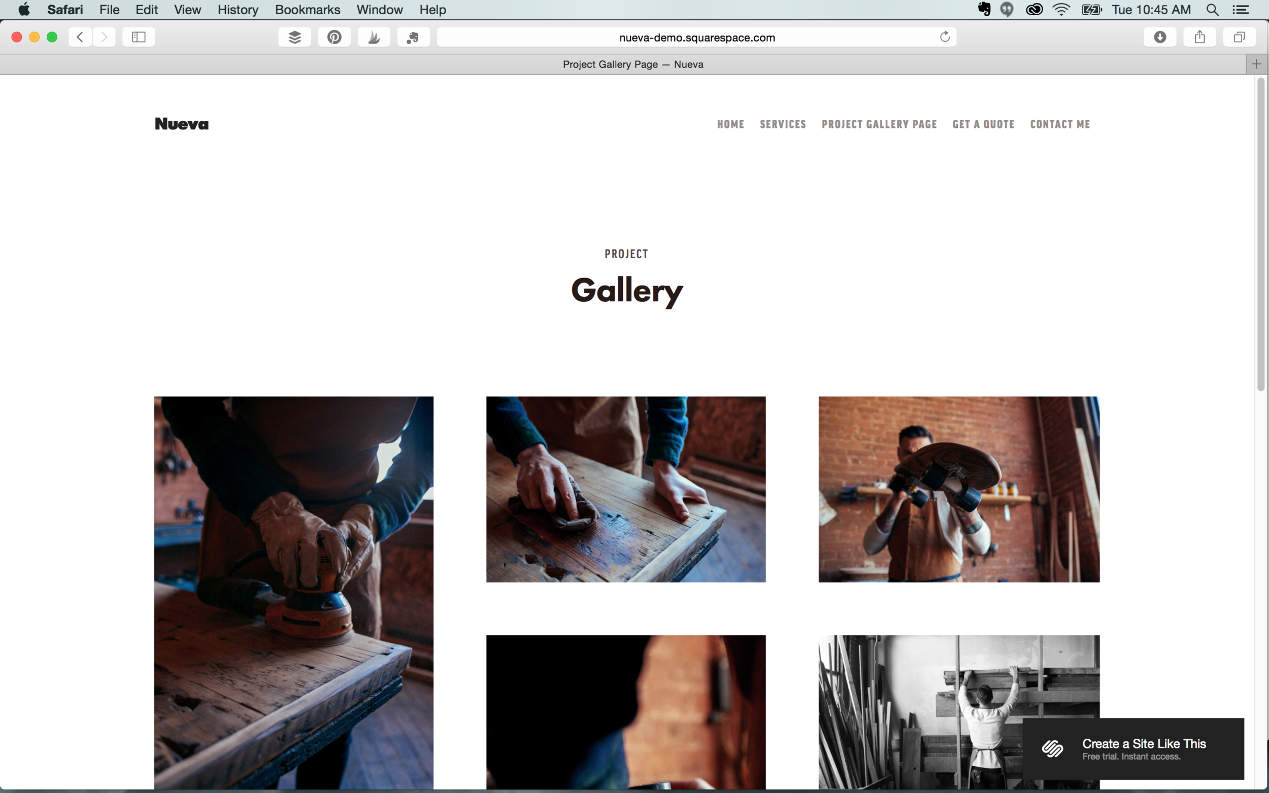
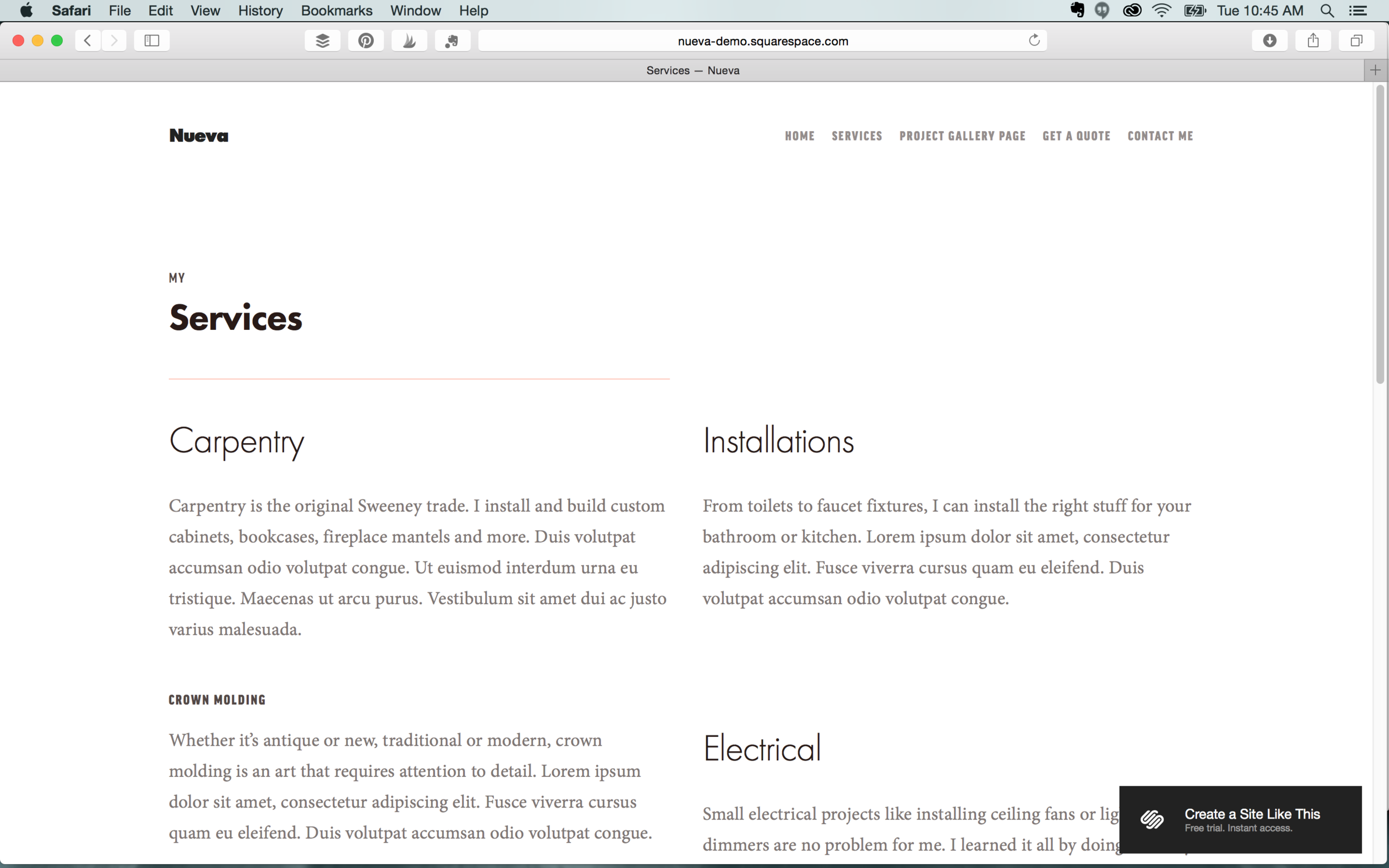
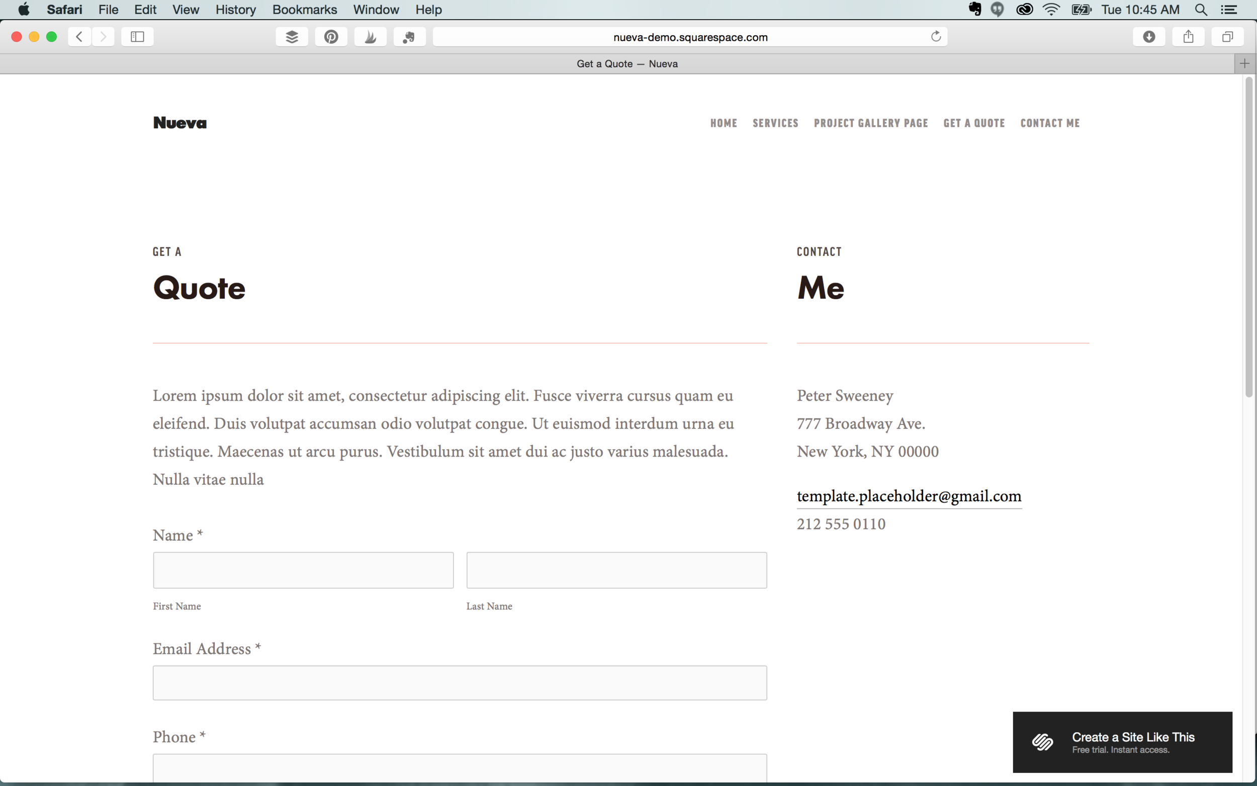
Nueva

We love the professional and polished style of Nueva. We recommend this for stores as well as restaurants. It’s not as image heavy as our other template picks, but it’s well organized and provides the option of a gallery.

Features: Commerce feature  |  Parallax scrolling  |  Multiple navigation  |  Customizable mobile styles  |  Blog
 

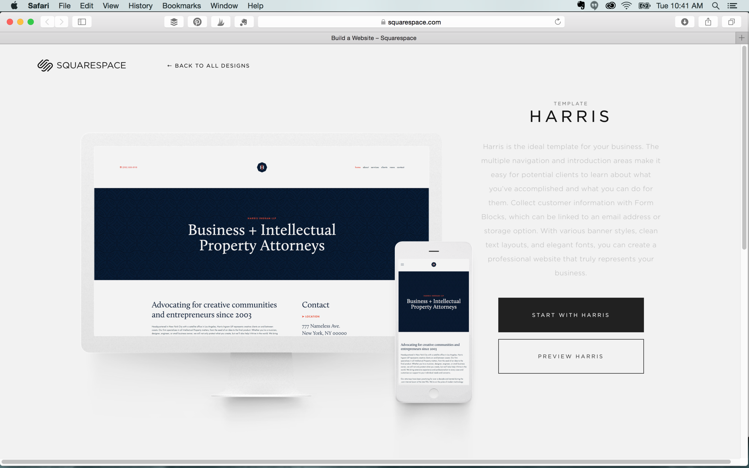
Harris

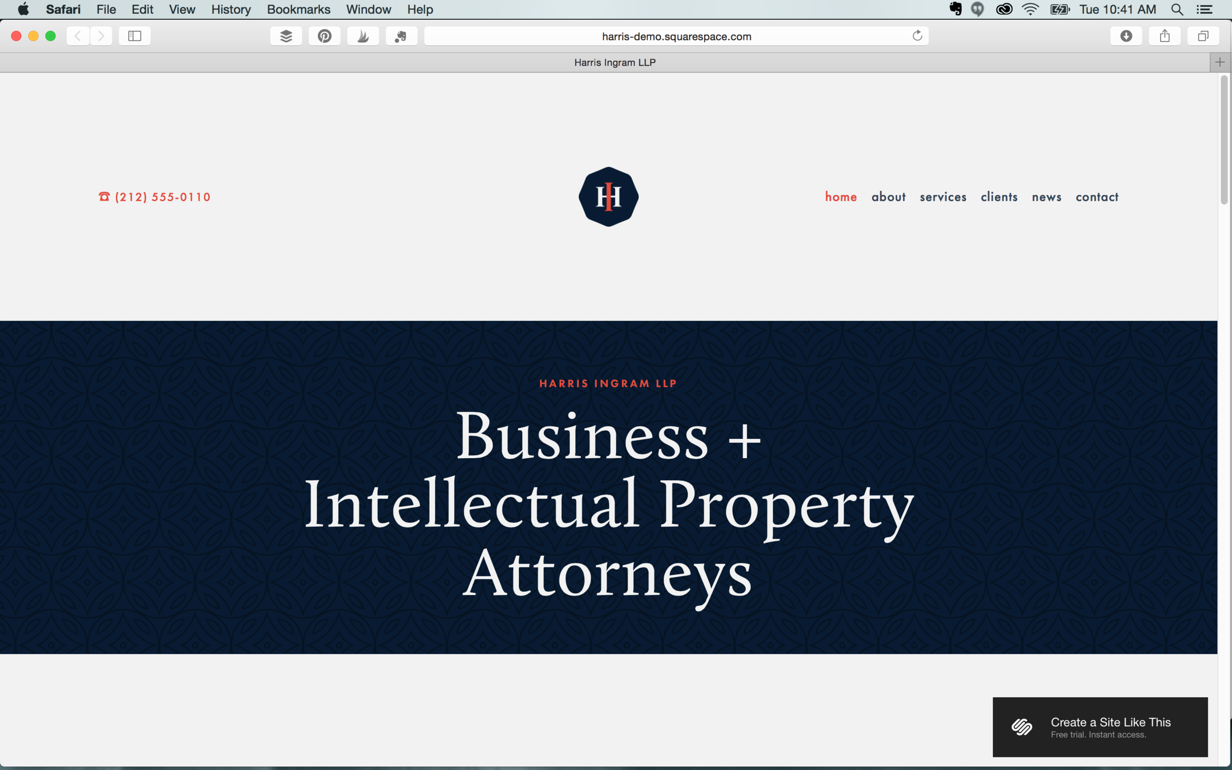
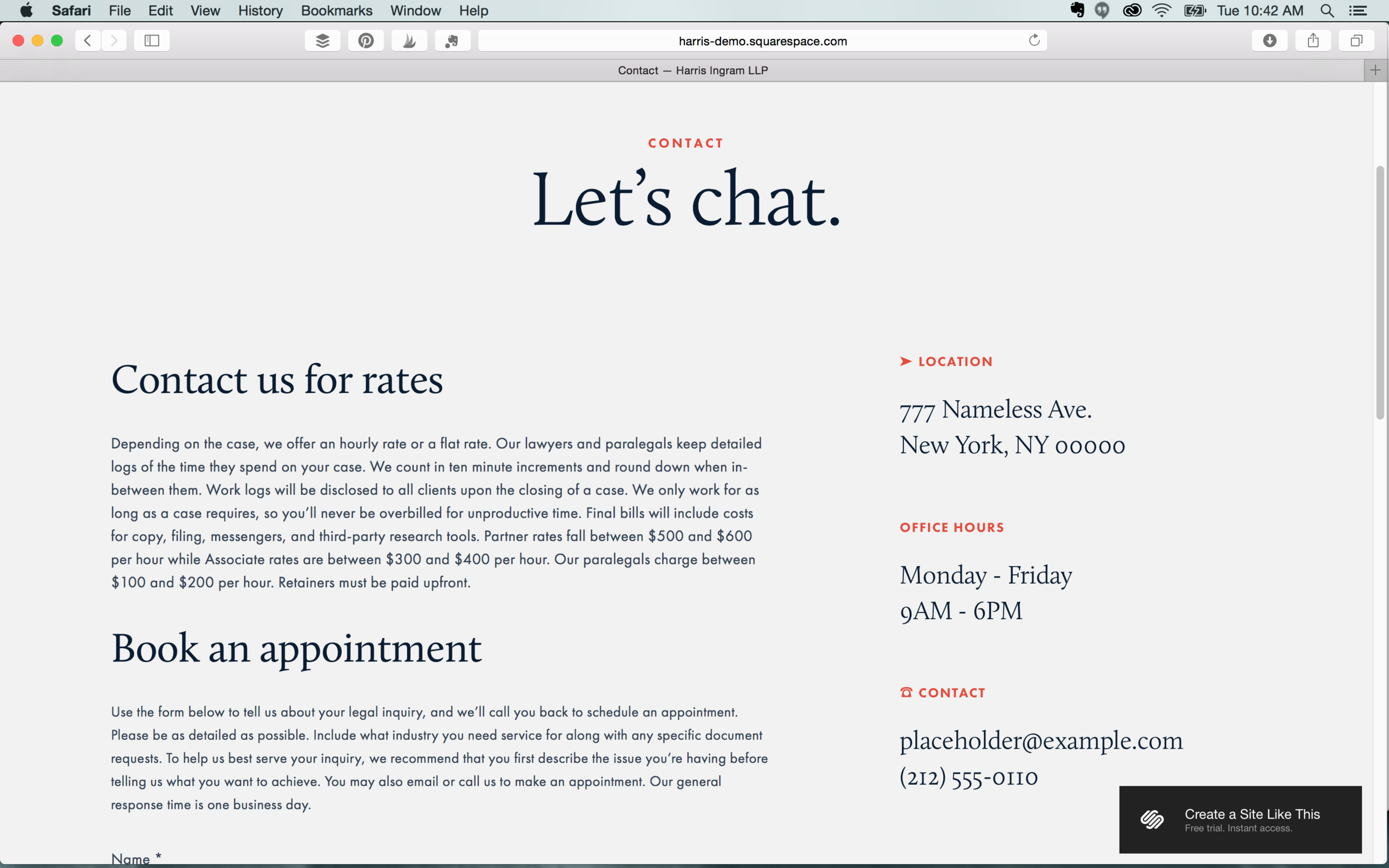
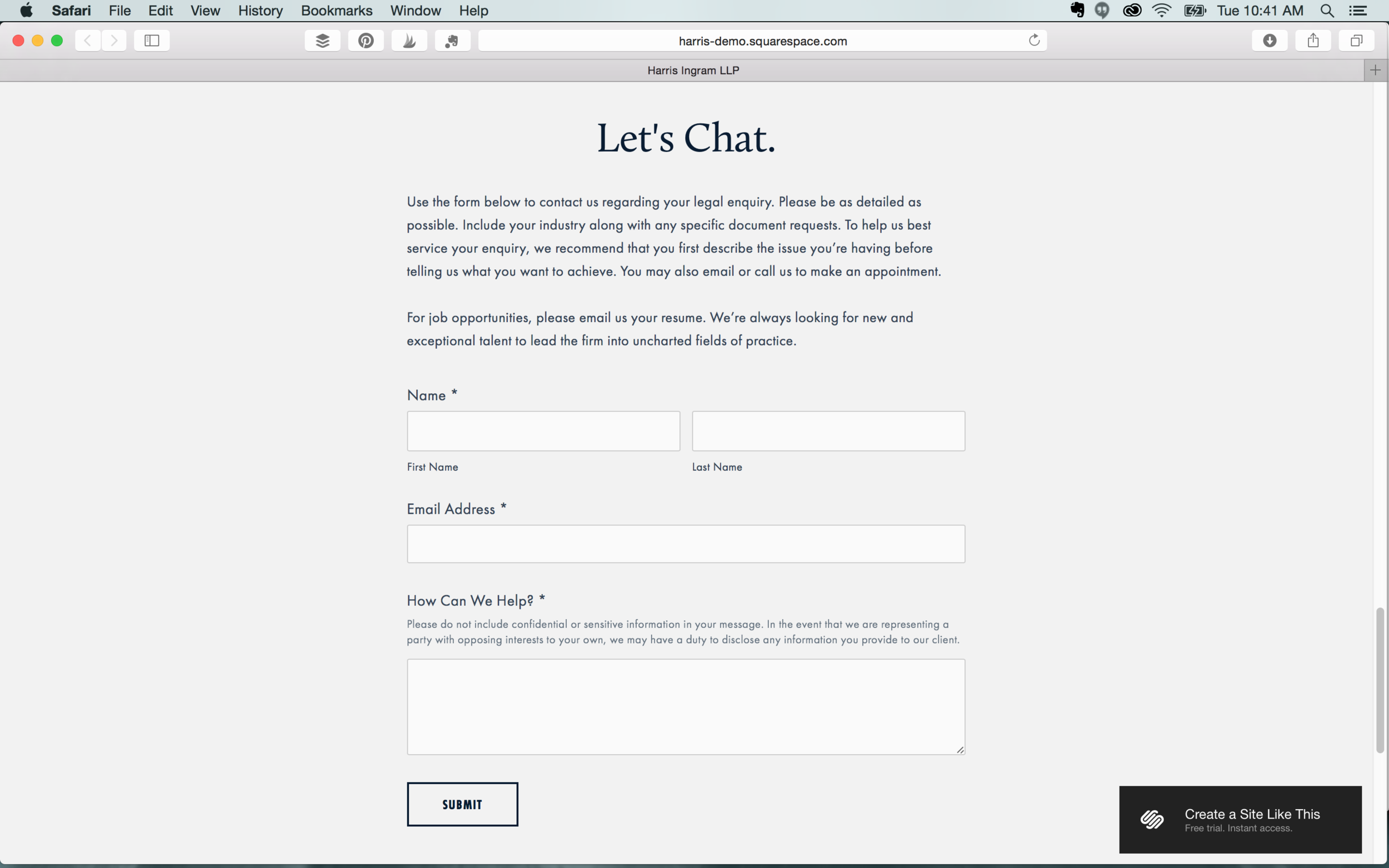
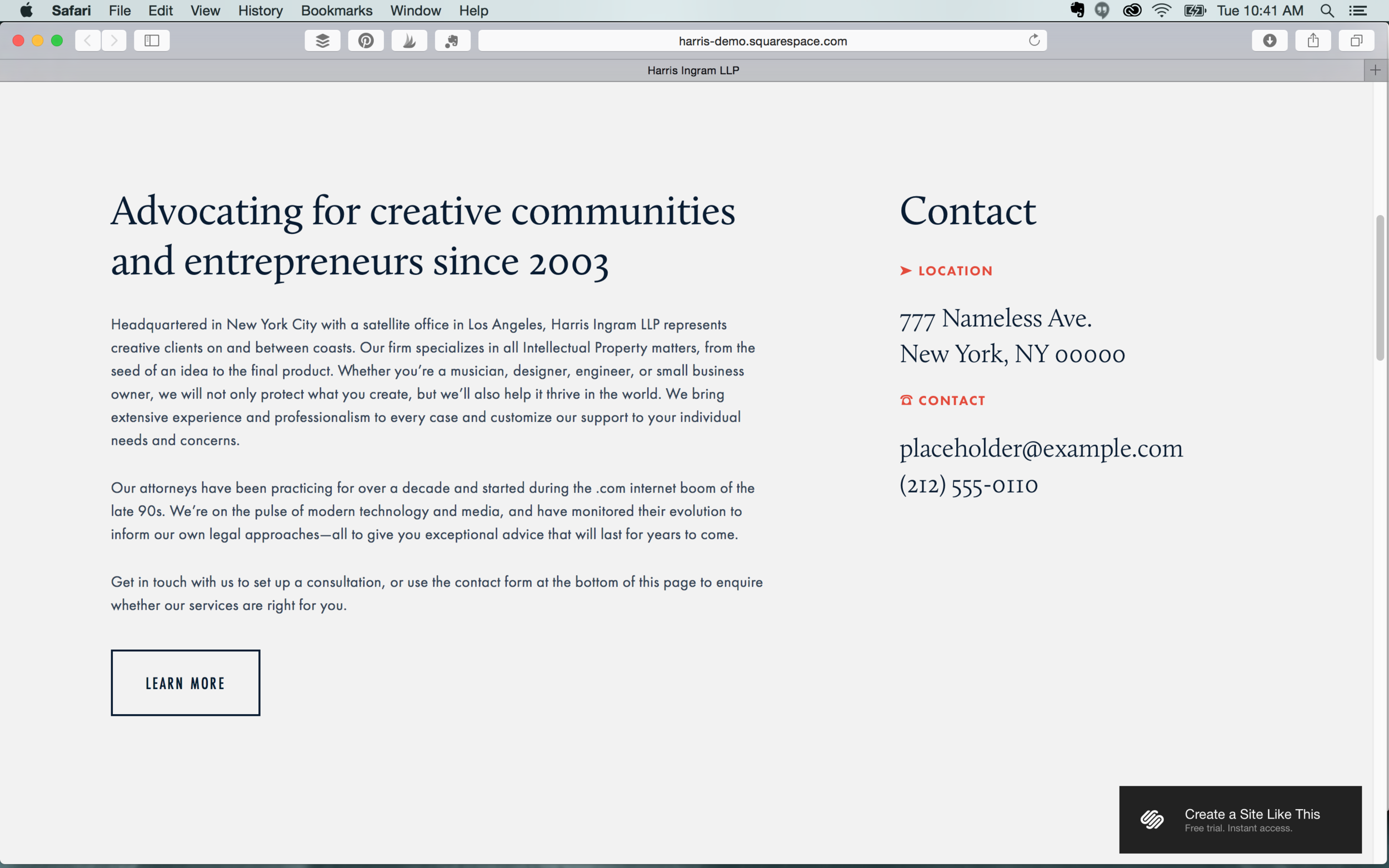
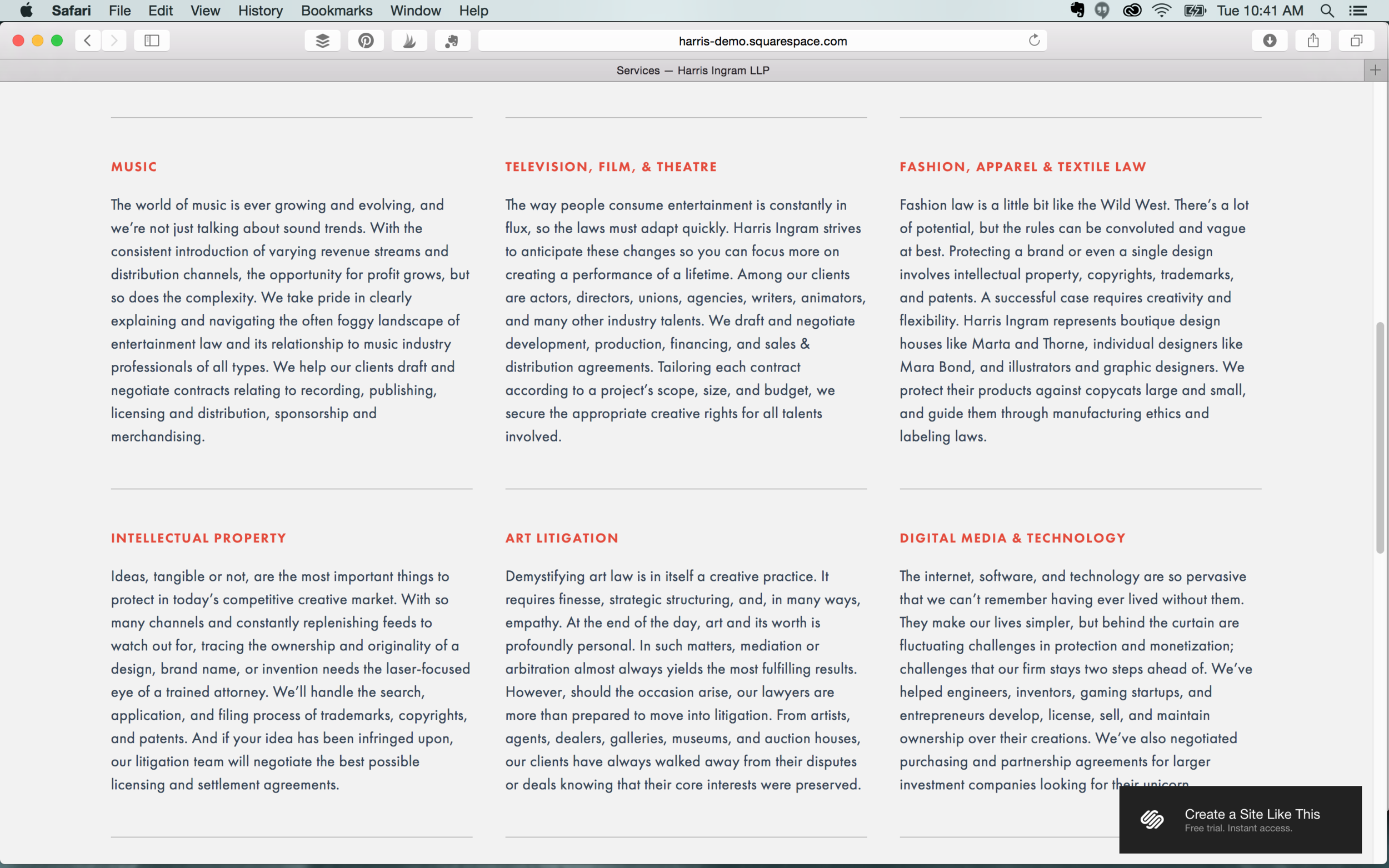
If your business doesn’t rely on pictures to promote your services, Harris is a great option. Its crisp layout, sophisticated font options, and banner styles makes this a great template for law offices, accounting firms, and writers. It also features Blocks to capture customer information as well as several introduction and navigation areas.

Features: Index page  |  Left, center, and right headers  |  Shopping cart  |  Main and secondary navigation


One last note

Even though we’ve made our recommendations, don’t be afraid to try the different templates Squarespace has to offer.  You can switch templates at any time – but *be warned* not all of your formatting will stick when you switch back. For example if you switch from the Bedford to the Nueva, and then back to the Bedford again, you’ll be starting with the original template settings. 

Had a great experience with Squarespace? Let us know in the comments! Feeling a little overwhelmed with Squarespace? We can help!