Posts in Hue & Tone
Client Spotlight: Rise & Shine, 20 years of making a difference

We know, we know -- we’ve highlighted Rise & Shine before… but when your clients just keep doing great work, it never gets old showing it off.

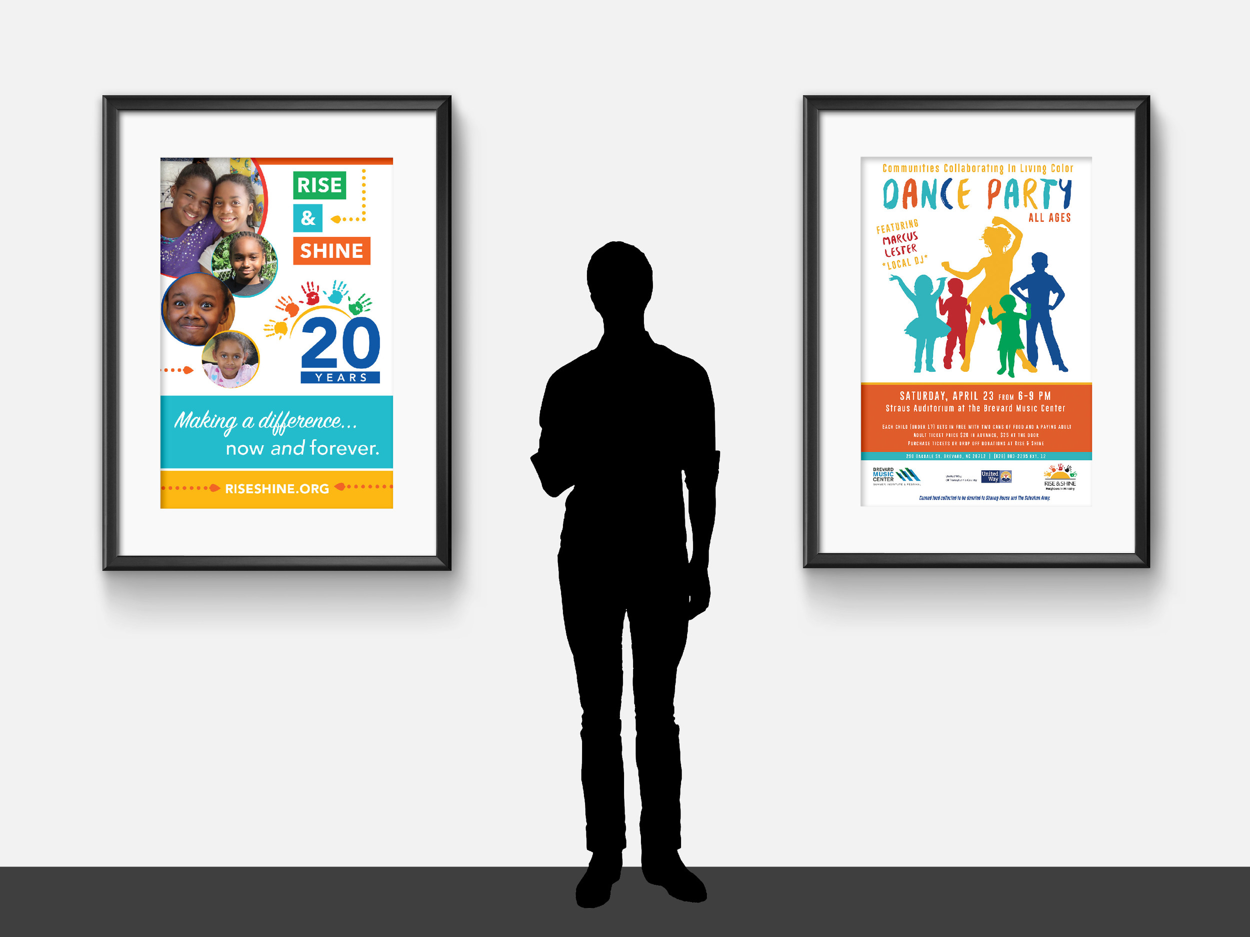
Throughout 2016, Rise & Shine has been hosting a series of events to celebrate and raise awareness for their organization. An afterschool program with a mission of promoting racial justice and equality, we loved being able to collaborate on collateral that's helping drive their mission forward.

All of our work for Rise & Shine features bright colors, eye-catching layouts, and vibrant photography of the program participants. We work to keep the focus on the facts and figures that demonstrate the program's efficacy, as well as highlight the organization's values. 

Take a look at the colorful collateral below!


Below, starting clockwise at top left: One-page infographic (front + back), homepage web slider, event program,  Facebook graphics, and bookmark.


Below, left: Booth signage
Below, right: Event poster for the "In Living Color" Dance Party


Below: Local Movie Theater Ad


Working with non-profits is a passion of ours, and we're always eager to dive into a new partnership. If your organization's marketing needs a boost, don't hesitate to reach out to us!

Friday Links: Mega Roundup

Happy first day of July!

We’re making a few changes to our blogging schedule, so for our last Friday Links we’ve rounded up a mega-list of some of the best resources we’ve shared over the last few months. From now on, we’ll be posting a long-format entry every Wednesday. With topics ranging from design and marketing to tips and tricks, each post will be an in-depth look at a different topic each week.

So, without further adieu, here’s our final Friday Links:


Design Links

One | 10 Commandments of graphic design  

Two | Introductory guide to choosing fonts

Three | How to utilize an inspiration board to design a consistent brand

Four | 15 Type Designers to keep an eye on

Five | An interview with Michael Bierut, Designer at Pentagram


Social Media Links

One | How to be social online (for the naturally unsocial)

Two | 10 Years of Twitter: Tweets that broke the Internet

Three |Essential LinkedIn Stats: When, how, and what to post

Four | 5 Habits of Successful Social Media Experts

Five | 9 Tips to create a cohesive, branded Instagram feed


Branding/ Marketing Links

One | The basics of marketing your blog or website

Two | Working with email marketing automation

Three | 12 Simple strategies the big brands use to leave a lasting impression

Four | Stand out on Pinterest as a small business

Five | More branding basics for small businesses


Miscellaneous Links

One | Website color schemes: The palettes of 50 visually impactful websites to inspire you

Two | The 6 best tools for creative work, according to science

Three | Free hand-lettering practice worksheets

Four | Why you should use Squarespace

Five | The best of Greensboro

We hope you’ve enjoyed this last Friday link post… but now it’s time to get excited for the future! We’ll be back on Wednesday with a list of SEO dos + don’ts that you don’t need a web developer to execute.

Going to miss our Friday Links series? No need to worry, we’ll be sharing more valuable resources than ever on our social media. Follow us here:

Get starting with social: Focus in on a platform

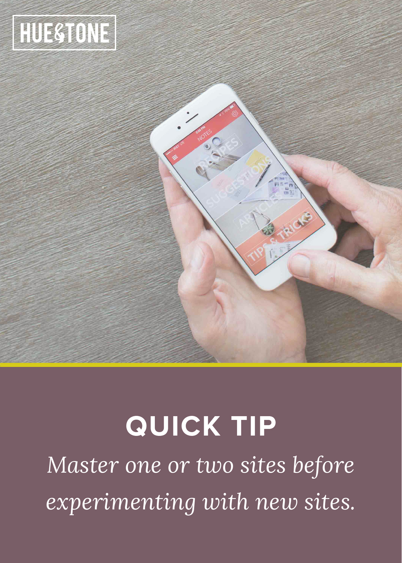
Social media can be an overwhelming thing to do well -- between Twitter, Instagram, Pinterest, LinkedIn, Snapchat, and niche sites (like Untappd or Houzz), it can be a lot to juggle. Managing multiple sites can turn into a full time job, so it’s important to pick and choose the sites that will work best for you.

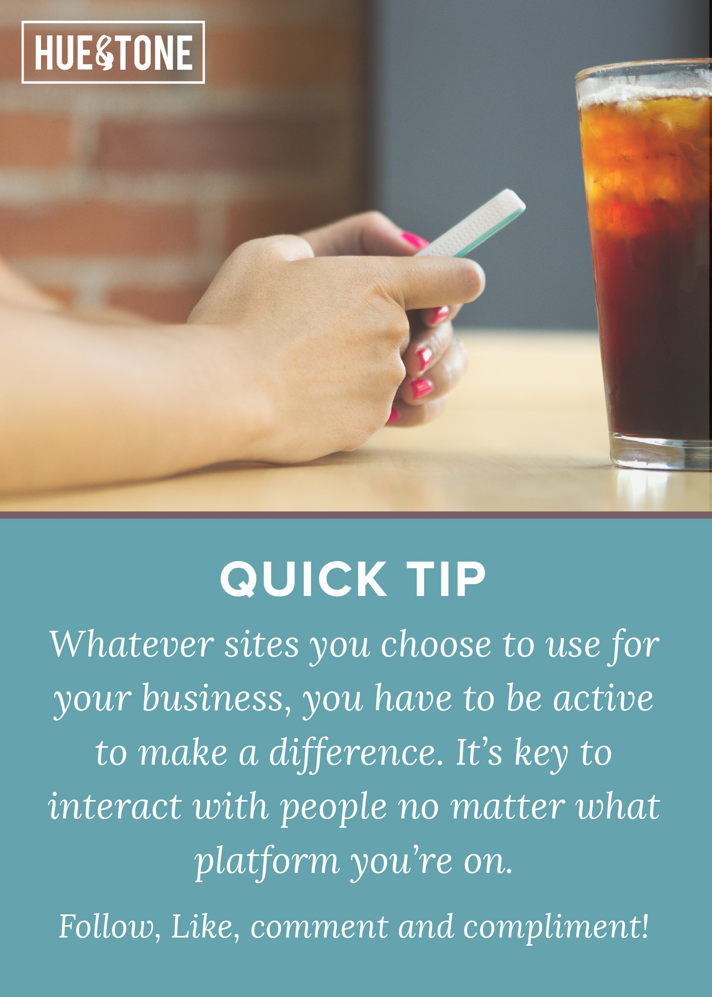
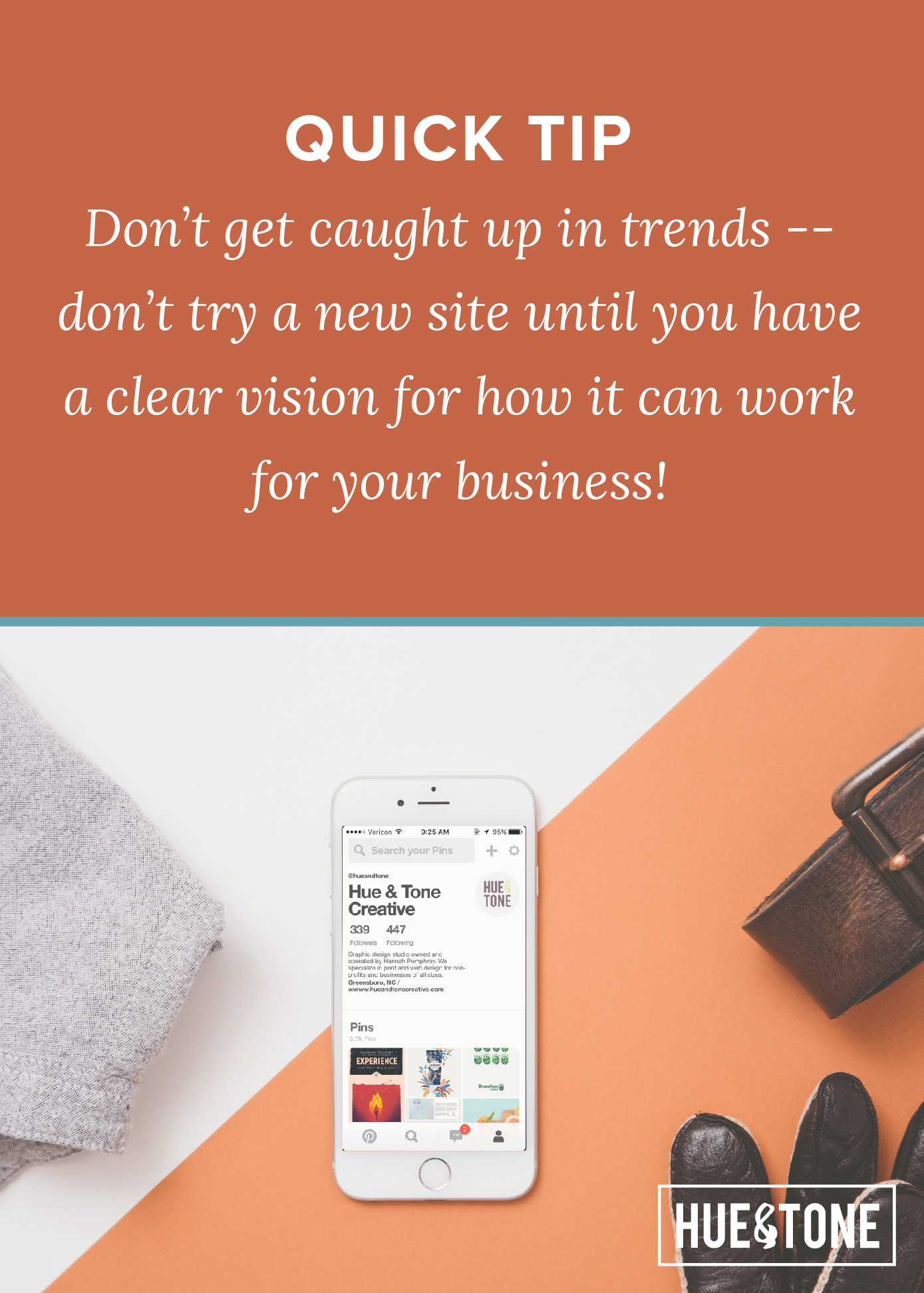
Always remember that the main goal of social media is to connect with potential customers -- and to do this you have to be strategic in the sites that you choose to use. While social media is an important part of almost any digital marketing plan, spreading yourself too thin by trying to manage every site available won’t get you anywhere. We recommend selecting two or three sites that will give you the best return on the time you invest.

Each platform has a unique identity based on the people who view it and how they are engaged. It’s important to know where different demographics spend their time online, what kind of content will catch their eye, and what platform will best showcase your products or services.

When thinking about your target demographic, you should ask yourself two things:

1- Who are your current clients?
2- And who do you want your clients to be?

Social media isn’t a quick fix to getting you the types of customers that you want -- but, done consistently and done well, social will develop into one of the most valuable tools in your marketing arsenal.

So, without further adieu let’s jump into some quick facts about each platform.


FACEBOOK: Let’s start with the most obvious site -- Facebook. With 1.44 billion monthly active users, Facebook is arguably the most well-known and widely used social site there is. Because of its wide reach and varied user base, Facebook is a must for business. 63% of people 50-64 and 56% of people 65+ use Facebook -- this makes it the best platform if you’re aiming to reach older people. The leading demographic of Facebook users are also college educated. And 74% and 72% of adults who make $50,000-$74,999 and $75k+ (respectively) use Facebook -- making it a good place to market luxury brands.

Post ideas: Announcing limited edition products or daily specials, sharing customer reviews, or the details about an upcoming events.


TWITTER: If you’re looking for the challenge of whittling your message down to 140 characters or less, then Twitter is for you. Twitter is best described as an ongoing conversation… kind of like texting back and forth with someone. Connecting with clients has never been easier. By retweeting, utilizing trending hashtags, and following others, you can quickly gain a lot of reach. Like most social sites, Twitter skews towards the younger crowd, with 37% of 18-29 using Twitter. Because of it’s fast paced nature, Twitter is great for quick feedback and breaking news. One of the best ways to gain some fast reach on Twitter is to hop onto a trending hashtag!

Post ideas: Your take on trending topics, polls, quick tips and tricks.


INSTAGRAM: Where are you? What are you doing now? Who are you with? Instagram is one of the best places to answer these questions for your potential customers. Perfect for behind-the-scenes updates, Instagram can help your customers get to know the “real” you. With the capability to upload snippets of video, an arsenal of filters, and handy editing tools, you can take a picture from blah to drool-worthy. If you take great photos and invest time in finding the right hashtags, you can make Instagram work for you. Instagram is one of the trendiest platforms right now, and is perfect if you’re looking to capture 18–29 year olds. With over 53% of 18-28 year olds using Instagram, it has overtaken Facebook and Twitter as the most popular site with younger audiences. It also has a predominately female user base.

Our top tip? Take the time to stage photos properly. For more on that go here and here.

Post ideas: Feature customer reviews, behind-the-scenes shots of your office, or show off a collection of your products.


PINTEREST:  A mecca for designers, interior decorators, and brides-to-be, Pinterest is the place for all things girly. On a site built for browsing, you have to be able to catch a potential customer's eye -- this means carefully curating the look of each board, and keeping your boards organized by category (such as food, travel, design, etc) so that people can follow just the board they're interested in. Pinterest has a predominantly female audience with 42% of online women pinning on the regular. These women also tend to have more disposable income -- make it a good place to sell expensive products or optional services.

Post ideas: Organize boards focused around your products, or inspiration that relates to the services you sell.


SNAPCHAT: With 79% of its users under the age of 25, Snapchat is definitely a younger man’s game. Use Snapchat to share real-life action -- it allows your clients to see exactly what you’re doing, and if you are selling products it’s perfect for taking your audience behind-the-scenes. We don’t know alot about the average Snapchat user -- but we do know that 71% of everyone who uses the platform is under 25, and around 70% are female. With the exception of business like boutiques, Snapchat probably isn’t the best platform for a small business to utilize.

Post ideas: Employee takeovers, behind the scenes, and day-to-day life.


PERISCOPE: Periscope is a video streaming app that allows real time interaction with your followers. By “going live” with Periscope you stream and connect with your followers at any time, from any location. The best part about Periscope is that it integrates with Twitter -- allowing you to utilize your existing audience and reach a larger audience.

Post ideas: live Q & A, tutorial on how to use a new product, or live event updates.  


LINKEDIN: LinkedIn is like a virtual resume -- it’s all about making connections with other professionals. You can upload your resume, link to your portfolio website, share your professional insight, apply to jobs, and connect with employers all in one place. LinkedIn is great for people who need to market business-to-business or business owners who are looking to use their personal profile to make direct connections with potential customers. Specifically, LinkedIn Pulse is a great place to stay in the know about industry information, and show off your own expertise. A news feed within LinkedIn, Pulse is designed for members to share self-published content. You can also follow major brands or industry leaders!

Post ideas: Business insights, new job postings, and industry updates.


Each network has it’s own benefits and drawbacks, and there are tons of sites we weren’t even able to cover! The key to success is picking 2-3 sites that work well with your services/products, sticking with them, and posting regularly. Seeing a return on social media can take months of diligence -- but in a digital world, it’s an inevitable investment.

Thinking social media still might be a little much for you to handle? Need full time help? Give us a call at 336-365-8559 and we can set you up with all the help you need to get your social media up and running smoothly!

Meet Camille (Hue & Tone's Newest Intern)

Hi all,

I’m Camille Nesi -- Hue & Tone’s newest intern!

I am currently a senior at the University of North Carolina at Greensboro working to receive my degree in Communication Studies, and plan to *fingers crossed* graduate this December.  I started blogging for Hue & Tone almost a month ago, and have loved every minute of it! (Check out one of my favorite Friday Links posts here). What I love about Hue & Tone is that it’s a small business -- I get to gain hands on experience and feel like what I’m doing really affects the bottom line!

Some fun facts about myself:

·      I know Greensboro like the back of my hand—I was born and raised here!

·      My day doesn’t start until my coffee does.

·      My favorite thing to learn more about is creating eye-catching graphics!

·      When I’m not blogging, or in school I’m a “barretender” at Pure Barre Greensboro.

·      Reality TV is my guilty pleasure (Any Real Housewives series or Dance Moms).

·      Tacos are my weakness, (Crafted The Art of the Taco)

·      My favorite place to study and work done is Green Joes Coffee Shop.

·      Favorite quote: “If your dreams don’t scare you they’re not big enough.”

·      If I didn’t have anything to do all day, I would spend it on Pinterest.

·      I’m striving to be the next #girlboss (if you haven’t checked out Sophia Amoruso’s book you can pick up a copy from Amazon here).

Let’s be friends! Find me on social media: Instagram, Pinterest, LinkedIn

Create a smoother working relationship: 8 tips for working with a designer

Bringing a brand to life is no small task, and a bad working relationship can steer a project off-the-rails before it even gains momentum. As designers, we know that understanding a client's business and personal taste is key to being able to properly brand a business. In order to appeal to potential customers, we need to have all the right information to create effective logos, websites, promotional materials, and social media posts.

If you’re nervous about working with a designer for the first time, or you feel like you aren’t on the same page about a certain project, these 8 tips will hopefully get you back on the track to a stellar end result:

  1. Make sure you’ve found the right fit. Don’t hesitate to reach out to a few different designers -- grab coffee with them and make sure you find someone that’s easy to talk to, is willing to listen, and understands your business goals.

  2. Explain in your own words. Communication is key -- don’t hold back from expressing yourself just because you don’t know what the technical term for something is. Your opinion is crucial to creating a quality final product -- and one skill no graphic designer has is mind reading.

  3. Provide examples. Bring pictures, prints, ideas, drawings, mood boards, color palettes and more to help your designer get a feel for what you want. Lacking inspiration? Hit up Pinterest.

  4. Be specific with your feedback. Ask questions, tell your designer how you feel, and explain what it is you like or dislike.

  5. Trust the process. The first draft is just the beginning. Do not get discouraged when it is not “perfect.” Your graphic designer is there to work with you through rounds of revisions to reach a finished product you love.

  6. Don’t be afraid to ask questions. If you’re ever unsure about why something was done, don’t hesitate to ask. Your designer wants you to have the best final product possible and is usually happy to explain their creative process.

  7. Think about it like a partnership. If a designer explains a technical reason for why they did something chances are you should listen. You hired a designer because you needed help -- acting like you’re the boss might land you with a less than effective final product.

  8. When you love a piece, say it! There’s nothing better than being acknowledged for your hard work and designers want to hear when they're on the right track. When you love the final result be sure to speak up so that they can get you more of what you love!


Have any additional tips? Encountered a particularly difficult situation you'd like advice on?  Share with us in the comments below!

A Year of Hue & Tone

On April 1, 2015, Hue & Tone Creative opened its doors. In a literal sense, we opened one door – to our office on the Revolution Mill campus in Greensboro, NC. Figuratively, it’s been a year of many more doors opening and closing for this business. New clients and partners have made their mark. Processes have been refined. In a personal and professional sense, it’s been a year of learning what works and what doesn’t. 

You only get one first year in business – and I want to celebrate all the successes and challenges that entails. So, with that in mind, here’s an overview of the last 365 days! 


Where We’ve Been

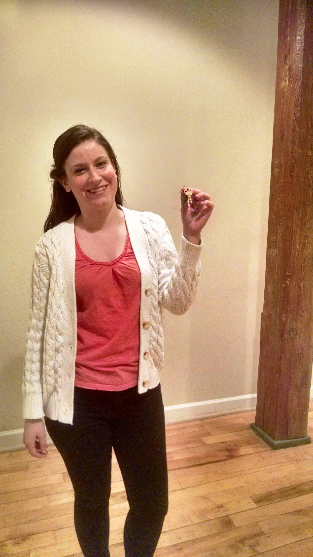
Getting the keys to our office!

Getting the keys to our office!

Hue & Tone got its start in early 2015 as the new, relocated home of Hannah Pomphrey Graphic Design. I’ve been a freelance graphic designer since I was about 19, and was coming off a 9-5 stint in marketing. I realized, though, that it was time to start up a bona fide business in my then-new home of Greensboro. Here’s how I described my freelance journey a year ago:

It wasn’t until my first client gave me a $100 “tip” that I realized I had just found my new side hustle. I set out with my VistaPrint business cards in hand to find myself some new clients. I cold-called and did pro-bono work for local nonprofits until I found enough momentum to begin working almost solely on referrals.

Recently, I took a break from freelancing full-time to try out a 9-5. I packed up my mismatched furniture and my massive shoe collection and relocated to Greensboro, NC with the intention of settling into my much more ‘normal’ 9-5 job.

Turns out this 9-5 thing isn’t for everyone. Even the parts of freelancing that I thought weren’t for me – the irregular income, quirky clients, and doing my own taxes – were some of the things I missed the most. While some might call irregular paychecks and lulls in work terrifying, it now seems like some much-needed work/life spice.   

A year in, I’d still describe it the same way. Owning your own business isn’t easy – it’s not even in the same universe as easy. But the ability to work for myself – to shape the business objectives of my organization, while still getting my hands messy with design – is rewarding and worthwhile in a way I have a tough time explaining. Given the decision to make again, I’d make the same one.


Growth as a Company

As I said above, Hue & Tone’s first year in business has been a year of refinement and learning what works. I’ve had the opportunity to work with fabulous clients, new and old, and have worked to improve processes both on the client side and internally.

On average, Hue & Tone typically works with 10 to 20 clients at a time, and the scope of work taken on varies by client. I’ve done print design, web design, videos, social media, and consulting for large corporations, small businesses, nonprofits, and individuals. Some clients seek assistance on a per-project basis, while others hire Hue & Tone on a monthly basis for ongoing projects.

Internally, I’ve worked toward greater cohesion and focus for Hue & Tone as a business. That’s meant asking tough questions about the type of work I do and the clients I seek out. (For example: do I primarily work with local clients, or web-based businesses?) It’s also meant diversifying our portfolio so multiple skills and competencies are being exercised through our current body of work. It’s never my goal to do only social media projects or only video projects or only (fill in the blank here). When possible, I love working with clients across a wide variety of their creative needs – simultaneously working on design, video, and social, for instance. There’s a lot of interplay between different types of creative and having a hand in multiple pieces of the puzzle can add some coherence and visual consistency.

Finally, the growth of the past year has meant I needed to continue defining and re-defining the way Hue & Tone itself is marketed. You may have noticed some changes on our website, and here on the blog as well. I’d love to hear your feedback as I continue to learn what works.


A Few Stand Out Projects

With year one in the books, I’d love to share a few favorites and highlights of the year. Every project was an opportunity to learn and grow, and I’m grateful for each one. Here are a few that stood out…

Comprehensive Branding for CSDHH | Website and branding for CSDHH, a nonprofit that provides communication services for the Deaf and Hard of Hearing. Notable for the opportunity to start from scratch and a desire, on the part of the client, to avoid the obvious. 

Revolution Mill Social Media | Design and daily management of Facebook, Twitter, and Instagram for Revolution Mill. From social graphics to #RevMillGSO, a chance to engage with a broad range of stakeholders (from future leaseholders to the community at large) about the live-work-create environment of Revolution Mill.

Pitch Video for Brown Investment Properties | An opportunity to create something rich, visually appealing, and (no pun intended) creative, while serving a strategic (and serious) purpose.


Favorite Blog Posts

Throughout the year, this blog has been a reliable place to share the ups and downs of Hue & Tone’s first year in business. Increasingly, it’s also become a place to share design inspiration and a few hints of the colors, textures, and patterns that fuel my imagination each day. Here are a few favorite posts from the year…

IMG_4726.jpeg
IMG_1234.JPG

One of my favorite aspects of being a local business owner is the opportunity to interact with the community. Here are a few of my favorite Greensboro events!

Coffee & Conversation | A Greensboro Chamber event with for networking and learning about a new, focused topic each time.

IdeaNetwork | Organized by Cochran Creative Group, IdeaNetwork is an opportunity to come together, hear a speaker, then participate in a group discussion on the ideas raised.

Craft Freedom | An initiative to change the North Carolina law that restricts the growth of breweries by placing a cap on the amount of beer they can self-distribute, and a chance to support small businesses’ rights.


Thank You!

When all is said and done, the past year has been a big one – a wild one – a just-plain-irreplaceable one. It’s involved a lot of hard work, both of the creative variety and the messy, hauling-furniture-into-offices variety. None of it would have been possible without the support and partnership of many, so a few thank-yous are in order!

To Hue & Tone’s clients, thank you for your partnership, and for allowing Hue & Tone to help tell your story. It’s an honor every time!

To the community of Greensboro-based designers I’ve met, your advice has been invaluable.

To Sirtuah, and to my family, thank you for your patience and support through the crazy journey of the last year.

To the Greensboro community as a whole, thank you for welcoming me, welcoming Hue & Tone as a business and being a wonderful place to call home.

With all that said…that’s a wrap on Hue & Tone’s first year. It hasn’t been perfect, and I wouldn’t change a thing. Here’s to year two!

Freebie: Desk scene coloring page

We use the blog as a place to experiment. A place to try new things and different styles. Last month we tested the waters with a custom coloring page and now we're giving it a second go. 

This page features a hero-style office supplies image. We may be the only one obsessed with art and office supplies, so if that's the case, excuse us while we have our fun! 

Download our latest coloring page here

Link Roundup: The best of the links

To round out this week, we’re rounding up the best of the links we’ve shared over the last few months. These are just all around, generally good resources that we couldn’t help but share a second time!

One  |  Good, free fonts can be hard to find. This list of 60 free minimalist fonts highlights a handful of unique + clean + modern finds -- ones that you won’t see on more basic free font lists. 

Two  |   Typewolf is one of the best sources for everything typography + fonts. With carefully curated lists and resources, you’ll find everything from unique ‘top 10’ lists to font profiles (complete with mixing & match suggestions).

Three  |  No matter what your goals, these eight inspirational TED Talks are a must watch.

Four  |  This is a great roundup on apps to boost your productivity as a freelancer. We'll definitely be trying a few of these.

Five  |  Death to the Stock Photo is one of the first sources people mention for cheap + not-tacky + actually useful stock photos. We see it mentioned constantly, and have even highlighted it a couples of times ourself -- but Death to Stock has come in handy so many times this week that we want to give them another shout out.

Six  |  The Hue & Tone website runs on Squarespace, and I'm a huge fan. Here's a good summary of the reasons why.

Seven  |   It’s easy to fall into a rut and start using the same colors -- so when you need a little inspiration check out these 50 creative color schemes.

Which of the links we’ve shared over the past few months have you found the most helpful?

*See all of our link roundups here, or check out our personal favorite -- our Greensboro link roundup -- here.*

Friday Links: Greensboro Favorites

For a twist on our usual Friday Links we’ve compiled a list of our favorite Greensboro things! We’ve been in Greensboro a little over a year, and while we still have a mile long list of things to try out, we definitely have some favorites -- here’s a quick list of everything we’ve been loving!
 

Favorite Spot: Our office at Revolution Mill!
Haven’t seen our space yet? Drop in and see us! You’ll get why we love hanging out in our office.

Favorite Restaurant: Boba House
We recommend the springs rolls and Hawaiian stir fry,  but everything we’ve sampled at this healthy and compassionate eatery has been vegan heaven.

Favorite Brewery: Red Oak 
We might be a little bias because they’re a client, but you can’t beat the clean, unfiltered taste of a Red Oak beer!

Favorite Coffee: Green Bean
A GSO staple, the Green Bean regularly makes lists “best coffee shops” and “must go to” lists. We love them for their amazing baked goods, vegan cream cheese, and close proximity to the office!  

Favorite Local Non-profit: CSDHH
There’s so many great local non-profits to pick from, but after working with CSDHH, we were blown away by their commitment to empower and inspire change for the deaf community.
 

What did we miss? Where do we need to try? Leave us a comment and let us know!


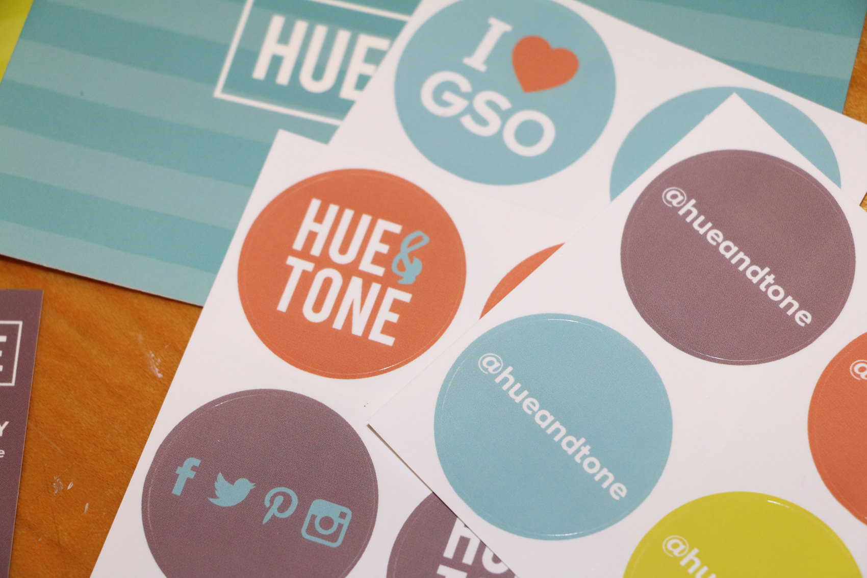
( Love Greensboro? Drop us a line and we’ll send you some I <3 GSO stickers! )


Client Spotlight: Little Toro Designs

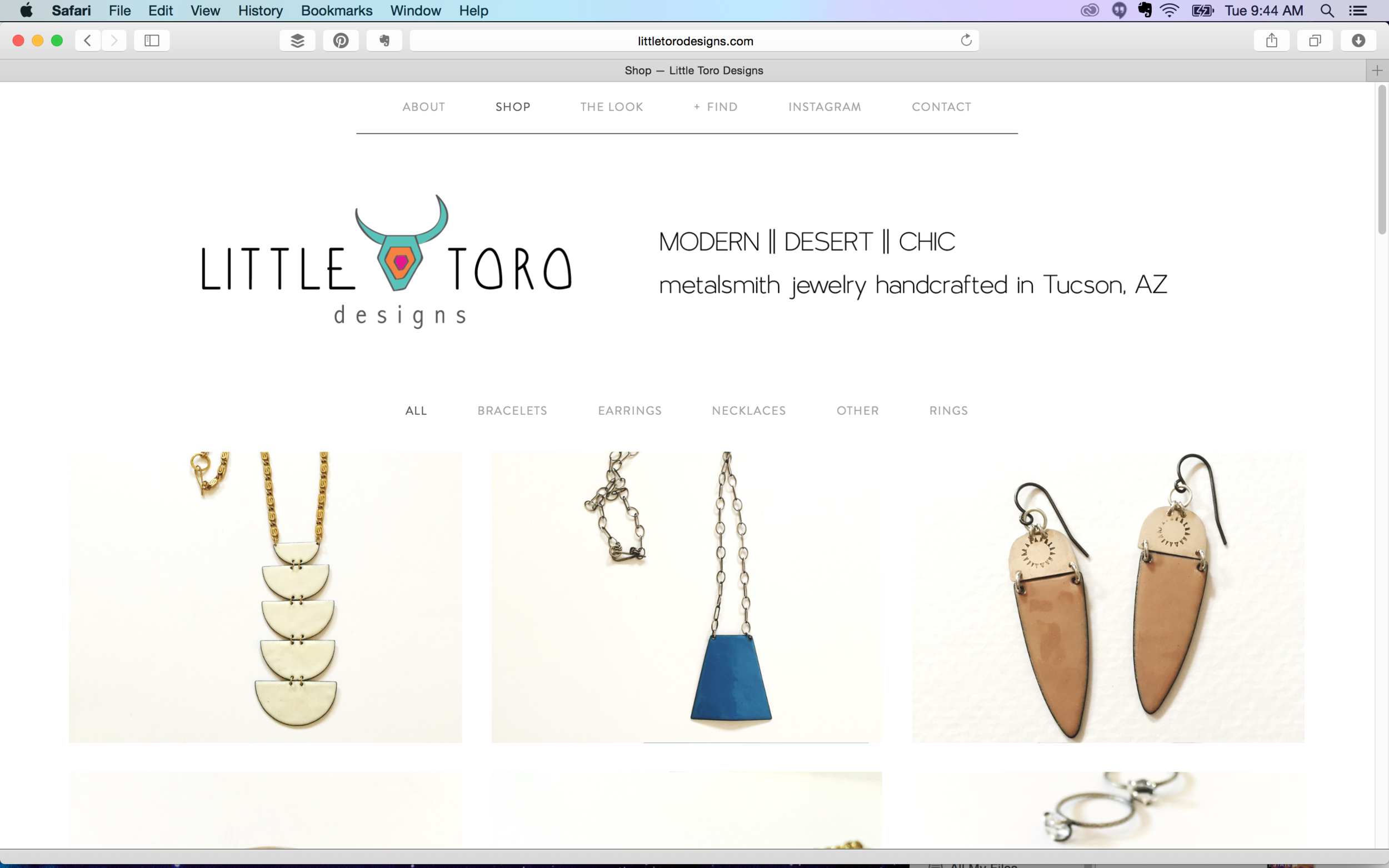
When we were approached by Tawney Weir, the creative force behind Little Toro Designs, we were immediately inspired by her southwestern flair. This owner + maker + designer was looking for a place to not only showcase her product, but also Little Toro's modern desert aesthetic. 

As a business owner, there's nothing better than working with someone who is equally passionate about their craft. After our first short conversation, it was clear that Tawney's work was both inspired and sustained by the unique blend of cultures around her. 

Click the image to see the site live!

Click the image to see the site live!

Who Little Toro Is: Metalsmith jewelry handcrafted in Tucson, AZ. Inspired by the nature and culture of the southwestern desert.  

What They Needed: A clean + modern website that embodies Little Toro's desert chic style without distracting from the product. 

What We Delivered: A customized Squarespace site with e-commerce capabilities. By highlighting Little Toro's beautiful editorial photography (by Puspa Lohmeyer Photography) we were able to not only keep the product front and center, but also capture the essence of the brand.

The takeaway? When inspired editorial photography meets clean web design, e-commerce magic happens. 

If you feel like your website could use a refresh, get in touch -- we'd love to do a free assessment of your current website!

A quick break from the blog...

As we head into the holidays, we'll be blocking out some time in our schedule to work on Hue & Tone as a business.

We're taking a blogging break! -- Hue & Tone Creative

That means the website will be down temporarily as we work on some improvements -- which also means we'll be taking a short break from the blog! 

The site will come down on Friday, December 11. If you need us while it's down, don't hesitate to reach out via phone or email: 

hannah@hueandtonecreative.com

336-365-8559

Don't forget to grab your holiday resources before the site goes down! We're wishing you all the very best holiday season, and can't wait to be back for a new year on the blog.

Friday Links: Your passion project and working in the arts

Hope you all had a great Thanksgiving! Here's our weekly roundup of links we're loving.

Friday Links: Your passion project and working in the arts -- Hue & Tone Creative

One | A good thing to work on if you've got holiday downtime: tips on making a media kit that'll impress your clients.

Two | Why everyone needs a passion project, even if you've got a 9 to 5.

Three | Something encouraging and sparking with a little creative magic: Amanda Palmer on working in the arts. "When you're an artist, nobody ever tells you or hits you with the magic wand of legitimacy. You have to hit your own head with your own handmade wand." 

Four | What makes a good designer -- the illustrated version.

Five | This could be a fun project (also useful if holiday downtime exists in your world) -- how to digitize hand lettering.

Have a great weekend. I'll see you all soon on the blog. 

What We're Working On: Lead Your City & co//ab anniversary
What We're Working On: Lead Your City & co//ab anniversary -- Hue & Tone Creative

One of my favorite parts of being a business owner is the opportunity to get involved in the community. Today, I want to share two upcoming community events I've gotten to take part in.

First is the Lead Your City Summit hosted by SynerG, an organization for Greensboro's young professionals. A little more information on the event, directly from the organizers: 

Join the synerG Young Professionals for Lead Your City – a summit that will bring together Community Leaders & Activists to help young professionals GROW their leadership skills, BUILD on their ideas, SERVE the community and CONNECT their network.

Hue & Tone donated a custom-designed resume for one attendee! I'm excited to work with the winner and create a resume that helps them reach their goals. 

The second event is the one-year anniversary of co//ab, a flexible coworking space in Greensboro. Again, here's a little more about the event directly from the folks at co//ab:

co//ab will have its one-year anniversary this November and we want YOU to help us celebrate. Join us on November 16th at 5:30pm (immediately following the monthly Idea Slam @ 4pm) for a night of food, drinks, and ping pong. Sign up to challenge local "celebrities" in a ping pong tournament you won't want to miss! 

For co//ab, I designed event collateral that uses bright, clean colors and imagery to get the spirit of the event across (see the image above for an example).

If you're in Greensboro, come out to these two events! You can register for the Lead Your City Summit here, and the co//ab anniversary here.


Hue & Tone Tips: Easy, do-it-yourself stock photography

I have a confession to make: when I post on the Hue & Tone Instagram, I don't actually reach out to snap a photo of the office supplies (in branded colors) already artfully arranged on my desk. Those are stock photos -- at least in the sense that I shot them all in one batch and stockpiled them for later. But I didn't have to spend a ton of money on them, since I took them myself.

If you want to keep your business photography on-brand and avoid spending a ton of $$ on stock photos, here are a few tips I've picked up from trial-and-error experience.

Hue & Tone Tips: Easy, do-it-yourself stock photography -- Hue & Tone Creative

Buy props that match your brand.

This doesn't have to be expensive -- if you go with office props like we did, check out the dollar section at Target and the clearance sections of office supply stores. And, in my case, none of these are solely a prop...I just kept an eye out, when I was buying functional office supplies, for a few that matched Hue & Tone's bright look.

Hue & Tone Tips: Easy, do-it-yourself stock photography -- Hue & Tone Creative

Get outside.

Unless you have professional lighting equipment or a ton of well-placed windows, heading outdoors is your best bet for well-lit, appealing photos that don't require a lot of editing. Wait for a sunny day, pack up your supplies, pick a spot without too much shade and head out for a photoshoot.

Hue & Tone Tips: Easy, do-it-yourself stock photography -- Hue & Tone Creative

Use a solid background.

Keep it clean and sharp by shooting props arranged on a solid-color background. I used a sheet of white posterboard and it worked out great -- just make sure to use the matte side so you don't wind up with a glare in your photos.

Hue & Tone Tips: Easy, do-it-yourself stock photography -- Hue & Tone Creative

Get creative.

Bring a bunch of different props and shoot them in every angle and combination you can dream up. Write something out. Try neat lineups and jumbled-up piles. You'll want variety, and you'll have to take a ton of photos for every one you'll actually like, so give yourself options!

Hue & Tone Tips: Easy, do-it-yourself stock photography -- Hue & Tone Creative

Keep it simple + make minimal edits.

For me, at least, clean, uncomplicated photos were easier to shoot on the front end, and easier to use in a variety of projects. This meant staying away from over-complicated setups and keeping the post-shoot Photoshop party to a minimum -- just brightening and sharpening where it was needed.

If this isn't for you, there are some good places to find royalty-free, non-cheesy stock photography. But, personally, I find that creating my own on-brand, simple stock photography is the way to go. If you decide to try it out, I'd love to know how it goes! hannah@hueandtonecreative.com, or comment below.

Monday Links: Type, design and a free font

Happy Monday! I'm back with another roundup of links we've been loving around the Hue & Tone office...

Hue &amp; Tone Creative -- Monday favorite links

One | Designers and design-minded people aren't the only ones who notice good design out in the world. This is a beautiful summary of the way type and lettering affect our daily lives.

Two | Quick freebie: I love this brush-style font, which is free to download.

Three | Speaking of fonts, brush up with this simple guide to pairing them effectively in your designs.

Four | Have a long drive coming up or just like to listen while you work? Try one of these 20 podcasts for creative entrepreneurs

Five | I love creating infographics, but creating an effective layout is tougher than it looks. Here's another simple, smart design resource to help you master visual arrangement.

Hope you've all had a fantastic start to the week!

Mood Board: She Who Dares

Here's a visual representation of where my mind is lately: 

Constantly focused on the wild risk and dare of running a business. 
Accentuated by bold color and pattern (in complementary combos, of course).
All topped off with a hint of sparkle.

Hue &amp; Tone Creative - 'she who dares, wins' mood board

Hue & Tone Creative - 'she who dares, wins' mood board

Sources: One | Two | Three


Branding Refresh: Hue & Tone's brighter, cleaner new look

As my small business grows, I have a better understanding of who we are and who we’re trying to reach. When I founded Hue & Tone, I went with muted, simple colors – but quickly found that this very basic palette was limiting.

Hue & Tone’s refreshed branding is cleaner, brighter, and better represents who we are and what we do – without being such an overhaul that we’ve become unrecognizable. A wider range of colors and textures, along with an expanded font palette, offer visual flexibility and do a better job of telling our story.

Check out the before and after here: 

Branding Refresh: Hue & Tone's brighter, cleaner new look -- Hue & Tone Creative

Branding Refresh: Hue & Tone's brighter, cleaner new look -- Hue & Tone Creative

How do you feel about your business's branding? Does it tell your story well, or is it time for a refresh?

What we've been working on...

You may have noticed that we haven't been around much on the blog lately. Our days have been filled to the brim -- packed with social media scheduling, logo design, video shoots, client meetings, and a few cups of coffee to keep it moving along. 

 It has been harried and busy and interesting and fun. On a serious note, I'm grateful for the opportunity to support organizations and individuals as they sort through the puzzle of explaining who they are to their audiences. It's my favorite kind of work and I'm glad I get to do it every day. 

Moving on, though, I wanted to share a little of what I've been working on since I last spent time in this space.

What we've been working on... -- Hue & Tone Creative

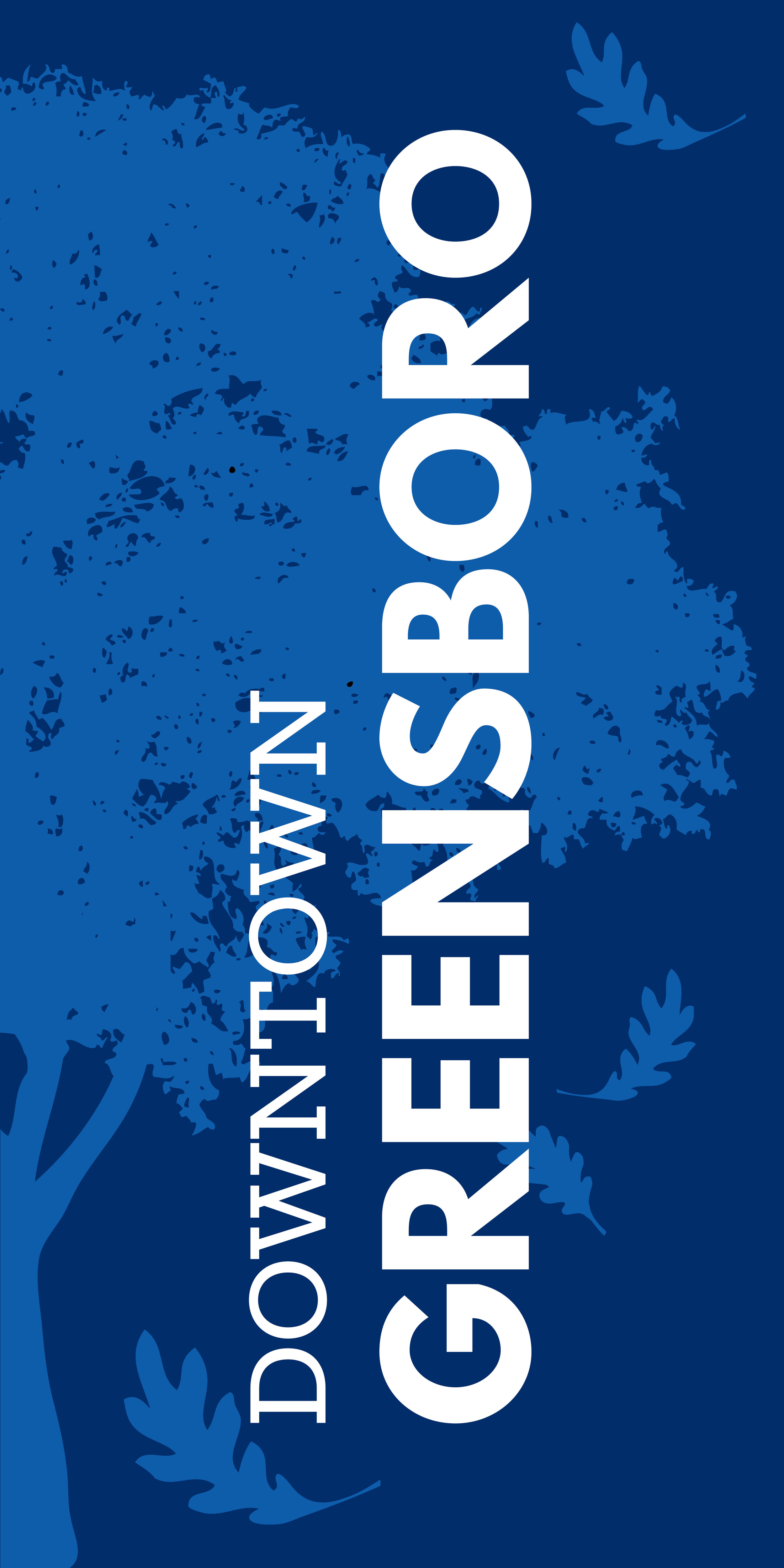
Downtown Greensboro banners

Front

Front

Back

Back

I've loved making a home in Greensboro, NC. It's one of those cities that's the perfect size -- big enough that there's plenty to do, small enough to know your neighbors -- and there are great things happening downtown. I partnered with the City of Greensboro to design these banners, which augment the city's placemaking efforts and establish the feel of downtown Greensboro for visitors and locals alike.

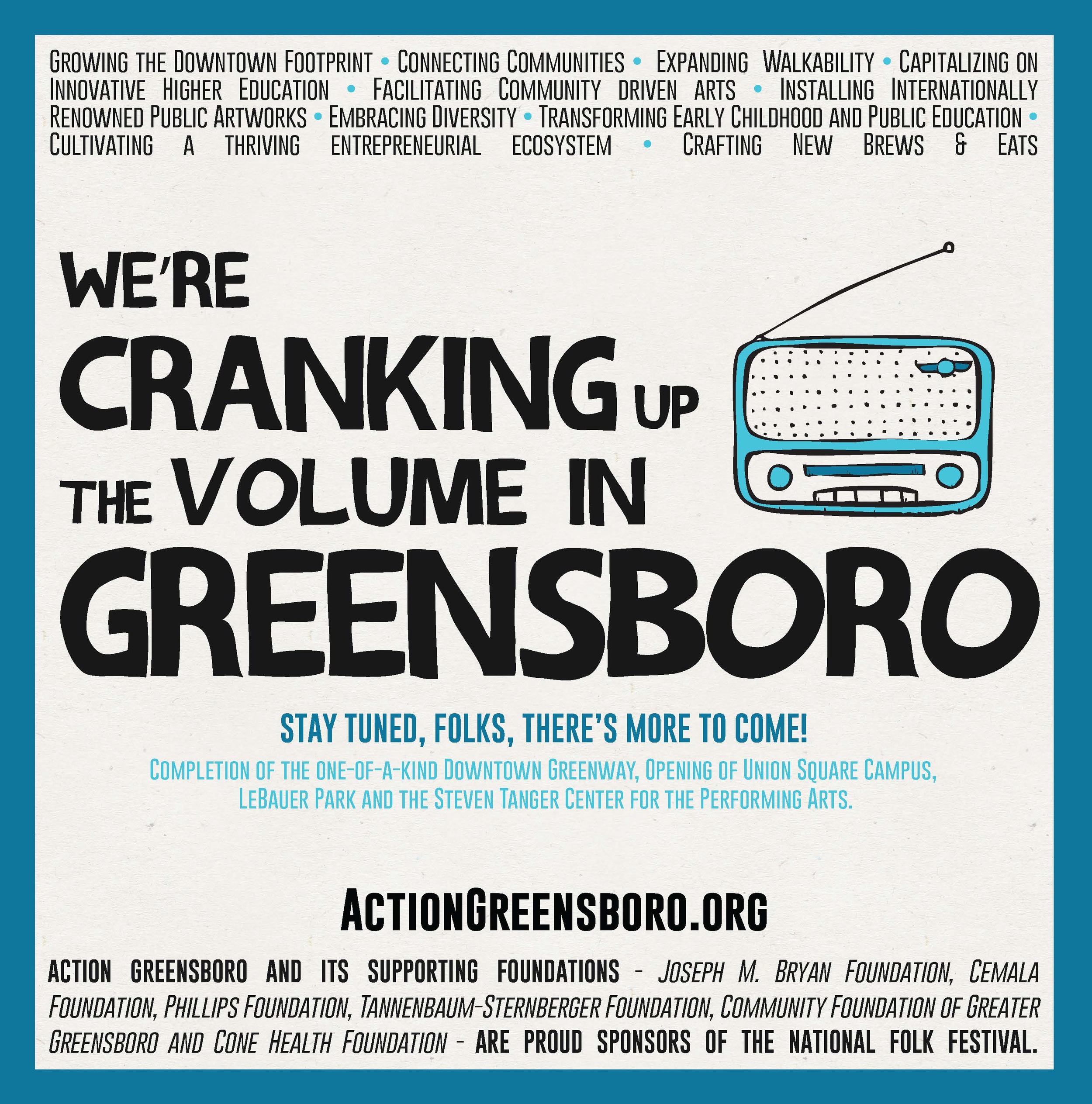
Action Greensboro print ad

This ad captures the spirit of Action Greensboro, which harnesses the energy of local business, education and government to strengthen the economy and ensure a great quality of life in Greensboro. This design needed to be clean and simple, while still capturing the verve and vibrancy of the work.

Social Media - Revolution Mill

I'm lucky to call Revolution Mill my home away from home (it's the location we chose for Hue & Tone's offices). Revolution Mill is a new live/work/play development in downtown Greensboro; the site has a rich history and is on the National Register of Historic Places. Social media for this client has to strike a balance; we need to highlight the great opportunities at Revolution Mill now (from studio, office, and event space to restaurant concepts and residential coming soon) while remaining grounded in the history of the space and sharing the story of preservation that's happening. 

I'd love to know -- what projects have you been working on lately? 

Freebie: "You got this" Wallpaper

Spend a little time with me and I'm sure you'll hear me use the phrase "You got this!" at least once. And who doesn't want a fun little reminder that you have everything under control? 

Click the image to download the "You got this" wallpaper! 

Check out the mobile version HERE!

Want to see one of your favorite phrases on our upcoming Freebie downloads? Shoot us an email at hannah@hueandtonecreative.com to send us your suggestion!