Posts in Resources
Why you should use Eventbrite

Planning an event can sound like a fun little project… until you realize how many little decisions need your attention. Even after you’ve worked out the details for a lot of the not-so-fun things (like port-a-potties, silverware, and parking) you’re stuck with the task of marketing your event.

While there’s no shortcut for a well developed theme, eye-catching graphics, or a solid marketing strategy there is one really big tool that can help streamline your ticketing + marketing process. When it comes to event marketing, Eventbrite takes the guesswork out of seating, ticketing, and promoting.

Eventbrite allows you to seamlessly create invitations, sell tickets, plan seating, and advertise all in one place.
 

A few of favorite features:

EventKingdom specializes in personalized digital and paper cards. Their variety of styles fits both traditional and trendy aesthetics. 

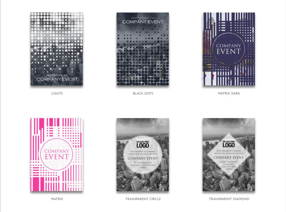
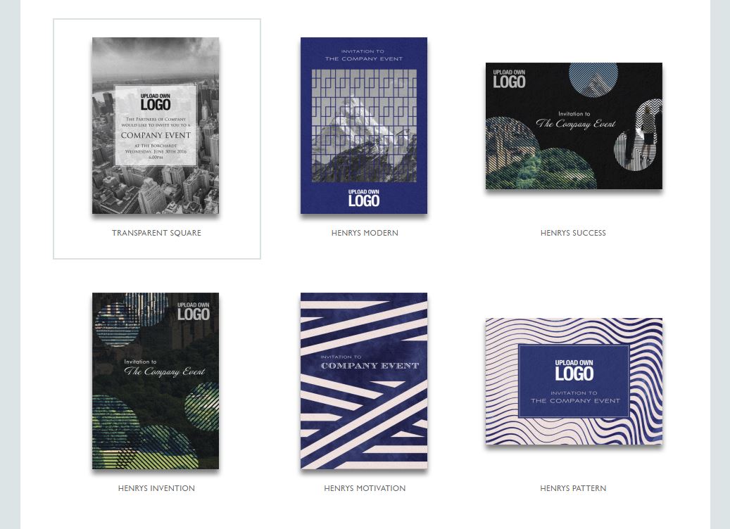
Custom designed invitations: If you want to take your invitations beyond the simple Eventbrite page you can choose from several customizable invitation templates, or install the EventKingdom plugin to create even fancier invites.

Reserved Seating: Selling tickets for an auditorium, runway, gala, or seated event space? Eventbrite’s reserved seating feature allows your guests to select their exact seats using a simple + customizable map interface.

Facebook Integration: Want to create a Facebook event to publicize your event? Just hit the “publish to Facebook” button on Eventbrite to automatically create an event page (without the hassle of reentering all of the event details on Facebook). Anyone who visits the page can easily see the details of the event, and will be pushed over to your Eventbrite to purchase tickets.


You can also publicize your event on your company’s website, Twitter, or Instagram with Eventbrite’s widget tool. View the full list of plugins HERE


Manage Attendees: Look up customer information, issue refunds, and print out guest lists using the manage attendees feature. It’s also the perfect way to communicate with customers, or send personalized emails to VIP Guests. 

Analytics: In-depth reporting and analytics tools allows you to monitor website traffic, see how many tickets you’re selling, and better understand where to focus your marketing efforts.

Organizer App: Perfect for last minute hiccups this free IOS and Android App allows you to sell tickets at the door, scan barcodes, print out name badges, and look up customer ticket information. 

Although we love using Eventbrite, there are other great alternatives:

So, how much does Eventbrite cost?

There’s no cost if your event is free, however if you’re selling tickets, Eventbrite charges 2.5% of the ticket price, .99 a ticket, and a 3% processing fee.

Eventbrite occasionally offers special promotions to new organizers as well as discounted rates for nonprofits. If your using Eventbrite for a high-end event it’s good to know that the service fee is capped at $19.95.


Still not sold on Eventbrite? Even though it’s one of our personal favorite tools, it’s not the be-all and end-all site to magically make your event a success. No matter what tool you choose to promote your event, be sure to stay organized, stay calm, and be prepared for the unexpected! 

Have you used Eventbrite? What’s your experience with it (or another event service) been like? Tell us in the comments!

SEO: Improving keywords + search results

If you’re totally new to SEO and want to learn more about it in depth, check out a great beginner’s guide here.

According to Google, the World Wide Web is comprised of over 60 trillion individual pages. By understanding and using SEO effectively, you can make yourself stand out from the trillions of other pages vying for you customer’s attention.

Search engines work by crawling and indexing all of the sites on the Internet. In order to generate relevant results complex algorithms are used to help sort the results and rank pages by popularity.

When searching for a restaurant, dentist, or a new pair of shoes online, we are naturally inclined to click on the websites near the top of the page. That’s because as consumers, we’ve instilled trust in those top tier search results. As a business, you want to be in those top results.

Today we’re going to dive into two elements of proper SEO marketing: keywords and search ranking. Keywords are the specific words a search engine uses to match your web page up with a search query. Understanding which keywords to use for your business is crucial because the right keywords can work as a guide to draw your target market to your site.

A common mistake people are guilty of is solely focusing on the amount of traffic being directed to your site. Traffic is important, but what’s even more important is attracting the right traffic. If you’re not using the right words, you’re missing the opportunity to help your target customers discover your business. 

Driving visitors who are looking for a different kind of site will only result in frustration for them – and no sales for you. If you’re just starting to brainstorm keywords for your site, the most important thing to ask yourself is what keywords fit the content on your website.

You want to consider clever keyword that capture your brand – but aren’t terms that are so niche no one would ever search for them. If you’re selling organic gluten free vegan cookies, simply using “cookies” or “bakery” is far too broad. Consider terms like “vegan muffins” “Greensboro, NC” or “unique vegan muffins.”


Tools like this keyword explorer can help give you real-time data on the terms you should be using!


So, are keywords the only thing that determine your search ranking? Not by a long shot. The usability of your website also plays a big role. Just like with a brick and mortar store, the experience a customer has when they visit you influences their impression of your business and determines a potential sale. If your website is easy to navigate, welcoming, and stimulating, more people are likely to visit, make a purchase, and return.

If you’re interested in allllllllll the other factors that can effect a website’s rank, take a look at this in depth study from Moz.

Social media can also be used to improve your site’s rank. Social media sites rank in searches, many people use social sites to perform searches, and most people agree social accounts have an impact on your website ranking. The easier viewers can share your content the better off you’ll be!

Keyword selection, usability, and social are just a few of the factors that influence ranking. If you’re out on the web searching for different ways to keep increasing your ranking remember there are some SEO methods that you’re better off avoiding. Paid links, deception, and spamming to boost popularity are considered black hat SEO. Using black hat methods can result in a loss of credibility and even cause your website to become banned on search engines.

For more on SEO, check out our rundown of do's + don't. Then, jump in and put the SEO tips you've learned to use! 

Small business on a small budget

Marketing is a necessity no matter what your business. But, it’s important to remember that a solid marketing plan can come in a wide variety of shapes, sizes, and budgets.

Bootstrap marketing is all about making the most out of your resources, finding new ways to work with others, and becoming your own PR agent. It’s the best mindset for new business owners because it’s wallet-friendly and forces you to use your creativity.

Fortunately, there’s a vast array of tools that you can take advantage of...without depleting your bank account!
 

Gather quality research

Estimated cost: Free

Use a short questionnaire to gather the opinions of people on the street, outside of shopping centers, or events that fit your target demographic. Load your iPad with a set of quick questions to ask people, visual aids, and product comparisons -- then hit the street!   
 

Create a Contest

Estimated cost: Whatever you decide to give away

Contests are a great way to use social media to engage your followers. Create a small scale contest by having your followers respond to a question or share a picture accompanied with a fun hashtag. Have your followers share your business page or submit their email address for a chance to win a product from your business. For long term contests, be sure to drive excitement daily and encourage your followers to enter for their chance to win!
 

Give the inside scoop on social

Estimated cost: Free

When posting on Instagram, Facebook, or Twitter, keep the one in seven rule in mind. For every seven posts you create, make sure that one in focused exclusively on promoting your brand. The content of the other six should focus on providing information, testimonials, or entertaining images or videos.


Start a loyalty program

Estimated cost: A few discounts or free gifts

Keeping an existing customer is far less expensive than searching for new customers. Create a loyalty program to show your clients that they are valued with discounts, tier programs, exclusive shopping days, or points programs. Check out Belly, Perkville, PunchTab, or Brownie Points if you’re looking for an app to help get you started.  


Remember to always keep your email list growing! Give your visitors several opportunities to register every time they visit your website.

Launch an email campaign

Estimated cost: Free (until you reach a high volume sending list)

Use your creativity to keep your emails engaging and beneficial to your customers. Feature flash sales, rewards program perks, and anything new to your businesses.  Stream Send, MailChimp, and Benchmark Email are some easy to use email marketing services.  


Embrace guerrilla marketing

Estimated cost: $10-$500

Hand out custom t-shirts, stickers, or swag (like water bottles or dog toys). People love free stuff so give them something to remember you by!

Or, consider using sidewalk chalk or posters to get your message out around town.


Gather testimonials

Estimated cost: Free

Stand out from your competitors by providing success stories from previous customers. Don’t be afraid to ask for feedback from your satisfied customers. Most are happy to write a review when they’re happy with a purchase. You can also offer a free trial or complementary item to select customers in return for an honest review. These are great to use in marketing materials of all kinds!


Maintain a blog

Estimated cost: Free (assuming you already have a website)

Most people would rather purchase a product or service from a brand with a personality rather than a stiff corporate tone. Use your blog to relate to customers as a person or small business! If you are new to blogging you could start with a customer success story, market trends, a behind the scenes look at your business, or maybe a feature of some of your staff members.


Things we don't recommend you skimp on?
An eye catching logo and an amazing website.


Partner with other businesses

Estimated cost: $50+

Look for local businesses that share similar values, target customers, and experience as your brand. Most businesses welcome connections, especially when they benefit both parties. For instance, if you own a bakery, partner with a nearby coffee shop on a special rewards card, let local vendors sell their wares in your storefront, or let a local artist offer painting classes at night. 


Host an event

Estimated cost: $500+

Think about the interests of your target customer and invite them to exclusive events. Anthropologie often holds special events for Anthro card holders. Guests are able to attend DIY workshops, fashion shows, and even pet adoption days. You can make an even larger event by networking with other businesses in your area. Many local businesses hold special shopping nights where customers can travel from store to store and enjoy sales and refreshments. There are endless event ideas, the key is to get your customer excited and eager to come.


Now that you’ve learned some budget friendly tips, remember that working with a small budget doesn’t necessarily mean a small marketing presence. Spend your money wisely and business will be booming in no time!

What to post: Twitter

The average tweet only has about a three hours shelf life. For business owners, that translates to needing to tweet often -- without sacrificing quality. You need to be on the top of your game to maximize your available 140 characters and capitalize on the few instants of attention you’ll get from followers. If you’re thinking that retweets will get you what you want… think again.

If you’re stumped on where to start -- or you’re just running low on ideas -- here’s a few things to test out:

  • Keep it industry related: No matter what you want to post, you can’t go wrong by keeping your content focused on your industry. This is one of the best ways to attract quality followers who have the same interests or profession as you.
  • How-to’s/tips/tricks: If you own your own business, you’ve got specialized knowledge of some kind. Think about what you know and boil your knowledge down to shareable tricks and tips that your clients can implement on their own. There’s no better source for original content than yourself!
  • FAQ: Think about what questions you hear most often from your clients and customers. If they want to know, chances are, other people will too. So, save everyone some time and tweet the answer! Play your cards right, and this will leave everyone following you wanting more...
  • Bold + high quality images: Whether you’re posting a photo from around the office or a sample of client work, an eye catching photo is key. An iPhone photo will definitely suffice, but make sure to use an app like Snapseed or Afterlight to clean up your photos.
  • Useful stats: People hear so much information every day it’s hard to know what to believe. Make yourself stand out as a reliable, industry source by sharing up-to-date, reliable stats on your industry… just be sure to double check your information and cite your sources.
  • A behind-the-scenes photo: Help people put a face to your company by sharing behind-the-scenes photos of what’s happening at your office. You’ll have to use your best judgment to decide if things like taking the team out to lunch fits with your image -- but no matter what message you’re trying to send there’s definitely something from behind-the-scenes that you can share.
  • Capitalize on local: If you’re a local business there’s no better way to connect with new clients than to focus on other local businesses, community events, and the general goings on in your area. Not only does this show you’re in the loop, it allows you to keep up with competitors, and can help you forge valuable connections.
  • Stay on top of trends (and help keep your followers up to date): Showcase your knowledge by staying plugged in to industry publications and key Twitter users in your field. This will help you stay on the cutting edge! For example, when a social platform rolls out a new feature we try to be one of the first to alert our followers.
  • Take a survey: Ask customers/clients what they prefer or are interested in, what they want to learn more about, which of your products is their favorite, etc. You’ll be creating great content… all while getting insight into your customer’s wants and needs!
  • Incorporate relevant hashtags: With limited characters it’s important to pick and choose the right hashtags to use. Content that isn’t related to the hashtag will annoy other users -- and won’t gain you any high quality interest. If you’re looking to reach a new audience (who isn’t?) then jump on to trending hashtags and try out some other new tags.

Do: have fun, have personality, be yourself, credit others when you share information, and respond promptly

Don’t: get political, don’t push too hard, or be too salesy

Keep in mind all of these posting ideas are for your business account. If you find it’s hard to keep your Twitter from getting too personal, start a separate account for yourself. This will allow people to get to know you...without tarnishing the professional reputation of your brand.

Need more tailored suggestions? We can do that. Leave a comment telling us a little about your business -- we’ll respond with more specific suggestions!

The Big List of Business Tools

Whether you’re starting a new business, turning over a new leaf, or just looking to streamline your current venture, you’re facing about a million (rough estimate) challenges at all times. But the good news is that for almost every problem you face there’s an app that’s here to make your life easier. And, to make things even easier, we’ve gone ahead and cut out the research process by compiling this list of essential business apps.

If you’re looking to streamline your marketing, finance, or internal communication efforts we’ve got an app for you!


Financial Tools

Keeping up with your finances can be one of the least fun parts about owning your business -- and, if you’re not careful, it can be one of the most time consuming.

MileIQ: Need to track your miles for tax purposes? The MilelQ app logs all of your drives and allows you to easily swipe left or right to categorize drives as work or personal.

Float: This cash flow forecasting app allows you to better predict the financial future of your company.

Quickbooks: Chances are, you’ve heard of Quickbooks. It’s accounting software specifically built for small business -- it’s essential for tracking your income, sending invoices, and managing your expenses.

Square: One of the easiest ways to accept chip + magstripe cards, Square is an app that pairs with a (free) card reader. It’s one of the easiest ways to accept POS payment!

PayPal: Send, accept, and request money with this online payment system. It connects with your bank account, and your information is secure and protected.


Marketing Tools

Now that we have your finances in place, we need to get you some new customers. These marketing tools will help you communicate effectively through every medium.

Hootsuite: Struggling to manage all of your social sites efficiently? Hootsuite allows you to manage all of your accounts one one screen. You can also schedule out your social media posts for multiple platforms at once, and track the results.

MailChimp: MailChimp is a cheap and easy email marketing platform that allows you to communicate with your customers. You can integrate the sign-up on your website to effortlessly collect email addresses, create branded templates, and send easily-trackable campaigns. If you want to learn more, check out our series on the benefits and basics of using MailChimp (here and here).

Canva: While we’re always in favor of bringing in a pro, we understand that sometimes you just need a quick fix. Canva is an easy app that allows you to create graphics for your business. There’s free templates for social media graphics, flyers, and more.

Hubspot: Hubspot’s a powerful inbound marketing software that helps you create powerful marketing materials, gather information, and convert leads into sales. It includes all the tools you need to market your business -- but may feel a little overwhelming for beginners.

Buzzsumo: Find out what your consumers really want! Buzzsumo helps you research your target audience so that you can ensure you’re spending time on the right content for your business.


Organization Tools

Organizing a team is no small task -- but luckily some of the best tools out there are meant to help you effectively manage your crew. Don’t count these tools out even if your business team only consists of just you! Project management apps can help you keep client work or new business initiatives intuitively organized.

17hats: Perfect for all the solopreneurs out there, 17hats cuts out the need for multiple apps. It simplifies everything and lets you keep track of your clients, projects, to do lists, calendar, workflow, templates and everything else all in one place.

Asana: If you’ve got a big team, Asana is the app for you. You can easily manage and assign tasks to different projects and teams. It cuts down on the need for unnecessary meetings and allows you to manage all of your to-do’s in one place.

Basecamp: A great alternative to Asana, Basecamp allows you to manage projects with a team. While Asana is our personal preference, the best thing to do is test out both apps for free and see what you prefer.

Evernote: A giant digital notebook, Evernote allows you to stay organized. You can store everything from big ideas to random musings in different digital notebooks. Add in images, audio, scanned documents, and files to keep everything organized. You can even forward emails to the different notebooks to keep everything in one place.

Wunderlist: Have a long to-do list? Wunderlist is a task management tool with a simple interface. It syncs to all of your devices so that you can easily check things off throughout the day.

Pocket: Ever spend hours looking for a link and wished you’d saved it? Pocket can help. Save everything and anything you come across on the web so that you can view it later.

IFTTT: An acronym for “If This Then That” this is a free web app that lets user automate web-based tasks. A little confused about what that means? That’s because it does almost anything!


Productivity Tools

It’s hard to stay on task when you’re feeling overwhelmed. These tools will help you keep your day-to-day routine on track!

30/30: A super simple task manager, this app guides you to work for 30 minutes/break for 30 minutes. It’s as simple as that!

FocusZen: Carefully engineered audio teaches your mind to block out all distractions and allow for maximum focus. The app also has timers for 10, 25, or 60 minutes of peace.

Spark: Emails can be a pain, especially unnecessary ones. This app collects and categorizes all of your emails so that they’re easy to process.

Slack: Slack is a cloud based messaging tool that promises to make you less busy by streamlining team communication.

RescueTime: RescueTime runs in the background to help you understand where your time goes from day-to-day. You can block distracting websites, set alerts for when you spend a certain amount of time on a task, and log highlights about what you accomplished.

Toggl: A ridiculously simple time tracker, Toggl lets you track your time per task so that you can recognize and improve it.


Misc

Google Apps: One of our personal obsessions, Google Apps are a powerful tool. You can create documents that are easily shareable, store files, comment on shared documents, and sooooooo much more. You can edit a document live with your team -- and it all syncs to your Drive. And -- purchasing an additional 100GB of extra space to store all your files starts at only $1.99 a month!

Skype: Have a remote client? Meet virtually with Skype and have a face-to-face conversation via your laptop or mobile device.

LastPass: Keep all of your passwords in one place with this password management app.

SignNow: A safe and effective way to get e-signatures in seconds from any device (for a very reasonable cost).

BidSketch: Use this tool to easily mix and match fees, projects, and conditions to create professional client proposals.

SurveyMonkey: Conduct free surveys and analyze the results with SurveyMonkey. With over 15 question types, you can easily gather information.


Don't be afraid to test out these different apps and see what works best for you -- finding just one tool that you love can make a big difference in your day-to-day efficiency! 

Tell us: which of these tools are you most eager to try? 

Your guide to design jargon
Your guide to design jargon -- Hue & Tone Creative

Feeling more then a little confused when you're trying to communicate with your designer? We get that. As designers, we do our best to explain things to our clients -- but it's easy to make assumptions or run through things a little too quickly. 

We put together this handy to guide to help cut down on client + designer relationship miscommunication. There's seemingly no end to the amount of technical terms out there -- but these 39 terms will give you a solid footing to get the conversation rolling. So... get studying!  


Alignment: Can refer either to the position of elements within the margins, or the idea of placing items so that they line up in an organized way.

Ascender: Any part of a letter that extends beyond the rest of the word. Examples: “b” + “h”.

Descender: Any part of a letter that drops beyond the x height/baseline of a character set.

Asymmetrical: A design in which the graphic elements or text on each side of the central line have unequal visual weight. One visually large element could possibly be balanced out by a grouping of smaller elements on the other side. Asymmetrical balance is typically more interesting.

Bleed: In printing, the bleed is what goes beyond the margin of the edge of the sheet of paper before trimming. A full bleed design means there is no white border/margin, and the color/images will go all the way to the edge of the paper.

Branding: The collection of language, ideas, principles, and visual elements that represent a company or business to clients and consumers.

Body copy: The main text in an advertisement, brochure, or website. Body copy is longer than headlines and is meant to be easily readable.

Body font: The text formatting for the main content of a magazine, website, or other printed material. Body fonts will contrast with the headlines, and is typically easily readable.

CMYK: A color mode used for print purposes. CMYK stands for ‘Cyan, Magenta, Yellow, Key (black)’.

Display Type: Fonts with distinctive personality that often sacrifice some readability for the purpose of being unique and eye catching. Typically used for headlines.

DPI: A measurement of resolution for a printed image. Stands for dots per inch.

Element: Individual parts of a logo or design. An element can be a flourish, a border, or something like a headline or image.

Favicon: A small icon that’s associated with a specific web page or URL. A favicon is displayed in the browser's address bar or near the site name in a bookmark.

Hero image: A common term to describe an oversized banner image -- usually near the top of the web page.

Kerning: The process of adjusting the horizontal distance between letters.

Leading: The process of adjusting the vertical distance between lines of type.

Letterpress: A printing process that results in an impression/indented design being left in the paper.

Logo mark: A graphic symbol or emblem that represents a business, organization, or individual.


Logo type: Also known as a wordmark, a logotype is the name of the company designed in a visual way.

Lorem ipsum: Latin text that’s used to demonstrate the graphic elements in a document or visual.

Margins: Only shown in computer layout programs, margins are the space around the printable area of a document.

Mobile responsive: A web or email design that automatically adjusts it’s sizing, layout, and proportions when viewed on a mobile device.

Negative space: Simply an area on the page that doesn’t contain any design elements.

Opacity: An object's degree of opacity. The lower the opacity the more transparent an element is. 0% = completely invisible, 100% = opaque/fully visible.

Palette: A set of cohesive colors you use for a design, brand, or campaign.  

Pantone Colors: The Pantone Matching system (or PMS) is a set of over 700 standardized colors used in a variety of industries.

Pica: A unit of type size and line length equal to 12 points (about 1/6 inch or 4.2 mm).

Pixel: A minute area of illumination on a display screen, one of many from which an image is composed.

Printer-ready (or camera-ready): Files/artwork is ready to be printed.

Proof: Can refer to either a “concept proof” or “printed proof.” A concept proof is a rough drawn, incomplete, or early stage preview of a project that demonstrates the concept to a client. A printed proof is designed to demonstrate the exact final product -- and is great for catching any last minute mistakes!

Raster files: A raster image consists of a dot matrix structure. Most of the images you see on your computer are a raster image. They can easily be scaled down without a loss of quality, but not scaled up without looking pixelated. Common formats like JPEGs, PNGs, and GIFs are all raster images.

RGB: A color mode used primarily for web. Colors are mixed from red, green, and blue (RGB).

Sans Serif: Typefaces that don’t have serifs at the ends of the stroke (aka the little feet). In print sans serif fonts are typically used for headlines (not body text). Sans serif fonts are popular for display or web fonts.  

Serif: Short strokes that extend from the top or bottom of the long part of a letter.

Slab Serif: A thick, block like serif font. Can be either blocky or rounded.

Typeface: A set of letters, numbers, etc. all in the same style.

Vector file: Created using illustration software (like Adobe Illustrator). Creates clean, camera-ready art that can be scaled up infinitely and still maintain a clean look.

Visual Brand Identity: The collection of all the individual logos marks, graphics, photos, print collateral and web graphics that make up the visual appearance of your brand.

Wireframe: A rough outline used for planning a website’s structure and functionality. Outlines all functional elements of a website or web page.


Feeling more prepared for your next meeting? The next time you give your designer feedback, break out a few of these terms and watch the look on their face as they realize what a pro you are!

If you're looking for even more advice on how to work with a designer we've got these 8 tips to help you create a smoother working relationship

Friday Links: Mega Roundup

Happy first day of July!

We’re making a few changes to our blogging schedule, so for our last Friday Links we’ve rounded up a mega-list of some of the best resources we’ve shared over the last few months. From now on, we’ll be posting a long-format entry every Wednesday. With topics ranging from design and marketing to tips and tricks, each post will be an in-depth look at a different topic each week.

So, without further adieu, here’s our final Friday Links:


Design Links

One | 10 Commandments of graphic design  

Two | Introductory guide to choosing fonts

Three | How to utilize an inspiration board to design a consistent brand

Four | 15 Type Designers to keep an eye on

Five | An interview with Michael Bierut, Designer at Pentagram


Social Media Links

One | How to be social online (for the naturally unsocial)

Two | 10 Years of Twitter: Tweets that broke the Internet

Three |Essential LinkedIn Stats: When, how, and what to post

Four | 5 Habits of Successful Social Media Experts

Five | 9 Tips to create a cohesive, branded Instagram feed


Branding/ Marketing Links

One | The basics of marketing your blog or website

Two | Working with email marketing automation

Three | 12 Simple strategies the big brands use to leave a lasting impression

Four | Stand out on Pinterest as a small business

Five | More branding basics for small businesses


Miscellaneous Links

One | Website color schemes: The palettes of 50 visually impactful websites to inspire you

Two | The 6 best tools for creative work, according to science

Three | Free hand-lettering practice worksheets

Four | Why you should use Squarespace

Five | The best of Greensboro

We hope you’ve enjoyed this last Friday link post… but now it’s time to get excited for the future! We’ll be back on Wednesday with a list of SEO dos + don’ts that you don’t need a web developer to execute.

Going to miss our Friday Links series? No need to worry, we’ll be sharing more valuable resources than ever on our social media. Follow us here:

Let's Talk Email Marketing: Content and Design Time

If you read our post last week, you know all about what email marketing is and why you should be using it to promote yourself. This week, we’re talking how to setup a great campaign. Following best practices ups the odds that your emails will be opened and that people will engage with them. From visuals to the subject line, no detail is too small.


Subject Lines

The subject line is the first thing people see after you send your campaign -- and with only seconds to capture someone’s attention, a single word can make or break your open rate.

The basic idea is that you want your subject line to be concise, accurate and informative. It should set an accurate expectation for the content of the email - without getting too cutesy.  For example, subject lines like “Website news - Issue 3” and “[COMPANYNAME] May 2005 News Bulletin!” are shown to do better than things like “Last Minute Gift - We Have The Answer” and “You Asked For More…” (source). Readers want to know what they’re about  to read, and they aren’t likely to read what they perceive as junk mail.

Need more? Here’s a couple of can’t-fail subject line tips:

  • Localization + Personalization. Personalizing your subject line with a reader's first and/or last name, or even the city name, often results in higher open rates.
  • Use different subject lines. Keep it fresh! Even if you only send out a regular feature (like a monthly industry update) be sure to change up your wording every time you send out an email. Highlight the lead story or a feature piece of content to keep things timely... and readers interested.
  • Don’t cry wolf. Only mark truly important emails as urgent -- no one likes to be faked out. Subject lines with the words ‘urgent,’ ‘breaking,’ ‘important,’ and alert show higher open rates -- but only when used appropriately and sparingly (source).
  • Keep the subject line short. Like we mentioned before, keep it short. Most readers scan through their emails so keeping the line 50 characters or fewer is best.


Choosing Templates

Creating a template that attracts your readers is one of the most effective ways to get your readers engaged. You’ll want to create a template, or set of templates, that you can use across all of your email campaigns. Creating a consistent look that matches the feel of your brand and blends with the rest of your internet presence is key.

Design inspiration here and here.

Design inspiration here and here.

Almost every platform allows you to start with a pre-made template or design your own from scratch. Depending on your design IQ, we recommend starting with a pre-made template and customizing from there.

Be sure to insert your logo, tweak all the elements to match your brand colors, and pick fonts that fit the feel of your brand. Then, save this template so you can use it time and time again. Not only is this less work for you, but it creates consistency for your customers!

We recommend:

  • Sticking to one or two colors to create a clean design and keep readers focused on the content of the email.
  • Using different colors to differentiate the headers and footers of your email.
  • Using borders to provide visual cues to readers where one article starts and another begins.
  • Keeping alignment constant. If you’re utilizing large amounts of text, be sure to left align so that it’s easy for people to read.  
  • Lots of white space makes for a modern look -- don’t stuff content so close together that you overwhelm readers.


Layout

No one wants to receive a wall of text in their email. Email marketing should be fun and eye-catching... but also informative. Balancing text and images is the best way to create a visually interesting email and encourage people to read through everything. 

  • Organize your content by importance. Important + timely content should always be front-and-center at the top of your email to catch the eye of people who are skimming.
  • Use different font sizes and weights to create interest and organization. You want to utilize headlines, body text, quotes and buttons to create interest and give visual cues to the reader.
  • If your message is long (and can’t be simplified any more) send those who care to your site to learn more.
  • Shake up the size/layout of your images. Test out different sizes and orientations within your email to create interest.


Other Tips

Design isn’t everything -- now that you have a visually appealing email, let’s get down to a few nitty gritty details to consider when you’re done designing your campaign.

  • Make sure to test. Now that your email is looking great and ready to go you need to test it out. Send a test in your email marketing system, or consider using a tool like Inbox Preview. Inbox Preview allows you to see what your email will look like to different people on different platforms, and it’s one of the best way to ensure the look of your email stays consistent.
  • Don’t harass people. The frequency you will want to email people varies by business -- but consider 2-3 emails a month to be a good jumping off point. After 6 months of consistently emailing people 2-3 times a month, you can analyze people’s reactions and make adjustments accordingly.
  • Never SPAM people. If there’s one cardinal rule of email marketing, it’s to never email people who haven’t given you explicit permission. Most likely they’ll immediately unsubscribe, and even if they don’t, chances are they won’t be likely to engage.
  • Don’t overlook the importance of social media. Integrate social media into your campaign, and be sure to push the sign-up option on both your website and social channels.
  • Don’t waste time sending the wrong email. Once you’re feeling really advanced, you can test things out using A/B testing. It’s perfect when you’re not sure which image or headline to use.

Feel like you’re far from being a pro? No need to worry -- after sending a few campaigns, it’ll be as easy as riding a bike. But, if you don’t find that to be the case, we’re always here to help!

Soooo.... Ready, set, create!

Friday Links: Summer Time Tips

The first week of summer is underway, and temperature in Greensboro is hot hot hot! Keeping up with your marketing and social media can slip a little during the summer months -- but depending on your business, summer could be one of the best times to promote yourself!

twenty20_2c4ff42a-159d-4f9c-a9a0-671bd9b22f41.jpg

Here’s a few links to help you promote yourself this summer:

One | Has your Instagram presence slipped a little? Redefine your look and reinvigorate your profile with these 9 tips.

Two | A recent Microsoft study showed that you only have 8 seconds to engage with a millennial -- here’s a few approaches to help you convert your 8 seconds in to a customer.

Three | Mobile use is involved in almost 45% of all shopping transaction -- and with 400 million active users, Instagram is a great place to focus your advertising efforts. To most effectively boost your summer sales, use this guide to create a results-focused Insta ad.

Four | If you only focus on 3 things about your website make sure it’s these.

Five | It’s time to stop hitting “remind me later” when your iPhone prompts an update...because there are about to be even more new emojis! These 72 new emojis won’t be available until the Fall, so you still have a little time to get your software up to date. (And be sure to be on the lookout for the IOS 10 update!)

Stay consistent, market your business, and test out an Instagram ad -- before you know it you’ll have escaped the summer slump! And, if you’re stuck in the office all day, take a look at our beachy color schemes to remind you that vacation is right around the corner…

Let's Talk Email Marketing: Platforms

Let’s talk email marketing.

Tip: Make sure to pick an email marketing platform that is mobile compatible. An estimated 50-60% of emails are now open on a mobile device.

Tip: Make sure to pick an email marketing platform that is mobile compatible. An estimated 50-60% of emails are now open on a mobile device.

First off, what is it? When we reference email marketing we’re referring to bulk email sending (typically sent using email marketing software). These emails usually include ads, request business, or solicit sales/donations. In addition to increasing sales, they also help to build trust and brand awareness.

Email marketing is both efficient and cost effective, so no matter what size your company is, it’s a great way to stay in touch with clients and follow-up on potential client leads.

There are a ton of email marketing platforms to choose from -- so, in all honestly, selecting a platform is often about personal preference. If you’re not sure where to start, here’s a few of the major players:

  • IContact is an email campaign service that helps small businesses to larger senders. Their personal coaching, and award winning technical support sets it apart from other tools.
  • Constant Contact (the most used platform in terms of customers) makes editing simple as 1, 2, 3. With the ability to drag and drop content into customized templates, you can create customize each template best for your consumers.
  • Campaign Monitor Campaign Monitor is geared towards larger companies. It integrates with a ton of apps, and allows you to easily manage multiple accounts.

Other popular platforms include AWeber, SendinBlue, Benchmark, GetResponse and Vertical Response. But our personal favorite? MailChimp! MailChimp is a great choice for small business. It’s low cost and seamlessly integrates with popular web platforms like Squarespace and Wordpress. More than 12 million people and businesses are using MailChimp, and they send out over a billion emails a day!

There’s a few key features MailChimp has (though a lot of the other platforms do as well) that you should consider when shopping around:

  1. Automation. Sending an onboarding series of emails? Need to introduce new subscribers to your business or organization? This feature is great for creating and sending out automated messages, without the headache! A certain behavior, like signing up, will trigger an email or series of emails to be sent -- without you having to do anything.

  2. A/B Testing. This feature tests two different emails against each other to see which content performs best. Which subject line lead to higher open rates? Which image worked best? Both of these questions (and more) can be answered by this feature.

  3. E-Commerce features. You can easily connect your online store to MailChimp, where you can set up product recommendations, track online orders, and analyze purchase data. These are powerful features especially for small retail shops or individual makers.

  4. Advanced Analytics. This is the easiest way to track your performance! Monitor sales, subscribers, and revenue. Most importantly, you can integrate Google Analytics to learn even more about your campaigns.

  5. Segmentation. Nothing can turn people off faster than receiving content they don’t care about. By using segmentation, you can break your email lists into different groups. For example, “potential customers” and “existing customers.”

Feel ready to pick a platform? Good! Because next week we’ll be back with more information on how to design your first (or a much better) campaign. We’ll go over things like how to design an eye-catching template, what kind of content to include, and how to write a solid subject line.

Not sure what platform will work best for you? Let us help you decide. Shoot an email to hannah@hueandtonecreative.com with your top options and we'll help you decide what's best!

Get your color on

If you're like us, being creative just breeds more creativity. We've been working on a lot of ultra creative projects lately -- everything from branding to creating fun eye-catching gifs -- and all of that innovating had us ready to make a fun new freebie. 

Test your coloring creativity with these fun pattern print outs! 

Love the end result? Tag us on social (@hueandtone) so we can see what you came up with! 

Friday Links: Must-see visual stats

I don’t know about you guys, but we love infographics -- they’re a great way to snag someone’s interest on social media and quickly communicate information. We’ve compiled 5 of our favorite infographics for you to effortlessly glean some new statistics from!  

One  |  At the beginning of the year, there was no end to the predictions being made about where 2016 would take design. See if they’re coming true with this infographic that predicts 8 design trends for 2016.

Two  |  When we say social media is a big deal, we mean like really big... literally. With 320 million users Twitter’s user base is almost as big as the population of the United States. Don’t believe us? Here’s more on social media’s active monthly users for this year.

Three  |  Did you know that the average user spends 20 minutes per visit on Facebook? Leverage these statistics to plan even better social content.

Four  |  The perfect filter can take a picture from good to great! Have you ever found your thumb hovering over two filters, wondering what other people would pick? Well, Canva’s mapped out the most popular filters from around the world. Can you guess what North Carolina’s most popular filter is?

Five  |  If you don’t read any of the other links today, be sure to read this one. If you want to be a successful social media manager all of the tips are a must!

We’ll be back on Tuesday with a coloring page. If you’re looking for some weekend enrichment, we suggest listening to The Ezra Klein Show or checking out one of our favorite places in Greensboro.

That’s all for today, have a great one!

Balmy beach schemes

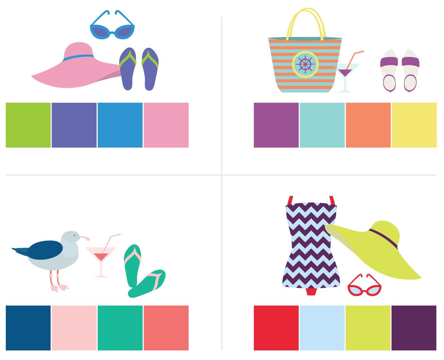
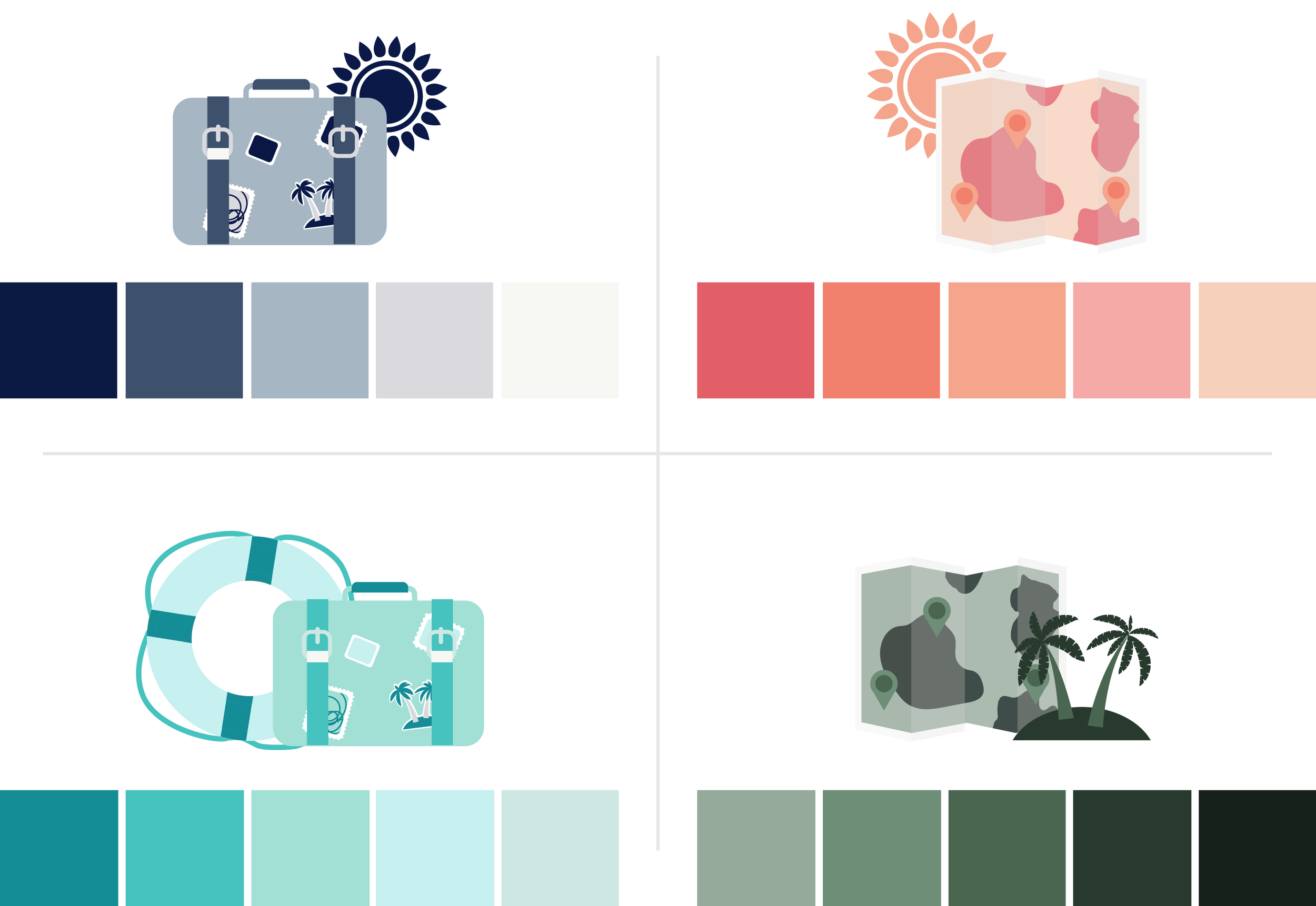
We love what we do -- but vacation is what refreshes us. Visiting a new city, traveling to the beach, or even taking an afternoon out of the office to wander Greensboro can result in major creativity. So, that’s what inspired us this week -- shorelines, sunshine, downtowns, and shopping.

Even if you’re not able to take time off just yet, you can use these colors to infuse the vacation mindset into your work. Do the beach your way with these fun color schemes -- use them to inspire an outfit, inform a design...or maybe they’ll even push you to plan a few days out of the office!

Spring Color Schemes -- Hue & Tone

Want to use these colors in your own work? Here are the hex colors:

Top left: #9ACA3C | #6569B0 | #3296D3 | #ED9DBA
Top right: #9A5294 | #93D5D3 | #F58A67 | #F5E472
Bottom left: #035385 | #FACBCA | #27B999 | #F27171
Bottom right: #E72937 | #C2E2F7 | #D9E253 | #5D2A5E

What colors do you find most inspiring? Is it bright colors like these? Or deep mountain colors? Tell us in the comments!

Monochromatic schemes: One color, many hues

Got a design in need of a boost? We've got a few monochromatic colors schemes for you! 

Don't underestimate the power of a single color. Finding the perfect shade that represents your brand might be all you need to revitalize a stale design. 

We've got a few suggestions for you -- test these options out on your design and watch it come to life!

Have success with one of these color schemes? Share a screenshot with us!

Create a smoother working relationship: 8 tips for working with a designer

Bringing a brand to life is no small task, and a bad working relationship can steer a project off-the-rails before it even gains momentum. As designers, we know that understanding a client's business and personal taste is key to being able to properly brand a business. In order to appeal to potential customers, we need to have all the right information to create effective logos, websites, promotional materials, and social media posts.

If you’re nervous about working with a designer for the first time, or you feel like you aren’t on the same page about a certain project, these 8 tips will hopefully get you back on the track to a stellar end result:

  1. Make sure you’ve found the right fit. Don’t hesitate to reach out to a few different designers -- grab coffee with them and make sure you find someone that’s easy to talk to, is willing to listen, and understands your business goals.

  2. Explain in your own words. Communication is key -- don’t hold back from expressing yourself just because you don’t know what the technical term for something is. Your opinion is crucial to creating a quality final product -- and one skill no graphic designer has is mind reading.

  3. Provide examples. Bring pictures, prints, ideas, drawings, mood boards, color palettes and more to help your designer get a feel for what you want. Lacking inspiration? Hit up Pinterest.

  4. Be specific with your feedback. Ask questions, tell your designer how you feel, and explain what it is you like or dislike.

  5. Trust the process. The first draft is just the beginning. Do not get discouraged when it is not “perfect.” Your graphic designer is there to work with you through rounds of revisions to reach a finished product you love.

  6. Don’t be afraid to ask questions. If you’re ever unsure about why something was done, don’t hesitate to ask. Your designer wants you to have the best final product possible and is usually happy to explain their creative process.

  7. Think about it like a partnership. If a designer explains a technical reason for why they did something chances are you should listen. You hired a designer because you needed help -- acting like you’re the boss might land you with a less than effective final product.

  8. When you love a piece, say it! There’s nothing better than being acknowledged for your hard work and designers want to hear when they're on the right track. When you love the final result be sure to speak up so that they can get you more of what you love!


Have any additional tips? Encountered a particularly difficult situation you'd like advice on?  Share with us in the comments below!

10 Pinterest Boards to Spark Design Inspiration

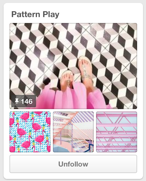
If you think Pinterest is just a site to find cooking recipes, think again!  Think of Pinterest as a site where at the click of a search button, you can find any and everything you’re looking for.  It's perfect for wardrobe tips, photo styling, and design inspiration (of course)!  We love to use Pinterest whenever we get stuck or need a little boost of creativity.

Need your own boost? We’ve picked out our top 10 Pinterest boards to spark design inspiration:

What boards do we need to be following? Leave a comment!

Friday Links: Spring Cleaning

The weather in Greensboro is heating up which only means one thing - springtime is coming! And, your house isn’t the only thing that could benefit from spring cleaning. It’s the perfect time to take a second look at your brand, website, and social media accounts,  so that you can leap into this new season with a fresh style. Here are five resources to help you get started:

One | Consider refreshing (or creating!) your inspiration board of images, colors, and quotes to keep you motivated for the year. Check out tips for designing an inspiration board for your brand!

Two | Spring brings livelier colors to explore! Consider adding some light pastels to your social media content for a fresh contrast that matches the  new season. Check out the top colors of Spring 2016.

Three | For reviving your website, consider using different fonts or even using different colors. This free and easy gold font will add a fresh color to liven up any website!

Four | Are you maximizing your online presence? Here are 10 tips on what you can do every week to increase your presence and engagement online.

Five | Warmer weather means more outdoor activities! When you step  outside take advantage of your surroundings and grab some nature pics for Instagram! Here are 13 tips on taking better Instagram pictures.

Enjoy the weather! Have a lovely weekend, and keep calm...spring is coming!

Link Roundup: The best of the links

To round out this week, we’re rounding up the best of the links we’ve shared over the last few months. These are just all around, generally good resources that we couldn’t help but share a second time!

One  |  Good, free fonts can be hard to find. This list of 60 free minimalist fonts highlights a handful of unique + clean + modern finds -- ones that you won’t see on more basic free font lists. 

Two  |   Typewolf is one of the best sources for everything typography + fonts. With carefully curated lists and resources, you’ll find everything from unique ‘top 10’ lists to font profiles (complete with mixing & match suggestions).

Three  |  No matter what your goals, these eight inspirational TED Talks are a must watch.

Four  |  This is a great roundup on apps to boost your productivity as a freelancer. We'll definitely be trying a few of these.

Five  |  Death to the Stock Photo is one of the first sources people mention for cheap + not-tacky + actually useful stock photos. We see it mentioned constantly, and have even highlighted it a couples of times ourself -- but Death to Stock has come in handy so many times this week that we want to give them another shout out.

Six  |  The Hue & Tone website runs on Squarespace, and I'm a huge fan. Here's a good summary of the reasons why.

Seven  |   It’s easy to fall into a rut and start using the same colors -- so when you need a little inspiration check out these 50 creative color schemes.

Which of the links we’ve shared over the past few months have you found the most helpful?

*See all of our link roundups here, or check out our personal favorite -- our Greensboro link roundup -- here.*