Posts in Resources
How to Become a Hashtag Pro (and specific hashtags for your industry)
HOW TO BECOME A HASHTAG PRO (AND SPECIFIC HASHTAGS FOR YOUR INDUSTRY)  |  Hue & Tone Creative

Everyone knows that hashtags and pictures go together like PB&J. But not everyone knows how to correctly utilize hashtags.  When it comes to helping people find your company and products on Instagram, hashtags can play a big role -- but only if you're using the right ones. 

Today, we're going to run through the two main types of hashtags, and then cover how to find and use them properly.


Types

Before you start collecting hashtags, it’s important to understand which ones you should be using. There are two main types to choose from: community and branded hashtags.

Community hashtags are popular on Instagram, but they don’t really have anything to do with brands. For instance, #tbt or #cat could be used by anybody, it’s not exclusive to a company. These are great for helping people discover your profile -- but you'll want to be specific and primarily use hashtags that directly relate to the mission of your brand.

Unlike community hashtags, branded hashtags are for… you guessed it, brands! Usually companies use a consistent tag featuring their name, but you could also make one for a promotion, competition, or product launch.

Branded hashtags are awesome for supporting user-generated content campaigns (UGC) because they help people connect with you and show their love for your brand. 


Where to Find Hashtags

Although it would be easy to throw on a couple of hashtags and call it a day, you really need to your homework if you want to be discovered. 

Save your hashtags tags in Google Docs or a spread sheet so that you have on hand when you need them. 

We recommend thinking like your audience. Dig around and find out which influencers and hashtags are popular with your followers. It also helps to zero in on the more specific community hashtags because they have a smaller following. For example, #artistsoninstagram has over 3 million posts, but if you narrow it down to #inkdrawing, you have about 820,000 posts to compete with. Less competition = more exposure for you.

Speaking of competition, it may also help to scope out what tags they’re using. If they’re posts are getting a crazy amount of attention, hunt around for the right hashtags to spark some likes on your own page. 


Instagram Pro tip

Keep your post clutter free by hiding your hashtags. 

  1. Open Notes in your phone.

  2. Type a dot and hit return (Repeat this process 5 times).

  3. Add all the hashtags you want to use after the 5th dot.

  4. Copy all the dots and hashtags.

  5. After you post your picture in Instagram, hit the comment button and paste all your dots and hashtags.

  6. When you look back at your post, all the tags should be hidden!


Need a few hashtag ideas to help you get started? Here are some popular ones for some of the top industries and the Triad:

Fitness:
#fitlife
#getoutside
#eatclean
#fitspo
#fitnessgoals 

Greensboro & the Triad:
#gso
#gbo
#sogso
#wsnc
#gatecity

 Marketing:
#digitalmarketing
#advertising
#entrepreneurship
#influencermarketing
#marketingstrategy

Restaurants:
#delicious
#locallygrown
#eatlocal
#treatyoself
#hungry

Nonprofits:
#volunteer
#change
#dogood
#socialgood
#socialimpact


Social Media Marketing in the Triad: Hue & Tone Creative

Does managing all your social media accounts feel like a chore? We can give you a hand! Whether you’re looking to expand your list of followers or boost your amount of likes, the digital marketing pros at Hue & Tone Creative can give your accounts the attention they need.

6 Pro Tips for a Great iPhone Video (Part 1, Great Mobile Video)

It’s no secret, video marketing isn’t going away anytime soon. In fact, by 2019, video will make up over 80% of online consumer traffic.

While anyone can pull out their iPhones and start filming, quality videos take effort.

Not sure where to begin? Our 6 pro tips can help you make a video worth watching.

6 Pro Tips for Great iPhone Video  |  Hue & Tone Creative

1.    Find A Location

While spontaneous videos can work well for social, it’s better to go for a more professional approach for advertising videos and promotional content.  Find a private area where you can focus and feel comfortable. You don’t want your filming to be interrupted by noisy traffic or someone yelling on their phone.

Choose a quiet space alone without any distractions. Want to film outside? Choose your day wisely. Wind is audio’s worst enemy.


2.    Check Your Lighting

Whether you’re filming inside or outside, terrible lighting can ruin an otherwise great video.

Never film directly in front of a window! You’ll wind up looking like a creepy silhouette. 

If you’re shooting outside, indirect lighting is your friend! The best times for filming are typically in the early morning or late afternoon while the lighting is still soft.

Filming inside requires a little more setup than outdoor videos. To make up for a dim space, it’s important to add additional lighting.

You don’t need to blow your budget for great lighting. At just under 60 bucks, this lighting kit is perfect.

Filming near a well-lit window works well in a pinch. Try to avoid shooting under fluorescent lights. They’re way too harsh and super unflattering on camera. 


3. Clean Your Lens

Have you ever watched a video and gotten super distracted by a weird smudge on the screen? We have. Don’t be that person. You want your audience to focus on you, not your dirty screen.


4. Lock Your Exposure & Focus

On an iPhone, your focus and exposure adjusts automatically. While this is great for pictures, it can make a video super choppy and blurry.  

To fix this, focus your camera by tapping and holding the screen. After a few seconds, the AE/AF button will pop up.


5. Film Horizontally

Although most Snaps and Instagram Stories are shot vertically, this is a major don’t for phone videos. Shooting horizontally will ensure that you don’t have any awkward rotation problems when people are watching your video.

And, make sure not to mix vertical and horizontal shots – it’s an editing nightmare!


6. Invest in a Tripod & Mic

Even if you try to hold your phone as steady as possible, you’re still going to end up bumpy shots. We highly suggest buying a tripod. Trust us, it makes all the difference! 

Here are a few options that won’t break the bank:

Along with having a smooth and steady shot, clear audio is essential. Buying a external microphone will ensure that you’re sound isn’t compromised. We personally love our Lavalier mic because it’s travel-friendly and works for phones, laptops, and tablets.

For under $20 you can also by a fuzzy microphone cover to help block out wind and background noise. This 5 pack from eBoot is practically a steal.


We'll be taking next week off from blogging... but be sure to keep an eye out the following two Wednesday's -- we'll be posting two more installments on how to get great mobile video! You’ll be going viral in no time!


Hue & Tone Creative: Social Media Management in Greensboro, NC

Need second opinion on your current social strategy? Ask the experts. From compelling email campaigns to social media account management, Hue & Tone Creative is here to cover all your marketing needs.

12 Must Reads for Designers, Marketers, & Creatives
The John Grisham can wait, it's time to start expanding your marketing knowledge...

The John Grisham can wait, it's time to start expanding your marketing knowledge...

Whether you’re laying out on the beach, traveling on a plane, or relaxing in your living room, you can never go wrong with a good book.

Because our ever-expanding book list is full of great design, marketing, and inspirational reads, we decided to share our top picks with you.


Design

  1. In Progress: See Inside a Lettering Artist's Sketchbook and Process, from Pencil to Vector by Jessica Hische
    From Wes Anderson movies to book covers, award-wining designer Jessica Hische’s work can be seen just about everywhere. In this in-depth book, Hische shares her process to creating her one-of-a-kind hand-lettering.

  2. The Design of Everyday Things by Don Norman
    What makes a design successful? Cognitive scientist Don Norman explains how design is more than just looking good, it’s about how the overall design affects the user.

  3. Draplin Design Co.: Pretty Much Everything by Aaron James Draplin
    Portland-based graphic designer Aaron Draplin provides a colorful look into his unique design process. Pretty Much Everything is true to its title. It’s filled with personal stories, a collection of work, and valuable advice for new designers

  4. Logo Design Love: A Guide to Creating Iconic Brand Identities by David Airey
    What makes a logo iconic? Logo Design Love is a must read for designers and marketers alike. Find out what sets strong logos apart from the competition and learn how to create a design of your own.


Marketing

  1. Growth Hacker Marketing: A Primer on the Future of PR, Marketing, and Advertising by Ryan Holiday
    Marketer Ryan Holiday explains how brands like Instagram, Facebook, and Pinterest became household names without using traditional marketing tactics. Holiday provides a guide for all marketers (no matter what budget) and shows how you can hype up your products and raise brand awareness.

  2. Hug Your Haters: How to Embrace Complaints and Keep Your Customers by Jay Baer
    In an ideal world, every customer would be happy and satisfied. Unfortunately, this isn’t the reality. Find out how you can turn your complaints into an opportunity to improve your business.
  3. Contagious: Why Things Catch On by Jonah Berger
    Why do some products go viral while others fizzle? Jonah Berger shares how word of mouth and social influence determine what becomes popular.

  4. Everybody Writes: Your Go-To Guide to Creating Ridiculously Good Content by Ann Handley
    Whether you’re writing a blog or captioning a picture, the words you choose are conveying a message. Find out how to hone your writing skills and create better written content.


Creativity

  1. Big Magic: Creative Living Beyond Fear by Elizabeth Gilbert
    Fans of Eat Pray Love can continue to find inspiration with Gilbert’s latest book. Through soul searching and exercises in mindfulness, Big Magic illustrates how to unlock your creativity and discover what drives you.

  2. Steal Like an Artist: 10 Things Nobody Told You About Being Creative by Austin Kleon
    Nothing is original. Instead, artists and creatives of every background need to embrace and tap into what makes them different.

  3. The Creative Habit: Learn It and Use It for Life by Twyla Tharp
    Award winning choreographer Twyla Tharp shares how you can make creativity part of your daily life through a series of exercises.

  4. Creative Confidence: Unleashing the Creative Potential Within Us All by Tom Kelley
    You don’t need an artistic background to think creatively. Kelley shares insight that can help creatives and non-creatives alike become innovators.


Hue & Tone Creative: YOUR GREENSBORO MARKETING FIRM

Don't have the time become a self-taught marketing expert? Don't worry, we already know everything we need to launch a game-changing marketing campaign for your business! From brand refreshes to event marketing, we can help you get your message across.

Why you need to be using Google Analytics

There are tons of web tools out there, but there’s one you need to be using: Google Analytics.

Google Analytics is powerhouse for data generation. It’s easy to use and can help you figure out what's hindering your site’s user experience. You can figure out where your site traffic comes from, who your users are, and what content they like best.

Why you need to be using Google Analytics  |  Hue & Tone Creative

So, let’s talk a little more about what Google Analytics is and why you should be using it.


What it is:

Google Analytics supplies marketing teams with all the data you and your team need to make better marketing decisions.

Signing up is easy and free -- a major plus for businesses on a budget. Start by filling out some basic info about your company, industry, website, etc. Then, you or your web developer just has to paste a small snippet of JavaScript code into your pages. This custom tracking code allows Google to monitor your pages and how often your site is visited.

Give it a few days and you’ll have access to new data that gives you a better understanding of your customer experience and site performance. 


Why you need to use it:

From big businesses to small blogs, Google Analytics can help provide you with comprehensive insight on who your visitors are and how they use your site.

Google Analytics shows you where your customers are coming from and which channels they use to discover you. Are they finding you through paid ads or organic methods? Do you get more visits through mobile? Which geographic locations bring in the most views? Having access to this data can help you examine trends to get a better feel for who your customers are and how they interact with your brand.
Do you feel like you site is lacking attention? Use Google Analytics to monitor your bounce rate (the percentage of people who leave a website after a single page visit). Figure what your pages are lacking and fill the gaps with engaging content.

Google Analytics can also help you measure your traffic and analyze which blog posts or web pages are the most popular. How many people visit your site each day? Are people responding better to visual content? What writing format attracts more viewers? Google can help you break it down and act as a guide to help you build a more customer-friendly site.

In short, it’s time to get Google Analytics on your site. Get started HERE


Digital Marketing & Graphic Design in Greensboro & Winston-Salem

Feel like your website or social media pages aren’t getting enough attention? We can fix that! From custom web design to creative content ideas, Hue & Tone Creative can help you get noticed.

9 (mostly) Free Stock Photo Sites for Every Aesthetic

A compelling image can capture attention, tell a story, and help you connect with your viewer.  But inexpensive, non-cheesy stock photos can sometimes be hard to come by. 

To save you the hassle of hunting for decent photos, we’ve narrowed our top 9 (mostly free) stock photo sites. If you're looking for even more photos, a few of these sites offer a reasonably priced upgrade option that will give you access to even more photos. 

Browse through this list and start bookmarking some new favorites! 

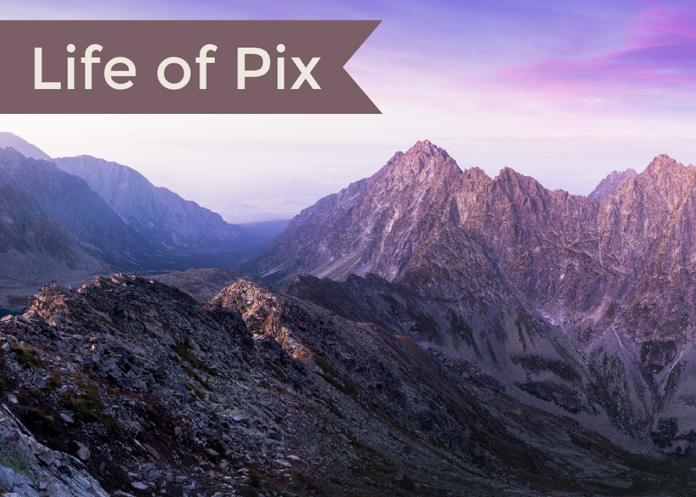
Life of Pix

Life of Pix pulls their content from a community of photographers who upload free, high quality images and video. This site is especially great for gorgeous pictures of nature and travel!


Unsplash

Unsplash is the perfect photo source for lifestyle pictures, food, and culture shots. All the pictures on Unsplash are hosted under a Creative Commons Zero (CC0) license, so you can feel free to alter, copy, or use them commercially.


Pexels

Pexels has a huge collection of high resolution pictures of people, animals, landscapes, and abstract subjects. You can choose to view the most popular images or search for specific topics. 


Fancy Crave

Want to tell a story? Fancy Crave offers a collection of “emotionally driven” images that are licensed under CC0. 


Death to Stock

This is site should be your go to resource for artsy photos and videos with a minimalistic aesthetic. For $15 a month (or $145 annually), premium members have access to unlimited downloads and over 20 new photos a month.  


Pic Jumbo

Pic Jumbo has an extensive collection of pictures for business, restaurants, technology, nature, people...and pretty much anything you can think of. For $10 a month, you can upgrade to a premium membership of over 3,000 stock photos and unlimited downloads. 


Travel Coffee Book

Travel Coffee Book is the go to destination for gorgeous travel photography. You may even be inspired to grab your passport after browsing their giant collection!


Jay Mantri

Jay Mantri posts a variety of free images under the CC0 license. All of the pictures have a soft aesthetic and range from hazy forest landscapes to abstract cityscapes.  


Kaboom Pics

Kaboom Pics has a huge collection of over 4,000 royalty images. This site is a popular source for lifestyle and interior design pictures. We especially love that each image features a complementary color palette!


Creative Marketing in Greensboro, NC and beyond

Hue & Tone is here to help you achieve your goals. From logo design to custom social media content, Hue & Tone can help you get noticed and make a lasting impression. Contact us today to learn more about our design and marketing services.

Pinterest: What to pin if you're an Interior Designer

With over 75 billion ideas to choose from, Pinterest is one of the best resources for creative inspiration.

While we all have fun pinning ideas for DIY terrariums or artisan cocktails, we also know it can be a great place to promote your business. Today, we're honing in on how to use Pinterest if you're an interior designer.

Whether you’re a seasoned professional or just need a little fresh marketing inspiration, we hope you can find some new ideas in this collection. 


Let's get started with a few must create boards...

Whether you create your own custom content, stick to repining, or bring in content from your website, these boards are the perfect way to display your creative expertise for your clients.

Pinterest: What to pin if you're an Interior Designer  |  Hue & Tone Creative

Prints & Patterns
From florals to stripes, prints help add character to any room.


Pinterest: What to pin if you're an Interior Designer  |  Hue & Tone Creative

 Home Décor
Pinterest is a haven for home design! We especially love how you can search for just about any style or room you can imagine.


Pinterest: What to pin if you're an Interior Designer  |  Hue & Tone Creative

Color Play
Pinterest is full of great color scheme ideas for any aesthetic.


Pinterest: What to pin if you're an Interior Designer  |  Hue & Tone Creative

Lighting
A collection of Edison lamps, decorative sconces, and chandeliers offer an upgrade to the basic table lamp.


Pinterest: What to pin if you're an Interior Designer  |  Hue & Tone Creative

Textiles
What better way to add a touch of color and texture than a rug, tapestry, or dramatic pair of drapes?


Pinterest: What to pin if you're an Interior Designer  |  Hue & Tone Creative

Storage
Pin a collection of creative storage solutions to keep clutter at bay.


Pinterest: What to pin if you're an Interior Designer  |  Hue & Tone Creative

Travel
From Grecian sea sides to Italian landscapes, design inspiration can be found worldwide.


Pinterest: What to pin if you're an Interior Designer  |  Hue & Tone Creative

Furniture
No room would be complete without the perfect furniture. Pin great finds from online stores or innovative ways to arrange each piece.


Pinterest: What to pin if you're an Interior Designer  |  Hue & Tone Creative

Hotels & Hospitality
Whether you’re creating a relaxing escape for visitors or streamlined designs to appeal to a wide audience, Pinterest is full of ideas.


Pinterest: What to pin if you're an Interior Designer  |  Hue & Tone Creative

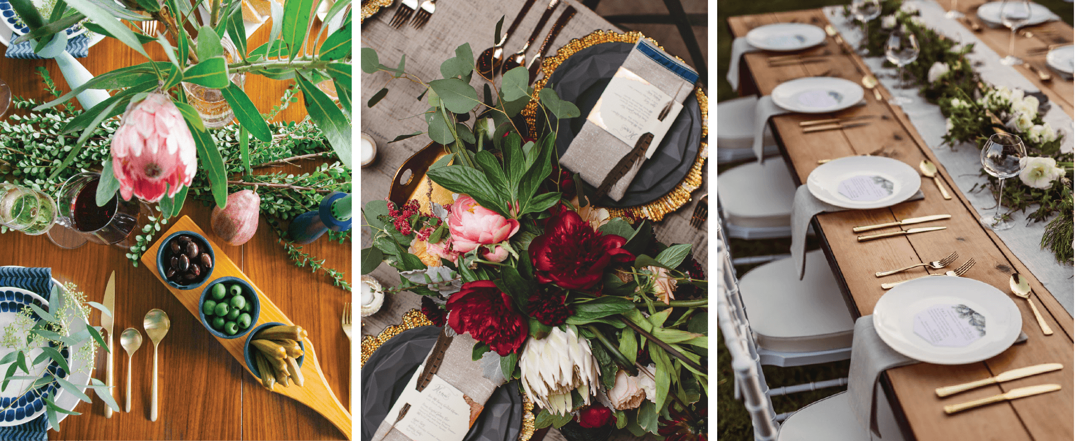
Tablescapes
Create a beautiful scene for photoshoots, gatherings, and events.


Need some new sources to pin from? These accounts are full of creative ideas and gorgeous images:
 

My Design Agenda
A great source for international design, installations, home décor.
 

Apartment Therapy
This well-known name has a loyal following of over 877,000 pinners. This account is full of shopping guides and design inspiration for every room.
 

Old Brand New 
Old-Brand New is curated by a LA-based blogger, Dabito. This diverse account is filled with art, style, and playful color combinations.
 

Design Milk
Interested in modern, minimalistic aesthetic? Design Milk is a stylish resource for clean design.
 

Remodelista
This account is perfect for designers that are drawn to cozy interiors and soft color palates.


Have a favorite account that we left out? Let us know in the comments!


Design & Marketing in Greensboro, NC

Ready to start seeing results? From design to delivery, Hue & Tone can help you create a truly unique social campaign. If you’re ready to start seeing a return on your social media dollars then it’s time to invest in a creative agency that can give you more. If you’re interested in social media management, a new campaign, or another creative service, give us a call today so we can set up a social media audit.

Photography Terms: A Glossary for Beginners
Photography terms for beginners  |  Hue & Tone Creative

With the evolution of iPhone photography, just about anyone can make a shot look artistic. But artistic isn't the same as high quality. While we can appreciate a nice shot on our Insta feed, there’s still a big lane for professional photography in advertising and marketing.

If just bought your first DSLR, or if you're looking to learn to go from a  beginner to a professional, there’s a few terms you should know. 


Aperture

Aperture is the adjustable opening in the lens where light travels. This is one of the three elements that creates exposure. When it comes to shutter speed, fast speeds need large apertures for more light. Slow shutter speeds require smaller apertures with less light passing through.

Aperture sizes are marked by f-stop numbers:

f/1.4 (largest)

f/2

f/2.8

f/4

f/5.6

f/8 (smallest)


Autofocus

This allows your camera to focus on the subject automatically. There are two types of autofocus: single or continuous. Continuous focus is best for moving subjects, and single focus works best stationary subjects.  


An example of bokeh

An example of bokeh

Bokeh

Have you ever noticed the tiny balls of light in filtered pictures? When lights are out of focus and the picture is taken with a wide exposure, it creates an effect called “bokeh.”


Color Depth

Basically, color depth is the amount of color that can be captured by a camera. Color depth is measured in bits, and varies from camera to camera. Higher bits allow for higher quality images with more variations of color. Most DSLR cameras have a color depth of 24 bits of color variation (about 16.7 million colors). 


Exposure

Exposure is the lightness or darkness of a photo.  Three factors determine the outcome of exposure: ISO, shutter speed, and aperture. If you’ve heard that an image is “overexposed”, it means that it is too washed out or too light. “Underexposed” means that it’s too dark.


Flash

Most people probably equate flash with blinding bursts of light and embarrassing school pictures. Flash is usually used to help add light to dark scenery, but it can also be used to create artistic effects.


Focus

Focus involves the clarity of a picture. Typically the main subject in a picture is sharp, and the background behind them is blurred.  It’s all dependent on angles and perspective, but the important thing is keeping the subject of your photo in focus. 


White Balance

Learn more about each white balance setting on Nikon’s site. 

You think you can determine if an object is white by looking at it, but sometimes cameras have difficulty. Color can change because of different lighting conditions: too much sun, a cloudy day, or a dim room.

There’s a white balance setting on cameras that usually solves this problem, but sometimes it’s better to adjust it manually. To do this, you just choose the appropriate setting: PRE, Kelvin color temperature, flash, incandescent, fluorescent, sunny, open shade, or cloudy. 


ISO

ISO stands for the International Organization for Standardization. ISO measures how sensitive your camera is to light. The measurements range from 200 to 1600. Typically, lower numbers require more light for a good exposure. 


RAW

RAW is essential to digital photography. This file format records every bit of image data without processing it. RAW files are the key to creating high quality images, because they can capture more information, levels of brightness, and detail than JPEGs.


An example of the rule of thirds.

An example of the rule of thirds.

Rule of Thirds

This is a basic rule of thumb for strong compositions. Basically, you want to imagine a three-part grid across your image to create a sense of balance.    


Shutter Speed

Every time you take a picture; the shutter of your camera opens and closes. Shutter speed measures how long the camera sensor is exposed to light in seconds or fractions of a second. Higher shutter speeds simply mean that the sensor was exposed for a shorter time.

Shutter speed is important to different areas of photography. For instance, if you’re tyrying to capture an action shot at a football game, a lower shutter speed will make your pictures come out blurry. Low shutter speeds work better for subjects with less movement, because you usually need use a tripod.


Creative Services in Greensboro & Winston-Salem

Don't exactly have an artistic eye? Or, maybe you just need a second set of eyes? Hue & Tone can help you with all your photography, graphic design, and web needs. 

What size should my photo be? Tips on photo resolution for print and web
What size should my photo be? Tips on photo resolution for print and web  |  Hue & Tone Creative

Every new designer has been there – you upload a photo to your site and it looks a little blurry. Or, maybe you get a proof back from the printer and things are looking a little off.

Not understanding photo and file resolution is a quick give away that you don’t know what you’re doing. Don’t let a great design get categorized as a “fail” because of a resolution issue -- arm yourself with a little knowledge and you’ll never again have to cross your fingers when you send something off to the printer.


Key Terms

Let’s start with a quick primer of some important terminology. Whether you’re working by yourself or with a designer these terms are bound to come up.

  • Resolution: Refers to the number of pixels in your image. The number of pixels determines the quality and clarity of your image.

  • Pixel: Defined as “a minute area of illumination on a display screen, one of many from which an image is composed.” Hundreds or thousands of pixels make up every raster image.

  • DPI (Dots per Inch): The amount of dots printed in a square inch.

  • PPI (Pixels per Inch): The amount of pixels in a square inch displayed on a screen.

  • Raw file: A collection of unprocessed and uncompressed data that can be turned into an image. Similar to photography negatives, the RAW image is not directly usable as an image, but has all the information needed to create an image. Many photographers choose to shoot in RAW.

  • Physical Size: The width and height of an image measured in pixels. A large physical size generally causes a longer time to download.

  • Down-sampling: To decrease the resolution of an image. It’s always best to shoot high resolution images so that you have the option to down-sample if needed.

  • Display Size: The size an image is displayed on a screen (monitor, tablet, phone, etc.)


Need a refresher on HOW TO SAVE your files? Revisit our file formatting guide.


Check your image resolution in Photoshop by clicking Image > Image Size.

Check your image resolution in Photoshop by clicking Image > Image Size.

Resolution Standards

Every time you set up project in Photoshop, InDesign, or an alternative design program, stick to these guidelines to ensure clear high quality images.

  • Brochures & Flyers: 300 DPI

  • Digital and Web: This varies. 72- 96 PPI is recommended for quick load times.

  • Large format print graphics: 100 DPI


Converting inches to pixels for print

Curious how many pixels you need for a clear print? Here’s a handful of common print sizes and the corresponding file dimensions you would need to get a 300dpi print.

  • 4”x6” = 1200 × 1800pixels

  • 5”x 7” = 1500 × 2100 pixels

  • 8” x 10” = 2400 × 3000 pixels

  • 8.5” x 11” = 3300 × 4200 pixels

High resolution images are the key to a quality product. But, after you’ve converted your RAW photo files and selected a photo, it’s important to work with an appropriately sized image.

A high quality picture is great – but when you’re working with web files load speed is important and a smaller file is necessary. The higher the resolution, the bigger the file size.

Get in the habit of saving your files at the resolution you need, and you’ll make every project look like a cake walk!


Marketing & Creative Services in Greensboro: Hue & Tone Creative

Need high quality presentation graphics, a fresh new logo, or an updated website? Hue & Tone has you covered. Work with a creative professional that will take the time to listen and bring your vision to life. Contact us today to get the conversation started.

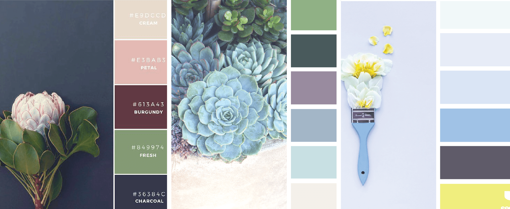
Color Stories: Inspired by Nature

Whether you’re revamping your resume or debuting a new logo, the colors you choose make a difference. With an endless library of colors at your disposal, it can be difficult to decide on the right combo.

Lately, we’ve been finding our inspiration in nature. The great outdoors is a bountiful source of *free* inspiration (and, the photos we used were free too)!

If you can't get away from your desk right this minute, turn to our nature inspired color schemes for your next project. Try out just one... or all of them! 

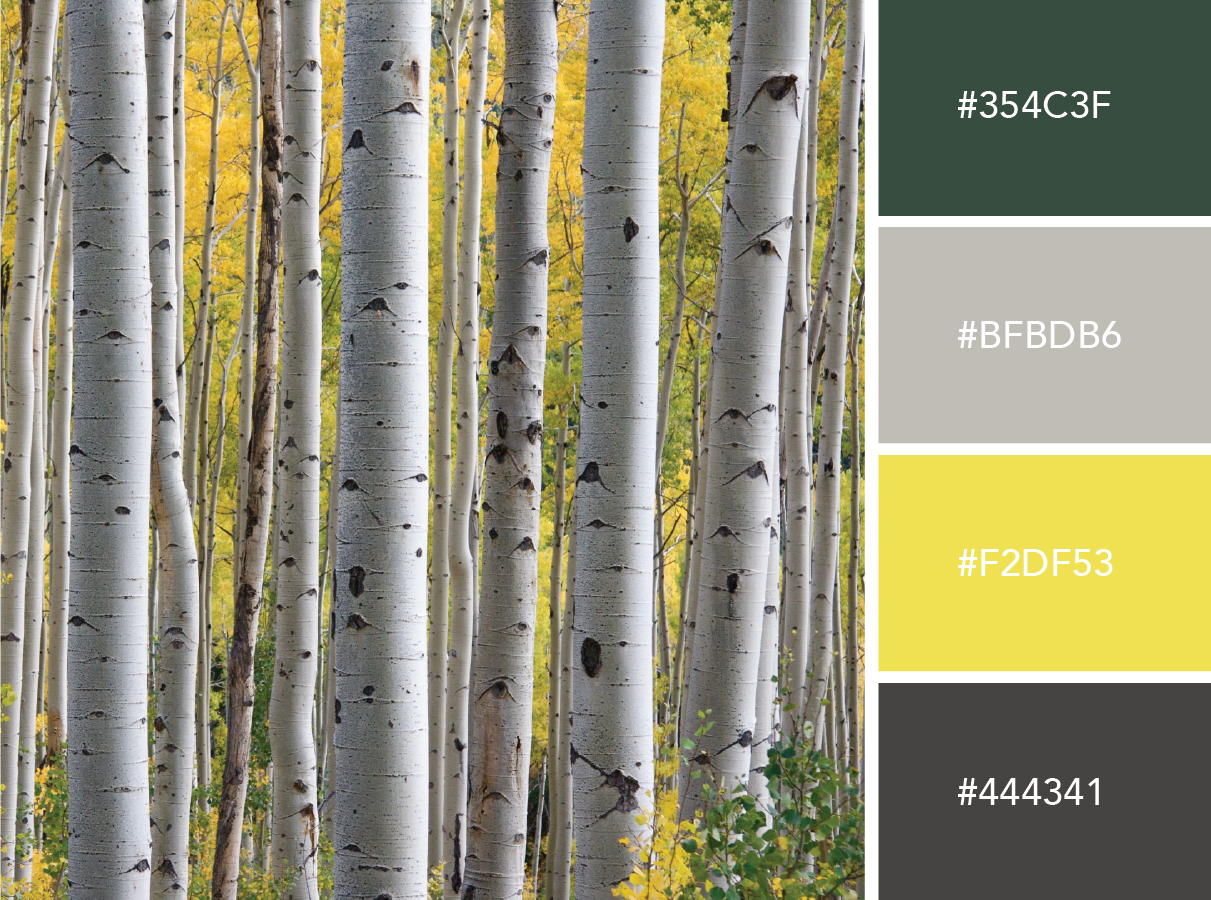
Neon Forest  |  Hue & Tone Creative

Neon Forest

This bold collection is perfect for trendsetters and influencers. Pair energetic colors with a charcoal brown for a crisp contrast.


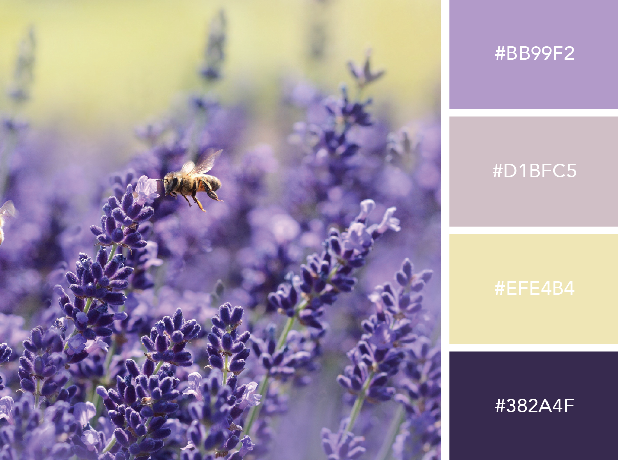
Luscious Lavender  |  Hue & Tone Creative

Luscious Lavender

Not afraid to get a little girly? This playful purple match up is for you.


Salt & Seafoam  |  Hue & Tone Creative

Salt & Seafoam

Want to appeal to a wide audience? These cool tones feel calm and approachable.


Citrus Sunrise  |   Hue & Tone Creative

Citrus Sunrise

Feeling a little playful? This bright collection is perfect for a fun new culinary or children’s brand!


Desert Flower  |  Hue & Tone Creative

Desert Flower

This color scheme is perfect for spring! The feminine and playful combo works nicely for logos, business cards, or boutique packaging.


Vivid Autumn  |  Hue & Tone Creative

Vivid Autumn

These bold tones feel warm and confident -- but still modern.


Bold & Earthy  |  Hue & Tone Creative

Bold & Earthy

Looking for a natural palette that can appeal to a down-to-earth demographic? We've got just the thing. 


Pastel Sea  |  Hue & Tone Creative

Pastel Sea

Think pastels are a little too girly? Tone down the femininity with rich tones. This palette would add a modern touch to packaging or branding materials. 


Incandescent  |  Hue & Tone Creative

Incandescent

These subtle colors serve as a great foundation to help your work stand out. Give this palette a try for your next portfolio site. 


Soft & Whimsical  |  Hue & Tone Creative

Soft & Whimsical

This color scheme feels delicate yet subtly strong.


Creative Professionals in Greensboro and Winston Salem

Need a second opinion on your current creative project? We can help! From personal branding to web-design, Hue & Tone is here to help you make your brand pop.

Which Adobe programs should I by?

A few other products worth checking out:

  • Project Felix
  • Premier Pro
  • InCopy
  • Prelude
  • Muse
  • Character Animator

Photoshop is probably the Adobe program you've heard the most about -- but it's only one piece of the larger Adobe Suite.   

Adobe has over twenty different programs to pick from! And, it can be a little overwhelming if you're new to Adobe or trying to figure out what to learn next. 

This isn't an exhaustive list, just an overview of some of the apps creatives are likely to find most useful. If you don't see what you're looking for here, head over to Adobe's website for an overview of some of their more specialty products. 


Photoshop

From basic retouching to creating detailed photo compositions, Photoshop should be your go-to tool for working with raster images. Images are imported into Photoshop in layers for maximum flexibility, and it's widely used by artists of all kinds. 

Perfect For: photo editing and manipulation, web/app layouts, digital art


Lightroom

Lightroom is a photo processor and image editor that can help you organize and fine-tune your images. It's primary function is to catalog and sort your images. You can touch up basics like brightness and contrast, but for the heavy duty editing you'll need to head over to Photoshop.

Perfect for: viewing, organizing and retouching large numbers of digital images


InDesign

Adobe InDesign is the perfect program to create high quality print and digital publications. InDesign possesses intensive typographical features that make it the go to for longer or text-heavy publications like books, white papers, and newspapers.  It's also great for shorter print documents like brochures and company newsletters. 

Perfect For: print materials, résumés, business cards, and cover letters, creating magazines and eBooks
 

Illustrator

Illustrator is a must have for any graphic designer. Illustrator specializes in creating vector images (unlike Photoshop which works only with raster graphics). Vector images can be scaled up or down indefinitely without manipulating the image. 

Perfect for: logo design, vector illustrations, icon creation, infographics


After Effects

Adobe After Effects is the industry standard for creating professional special effects and animations. It has a variety of high-powered effects which allow you to do things like create a rain simulation, create custom titles, or zoom through your clips in 3-D space. Beware, After Effects only lets you work with one clip at a time, so it's not the right choice if you're looking to splice together a series of video clips. 

Perfect for: animation, motion graphics, cinematic effects, green screening
 

Premiere

Adobe is a production and editing tool meant for working with multiple video clips. It's perfect for editing together things like commercials, testimonials, and news video. Whether you're working on a short or long video project, Premiere is for you.

Perfect for: commercials, webcasts, documentaries


Dreamweaver

Dreamweaver is a must have for web designers and developers. This program has a customizable interface and allows you to see your edits in real time. If you’re new to coding, Dreamweaver has built in code hints and Quick Docs to help you along the way.

Perfect for: Web design (supports: ActionScript, ASP, C#, CSS, ColdFusion, EDML, XHTML, XML, XSLT, HTML, Java, JavaScript, PHP, VB, VBScript, and WML) 


PRICING

Adobe offers several different plan options for individuals, businesses, students/ teachers, and universities. We’re going to focus on the individual plans today. If you’re interested in some of the other options, you can learn more here.
 

Photography- $9.99 a month

  • Includes Photoshop CC and Lightroom CC
  • Portfolio website
     

Single App- $19.99 a month

  • Includes your choice of one desktop program
  • 20 GB of cloud storage
  • Premium fonts
  • Portfolio website
     

All Apps- $49.99 a month

  • Includes all the Creative Cloud programs for desktop and mobile
  • Portfolio website
  • 20 GB of cloud storage
  • Premium fonts
     

All Apps and Adobe Stock- $79.98 a month

  • Includes every Creative Cloud application for both mobile and desktop
  • 10 free Adobe Stock photos
  • One free month of Adobe Stock

Greensboro Graphic Design

Want to add a professional creative touch to your next project? We’re here to help! Hue & Tone can help you create one-of-a-kind projects that tell your story. Contact us today to learn more about our graphic design services. 
The 6-step content calendar

"A content calendar is a shareable resource that marketing teams can use to plan all content marketing activity. The benefit of using the calendar format, rather than just a long list of content to be published, is that you can visualize how your content is distributed throughout the year." - Convince and Convert 


When you’re swamped with meetings, deadlines, and daily work hiccups, squeezing in the time to create content to promote your business can be a hassle.

Creating a content calendar will save you time, provide consistency, and help you manage your communication channels. Chances are, if you’re not pre-planning your social posts and blogs in advance, you’re constantly struggling to find last minute material... usually resulting in rushed and irrelevant content.

Avoid stress and get organized with our 6 step process:  


Step 1: Brainstorm with no distractions

Need some fresh posting ideas? Checkout our What to Post series for, Facebook, LinkedIn, Instagram, Twitter, and Pinterest.

Sit down with a pen and paper and set a timer for 30 minutes. In that time, write down a list of every blog/podcast/content idea that pops into your head. Making sure that you have no distractions is key. When the timer goes off, start divvying up what's appropriate for blog and social media.  

If you're a little low on ideas, you may need to do this process a few times. 

Once you’re done brainstorming, go on a fact-finding mission to study what other businesses and experts do. Then, add any new ideas you have to your master list. From here you can start refining things and decide what works best and what to toss. 
 

Step 2: See what worked

Sidebar: Perform an audit to determine how impactful your social presence is.

Before you start planning, take some time to revisit past posts. Which posts have the most likes and engagement? Which blogs and newsletters have been the most successful?

Once you’ve analyzed what your clients respond best to, you can tailor future content to fit their needs.

Step 3: Determine how often you should post

Tip: Plan content for holidays, anniversaries, product launches, or important events in advance. 

If don’t have a plan in place for how often you want to post on your blog and each social network, you run into the problem of inconsistency. If you’re posting on Facebook 10 times on a Monday, 3 times on a Wednesday, and 6 times on a Friday, your followers will probably get confused, annoyed, or simply unfollow you because they're overwhelmed.

Give your audience a routine so that they know when and how often you’re going to post (especially important with a blog, podcast, or email list). 

The 6-step content calendar  |  Hue & Tone Creative

These are just general guidelines, so feel free to adjust to the frequency that works best for your business and audience.

Step 4: Create a resource library for social and blog images

Take time to compile a long list of post ideas and sources for material. Having a database of quotes, photos, statistics, relevant websites, and content ideas at your disposal will help you organize all of your content ahead of time. And, in the case that you need some last minute content, you already have quality content at your fingertips! 
 

Step 5: Select a tool

There are several great content planning calendars to choose from and many of them are free.

Sprout Social

Basecamp

CoSchedule

Asana

Google Docs/Sheets

Excel

Buffer

Requeue


We personally prefer to plan our content with Google Sheets, and then schedule things out from there on a weekly basis in Hootsuite. But, if you already have a tool you're comfortable with, try to fit your content planning tools into your existing work flow.
 

Step 6 : Plan everything out

While planning is great, don't miss out on trending tops and current events. If a post you have planned doesn't work don't be afraid to change things up!

Now that you’ve brainstormed and found out what works for you, spend time planning out your content on an actual calendar. Figure out how far you want to plan - we suggest planning at least two or three months out, all the way up to a year. 

Plan out big pieces of content like blogs, infographics, podcasts, and emails first. Once you've got that in place you can work your social content for the week around these big content offerings. Don't catch yourself getting bogged down planning out every social post -- you can always just put a general outline of content you’d like to post on the calnedar (quotes, stats, blog throwbacks, tips, etc.)


Greensboro Marketing Firm: Hue & Tone Creative

Stumped on how to make the most of your inbound marketing plan? We can help you plan the traffic driving blogs, social, and email campaigns your brand deserves. 
Top LinkedIn Tips for Job Seekers
Top LinkedIn Tips for Job Seekers  |  Hue & Tone Creative

Like a strong resume, a well written cover letter, and strong recommendations, a well cultivated LinkedIn page can help you land your dream job. But snagging a recruiter's attention with your profile can take a bit of elbow grease -- you'll have to get your profile up to date and stay active. Do that, and LinkedIn may just be the secret weapon your job search needs.

So, let's start turning some heads...


Put your best face forward

Having a professional photo makes your page 14 times more likely to pop up in search results. Fortunately, most people have the common sense to avoid unprofessional selfies and dog face filters. If you really want to step up your profile picture game, we recommend taking a simple headshot against a neutral background.

Keep your profile picture recent: If you’re rocking a Jennifer Anniston hairstyle from Friend’s, it’s time for a new picture. 

Not all industries have the same dress code, so be sure to choose an outfit that reflects the position you’re looking for. Searching for a position as a lawyer or a CPA? Wear a suit! Designers, programmers, and creative job seekers can typically keep it casual.

Not sure about the dress code? Dressier is always better. 


Create an attention grabbing headline

Most recruiters are going to scroll past a boring headline.

Sell yourself and entice people into visiting your page by using creative and descriptive headlines. Simply listing “Freelance Designer” doesn’t tell people what you do or why they should connect with you.

  • Before you create your headline ask yourself a few questions:
  • What do you do?
  • What is your specialty?
  • Why should a recruiter hire you?
  • What do you bring to the table?
  • Do you have any certifications or professional accomplishments?

After considering what you bring to the table, incorporate it into your headline. “Innovative Digital Freelance Artist  |  Specializes in Comprehensive Logo Design and Personalized Branding” is much more descriptive and packs more of a punch than “Freelance Designer."


Quality over Quantity

Before you start looking for new leads and connections, try building up your contacts with friends and coworkers. 

Like most people on LinkedIn, you’ve probably received a random request from someone halfway across the world. Some people are under the impression that a huge LinkedIn network equals networking success.

The reality is, a few genuine and meaningful connections are better than a list of hundreds of random strangers you’ll never meet (or probably even talk to). Don’t worry about the amount of contacts you have. Instead, focus on making genuine connections with past coworkers, managers, and recruiters.


Show Interest

Have a dream company? Follow them! This will keep you up to date on any big news, business successes, and job openings. Having a bank of knowledge about your top companies keeps you in the loop and prepared for interview questions when they arise.


Show off your Skills

Endorsements are an excellent way to be recognized for your strengths. Much like on a resume, list your most relevant and important skills towards the top.

If you’re starting out in a new industry or have recently changed career paths, make sure to keep your skills and endorsements updated regularly. Don’t be afraid to delete old skills that are no longer necessary to the jobs you’re applying for.

For those curious about what skills employers are looking for, take a look at the Top LinkedIn Skills of 2016


Customize your URL

Make it easier for employers to find you. LinkedIn automatically assigns a series of numbers to each member’s URL when they sign up.

You can easily edit your existing URL in your Public Profile settings. Just be sure to keep it simple. Linkedin.com/yourname is as complicated as you need to get. This little change can also make it easier for you to add your LinkedIn profile URL to your resume. 


Use LinkedIn Pulse

For more detailed tips on how to use LinkedIn Pulse, be sure to check out this guide from HubSpot. 

In 2014, LinkedIn introduced Pulse and gave its members a way to share custom content instantly.

Posting on LinkedIn Pulse allows other members and recruiters to discover you organically. It gives you a platform to show off your skills, get exposure, and share your perspective on a variety of professional topics.


Hue & Tone Creative: Your job search partner

Are you a recent graduate, in the middle of a career switch, or just looking for a more fulfilling position? Hue & Tone is here to help you achieve your career goals. From resume design to revamping your LinkedIn, Hue & Tone can help you get noticed and make a lasting impression. Contact us today to learn more about our personal marketing services.
6 Skills Every Marketing Professional Needs

If you’ve watched Parks and Rec you might be under the impression that tigers, free iPads, and mobile hot tubs are the way to attract new customers. While part of us is curious to see what would happen if you use the "Ralphio + Haverford method," we're here to offer a few other ideas. 

If you're looking to go into marketing or feel like you're being left behind by the industry, there's a few things you need to learn:  

6 Skills Every Marketing Professional Needs  |  Hue & Tone Creative

1. Inbound Marketing (More specifically, HubSpot)

In response to the growing dislike of pushy advertising strategies, more and more marketers are embracing inbound.

HubSpot offers comprehensive sales and inbound marketing software that helps businesses generate leads and turn them into customers. HubSpot offers a few free certification courses that are perfect for beginners. The best part? You don't even have to be a customer!

What you can earn (with no commitment):

  • Inbound Certification
  • Inbound Sales
  • Content Marketing
  • Email Marketing
  • Growth-Driven Design
     

2. SEO

If you don't already know about Search Engine Optimization -- we hate to say it -- but you're way behind. The good news is it's never too late to catch up! SEO is the complicated process of generating traffic through organic search results. Because the entire process can get pretty complicated, we highly recommend checking out our SEO Do’s and Don’ts -- as well as this great Beginners Guide to SEO from Moz.


3. Google AdWords

Studies show that 75% of people who perform an online search never scroll past the first page of results. 

Google AdWords allows you to plan and purchase display ads, video ads, app ads and search ads. It also helps you discover new keywords, study trends, retarget, and geo-track traffic so that you can continue improving your ads. 

This a valuable tool for beginners especially because you can monitor goals like ROI, brand awareness, traffic, and conversion all in one easy place. They offer resources that allow you to dip your toes into their content -- or become a fully certified Google Partner.

4. Sprout Social

A social media management platform is a must if you have multiple accounts to manage. Sprout Social allows you to manage your channels, post/schedule easily, and monitor your interaction. We like Sprout because it let's you recycle content by easily rescheduling it.

If you're looking for a less heavy-duty social media management tool to start out with, we suggest looking into Hootsuite or Buffer


5. Google Analytics

Another powerful tool from Google, Google Analytics is valuable for beginners and seasoned marketers alike. This “freemium” service monitors and reports traffic so that you can better understand who your target customer is and what they're looking for.

Google Analytics can help you improve your SEO tactics by tracking the ways visitors discover your site. What words are they using when they search? How many pages and what types of pages do they visit? Which pages and links are the most popular? Google Analytics studies these trends and helps provide the answers you need to make your site easier to find and more relevant to searchers

Use what you learn from Google Analytics in conjunction with Google AdWords and you'll be an unstoppable marketing machine!

6. Email Marketing

Email marketing is here to stay. It continues to grow in popularity year after year and consistently generates a high ROI.  

If you're looking for a cost effective and efficient way to keep in touch with customers then email marketing needs to be a part of your marketing strategy. We prefer MailChimp, but IContact, Constant Contact, and Campaign Monster are other great options. 

The takeaway? The platform you use isn't as important as the fact that you are using an email marketing platform! 


Greensboro Marketing Company

Feeling more than a little overwhelmed? Pass your marketing off to the pros and get it off your plate for good. From email campaigns to comprehensive branding, Hue & Tone Creative is here to help you create. Not sure exactly what you need? We can help you figure that out too! 

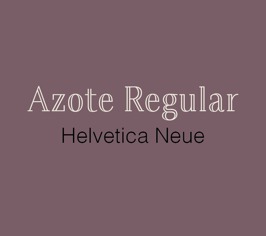
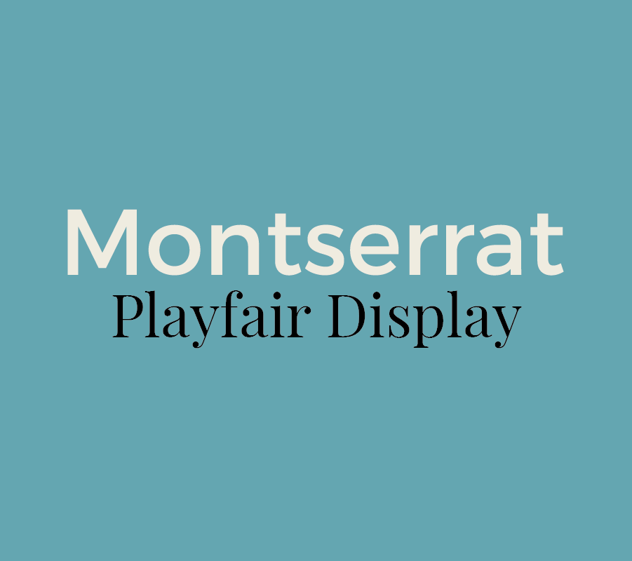
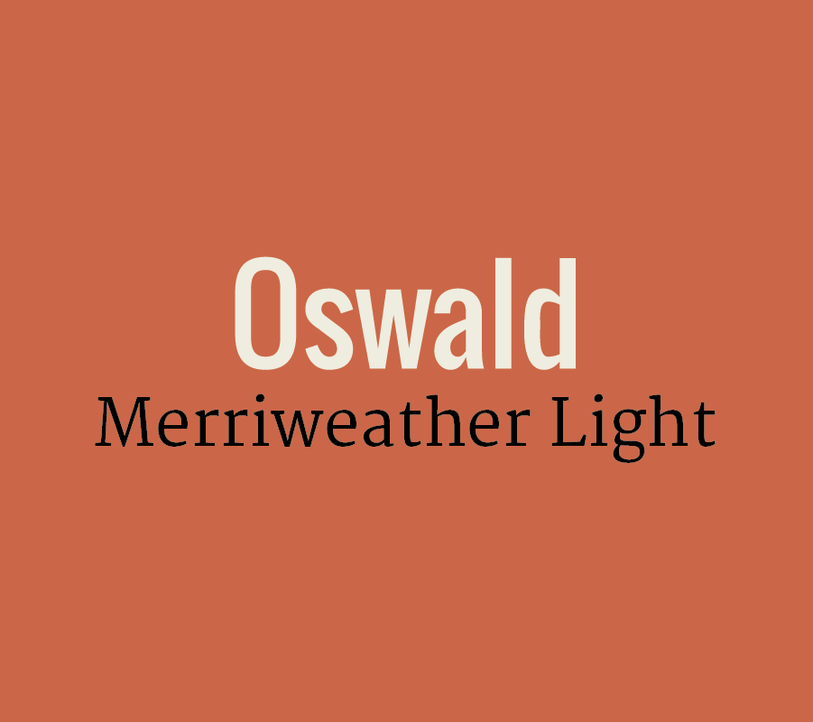
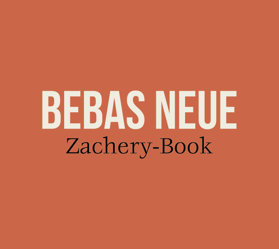
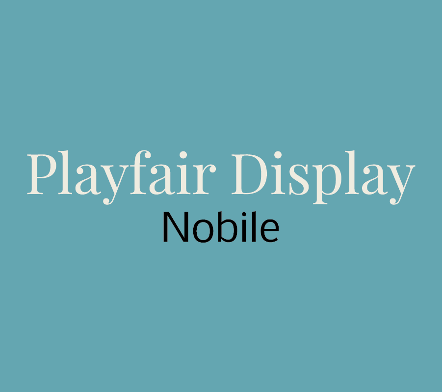
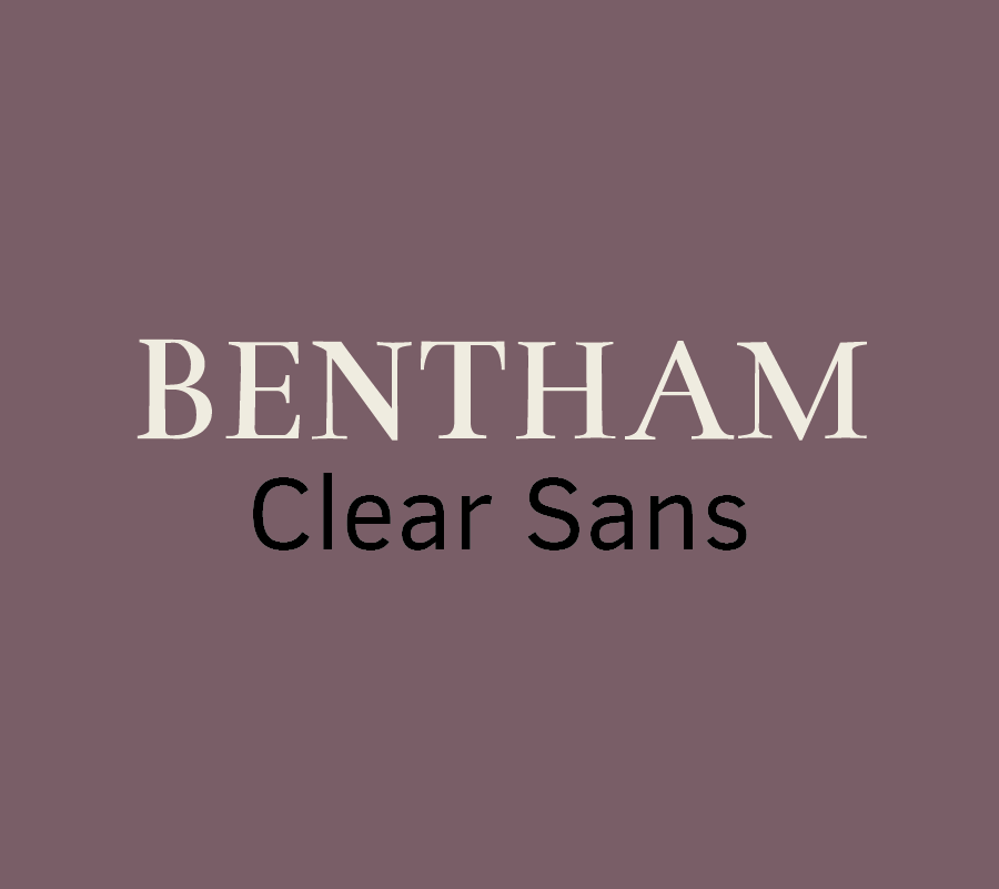
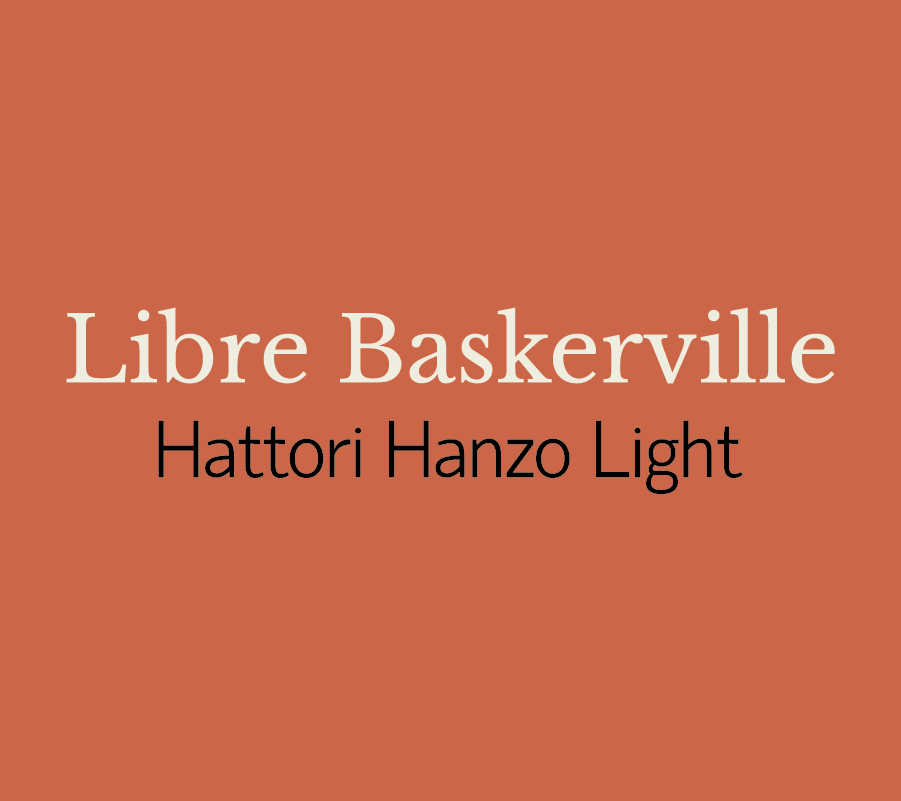
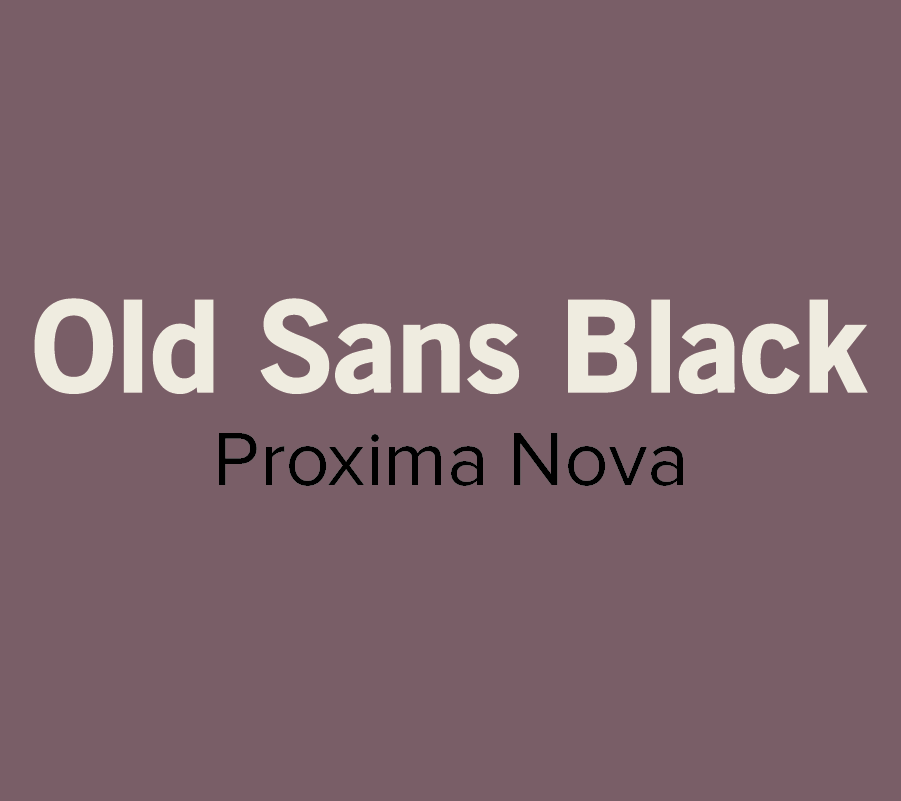
12 Inspiring Font Combination

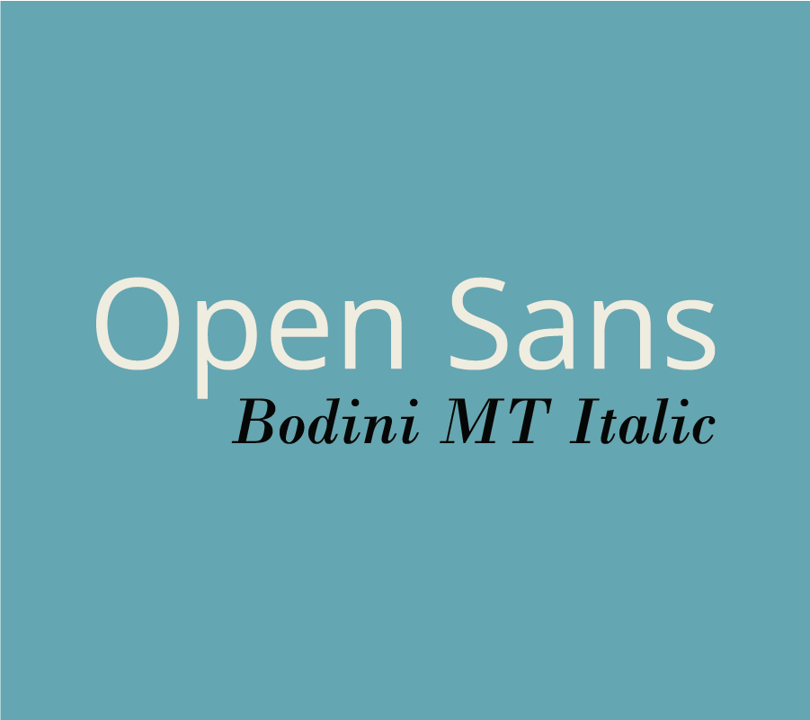
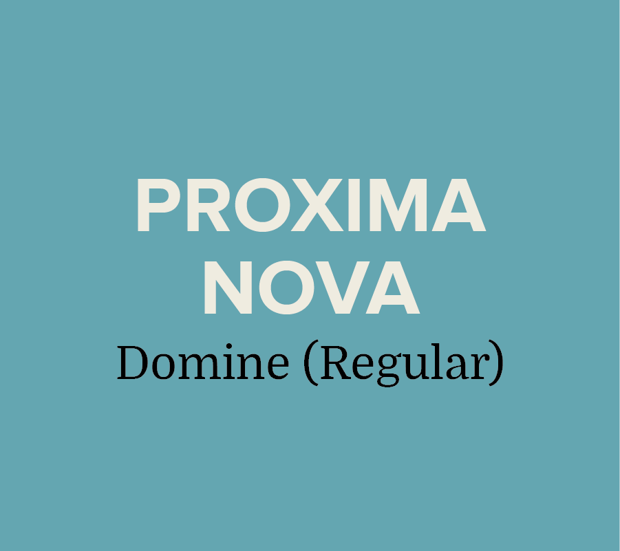
Whether you’re designing a resume, website, or even a graphic for social media, choosing the right fonts can make a good design even better.  However, the seemingly endless font options available at our disposal can make choosing the right ones a little tricky.

To help alleviate a little stress and confusion, we put together a brief guide on font pairing. 

If you’re interested in the complexities of font typography, you can learn more here. But, if you're just looking to learn a few basics, start with these guidelines: 

  • Try combing a serif with a sans serif.
  • Stick to 2-3 fonts, any more than that can be distracting.
  • Designate rolls to your fonts. Keep headings, subheadings, or body text consistent.
  • Vary the weight to achieve visual hierarchy.
  • Contrast is key! Try not to select fonts that are too similar.
  • Don’t pick fonts that clash with your aesthetic.

Now that you have some basics down, here are a few of our favorite combinations:

Most of the font examples we used below are from Font Squirrel, but you can also find some free or inexpensive downloads from these sites:

These are just a few of our suggestions, so don’t be afraid to branch out and try something different. There are seemingly endless font combinations to choose from! Play around and try out different combinations until you find what works best for you.

What are your favorite font pairings? Let us know in the comments!

Do's + Don'ts of Resume Writing

Does the thought of drafting or updating your resume give you an instant headache and fill you with anxiety? Fear not! We’re breaking down the top do’s and don’ts to save you a little stress and help your resume stand out!

DO list relevant experience: Employers typically scan resumes quickly, so make sure to list your most relevant and recent experience at the top. Provide a few brief sentences on where you worked, what you did, and how long you were employed.

The more relevant a position is to what you're applying for the more detail you should include.

DON'T include everything: It’s great if you have a lot of experience, however your part-time barista job isn’t relevant if you’re applying to a position in advertising. Keep it basic and list what’s most important. 

If you need to include regular work experience to pad your resume, keep your description of the positions brief OR just list the positions with no description. Any employer can imagine what you did during your tenure at Burger King -- there's no need to try to tell them or make it sound more impressive then it was. 

DO list your skills: Including your skills helps set you apart from other candidates. Depending on the position you’re applying for, here are some basic skill sets to consider including:

  • Communication: public speaking, persuasion, negotiation
  • Interpersonal: responsible, works well with others, positive attitude
  • Management: leadership, team building, delegation
  • Planning: forecasting, problem solving, analyzing
  • Organization: goal setting, budgeting, punctuality

DON'T be too text heavy: Keep your content clean and easy to read. Employers typically scan for the important stuff, don’t give them giant paragraphs to sift through. You'll have time to elaborate on your experience and skills in the cover letter -- and, hopefully, in the interview. 

Make your resume stand out by writing a customized cover letter for the position. Check out some helpful tips on how to craft the perfect cover letter here.

DO create a separate list of references: Although you don’t want to include your references in the résumé itself, you want to make sure that you have a list readily available. 

DON'T have multiple pages: Your potential employer’s time is valuable, don’t waste it with a novel of a resume. Everyone tries to tell us why their the exception to this rule, but unless you have over 10-20 years of applicable experience, one page is all you need! And, even if you have over 20+ years of experience chances are that you should still stick to one page! 

DO include transferable skills: Transferable skills are the skills you’ve collected throughout your work history. Some skills include: multitasking, planning, delegating, and being a team player. They also include hard skills like using software (be specific), public speaking, and writing. If you’re applying for a job that might be a great fit even though you're underqualified, listing transferable skills can help a potential employer see your potential.  

Include some awesome action words like: renegotiated, integrated, drove, and accelerated. LinkedIn created a great list of potential words to use here.   

DON'T forget about typo’s!: Nothing will ruin an amazing resume faster than typos. This might seem like a no-brainer, but spellcheck saves lives (and jobs)!

DO quantify your accomplishments: “Increased sales by 100%” sounds a lot more impressive than “Increased sales”. Be specific and show what you bring to the table!

DON'T include an objective statement: Expert opinions vary on this subject, but the majority rule that objective statements are outdated.

DO list internships: If you have limited work history, listing relevant internships can help show that you have experience.

So, there you have it. Get working on the content of your resume, because next week we'll be covering how to design it! You’ll have an awesome resume in no time!

Have any questions? Ask us know in the comments

Inbound Marketing: A Crash Course

If you’re like most, commercial breaks are usually spent browsing your phone or grabbing a quick snack before your favorite show comes back on. Banner ads and popups are quickly ignored, and you probably change the station quickly when you hear an annoying radio ad.

Purchase Funnel

  • Awareness: customer is aware of product or service

  • Interest: customer is going out of their way to seek the product

  • Desire: customer wants or aspires to brand/ product

  • Action: customer is planning to purchase product/ service

People have grown tired of traditional in-your-face marketing tactics. We can tell when a company is trying to get us to buy something. Seriously, who looks that excited about going to Walmart on Black Friday? In an effort to connect to consumers and gain trust, more and more businesses are utilizing inbound marketing. 


What is it?

Inbound marketing is the promotion of a business through blogs, newsletters, podcasts, social media, videos, and SEO. Inbound marketing is all about being found naturally. You want potential customers to come to you, rather than having to hunt for them yourself. Customers spread awareness about the brand by reblogging content, sharing posts, and discovering the company naturally during regular search inquiries.


Generating Leads

The main key to successful inbound marketing, is creating content tailored specifically to your target customer.  You then want to make sure to post content on the appropriate channel so that your potential lead can find it and become a customer. For example, if your target client is a parent looking for healthy recipes or school supplies, you wouldn’t want to post them on Tumblr, because those tips would probably never be found.


93% of buying cycles start with an online search and 66% of marketers are focusing on improving SEO and growing their organic presence.  


It’s crucial to do your research and to think like your customer. Where do they go for information? What social media platforms do they use? What key words would they use to search online? When and how often do they make a purchase? Understand your demographics and do your homework so that future leads can find your business organically and eventually become long term customers.


Inbound vs Outbound Marketing

Outbound marketing is quickly becoming outdated and costly. In fact, inbound marketing costs 62% less per lead and 79% of businesses with a blog report that they’ve experienced higher returns when using this marketing tactic.


4 Step Inbound Marketing Strategy

Inbound marketing may sound complicated and difficult to implement, but it can be fairly simple. We’ve broken down the 4 steps to help you get started.

#1. Attract: The best way to attract customers is through blogs, tailored SEO tactics, well-designed websites, and social media. 

Remarketing-Keep your visitors engaged by reminding them about a specific product they showed interest in. 

#2 Convert: After you gain exposure and traffic, the next step is to convert those visitors into customers. Make sure to provide many opportunities for potential customers to connect by providing their email address and contact information. Incentives help, as people are more likely to give out their information in exchange for a free download or a discount code.

#3 Close: Customer Relationship Management or CRM helps keep track of all of the contact information you collect, and allows you to tailor email and newsletters specifically to each customer. Complex and in depth software typically costs hundreds to thousands of dollars, but HubSpot offers a simple version for free. 

#4 Engage/Retain: Keep your customers wanting more by providing a great experience after they’ve made a purchase. Keep track of what products or features your customers respond best to, send out surveys, and continue to send personalized emails.


Hue & Tone Creative

Now that you have a basic understanding about inbound marketing, start working on your own strategy. Why spend time and unnecessary money hunting for possible leads, when you can help them come to you?  

Need tailored assistance with your inbound marketing campaign? Let’s team up! Reach out to Hue & Tone today: 336-365-8559 or hannah@hueandtonecreative.com.

What to post: Facebook
twenty20_241d783a-b1fe-4040-b33d-f644154d5ea0.jpg

Posting selfies, connecting with friends, and sharing your latest Buzzfeed quiz results are just a few of the many uses of Facebook. But for business owners, having a Facebook page is a great way to build trust, engage with customers, and promote your brand’s offerings.

If your business is in the minority not utilizing Facebook, you’re missing out on engagement opportunities! 80% of consumers prefer to connect with brands through this platform to get updates, access to discounts, and to share their experiences. Facebook has also become increasingly popular with older adults and is used equally by both men and women, making this platform ideal for virtually every business.

If you’re new to Facebook, or if you just want some inspiration about what to share, we’ve gathered a list of post ideas:

  • Stories: People enjoy reading content they can relate to. Share a funny anecdote, or even a #throwback story about your company’s beginnings.
  • Seasonal content
  • Blog excerpts: Link your latest blog entries- this also gives you an opportunity to direct followers to your business’s website and portfolio.
  • Company updates: Some of the best posts are the easiest to pull together! Use Facebook to people updated on your company. Anything from highlighting promotions to new products is fair game!
  • Tutorials
  • Promos: Share coupons, discount codes, and any promotions your business is offering. 
  • Testimonials: Repost positive customer experiences or any press/blog mentions.
  • Contests
  • Fill in the blank: Give your followers an opportunity to share their opinions by answering lighthearted questions. “My favorite way to spend a Saturday is _________.” “I can’t get through a Monday without _________”.
  • Infographics
  • Product page links: This is another great way to direct potential customers to your website. Highlight new products of promotions on older items.
  • Picture Quotes
  • Statistics: Post a statistic accompanied by an image-photos receive 39% more engagement than links.
  • Trending Topics
  • Fun pictures: Most people browse Facebook for fun. Keep it from getting too serious with a funny behind the scenes picture or maybe a viral video/ picture (depending on your target customer).
  • Videos: Share a how-to video, GIF, or a live event video.   

Depending on your business, here are a few industry-specific posting ideas:


QUICK TAKES/TIPS:

- Preplan and schedule your posts with services like Hootsuite or Buffer. It’ll save you time and help prevent those annoying “I need to think up something to post in 5 minute” moments.

- Choose engaging and clear profile pictures and cover photos

Link your other business social media accounts to your Facebook page.

Make sure to post at the right timeSaturdays and Sundays (12pm-1pm), Wednesdays (3pm-4pm), Thursdays & Fridays: 1pm-4pm


Hospitality: Photos of the property, past events/ weddings, travel/ vacation planning tips, best cocktails in town, top restaurant picks for Valentine’s Day, local restaurants/ things to do, best local restaurants, favorite weddings from past guests, must see places around town, top rated tours, best luggage brands for your next trip, how to become a better packer, 10 things to pack on your next vacation, seasonal offerings from the on-sight restaurant

Manufacturing: Sneak peak of new products, business partnerships, productivity tips, industry news, product flat lays, weekly roundup of inspiration: design, technology, etc., publication features, latest industry trends, infographics, top products of the year, contests/competitions, employee spotlight, behind-the-scenes

Retail: Promotions/ sales, picture quotes, styling tips, photoshoot sneak peaks, employee favorites, budget friendly gift ideas, seasonal must haves, coupons/ Discount codes, style inspiration, street style inspiration, fashion flat lays, gift ideas for Mother’s Day, Father’s Day, grads, etc., top 10 favorites for spring, fall, etc., outfit of the day inspiration (use #OOTD), customer style inspirations, key wardrobe pieces, holiday outfit ideas

Restaurants/ Coffee Shops: New additions to the menu, game day snacks, daily specials, employee menu recommendations, latte art tutorial video, "What’s your favorite menu item? Comment for a chance to win a gift card.", special lunch discounts during the week, behind-the-scenes, "Like us on Facebook and share this post for a muffin with your next coffee purchase", holiday recipes, tag a friend for a buy one get one coffee promo, video recipe tutorials, events/promotions 


We’ve shared our recommendations, but don’t hesitate to try something new. Just make sure that whatever you share is interesting and helps reflect your brand’s personality. Most people respond better to something that feels genuine and relatable, so don’t try too hard. Have fun and start posting!


Need more posting ideas for your business? Check out our entire "What to Post" series here:

Twitter  |  Pinterest  |  Instagram


Type: A brief guide on typography

What do Chanel, Target, and Harley Davidson have in common? They all use Helvetica. This versatile Swiss typeface speaks to us every day. It’s on street signs, album covers, paper coffee cups, and even the shopping bags of our favorite stores.

Helvetica is just one of many expressive typefaces available to us today. If you’re a business owner that needs an introduction or a designer in need of a brief refresher to typography and font selection, we’ve put together a little guide. We won’t get too in depth- just some basics of typography, different type families, and some recommendations on our favorite typefaces. Sound good? Let’s jump in!


Typography

Typography is the art of arranging letters and characters in creative ways without impacting legibility. Typography isn’t just selecting an interesting font, it’s the art of adjusting the size, spacing, and placement of text in creative ways that captures the viewer’s attention. (source).

Typefaces vs Fonts

One common misconception is that typefaces and fonts are the same thing. The key difference is that font is what you use and a typeface is the creative style you see. In the early days of manual printing, individual metal blocks were used to print each character. If you wanted to use the typeface Baskerville, you would need to purchase the font in the desired point size, style, and weight separately.

Leading, Kerning & Tracking

Leading is the vertical spacing of lines of text. When dealing with several lines of text, you may need to adjust the leading. Kerning is the spacing between two letters to produce an aesthetically pleasing result. You never want your viewer to struggle to decipher tight letters that are smashed together, or to see loose awkward spacing that distracts from the message you’re trying to convey. Not to be confused with kerning, tracking is the adjustment of spacing throughout an entire word.  


Type Categories

Because of its rich and lengthy history, there are several different type families. We’ve included a few examples, but if you’re eager to learn about more in detail, you can read more here.  

SERIF:

SANS SERIF: 

SLAB SERIF: 

Serif

Typefaces in this family utilize serifs, which are the small decorative lines attached to the stroke of a letter. Serifs are like extensions or finishing strokes at the end of characters. Serifs are often used in print media like books, magazines, and newspapers.  Some examples of this type are: Garamond, Times New Roman, and Baskerville. 


Sans Serif

In the early 1900’s, San Serif was criticized as being ugly because they lacked the elegance of the classic Serif style.


Derived from the French word sans, meaning “without”, this typeface does not use decorative finishing strokes associated with its formal counterpart. Because of its simplicity and clarity, Sans Serif typefaces are usually used for websites, signage, and government documents. A popular example that is used almost universally is Helvetica. 

Slab or Square Serif

Developed in the early 19th century, this style implies a heavy block-like serif. Slab Serifs are more geometric in style and have a strong square-like appearance than traditional Serif fonts. Rockwell, Aleo, and Courier New are a few examples of this mechanistic style.


In the early 19th century, Slab Serif was extremely popular for newspapers. The bold style was eye-catching and held up well is mass printing. 


Our Favorite typefaces

There are endless styles to choose from. Here are some of our favorite styles that we think would work well for different areas.

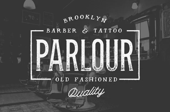
Parlour

We love this rustic and masculine typeface, and think it would be perfect for menswear brands, barbershops, and tattoo shops. 

Hermes

This style is a popular choice for designers because it’s minimalistic, yet strong.

Oraniembaum

We like the retro feel of this stylish serif typeface, and think it would be great for blogs, headlines, or logos.

ADAM

Clean and easy to read, this modern San Serif style provides a futuristic feel to websites and logos.

Knubi

This serif typeface is delicate yet memorable. It would work well for magazines, brochures, books, and most printed media.

Zefani

Zefani has a sophisticated feel and would be perfect for luxury projects.

Rockwell

This thick slab serif is a great choice for eye-catching titles and headlines.  
 

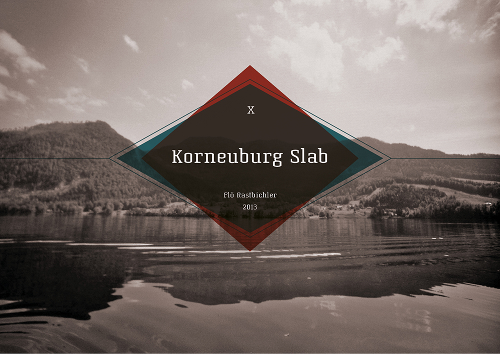
Korneuburg Slab

We love the old world feel of this eye-catching serif typeface. 
 

Julep

We love this versatile typeface, and think it would be perfect choice for fashion brands, coffee shops, or bakeries.
 

Moderne Sans

This typeface was inspired by 1920’s typography. This minimalistic style pairs well with images. 


Shepia

This script adds a fun vintage feel to fashion labels, signage, packaging, and logos. We like that this typeface isn’t gender specific, so it would work well for both menswear and women’s fashion. 


Not sure where to find different typefaces? We’ve got you covered. Here are a few of our favorite sources- several of them offer free downloads:

Dafont

Visual Hierarchy

Hype For Type
 

Great typography can elevate the quality of a design and transform it into something remarkable. It takes time, patience, and a lot of trial and error to develop this skill, so don’t get discouraged! Play around with spacing, placement, and color until you find the best fit for you.  Don’t try to force it - great typography speaks for itself.

What do you want to know about typography? Leave a comment! 


SOURCES:
Source 1  |  Source 2  |  Source 3  |  Source 4  |  Source 5  |  Source 6  |  Source 7  |  Source 8  |  Source 9

Type Rules! The Designer’s Guide to Professional Typography, by Ilene Striver

Which file format should I use?

File formats can read like a different language -- we've all been there. Whether you’re a design student or a small business owner, it is important to understand which formats are best for websites, social media, or logo and packaging design. Sending the wrong file can cost time, money, and a compromised final product.

twenty20_c9fdb499-68bf-4746-966a-2926c375000e.jpg

To clear up some of the confusion, we've pulled together this easy file format guide. The perfect balance between basic and exhaustive, we hope this will answer all your file-related questions: 
 

.JPEG- Joint Photographic Experts Group

Best for: Web and social tasks where the image has a fixed resolution
This format is great for producing high resolution images for both print and web.  JPEGs work through lossy compression, which means that the quality decreases as the file size gets smaller.
 

.TIF- Tagged Image File

Best for large scale prints, banners, large signs
This format is popular with graphic artists and photographers because it’s great for large scale print images.  Because of its large format, it will cause a slow load time and is not recommended for web pages.


.GIF- Graphics Interchange Format

Best for social, small icons, and blogs
Gifs can be downloaded quickly and are often animated. They work through the bitmap image format and can use up to 256 colors in the RGB palate.
 

.PNG- Portable Network Graphics

Best for website headers, logos, any time you need a transparent background
PNGs are low resolution graphics that are typically used for web pages.  They support lossless data compression, so they can be reconstructed without a loss in quality.

If you want your image to have a transparent background (not white) then you'll probably want to use a PNG! 
 

.RAW

Best for: Editing photos before converting them to JPEGs
This format maintains all the data from the image sensor when you take a picture. Unlike a JPEG, a camera raw image file is unprocessed and not yet ready for print. Because RAW files have yet to be compressed, they are ideal for high quality images. Beware -- only certain computer programs will read .raw files! 
 

.PDF- Portable Document Format

Best for: Sharing graphics designed in Adobe, text documents, sending to printer
PDFs are a versatile file format that make it easy to share images and documents. Because of their accessibility, these files are a great way to share work designed in Adobe without the hassle of downloading design software. When in doubt about the software or operating system someone is using send a PDF! 


.AI- Adobe Illustrator Document

Best for: art files
An .ai file is one that was created in Adobe Illustrator -- meaning it was probably used for vector illustration or file manipulation. If you want another designer to be able to edit your original design .ai is one of the formats you could send them. 


.EPS- Encapsulated Postscript

Best for: sharing images to non-Adobe Illustrator users, sending advertisements and pages, and for sharing logos.
An EPS is a file extension for high resolution vector graphics created in Adobe Illustrator.  This format can contain both graphics and text.
 

.PSD- Photoshop Document

Best for: sending layered images, editing and retouching photos, creating logos and packaging
This raster file format uses layers to easily edit and modify images in Adobe Photoshop. This format is great for retouching photos, manipulating images, and for creating complex digital artwork.
 

.TTF- TrueType font

Best for: sharing fonts
Due to its precision and ability to maintain quality, TTFs are the standard format for sharing fonts.
 

.RSS- Rich Site Summary

Best for: sharing news stories, subscribing to blogs, monitoring social media
This format uses web feeds to publish updated blogs, audio, video, and news stories. The RSS format is popular for blogs because it updates subscribers to new content automatically.
 

.PHP

Best for: web development, e-commerce, application development
PHP is used for web development and serves as a programming language. It can be embedded into HTML code and can be used with web template systems.
 

.MPEG 4

Best for: Storing audio, video, subtitles, and stills, online streaming
This digital multimedia file format is used both audio and visual. It can also store still images and subtitles.
 

.MOV

Best for: saving movie, music, and text files, streaming on computers and mobile, downloading audio and video
MOV is a multimedia file container used by Apple’s QuickTime media software. Most videos online are saved in this format because the compressed format makes it easier to download and stream files.  Although it was developed by Apple, it is also compatible with Windows.


.WMA- Windows Media Audio

Best for: high quality digital audio and video
Developed by Microsoft, this format is used for audio data compression. This file format can only be played using Windows Media Player.


One more important note: It's not a file format, but color mode is an important distinction to make when exporting artwork. CMYK and RGB are the main two color modes. RGB is an additive color model used for web. Red, green, and blue light are added together to produce different colors. CMYK is a subtractive color model used for print media. Cyan, Magenta, Yellow, and Black (key) are combined for color printing. When exporting from programs like Illustrator or Photoshop it's important to make sure you've selected the right color mode -- or you'll be shocked by what you get back from the printer!

If you're ever unsure about what format to use, be sure to refer back to this guide! We've had plenty of our own file malfunctions -- and it's not a fun place to be. 

Tell us, have you ever had a serious file mishap? 

The Big List of Icons

We believe that minimalist, clean design is here to stay. 

That means that sometimes the tiniest details can make an impact. We love using icons to add a special touch to our digital content.

To help you find some of the best icons out there, we’ve compiled a big list so that you don’t have to scour the Internet for free icons. Whether you need a new social media icon or even a quirky icon of a soft pretzel, we’ve got you covered. 


1. Long Shadow SOCIAL  |  Download

2. Social Media Hexagons  |  Download

3. Simple MedicaL Icons  |  Download

4. Minimalist Medical  |  Download

5. Simple Travel Icons  |  Download

6. Mountain + Explorer Icons ($8)  |  Download

7. World Monuments  |  Download

8. Summertime Icons  |  DOWNLOAD

9. Nautical Icons  |  DOWNLOAD

10. Weather Icons | Download

11. Succulent Icons | Download 

12. Eco Icons | Download

13. Tree Icons | Download

14. Credit Card Icons | Download

15. Shopping Cart Icons | Download

16. E- Commerce Icons | Download

17. Beauty & Fashion Icons | Download

18. Beer Icons | Download

19. Dessert Icons | Download

20. Glass Bottle & Cup Icons | Download

21. Food & Drink Icons | Download

22. Cooking Icons | Download

23. Graphic Design Icons | Download

24. Drawing Tools Icons | Download

25. Email Icons | Download 

26. Minimal Line Icons | Download

27. IOS7 Icons | Downloads

28. SEO Icons | Download

29. Retro Office Icons | Download

30. Furniture Icons | Download

31. Minimalist Furniture Icons ($13) | Download

32. Home Icons | Download

33. Library Icons | Download

Now that you have plenty of icons to get you started, have fun exploring! There are so many styles out there to suit just about every aesthetic. For more inspiration be sure to follow us on Twitter, Facebook, and Instagram: