Posts in Tips & Tricks
Increase Your Video Reach (Part 3, Great Mobile Video)
INCREASE YOUR VIDEO REACH (PART 3, GREAT MOBILE VIDEO)  |  Hue & Tone Creative

Think about the last time you watched something. Did you sit back on the couch and grab the remote, or did you reach for the phone in your pocket?

The days of devouring media solely on a TV screen are long gone. In fact, the total number of videos uploaded in the last 30 days dramatically surpasses the amount of content produced by major U.S. networks in the past 30 years.

With all those videos out there, how do you get eyes on your own content?

This week for Part 3 of our Great Mobile Video series, we’ll show you how to your iPhone videos to stand out on three major platforms.   


YouTube

YouTube’s search engine is massive, so getting noticed in a sea of competing content boils down to the work you put into your SEO.

To help your videos pop up more often in search results, put time and effort into your metadata (title, description, tags, category, and thumbnail).

TITLE
Your title should be no more than 60 characters long, but keep in mind that mobile users will only see about 26 characters of that.  

Avoid using “clickbait” titles to draw in views. An example? “This will change your life forever!” about a video showing off a new mop. Come up with a title that’s catchy, but honest… or you risk annoying your viewers and forfeiting subscribers.

Organize your videos into playlists. It will entice viewers to watch more of your content. 

DESCRIPTION
Because only 2-3 lines of text (about 100 characters) are shown in the description of your videos during searches, put the most important info first. Mobile users won’t see your description at all, only your title.

TAGS
Spend time researching relevant tags (Google’s Keyword planner is a great tool to use). Make sure that you only use tags that have to do with your video. Irrelevant tags could cause you to land in trouble with Google.

CATEGORY
Make sure to choose the right category based on your viewers’ demographics. We recommend visiting YouTube’s Creator Academy to make sure that your selection is the right fit for your brand.

CREATE A CLEVER THUMBNAIL
An eye-catching thumbnail can help your videos stand from competing search results. Think of your thumbnail as a little snapshot of what your video is about. Stick to a simple scheme like an image from your video paired with bold title. Canva is a great tool to use if you’re not savvy with Photoshop. 


Facebook

Think YouTube is the leading video viewing platform? Well, that’s sort of true…

On average, 45% of people watch over an hour of YouTube or Facebook videos every week. Focusing on one over the other could cause you to miss out on a lot of potential leads.

While you may be tempted to simply share your YouTube link on Facebook, studies show that uploading videos directly to Facebook can increase your share rate dramatically. In fact, when compared to YouTube links, native Facebook videos perform 10x better and receive higher levels of engagement.

Sidebar: Because 85% of Facebook are viewed without sound, make sure that you have your subtitles enabled.

The uploading process it pretty similar to YouTube’s, choose a descriptive title and a compelling thumbnail to draw in views. We highly recommend spending time on your actual post. Only 400 characters of your post will share when people are scrolling through their feeds, so choose your words wisely.

Investing in a Facebook campaign is another great way to amp up your views. Check out our guide for more details. 


Instagram

Before your video debuts, drum up excitement by mixing in teasers with your normal content. 

When it comes to Instagram views, hashtags are your best friend. Using at least one hashtag will bring in 12.6% more engagement that not using any. Just try not to go overboard. The rule of thumb is to choose relevant hashtags that are consistent with your brand, and are easily discoverable by new viewers.

Advertise your video in your bio with a compressed link. You can promote the video further in your other posts by stating “link in bio” at the bottom of the captions.

If you have influencers or special guests featured in your video, make sure to tag their page and have your participants do the same for you. This makes it easier for their viewers to discover your brand. 


One final takeaway…

When you get started with video, don’t obsess over your amount of views. Results take time. Instead, focus on producing and uploading high quality videos regularly, so that you can build up a following and increase your brand awareness overtime.


Hue & Tone Creative: Social Media Marketing in the Triad

Looking to launch an ad campaign or ramp up your social media presence? Get started with the pros! From social media management to email campaigns, the creative thinkers at Hue & Tone Creative can help bring your brand’s story to life.

How to Edit Your Video (Part 2, Great Mobile Video)
Grab a cup of coffee and get ready to edit together a viral video! 

Grab a cup of coffee and get ready to edit together a viral video! 

We’re back after taking a week off from the blog!  Two weeks ago, we shared some filming basics (you can catch up on Part 1 here). Now we’re jumping into the must-know stuff about editing video.

Let’s go ahead and dive in head first! 


Edit on a computer

Although there are plenty of video editing apps to choose from, editing on a computer is the key to producing quality professional videos.

iMovie is the perfect starter program for beginners, but its features can be a little limited.  It’s a great place to start -- you can use filters, voiceovers, and a small array special effects. But you might be a little limited when it comes to visual effects, audio editing, and graphic integrations. (It’s also the only cheap/free option on this list!)

Need an app for spontaneous videos? Magisto and Adobe Premiere Clip are free and perfect for on-the-go projects:

Adobe Premiere Pro is one of the leading cross-platform video-editing programs on the market. Because it’s used by film makers, journalists, and broadcasters, Premiere Pro is perfect for high quality professional content. Virtually every type of film or file type is compatible and can be exported to any screen and format. Premiere Pro also works seamlessly with other Adobe programs like Illustrator and After Effects – great for integrating custom titles.

Final Cut Pro X is a high quality professional program from Apple. Like Premiere Pro, Final Cut specializes in advanced techniques and 4K video. And, we personally find it to be a little more beginner friendly than Adobe Premiere. You can also purchase title and animation templates directly through Apple Motion rather than editing them in separate Adobe programs.


A final tip? No matter which software you use, make sure to back up your files! Nothings worse than losing all your hard work to a corrupt file or technical hiccup. If you’re really looking to make video a big part of your marketing take the safe route and invest in a cloud plan or external hard drive. 


Consider the Viewer

The obvious goal of your video is to be shared. When you’re editing, focus on what you want your audience to see, think, and feel.

The best way to spark your creativity? Go watch other people’s videos and see what’s trending!

Are you trying to spark an emotional response? Sharing a clever hack? How you present your material makes a difference in how it’s received by others. Think of your video as a story, with a clear beginning, middle, and ending. If you’re viewers are confused by what they’re watching, they’ll move on to something else.

Studies show that the average viewer’s attention starts to dwindle after 8.25 seconds. To keep your viewers engaged, trying to break up talk-heavy scenes with visuals or infographics. You can also shake up static scenes by varying your camera angles. 


Cut out the fluff

You have a limited amount of time to hold your viewer’s attention and communicate your message. If your video if veering off-topic, cut it down. There’s no point filling your video with irrelevant content.

Make sure to scan your video for mistakes, “ums”, awkward little moments where you may have lost your train of thought (it happens to everyone). Cutting on specific words can help transition to a different topic and make the video flow evenly. 


Tailor for social

Your video’s length really depends on which platform you’re uploading to. Keep this little guideline in mind before you start filming. Save intros/outros for YouTube videos. There’s no need to use them for shorter social media videos.

Facebook: 1 minute

Twitter: 45 seconds

YouTube: 2 Minutes

Instagram: 30 seconds


Add Some Music

Want to use some subtle background music? Here’s a list of sites that offer music with a Creative Commons license.  Just be sure to double check the terms before you use a song. 

Music can add a nice touch and help set the tone of your movie, but make sure to watch the volume! Background music should enhance the scene, not overpower it.


Create a Silent Video

No, not a Charlie Chaplin inspired silent film (although, that may be a fun idea). We mean a soundless video.

Videos on Facebook and Instagram autoplay without the sound, so it’s important to edit with that feature in mind. No one wants a loud video to start playing when they’re standing in line at Starbucks or sneakily browsing Facebook during a boring meeting (don’t do that, BTW).

Using strong visual elements like bright colors, bold fonts, and graphics will help your audience get the gist of what your video’s about when it’s muted.

You can also add captions with iMovie, Premiere Pro, or Facebook Live. Just watch your placement and make sure to use a crisp bold font that’s easy to read at any size.


That’s it for this week’s installment! Check back next week for Part 3 of our mobile video series…we’ll be giving you a run down on how to get more views!


Social Media Marketing in Greensboro and Winston Salem

Struggling to get noticed on social? We can fix that! From social media management to email campaigns, Hue & Tone creative can help boost your engagement and help create a loyal following. We can also help you come up with a plan to creatively incorporate video into your daily social schedule!

Why you need to be using Google Analytics

There are tons of web tools out there, but there’s one you need to be using: Google Analytics.

Google Analytics is powerhouse for data generation. It’s easy to use and can help you figure out what's hindering your site’s user experience. You can figure out where your site traffic comes from, who your users are, and what content they like best.

Why you need to be using Google Analytics  |  Hue & Tone Creative

So, let’s talk a little more about what Google Analytics is and why you should be using it.


What it is:

Google Analytics supplies marketing teams with all the data you and your team need to make better marketing decisions.

Signing up is easy and free -- a major plus for businesses on a budget. Start by filling out some basic info about your company, industry, website, etc. Then, you or your web developer just has to paste a small snippet of JavaScript code into your pages. This custom tracking code allows Google to monitor your pages and how often your site is visited.

Give it a few days and you’ll have access to new data that gives you a better understanding of your customer experience and site performance. 


Why you need to use it:

From big businesses to small blogs, Google Analytics can help provide you with comprehensive insight on who your visitors are and how they use your site.

Google Analytics shows you where your customers are coming from and which channels they use to discover you. Are they finding you through paid ads or organic methods? Do you get more visits through mobile? Which geographic locations bring in the most views? Having access to this data can help you examine trends to get a better feel for who your customers are and how they interact with your brand.

Do you feel like you site is lacking attention? Use Google Analytics to monitor your bounce rate (the percentage of people who leave a website after a single page visit). Figure what your pages are lacking and fill the gaps with engaging content.

Google Analytics can also help you measure your traffic and analyze which blog posts or web pages are the most popular. How many people visit your site each day? Are people responding better to visual content? What writing format attracts more viewers? Google can help you break it down and act as a guide to help you build a more customer-friendly site.

In short, it’s time to get Google Analytics on your site. Get started HERE


Digital Marketing & Graphic Design in Greensboro & Winston-Salem

Feel like your website or social media pages aren’t getting enough attention? We can fix that! From custom web design to creative content ideas, Hue & Tone Creative can help you get noticed.

What size should my photo be? Tips on photo resolution for print and web
What size should my photo be? Tips on photo resolution for print and web  |  Hue & Tone Creative

Every new designer has been there – you upload a photo to your site and it looks a little blurry. Or, maybe you get a proof back from the printer and things are looking a little off.

Not understanding photo and file resolution is a quick give away that you don’t know what you’re doing. Don’t let a great design get categorized as a “fail” because of a resolution issue -- arm yourself with a little knowledge and you’ll never again have to cross your fingers when you send something off to the printer.


Key Terms

Let’s start with a quick primer of some important terminology. Whether you’re working by yourself or with a designer these terms are bound to come up.

  • Resolution: Refers to the number of pixels in your image. The number of pixels determines the quality and clarity of your image.

  • Pixel: Defined as “a minute area of illumination on a display screen, one of many from which an image is composed.” Hundreds or thousands of pixels make up every raster image.

  • DPI (Dots per Inch): The amount of dots printed in a square inch.

  • PPI (Pixels per Inch): The amount of pixels in a square inch displayed on a screen.

  • Raw file: A collection of unprocessed and uncompressed data that can be turned into an image. Similar to photography negatives, the RAW image is not directly usable as an image, but has all the information needed to create an image. Many photographers choose to shoot in RAW.

  • Physical Size: The width and height of an image measured in pixels. A large physical size generally causes a longer time to download.

  • Down-sampling: To decrease the resolution of an image. It’s always best to shoot high resolution images so that you have the option to down-sample if needed.

  • Display Size: The size an image is displayed on a screen (monitor, tablet, phone, etc.)


Need a refresher on HOW TO SAVE your files? Revisit our file formatting guide.


Check your image resolution in Photoshop by clicking Image > Image Size.

Check your image resolution in Photoshop by clicking Image > Image Size.

Resolution Standards

Every time you set up project in Photoshop, InDesign, or an alternative design program, stick to these guidelines to ensure clear high quality images.

  • Brochures & Flyers: 300 DPI

  • Digital and Web: This varies. 72- 96 PPI is recommended for quick load times.

  • Large format print graphics: 100 DPI


Converting inches to pixels for print

Curious how many pixels you need for a clear print? Here’s a handful of common print sizes and the corresponding file dimensions you would need to get a 300dpi print.

  • 4”x6” = 1200 × 1800pixels

  • 5”x 7” = 1500 × 2100 pixels

  • 8” x 10” = 2400 × 3000 pixels

  • 8.5” x 11” = 3300 × 4200 pixels

High resolution images are the key to a quality product. But, after you’ve converted your RAW photo files and selected a photo, it’s important to work with an appropriately sized image.

A high quality picture is great – but when you’re working with web files load speed is important and a smaller file is necessary. The higher the resolution, the bigger the file size.

Get in the habit of saving your files at the resolution you need, and you’ll make every project look like a cake walk!


Marketing & Creative Services in Greensboro: Hue & Tone Creative

Need high quality presentation graphics, a fresh new logo, or an updated website? Hue & Tone has you covered. Work with a creative professional that will take the time to listen and bring your vision to life. Contact us today to get the conversation started.

The 6-step content calendar

"A content calendar is a shareable resource that marketing teams can use to plan all content marketing activity. The benefit of using the calendar format, rather than just a long list of content to be published, is that you can visualize how your content is distributed throughout the year." - Convince and Convert 


When you’re swamped with meetings, deadlines, and daily work hiccups, squeezing in the time to create content to promote your business can be a hassle.

Creating a content calendar will save you time, provide consistency, and help you manage your communication channels. Chances are, if you’re not pre-planning your social posts and blogs in advance, you’re constantly struggling to find last minute material... usually resulting in rushed and irrelevant content.

Avoid stress and get organized with our 6 step process:  


Step 1: Brainstorm with no distractions

Need some fresh posting ideas? Checkout our What to Post series for, Facebook, LinkedIn, Instagram, Twitter, and Pinterest.

Sit down with a pen and paper and set a timer for 30 minutes. In that time, write down a list of every blog/podcast/content idea that pops into your head. Making sure that you have no distractions is key. When the timer goes off, start divvying up what's appropriate for blog and social media.  

If you're a little low on ideas, you may need to do this process a few times. 

Once you’re done brainstorming, go on a fact-finding mission to study what other businesses and experts do. Then, add any new ideas you have to your master list. From here you can start refining things and decide what works best and what to toss. 
 

Step 2: See what worked

Sidebar: Perform an audit to determine how impactful your social presence is.

Before you start planning, take some time to revisit past posts. Which posts have the most likes and engagement? Which blogs and newsletters have been the most successful?

Once you’ve analyzed what your clients respond best to, you can tailor future content to fit their needs.

Step 3: Determine how often you should post

Tip: Plan content for holidays, anniversaries, product launches, or important events in advance. 

If don’t have a plan in place for how often you want to post on your blog and each social network, you run into the problem of inconsistency. If you’re posting on Facebook 10 times on a Monday, 3 times on a Wednesday, and 6 times on a Friday, your followers will probably get confused, annoyed, or simply unfollow you because they're overwhelmed.

Give your audience a routine so that they know when and how often you’re going to post (especially important with a blog, podcast, or email list). 

The 6-step content calendar  |  Hue & Tone Creative

These are just general guidelines, so feel free to adjust to the frequency that works best for your business and audience.

Step 4: Create a resource library for social and blog images

Take time to compile a long list of post ideas and sources for material. Having a database of quotes, photos, statistics, relevant websites, and content ideas at your disposal will help you organize all of your content ahead of time. And, in the case that you need some last minute content, you already have quality content at your fingertips! 
 

Step 5: Select a tool

There are several great content planning calendars to choose from and many of them are free.

Sprout Social

Basecamp

CoSchedule

Asana

Google Docs/Sheets

Excel

Buffer

Requeue


We personally prefer to plan our content with Google Sheets, and then schedule things out from there on a weekly basis in Hootsuite. But, if you already have a tool you're comfortable with, try to fit your content planning tools into your existing work flow.
 

Step 6 : Plan everything out

While planning is great, don't miss out on trending tops and current events. If a post you have planned doesn't work don't be afraid to change things up!

Now that you’ve brainstormed and found out what works for you, spend time planning out your content on an actual calendar. Figure out how far you want to plan - we suggest planning at least two or three months out, all the way up to a year. 

Plan out big pieces of content like blogs, infographics, podcasts, and emails first. Once you've got that in place you can work your social content for the week around these big content offerings. Don't catch yourself getting bogged down planning out every social post -- you can always just put a general outline of content you’d like to post on the calnedar (quotes, stats, blog throwbacks, tips, etc.)


Greensboro Marketing Firm: Hue & Tone Creative

Stumped on how to make the most of your inbound marketing plan? We can help you plan the traffic driving blogs, social, and email campaigns your brand deserves. 
Most Outdated Web Design Trends
Stop boring your visitors with bad web design...

Stop boring your visitors with bad web design...

Like chain wallets, spiked hair, and jelly shoes, many web design effects have come into fashion and then disappeared, never to be seen again. As design technology continues to develop, so do consumers’ opinions of what constitutes a strong, professional design aesthetic. Here are 7 outdated effects we’re happy to say goodbye to.


Drop Shadows

The drop shadow was one of the 90s’ most beloved Photoshop effects. With the click of a mouse, web designers could make big blocks of text appear “fancy” and defined. Unfortunately, when applied to a large area of text, drop shadows made websites uncomfortable to read and difficult to browse. Thankfully, designers have moved on to more minimal font-enhancing effects.


Outdated Fonts

Many fonts which were once very popular now serve as bright red flags that a website was created by someone with very little design experience. Comic Sans is widely recognized as one of the world’s worst fonts, as well as Papyrus, Curlz, and Bradley Hand. Even “normal” fonts such as Times New Roman or Arial can make a website appear unprofessional since, as Microsoft Word default fonts, they indicate “lazy” font selection.


Bevel, Emboss, and Gloss

Bevel and Emboss were once extremely popular Photoshop tools which could be used to create a stylish “3D” appearance. Flash-forward a few decades later, and the effect is now more cringeworthy than impressive. Bevel and emboss were supplanted by the “Gloss” effect, which was used to make web buttons imitate shiny plastic or glass. Nowadays, designers have mostly moved onto more subtle choices to create attractive buttons that beg to be clicked. 


Adobe Flash Intros

Once upon a time, Adobe Flash intro videos like this one were all the rage. Nowadays, however, such videos have become internet dinosaurs. Not only do visitors tend to find them irritating, Flash videos are not supported on most mobile devices and can even hurt a website’s search engine rankings.


Auto-Play ads/music

Auto-play, which has been described as “the most hated digital advertising tactic,” is not yet completely eradicated, but should be. Few things are more alarming than opening a new webpage and being assaulted with a loud advertisement or blast of music. Sadly, many companies still insist on treating their visitors’ ears with everything from loud sales pitches to soft jazz.


Lack of Mobile Optimization

The biggest mistake modern companies are making in terms of web design is lack of mobile optimization. With smartphones and other mobile devices quickly becoming the preferred method of internet access for the majority of consumers, it’s more important than ever for websites to be mobile-friendly. Google itself says that more Google searches are performed on mobile devices than on computers, so if your website isn’t legible when shrunk to fit a smaller screen, you’re missing out on a huge market opportunity.


Professional Greensboro Web Design Company

If your company website features any of the above trends, perhaps it’s time for an update. A professional graphic designer at Hue & Tone Creative can help create a visually pleasing, modern design that guides people to focus on your products and services, not the platform on which you offer them. If you’re interested in logo redesign, website design, or another creative branding service, give us a call today for a free website audit.
Resume Design: Get noticed

Last week we went over all the basics of writing a killer resume. Now that your resume is written to impress, it's time to work on a knockout design.  

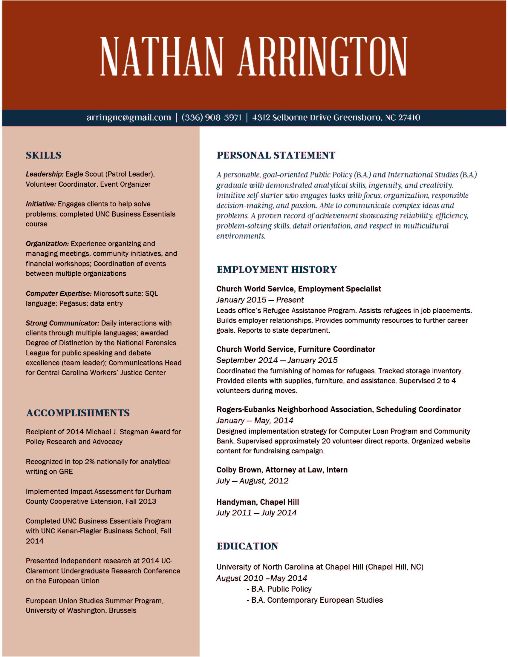
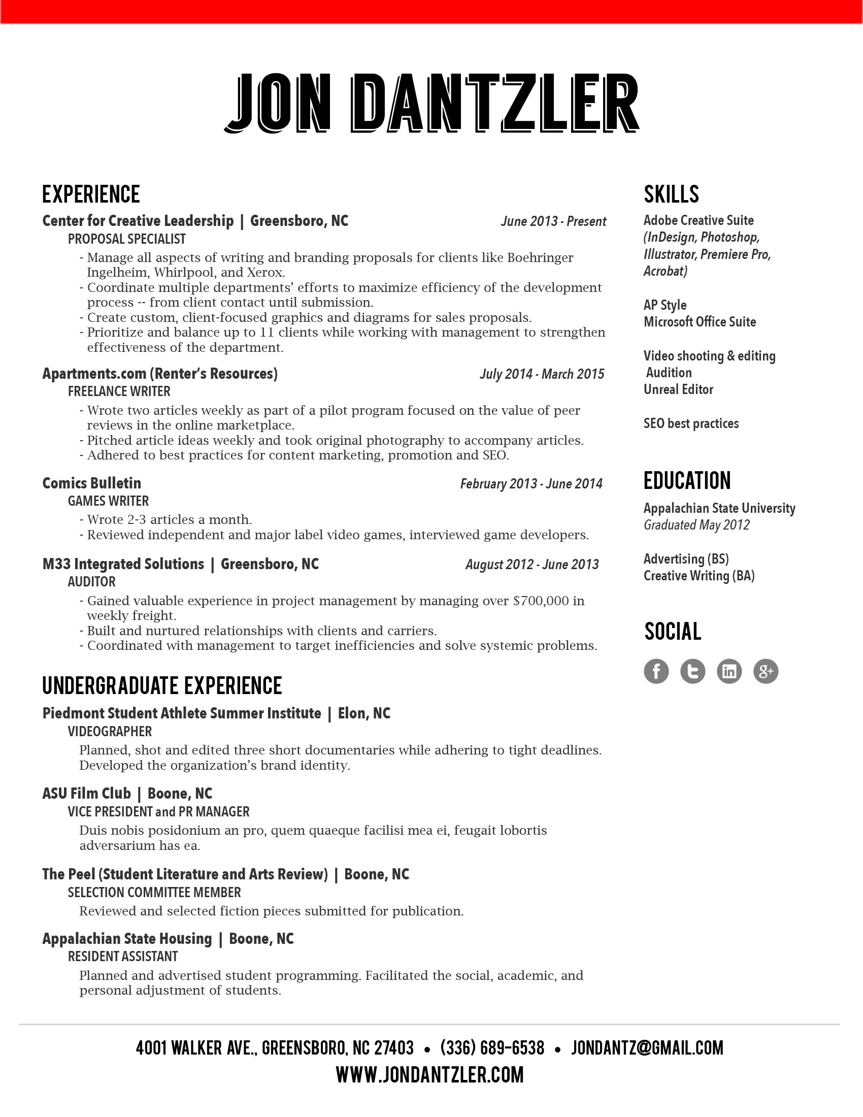
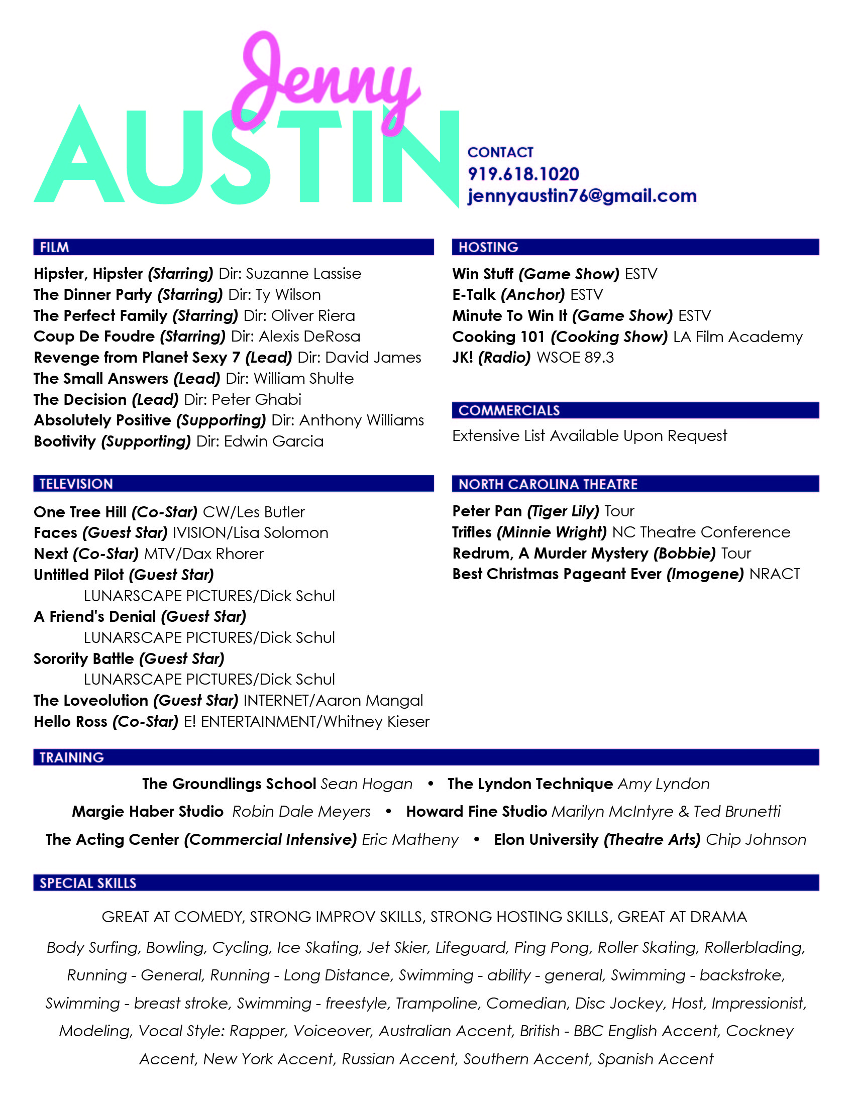
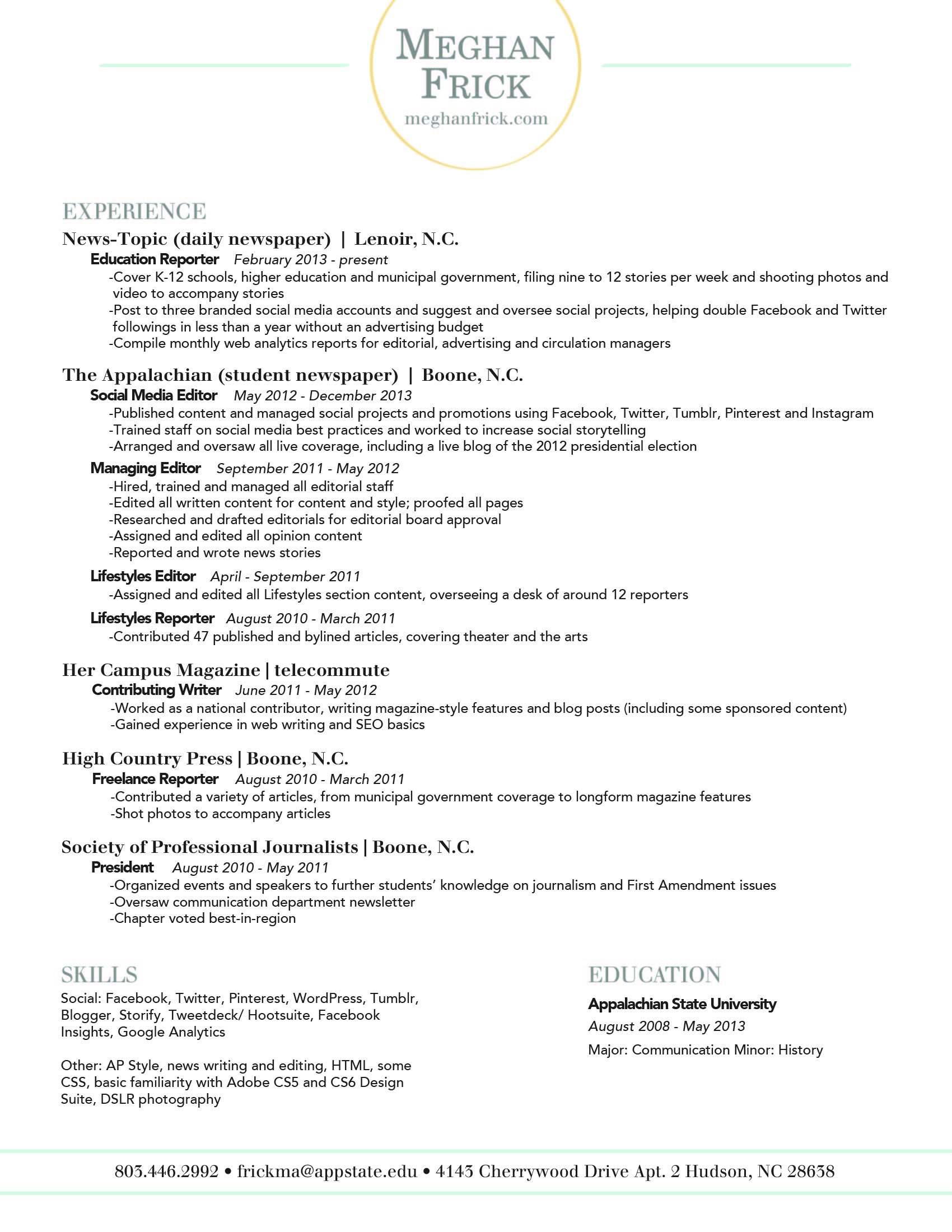
Selecting the right font, color, and composition can be an intimidating task, especially when your dream job is on the line. To help relieve some resume-design stress, we’ve compiled some tips and examples to help you get started. 


Personal brand

Before you begin designing your resume, you need to do some thinking about your personal brand. Your resume is more than just a piece of paper, it’s a glimpse into who you are as an employee. Are you neat and organized? Expressive and creative? Show it off! Create a strong, well-organized resume that showcases your personality and sets you apart from the competition. 


Fonts

When selecting a font, it’s crucial to choose something that’s professional and easy to read. Some fonts that seem fine at first glance may be difficult to read when they're used for a full page of text.

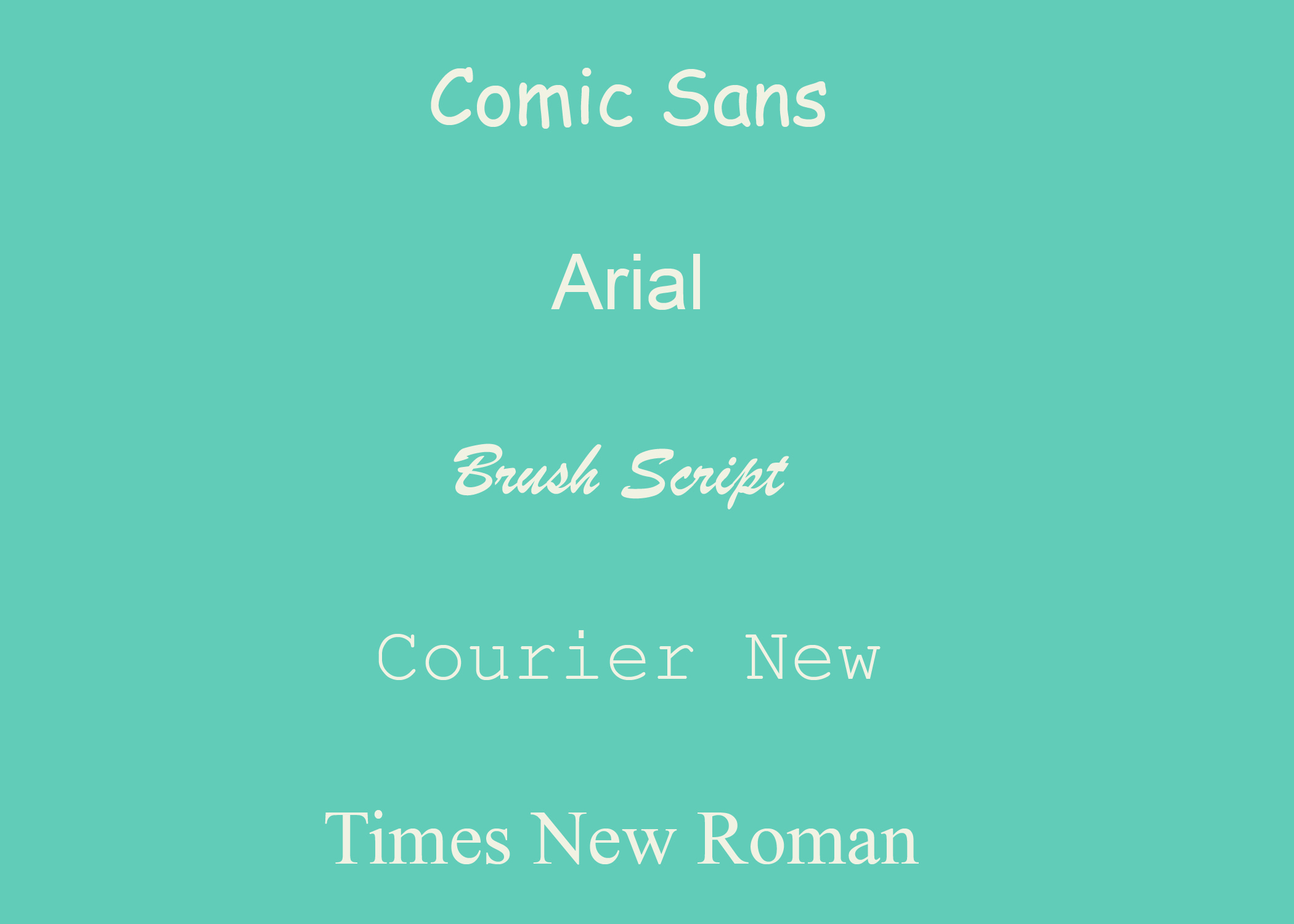
Best Fonts: Garamond, Helvetica, Garamond, Proxima Nova, Georgia, Gill Sans MT, and Calibri are all great choices. 

examples-02.jpg

Stay Away from: Zapfino, Brush Script, Trajan Pro, Courier (looks like you typed up your resume on a typewriter), Comic Sans (Never use Comic Sans!)

Arial & Times New Roman aren’t bad, they’re just overused. We recommended choosing something less predictable. It’s best to stick to 9 - 12pt. font for the body of your resume, but feel free to go bigger for headings and subheadings. 

Don’t be afraid to use more than one font! It adds interest and helps highlight different sections of your resume.  Just make sure to use no more than 2 (3 max) and keep it consistent. Use the same font for the body, headings, and subheadings, respectively.  

Layout

Regardless of the style and design you choose, keep your resume to one page!

Constantly looking at screens has changed the way people read. People tend to scan the entire page rather than read top to bottom. Use bolded text to make important aspects of the resume stand out.

To maintain your one page resume format, you can use columns to save on space and keep your content organized. We also recommend staggering your font sizing help highlight different aspects. Try using 12 pts. for headings, 11 pts. for the subheadings, and 9 pts. for the body text. 


Color

A pop of color is a great way to make your resume standout. While we don’t recommend one color over another, we do recommend that you chose a hue that isn’t distracting or unprofessional. A hot pink resume worked for Elle Woods, but it probably won’t work out well if you’re applying for an accounting position.          


Icons

Depending on the position you’re applying for, you may want to use icons to add some interest to your resume. Social media icons can help give your resume a contemporary look and highlight your contact information. Check out our Big List of Icons for some free downloads.

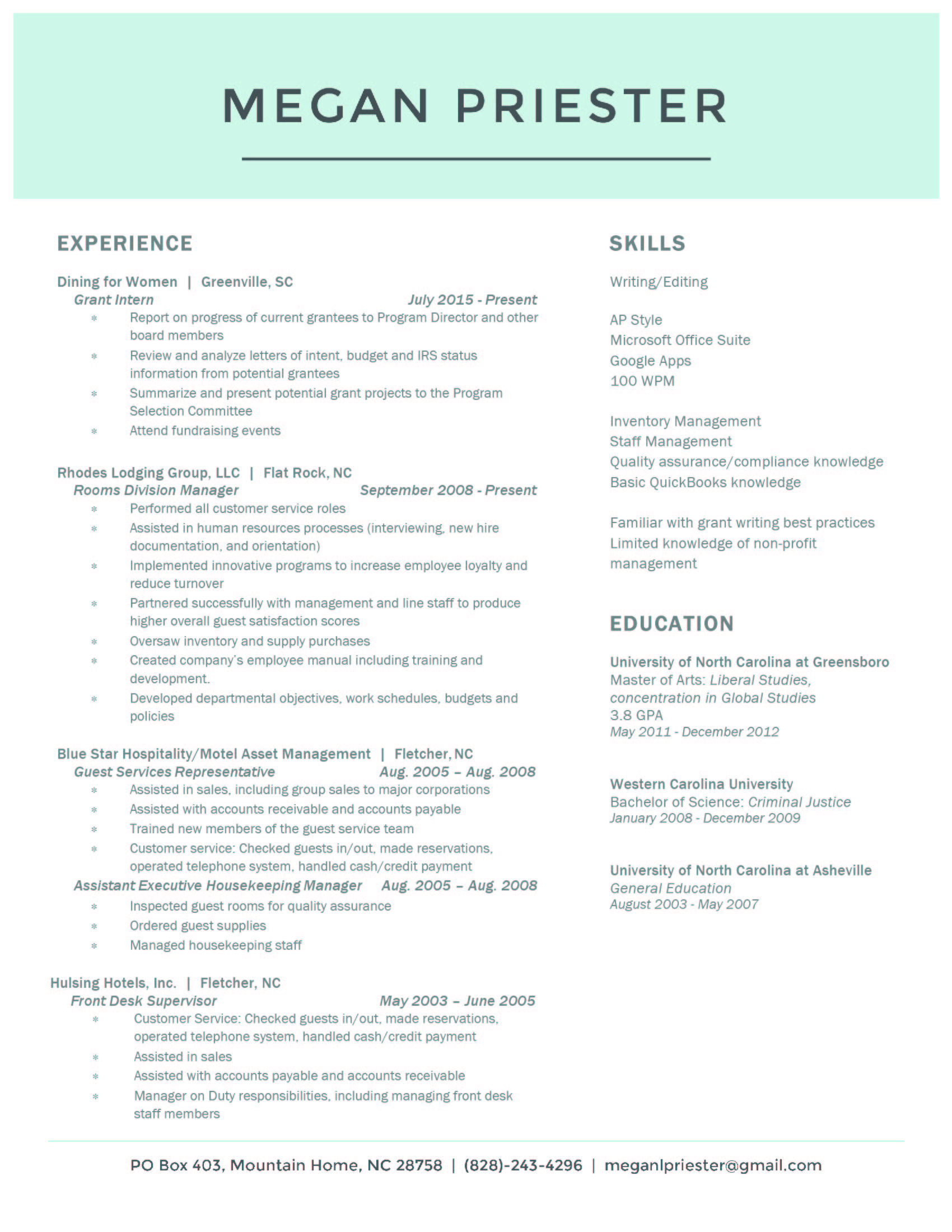
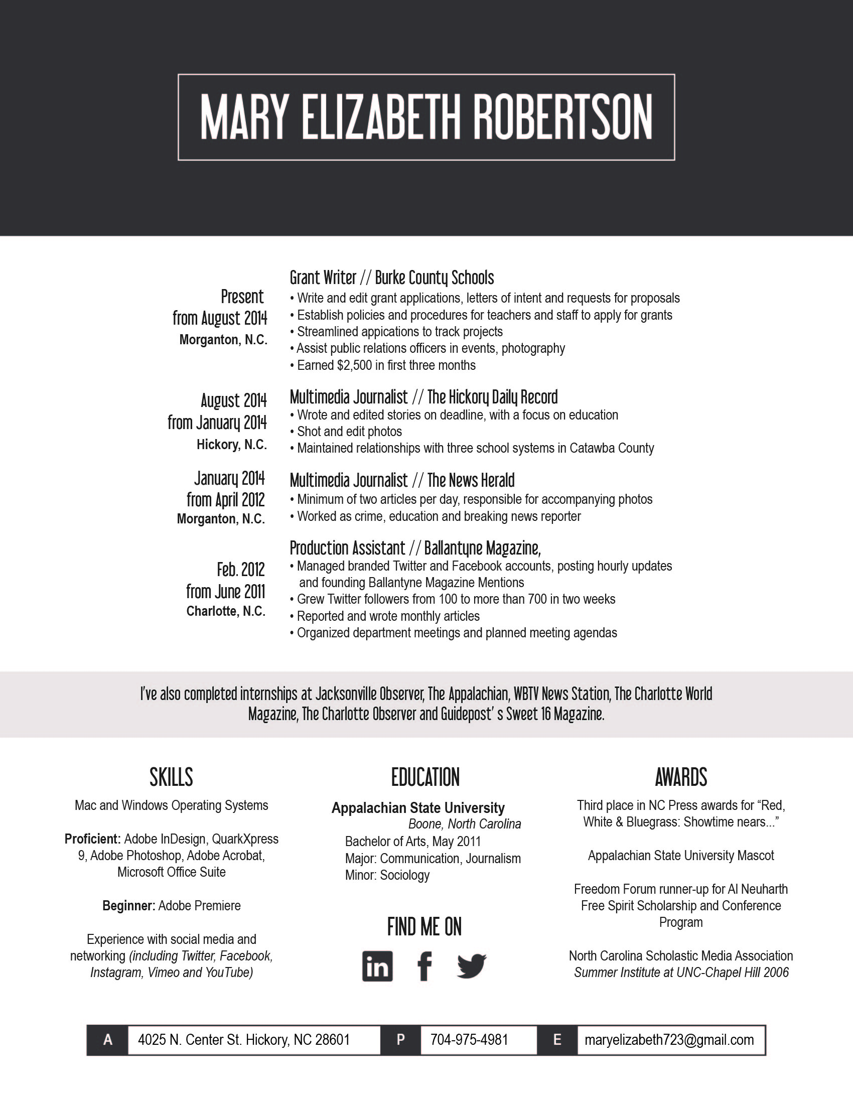
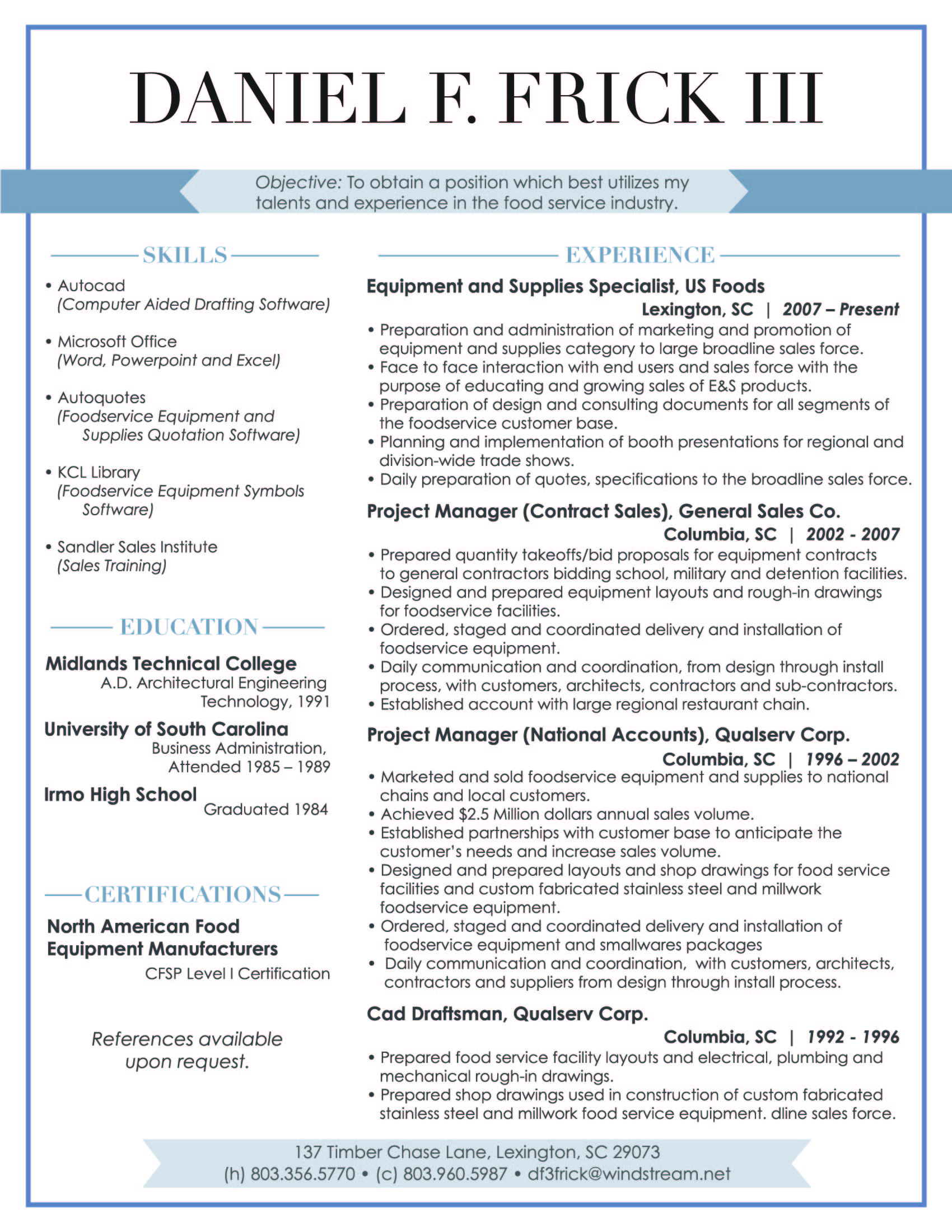
If you need a little help to get your design jumpstarted, check out this slideshow of resumes we've done for inspiration!  

Once you’ve crafted the perfect resume, make sure that you have alternative files available. You don't want to risk having your resume tossed aside because no one can open the file! 

Now that we’ve broken down some resume-design tips, it’s time for you to get started! Play around with different layouts and styles until you find what works best to express your personality as a candidate.

Looking for further reading? 

Do's + Don'ts of Resume Writing

Does the thought of drafting or updating your resume give you an instant headache and fill you with anxiety? Fear not! We’re breaking down the top do’s and don’ts to save you a little stress and help your resume stand out!

DO list relevant experience: Employers typically scan resumes quickly, so make sure to list your most relevant and recent experience at the top. Provide a few brief sentences on where you worked, what you did, and how long you were employed.

The more relevant a position is to what you're applying for the more detail you should include.

DON'T include everything: It’s great if you have a lot of experience, however your part-time barista job isn’t relevant if you’re applying to a position in advertising. Keep it basic and list what’s most important. 

If you need to include regular work experience to pad your resume, keep your description of the positions brief OR just list the positions with no description. Any employer can imagine what you did during your tenure at Burger King -- there's no need to try to tell them or make it sound more impressive then it was. 

DO list your skills: Including your skills helps set you apart from other candidates. Depending on the position you’re applying for, here are some basic skill sets to consider including:

  • Communication: public speaking, persuasion, negotiation
  • Interpersonal: responsible, works well with others, positive attitude
  • Management: leadership, team building, delegation
  • Planning: forecasting, problem solving, analyzing
  • Organization: goal setting, budgeting, punctuality

DON'T be too text heavy: Keep your content clean and easy to read. Employers typically scan for the important stuff, don’t give them giant paragraphs to sift through. You'll have time to elaborate on your experience and skills in the cover letter -- and, hopefully, in the interview. 

Make your resume stand out by writing a customized cover letter for the position. Check out some helpful tips on how to craft the perfect cover letter here.

DO create a separate list of references: Although you don’t want to include your references in the résumé itself, you want to make sure that you have a list readily available. 

DON'T have multiple pages: Your potential employer’s time is valuable, don’t waste it with a novel of a resume. Everyone tries to tell us why their the exception to this rule, but unless you have over 10-20 years of applicable experience, one page is all you need! And, even if you have over 20+ years of experience chances are that you should still stick to one page! 

DO include transferable skills: Transferable skills are the skills you’ve collected throughout your work history. Some skills include: multitasking, planning, delegating, and being a team player. They also include hard skills like using software (be specific), public speaking, and writing. If you’re applying for a job that might be a great fit even though you're underqualified, listing transferable skills can help a potential employer see your potential.  

Include some awesome action words like: renegotiated, integrated, drove, and accelerated. LinkedIn created a great list of potential words to use here.   

DON'T forget about typo’s!: Nothing will ruin an amazing resume faster than typos. This might seem like a no-brainer, but spellcheck saves lives (and jobs)!

DO quantify your accomplishments: “Increased sales by 100%” sounds a lot more impressive than “Increased sales”. Be specific and show what you bring to the table!

DON'T include an objective statement: Expert opinions vary on this subject, but the majority rule that objective statements are outdated.

DO list internships: If you have limited work history, listing relevant internships can help show that you have experience.

So, there you have it. Get working on the content of your resume, because next week we'll be covering how to design it! You’ll have an awesome resume in no time!

Have any questions? Ask us know in the comments

SEO: Improving keywords + search results

If you’re totally new to SEO and want to learn more about it in depth, check out a great beginner’s guide here.

According to Google, the World Wide Web is comprised of over 60 trillion individual pages. By understanding and using SEO effectively, you can make yourself stand out from the trillions of other pages vying for you customer’s attention.

Search engines work by crawling and indexing all of the sites on the Internet. In order to generate relevant results complex algorithms are used to help sort the results and rank pages by popularity.

When searching for a restaurant, dentist, or a new pair of shoes online, we are naturally inclined to click on the websites near the top of the page. That’s because as consumers, we’ve instilled trust in those top tier search results. As a business, you want to be in those top results.

Today we’re going to dive into two elements of proper SEO marketing: keywords and search ranking. Keywords are the specific words a search engine uses to match your web page up with a search query. Understanding which keywords to use for your business is crucial because the right keywords can work as a guide to draw your target market to your site.

A common mistake people are guilty of is solely focusing on the amount of traffic being directed to your site. Traffic is important, but what’s even more important is attracting the right traffic. If you’re not using the right words, you’re missing the opportunity to help your target customers discover your business. 

Driving visitors who are looking for a different kind of site will only result in frustration for them – and no sales for you. If you’re just starting to brainstorm keywords for your site, the most important thing to ask yourself is what keywords fit the content on your website.

You want to consider clever keyword that capture your brand – but aren’t terms that are so niche no one would ever search for them. If you’re selling organic gluten free vegan cookies, simply using “cookies” or “bakery” is far too broad. Consider terms like “vegan muffins” “Greensboro, NC” or “unique vegan muffins.”


Tools like this keyword explorer can help give you real-time data on the terms you should be using!


So, are keywords the only thing that determine your search ranking? Not by a long shot. The usability of your website also plays a big role. Just like with a brick and mortar store, the experience a customer has when they visit you influences their impression of your business and determines a potential sale. If your website is easy to navigate, welcoming, and stimulating, more people are likely to visit, make a purchase, and return.

If you’re interested in allllllllll the other factors that can effect a website’s rank, take a look at this in depth study from Moz.

Social media can also be used to improve your site’s rank. Social media sites rank in searches, many people use social sites to perform searches, and most people agree social accounts have an impact on your website ranking. The easier viewers can share your content the better off you’ll be!

Keyword selection, usability, and social are just a few of the factors that influence ranking. If you’re out on the web searching for different ways to keep increasing your ranking remember there are some SEO methods that you’re better off avoiding. Paid links, deception, and spamming to boost popularity are considered black hat SEO. Using black hat methods can result in a loss of credibility and even cause your website to become banned on search engines.

For more on SEO, check out our rundown of do's + don't. Then, jump in and put the SEO tips you've learned to use! 

Small business on a small budget

Marketing is a necessity no matter what your business. But, it’s important to remember that a solid marketing plan can come in a wide variety of shapes, sizes, and budgets.

Bootstrap marketing is all about making the most out of your resources, finding new ways to work with others, and becoming your own PR agent. It’s the best mindset for new business owners because it’s wallet-friendly and forces you to use your creativity.

Fortunately, there’s a vast array of tools that you can take advantage of...without depleting your bank account!
 

Gather quality research

Estimated cost: Free

Use a short questionnaire to gather the opinions of people on the street, outside of shopping centers, or events that fit your target demographic. Load your iPad with a set of quick questions to ask people, visual aids, and product comparisons -- then hit the street!   
 

Create a Contest

Estimated cost: Whatever you decide to give away

Contests are a great way to use social media to engage your followers. Create a small scale contest by having your followers respond to a question or share a picture accompanied with a fun hashtag. Have your followers share your business page or submit their email address for a chance to win a product from your business. For long term contests, be sure to drive excitement daily and encourage your followers to enter for their chance to win!
 

Give the inside scoop on social

Estimated cost: Free

When posting on Instagram, Facebook, or Twitter, keep the one in seven rule in mind. For every seven posts you create, make sure that one in focused exclusively on promoting your brand. The content of the other six should focus on providing information, testimonials, or entertaining images or videos.


Start a loyalty program

Estimated cost: A few discounts or free gifts

Keeping an existing customer is far less expensive than searching for new customers. Create a loyalty program to show your clients that they are valued with discounts, tier programs, exclusive shopping days, or points programs. Check out Belly, Perkville, PunchTab, or Brownie Points if you’re looking for an app to help get you started.  


Remember to always keep your email list growing! Give your visitors several opportunities to register every time they visit your website.

Launch an email campaign

Estimated cost: Free (until you reach a high volume sending list)

Use your creativity to keep your emails engaging and beneficial to your customers. Feature flash sales, rewards program perks, and anything new to your businesses.  Stream Send, MailChimp, and Benchmark Email are some easy to use email marketing services.  


Embrace guerrilla marketing

Estimated cost: $10-$500

Hand out custom t-shirts, stickers, or swag (like water bottles or dog toys). People love free stuff so give them something to remember you by!

Or, consider using sidewalk chalk or posters to get your message out around town.


Gather testimonials

Estimated cost: Free

Stand out from your competitors by providing success stories from previous customers. Don’t be afraid to ask for feedback from your satisfied customers. Most are happy to write a review when they’re happy with a purchase. You can also offer a free trial or complementary item to select customers in return for an honest review. These are great to use in marketing materials of all kinds!


Maintain a blog

Estimated cost: Free (assuming you already have a website)

Most people would rather purchase a product or service from a brand with a personality rather than a stiff corporate tone. Use your blog to relate to customers as a person or small business! If you are new to blogging you could start with a customer success story, market trends, a behind the scenes look at your business, or maybe a feature of some of your staff members.


Things we don't recommend you skimp on?
An eye catching logo and an amazing website.


Partner with other businesses

Estimated cost: $50+

Look for local businesses that share similar values, target customers, and experience as your brand. Most businesses welcome connections, especially when they benefit both parties. For instance, if you own a bakery, partner with a nearby coffee shop on a special rewards card, let local vendors sell their wares in your storefront, or let a local artist offer painting classes at night. 


Host an event

Estimated cost: $500+

Think about the interests of your target customer and invite them to exclusive events. Anthropologie often holds special events for Anthro card holders. Guests are able to attend DIY workshops, fashion shows, and even pet adoption days. You can make an even larger event by networking with other businesses in your area. Many local businesses hold special shopping nights where customers can travel from store to store and enjoy sales and refreshments. There are endless event ideas, the key is to get your customer excited and eager to come.


Now that you’ve learned some budget friendly tips, remember that working with a small budget doesn’t necessarily mean a small marketing presence. Spend your money wisely and business will be booming in no time!

Brand your social media images like a pro

We are living in the Golden Age of social media. Today, you can post a picture of your artisan avocado toast on Instagram, pin your imaginary dream wedding, or simply tweet about whatever random thing your cat just did. Although these things can seem silly, social media is incredibly powerful if used the right way. Utilizing social media is especially fantastic for brands -- you can reach audiences around the world or just expand your reach locally.
 

1.     Who are you?

Before you start posting, it is crucial to have a clear sense of your brand. Is your look sleek, modern, and polished? Are you bold, artistic, and experimental? Taking the time to research and understand who you are as a brand allows you create a look that is entirely your own.

If you’re feeling a little stumped a mood board is a great way to start your research. Use Pinterest, Photoshop, or even a paper collage to gather whatever images speak to your brand. Anytime you feel lost for inspiration, go back to your mood board as a reminder of what your brand represents.
 

2.     Color & Fonts

In addition to color, your brands choice of fonts and lettering are also important. Anthropologie often uses fonts that look handwritten to capture the whimsy of their merchandise. Alternatively, Target uses clean minimalistic lettering that pairs well with the brand’s simple and crisp aesthetic.
 

3.     Filters & Photo Editing

Along with ready to use filters, adjusting your brightness and saturation can make your images more eye catching. Bright clean images with bold pops of color are perfect for brands with a youthful and playful aesthetic.

Muted colors with strong saturated hues work well for brands with a modern sophisticated style.

Although filters are fun to use, you don’t want your social media accounts to look like a confused medley of styles. Pick a look and stick to it.

One last tip,

It’s easy to obsess about achieving perfection, but it’s ok to mess up. You might discover a filter you like better or find some unexpected inspiration. Growing, learning, and evolving is much more valuable than staying predictable and stagnant. Have fun and don’t be afraid! 

What to post: Twitter

The average tweet only has about a three hours shelf life. For business owners, that translates to needing to tweet often -- without sacrificing quality. You need to be on the top of your game to maximize your available 140 characters and capitalize on the few instants of attention you’ll get from followers. If you’re thinking that retweets will get you what you want… think again.

If you’re stumped on where to start -- or you’re just running low on ideas -- here’s a few things to test out:

  • Keep it industry related: No matter what you want to post, you can’t go wrong by keeping your content focused on your industry. This is one of the best ways to attract quality followers who have the same interests or profession as you.
  • How-to’s/tips/tricks: If you own your own business, you’ve got specialized knowledge of some kind. Think about what you know and boil your knowledge down to shareable tricks and tips that your clients can implement on their own. There’s no better source for original content than yourself!
  • FAQ: Think about what questions you hear most often from your clients and customers. If they want to know, chances are, other people will too. So, save everyone some time and tweet the answer! Play your cards right, and this will leave everyone following you wanting more...
  • Bold + high quality images: Whether you’re posting a photo from around the office or a sample of client work, an eye catching photo is key. An iPhone photo will definitely suffice, but make sure to use an app like Snapseed or Afterlight to clean up your photos.
  • Useful stats: People hear so much information every day it’s hard to know what to believe. Make yourself stand out as a reliable, industry source by sharing up-to-date, reliable stats on your industry… just be sure to double check your information and cite your sources.
  • A behind-the-scenes photo: Help people put a face to your company by sharing behind-the-scenes photos of what’s happening at your office. You’ll have to use your best judgment to decide if things like taking the team out to lunch fits with your image -- but no matter what message you’re trying to send there’s definitely something from behind-the-scenes that you can share.
  • Capitalize on local: If you’re a local business there’s no better way to connect with new clients than to focus on other local businesses, community events, and the general goings on in your area. Not only does this show you’re in the loop, it allows you to keep up with competitors, and can help you forge valuable connections.
  • Stay on top of trends (and help keep your followers up to date): Showcase your knowledge by staying plugged in to industry publications and key Twitter users in your field. This will help you stay on the cutting edge! For example, when a social platform rolls out a new feature we try to be one of the first to alert our followers.
  • Take a survey: Ask customers/clients what they prefer or are interested in, what they want to learn more about, which of your products is their favorite, etc. You’ll be creating great content… all while getting insight into your customer’s wants and needs!
  • Incorporate relevant hashtags: With limited characters it’s important to pick and choose the right hashtags to use. Content that isn’t related to the hashtag will annoy other users -- and won’t gain you any high quality interest. If you’re looking to reach a new audience (who isn’t?) then jump on to trending hashtags and try out some other new tags.

Do: have fun, have personality, be yourself, credit others when you share information, and respond promptly

Don’t: get political, don’t push too hard, or be too salesy

Keep in mind all of these posting ideas are for your business account. If you find it’s hard to keep your Twitter from getting too personal, start a separate account for yourself. This will allow people to get to know you...without tarnishing the professional reputation of your brand.

Need more tailored suggestions? We can do that. Leave a comment telling us a little about your business -- we’ll respond with more specific suggestions!

Your guide to design jargon
Your guide to design jargon -- Hue & Tone Creative

Feeling more then a little confused when you're trying to communicate with your designer? We get that. As designers, we do our best to explain things to our clients -- but it's easy to make assumptions or run through things a little too quickly. 

We put together this handy to guide to help cut down on client + designer relationship miscommunication. There's seemingly no end to the amount of technical terms out there -- but these 39 terms will give you a solid footing to get the conversation rolling. So... get studying!  


Alignment: Can refer either to the position of elements within the margins, or the idea of placing items so that they line up in an organized way.

Ascender: Any part of a letter that extends beyond the rest of the word. Examples: “b” + “h”.

Descender: Any part of a letter that drops beyond the x height/baseline of a character set.

Asymmetrical: A design in which the graphic elements or text on each side of the central line have unequal visual weight. One visually large element could possibly be balanced out by a grouping of smaller elements on the other side. Asymmetrical balance is typically more interesting.

Bleed: In printing, the bleed is what goes beyond the margin of the edge of the sheet of paper before trimming. A full bleed design means there is no white border/margin, and the color/images will go all the way to the edge of the paper.

Branding: The collection of language, ideas, principles, and visual elements that represent a company or business to clients and consumers.

Body copy: The main text in an advertisement, brochure, or website. Body copy is longer than headlines and is meant to be easily readable.

Body font: The text formatting for the main content of a magazine, website, or other printed material. Body fonts will contrast with the headlines, and is typically easily readable.

CMYK: A color mode used for print purposes. CMYK stands for ‘Cyan, Magenta, Yellow, Key (black)’.

Display Type: Fonts with distinctive personality that often sacrifice some readability for the purpose of being unique and eye catching. Typically used for headlines.

DPI: A measurement of resolution for a printed image. Stands for dots per inch.

Element: Individual parts of a logo or design. An element can be a flourish, a border, or something like a headline or image.

Favicon: A small icon that’s associated with a specific web page or URL. A favicon is displayed in the browser's address bar or near the site name in a bookmark.

Hero image: A common term to describe an oversized banner image -- usually near the top of the web page.

Kerning: The process of adjusting the horizontal distance between letters.

Leading: The process of adjusting the vertical distance between lines of type.

Letterpress: A printing process that results in an impression/indented design being left in the paper.

Logo mark: A graphic symbol or emblem that represents a business, organization, or individual.


Logo type: Also known as a wordmark, a logotype is the name of the company designed in a visual way.

Lorem ipsum: Latin text that’s used to demonstrate the graphic elements in a document or visual.

Margins: Only shown in computer layout programs, margins are the space around the printable area of a document.

Mobile responsive: A web or email design that automatically adjusts it’s sizing, layout, and proportions when viewed on a mobile device.

Negative space: Simply an area on the page that doesn’t contain any design elements.

Opacity: An object's degree of opacity. The lower the opacity the more transparent an element is. 0% = completely invisible, 100% = opaque/fully visible.

Palette: A set of cohesive colors you use for a design, brand, or campaign.  

Pantone Colors: The Pantone Matching system (or PMS) is a set of over 700 standardized colors used in a variety of industries.

Pica: A unit of type size and line length equal to 12 points (about 1/6 inch or 4.2 mm).

Pixel: A minute area of illumination on a display screen, one of many from which an image is composed.

Printer-ready (or camera-ready): Files/artwork is ready to be printed.

Proof: Can refer to either a “concept proof” or “printed proof.” A concept proof is a rough drawn, incomplete, or early stage preview of a project that demonstrates the concept to a client. A printed proof is designed to demonstrate the exact final product -- and is great for catching any last minute mistakes!

Raster files: A raster image consists of a dot matrix structure. Most of the images you see on your computer are a raster image. They can easily be scaled down without a loss of quality, but not scaled up without looking pixelated. Common formats like JPEGs, PNGs, and GIFs are all raster images.

RGB: A color mode used primarily for web. Colors are mixed from red, green, and blue (RGB).

Sans Serif: Typefaces that don’t have serifs at the ends of the stroke (aka the little feet). In print sans serif fonts are typically used for headlines (not body text). Sans serif fonts are popular for display or web fonts.  

Serif: Short strokes that extend from the top or bottom of the long part of a letter.

Slab Serif: A thick, block like serif font. Can be either blocky or rounded.

Typeface: A set of letters, numbers, etc. all in the same style.

Vector file: Created using illustration software (like Adobe Illustrator). Creates clean, camera-ready art that can be scaled up infinitely and still maintain a clean look.

Visual Brand Identity: The collection of all the individual logos marks, graphics, photos, print collateral and web graphics that make up the visual appearance of your brand.

Wireframe: A rough outline used for planning a website’s structure and functionality. Outlines all functional elements of a website or web page.


Feeling more prepared for your next meeting? The next time you give your designer feedback, break out a few of these terms and watch the look on their face as they realize what a pro you are!

If you're looking for even more advice on how to work with a designer we've got these 8 tips to help you create a smoother working relationship

5 Easy to Accomplish Do's + Don'ts of SEO

One of the most common questions we hear is “How do I make my website come up first on Google?”

SEO Do's + Don'ts -- Hue & Tone Creative

That’s a great question -- one with a complicated answer. The short answer is SEO, but the long answer requires diving into what SEO is. It’s important to understand that there are a number of ways to improve your SEO, some of which require a developer or paying for ranking -- but the ideas we’ve compiled here are meant to be easy to execute, no matter what your skill level.

First things first, what does SEO even stand for? SEO means Search Engine Optimization. It can refer to anything that helps increase the authority and relevancy of your site.

Let’s let Cristers Media explain more about how that process works:

“The way Google and other search engines display websites is this: Google has automated computer systems working around the clock that randomly visit websites all over the Internet, take snapshots of each page, and file them away in a massive database.

As part of taking a snapshot of each web page, Google's system reads every word and other content on a web page in order to determine the specific subject of the page. Google uses this collected data to determine which web pages to show, and in what order, for a particular keyword search.

In other words, Google's computer algorithms dynamically determine which web page on the Internet is the most relevant for a specific keyword or key phrase and displays it first. It then displays the second most relevant page, and so on. The resulting list of web pages is known as a Search Engine Results Page (SERP).”

So now that you know what SEO is, how do you improve it? And what should you avoid doing?

DO:

  1. Do keep your content fresh with high quality content. The more frequently you update the content on your site, the happier your customers (and Google) will be with you. Providing customers + clients with original content on a regular basis ups the frequency with which a search engine will crawl and recatalog the pages on your site. The more frequently your pages are cataloged, the more opportunities you have to rise in the search rankings. To provide a frame of reference, a site that is updated daily, or at least 2-3 times a week, is considered a frequently updated site.  
     
  2. Do include keywords where it counts. Keywords are words or phrases in your content that people will search for in order to find your site -- it’s how the search engine matches up a query with your specific website. You’ll want to do research on which words to use, because you have to think like your customers in order to narrow down the proper search terms. Keep in mind that people will often perform a search using general or plain language terms instead of technical jargon.
     
  3. Do get social. Social media serves as a way to push your content out -- this puts it in front of more eyes, increasing the chance of getting an external link to your site. An external link is simply any other website (hopefully one with high authority) that points to your site. External links demonstrate and increase the credibility of your site.

    Secondarily, if your content is widely shared on social media it can contribute to a website's authority just like external links can (more on that in a minute). It’s another way that Google validates your content, leading to a small bump in domain authority.
     
  4. Do utilize Google Webmaster Tools. Google Webmasters is a free toolset by Google, for, well...webmasters. They help you do things like track your website’s search presence, see subscriber stats, and measure your overall website performance. Specifically, Search Console will help you make sure Google can access your content, hide content you don’t want show in the results, and monitor any malware issues.
     
  5. Do include outbound links. Practically the opposite of an external link, outbound links refer from your site to someone else's. When you link out to other domains, it helps the search engine to understand your “niche” and it helps increase the perceived quality of your site.

DONT:

SEO Do's + Don'ts -- Hue & Tone Creative
  1. Don’t have a slow load speed. A faster page speed (the time it takes for each individual page to load) is show to lead to a higher rank and conversion rate. Google’s also indicated that site speed (the speed of a sampling of all the pages together) is an influencing factor on page rank. Plus, no one likes waiting around for a website to load, so your customers will be happy too.
     
  2. Don’t use paid links. Google is firmly against manipulation of their site results -- specifically people sneakily buying their way to the top. Things like display ads are fine, because they’re a regular tool of marketing, but just regular linked text can come across the wrong way to Google. If you want a search engine to ignore something that really is a paid link, you should use a “nofollow” tag -- but, we promised this wasn’t an article for developers, so if you need to learn more about that check this out.
     
  3. Don’t keyword stuff. When you’re blatantly cramming tons of keywords in the content of your article, or in the meta tags of your site it’s called keyword stuffing. It’s obvious you’re trying to up your rankings (in a way that isn’t valuable to the reader) and it can lead to your site being penalized -- or even banned.
     
  4. Don’t duplicate content. Content that appears on the Internet more than once is called duplicate content. When there are multiple pieces of identical content on the Internet, it’s hard for search engines to decide which is more relevant. It’s important to note that there is no penalty for duplicate content, but rather rewards for original content (source).
     
  5. Don’t have broken links. In addition to harming the user experience of your website, broken links can stop a webcrawler from seeing the rest of your site. Web crawlers function by moving from the root of your site (main page) down to the different pages, subpages, and blog entries. When they hit a broken link they can’t crawl any further -- and might end up missing other pages on your site.

As you can see from all these do’s and dont’s, SEO can be pretty complicated. But the impact of doing things right can mean transforming your site from a deserted corner of the innerwebs to one of the most popular Internet hangouts around.

Looking to read more on SEO? We’ve got even more in-depth reading for you here and here.

Create a smoother working relationship: 8 tips for working with a designer

Bringing a brand to life is no small task, and a bad working relationship can steer a project off-the-rails before it even gains momentum. As designers, we know that understanding a client's business and personal taste is key to being able to properly brand a business. In order to appeal to potential customers, we need to have all the right information to create effective logos, websites, promotional materials, and social media posts.

If you’re nervous about working with a designer for the first time, or you feel like you aren’t on the same page about a certain project, these 8 tips will hopefully get you back on the track to a stellar end result:

  1. Make sure you’ve found the right fit. Don’t hesitate to reach out to a few different designers -- grab coffee with them and make sure you find someone that’s easy to talk to, is willing to listen, and understands your business goals.

  2. Explain in your own words. Communication is key -- don’t hold back from expressing yourself just because you don’t know what the technical term for something is. Your opinion is crucial to creating a quality final product -- and one skill no graphic designer has is mind reading.

  3. Provide examples. Bring pictures, prints, ideas, drawings, mood boards, color palettes and more to help your designer get a feel for what you want. Lacking inspiration? Hit up Pinterest.

  4. Be specific with your feedback. Ask questions, tell your designer how you feel, and explain what it is you like or dislike.

  5. Trust the process. The first draft is just the beginning. Do not get discouraged when it is not “perfect.” Your graphic designer is there to work with you through rounds of revisions to reach a finished product you love.

  6. Don’t be afraid to ask questions. If you’re ever unsure about why something was done, don’t hesitate to ask. Your designer wants you to have the best final product possible and is usually happy to explain their creative process.

  7. Think about it like a partnership. If a designer explains a technical reason for why they did something chances are you should listen. You hired a designer because you needed help -- acting like you’re the boss might land you with a less than effective final product.

  8. When you love a piece, say it! There’s nothing better than being acknowledged for your hard work and designers want to hear when they're on the right track. When you love the final result be sure to speak up so that they can get you more of what you love!


Have any additional tips? Encountered a particularly difficult situation you'd like advice on?  Share with us in the comments below!

Seven reasons to get inspired by texture

On your computer screen or in real life, there’s no better place to find inspiration than in natural texture --  there’s an abundance of hues, patterns, and finishes to draw from for inspiration. Whether you’re looking to spark an idea, or looking to make your work pop, textures are the way to go. With the right license you can can even incorporate them into your work!

Not convinced? Here are just a few of the reasons we love textures:

1 - Unique color inspiration. Nobody knows how to blend colors better than Mother Nature does. Next time you’re feeling stuck look to landscapes for creative new color palettes!

2 - Unusual shapes. Textiles are one of our favorite sources for out of the ordinary shapes. Next time you’re out shopping for your home snap a few close-up pictures of different fabrics, throw pillows or hammered metals.

3 - Texture is everywhere. Look around -- from floor to ceiling, you’re surrounded by different textures. Get up and take a walk around your building… or just take a closer look at your corkboard or cracked leather chair.

A sampling of all the textures a few feet from our office!

A sampling of all the textures a few feet from our office!

4 - Bold shapes. Things like fabric swatches are perfect when you need a little logo inspiration! The variation you’ll find is unparalleled -- and textures are easy to play around with, so don’t hesitate to be a little daring!

5 - Simple details. Subtle textures are great if you just need to add little depth to a print ad or graphic. The understated variation in a swatch of linen or a close-up of cork might be all you need to take a Facebook graphic from blah to engaging!

6 - It’s trendy. Texture can help you achieve a trendy, vintage look. While every designer needs to use their own discretion about getting on the vintage bandwagon, if you’re looking to elevate a flat vector to a hipster masterpiece, a little worn concrete overlay might be all you need!

Just a few patterns we've used!

7 - Pattern inspiration. Texture’s manmade cousin, vector patterns are great for everything from branding to print collateral to websites. Use nature’s organic patterns to inspire your sketches or draw inspiration from the patterns you see in a print!

Next time you’re feeling stuck, turn to textures. Consider asking your client what kind of materials they use in their daily work and let it to inspire your design. You never know what you’ll end up with -- once, we created a logo based on a brain scan!

Looking for some inspiration? Check out our “Patterns” board on Pinterest.

Spotlight: Favorite Design Blogs

Working for yourself is not the same as working by yourself -- it takes a ton of meaningful connections with smart, creative people to make it happen. I'm all about in-person connections, but blogging provides a powerful way to learn from people all over who are walking a road similar to yours. 

With that in mind, today I wanted to share a few of my favorite design blogs! check these out if you're looking for new bloggers to follow. And, while you're at it, let's be blog friends. Follow Hue & Tone on Bloglovin'

1. Braid Creative 

The ladies of Braid Creative -- who obviously nailed the search for a fabulous name -- share smart, easily applicable tips on branding, entrepreneurship, and all things creative. 

Favorite Post: When Everyone is Doing the Same Thing

2. Paper & Oats 

Kelsey of Paper & Oats puts a bold, personal spin on posts about productivity and entrepreneurship, and is unapologetic about finding and sticking to her own creative niche. 

Favorite Post: Why I'm Scrapping All My Design Services 

3. Elembee 

When it comes to blogs about nitty-gritty topics like branding and design, there's fun and then there's comprehensive. Elembee is both. It's jam-packed with ideas but never a chore to read -- and the weekly emails are great, too! 

Favorite Post: It Will Never Be Good Enough. Do it Anyway. 

4. Love Plus Color

In addition to a clean, colorful blog design that makes my day every time I see it, Love Plus Color is a great stop for unique, easy-to-consume posts on all things visual. 

Favorite Post: The Mood Board Monday series

What are your favorite blogs? Bonus points if they focus on design, branding, or entrepreneurship.  

Hue & Tone Tips: Easy, do-it-yourself stock photography

I have a confession to make: when I post on the Hue & Tone Instagram, I don't actually reach out to snap a photo of the office supplies (in branded colors) already artfully arranged on my desk. Those are stock photos -- at least in the sense that I shot them all in one batch and stockpiled them for later. But I didn't have to spend a ton of money on them, since I took them myself.

If you want to keep your business photography on-brand and avoid spending a ton of $$ on stock photos, here are a few tips I've picked up from trial-and-error experience.

Hue & Tone Tips: Easy, do-it-yourself stock photography -- Hue & Tone Creative

Buy props that match your brand.

This doesn't have to be expensive -- if you go with office props like we did, check out the dollar section at Target and the clearance sections of office supply stores. And, in my case, none of these are solely a prop...I just kept an eye out, when I was buying functional office supplies, for a few that matched Hue & Tone's bright look.

Hue & Tone Tips: Easy, do-it-yourself stock photography -- Hue & Tone Creative

Get outside.

Unless you have professional lighting equipment or a ton of well-placed windows, heading outdoors is your best bet for well-lit, appealing photos that don't require a lot of editing. Wait for a sunny day, pack up your supplies, pick a spot without too much shade and head out for a photoshoot.

Hue & Tone Tips: Easy, do-it-yourself stock photography -- Hue & Tone Creative

Use a solid background.

Keep it clean and sharp by shooting props arranged on a solid-color background. I used a sheet of white posterboard and it worked out great -- just make sure to use the matte side so you don't wind up with a glare in your photos.

Hue & Tone Tips: Easy, do-it-yourself stock photography -- Hue & Tone Creative

Get creative.

Bring a bunch of different props and shoot them in every angle and combination you can dream up. Write something out. Try neat lineups and jumbled-up piles. You'll want variety, and you'll have to take a ton of photos for every one you'll actually like, so give yourself options!

Hue & Tone Tips: Easy, do-it-yourself stock photography -- Hue & Tone Creative

Keep it simple + make minimal edits.

For me, at least, clean, uncomplicated photos were easier to shoot on the front end, and easier to use in a variety of projects. This meant staying away from over-complicated setups and keeping the post-shoot Photoshop party to a minimum -- just brightening and sharpening where it was needed.

If this isn't for you, there are some good places to find royalty-free, non-cheesy stock photography. But, personally, I find that creating my own on-brand, simple stock photography is the way to go. If you decide to try it out, I'd love to know how it goes! hannah@hueandtonecreative.com, or comment below.

Hue & Tone Tips: Small changes that'll make a big difference in your visual branding
Hue & Tone Tips: Small changes that'll make a big difference in your visual branding -- Hue & Tone Creative

I've said this a time or two on the blog -- your organization's visual brand is really, really important. In most cases, it's your first chance to make an impression on a potential customer or client, some of whom aren't going to take a risk on your business or organization if you don't have professional, cohesive branding.

If you're interested in a more in-depth look at the importance of branding, including how-tos on establishing your brand, you can check out my branding series. Today, though, I want to offer a few quick action steps that will improve your branding in a big way, without requiring a huge time investment. 

Invest in good-quality photography. 

Using clear, bright, well-composed photos -- rather than the "just okay" photography most organizations wind up with-- instantly elevates the quality of any branding collateral. This might mean investing in professional photography services or equipment, but it could be as simple as getting outside with your smart phone and a white-posterboard background and taking advantage of some good, natural light.

If you've seen that font before, stay away from it!

When you're choosing a logo font, go the extra mile and look for a font that's not commonly used by other organizations in your niche. This is often as simple as avoiding the default fonts on your computer (for a few places to download free or inexpensive fonts, check out Tuesday's blog post). 

Add texture to your graphics.

Particularly in graphics involving text, it's easy to think type and color are the only elements you need to pull in. But those flat graphics don't draw the eye. Even the simplest graphics need some form of texture to create visual interest -- take a look at the Hue & Tone post graphics for an example. 

Establish a consistent look on social media.

If you post graphics on social media, have an idea of which fonts, colors, and textures you're going to use in that space. These should be consistent with your overall brand identity. If there's a certain type of content you post often -- quotes, for example, or opening and closing dates for your business -- you can develop a consistent graphic template for that content and rotate in colors and textures. 

What's worked for you as you work to brand & define your business? Let me know in the comments. If you have questions about your branding, or want to discuss ideas, drop me a line here.


Branding (Part 3): Creating a consistent brand on social media

Note: Today’s installment of the branding series is a guest post from Meghan Frick

You probably don’t need to be told that social media’s a powerful tool for your business – whatever your business is. And social media is important for your business for the same reasons it’s such a force in your personal life – it’s a way to build real friendships and networks, based around pretty much anything.

At its core and at its best, social media is about relationships. You are in the best position to strengthen your business when you are building genuine relationships with potential clients, customers, and partners.

That’s easier to do when your social media accounts are tied together with a consistent visual and editorial brand. When you post and when you interact with other users, people should know – seamlessly, easily – who they’re interacting with. Here are a few easy ways to strengthen your social branding.

1. Brand your images

Watermarking the photos you post to social media is a simple way to include a visual reminder of your business and what it stands for in nearly every post. Here’s how we do this at my day job. There are a ton of different options for branding your photos, but we accomplished this effect by converting our logo into a Photoshop brush preset.

Tip: Unless you’re a photography business – meaning your images are the product you sell – don’t make your watermark so obtrusive that it would deter other users from sharing your images. In most industries, you want people sharing your images on social! The brand is more of a visual cue than a banner proclaiming “this is mine!” 

2. Take advantage of valuable real estate

Any social media account you create comes with some built-in real estate that allows you to communicate your visual brand. Think cover photos, profile images, “about” sections, etc. Don’t let these go to waste. For your cover images, create collages or sharp, appealing graphics. Use sections like your Twitter bio to point to other content, like your most recent blog post or your business’s other social-media accounts. Never leave a profile picture or a bio blank – be strategic in your use of these “built-in” sections.

3. Pay careful attention to consistency of quality

Put another way: if you’re going to put it out there, make it good. Shoot and select sharp photos. Carefully proof your writing – and, if you’re prone to mistakes, let someone else comb through it too. Develop a consistent editorial style (for example, refer to yourself and your business in the same way; no fluctuating between I and we). Develop a reasonable consistency of written tone – many accounts do well with a decidedly untraditional tone, but you don’t want to switch between that and super-seriousness.

I’ll end with a warning, though.

I approach social media – even for business purposes – with an attitude of “inspiration, not rules.” If I’m tweeting live and don’t have time to brand a photo, I post the photo anyway. If a slightly blurry image reflects an exceptional moment, I sharpen it up as much as I can in Photoshop…and then I post it anyway. You don’t want to seem canned, and you don’t want your branding efforts to detract from real communication and opportunities to share what you and your organization are all about.

How do you brand your social media accounts? How has social media been valuable to you as a professional? Let us know in the comments!

Meghan Frick is a communications and social media specialist for the Georgia Department of Education by day, and a blogger and freelancer by night. Connect with her on Twitter, Instagram, or her blog.