Posts in Web
5 things we need to know before designing your website
5 things designers need to know before designing your website  |  Hue & Tone Creative

You want a brilliant website. We want you have to a brilliant website. But, to make that happen, there’s the small matter of distinguishing between what you think you want and what your business really needs.

Before we get going, here are a few quick facts for you. Did you know:

  • 38% of people say they’d leave a website if its content/layout was unattractive?

  • 94% of people gave poor web design as the reason for mistrusting or rejecting a website?

  • 46% of mobile users face difficulties interacting with a web page?

If anyone who’s reading this post doubts the importance of a good website, hopefully we’ll be able to clear up any confusion!

Whether you’re looking for a brand spanking new website or a revamp of your existing site, here are five things we need to know before helping you embark on your web design or redesign.


1.  What's the purpose of your site?

There’s a reason we’ve started with this question: it’s probably the most important one. Why? Because your end goal will heavily determine your website’s look, feel, navigation and layout.

Is your aim to sell a product or a service? Or both? Are you B2B or B2C? Are your offerings low or high value? Or do you exist to ply people with knowledge and information? Are you on the web to raise awareness? Or are you after a personal portfolio? There are endless options. All we need know is which goal is applicable to you – and the more specific the goal the better.


2. Who's your target audience? 

Your audience and their persona also play a large part in engineering your website, and this is where collecting data comes in handy. Examples of persona information include


Need help building your audience personas?

We've got a blog for that

  • Age bracket

  • Employment status

  • Living arrangements

  • Education

  • Hobbies and interests

  • Salary

  • Online behaviors

  • Pain points

  • Motivators

  • Personality traits

All of these elements (and more) will influence how people interact with a website and what makes them tick, which is why it’s essential the behavior of your ideal end user is incorporated into your design.


3. What kind of content will you be using?

You can’t have design without words, right? So who’ll be writing those words: you or us? If it’s us, do you have tone of voice guidelines? 

And, do you plan on having a blog? Try and think of the long game for this one. Even if you don’t think you’re in the position to have one in the immediate future, is it in the pipeline? If so, it makes sense to factor it into the design stage from the get go.


4.  What kind of branding do you already have established?  

If this isn’t your first stab at a site, it’s likely you’ll already have some form of branding guidelines established – for both your on and offline brand elements. So, the question is, are there elements of that branding you’re adamant on keeping? And if so, why? We need to know the why to help us build a robust picture of how you want your brand to look.

What have you learned about your existing brand since you started using it? How are customers responding – good or bad? Knowing this will help us to make any necessary tweaks to your branding so you can reach your maximum potential. 

Bonus question: If we’re making tweaks to your branding on the website, do you also need help updating things like your emails, social media, brochures, and letterhead?


5.  Do you have any no-go's?

Whether it’s from an old website of yours, your competitors’, or the local store you buy your groceries from -- are there any color palettes, page layouts, fonts or image styles you absolutely do not like? If so, let us know! 

This’ll help us to build only the elements you like into our wireframes and reduce unnecessary back and forth. The end result? You get your polished, finished product as soon as possible!


Hue & Tone: Your Greensboro Marketing Team

Know your website needs improvements, but not sure what they are? Need a fresh set of eyes on your content and design? Give us a call. We're here to help you with all your web and graphic design needs -- no matter how big or small.

Why You Need To Be Blogging

When business is booming, it’s easy to put blogging on the back burner. If you blog frequently, it can seem logical to cut back on something that can require a lot of your thought, time, resources, and skill. However, investing all that time and skill has a very real payoff -- 74% of businesses say that engaging blog content increases their quality and quantity of leads. Surely worth the investment, right?

There are umpteen reasons you need to be blogging, but for the purpose of this post we’ll focus our attention solely on some of the top SEO and brand authority benefits.
 

Why you need to be blogging  |  Hue & Tone Creative


Blogging is a staple part of your SEO strategy


Linking

First and foremost, blogging gives you significantly more opportunity to link internally. The logic is simple -- the more quality content you have on your site, the more relevant pages you can point visitors to.

The second opportunity comes in the form of external links. If you’re pushing out engaging, authoritative, and useful content, other sites will want to link to it, so that they can add value to their audience, too. Evergreen content (timeless content that attracts both first time and repeat readers) is especially great for this, because it can earn you links until the end of time - for free!
 

Enhance your engagement

Blogging not only helps to get visitors landing on your site, but it helps to retain them too. So, why does this matter? Low bounce rates and longer session durations are signs that you’re providing people with quality content, which is exactly what search engines look for when serving people search results. 

Long-term, this will boost your rankings and help you come up higher in a Google search. 
 

Target your keywords

Blogging is the perfect platform to target all your keywords – as long as you’re incorporating them organically, of course. It allows you to answer the questions your audience is asking, to engineer your content strategy towards what’s being searched for, and to produce intent-based blogs that help to convert.

The end result? Higher rankings, greater organic visibility, more traffic and an increase in sales.


Blogging build your brand’s authority


Become an industry leader

By pushing out timely, high-quality, accurate, and interesting content on a regular basis, you’ll prove yourself as a leader in your arena. People will trust you. When they’ve got a question, they’ll come directly to you. They’ll recommend you to others. And they’ll build a rapport with you without a single word being spoken.
 

They’ll keep on coming back

Great quality content wins lasting relationships. Poor quality content turns people away. One less than interesting article can lose you a visitor for life - it sounds extreme, but it’s true. Cast your mind back to a time when you landed on a poorly put together piece of content: what impression did it leave? And, how fast did you click away from that site? 
 

Get your name out there

Having a regular flow of posts helps you get your business out there. Whether it gets traction from external sites, is shared on social media, included in your weekly newsletter or promoted in paid ads, it gives you something to shout about. Without it, you’ll soon run out of things to say.


So, that’s it for our handpicked pros of blogging. What else do you need to know? Leave us a comment below! 


GRAPHIC DESIGN FOR GREENSBORO, NC AND BEYOND

Let us take the headaches out of managing your blog. Whether you need help developing keywords, creating fresh content, or moderating comments, Hue & Tone Creative has you covered. Contact us today.

4 methods to measure your web traffic

Having a slick looking website is key. Having quality content is key. Having an SEO strategy is key. Having an enviable UX journey is key. But what use is all of that if you can’t, or aren’t, monitoring your results?

Measuring traffic is a monumental part of running a website - without it, all your efforts are essentially a guessing game. The benefits of meaningfully measuring your traffic are almost endless, but here’s a summary of our top six. It:
 

  • Identifies which pages are and aren’t working for you

  • Shows you where improvements can be made

  • Presents your business’ peaks and troughs

  • Allows you to identify trends and patterns

  • Provides a benchmark to continually evolve

  • Puts tangible data behind future design, journey and content adaptations

If you’re new to this data-driven side of things it can be daunting, but it needn’t be. To help you start your web traffic measurement journey, we’ve got four easy-to-use tools to share with you.

4 methods to measure your web traffic  |  Hue & Tone Creative


1. Google Analytics

Given it’s the leader of the pack, it only seemed natural to start with Google Analytics (GA). GA is a completely free tracking and reporting platform provided by Google, and it’s an absolute beast in the world of web traffic measurement.

So, let’s take a look at some key metrics you need to be getting the most out of:

Sources: Whether it’s email, SEO, PPC, social, referrals or otherwise, with GA, you can keep abreast of exactly which campaigns are driving traffic to your site, and how much of it they’re bringing in. This will help you to understand which campaigns are working, and which ones are falling flat.

Bounce rate: this is the number of people who land on your site and then ‘bounce’ straight back out. With this one, the lower the number the better. The bounce rate is a really good indicator as to how visitors interact with your site.

A high bounce rate could mean that people find the corresponding page difficult to navigate around, that they don’t like what’s on the page, or that the page isn’t what they expected it to be. Conversely, a low bounce rate shows that visitors have engaged with the page, so much so that they’ve gone and had a look elsewhere on your website.

Time on page: this one ties in nicely with what we’ve just been talking about. A high bounce rate and little time spent on page is the worst combo. Why? Because it’s a sign that the visitor is highly disengaged with what they’ve landed on.

On a more optimistic note, long page durations will show you which pages and content types visitors are interested in, which may help steer the direction you take other pages of your site.

Exit pages: quite simply, this’ll show you at what point visitors are abandoning your site. So, why is this so important? Of course, everyone will leave at one point or another, but if there’s a trend emerging that lots of your visitors are leaving on x page before they complete a conversion, it may well be a sign that some form of action needs taking to rectify it.

Such is the size of GA’s traffic tracking capabilities, we could literally go on forever. But hopefully we’ve given you a flavor of how it can steer your overall strategy.


2.  A/B testing

A/B testing lets you change what your traffic sees when it lands on your site - this could be anything from the text on the page to the color of a button.

So, why’s this so great? Because it puts real-life data behind which variations work best, which can subsequently steer your marketing efforts - for the better.

With A/B testing under your belt, you’re no longer sticking your finger in the air and implementing changes based on what you think might work. Instead, you can make informed decisions using a reliable and representative source of data.

One thing worth mentioning is that’s important to be patient and wait until you’ve built up a decent pot of data before coming to any conclusions. As with any type of research, the numbers need to be statistically significant to add value. Not sure what this means? Check out this calculator to help you with the maths. 


3.  Heatmaps

Another method you can use to measure your web traffic is setting up heatmaps: enter Hotjar (they’re big guns in this arena).

Heatmaps are a really handy way to monitor how your traffic interacts with pages on your site, by tallying up numbers for things like clicks, taps and scrolling behavior.

What does this tell you about your traffic? Well, it tells you where on your page visitors are losing interest. It tells you where people are clicking most, which might steer the placement of your page’s assets. It tells you if certain elements on your page are getting lost. And it tells you which part(s) of the page are drawing the most attention.

All of these learnings can form the basis of navigational, design and content decisions.

As with A/B testing, you should wait until you have a meaningful amount of data before interpreting your numbers and coming to conclusions. Heatmaps work by adding a snippet of code onto chosen pages, so if you’re after quick wins, it might be worth starting with sections of your site that you know receive large volumes of traffic.


4.  Visitor videos

Last but not least is the use of visitor recording tools. Admittedly, some of the perks overlap with that of a heatmap, but while heatmaps provide valuable numbers, videos let you actually see your visitors in action.

This helps you monitor and measure your traffic by:

  • Understanding visitors’ movements

  • Seeing how visitors interact on an individual level

  • Getting under the skin of why people get stuck in certain sections

  • Seeing exactly where visitors abandon you and forming a picture of the ‘why’

  • Allowing you to test new designs and journeys and how they impact your user experience.

The end result? Ample learnings to feed into your website strategy. If you’re unsure of where to go for video recording support, tools like UXPin, Inspectlet, Hotjar and Mouseflow do it well.


HUE & TONE: YOUR WEB MARKETING EXPERTS 

Know what you need to improve about your website, but not sure how to do it? Need a fresh perspective on your content and design? Give us a call. We're here to help you with all your web and graphic design needs -- big or small.

What's the difference between a graphic designer and a developer?
What's the difference between a graphic designer and a developer?   |  Hue & Tone Creative

Although graphic design and web development are two totally different jobs, there’s an increasing level of confusion between the two. 

As online tools make it easier for people to learn new skills there’s been more and more overlap between the two roles. Graphic designers want to dabble in the coding side of things, and developers are paying more attention to the visual elements.

Although they are experiencing more and more of each other’s worlds, there are still several clearcut differences between the skillsets of graphic designers and developers — and you should know what they are before hiring someone to take on your next web project. 


Graphic designers

Creativity

Graphic designers do what they do because they are creative (well, the good ones are, anyway!). They can see your vision from the get go, come up with concepts, and then mock-up your dream website. 

They’re able to illustrate or design anything you might need and are explicitly tuned in to the aesthetic side of things.


Attuned to detail

Unlike developers, graphic designers have a fine eye for things like fonts, sizes, colors and spacing. Because they don't have to focus on making your site work, they're free to hone in on the small details. They’ll perfect and refine every element of your site to meet brand guidelines and will ensure consistency with the rest of your brand.


Marketing awareness

In addition to a fine eye for design, a good graphic designer has a better understanding of marketing as a whole. They not only stay up-to-date on design trends, but they also have a solid understanding of what's going on in the industry so they can keep your brand collateral on trend. Whether it’s an online UX experience or offline advert, they’re responsible for ensuring their designs not only look good, but are built to convert.


Breadth of input

Last but not least, the role of a graphic designer spans far beyond a business’ website -- they can handle everything from creating a print campaign to simple things like re-sizing images. No matter what you need they'll be able to help you put together the entire package, not just your website. 


Developers
 

Make your website work

Where designer's jobs are creative, developer's jobs are technical. Developers can be split into two categories: front end and back end. In their simplest form, front end developers deal with the part of the website you can see. They typically write in languages like HTML, Javascript or CSS. Back end developers deal with servers, applications, and databases.  They work out the details of how and where your data gets stored. 


Technically driven

Developers are very analytically driven, they have a technical mindset and work behind the scenes to make graphic designers’ work live on a website. Each coding language has it's own set of rules and regulations, making their job more about memorization and problem solving than aesthetics. 


Carry the weight of your website

While developers don’t necessarily need to be creative, it falls on them to make sure the website actually works. Does it load quickly? Can you easily log-in and put things in your shopping cart? Is your billing information stored correctly? 

If pages, apps, or websites falter, it’s on developers to get them back up and running as fast as possible to ensure revenue isn’t lost.


So, who should you hire?

In the end, you need both to form a partnership.

Graphic designers and developers come as a package. Although their skills and role vary, they work in harmony to make sure end results are up to scratch.

Think of it like a production line. The graphic designer works on the visual stage, then passes their work onto the developer to encode, and then both work together to quality check the finished product.


Graphic Design for Greensboro, NC and beyond

Let us take the headaches out of creating your new website. Check out our design portfolio to see clients we've helped in the past, and then give us a call -- we can't wait to get the conversation started.

Why having a mobile-friendly site is no longer optional
Why having a mobile-friendly site is no longer optional  |  Hue & Tone Creative

Yes, we know you've heard it before. 

The last web designer you spoke to probably mentioned it 5 times in the last 5 minutes. 

They probably used words like “mobile responsiveness,” “optimizing for mobile,” “responsive design”… maybe they even threw in “MobileGeddon” for good measure. 

But, what is "mobile-friendly," why is there a need for it on your website, and why are web designers so obsessed with it? 

In this post, we'll cover just that. We’ll also give you 7 undeniable reasons why you need to invest in your website being mobile responsive.

But first, the basics.


What is a mobile-friendly website?

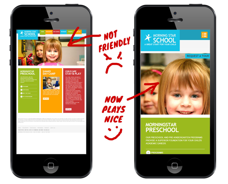
Let's illustrate the concept using a couple of images:

 
Why having a mobile-friendly site is no longer optional  |  Hue & Tone Creative
 

And, this illustration from Google:

 
Why having a mobile-friendly site is no longer optional  |  Hue & Tone Creative
 

See the difference?

One looks like a typical phone app and the other one will require a magnifying glass just to read the site title.

You'll notice the "mobile-friendly" one on the right has:

  • Large, easy to read text

  • Full screen, viewable images

  • An intuitive page layout

  • Easy to use navigation

When you’re on your phone, this is exactly what you would expect a good website to look like. A website optimized for mobile adjusts and displays properly on all smaller screens – not just phones, but tablets too.


Why is mobile-friendly website important?

In addition to elevating your user experience, we’ve got some hard numbers on why mobile compatibility is important. A few highlights:
 

  1. In 2017, 52.64% of all traffic came from mobile devices.

  2. By the end of 2018, it’s expected that traffic on mobile devices will make up 79% of global internet use.

  3. Last year 50% of total eCommerce revenue came from mobile devices

  4. 57% of internet users say they won’t recommend a business with a poorly designed website on mobile.

  5. Nearly 8 in 10 customers would stop engaging with content that doesn’t display well on their device.

  6. 88% of consumers who search for a type of business on a mobile device call or go to that business within 24 hours.

It comes down to the fact that almost everyone uses their mobile device to browse, shop, and interact with businesses. Not having a mobile optimized site directly converts to losing potential customers.

If you are a business owner looking to make your mark in the digital ecosystem, we highly recommend that your website be mobile optimized. You don't want site visitors squinting to see what your website is all about.

Still not convinced? 


6 (more) reasons why you need a mobile responsive website

  • Google prioritizes mobile-friendly websites in mobile search results. Back in 2015, Google made a change to the algorithm that allows websites optimized for mobile to rank better than those that aren’t optimized.

  • Having a mobile friendly site is considered best practices today and it increases your credibility to comply with industry standards.

  • 91% of mobile internet activity is spent on social media. You don’t want to waste your social media marketing dollars by sending people to a subpar or slow loading site.

  • Good site design makes customers happy and saves them time. You always want to give your customers a good experience – and this means having an easy to navigate site. You can be guaranteed people won’t come back to your site if they can’t navigate it easily.

  • A site that operates smoothly leads to people spending more time on your site.

  • Mobile optimized sites are programmed to load more quickly – you no longer run the risk of people clicking away because your site loads slowly!

In 2018, making your site mobile friendly is no longer optional. It’s worth investing in revising or redesigning your website to make sure your site conforms to the industry standard of being mobile ready. If you don't, you risk losing potential customers, lowering the impact of your social and PPC ad campaigns, and alienating people who aren’t willing to put up with an inferior user experience.  


Hue & Tone: Greensboro-BASED Marketing FIRM

Ready to get your site up to speed? We can hook you up. At Hue & Tone Creative, we believe good marketing can help you create a lasting impression on your customers. From site design to business card design -- we can help you with every piece of your marketing strategy.

The Importance of Strong Content... according to Yoda

Millions tune in to watch shows like Grey’s Anatomy, events like Super Bowl LII, and cult favorites such as Star Wars. Why? Because the content is so darn good.

Content, as stated by the Oxford English Dictionary, is information made available by a website or other electronic medium. People know good when they see it and recognize good content when they read it. Which is why crafting strong content is so important on the information-overloaded web.

The Importance of Strong Content according to Yoda  |  Hue & Tone Creative

“The force is strong with this one.” –Darth Vader, Star Wars: Episode IV

“What makes for strong content?” you may be asking. It starts with knowing your audience. The subjects you discuss as well as how you choose to tackle them are dictated by those seeking your infinite wisdom and wares. Exploring topics that are helpful to your customers, followers and clients make for good content because it’s relevant. Ask yourself, “what can I do to serve the needs of my unique base”? And create from there.
 

“Always pass on what you have learned.” –Yoda, Star Wars: Episode VI

You can’t teach what you don’t know. Integrate your company’s core competencies (those things you do exceptionally and distinguishes you from competitors) into your content. Kim K posts tons of information regarding make-up and fashion help. Oprah’s website is packed with inspirational tidbits and plenty on healthy eating. Your content could detail how to start a non-profit, demonstrate yoga techniques, or show the masses How to Curate Their Instagram Feeds. Basically, write what you know.
 

"There is NO substitute for WORK." –Vince Lombardi, Green Bay Packers Coach (1959-1967)

Content is often copied from one site and reposted on another. This should only occur when express permission has been provided by the content’s owner. It should also be an option rarely elected. For one, originality is rewarded by Google search rankings and secondly, you can’t contribute much to the virtual conversation if you’re only saying what has already been said. Don’t have the time to create original content? Partner with a professional content provider. Unlike reposting published pieces, working with a content generating service is a savvy alternative that provides you with unique postings for your site.
 

"Pretty good is not enough, I wanna be great." –Christina Yang, Grey’s Anatomy

Your content choices and execution should be in alignment with your brand image. If you’re known for being reliable, posting consistently and on time is a way to demonstrate that trait. Presenting thought-provoking and engaging topics showcases you as the thought-leader that you are. Great at design? Be sure that your content is presented in the showiest of packages that displays your exceptional stylistic talents. If you’re great, your content should be great. Post that which you are.
 

"Knowing is better than wondering." –Meredith Grey, Grey’s Anatomy

What content have you produced that garnered the most engagement and views? There’s an analytic for that.  Refer to your site’s pageview data and determine what your readers prefer. This helps to cultivate similar content that speaks to the needs and wants of your followers. Do your research and give the people what they want.

Keep in mind, your web content may not make a colossal mark or be permanently enshrined in greatness like Star Wars. Instead, it might convert a visitor into a lead or even a client. She may be persuaded to subscribe to your newsletter. He could be moved to try your service. And that is much better and even, dare I say, compelling.


WEB DESIGN, CONTENT CREATION, and SOCIAL MEDIA MANAGEMENT 

No matter what you're looking for help with, Hue & Tone Creative can help take your website -- and the content on it -- to the next level. If you'd like to see what we can do, be sure to take a look at our design portfolio, scope out more of our blog posts, and take a look at the services we offer.

15 Questions to Ask Your Designer Before Hiring Them
15 questions to ask your designer before hiring them   |  Hue & Tone Creative

“You’re hired,” maybe two of the greatest words ever uttered. These babies mean rising employment rates and new beginnings and additional human resources helping to further your professional dreams. The human resource in this case being the much sought-after web designer.

Entrusting your business’s online presence to a trained professional is an excellent choice.  However, before journeying any further, there’s something you must consider: you’re the boss. Like with any other hire, it’s your responsibility to find the right talent to perform the task. Here are 15 questions you should ask a designer before shouting, in boss-like fashion, “you’re hired!”


1. What are your qualifications/professional background?

Your designer will work for you; at least for a time. It’s not unreasonable to seek more information about this person or the company in question. Inquiries regarding past work, training, and experience are all fair game and a good start.


2. How are your services priced?

This may not seem like an important matter upfront, but it’s one that you want to clarify early. The designer probably can’t provide a complete quote at this stage, especially if you haven’t yet articulated all the specifications for your site. This question pertains to how the designer arrives at the total. Does she prefer to work hourly or is the work charged as a flat-fee? Are some items only available a la carte, such as a logo design, or are packages offered? Understanding how the project will be priced will allow you to decide if you’re comfortable with the arrangement and moving forward, and may help you to more knowledgably consider the final quote later.


3. What services do you offer?

The web landscape is changing. While having a professional website is better than not having one, web design is more than just domain names and eye-catching pages. Maybe the designer is qualified to perform analytics once the site has launched or search engine optimization. There may be functions and additions that you’ve not considered. Asking what a designer can do is a great way to discover your options. It can also highlight what services aren’t available.


4. Who owns what?

Once you enlist the assistance of a third party, it’s best to get clear on ownership. If you don’t already own your domain name, who owns it if the designer or company obtains it as part of the web building process? Who maintains possession of any graphics, artwork, content, and the website as a whole once the site is built? What about when your professional relationship ends? It’s best not to assume the answer to these questions and prudent to ask during the vetting stage.


5. What platform will you be using?

Assuming that your designer is constructing a site from scratch, the building medium is key. Are they partial to using a blank slate platform like WordPress or do they favor Squarespace which offers beautiful templates? (If you’re unfamiliar with the latter, see our helpful post, To Squarespace or not to Squarespace?).

The answer to this question will affect everything from costs to curation options.


6. Do you outsource any work?   

The answer here is neither good nor bad. It’s just essential that you know who is working on your project. Being informed helps you better assist in the process and it’s good to know what to expect along the way.


7. What are my hosting options?

Hosting is basically where your web files are kept on the net. You may not want to get this technical, but the answer, depending on how much traffic your site experiences, could mean the difference in site speed, SEO, and accessibility. Also, if the designer self-hosts, questions regarding future accessibility can be discussed here.


8. Do you provide content?

Websites need a consistent flow of updated or new content. If you’re interested in having someone else do this for you, your designer may be your solution. Web design and content production go hand in hand and some designers have begun offering this special service.  Be sure to ask if this is an option.


9. Will I be able to update my site’s content?

Say your company wins a prestigious award, as it should, and you want to add the accolade to your site right away. Will you be able to access the intended page and update your site yourself or will you need to contact your designer each time? Having the ability to easily add and update content is something you definitely want, and knowing if it’s possible is super important.


10. What kind of clients have you worked with in the past?

Your similarity to past clients may mean a more seamless move from building their websites to creating yours. If your designer is used to working with much larger or far smaller companies, this isn’t an indication that they can’t perform the work, but similar practice makes perfect.


11. Do you have a portfolio or examples of previous work?

Taking a gander at a designer’s portfolio can communicate much more than words. Asking to look at completed sites is a quick and easy way to familiarize yourself with the designer’s capabilities.


12. What is your design process?

Ernest Hemingway, Maya Angelou and Eat, Pray, Love author, Elizabeth Gilbert, all expressed very similar writing processes. These masters having like methods is less the point, but there being a process at all is what matters. How does your designer get from point A to point Z? Is there a plan? As stated earlier, knowing what to expect allows you to better assist in your site’s development and eliminates unnecessary uncertainty.


13. What is your timeline?

Will the site be up and running in 3 weeks or 3 months? Get clear on how much time your designer needs to complete their plan. With this info, you can design a marketing campaign around the launch date or if you’re having an existing site revamped, you’ll have a timeframe for maintenance and testing; either way, you’re in the know.


14. What happens if I need additional work once it’s complete?

Your site is not static. It’s a living, breathing organism that will require changes and maintenance from time to time. You may need future support from your designer and working out the logistics now is certainly the way to go.


15. Can you help me, help you?

Designers are usually pretty busy. Juggling several clients and multiple projects with strict deadlines isn’t unusual. While they essentially work for you, they probably aren’t able to be at your beck and call.

You want to understand their best forms of communication and best times to be contacted. This simply allows them to be as responsive to you as possible while allowing space and time to build an amazing product. Openly and honestly communicate any concerns or needs like you would with any other part of your team. Professional courtesy goes a long way in a situation like this and treating your designer with due respect may result in a better product. Asking questions could certainly aid in you confidently uttering those two special words, “you’re hired,” they may also lead to you hearing the beautiful response, “I happily accept.”


WEB MARKETING CONSULTANTS  |  GREENSBORO, NC

We're happy to answer all of these questions...and more! Hue & Tone Creative will take the stress out of developing a new website. Check out our design portfolio to see clients we've helped in the past, and then give us a call -- we can't wait to get the conversation started.

Getting Analytical in the New Year
Getting Analytical in the New Year  |  Hue & Tone Creative

A business’s ultimate success has grown increasingly reliant on its web presence; particularly its website. According to an April 2017 survey taken by Statista, 40 percent of internet users in the US stated that they purchased items online, several times per month. Retail e-commerce sales worldwide are expected to nearly double between 2016 and 2020. More people than ever are performing research online before journeying to a brick and mortar store to complete a purchase. With so many transactions occurring online, how can you be certain your website is performing up to par?

Most small business owners can at least determine how much traffic their website solicits. But this can be as beneficial as knowing how many people attended a party without actually talking to anyone. There’s so much more information available. So, if you haven’t already, it’s time to get analytical in 2018.


Conversion

This statistic tells you how successfully your website is completing your intended goal. For example, if you’re Pizza Hut and your website’s primary purpose is for a visitor to complete a purchase, then your conversion statistic will indicate the percentage of visitor’s doing just that. Maybe you’re a real estate company, and your conversion goal is to have web users complete a contact form; this statistic will give you those percentages.


Source Report

Again, most people are familiar with Traffic Acquisition Reports, which measure the amount of traffic your website is getting during any given period of time. But remember, we’re after much more; like, how did they find you in the first place? There’s an analytic for that. A Source Report can tell you if someone arrived at your site by way of a search engine like Yahoo, or a referring site like Pinterest which includes links that route users to a pin’s original site or page. It can even determine how many people typed your url directly into the address bar.


Medium Report

There is also a Medium Report which indicates whether the result was the product of organic search or unpaid search, a paid search result, or via a referring website. All of this information could help influence marketing decisions going forward and guide a strategy for capitalizing on the sources and mediums already generating much of your traffic.


Bounce Rates

This statistic can inform several website elements, because it tracks what happens once a visitor enters your online presence. Do users journey to another page within your site or do they leave it all together? If your bounce percentage is high, you can determine where visitors are landing, which may prompt insight into why they’re leaving. Essentially, this analytic provides valuable insight into what visitors like about your site and what they don’t. Moreover, it empowers you to customize and alter your website accordingly.


Pageviews

This statistic is self-explanatory. It measures how many views a specific page receives. If visitors are returning to the same page again and again, hypothetically, you can formulate content that may garner similar interest. It could also point to other contributing factors like design schemes that users prefer. Using this information to formulate a strategic response can ultimately assist in improving your overall conversion rate.


The world wide web will continue to change and grow to meet human demand and businesses must evolve to keep pace. With the new year, usher in a new marketing strategy with the help of web analytics. It will be the best resolution you’ve ever made.


web marketing consultants  |  Greensboro, NC

Need help getting your website set up? Want a second set of eyes looking over your analytics? Hue & Tone Creative will take the stress out of marketing your business online. Check out our design portfolio to see clients we've helped in the past, and then give us a call to get your web presence ready for the new year.

Web Design Trends to Leave in 2017

The song, It’s so Hard to Say Goodbye to Yesterday was originally recorded for the 1975 film, Cooley High. It’s a real tear jerker and may make for fitting music as we bid farewell to design trends that can’t join us in the new year. Honestly, the list itself isn’t sad at all. It’s actually solid advice regarding 4 web design trends to leave in 2017.

Design Trends to Leave in 2017  |  Hue & Tone Creative

Before we get to the list, let’s quickly discuss why this purge is so necessary. Two letters: UX. UX or User experience refers to a person’s feelings and impressions about using a particular product, system or service. In this case, your website. To keep this experience simple, logical and enjoyable, these 4 web designs must be left behind.


#1. Skeuomorphism

The design concept that merges our real-life perception or characteristics of an object with its digital equivalent. A good example of this is the original Instagram logo; a life-like image of a camera that has since changed to a simpler, semi-flat design. Flat and semi-flat designs have a minimalistic feel and seem to be preferred more widely by web audiences. For this we say adieu to skeuomorphism. 


#2. Hero Images as the whole Story

Hero images are large images that take the place of traditional banners and are generally overlaid with text. Don’t get me wrong, they look amazing. They are captivating, they are alluring and signal substance. The problem is, some websites are little more than these images with no accompanying meaningful content. Perfectly fine for a webpage used for contact information or a place to describe a single product. However, hero images are not enough to tell the whole story about a business and its products or services. Coca-Cola is a great example of how to use hero Images while still boasting a site full of relevant and substantive content. Easy to say arrivederci to hero images as the entire story.


#3. Tight Spacing

Sometimes, full breakups aren’t necessary. A little space goes a long way at rekindling a quenched flame. White space in particular, could vastly improve the look and feel of your website. This can be accomplished pretty easily. Sites that are text heavy can add space between lines and letters, enhancing readability. Similarly, those with lots of products to display should take a hint from Amazon.com which uses grid layout design. The online superstore has successfully employed this design to organize their many products. In either case, the user experience is upgraded. We can happily say adios to tight spacing. 


#4. Sliders and Carousels

These are not the same, but are similar design techniques. They each involve the movement of images in either a sliding or rotating fashion. Neither, according to a Nielsen Norman Group study, were found to be effective conversion tools. A point made many times over the years, but appears on this list due to an even greater downside. The designs could negatively impact your SEO or search engine optimization. While the use of sliders and carousels aren’t automatic SEO killers, the risk to your website’s ranking is real and may not be worth taking that chance. Either, enlist the help of a professional website builder or try something else. Videos are a great alternative to both these elements and may be a better way to tell your story. Let us say Gooday to sliders and carousels. 


Companies in the know wisely improve their websites to increase user satisfaction. This includes, but is not limited to the way the site appears on mobile or desktop devices, how easily and intuitively one can navigate the site, and the overall functionality and feel when engaging with the website. The 4 web design trends to leave behind, tend to interfere with these aims in one way or another. It may not be so hard to say goodbye after all.


WEB DESIGN IN GREENSBORO AND BEYOND

Guilty of using all these things on your website? We can help pull you out of the past!
Hue & Tone Creative will help get your web presence up to speed. Be sure to check out our design portfolio to see clients we’ve helped in the past -- and then give us a call if you’d like us to build you a modern website that truly tells your story.
To Squarespace or not to Squarespace? The small business’s question.

According to the SBA, small businesses account for a whopping 99.7% of U.S. employer firms. If you’re thinking of starting your own small business or maybe you already have, how do you emerge as the peacock amongst all the other peacocks with the showiest feathers? Well, an aesthetically pleasing and user-friendly website would certainly help. In this DIY climate, only one website builder springs to mind: Squarespace. This week, we’ll explore why Squarespace is the best choice for small businesses.

To Squarespace or not to Squarespace?  |  Hue & Tone Creative

We’ve all heard or seen the commercials for Squarespace, the self-proclaimed “all-in-one solution for anyone looking to create a beautiful website.” And beautiful it is. Squarespace’s landing page is like a mini trip to an art museum. The evocative photographs, set against sleek and colorful backdrops, coupled with drag-and-drop functionality, easily marks its self as the preeminent option. Once there, you’re thrilled and delighted to press the Create A Site button.
 

Inside, you’ll find that Squarespace’s versatility is unmatched. The site currently boasts more than 70 different templates. After exploring and choosing the design of your liking, you can begin adding your own content. One caveat, Squarespace’s polished designs only go so far. Be sure to use high-quality photos when swapping out placeholder images. One of the allures of Squarespace is its sleek, professional design, but even that won’t make up for low quality, grainy photographs.

Squarespace has done a phenomenal job with creating beautiful spaces that you can tailor to fit your needs. Do play around with templates if you can’t seem to settle on just one.  Once you begin customizing, Squarespace provides you the option of previewing other templates without losing earlier work. You can experience what your site looks like with a banner overlay, or at various scale sizes, or with numerous navigation choices, or utilizing page animation or displaying a slideshow. And these are just a few of the design options available to you. Like what you see? Great! Let’s talk pricing: 

Screen Shot 2017-11-15 at 8.11.40 AM.png

Squarespace has the simplest pricing plans than any other web builder; with only two total. $12 per month for personal websites, billed annually or $16 paid month to month, and $18 per month for businesses, billed annually or $26 paid month to month. Two additional pricing plans are available if you want an online store. Your hosting and a custom domain name are included with the purchase of an annual membership and that’s certainly a plus.


Other web builders offer free plans, but with limited features, and sub-domain names. Squarespace permits you to try their service for a 14-day trial, but once expired, you’ll need to choose a paid membership to continue service. All things considered, Squarespace’s pricing is competitive with other web builders and the value you receive is undeniable. It has the tools to set any small business apart by adorning it in the most beautiful of feathers and allowing it to really strut its stuff. 


WEB DESIGN IN GREENSBORO AND BEYOND

Loving Squarespace, but not sure what to include on your website? Or maybe your homepage is just looking a little flat? Hue & Tone Creative will help get your web presence up to speed. Be sure to check out our design portfolio to see clients we’ve helped in the past -- and then give us a call if you’d like us to build you a custom, modern website that truly tells your story.

Intro to HTML: Must Know Tags for Beginners
Into to HTML  |  Hue & Tone Creative

If you’re not familiar with HTML, making even small tweaks to your website or custom MailChimp template can be a struggle. HTML is a complicated language and you won’t become an expert overnight – however, you can master a few basics that will make it easier to tweak templates, build web pages, and control your online presence.

This is by no means meant to be a comprehensive guide to HTML, but rather an introduction with some of the most basic tags you’ll need to customize your in-house marketing campaigns. 


What is HTML?

Let’s start with the most basic question – “what is HTML?”

Hypertext markup language (HTML) is a standardized system for tagging text files to achieve font, color, graphic, and hyperlink effects. You use specific tags to customize each element of a web page.

Check it out for yourself: Open up a well-designed site in Chrome, right click, and select "Inspect Element." You’ll be able to get a look behind-the-scenes at how the site was coded. 


HTML Elements

HTML elements are individual components of your webpage that are made up of a start tag <example> and an end tag </example >.

Here’s an example of what a simple HTML page might look like:

<!DOCTYPE html>
<html>
<head>
<title>Page Title</title>
</head>
<body>

<h1>Sample heading</h1>
<p>A sample paragraph would go here.</p>

</body>
</html>


Note the <html> tag at the very top.

This element specifies the language the webpage or document is written in. Without this tag your computer won’t know how to process all the code that follows it. It’s important to realize that browsers do not display the HTML tags, but they use them to render the content of the page.


The Basics

<body>
The visible part of the HTML document is between <body> and </body>.

Your body tag is the first element content tag that you can open after you’ve opened your initial html tag.


<head>
This tag is one of the content elements that can be opened within your body tag. You can vary the size of your headings and subheadings by specifying whether you want <h1>, <h2>, <h3>, <h4>, <h5>, or <h6>.

<h1> defines the most important heading. <h6> defines the least important heading.


<p>
Used for formatting paragraphs of text. Just to be clear, the paragraph tag defaults to which ever style you already have assigned to your style sheet.


<a>
HTML links are defined with the <a> tag.

For example:
<a href="hueandtonecreative.com">You would put the text you want to be hyperlinked here. </a>


<img>
To incorporate an image into your page you’ll want to use an <img> tag -- the source file (src), alternative text (alt), width, and height can all be defined.

Example here:
<img src="hueandtonelogo.jpg" alt="hueandtonecreative.com" width="210" height="210">


Always remember to close your tags. Anytime you open a tag <example> you should close it after you’ve defined all your content </example>. 


Style Elements

<style>
Your style tags help you specify which colors and fonts are used for your headings, paragraphs, etc.


Here’s a few examples:

You could format size like this:

<h1 style="font-size:300%;">This is a heading</h1>
 

Color like this:

<h1 style="color:blue">This is where the text you want stylized goes. </h1>
 

Or both like this:

<h1 style="color:blue;"font-size:300%">This is where the text you want stylized goes.</h1>


Formatting Elements

Formatting assist with the aesthetics of your webpage, kind of like the style elements we mentioned earlier. The main difference between the two is that your formatting elements deal with text effects.

<b>
Used to make specific text bold.

<i>
Used for italicizing text.

<marked>
Highlights text.

<small>
Makes specific text smaller. 


Helpful Resources

Learning HTML isn’t the easiest task, so here are a few tools to help you become a pro in no time!

  • Treehouse is an online coding school specializing in front end web development, JavaScript, IOS, and Python. Learn from over 1,000 video tutorials, quizzes, and coding challenges. There’s a free trial for first time users.

  • Lynda is a digital learning library where you can learn skills for business, design, marketing, and web development.

  • HTML Dog offers free online tutorials in HTML, CSS, and JavaScript. There are specific tutorials for every level of learning: beginner, intermediate, and advanced.


One last note…

Becoming proficient in HTML takes time and consistent practice, so don’t get discouraged if it doesn’t come easy to you! Be patient and try to set obtainable goals for yourself.


Web and Graphic Design in Greensboro and beyond.

Clueless on how to build a website or create a logo? We’ve got you covered! Eye catching landing pages that help reel in leads to business cards that leave a lasting impression, Hue & Tone Creative is here for all of your marketing needs.

The Optimal Font Size for Web, MailChimp, and Mobile

Earlier this month, Twitter rolled out a new font. Unfortunately, not everyone was a fan

Twitter’s switch from Helvetica Neue, to Segue left users complaining that the slender new font was hard to read and caused way too much eye-strain.

Like Twitter, most businesses are bound to make mistakes when it comes to using the right fonts and sizes. Instead of fumbling through and learning from trial and error, do yourself a favor by learning a few of the best font-size secrets. 

Artboard 3test.png

Websites

Whether you’re designing an online shop, portfolio, or blog, it’s crucial that your fonts look clean, appealing, and easy to read.

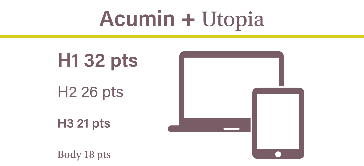
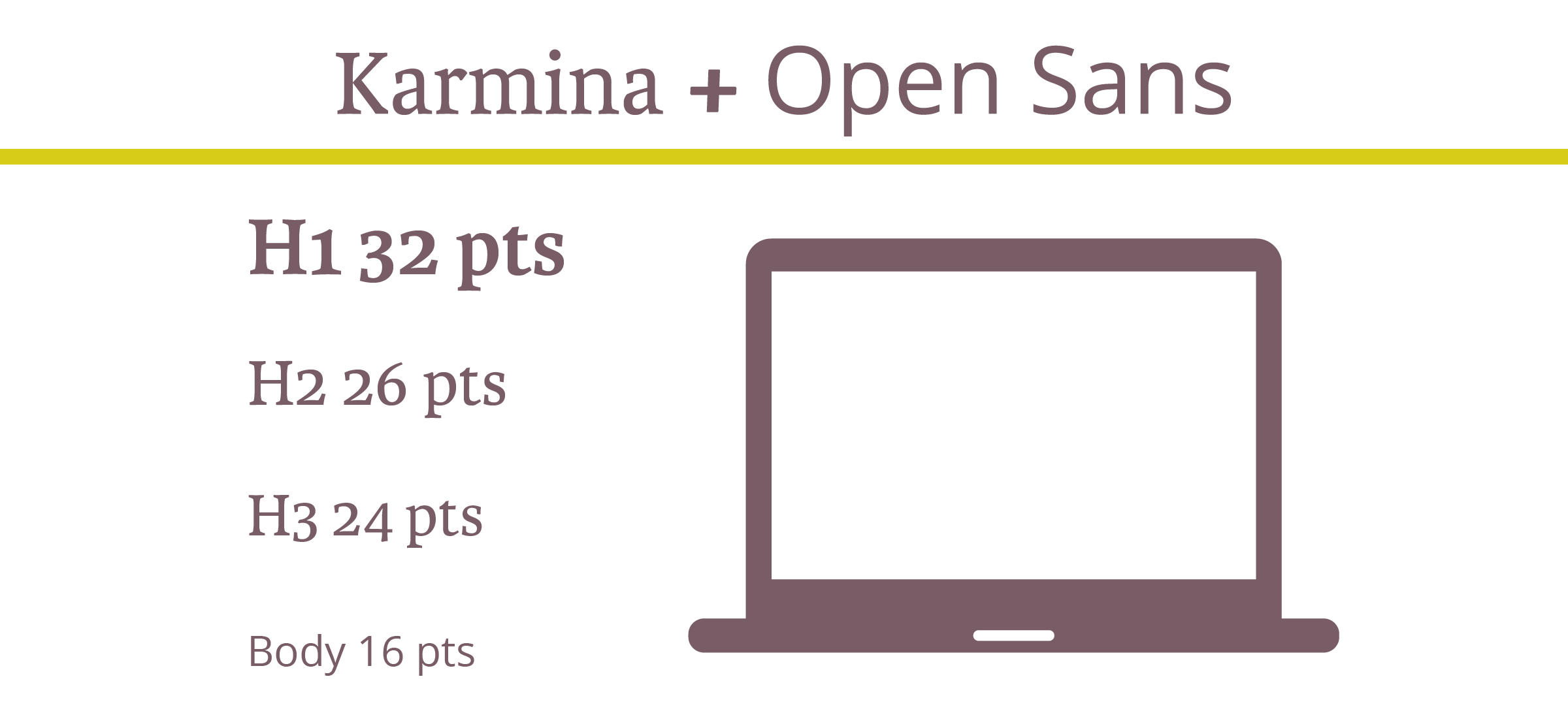
For best readability, we recommend that you keep your headers and buttons between 30-32 pts and sub headers between 18-26 pts. Body text usually looks best when it’s between 12-16 pts. 


The Optimal Font Size for Web, MailChimp, and Mobile  |  Hue & Tone Creative

Looking to compare email marketing platforms? Here’s a rundown on a few of our favorites.

MailChimp

Email marketing isn’t going away anytime soon. In fact, email is 40 times more successful at bringing in leads than Twitter or Facebook.

One of our personal email marketing tools, MailChimp, recommends that you keep your body text between 14-16 pts. 16 is best for short emails between 2-3 sentences, while 14 pts us better for more lengthy emails.


The Optimal Font Size for Web, MailChimp, and Mobile  |  Hue & Tone Creative

Mobile

According to MailChimp, it’s best to stick to the “one eyeball, one thumb, and arm’s length” rule when it comes to font sizes. Basically, your viewers should be able to see and scroll through the entire email with ease and clarity. 

With this guide in mind, your body fonts should be between 12-16 pts and your links, CTA, and buttons should be between 34-36 pts.


One last note…

When it comes to selecting fonts, the most important thing is to pick an easily readable font. When in doubt, go back to basics. If you stick to a plain serif or sans serif and use these size guidelines, you'll be on your way to finding the perfect typography for your next web project! 


Web & Blog Design in Greensboro, NC

Not seeing much traffic or engagement on your website? It’s probably time for an upgrade! From landing pages to business blogs, Hue & Tone Creative can help you create a site that matches your style and helps reel in leads. 

How to Become a Hashtag Pro (and specific hashtags for your industry)
HOW TO BECOME A HASHTAG PRO (AND SPECIFIC HASHTAGS FOR YOUR INDUSTRY)  |  Hue & Tone Creative

Everyone knows that hashtags and pictures go together like PB&J. But not everyone knows how to correctly utilize hashtags.  When it comes to helping people find your company and products on Instagram, hashtags can play a big role -- but only if you're using the right ones. 

Today, we're going to run through the two main types of hashtags, and then cover how to find and use them properly.


Types

Before you start collecting hashtags, it’s important to understand which ones you should be using. There are two main types to choose from: community and branded hashtags.

Community hashtags are popular on Instagram, but they don’t really have anything to do with brands. For instance, #tbt or #cat could be used by anybody, it’s not exclusive to a company. These are great for helping people discover your profile -- but you'll want to be specific and primarily use hashtags that directly relate to the mission of your brand.

Unlike community hashtags, branded hashtags are for… you guessed it, brands! Usually companies use a consistent tag featuring their name, but you could also make one for a promotion, competition, or product launch.

Branded hashtags are awesome for supporting user-generated content campaigns (UGC) because they help people connect with you and show their love for your brand. 


Where to Find Hashtags

Although it would be easy to throw on a couple of hashtags and call it a day, you really need to your homework if you want to be discovered. 

Save your hashtags tags in Google Docs or a spread sheet so that you have on hand when you need them. 

We recommend thinking like your audience. Dig around and find out which influencers and hashtags are popular with your followers. It also helps to zero in on the more specific community hashtags because they have a smaller following. For example, #artistsoninstagram has over 3 million posts, but if you narrow it down to #inkdrawing, you have about 820,000 posts to compete with. Less competition = more exposure for you.

Speaking of competition, it may also help to scope out what tags they’re using. If they’re posts are getting a crazy amount of attention, hunt around for the right hashtags to spark some likes on your own page. 


Instagram Pro tip

Keep your post clutter free by hiding your hashtags. 

  1. Open Notes in your phone.

  2. Type a dot and hit return (Repeat this process 5 times).

  3. Add all the hashtags you want to use after the 5th dot.

  4. Copy all the dots and hashtags.

  5. After you post your picture in Instagram, hit the comment button and paste all your dots and hashtags.

  6. When you look back at your post, all the tags should be hidden!


Need a few hashtag ideas to help you get started? Here are some popular ones for some of the top industries and the Triad:

Fitness:
#fitlife
#getoutside
#eatclean
#fitspo
#fitnessgoals 

Greensboro & the Triad:
#gso
#gbo
#sogso
#wsnc
#gatecity

 Marketing:
#digitalmarketing
#advertising
#entrepreneurship
#influencermarketing
#marketingstrategy

Restaurants:
#delicious
#locallygrown
#eatlocal
#treatyoself
#hungry

Nonprofits:
#volunteer
#change
#dogood
#socialgood
#socialimpact


Social Media Marketing in the Triad: Hue & Tone Creative

Does managing all your social media accounts feel like a chore? We can give you a hand! Whether you’re looking to expand your list of followers or boost your amount of likes, the digital marketing pros at Hue & Tone Creative can give your accounts the attention they need.

4 Elements for a Killer Landing Page

When it comes to lead generation, landing pages count. A landing page gives your customers a clear why and how -- it tells them why they should care about your product and it gives them a clear next step to take.

Keep in mind that landing pages shouldn't look like your homepage. Where homepages are general and intended to appeal to everyone, landing pages are tailored to a specific type of customer. Homepage typically have multiple messages, where landing pages have one focused message.

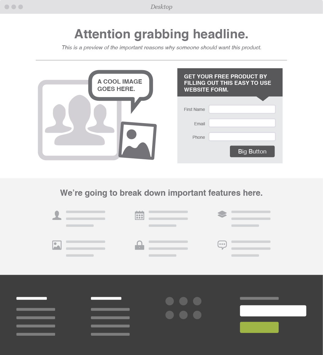
A special type of page means a special design. We've broken down our four must have elements for a lead generating landing page: 

Attention Grabbing Headline

The first thing your visitors see is your headline, so make sure to capture their attention and incentivize them to stay longer. Most people tend to skim over body text quickly, and will leave sites that aren’t relevant or seem too wordy.

To craft the most effective headline, keep these three principles in mind:

  • Share Information

  • Solve a Problem

  • Show Value

What are you selling? Why does your customer need this product/service? What can your customers gain/save? Write a headline that packs a punch and leaves your customer wanting more.


Call to Action

After you’ve effectively gotten your viewer’s attention and promoted your business, it’s crucial to capture their contact information and turn those visitors into leads.

Offer up discounts, free downloads, or exclusive offers -- the catch? All we need is your email address.

To keep your CTA from sounding too self-serving be sure to keep the focus on the customer. Try something like “Get your free coupon” instead of “Sign up for emails here.”


Form

Having a form to capture your customers information is a must. How else will you follow-up so you can turn someone into a potential customer? We suggest asking for as little information as you can get away with -- this ups the chances of someone filling out your form. 


Multiple target demographics? Create multiple, tailored landing pages so that you can effectively reach all of your customers.


Graphics

Eye-tracking studies have found that people pay more attention to information when it’s combined with relevant images. Pair your headline and body text with pictures or videos that will help your information stick.

If you choose to go the video route, make sure the videos load quickly aren’t too distracting to the overall composition of your landing page.


OPTIONAL: Testimonials & Endorsements

A great way to show value in your brand is by providing proof from actual human beings.

People tend to trust others they can relate to. Share feedback from influencers or previous customers. If your products have been featured in any noteworthy blogs, publications, or social media pages, show it off!


Web & Graphic Design in Greensboro, NC

Time to revamp your outdated site? Leave it to the experts! From product websites to landing pages, Hue & Tone can help you market your brand and leave a lasting impression.

7 Squarespace Font Pairings
7 Squarespace Font Pairings  |  Hue & Tone Creative

You see a Squarespace template, you love it, you start playing with the fonts... and suddenly you don't love it quite so much. No worries -- it happens to everyone!

Although it may be tempting to stick with the default settings of your template, taking the time to select the right fonts adds depth and personality to your site. With over 600 font options through Google and nearly 1,000 on Adobe Typekit, picking the perfect combo can feel almost impossible.

We're here to take the guesswork out of selecting the perfect Squarespace font combination - here's 7 suggestions to revive your favorite template: 

Merriweather + Roboto Condensed  |  Squarespace Font Pairings  |  Hue & Tone Creative

Merriweather & Roboto

This classic and modern mix of serif and sans serif fonts is perfect for any business. 


Skolar Sans + Domine  |  Squarespace Font Pairings  |  Hue & Tone Creative

Domine & Skolar Sans

Need a clean no-fuss combination? Domine and Skolar pairs nicely with strong graphics. 


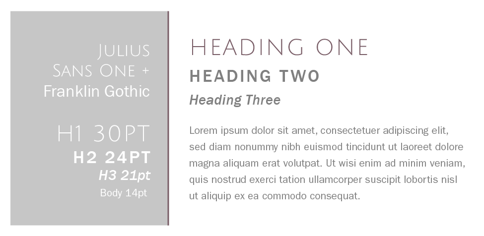
Julius Sans One + Franklin Gothic  |  Squarespace Font Pairings  |  Hue & Tone Creative

Julius Sans One + Franklin Gothic

Franklin Gothic is classic, readable, and approachable -- but add Julius Sans One in and you've got an edgy clean feel.


Rift Soft + Vendetta  |  Squarespace Font Pairings  |  Hue & Tone Creative

Rift Soft & Vendetta

Looking for a sophisticated pairing for an upscale brand? The sleek style of Rift keeps Vendetta from feeling too stuffy. 


Essonnes + Futura  |  Squarespace Font Pairings  |  Hue & Tone Creative

Essones & Futura

This duo feel playful and approachable. We love this serif & sans serif mix for boutiques, portfolios, and blogs. 


Park Lane + Tenso  |  Squarespace Font Pairings  |  Hue & Tone Creative

Park Lane & Tenso

This crisp and versatile combo would work well for real estate, bistros, and trendy salons. 


Lust Script + Sofia Pro  |  Squarespace Font Pairings  |  Hue & Tone Creative

Lust Script + Sofia Pro

Feeling a little edgy? Mixing in Lust Script takes this font palette to the next level. 


branding + web services in greensboro: Hue & Tone

Looking for a web designer in Greensboro, Winston Salem or the surrounding areas? Hue & Tone is a creative graphic design agency specializing in logo design, web design, social media management, and more. Give us a call if you’re interested in a custom, branded website that truly tells your story.
Most Outdated Web Design Trends
Stop boring your visitors with bad web design...

Stop boring your visitors with bad web design...

Like chain wallets, spiked hair, and jelly shoes, many web design effects have come into fashion and then disappeared, never to be seen again. As design technology continues to develop, so do consumers’ opinions of what constitutes a strong, professional design aesthetic. Here are 7 outdated effects we’re happy to say goodbye to.


Drop Shadows

The drop shadow was one of the 90s’ most beloved Photoshop effects. With the click of a mouse, web designers could make big blocks of text appear “fancy” and defined. Unfortunately, when applied to a large area of text, drop shadows made websites uncomfortable to read and difficult to browse. Thankfully, designers have moved on to more minimal font-enhancing effects.


Outdated Fonts

Many fonts which were once very popular now serve as bright red flags that a website was created by someone with very little design experience. Comic Sans is widely recognized as one of the world’s worst fonts, as well as Papyrus, Curlz, and Bradley Hand. Even “normal” fonts such as Times New Roman or Arial can make a website appear unprofessional since, as Microsoft Word default fonts, they indicate “lazy” font selection.


Bevel, Emboss, and Gloss

Bevel and Emboss were once extremely popular Photoshop tools which could be used to create a stylish “3D” appearance. Flash-forward a few decades later, and the effect is now more cringeworthy than impressive. Bevel and emboss were supplanted by the “Gloss” effect, which was used to make web buttons imitate shiny plastic or glass. Nowadays, designers have mostly moved onto more subtle choices to create attractive buttons that beg to be clicked. 


Adobe Flash Intros

Once upon a time, Adobe Flash intro videos like this one were all the rage. Nowadays, however, such videos have become internet dinosaurs. Not only do visitors tend to find them irritating, Flash videos are not supported on most mobile devices and can even hurt a website’s search engine rankings.


Auto-Play ads/music

Auto-play, which has been described as “the most hated digital advertising tactic,” is not yet completely eradicated, but should be. Few things are more alarming than opening a new webpage and being assaulted with a loud advertisement or blast of music. Sadly, many companies still insist on treating their visitors’ ears with everything from loud sales pitches to soft jazz.


Lack of Mobile Optimization

The biggest mistake modern companies are making in terms of web design is lack of mobile optimization. With smartphones and other mobile devices quickly becoming the preferred method of internet access for the majority of consumers, it’s more important than ever for websites to be mobile-friendly. Google itself says that more Google searches are performed on mobile devices than on computers, so if your website isn’t legible when shrunk to fit a smaller screen, you’re missing out on a huge market opportunity.


Professional Greensboro Web Design Company

If your company website features any of the above trends, perhaps it’s time for an update. A professional graphic designer at Hue & Tone Creative can help create a visually pleasing, modern design that guides people to focus on your products and services, not the platform on which you offer them. If you’re interested in logo redesign, website design, or another creative branding service, give us a call today for a free website audit.
How to pick a Squarespace Template

Building a well-designed website for your business can be an intimidating task. Squarespace is one of our favorite platforms because it allows you to easily create beautiful and professional websites for a reasonable cost. 

Although it can be fun to experiment with all the offerings on Squarespace, it’s important to consider the overall goal of your website. Do you need to show off the menu of your organic coffee shop? Promote your event photography? Sell products for your online boutique?

Squarespace identifies their templates as falling into three main types of websites:

  • Information: “The goal of your site is to provide information to visitors, like business hours, who you are, or an overview of a project. The goal might be passive, where visitors find the information, read your blog, and move on, or active, where they sign up for a newsletter, submit a form, or contact you.”
     
  • Images: “The goal of your site is to display beautiful images. If you're an artist, design studio, or photographer, an image-focused template will help you display your work to prospective clients. Sites for restaurants, weddings, and more can also be very visual.”
     
  • eCommerce: “The goal of your site is to sell products, services, or media. If you're selling a small number of products, you can use a Website template to create a small shop. But if eCommerce is the primary goal for your site, a Commerce template provides advanced features to help your product display match your brand and vision.”

Squarespace also offers a cover page option. Cover pages are single-page sites that can be used as a standalone or integrated into an existing site. They’re also great if you need to get something up while you’re building your website behind-the- scenes!

Every Squarespace template offers the ability to add text, social integrations, photos, search, and gallery features. However, only some offer things like index pages, gallery pages, and blog pages. Do your research and identify any special features you might need! 

To make your search a little easier, we’ve picked out five of our favorite templates -- we’ve also highlighted some of the differences between each template. If you’re overwhelmed by the amount of options, these are a great place to start!


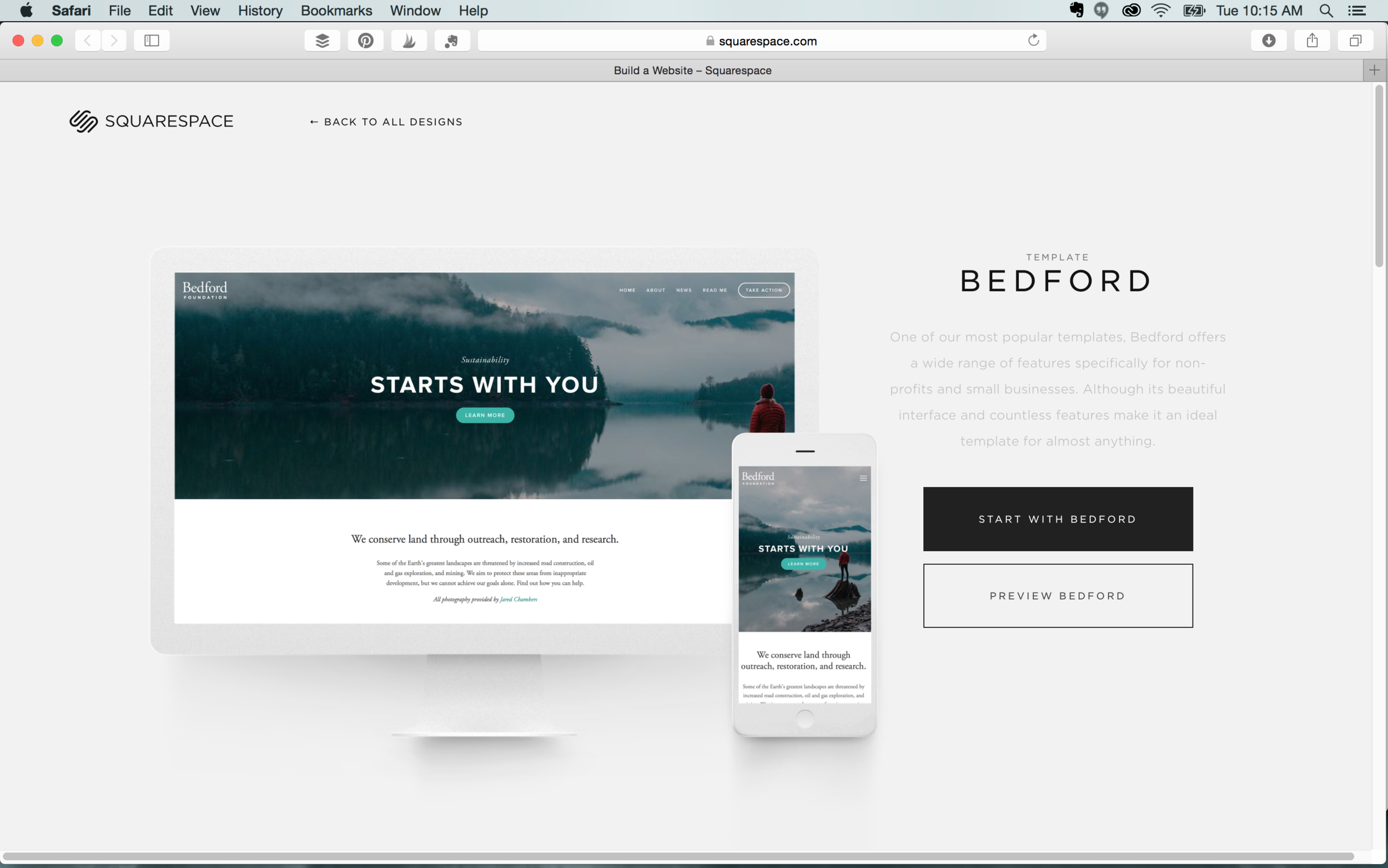
Bedford

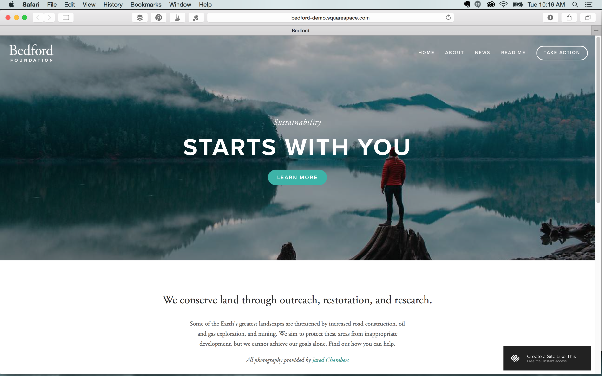
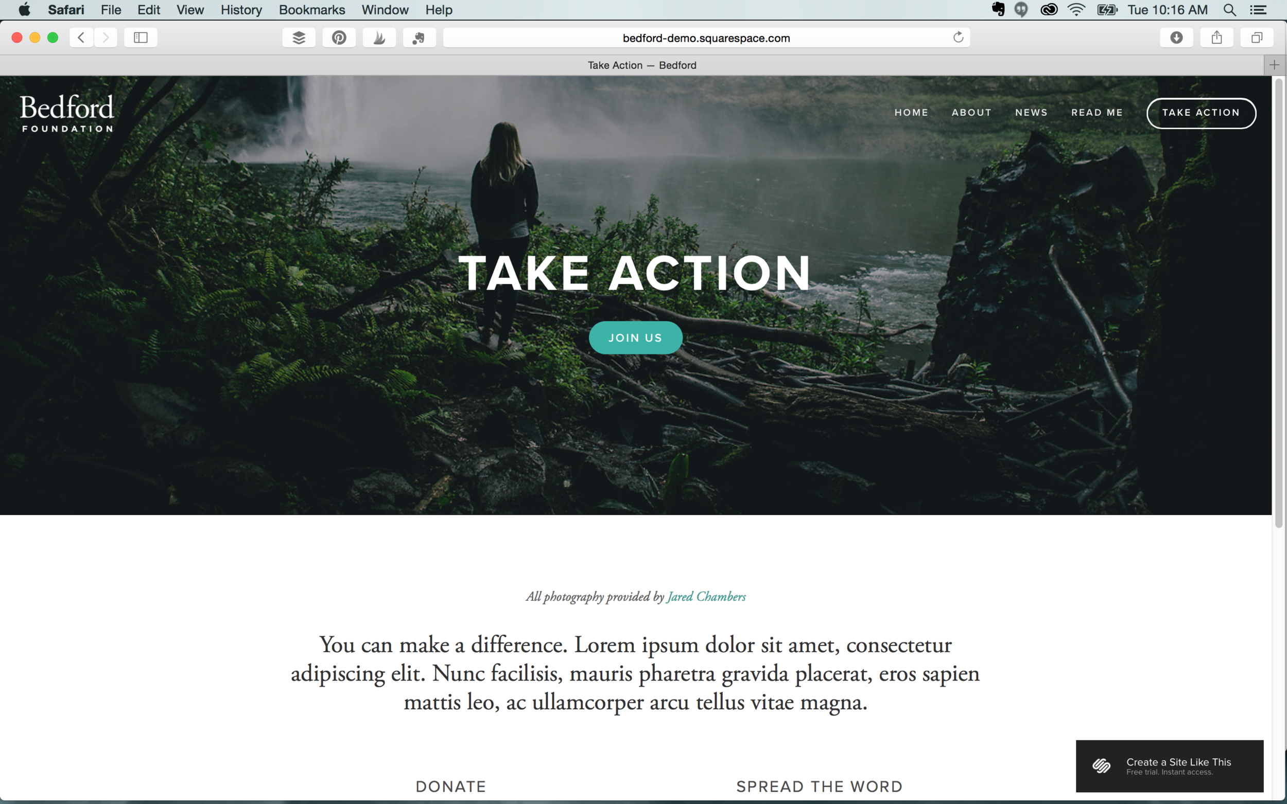
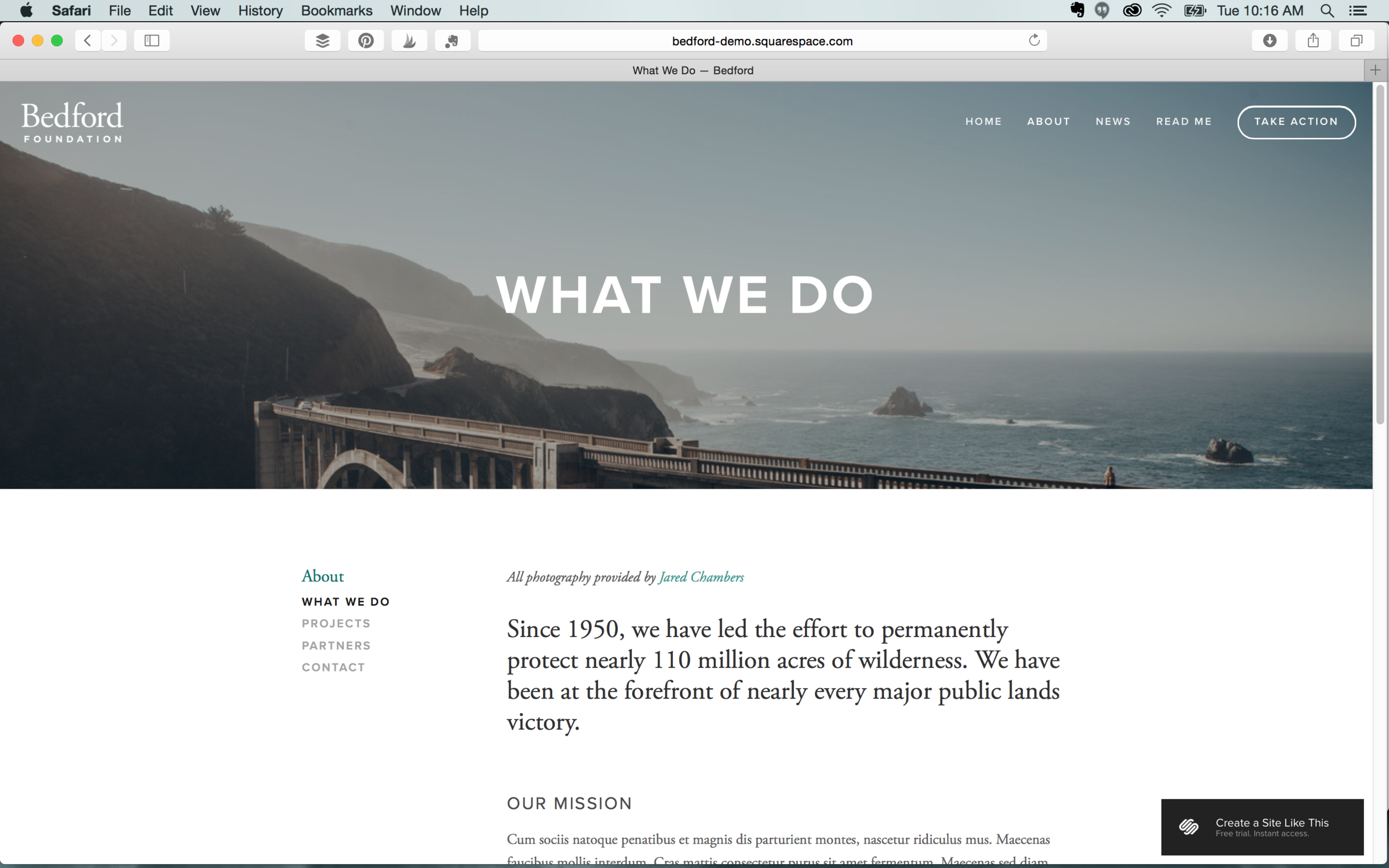
Bedford is the most popular template on Squarespace and it’s also the template HueAndToneCreative.com is built on. This beautiful and clean interface is ideal for just about any small business.  We also love that Bedford offers the option to have a second navigation in the footer.

Features: Index  |  Blog  |  Header image  |  Folder & footer navigation  |  Page titles  |  Grid & slide gallery  |  Cannot display social icons


Momentum

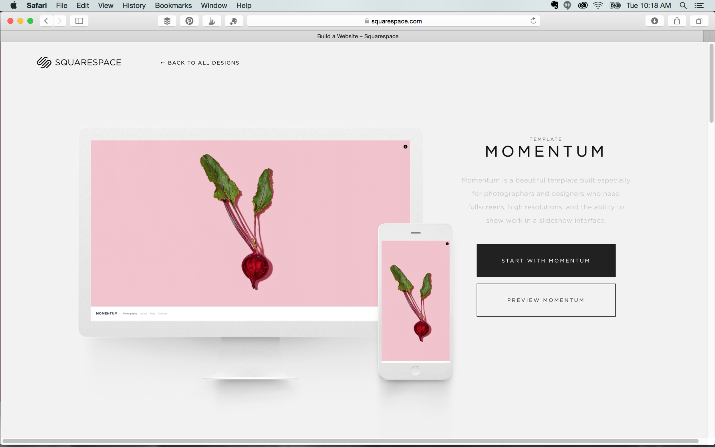
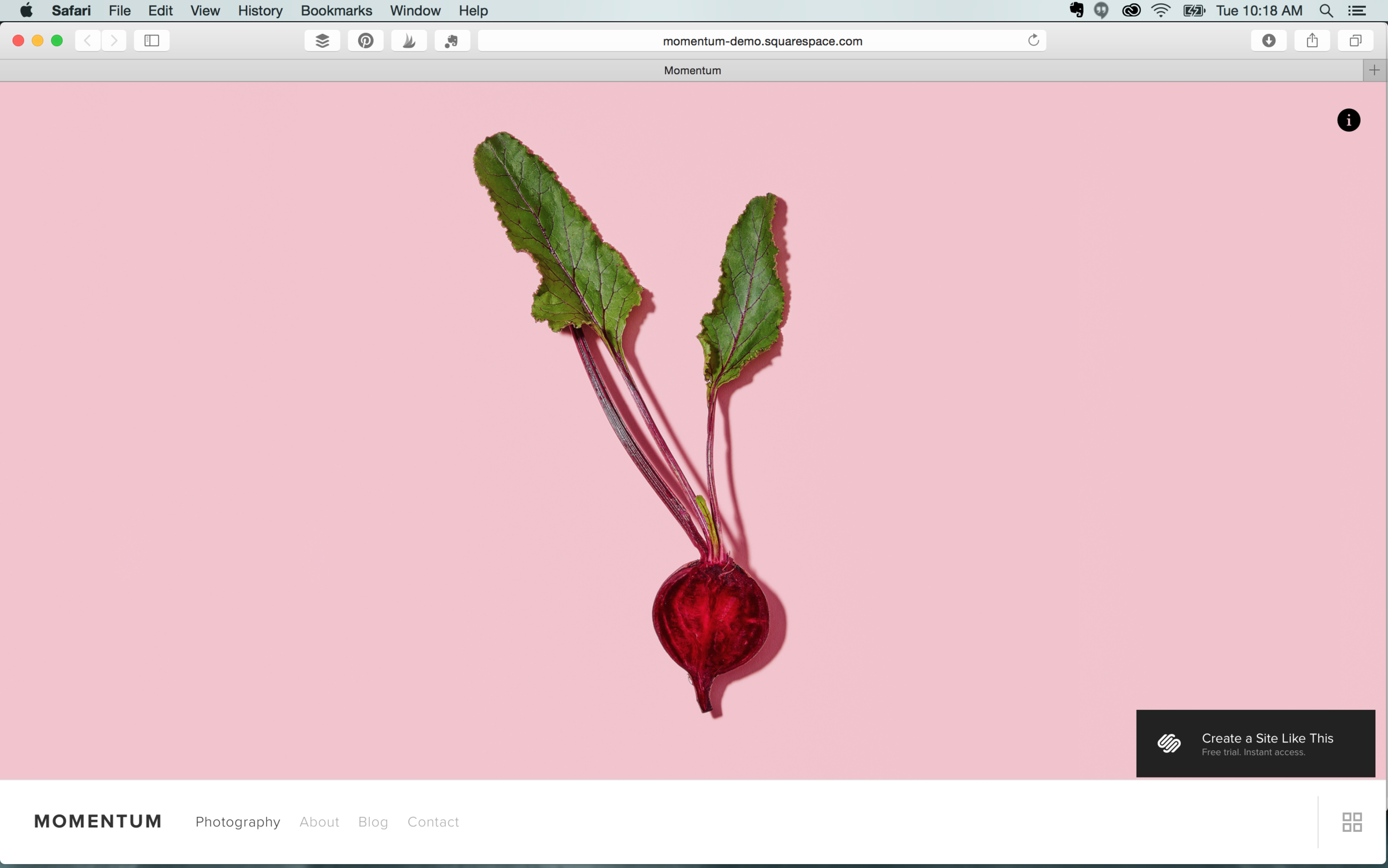
This clean template is perfect for designers and photographers to showcase high resolution images. If you’re looking to create a portfolio site, Momentum features a great slideshow interface and full screen images. This template’s aesthetic also works well to advertise products.

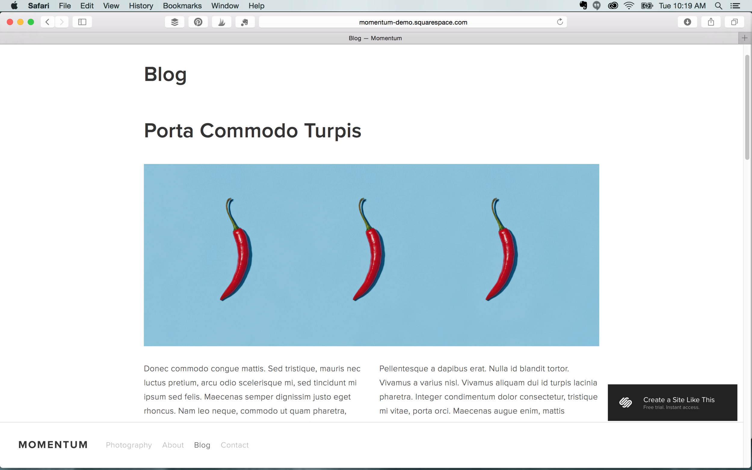
Features: Index/Gallery  |  Ability to display social icons  |  Page titles  |  Slide & grid gallery  |  No side bars  |  Page titles


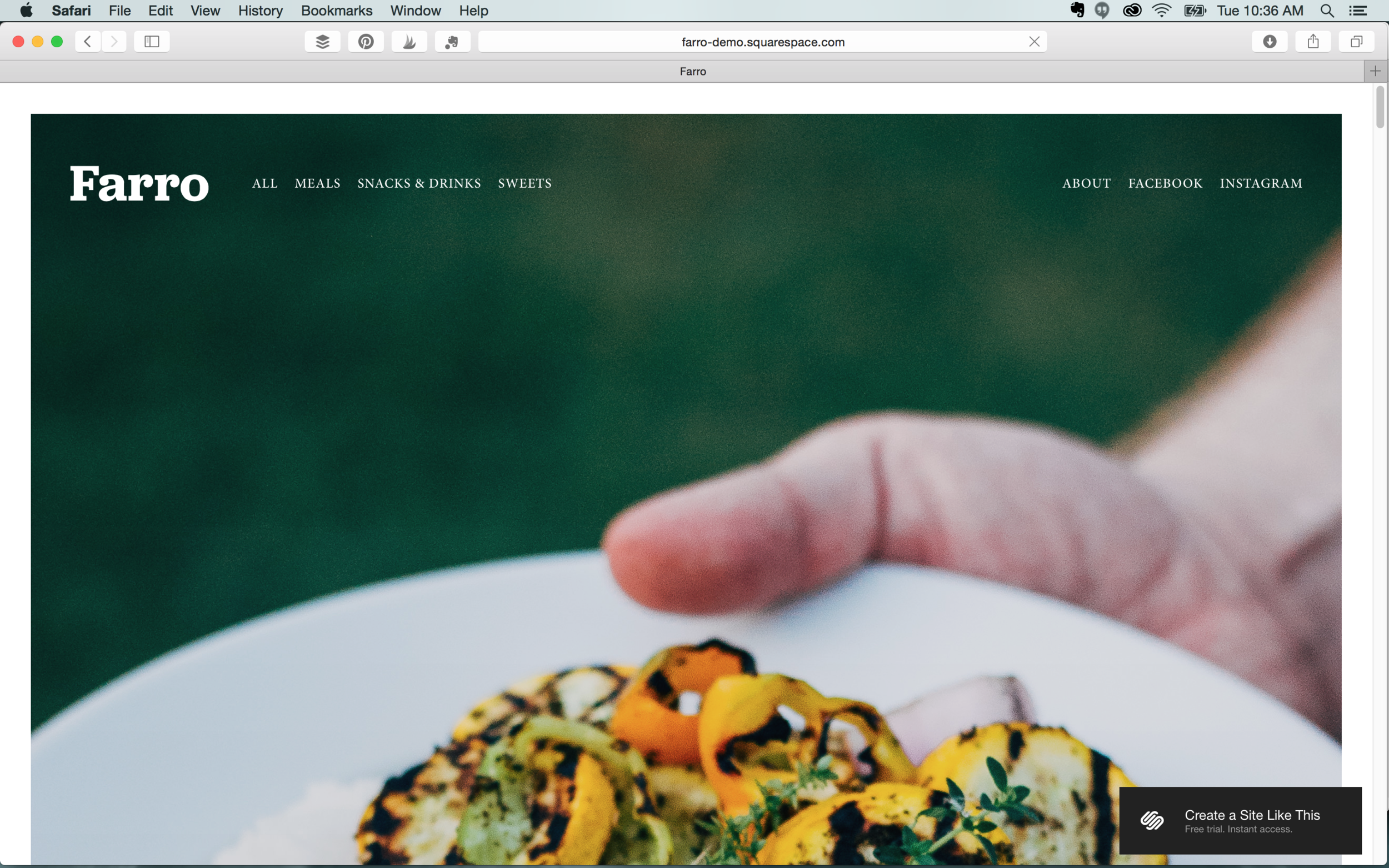
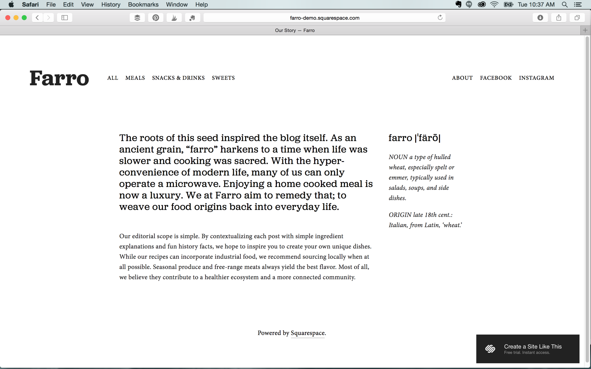
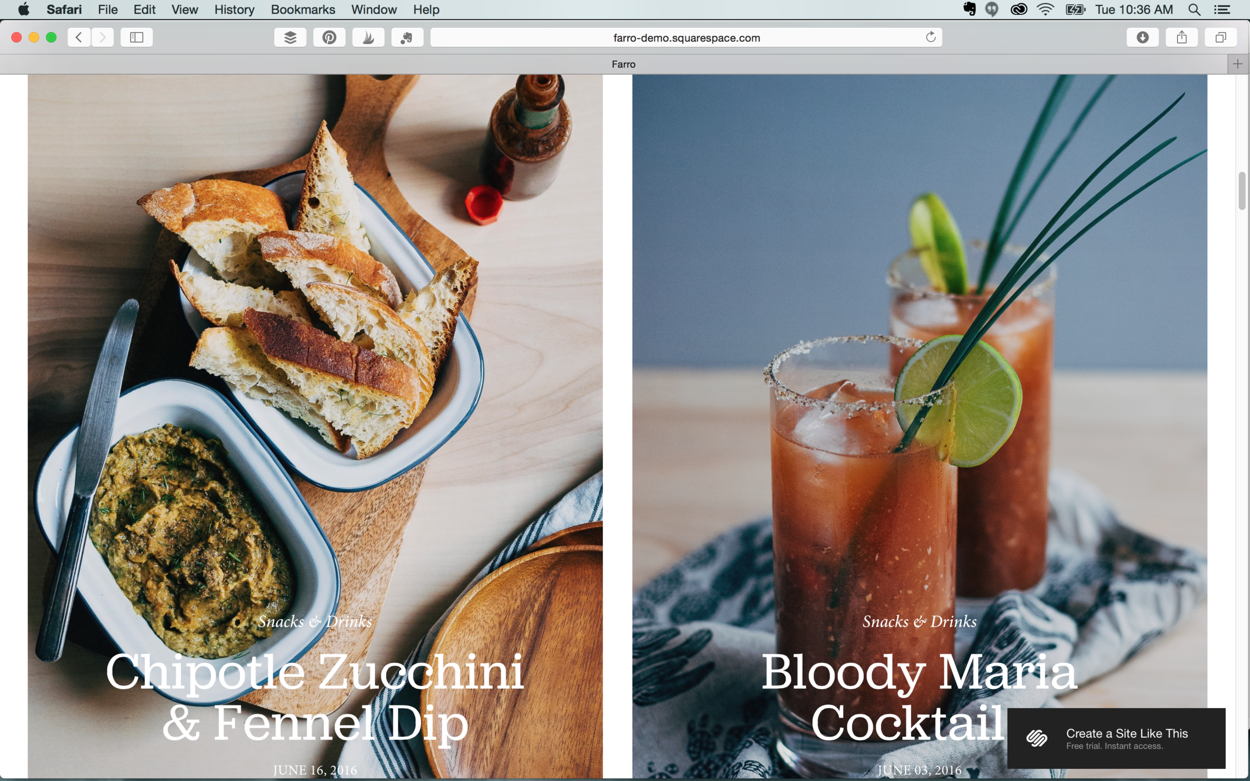
Farro

Farro’s sleek editorial style is a great choice for bloggers with strong images or digital publications. This post-like interface could also work well to display the portfolios of photographers.  

Features: Blog  |  Sidebar  |  Ability to display social icons  |  No page titles  |  Grid & slide gallery  |  Secondary navigation


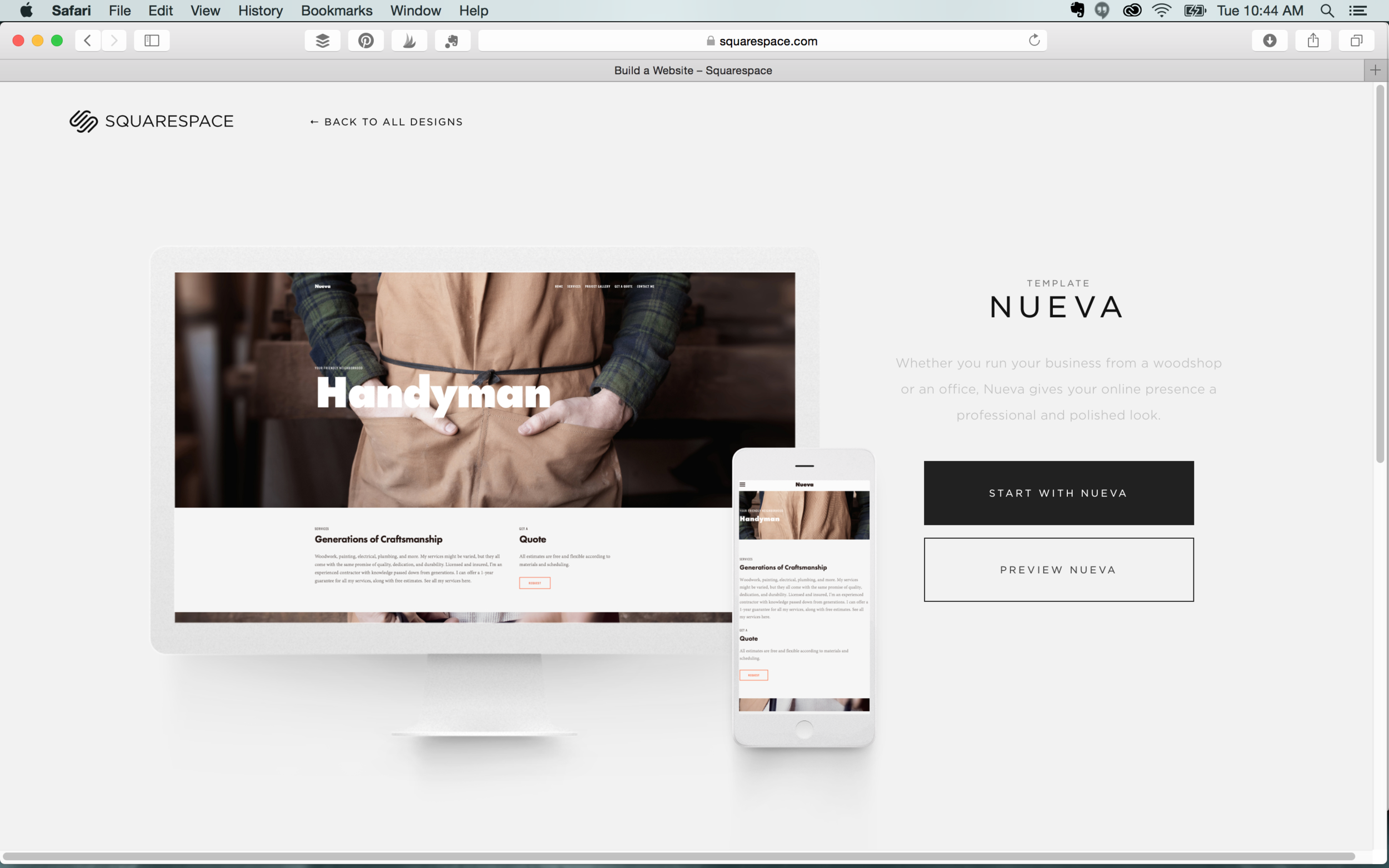
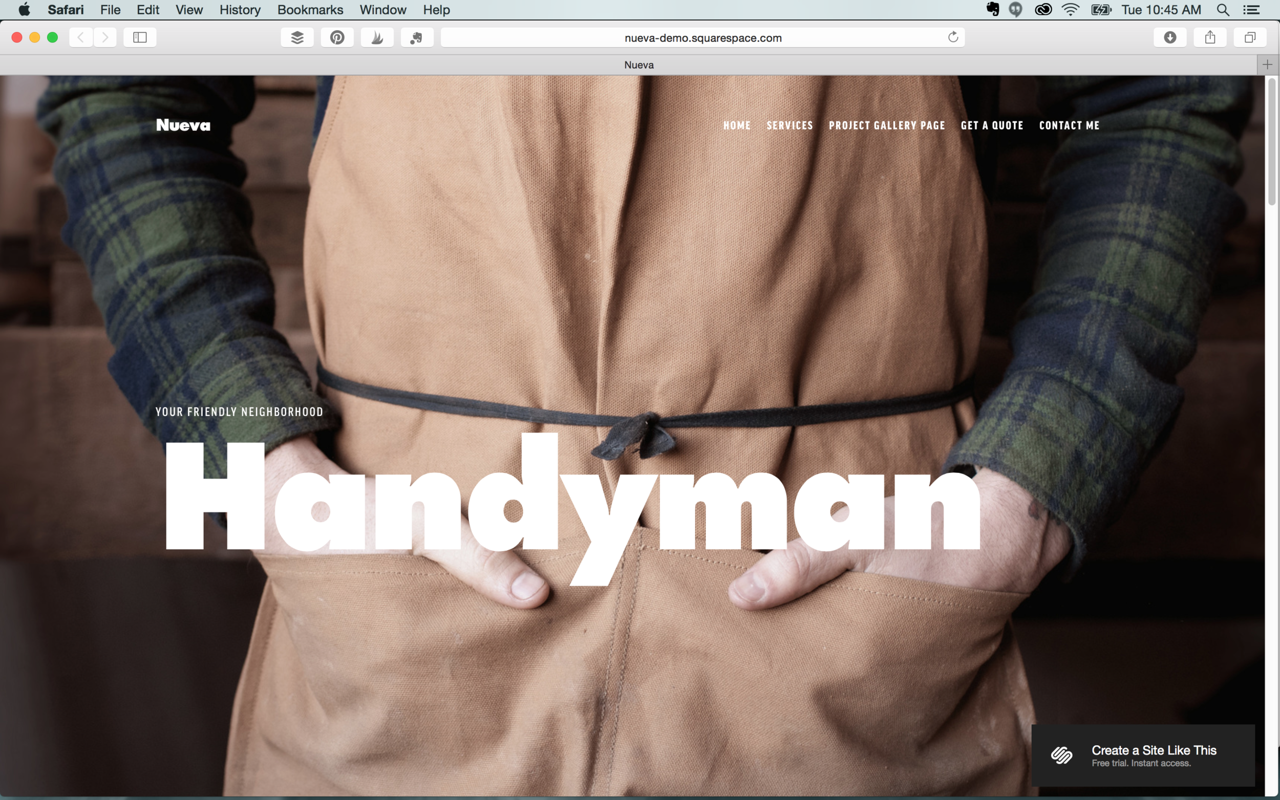
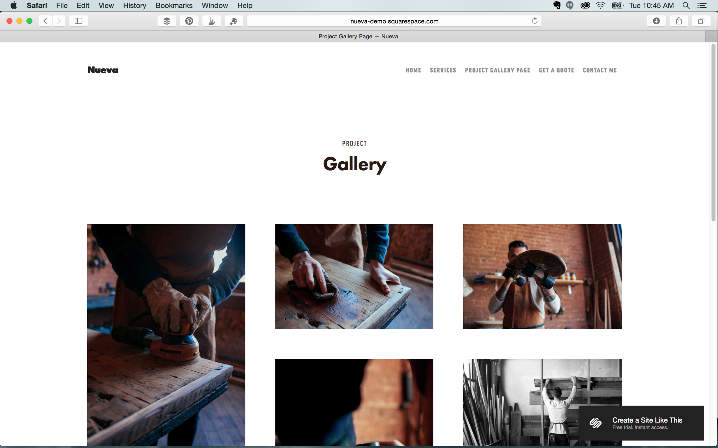
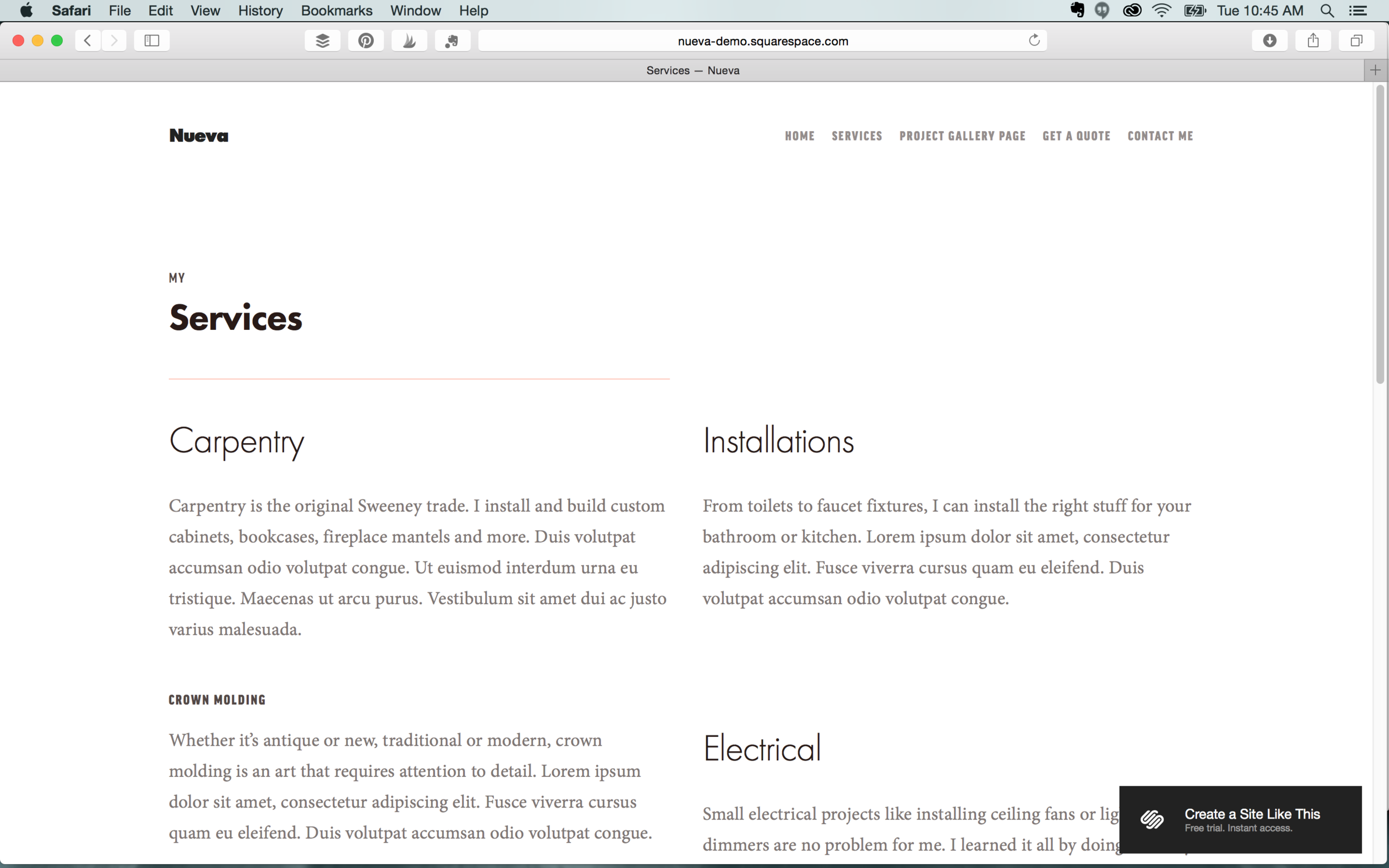
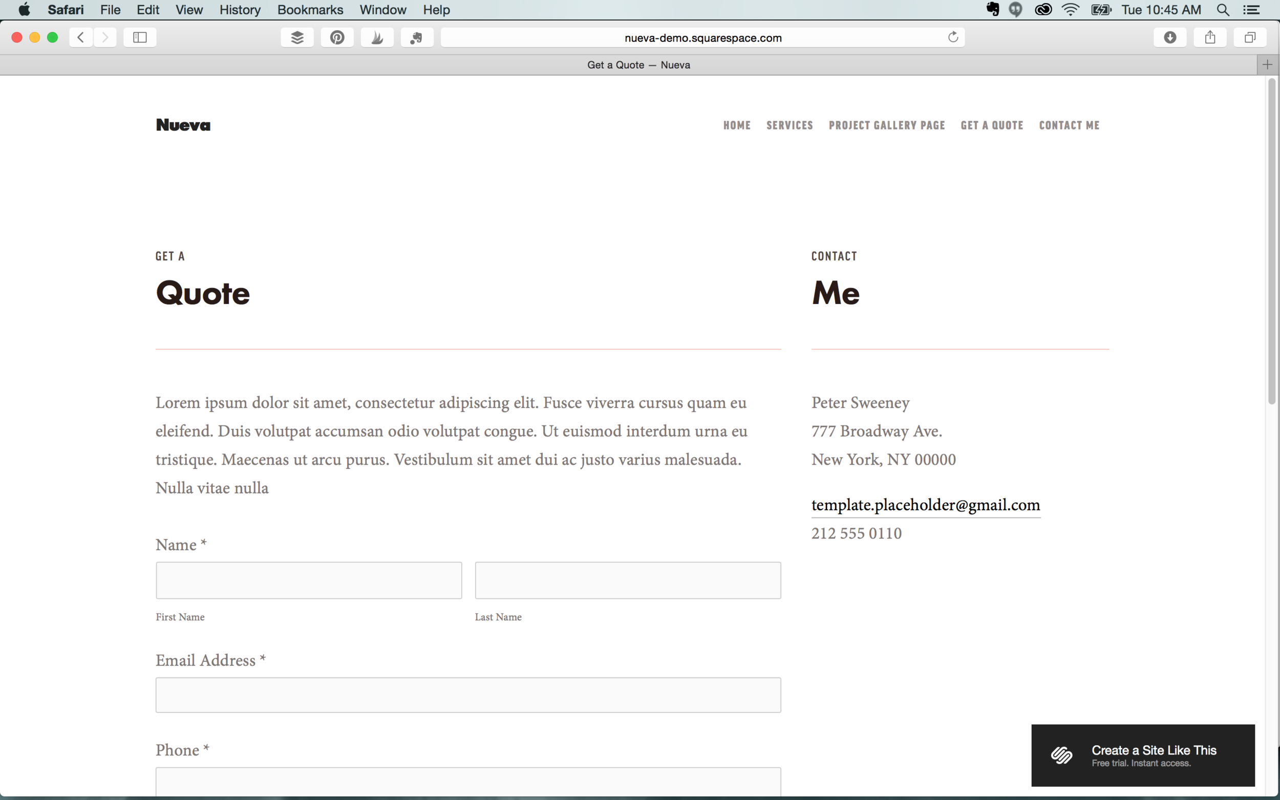
Nueva

We love the professional and polished style of Nueva. We recommend this for stores as well as restaurants. It’s not as image heavy as our other template picks, but it’s well organized and provides the option of a gallery.

Features: Commerce feature  |  Parallax scrolling  |  Multiple navigation  |  Customizable mobile styles  |  Blog
 

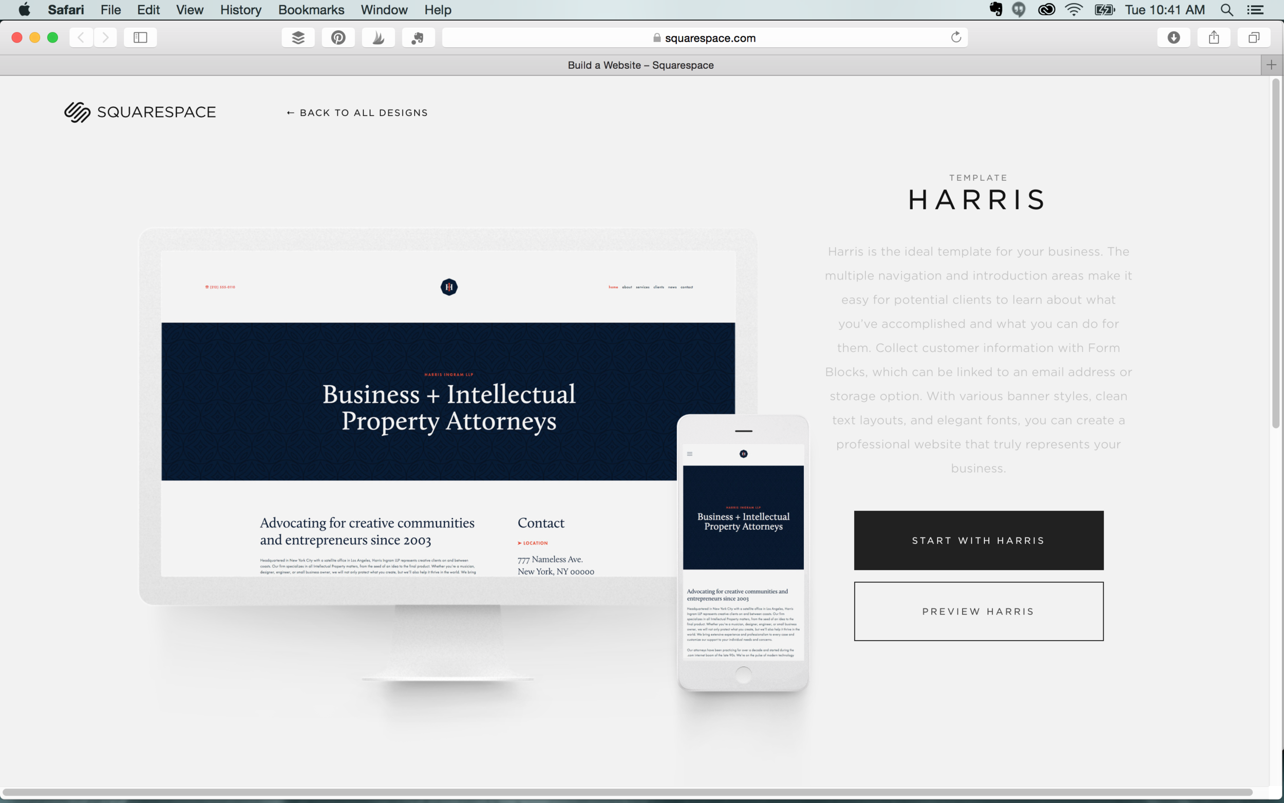
Harris

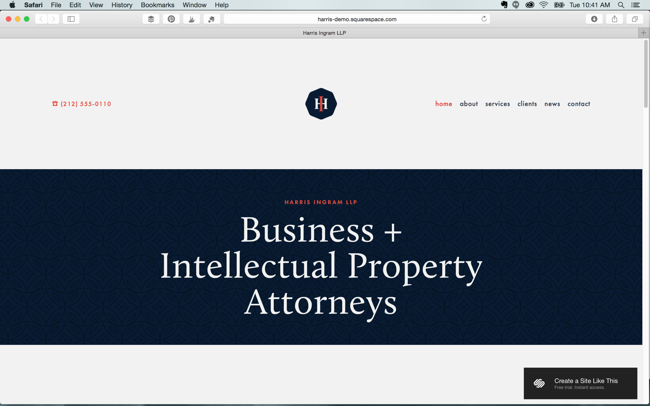
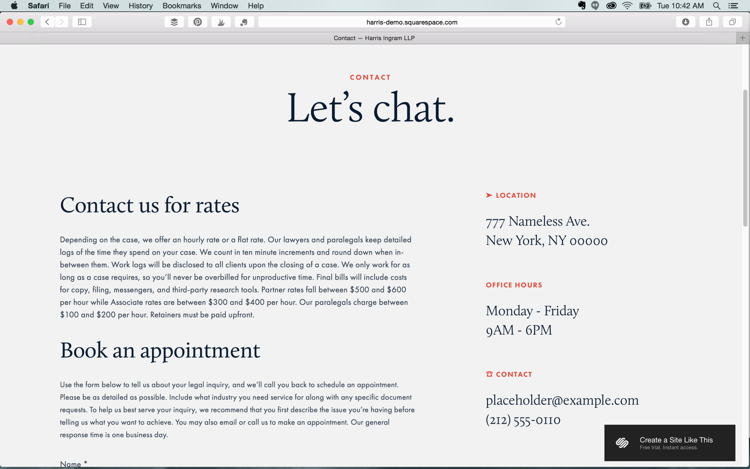
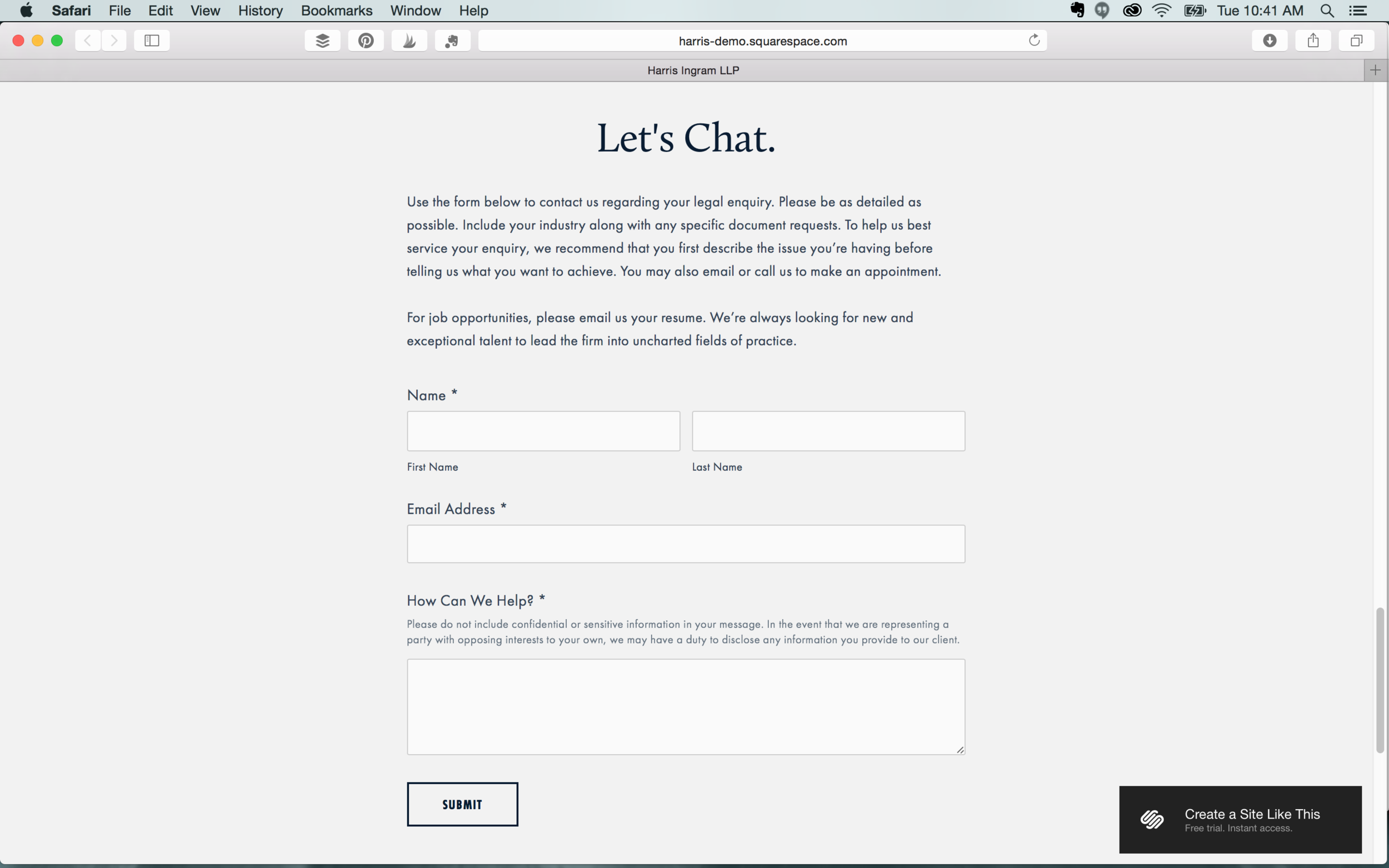
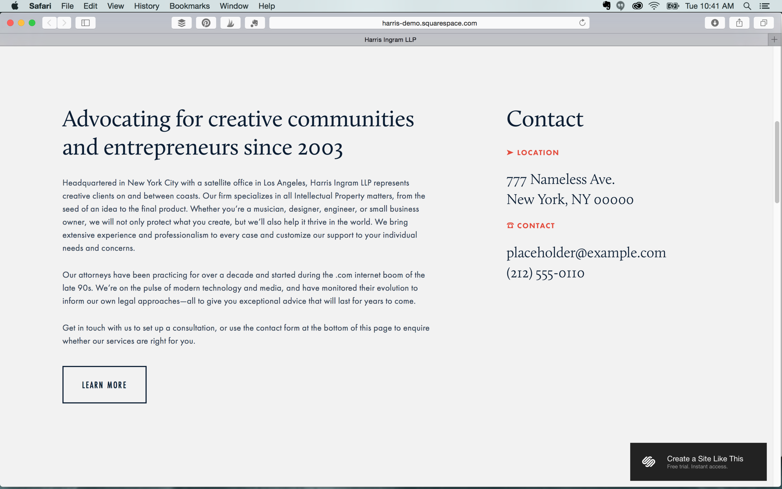
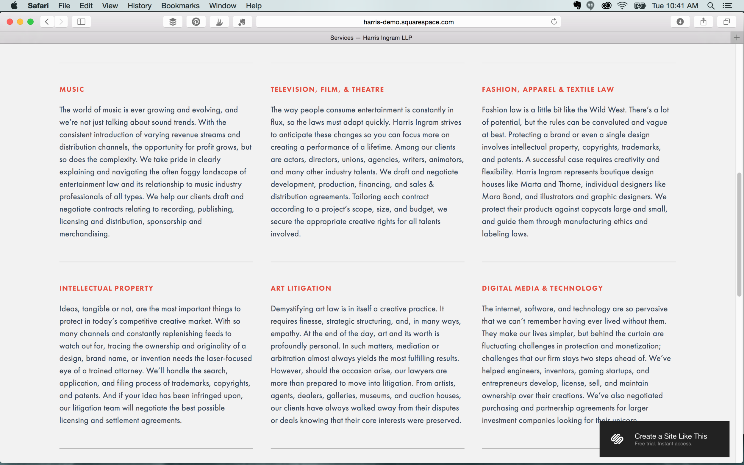
If your business doesn’t rely on pictures to promote your services, Harris is a great option. Its crisp layout, sophisticated font options, and banner styles makes this a great template for law offices, accounting firms, and writers. It also features Blocks to capture customer information as well as several introduction and navigation areas.

Features: Index page  |  Left, center, and right headers  |  Shopping cart  |  Main and secondary navigation


One last note

Even though we’ve made our recommendations, don’t be afraid to try the different templates Squarespace has to offer.  You can switch templates at any time – but *be warned* not all of your formatting will stick when you switch back. For example if you switch from the Bedford to the Nueva, and then back to the Bedford again, you’ll be starting with the original template settings. 

Had a great experience with Squarespace? Let us know in the comments! Feeling a little overwhelmed with Squarespace? We can help!