Posts in Resources
12 great free Google fonts

Looking for more inspo? Here’s our list of MUST download free Google fonts.

12 Great Free Google Fonts  |  Hue & Tone Creative

Google’s got around 915 fonts in its directory. Having a wide selection is great, but this can be a lot to sort through. You’ll probably be able to find the perfect font for your piece, but where do you even start?! 

Aside from the fact that Google Fonts are free, millions of people turn to Google fonts for its simplicity, easy-to-implement set-up, and high quality selection. The fact that a number of these fonts are available for print use is another great bonus. If this is your first time using Google to pick a font, you can find step-by-step instructions on the ‘how’ here.

To save you a bit of time scrolling through pages and pages of typography, here are 12 of our favorite freebies.


Popular choices

Numbers don’t lie. The first six on our list were the most viewed fonts over the last seven days, 30 days, 90 days, and year. 

12 Great Free Google Fonts  |  Hue & Tone Creative

1. Roboto, by Christian Robertson

Roboto’s a sans-serif font and comes in 12 different styles (thin, thin italic, light, light italic, regular, regular italic, medium, medium italic, bold, bold italic, black, and black italic). 

It’s known for its natural reading rhythm and features friendly, open curves.


12 Great Free Google Fonts  |  Hue & Tone Creative

2. Open Sans, by Steve Matteson 

Another sans-serif font, Open Sans has 10 styles to choose from. It’s featured on Google’s sites, and in print/web adverts. This font is endorsed by some of the biggest brands out there.


12 Great Free Google Fonts  |  Hue & Tone Creative

 3. Lato, by Łukasz Dziedzic

When creating Lato, Dziedzic wanted to come up with something transparent enough for body text while comprising unique traits for larger sizes; and he did just that.

With semi-rounded details and strong, structural entities, Lato oozes warmth, stability and seriousness all in one.


12 Great Free Google Fonts  |  Hue & Tone Creative

 4. Oswald, by Vernon Adams, Kalapi Gajjar, and Alexei Vanyashin

Originally created by Vernon Adams, Oswald has seen a number of interactions over the years based on user feedback.

It was designed to be appropriate for use across desktop computers, laptops and mobile devices and comes with six different styles - extra-light, light, regular, medium, semi-bold, and bold.


12 Great Free Google Fonts  |  Hue & Tone Creative

5. Slabo, by John Hudson

Slabo has just two weights. What’s unique about this one is that it’s specifically designed to be used at a certain size -- either 27px or 13px depending on your piece.


12 Great Free Google Fonts  |  Hue & Tone Creative

6. Roboto Condensed, by Christian Robertson

Part of the Roboto and Roboto Slab family, Roboto Condensed refuses to compromise. Its letters are freely positioned to settle into their natural width without encroaching on their neighbors, and it adds impact to body and heading copy alike. 


Hidden gems

Our next batch of fonts are just as easy to use and read but are less well-used, giving you chance to create something a little different.

12 Great Free Google Fonts  |  Hue & Tone Creative

7. Arvo, by Anton Koovit

Best suited to heading and sub-headings, Arvo’s a slightly more edgy font with tints of contrast. Available in regular, regular-italic, bold and bold-italic, you can tailor its impact to your tastes and needs too.


12 Great Free Google Fonts  |  Hue & Tone Creative

8. Bree Serif, by TypeTogether 

Charming, original and versatile by nature, Bree Serif was an instant hit when it first came onto the scene back in 2008 -- and we can see why.


12 Great Free Google Fonts  |  Hue & Tone Creative

9. Sanchez, by Daniel Hernandez

Sanchez is a slab-serif typeface and it’s simple, scannable, and distinguishable. It might not be for everyone but if it fits your organizations feel it can be a solid design choice.


12 Great Free Google Fonts  |  Hue & Tone Creative

10. Hammersmith One, by Sorkin Type

Low in contrast, unique in style, and subtle in curves Hammersmith One was built specifically for web-use. Although it does still work well to smaller sizes, it’s perhaps best limited to titles, sub-headings, and short intro paragraphs.


12 Great Free Google Fonts  |  Hue & Tone Creative

11. Catamaran, by Pria Ravichandran 

With nine different text weights Catamaran’s incredibly versatile and, in the designer’s own words, “strikes a balance between typographic conventions and that bit of sparkle.”


12 Great Free Google Fonts  |  Hue & Tone Creative

12. Playfair Display, by Claus Eggers Sørensen

Used across millions of websites worldwide, this transitional font’s functional and stylistic and pairs well with Georgia for body text. Other popular couplings include a few of our already mentioned Google Fonts: 

  • Lato

  • Roboto

  • Raleway

  • Oswald

  • Open Sans Condensed


Hue & Tone Creative: Your Font Partners

Finding the right font for your website, flyer or social media advert can be really tough -- we get that. If you’re struggling to find a font that gels with your work, we can help. Get in touch at hannah@hueandtonecreative.com or (336) 365-8559 to see how.

75 great promotional words to use
75 great promotional words to use  |  Hue & Tone Creative

The words you use have a direct impact on the actions people take. They’re the difference between someone looking at your advert and thinking “hmm, sounds interesting” and “wow, I’m going to give them a call right now.”

Needless to say, every single organization out there is striving for the latter. 

Take a look at this line for example:

  1. Start earning money today

  2. Start making money today

Both deliver the same message, but the second is more impactful. Why? Because making money sounds simpler than earning it, and in a dog eat dog world where everything’s about maximizing profit - easily, that’s exactly what people are after.

Boosting your conversion rates really could be as simple as tweaking the odd word here and there, so, let today be the day you go through your websiteoffline collateral and online adverts and see where you could be making the most of stronger alternatives.


Words that create reassurance

If you want to convert a prospect into a customer you need to give them a reason to believe what you’re saying and trust what you’re selling. So, here are some words that incite just that:

  1. Promise

  2. Guarantee

  3. Risk-free

  4. Unconditional

  5. Proven

  6. Tried and tested

  7. Protected


Words that create a sense of urgency

Whether you’ve got a promotion that’s due to expire or you just want to encourage your audience to buy now, these words will give them a nudge in the right direction. One thing worth mentioning though is not to over-use these kinds of words, if you do, over time, they’ll lose their effectiveness. 

7. Now

8. Last chance

9. Flash sale

10. Call today

11. Quick

12. Expires

13. Soon

14. Immediately

15. Hurry

16. Ending

17. Going-fast

18. Limited

19. Last

20. Don’t miss out

75 great promotional words to use  |  Hue & Tone Creative


Words that promote ease

People are busy. They don’t have time to faff around and they want products and services that make their life easier, so let them know yours does just that with words like:

21. Easy

22. Simple

23. No-fuss

24. Hassle-free

25. Smooth

26. Painless

27. Straight-forward


Words that invoke value

As a society, we’re a demanding bunch; we don’t just want ease, we want value for money and deals too. You can cater for all these needs with words like:

29. Bargain

30. Free

31. Discount

32. Freebie

33. Sale

34. Value

35. Save

36. Buy one, get one

37. Elite

38. Premium

39. Effective

40. Popular

41. Market-leading

42. Best-seller


Words that give off a personal touch

People aren’t naive. When you send out a promotional email they know they’re not the only one on the receiving end of it, but that doesn’t mean you can’t still make it personal. Here are a few words to achieve this:

43. Invite-only

44. Hand-crafted

45. Just for you

46. You told us

47. We thought you might like

48. Thank you


Words that offer exclusivity

It’s a time-old problem, people want what they can’t have. As soon as we know something’s off the table we want it more, and the same goes for the world of business. Make your products and/or services more desirable by saying things like: 

49. Secret

50. Rare

51. Few

52. Limited edition

53. Unique

54. Select

55. One-off

56. One of a kind

57. Sought-after


Words that promote luxury 

If you’re offering something lavish and your target market’s after the finer things in life, here’s how to up-sell what’s on your shelf:

58. State-of-the-art

59. Luxury

60. Finest

61. Delux

62. Plush

63. Magnificent


Words that inspire 

Saying your service’s ‘really great’ is hardly inspiring, is it? You need attention-grabbing words that motivate people to want to take action, like:

64. Mind-blowing 

65. Incredible

66. Remarkable

67. Life-changing

68. Amazing

69. The new way to…

70. The new you


Words that create curiosity

Finally, if you want to pique people’s interest, stop them in their tracks, and lure them into what you’re saying, start with:

71. Introducing

72. Coming soon

73. Did you know…

74. Discover

75. Stop 


Hue & Tone Creative: Campaign experts

So you’ve got the promotional words you need, but do you know what to put before and after them to make your next campaign really work for you? No? Don’t worry, we can help with that. Get in touch at hannah@hueandtonecreative.com or (336) 365-8559 to see how.

All About Email Marketing

Check out all our email marketing posts here.

Over the last few months, email marketing has been the topic of our most popular blogs — and with a low up front investment and great conversion rate, we can see why.

We’ve compiled a few of our favorite email marketing blogs into an easy to reference list. From the basics of what kind of emails to send to templates for upselling emails, we hope you’ll find what you need here.

Don’t see what you’re looking for? Leave us a comment letting us know what we should post about!

Email Basics

4 types of emails you need to be sending

You can send a wide variety of different emails to your marketing list, but if you’re just getting started with email marketing, there’s a few types of emails we suggest you start with. These four types are all great to engage both new customers and old leads.

Learn more here >

4+types+of+emails+you+need+to+be+sending++|++Hue+&+Tone+Creative.jpeg

How+to+write+a+subject+line+that+gets+clicks+|+Hue+&+Tone+Creative.jpeg

How to write a subject line that gets clicks

If you’re struggling to see the click through rate your campaigns need to succeed, we’ve got a bank of ideas to help give them a boost.

Get the details here >


6 reasons to send a company newsletter

Newsletters can, and should be, a staple lead-generating part of your marketing activity. They add credibility. They add value. And, most importantly, they add revenue to your books.

Read it here >

6+reasons+to+send+a+company+newsletter++|++Hue+&+Tone+Creative.jpeg

_t20_294nR6-2.jpg

6 ways to spruce up your email signature

By leveraging your email signature you could drive more traffic to your site, increase your social following and promote current or upcoming sales.

Learn more here >


Email Templates

If you’re just getting started with email campaigns, these quick and customizable templates will help you get things off on the right foot.

3 cross-sell emails that convert

There’s endless potential sales out there to To help improve the chance of upselling, we’ve compiled three proven cross-sell templates for you to tweak and use.

Get the templates here >

3+cross+sell+email+templates+that+convert++|++Hue+&+Tone+Creative-2.jpeg

event+emails+that’ll+increase+attendance+rates+|+Hue+&+Tone+Creative.jpeg

4 event emails that will increase attendance rates

If your attendance levels aren’t as high as you’d hoped this four-stage email marketing plan will help you hit your event’s overarching key performance indicators.

Learn more here >


4 free welcome template emails

According to Salesforce’s benchmark study, welcome emails are the third most popular type of email sent by businesses. If done right, they engage new customers straight away by prompting recipients to start the next stage in their customer journey.

Learn more here >

4+Free+Welcome+Email+Templates++|++Hue+&+Tone+Creative-2.jpeg

Hue & Tone Creative: your Email Marketing Partners

Need a hand writing or designing your very own emails? Look no further - we’ve got you covered from content development to design. To discuss our email services and more, contact us at (336) 365-8559 or hannah@hueandtonecreative.com.

3 cross-sell email templates that convert

Picture this: you head to your local sports store to grab a new pair of sneakers. One of the assistants comes over and asks if you need help. You accept. While showing you the shoes, they point out their range of high-performance socks, insoles, and foam rollers. 

You walk out of the shop with the shoes you originally came for…and a three-pack of new socks too.

You probably didn’t realize it at the time, but you were just the subject of up-selling and cross-selling in person.

This tactic works well in person, but it works just as well online. There’s endless potential sales out there to seize -- but if you’re not grabbing these cross-sell opportunites with both hands, your business’ bottom line could be missing out.

To help improve the chance of upselling, we’ve compiled three proven cross-sell templates for you to tweak and use.

3 cross sell email templates that convert  |  Hue & Tone Creative

Opportunity #1: Right after a sale

Your very first cross-sell opportunity comes right after a new customer has made a purchase. We recommend sending out a thank you email — while you’re still fresh in the customer’s mind, offer them some complementary products.

For example, if you’re a DIY company and someone’s just bought a gallon of paint, why not highlight your paint brush, roller, and trays range? If they don’t already have them, odds are they’ll need them very soon… 

Sticking with the paint example, here’s some sample copy:


Hi [insert name],

Thanks a bunch for choosing us for your next DIY project. 

Your order’s been sent to the warehouse and should be on your doorstep in the next 2-3 business days.

If you need some more tools for the job, check out our range of [paint brushespaint rollers, and paint trays]

If there’s anything else we can help you with, get in touch with our customer service team on [insert number].

Thanks again,

[Company X] team


Opportunity #2: when asking for a review

It’s good practice to check in with customers down the line and ask for a review. The review itself will not only help you attract more new customers, but it could help you improve your product or service too.

So, if you’re already doing this, take the opportunity to kill two birds with one stone and steer them towards some more of your offerings. Here’s how you could do it:


Hi [insert name]

Thanks for shopping with us recently. 

Here at [company name] we take what you think to heart, and we’re always looking for ways to build on what we’ve got. If you have just a minute to spare, we’d love to hear what you thought about your recent purchase. 

>LEAVE A REVIEW< 

If you liked what you got, these might just be up your street too:

[Reel of relevant product names and images]

We look forward to hopefully seeing what you say soon.


Thanks,

[Company X] team

3 cross sell email templates that convert  |  Hue & Tone Creative


Opportunity #3: promotional pitch

Your cross-sell efforts don’t always have to piggyback onto another of your email activities. You can also send emails when you have a sale happening, you want to promote a new product, or offer a discount on a certain service. You can send cross-sell pitches whenever you want, just make sure you don’t bombard your database with emails — and be sure to keep the products or service offers relevant.

Here’s an example to steal some inspiration from:

Hi [insert name]

So, you’ve taken out our [insert service name] service, but have you ever considered our [insert service name] offering too?

If the answer’s yes then now’s the time to make your move, because we’re exclusively offering 15% off to existing customers!

By taking out our [insert service name]service, you’ll benefit from:

  • Benefit #1

  • Benefit #2

  • Benefit #3

  • Benefit #4

To claim your discount today, just use the code SUMMER2019 at checkout.

Thanks,

[Company X] team 


Hue & Tone: Email Design and Marketing

So, you’ve got the words, but do you have the design? Don’t worry if not, we can help you create kickass email templates that complement your content and encourage customers to re-convert. Interested? Then get in touch at (336) 365-8559 or hannah@hueandtonecreative.com.

4 event emails that’ll increase attendance rates
event emails that’ll increase attendance rates | Hue & Tone Creative

Organizing an event is no easy feat -- it’s time intensive, resource intensive, and financially intensive. So, if you’re investing your efforts into pulling an event together, you’ll want to make sure you’re squeezing every bit of benefit out of it as you can.

If your attendance levels aren’t as high as you’d hoped, hopefully, this four-stage email marketing plan will help you hit your event’s overarching key performance indicators (KPIs).


Phase #1: the invite

First things first, you need to pique peoples’ interest, and to do this, you need to feed them with the facts that will benefit them. What will they come away knowing that they don’t know now? How will this information benefit them? And what do you have to offer that others don’t? 

And, of course, as with any email, this all needs to be said in as few words as possible; easier said than done, we know.
 

The template 

Hi [insert name],

Do you want to build your business’ brand awareness? Attract more people to your site? Overtake your competitors? And increase that all-important profit margin?

Yes, yes, yes, and yes?

Then you NEED to come to our next event: [insert event name].

This event is being hosted by [insert speaker’s name] and he/she brings a whole load of knowledge to the table. He/she’s:
  • Reason #1 (e.g. number of years’ experience)

  • Reason #2 (e.g. qualifications)

  • Reason #3 (e.g. big brands they’ve helped)

Interested? Here are the details:

  • Date:XX/XX/XXXX

  • Time:XX.XX

  • Duration:XX hours

  • Location:XXXXXXXX


To secure your spot today, just RSVP to this email and let us know how many of you will be joining us.

Thanks,

[Company X] team


event emails that’ll increase attendance rates | Hue & Tone Creative

Phase #2: confirmation 

This one doesn’t need to be long at all, but don’t leave people guessing; let them know - right away - they’ve successfully signed up to your event. It’s a nice added touch, shows your professionalism, and saves them accidentally signing up twice.


The template

Hi [insert name],

Thanks for signing up for our [insert event name]event!

We’re really looking forward to meeting you there and we can’t wait for you to see what we’re all about. 

We’ll touch base with you again soon, but if you need anything from us between now and then, get in touch with our team at [insert number].


Thanks again,

 [Company X] team


Phase #3: Keep them keen 

Once you’ve got a bunch of people on board, let them know they’ve not slipped off your radar – and, as an added bonus, arm them with even more valuable information. We suggest sharing content like a blog article or guide that is relevant to the topic(s) covered in the event.


The template

Hi [insert name],

It’s only one week until our [insert event name]event - eek! We hope you’re as excited as we are for the big day.

To give you a flavor of what’s to come, we’ve put together a free guide on [insert event topic(s)]for you - just click hereto read it.

See you very soon!

Thanks,

[Company X] team


Phase #4: the reminder

The fourth and final stage of your pre-event build-up is your reminder. This one is important because, let’s be honest, everyone’s human and we all forget things now and then - especially at work when we’ve got to-do lists as long as our arm! So, give your attendee list a polite prod the day before. That’s how you can ensure your event is fresh on their mind.


The template

Hi [insert name],

We can’t wait to see you tomorrow!

To save you crawling through your emails, here’s all the info you need to get to the venue:

  • Location:XXXXXXXX

  • Time:XX.XX

  • Duration:XX hours

  • Directions:XXXXXXXXXXX

See you tomorrow, 

[Company X] team


Hue & Tone Creative: Let’s work together

If you need help with your email event marketing, presentation graphics, branding, business cards, or more, that’s exactly what we’re here for. Get in touch at (336) 365-8559 or hueandtonecreative.com to see what exactly we can do for you.

19 marketing terms you need to know

Let’s be honest. We’ve all been sat in a meeting at one point or another, heard a term we’ve never come across before, not wanted to put our hand up to ask what it means, and instead sat there nodding along, not entirely sure what’s going on... hey, it happens to the best of us.

So, to help you bridge that gap and wave goodbye to your unknowing head nods, we’ve put together a glossary of 19 common marketing terms and what they mean - without the jargon. 

19 Marketing Terms You Need to Know  |  Hue & Tone Creative

1. A/B testing

A/B testing involves creating two variations of one element and running tests to compare which version works best. A few examples of when you would use A/B testing:

  • Email subject line text

  • Colors used for call-to-action (CTA) buttons

  • Content placed on landing pages

  • Imagery used in social media ads

The end goal of A/B testing is to figure out which assets are most successful and, ultimately, improve conversions.

2. Bounce rate

This number can be found in Google Analytics and it represents the percentage of visitors who land on any given page of your website, but then leave without clicking through to any other areas of your site. 
 

3. Buyer personas

buyer persona is a breakdown of what characteristics are typically present within certain clusters of your customer base, for example their:

  • Age, gender and geographic location

  • Professional and/or education status

  • Personality traits - i.e. comfort seekers, impulse buyers, worriers, confident, highly skilled, etc.

It’s worth noting that you can have several different types of buyer personas for a single product or service.


4. Click-through rate (CTR)

This is the number of visitors who visit a webpage and proceed to the next desired step - i.e. they click from your homepage through to a marketing advertisement. Or, they open your email and click through to your landing page.

5. Content management system (CMS)

The majority of us aren’t able to build a website from scratch, which is where CMS’ come in. Quite simply, a CMS is a facility created by web development experts, that allows non-technical users to create, edit and manage their very own site.  

It also helps with things like:

  • Making content SEO-friendly

  • Ensuring content is indexable

  • Automatically generating navigational elements

  • Setting up user permissions


6. Conversion rate

What defines a conversion can vary. For some businesses it might be a newsletter sign-up, for others it’s filling in a form, and for another it could be completing a purchase. So, your conversion rate is the percentage of people who follow through and complete yourdesired action.

A page with a high conversion rate can be classed as well-performing, while pages with a poor conversion rate might be an indication that work needs to be done to improve your numbers.

7. Dynamic content

Dynamic content enables you to present visitors with different content, based on what information you already have on them. 

For example, in the email world, this could be sending the same email to your entire customer base, but sending one cluster to a landing page promoting product X, another to product Y, and another again to product Z, because each item is best suited to their needs and spending history.

8. Evergreen content

Unlike things like news articles and seasonal blogs, evergreen content doesn’t have a sell-by date. It infinitely provides rich, useful information to its readers, and, if done well, it can add a great deal of SEO value to your site. 

For a flavor of what evergreen content looks like, here are a few great examples: 

9. HTML

Short for HyperText Markup Language, HTML is a type of language used to build webpages. It’s the foundation of every single site - regardless of its complexity, and works in conjunction with things like CSS and JavaScript.

11. Landing page

Landing pages are designated pages that are designed for lead generation purposes. Their content will vary from business-to-business, but some examples include offering an ebook, webinar, white paper or event. One element that tends to remain consistent though, is the presence of a form to capture important lead-generating information - like names, job titles, company information and contact details.

12. Microsite

You could say a microsite is a halfway house between a regular website and a landing page. They’re commonly used when companies want to create a unique experience for their audience, and one that’s distinct from their typical style. Because of this, microsites typically have their own domain name and a whole new look and feel design-wise.

13. On-page optimization

This is one of your site’s SEO elements, and it refers to things like your content, title tags, URL and image tags. Basically, it’s the practice of ensuring all the aforementioned areas are optimized for your desired keywords, to help bolster your organic rankings. 

14. Off-page optimization

Another segment that makes up your SEO efforts. Off-page optimization is often much more difficult to obtain success in because it’s usually out of your control, but if you master it, it can be incredibly fruitful.

A few ways to optimize your website off-page include:

  • Link building

  • Social media engagement

  • Social bookmarking

  • Guest blogging

15. PPC

PPC is short for pay-per-click. Quite simply, it involves paying a publisher (like a search engine, social media site or website owner) each time your ad is clicked on. 

19 Marketing Terms You Need to Know  |  Hue & Tone Creative


16. Responsive design

This refers to websites that are built to mould around the device they're being viewed on. So, for example, if you go to a website on your desktop and then again on your mobile, the content will automatically be optimized for both screens’ dimensions, ensuring ease of readability and accessibility.

17. User experience (UX)

UX encompasses everything your organization does from a prospect’s discovery all the way through to an existing customer’s renewal. A good UX can aid your conversions and a bad UX can do quite the opposite. To really get under the skin of a customer’s experience, you have to put yourself in their shoes and bethe customer - market research (like focus groups) can help with this.

18. Viral content

Viral content is the ultimate goal for most. It’s a piece of content that takes the internet by storm and spreads like wildfire through social sharing and re-publishing. Check out these examples for some inspiration. 

19. XML sitemap

Last but certainly not least, an XML sitemap is a file that hosts all your website’s relevant URLs. It helps search engines a) get to grips with your site’s structure, and b) crawl your pages more efficiently.

Although XML sitemaps don’t guarantee your pages will be indexed, they are still the best way to put your website out there and in front of search bots. 

Keywords form an important part of your SEO strategy and they play a key role in getting your pages ranked in search engines, such as Google, Yahoo, and Bing.

The keywords you target should be relevant to your product or service, in sync with what your target audience are likely to search for, and optimized both on-page (i.e. within a blog post or on a product page) and off-page (i.e. in your meta descriptions).


Hue & Tone Creative: Your marketing partners

So now you’ve come to grips with the jargon – but do you know how to truly utilize some of these tactics and trends If you don’t, don’t stress – that’s where we come in! To see how we can fulfill everything from your design and branding to social media and blogging needs, contact us today at (336) 365-8559 or hannah@hueandtonecreative.com

Typography for beginners
Typography for Beginners  |  Hue & Tone Creative

Some web pages and brochures good… and some look terribly unprofessional. If you’re new to graphic design or typesetting it can be hard to determine what makes someone’s branding look good or bad.  

If you’re a beginner – or you’re attempting to brand your own business -- there’s a number of type rules you can follow to give brand a polished look. Following these simple rules will help even the most amateur designer get their webpages and print assets in tip top shape!


1. Less is more when it comes to typeface

If you’re looking for some font pairing inspiration, head over to these two posts about pairing fonts on Squarespace (here and here). 

Choosing the right typeface is key. Get it right, and you’ll set yourself up for stylish, simple and easy-to-read assets. But get it wrong, and you’ll end up with illegible, cluttered and unappealing pages. 

Simple fonts should be used for main body copy, and decorative typefaces should be used sparingly for things like subheadings.

The golden rule in the design world is to stick to a maximum of three fonts in any given piece of artwork - whether that is a website page, social media banner, or hardcopy flyer. However, whittling your fonts down to two can sometimes be even better. 

If you stick to just one or two fonts, you can use varying weights to create a more refined look. 


2. Use a sensible hierarchical structure

Following a logical hierarchy helps to give your site’s pages a clear flow and effortlessly guides readers through the structure of the website. Let’s compare and contrast two examples to give you a better idea of what we mean: 

Good content formatting.png

Exhibit A is a bad example. The website’s name, navigation bar, subheadings, and main body copy are all the same font size. Now there are two issues with that – first, it gives readers no visual indication where they should start reading or what’s most important to look at. Secondly, it makes it really difficult for the reader to skim through the copy.
 

Now, let’s contrast an example of a solid hierarchical structure. The page’s title, navigation bar, subheadings and copy are clearly defined with varying font points, making it much easier on the viewer’s eye.


3. Be creative with contrast

Typography for Beginners  |  Hue & Tone Creative

Being creative is part of being a designer. Now we know we said earlier you should stick to two to three font combinations per project, but that doesn’t mean you can’t mix up your styling by playing around with things like the font’s size, weight, color and style.

Whether you emphasize a key word with italics, change the color of a subead to something more bold, or bump up a term in your tagline to a size that’s more eye-catching, there are endless ways to create contrast within your copy.


4. Keep your alignment neat and tidy

Alignment applies to all your on-page elements - like body text, titles, logos, images, and menu bars. When it comes to alignment, everything should be connected in one way or another. For example, you might want your logo to align with your main navigation bar, your body copy to align with your page’s title, and your images to align with your body copy.

Well thought-out alignment will help prevent your page from becoming disjointed and ensure all your assets create well-measured sizes and distances between each other.


5. Don’t be a stranger to whitespace

Don’t fall into the trap of thinking you need to fill everynook and cranny on your page. Creating whitespace around your words can be incredibly powerful, can help draw attention to text, and will aid you in achieving a simple and trendy look. 


6. Choose your colors carefully

Last but not least is your color choice. The right colors can make or break the look and readability of your copy – there’s nothing worse than colors that make your words a strain to read.

When it comes to color, there are three key components: 

  • Hue - the shade of the color

  • Saturation - the brilliance of the color

  • Value - the lightness or darkness of the color

Source &gt;

When it comes to choosing your colors, the aim of the game is to make your text as easy as possible to read. It’s as simple as that.


Hue & Tone Creative: Let’s work together

Feeling overwhelmed with information? If you’re not a designer, knowing and deciding what does and doesn’t work is easier said than done. If you need a hand with your typesetting - or any other area of design, get in touch with our team today at (336) 365-8559.

6 reasons to send a company newsletter

“For years, in large part thanks to the newsletter I think, I’ve never had trouble attracting new clients and the right kinds of clients. People will read my newsletter and be able to tell if I’m the right person for the project before they even call me.”

Tom Ahern, Small Business Owner


6 reasons to send a company newsletter  |  Hue & Tone Creative

Sold already? 

Newsletters can, and should be, a staple lead-generating part of your marketing activity. They add credibility. They add value. And, most importantly, they add revenue to your books.

In fact, you could say the proof’s already in the pudding. According to research conducted by the Content Marketing Institute, 83% of B2B marketers already send out email newsletters. And let’s be honest, the majority of organizations wouldn’t be willingly pouring their time and resources into them if the investment wasn’t worthwhile…right? 

Whether you’re already sending newsletters or are new to the scene, here’s a reminder of their six core benefits:


1. Constant communication

Sending a regular newsletter to prospective, current and past customers (providing they’ve asked for it, of course) opens up a non-invasive, continual line of communication. It might be one-sided, but it enables you to keep talking to your target market in a way that doesn’t leave them feeling bombarded. 


2. Gentle reminders

Whether you opt to send your newsletter weekly, biweekly, monthly or biannually, it serves as a reminder of your business to the recipients and ensures your name remains at the forefront of their mind. The benefit to you? It means they’re morelikely to turn to you when they’re in need of your product or service.

3. Add value

If your newsletter is packed with genuinely useful hints, tips, guides and videos, you’ll be giving something back to people for free - and they’ll appreciate that. But (and this is a big but) you’ll only reap the rewards of this if your newsletter content’s rich and relevant, which is where we can’t stress the importance of quality content enough. 


4. Increase sales

If you plan and pick your content smartly, your newsletter could help build your business’ bottom line. By using it as a platform to subtly sell as well as educate and inform, you can give both prospects and existing customers a polite nudge in the direction of a new sale.

For example, if you’re a social media management company and, say, 30% of your customers have only signed up for your Facebook services, why not include an article in their newsletter around the benefits of your Instagram and/or LinkedIn expertise? If not immediately, it could spark a sale down the line.

6 reasons to send a company newsletter  |  Hue & Tone Creative


5. Bolster your social following

More social media followers = more engagement = more reach. It’s as simple as that. As an added bonus, several studies indicate social signals can contribute to how search engines rank pages, so it could aid your SEO efforts too.

To maximize the benefits of this one, just make sure you remember to include links to all your profiles and in a place where they’re easily seen. 


6. Make your content go further 

If you’re investing time, money and resource into producing great content, it just makes business sense to make it go further, right? And your newsletter’s certainly one extra outlet for that. 


Now we’re not suggesting you start churning out generic content and pushing it out through every medium just for the sake of it. It’s important to tailor your content to each platform, audience and end goal -- but if you’ve got a bank of dormant articles, why not tweak and recycle them to boost their value and reach? 


Hue & Tone: all things creative marketing

If you’re sold but just don’t know where to start, we can help you with everything from your content and layout to design and social media. To get the wheels in motion, get in touch with the team at (336) 365-8559 or hannah@hueandtonecreative.com

12 tips for picking a good URL
Lead your website visitors right where they need to go…

Lead your website visitors right where they need to go…

Picking the perfect URL is a pretty big deal. It’s your online identity, it’s got to fit your business, and it’s got to be easy to find and promote. Not to mention, if you change your mind down the road it’s going to be a pain to go back and undo.

So, to make your future easier, here are 12 tips to help you settle on a good URL the first time around:


1. Make it easy to type

You want it to be as easy as possible for people to type your domain name into their browser, hit enter and land on your site. If it isn’t, you run the risk of losing potential visitors. So, try to avoid the use of slang (using ‘u’ instead of ‘you’ for example) or words with various spellings (like express and xpress).


2. Keep it short

Tying in with tip number one, keeping your domain name short reduces the chances of people mis-typing or mis-spelling it. Plus, long and complex URLs can be hard to remember, and you want people to remember you, right?


3. Watch out for bloopers

Here’s a prime example for you: penisland.net. The company’s called Pen Island, but we don’t need to tell you what the domain name can be interpreted as… 

The moral of the story: always check for embarrassing double meanings before you buy your domain.


4. Insert keywords

Try to include keywords relevant to your business. For example, if you’re a door repair company, you might want to register for a domain along the lines of doorrepair.com or doorreplacements.com. Keywords not only aid your organic efforts, but they just make sense to your customers.


5. Geographic targeting

If your product or service operates on a local basis, consider tying this into your domain name too. Sticking with the door repair example, this could mean having a domain like: vegasdoorrepair.com or doorrepair.vegas. Again, this makes your domain easier for people to find and remember.


6. Avoid numbers

Numbers can be easily misunderstood. For example, a numeral number 5 could be misplaced with a spelled out number five, and vice versa. 

woman-using-smartphone_t20_AeLxr0.jpg

 7. Skip the hyphen

Try to stay away from using hyphens, too. They can be forgotten about which, you guessed it, makes your website more difficult to be found. 


8. Do your research

The last thing you want is a legal battle on your hands, so make sure you research your chosen domain name to make sure it isn’t trademarked, copyrighted or being used by another company.


9. Don’t gloss over your extension

When we say ‘extension’, we mean the end bit of the url, like .com, .net, .org and .info, for example. Here’s a breakdown of how each is typically used:

  • .co - an abbreviation for company, commerce and community

  • .info - informational sites

  • .net - technical, internet infrastructure sites

  • .org - non-commercial organizations and non-profits

  • .biz - business or commercial sites

  • .me - blogs, resumes or personal spaces

Don’t be afraid of straying from the standard .com. It’s by far the most popular, but because of this, it can be tough to get your hands on a short and memorable URL that isn’t already taken. The key to choosing one that’s right, is making sure it’s relevant.

For example, if you’re a non-profit organization, it wouldn’t make sense to opt for a .biz extension. It might throw visitors off the scent and make them less likely to remember your link.


10. Buy back-ups

Everything up until now has been centered around building a URL that’s sheltered from being misspelled. But, it’s better to be safe than sorry, so it could be worth registering misspelled versions of your domain too, so people still make their way to your site anyway.


11. Bat off your competitors

Stop your competitors from stepping on your toes by purchasing similar domains to your own and redirecting them to your primary URL. For example, if your domain is doorrepair.com, you might also want to consider owning:

  • doorrepairs.com

  • doorrepair.biz

  • doorrepair.net

  • doorrepair.co.uk


12. Check its history

And finally, using sites like who.is and WaybackMachine, check out the domain’s history. After all, you don’t want to be associated with something that has a shady past.


Hue & Tone: Let us help you with your website

Brainstorming, agreeing on, and purchasing your domain name is the first half of the battle... building a website that converts is the other - and that’s where we come in. To see how we can help, contact our team at (336) 365-8559.

Data trends: 7 metrics you need to be measuring

Your data’s essentially the backbone of your marketing efforts. It tells you what is and (perhaps more importantly) isn’t working. It shapes strategic decisions. It funnels your money into the marketing channels that give the greatest return. It helps you prevent dead time, maximize resources, and effectively utilize your budget. 

Knowing which numbers to monitor, and what they mean, is key to properly utilizing the data you’re collecting. Here are seven key marketing metrics you need to be measuring: 


1. Total visits

Your totals visits refer to the number of people who check out your website. You can monitor your total visits on Google Analytics for things like:

  • Your entire website

  • Specific pages of your site

  • Campaign landing pages

 Keeping an eye on this type of data is important when you’re trying to gain an understanding of the effectiveness of your overall marketing efforts or the effectiveness of a specific campaign.

Data trends: 7 metrics you need to be measuring  |  Hue & Tone Creative

2. Acquisition type

Looking for different ways to measure your traffic? Here’s our top four methods.

Acquisition is where your traffic comes from – for example is it direct, referral, email, organic, paid or social? This is a key metric to stay on top of, because it tells you which channels are top performers and which may need to be revisited. Either way, it helps you put your efforts into the areas that actually generate a return for you.


3. Bounce rate

Bounce rates tell you how many visitors enter your website and leave before exploring any other pages. For example, are people making it to your ‘About us’ page and then heading off the website without clicking on any internal links? 

Generally speaking, the lower your bounce rate the better. High bounce rates canbe associated with people not finding the content on your page useful, and low bounce rates are more likely to convert and perform meaningful actions.

Bounce rates can be measured on your overall site or for specific pages.


4. Conversions

 This is arguably one of your most important metrics. A conversion can mean different things depending on what your goals are -- for example, it might be a newsletter sign up, filling out a lead form, and or completing a checkout.  

Your conversion numbers help you measure the profitability of your marketing efforts and they can be tracked either directly on your site (depending on how it’s built) or by setting up goals in Google Analytics. If your conversion numbers are looking pretty low, it might be worth looking at your design, content, user experience or product/service.


5. Cost per lead

Quite simply, this is the amount it costs you to turn a prospect into a customer. Your cost per lead should be calculated on a channel-specific basis, and the numbers you retrieve will give you a good idea of which channels are most profitable.

To calculate your cost per lead, simply work out how much you’ve spent on each medium and compare it to how many conversions it’s earned you. For example, if you invested $1,000 into a PPC campaign and got 15 conversions out of it, your cost per lead would be $66.66. 

This cost per lead needs to be weighed against the cost of creating or delivering your product. If closing a customer costs $100 and it takes $400 to manufacture your product, you need to seriously revisit your marketing efforts. 


6. Open rate

Open rates tell you how many of the emails you’ve successfully sent are actually being opened. For example, if you send 600 emails to prospects and 75 of them are opened, your open rate would be 12.5%.

It’s important to keep track of your open rates to understand how a) far your email campaigns are reaching, and b) you can improve your subject lines. Low open rates mean your emails aren’t being read, which results in missed opportunities. 


7. Customer value

twenty20_34643184-b92e-4852-ba8c-d79fae59854a.jpg

Last but certainly not least, is customer value. This is how much a customer is likely to generate you per year (or whichever cycle is most relevant to you) and can help you determine your overall return on investment. 

If you’re a start-up this figure will be more of a forecast. If you’ve been in business for some years, you can use the past few years’ sales numbers to calculate out the average number of yearly sales, along with the value of those purchases.

You can work your customer value out as an overall average or based on clusters – and your clusters could be anything from age and geography to persona and profession. Knowing your customer value helps you set organizational goals and expectations. 


Hue & Tone: Greensboro Marketing firm

When it comes to your business’ numbers, everything from your design to your social media management plays a part in your success. To see how we can help give your bottomline a healthy boost, get in touch with our team today at (336) 365-8559.

Expand your sales by selling on Instagram
Expand your sales by selling on Instagram  |  Hue & Tone Creative

Sales are down, and you’re looking for creative marketing strategies to help boost them. Enter shoppable posts.

As Instagram’s grown in influence, so has the sophistication of its sales funnel. Shoppable posts take Instagram’s selling cycle one step further, streamline the user’s journey, and boost your business’ odds of converting followers into customers. 

With around 90 million Instagram accounts tapping on a shoppable post every month, they might just be that sweet spot your business has been missing.

Not sure how or where to start? Not to worry. We’ve covered the A to Z of everything you need to know to get going.


What are shoppable posts?


In a nutshell, shoppable posts enable Instagram users to complete the entire purchase journey - from discovery all the way through to checkout - without ever leaving the app. The benefit to you? Less steps. Less chance of distraction. Less chance of losing customers.

On or off Instagram, your customer journey is crucial. For starters, almost three quarters (76%) of consumers cite it as an important pre-purchase factor. But did you also know, 86% of customers say they’re actually willing to pay more for a great user experience?

Looking at Instagram alone, here are some successful case studies from brands who use shoppable posts as part of there social strategy:

  • Spearmint LOVE witnessed a 25% increase in traffic and 8% uplift in revenue

  • Tyme saw their web traffic rise by 44%

  • Lulus attributes more than 100,000 site visits and 1,200 product orders to shoppers who started on Instagram

Here’s what it looks like in practice:


With more than 200 million Instagram accounts viewing at least one business profile per day, shoppable posts unlock the door to a whole load of opportunities.

A few quick-fire facts:

  • You can tag up to five products per image or video

  • A maximum of 20 products can be tagged per carousel

  • When you tag products in Instagram, they’re shared on the explore section (where 200 million accounts visit daily) as well as with your immediate audience

  • Products can be tagged within stories too, by using what’s called a ‘product sticker’. We’ll delve into the detail of how this differs a little later on, but below’s a snapshot of how product stickers vary from shoppable posts

A step-by-step guide

So, let’s get started with the details of how to actually create your own shoppable Instagram posts. 


1.  Account requirements 

To be able to make the most of shoppable posts, there are a few boxes you need to tick:

  • Your business must be located in certain countries (if you’re in the US, don’t worry, you’re covered). For a full list of countries that are and aren’t included, head here

  • Your Instagram account must primarily sell physical goods

  • You must convert your account to a business profile

  • You must comply with Instagram’s commerce policies

  • Your Instagram business profile must be hooked up to a Facebook catalog

  • Your Facebook profile (which must also be a business page) can’t have any country or age restrictions attached to it


2. Facebook catalogs

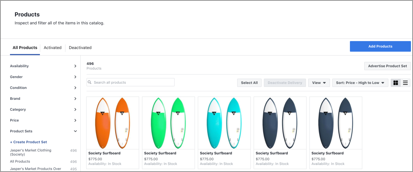
As we just touched on, to enable shoppable posts, your Instagram account must be associated with a Facebook catalog. In its simplest form, a Facebook catalog is a hub containing information on each of the items you want to sell - like their name, price, condition and category, and looks like this:

Image via facebook.com

Image via facebook.com

Now, there are one of two ways you can go about setting your Facebook catalog up:

  • Option A: Add a shop to your Facebook page. Find out how to do this in five simple steps here.

  • Option B: Use a catalog on Business Manager. This guide will walk you through the set-up process.

3. Account review

Once you’ve hooked your Instagram profile up to a Facebook catalog it’s a bit of a waiting game because, before you can start exploring Instagram’s shopping feature, your account has to be reviewed - this’ll happen automatically. Typically, it takes a few days for the review to complete, however, it may take longer if your account needs to be reviewed in more detail.

It’s worth noting that if you’re creating your very first Facebook catalog, the catalog itself will need to be reviewed before your automatic review can commence.


4. Start adding tags and/or stickers

The penultimate step revolves around actually adding your product tags and/or stickers on Instagram. Before you get going, here are a couple of points to bear in mind:

  • Before you can add tags or stickers, your Instagram account must be approved for shopping. If it’s not, you’ll hit a dead end; and

  • Make sure you’re using the latest version of Instagram’s app to ensure you’re utilizing all its latest updates.

If you’re up to speed with everything you ought to be at this point, then you’re ready to turn on your product tags. To do this, just work your way through these easy-to-follow steps:


1.  Head to your Instagram business profile

2. At the top right of your screen, you should see an ellipsis (…) - click on it

3. Look out for the ‘Shopping’ option under the ‘Business settings’ tab and tap into it

4. Hit ‘Continue’

5. See which product catalog you want to use within your shoppable posts and select it

6. Voila. You’re set-up and ready to start tagging products in your posts and/or stories.


5. Creating the actual post

So, you’ve got all the ingredients you need to create a shoppable post or story, now it’s time to pull the final concoction together. 

Shoppable posts 

As we touched on earlier, you can tag up to a maximum of five products per single picture and 20 products per carousel (i.e. a series of images within one post). 

Each tag will show the name and price of the item in question, and if you want, you have the option to go back and add tags into old posts, too.

Shoppable stories

Instagram stories work slightly differently. For starters, you use what’s called a ‘product sticker’ which showcases the product’s name - but not the price. You are, however, given a bit more personalization flexibility with stickers, in that you can edit their color and text. 

Unlike with shoppable posts, you can’tadd product stickers to already published stories. If you want to add a sticker to an already-published story, you’ll have to delete and re-publish it with the product sticker.


The creation process: 

1.   Create your Instagram post or story as you normally would.

2a. If you’re pulling a post together, click ‘Tag products’ on the ‘Share’ screen.

2b. If you’re making a story, tap the sticker icon and then hit the product sticker option.

3. Whether you’re following the instructions for a post or a story, you’ll be presented with your product catalog - choose which one you want to tag and drop it on or close to the item you want to promote.

4. Share your post or story and prepare to monitor the traction you get from your product tags or stickers - you can do this by heading to the ‘Insights’ section of the app (for posts, tap ‘View Insights’ on your chosen shopping post, and for stories just swipe up once you’re in the story).


Hue & Tone: Your Social Media Partners

Overwhelmed just reading this guide? Ready to see your business' Instagram sales shoot up? See how we can help amplify your efforts today by getting in touch with the team at (336) 365-8559. 

Our Favorites: More Great Free Fonts to Download

Finding the perfect font is no easy feat. For starters, there’s an unfathomable number of options to choose from. Even once you select a font, there’s a ton of variables that can interfere with what does and doesn’t work - do you need the font for print or digital? Are you designing something colorful or monochromatic? Are you laying the font over an image or putting it on a blank background? The the list of potential factors goes on and on!

What’s worse, is that many popular fonts require purchasing a license — one that can often be quite pricey. We’ve already compiled lists of our favorite Adobe Typekit fonts (free if you have an Adobe CC license) and our favorite Google Fonts. But if none of those are speaking to you, we’ve pulled together another list of ten great free and easy to download fonts.


1. Hansief

Hansief is a simple and bold typeface offering a unique vintage feel. It comes with two styles - regular and rough - enabling it to easily adapt to a range of design settings. Download here.


2. Tuesday Night

For those pieces that need an elegant, classy and handcrafted touch, look no further than Tuesday Night. Download here.


3. Mr Grieves

 If you’re after something with a bit of texture, then Mr Grieves has you covered. It’s rough, ready, and raring to grab your audience’s eye. Download here.


4. Bosk 

A handmade brush font by nature, Bosk lends itself very well to artwork in need of that personal and custom feel. Better yet, it’s multilingual and comes with more than 400 characters, so you won’t struggle for choice. Download here.


5. Oraqle Script

Talking of choice, enter Oraqle Script. It’s got uppercase, lowecase, numerals, punctuation and multilingual characters, and also includes things like ligatures, stylistic alternate characters and swashes. Modern, striking and full of texture, it ticks all the boxes. Download here.


6. THE BOLD FONT

 If there’s one thing The Bold Font absolutely oozes, it’s trendiness. It’s streamlined and ideal for anything from logos and packaging to social posts and on-page headings. Download here.


7. Nikoleta

Simple, slim, refined and commanding, Nikoleta is good to go for things like posters, headlines and online ads. Download here.


8. Old Growth

Inspired by the old growth forests of the west coast, Old Growth is fairly new which opens up the door to testing something relatively untried and really standing out. In the words of the creator, it’s perfect for branding, quotes, headlines and more. Download here.


9. Buffalo

Now this one’s definitely different, but different is by no means bad. While we wouldn’t suggest overusing this one, we think it’s the perfect pick for key headlines and accents. Download here.


10. Bodoni XT

For those after more of a classic feel, Bodoni XT offers the right balance between traditional and on-trend. It’s also readable, making it a good fit for longer chunks of text. Download here.


Hue & Tone Creative: YOUR Graphic Design PARTNER

Whether it’s a complete overhaul of your branding, a one-off social media ad, an eye-catching business card, or a logo refresh, we’ve got the expertise you need to make your branding pop. Contact us at (336) 365-8559 or hannah@hueandtonecreative.com to see how we can start working together.

5 ways to incorporate social media into your placemaking
5 ways to incorporate social media into your placemaking  |  Hue & Tone Creative

Here at Hue & Tone Creative, we love working on projects that contribute to a sense of place – especially if that place is our hometown of Greensboro, NC. 

Throughout our work with spaces like Revolution Mill, we’ve developed an interest in all things placemaking, economic development, and real estate related. Whether you’re a marketing generalist or, like us, you strive to take on more economic development projects, we believe placemaking is a concept every marketer should be familiar with. The methods used in effective placemaking can be applied to a number of campaigns across a wide range of industries. 

The Project for Public Spaces (PPS) defines placemaking as “a collaborative process by which we can shape our public realm in order to maximize shared value. More than just promoting better urban design, placemaking facilitates creative patterns of use, paying particular attention to the physical, cultural, and social identities that define a place and support its ongoing evolution.” 

Placemaking is all about creating spaces and places that people want to be – places where citizens feel comfortable living, learning, working, and playing. These places are people friendly, visually interesting, accessible, and memorable. 

Robert Steuteville, editor of Public Square: A CNU Journalargues that a Quality Place possesses the following features: 

  •  A mix of uses

  • Effective public spaces

  • Broadband capability

  • Multiple transportation options

  • Multiple housing options

  • Preservation of historic structure

  • Respect community heritage

  • Arts, culture, and creativity

  • Recreation

  • Green space

  • Quiet, unless they are designed to be otherwise

Now that you know what placemaking is, it’s time to figure out how to marry your social media strategy with more traditional placemaking efforts. That’s called Digital Placemaking – and PPS defines it as “the integration of social media into Placemaking practices, which are community-centered, encouraging public participation, collaboration, and transparency.”

As you start to incorporate social media into your placemaking efforts, here’s 5 ideas you can use as a springboard for your brainstorming: 


1. Use social to amplify temporary placemaking efforts

Temporary placemaking is the bootstrap version of true placemaking – and it’s perfect for activating areas people perceive as unsafe. It allows you to experiment with a variety of ideas on a smaller scale, and then grow what worked.  

Good examples of this are an interactive art project, an activity or game, or an event. Even something small like an Instagram-able mural or photo background can help transform an otherwise unused wall. 

 Once you have your project in place, set up a hashtag and a sign or photobooth that will encourage people to use and share their experience. 

5 ways to incorporate social media into your placemaking | Hue & Tone Creative

2. Use social media to establish your city/space as a tastemaker

Instead of hiring influencers, it’s time to set your own trends -- start utilizing your social accounts to amplify your subject matter expertise. That means using your accounts to show off your expert knowledge about a place – Where do you get the best Pho? What boutique do visitors need to check out? What downtown city corner has an incredible history?  

Answer those questions for your followers and you won’t have to hire someone to show off what’s cool about your city or space.

Hashtagging properly and regularly interacting with followers will help activate people who already live in your city -- and long term you’ll be enticing new people to visit your neck of the woods.


3. Establish transparency using open source data

Did you know City of Greensboro does a good job of making public data available? Their open data program, “Open Gate City” was launched in 2016 to facilitate transparency, promote community engagement, and stimulate innovation. Open Gate City is a collaboration with Bloomberg Philanthropies' "What Works Cities Initiative."

Check it out here.

The idea behind open data is that data should be readily and freely available to the general public to use and republish as they wish. Additionally, the idea of open government means that access to government documents and proceedings allows for effective public oversight and protects against extensive state secrecy.  

City governments and public agencies can leverage open data to help build positive relationships with the public. In addition to building general good will, these open data efforts are a treasure trove of potential content for municipal marketing efforts. 

4. Create a hashtag campaign that encourages citizens to share their views  

Create a unique hashtag and use it as the central sharing point of your campaign. Embed the hashtag across all your touchpoints – social, web copy, print collateral, direct mail, email advertising, and online ads -- and encourage people to use it when they’re talking about your campaign (or your city).  

Don’t just sit behind your screen though! Hit the streets with merchandise, handouts, spray paint, or banners, and get to know the people you’re targeting. In-person marketing efforts are sure to connect with a new group, not just the same old group of active users that are constantly retweeting you. 


5. Use social media channels as a tool for crowdsourcing data 

With its exponential reach, social media is an incredibly powerful - and free - tool for crowdsourcing. If you’re stumped on what the public wants to see in a space, use social media to start running polls, start discussions, or gather feedback. 

The insights you gain can then be built into future stages of your placemaking campaign! 


Hue & Tone Creative: Your placemaking partner

Ready to brainstorm some fresh ideas? Or, maybe you just need the creative muscle to execute your ideas? Let’s talk and see if we make a good fit: 336-365-8559.

Our Favorite Posts of 2018

Last year we shared our favorite posts of 2017 — and it was such a hit we wanted to capitalize on the chance to highlight a few of our favorite posts again this year!

While we put a lot of work into every post, we definitely have a handful of favorites that we can’t help but wanting to highlight a second time. If you haven’t been able to keep up with every post this year, we suggest just checking out these can’t miss picks:

How to do a social media audit  |  Hue & Tone Creative

Our favorite social media post: How to do a social media audit

If you’re finding it hard to remember the last time you reviewed your big picture social media strategy, it’s probably time to step back and do a social media audit. Regular audits will help you identify any weak points in your approach, give you more detailed information about your audience, and help you retool your strategy to match current trends. 


75 post ideas for Instagram  |  Hue & Tone Creative

Our favorite web post: 75 post ideas for Instagram

Are you lacking imagination for your next Instagram post? Everyone’s creative cogs stop turning now and then, but fear not, we’ve put our creativity to the test by coming up with 75 post ideas to help you through your creative block.


Color+Stories-+City+Views++|++Hue+&+Tone+Creative-2.png

Our favorite design post: Color Stories, City Views

To further explore the aesthetic and inspiration found in an urban environment, we’ve snagged Unsplash photos from cities all over the world. Cities are so much more than grey and concrete – and the colors we’ve pulled from these images prove that. 


Our favorite email marketing post: How to write a subject line that gets clicks

The world of email marketing is remarkably noisy. According to research conducted by The Radicati Group, a Technology Market Research Firm, 235.6 billion emails are sent and received worldwide every single day, and that number is only set to increase. If you’re struggling to see the click through rate your campaigns need to succeed, we’ve got a bank of ideas to help give them a boost. 

How to write a subject line that gets clicks | Hue & Tone Creative

The+essentials-+Must+have+marketing+assets+for+new+businesses++|++Hue+&+Tone+Creative-3.jpeg

Our favorite business blog: Must have Marketing Assets for every new business

So, you’ve decided to start a business. You know you need the basics like a logo and business cards – but what other marketing assets should you make a priority? We’re here to tell you what you need it, why you need it, when you need it, and how you get it. We hope this run down of essential marketing materials helps empower you when you’re hiring a graphic designer or marketing agency.


Our picks for must read  |  Hue & Tone Creative

Our picks for must read: 

This year we couldn’t pick just one must read post! But, all three of the posts we did pick have something in common – they’re all about finding, hiring, and working with the right marketing professional for you. 

We love these three posts because they highlight the importance of a good working relationship:

  1. 15 Questions to ask your designer before hiring them

  2. How to give honest feedback without frustrating your designer

  3. Pros and Cons to hiring a DIY web designer vs a web designer


Our most read blog post: 7 (more) Squarespace Font Pairings

Our most read post last year was 7 Squarespace Font Pairings, and this year our follow-up piece, 7 (more) Squarespace Font Pairings, was also the most read!

7 Squarespace Font Pairings  |  Hue & Tone Creative

Hue & Tone Creative: Web Marketing, Social Media, and Design

Looking to market your business in Greensboro, Winston Salem, or the surrounding areas? Hue & Tone is a creative graphic design agency specializing in logo design, web design, social media management, and more. 

How to write a subject line that gets clicks

The world of email marketing is remarkably noisy. According to research conducted by The Radicati Group, a Technology Market Research Firm, 235.6 billion emails are sent and received worldwide every single day, and that number is only set to increase. 

For you as a marketer, that means there’s an endless stream of emails - both business and personal - to compete with, making the appeal of your subject lines crucial to getting an open. 

If you’re struggling to see the click through rate your campaigns need to succeed, we’ve got a bank of ideas to help give them a boost. 

How to write a subject line that gets clicks | Hue & Tone Creative


1. Short and snappy for the win

Short and snappy is usually the name of the game when it comes to digital communication, and email marketing is no exception. You’ll want to use as few words as possible, while still communicating a cohesive idea or call to action. You’ve only got a finite amount of time to capture people’s attention and if your subject line is too long it’ll truncate. If you’re struggling to know when to stop, aim to keep it within 50 characters.


2. Make it personal

Include personal information -- like the recipient’s name or location -- in the subject line makes it feel unique and tailored to the recipient. It’s important to only do this if you’re certain your data is accurate -- if you refer to ‘John’ as ‘Mark’ in your subject line, there’s only one place your email is going: the trash.


3. Use simple language

People don’t tend to read carefully when they’re scanning their inbox. So, don’t make it difficult for them to skim and easily  understand the subject line. Use simple language that’s easy to understand and gives a clear indication as to what’s inside.


4. Make it actionable

The reason you’re sending an email in the first place is because you have a desired end goal in mind, so incorporate that goal into your leading line. For example, if the email’s promoting a special offer, instead of saying ‘Boots are now 20% off’, you should say ‘Flash Sale: Get 20% off boots today!’ 

Use active and action-oriented language to encourage clicks and promote a sense of urgency. 


5. Create a sense of urgency

If people think something’s about to expire or run out, they’re much more likely to act sooner rather than later. Adding something as simple as ‘ends soon,’ ‘act now,’ or ‘hurry’ to your subject line can help communicate this message.

That being said, it’s important not to overuse this tactic. If you make every email sound like an emergency, it’ll quickly lose its novelty and recipients will stop taking action. 


6. Use numbers

Numbers can help spark intrigue and are great for promoting things like listicles, events, statistics, or blog posts. For example:

  • 8 ways you can save money this summer

  • Join our 2,000 happy clients

  • 200 others are coming to our event – don’t miss out! 

 The use of numbers helps make your subject line stand out, set expectations, and get straight to the point.


7. Ask a question

Questions draw people in, stimulate interest, and get people curious about what you have to say. For example, if your email exists to promote an article on ‘7 common subject line mistakes’, you could send it with subject line questions like: 

  • Are you making these subject line mistakes?

  • How successful are your emails?

  • Do you know where your subject lines are going wrong?
     

8. Dare to be different

If you don’t want to get lost in a sea of sameness, don’t fall into the trap of being the same. Be bold with your subject lines and don’t be afraid of injecting a bit of humor, sarcasm, or strangeness into them. 


Hue & Tone Creative: Email Marketing for the Triad

These eight tips are just the tip of the iceberg! We’ll get email marketing off your to do list and give you the hands on help you need for a successful conversion rate. Let’s chat about it: 336-365-8559 or hannah@hueandtonecreative.com.

How to do a social media audit

Managing your businesses social media channels is a daily, if not hourly, endeavor. You get into the groove of posting regularly, and it makes it easy to forget about the big picture: your overall social media strategy.

If you’re finding it hard to remember the last time you reviewed your overarching social media strategy, it’s probably time to step back and do a social media audit.

In fact, routine audits should be an important element of your social media strategy. Regular audits will help you identify any weak points in your approach, give you more detailed information about your audience, and help you retool your strategy to match current trends. 

We would suggest doing an in-depth audit at least once a year in addition to a monthly or quarterly mini-audit. Doing a monthly check-in will give you a real-time idea of where you’re at with your goals, making it easier to pivot and adapt as you go. 

How to do a social media audit |  Hue & Tone Creative


Set goals for yourself

If you don’t have a set of measurements to grade yourself against, how will you know if your social media has been successful? 

Before you jump into your first social media audit, set some guidelines for what success looks like. There are many third party templates available – like this one from Sprout Social– or you can set your own goals. 

You’ll want to review the following for each profile: 

  • Engagement numbers

  • Publishing frequency

  • Consistency

  • Audience demographics

  • Referral sources

  • Social media budget/ROI

  • Channel specific metrics 


Delve into the numbers

Whether you use built in analytics or an outside platform, you’ll want to make sure you’re checking in regularly to gauge the health of your social media channels. Analytics are invaluable in terms of steering your future strategy and ensuring you are tailoring your content to what works best for each platform.

A few basic things to be looking for:

  • Are you on the right platforms? There’s little value in investing time into daily Facebook posts if the majority of your audience uses LinkedIn. Even if you’ve already done this in the past, behaviors change, so make sure you’re up-to-date with current trends. Do some digging to find out where your audience actually is and refocus your efforts accordingly. 

  • Who is on your page? Thought you were marketing to young women, but most of your traffic is middle aged men? That’s good information to have so you can tailor your strategy accordingly. 

  • What content is most popular? What content is really connecting with you audience – and what isn’t? Consider cutting what isn’t connecting – especially if it’s content that’s taking up the bulk of your content creation time. 

  • When is your audience online? Built in analytics make it so you no longer have to guess about peak posting times. 

  • Don’t forget to track these stats all the way through to your web traffic. When people come over to your site from social media, how long are they staying? Are they happy with the links you’re serving them?

other MAINTENANCE steps

Once you’ve outlined the metrics you’ll use, there’s a few more things we suggest you do:

Need to display more than one link in your Instagram bio? LinkTree is the solution! Check it out here

1.    Go back to your bios

If you don’t regularly check in on your social media bios, you’ll probably be surprised how much has changed since you last updated it. Business objectives change, taglines get updated, and advertising campaigns shift focus – and your social media bios should reflect every one of these significant changes.

Your bio should be tailored to each platform, and no matter where it’s displayed your social bios should be short, snappy, and on-brand. You’ll want to make sure you’ve included an overview of your services, your location, and who you work with/for.


A great example of an Instagram bio

Trendy and affordable clothing boutique for professional women of all ages. Charlotte and Greensboro locations open M-F, 7a-5p. #BoutiqueName

Why it’s good: This bio tells you who this boutique is for, where they’re located and when they’re open. Chances are, that info covers most of the questions first time visitors would ask. Hashtags in Instagram bios are live links, making #BoutiqueName is a valuable use of space. 


A bad example of an Instagram bio

Great clothes, great prices. Founded in 2002, open daily. Visit www.URL.com for more. 

Why it’s bad: When you were founded is pretty much irrelevant information. And, this bio isn’t properly tailored for Instagram – that hyperlink should only be listed in the website field, because that’s the only place a URL is clickable.

How to do a social media audit |  Hue & Tone Creative

2. Refresh your imagery

Visual branding evolves over time – and your cover photos should evolve as well. Bonus points if you update them to fit the seasons, your most current advertising campaign, or special events. 

When it comes to cover photo quality, make sure you’re up to date with the latest trends. For example, most major brands have swapped out a high res image in favor of a video cover photo. If you opt to make the switch, you’ll want to make sure your video looks clear and loads quickly. 


3. Scan the web

Do a quick Google search and make sure there aren’t any profiles out there claiming to be you -- or that you don’t have any old profiles of your own lingering around. If there are, you could be losing out on some business-winning followers.  

If you do come across your own old profile, delete it. And if it’s someone else impersonating you, ask them to remove the page - if they don’t, report it.


4. Create new goals

Now that you’ve tracked and measured your goals, how are you going to improve and change them? Once you’ve concluded your social media audit be sure to set new goals that you hope to achieve in the next month, quarter, or year.  


Hue & Tone: Social Media Solutions for every business

If you need help refining or maintaining your social media strategy, you’ve made it to the right place! No matter what state your social media plan is in, we can help you get your profiles back on track. We can even do the posting for you! To learn more, get in touch with us.

12 tips for a successful webinar

If done right, webinars are a great way to engage your audience, add credibility to your name, build meaningful relationships, and raise your brand awareness. But if things go poorly, you’ll be funneling a lot of time and energy into a failed presentation. 

Not sure what “getting it right” looks like? Well, we’ve put 12 tips together to help guide the creation of your webinar.  

12 tips for a successful webinar  |  Hue & Tone Creative


1. Make sure the speaker’s engaging 

If you’re expecting your audience to tune in for 10, 20, 45 or 50+ minutes, make sure the person delivering the webinar has a voice for it. You need someone who has an enthusiastic tone and, most importantly, is clear with their delivery. 


2. Sound out the sound quality 

There’s nothing more annoying than trying to intently listen to something that’s too quiet, keeps crackling, or has irritating background noise behind it. Do a few test runs before you go live so that you can ensure your sound quality is top notch.


3. Don’t forget about the design

As with any collateral you produce, your webinar slide design needs to be high-quality and on brand. Use easy to read brand typefaces, don’t cram too much on one slide, and don’t go overboard on graphics or photos. 


4. Analyze the length

There’s no golden rule when it comes to the length of your webinar. If you’ve got past recordings to learn from, see what time people tend to drop off and take it from there. If this is your first ever webinar, we would suggest never going over 60 minutes. 


12 tips for a successful webinar  |  Hue & Tone Creative

5. Rehearse, rehearse, rehearse

No matter how confident you are with your delivery skills, always do a test run. Fine tune the order of the slides, practice tongue-twisting lines, and work out all the glitch with your transitions –it’s better to work these things out now rather than later.   

It’s a good idea to have someone sit in on the practice run too - their fresh perspective might help you uncover issues you hadn’t previously picked up on.


6. Keep it conversational

Unless you’re delivering your webinar to robots, keep it conversational. It’ll make it easier for people to keep up with and digest, and itwill bring that all-important human element to it.


7. Introduce Q&As

Allowing a forum for Q&A’s is a great way to involve your audience, keep them engaged, and provide them with key takeaways that are tailored to them. 


8. Speak in second person

Refer to your audience as ‘you’. This’ll help submerge them into what you’re saying, build interaction, and make the entire webinar feel as though it’s being delivered to them on an individual level.


9. Bring it to life

Refer to real-life experiences throughout your webinar. In doing this, you’ll instantly make the information more relatable –and, the power of storytelling often makes details easier to remember.


10. Keep mobile in mind 

When you’re doing your test run, bear in mind that people might be watching your webinar on either their desktop, tablet, or mobile. So, make sure it works and streams easily on all types of devices. 


11. Your personal plug 

Don’t forget to mention your product or service at least one point - after all, the goal (whether now or in the future) is a sale. Just make sure you don’t go overboard. If your pitch is toosales-y you run the risk of listeners zoning out.


12. Don’t forget time differences

Last but not least, if you’re targeting people from different countries or time zones, factor these variances into the date and time you’re hosting your webinar –no matter what you’re sharing, people probably won’t wake up at 2am to see it. 


Hue & Tone Creative: Marketing for Greensboro, NC and beyond

If you feel like your webinar isn’t connecting, we can help you take your content to the next level. We can work with you on every marketing project, no matter what the format. To get an idea of what we can do, see some of the projects we’ve worked on in the past or get in touch.

The beginner's toolkit to hiring a graphic designer

Completely devoid of design sense? Struggling to put in words why others should support your business? It may be time to bring some outside help in. Whether you’re thinking about hiring an agency, graphic designer, or web designer, there’s a few things you need to know before hiring outside help.

We’ve pulled together some of our best articles from over the last year to help answer some of the big questions you’ll run into when hiring outside help.

Whether you’re a new business just getting off the ground, your business is suddenly growing, or you’ve just realized you’re in too deep — we’ve got an article here for you.

Best post if you’re just getting started: The essentials: Must have marketing assets for new businesses |  Hue & Tone Creative

Best post if you’re just getting started: The essentials: Must have marketing assets for new businesses

You know you need the basics like a logo and business cards – but what other marketing assets should you make a priority? We’re here to tell you what you need it, why you need it, when you need it, and how you get it.


Best post if you’re looking into doing a rebrand: 7 reasons why you should invest in a professional logo design

Your logo is an integral part of your brand. It identifies you. It distinguishes you. And it creates consistency across everything you do. This post breaks down how a professional can design a logo that has meaning, purpose and power.

7 reasons why you should invest in a professional logo design  |  Hue & Tone Creative

15+questions+to+ask+your+designer+before+hiring+them+++|++Hue+&+Tone+Creative.jpeg

Best post if you’re in the process of finding a designer: 15 Questions to ask your designer before hiring them

Entrusting your business’s online presence to a trained professional is an excellent choice.  However, before journeying any further, there’s something you must consider: you’re the boss. Like with any other hire, it’s your responsibility to find the right talent to perform the task. Here are 15 questions you should ask a designer before shouting, in boss-like fashion, “you’re hired!”


Best post if you might need website help: Pros and Cons: DIY Web Design vs. Hiring a Web Designer

You’re in need of a new website, but you’re not sure if you should take a stab at it yourself or hire outside help. It all depends on your needs. While web site builders make it easier than ever for non-designers to pull together their own website, they don’t work for everyone. If you’re a tech savvy business owner who needs a simple site, they might be a great option. But, if you’re tech-challenged, short on time, or in need of a more custom site you probably need to consider hiring a web designer.

Pros and Cons: DIY Web Design vs. Hiring a Web Designer  |  Hue & Tone Creative

What’s the difference between a graphic designer and a developer?   |  Hue & Tone Creative

Best post if you already know you need website help: What’s the difference between a graphic designer and a developer?

As online tools make it easier for people to learn new skills there’s been more and more overlap between the jobs of graphic designer and developer. Although they are experiencing more and more of each other’s worlds, there are still several clear-cut differences between the skillsets of graphic designers and developers — so, who do you need to hire?  


Best post no matter who you are: How to give honest feedback without frustrating your designer

If you do it right, giving feedback won’t be perceived as negative. In fact, it’s an important part of the design process – and it’s something that your designer is anticipating. But giving feedback in an unproductive way can lead to an overall unproductive relationship between you and the creative you hired. 

How to give honest feedback without frustrating your designer  |  Hue & Tone Creative

Hue & Tone: Your new marketing partner

You probably made it to this blog post because you’re considering hiring an outside designer. We’d love to throw our hat in the ring! 🎩🙋🏻‍♀️No matter who you are or what stage your business is at, we’d love to sit down and tell you why we’re the right marketing partner for you. Let’s set something up: 336-365-8559.

Why you should (probably) be using Hubspot
Why you should (probably) be using Hubspot | Hue & Tone Creative

Should you be using Hubspot for your business? We’ll start by giving you a quick answer so that you know if this article is for you. 

We believe you’ll get a great ROI on using Hubspot for your business if you plan to spend a minimum of $2,000-$3,000 a month on digital marketing. 

Now, to back that up…what does Hubspot do?

Hubspot’s an all-encompassing marketing platform, and it provides businesses with the tools they need to optimize their inbound marketing efforts. 

In a nutshell, some of their software includes:

  • Email: the ability to create custom-made email templates, tailor subject lines to your audience, and conduct A/B tests to continue making improvements.

  • Blogging: helps you optimize your copy to aid with conversions and organic visibility, as well as keep your formatting consistent and clean.

  • Landing pages: allows you to easily build responsive landing pages, personalize their elements (like content, CTAs and forms), and analyze, test and optimize them to keep leveraging their conversion rate.

  • Marketing automation: saves you time by automating your email campaigns with the ability to tweak triggers, conditions and actions, so you’re contacting the right lead at the right time.

  • Lead management: with the click of a button, it enables you to see which leads you’ve contacted, when, and how they responded, to tailor future campaigns to their behavioral patterns. 

  • Analytics: with built-in analytics, reports and dashboards, it gives intelligent insights on all your inbound marketing efforts to see which channels are and aren’t working for you.

  • CMS: it enables you to build a responsive, SEO-friendly site, that’s fully integrated with all your marketing funnels.

  • Social media: you can seamlessly build your social presence by sharing your content from the same place you build your campaigns, and monitor how different social channels perform. 

  • SEO: with content strategy tools, search data stats, SEO tips as-you-type and reporting suites, it gives you all the tools needed to easily plan, optimize, and monitor your organic efforts.

  • Call to action (CTA): it provides you with a platform to design dazzling CTAs and see who’s actually clicking them. 

  • Ads: it takes the guesswork out of your Facebook and AdWords adverts with reports that prove your ROI – with precision.

And that’s just some of the major draws – they also provide a suite of service and sales tools, many of which are free add-ons. 

Lead customers the right way with Hubspot!

Lead customers the right way with Hubspot!

Really good resources

Beyond their software packages, Hubspot also has a large database of free resources that will help you stay plugged in to any emerging trends or best practices.

Our top five reasons why

When it comes to inbound marketing, Hubspot’s one of the leaders in the pack. There are countless reasons to couple up with them, but here are our top four: 

1. It’s an intuitive tool. While Hubspot’s interface is incredibly layered – and can be a little intimidating to first time users – it’s also designed incredibly well. Once you get a basic idea of where everything is at, you’ll be able to seamlessly navigate within the interface as you learn to master their tools.

2. Great free options. Hubspot’s CRM is always free, and many of their basic marketing tools are free as well. It’s a great way to get a hang of the tool and see if it works for you before you spend a single penny.

3. Superb support. In addition to the comprehensive database we previously mentioned, HubSpot’s online and phone support team is available for Service Hub and Enterprise users. 

4. An integrated approach. By letting you control the entire sales process from start to finish, Hubspot cuts out the need for multiple tools. In the long run this will save you time and make your day-to-day digital marketing more efficient. 

5. Detailed reporting. Intensive reporting allows you to see the details on everything from who your customers are, to what they’re viewing, where your customers came from, how your  content is preforming, how you stack up to the competition, and more.


Hue & Tone Creative: Digital Marketing for Greensboro, NC

Need to refresh your stale online ads? Give your Facebook a lift? Breathe new life into your website? We can do all that and more. We’ll rechart the course of your marketing strategy and help you increase the ROI on your digital efforts. Just give us a call to get started: 336-365-8559.

When + why + how to create a new hashtag

Hashtags are everywhere on social media. You’ll see them tacked on to the end of Instagram posts, incorporated into the body of a tweet, and sparingly used on Facebook. They’re key for discovering and organizing social media posts – they make it easy for you to find additional posts on a related topic so that you can more easily contribute to the conversation on a topic.

 But, why should you start your own hashtag(s)? The easy answer is to group your posts together so that people can find more of your content. However, you don’t want to start randomly making hashtags with no rhyme or reason – that will only confuse people and further bury your content.  

Let’s dive into the why – and when – you start your own hashtag. 

When + why + how to create a new hashtag  |  Hue & Tone Creative

The why

Some hashtags are overused -- meaning they get a lot of reach – but after a while the content associated with them may turn into spam. Piggybacking off already popular hashtags can help get you a lot of reach, but your posts may also get lost in the shuffle. 


By creating your own, you can help convert a follower of a more general topic (for example, #marketing), into someone that follows you (#hueandtone). When people discover your content using a general hashtag, the theory is that they’ll want to see more, leading them click on your branded hashtag to see what else you have to offer.  

By creating your own hashtag, you’ll be able to: 

  • Stand out from the crowd

  • Cement credibility and establish authority

  • Increase your engagement and reach

  • Create cross-channel awareness (if you use it consistently) 

  • Be able to track posts other people make about your brand

The when

While there should be a solid reason beyond creating a new hashtag, we also suggest you have fun and play around with them. See what sticks before making it part of your brand identity. As an example, #ShareACoke, has become a staple part of Coca Cola’s social strategy. It works well, because it encourages recurring interaction and tagging. 

That said, some popular reasons for creating custom hashtags include:

  • Launching a new product, service, or campaign

  • Posting live updates from an event

  • Hosting a live chat or Q&A session

  • Running a competition

  • Establishing a general hashtag for your brand 

In each of the above instances, using previously and frequently used hashtags can cause havoc. Not only do they make it difficult for you to monitor, but it can confuse your audience. You don’t want to put your followers in the position of having to scroll through irrelevant content just to find what they’re looking for. 


How to create a hashtag in 5 simple steps 

When + why + how to create a new hashtag  |  Hue & Tone Creative

1.  First things first, define your goals. Some fairly common ones include increasing:

  • Brand conversations

  • Visibility

  • Total link clicks

  • Total reach

  • Mentions

  • Followers

  • Likes

Behavioral patterns vary on different networks, so if you’re using your new hashtag across multiple social channels, you should set goals specific for each one.


2.  The fun part - get creative! But make sure your hashtag’s the right balance between engaging and easily understandable -- if people don’t instantly grasp it, the effect’s kind of lost.

Here are some simple tips to start you off: 

  • Keep it short and snappy

  • Make it easy to remember

  • Ensure it’s relevant to your brand

  • Don’t make it too generic

  • Check it doesn’t have any obscure double meanings -- let’s not forget the #susanalbumparty fail!

3. Do your research. Make sure it’s not already in use on anysocial media networks, and double-check it doesn’t, for whatever reason, have any potentially offensive roots or connotations. 


4.  Make it actionable. At the end of the day, every marketer’s end goal is to drive revenue. Even if your hashtag’s goal is to increase social follows, the bigger picture is more sales. So, if you can, put an actionable spin on your new hashtag -- ask a question, play on an emotion, encourage engagement, or incite urgency, for example.


5.  Last but certainly not least, triple check your hashtag for typos and post it! See what kind of reaction you get, and if you feel like the tag falls flat after a handful of posts, then don’t be afraid to try out a new one. 


Hue & Tone Creative: SOCIAL MEDIA Services for Greensboro and beyond

Struggling to keep up with the comments, likes, and mentions on your posts? Can’t come up with a creative hashtag? Stumped for original content ideas? We can handle all of that for you. From multi-channel audits to content generation and social media monitoring, Hue & Tone is the solution for all your social media woes.