Pinterest: What to pin if you're an Interior Designer

With over 75 billion ideas to choose from, Pinterest is one of the best resources for creative inspiration.

While we all have fun pinning ideas for DIY terrariums or artisan cocktails, we also know it can be a great place to promote your business. Today, we're honing in on how to use Pinterest if you're an interior designer.

Whether you’re a seasoned professional or just need a little fresh marketing inspiration, we hope you can find some new ideas in this collection. 


Let's get started with a few must create boards...

Whether you create your own custom content, stick to repining, or bring in content from your website, these boards are the perfect way to display your creative expertise for your clients.

Pinterest: What to pin if you're an Interior Designer  |  Hue & Tone Creative

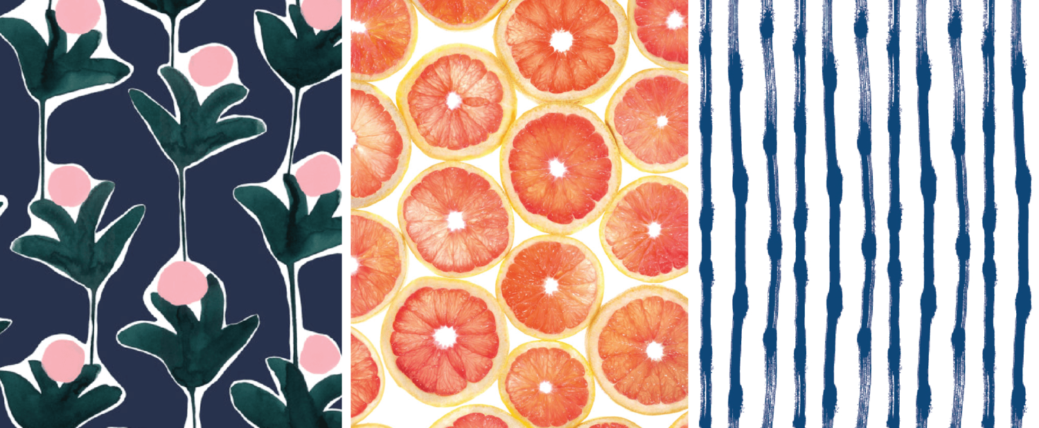
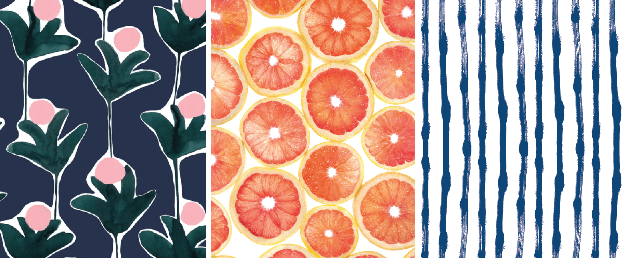
Prints & Patterns
From florals to stripes, prints help add character to any room.


Pinterest: What to pin if you're an Interior Designer  |  Hue & Tone Creative

 Home Décor
Pinterest is a haven for home design! We especially love how you can search for just about any style or room you can imagine.


Pinterest: What to pin if you're an Interior Designer  |  Hue & Tone Creative

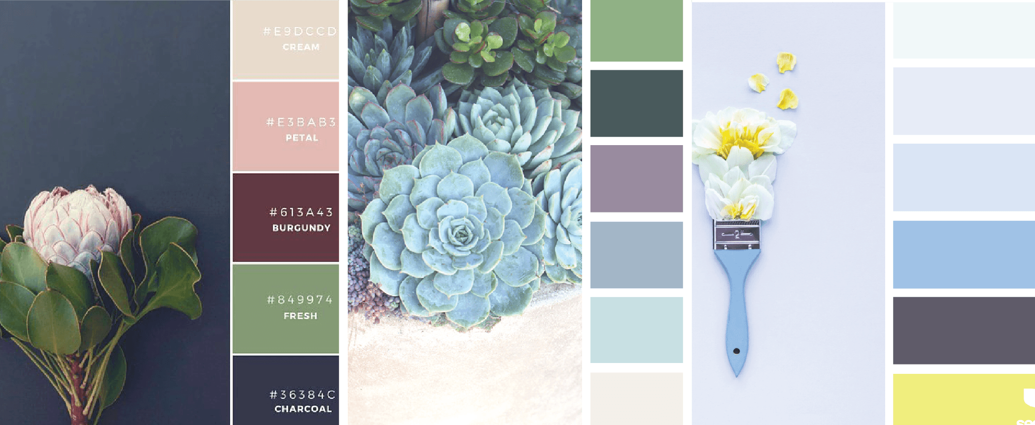
Color Play
Pinterest is full of great color scheme ideas for any aesthetic.


Pinterest: What to pin if you're an Interior Designer  |  Hue & Tone Creative

Lighting
A collection of Edison lamps, decorative sconces, and chandeliers offer an upgrade to the basic table lamp.


Pinterest: What to pin if you're an Interior Designer  |  Hue & Tone Creative

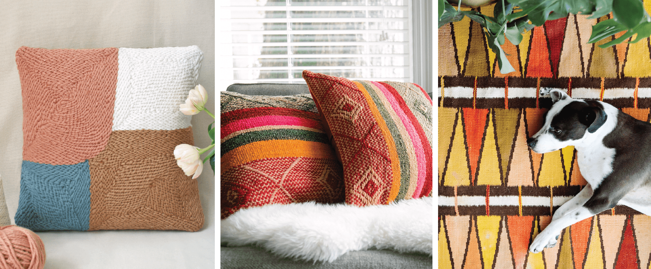
Textiles
What better way to add a touch of color and texture than a rug, tapestry, or dramatic pair of drapes?


Pinterest: What to pin if you're an Interior Designer  |  Hue & Tone Creative

Storage
Pin a collection of creative storage solutions to keep clutter at bay.


Pinterest: What to pin if you're an Interior Designer  |  Hue & Tone Creative

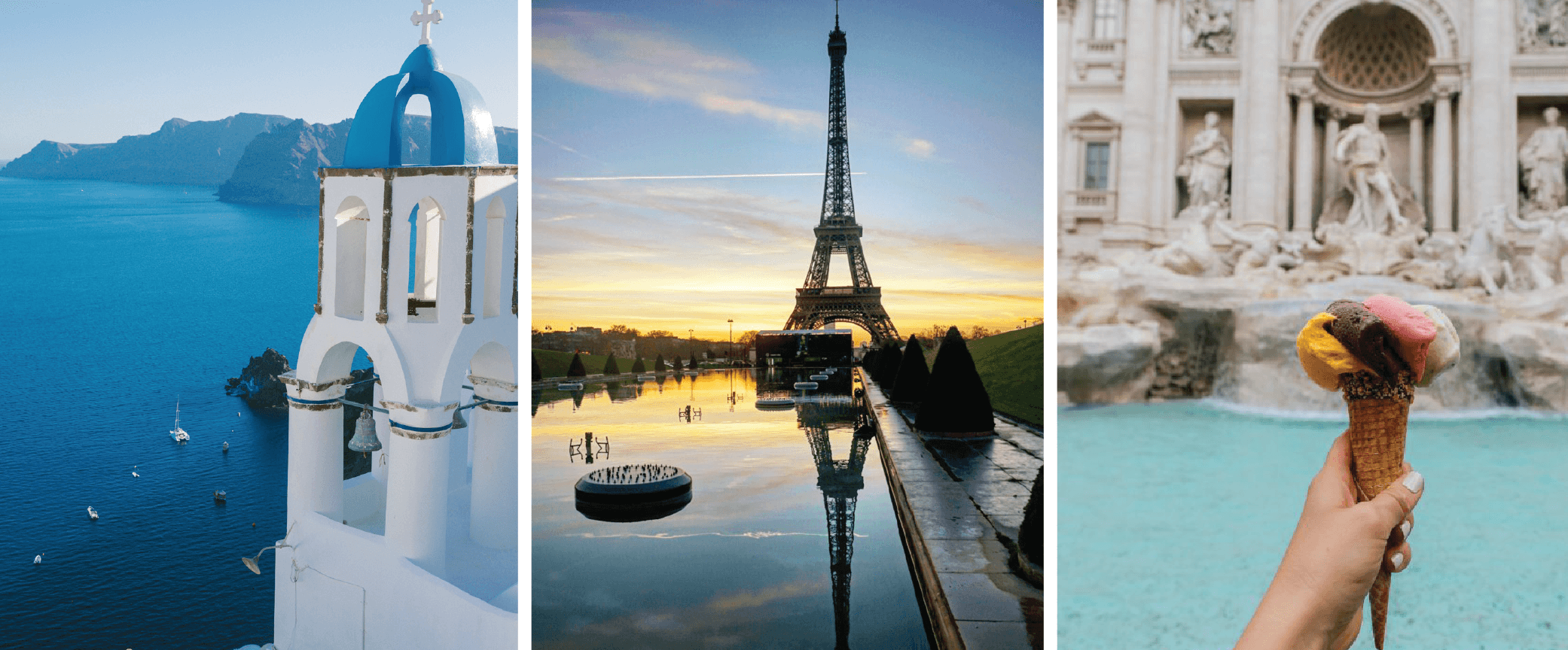
Travel
From Grecian sea sides to Italian landscapes, design inspiration can be found worldwide.


Pinterest: What to pin if you're an Interior Designer  |  Hue & Tone Creative

Furniture
No room would be complete without the perfect furniture. Pin great finds from online stores or innovative ways to arrange each piece.


Pinterest: What to pin if you're an Interior Designer  |  Hue & Tone Creative

Hotels & Hospitality
Whether you’re creating a relaxing escape for visitors or streamlined designs to appeal to a wide audience, Pinterest is full of ideas.


Pinterest: What to pin if you're an Interior Designer  |  Hue & Tone Creative

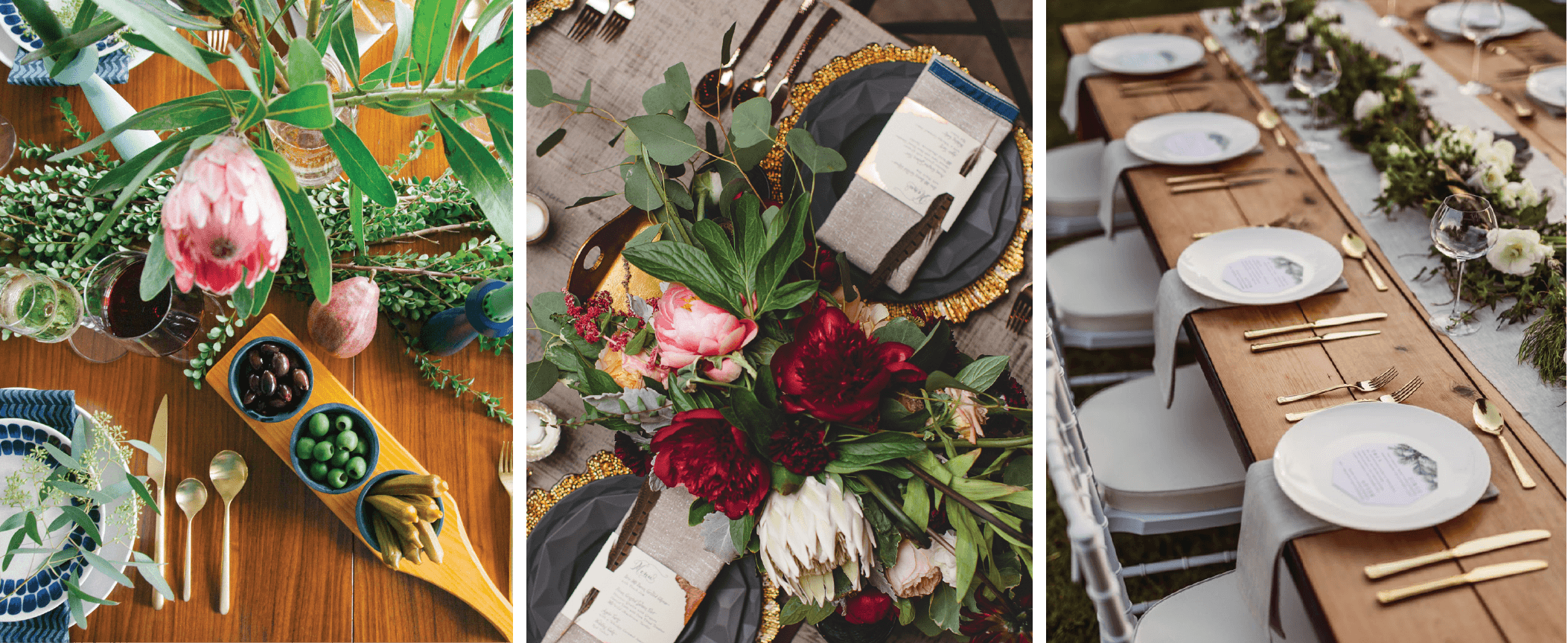
Tablescapes
Create a beautiful scene for photoshoots, gatherings, and events.


Need some new sources to pin from? These accounts are full of creative ideas and gorgeous images:
 

My Design Agenda
A great source for international design, installations, home décor.
 

Apartment Therapy
This well-known name has a loyal following of over 877,000 pinners. This account is full of shopping guides and design inspiration for every room.
 

Old Brand New 
Old-Brand New is curated by a LA-based blogger, Dabito. This diverse account is filled with art, style, and playful color combinations.
 

Design Milk
Interested in modern, minimalistic aesthetic? Design Milk is a stylish resource for clean design.
 

Remodelista
This account is perfect for designers that are drawn to cozy interiors and soft color palates.


Have a favorite account that we left out? Let us know in the comments!


Design & Marketing in Greensboro, NC

Ready to start seeing results? From design to delivery, Hue & Tone can help you create a truly unique social campaign. If you’re ready to start seeing a return on your social media dollars then it’s time to invest in a creative agency that can give you more. If you’re interested in social media management, a new campaign, or another creative service, give us a call today so we can set up a social media audit.

Photography Terms: A Glossary for Beginners
Photography terms for beginners  |  Hue & Tone Creative

With the evolution of iPhone photography, just about anyone can make a shot look artistic. But artistic isn't the same as high quality. While we can appreciate a nice shot on our Insta feed, there’s still a big lane for professional photography in advertising and marketing.

If just bought your first DSLR, or if you're looking to learn to go from a  beginner to a professional, there’s a few terms you should know. 


Aperture

Aperture is the adjustable opening in the lens where light travels. This is one of the three elements that creates exposure. When it comes to shutter speed, fast speeds need large apertures for more light. Slow shutter speeds require smaller apertures with less light passing through.

Aperture sizes are marked by f-stop numbers:

f/1.4 (largest)

f/2

f/2.8

f/4

f/5.6

f/8 (smallest)


Autofocus

This allows your camera to focus on the subject automatically. There are two types of autofocus: single or continuous. Continuous focus is best for moving subjects, and single focus works best stationary subjects.  


An example of bokeh

An example of bokeh

Bokeh

Have you ever noticed the tiny balls of light in filtered pictures? When lights are out of focus and the picture is taken with a wide exposure, it creates an effect called “bokeh.”


Color Depth

Basically, color depth is the amount of color that can be captured by a camera. Color depth is measured in bits, and varies from camera to camera. Higher bits allow for higher quality images with more variations of color. Most DSLR cameras have a color depth of 24 bits of color variation (about 16.7 million colors). 


Exposure

Exposure is the lightness or darkness of a photo.  Three factors determine the outcome of exposure: ISO, shutter speed, and aperture. If you’ve heard that an image is “overexposed”, it means that it is too washed out or too light. “Underexposed” means that it’s too dark.


Flash

Most people probably equate flash with blinding bursts of light and embarrassing school pictures. Flash is usually used to help add light to dark scenery, but it can also be used to create artistic effects.


Focus

Focus involves the clarity of a picture. Typically the main subject in a picture is sharp, and the background behind them is blurred.  It’s all dependent on angles and perspective, but the important thing is keeping the subject of your photo in focus. 


White Balance

Learn more about each white balance setting on Nikon’s site. 

You think you can determine if an object is white by looking at it, but sometimes cameras have difficulty. Color can change because of different lighting conditions: too much sun, a cloudy day, or a dim room.

There’s a white balance setting on cameras that usually solves this problem, but sometimes it’s better to adjust it manually. To do this, you just choose the appropriate setting: PRE, Kelvin color temperature, flash, incandescent, fluorescent, sunny, open shade, or cloudy. 


ISO

ISO stands for the International Organization for Standardization. ISO measures how sensitive your camera is to light. The measurements range from 200 to 1600. Typically, lower numbers require more light for a good exposure. 


RAW

RAW is essential to digital photography. This file format records every bit of image data without processing it. RAW files are the key to creating high quality images, because they can capture more information, levels of brightness, and detail than JPEGs.


An example of the rule of thirds.

An example of the rule of thirds.

Rule of Thirds

This is a basic rule of thumb for strong compositions. Basically, you want to imagine a three-part grid across your image to create a sense of balance.    


Shutter Speed

Every time you take a picture; the shutter of your camera opens and closes. Shutter speed measures how long the camera sensor is exposed to light in seconds or fractions of a second. Higher shutter speeds simply mean that the sensor was exposed for a shorter time.

Shutter speed is important to different areas of photography. For instance, if you’re tyrying to capture an action shot at a football game, a lower shutter speed will make your pictures come out blurry. Low shutter speeds work better for subjects with less movement, because you usually need use a tripod.


Creative Services in Greensboro & Winston-Salem

Don't exactly have an artistic eye? Or, maybe you just need a second set of eyes? Hue & Tone can help you with all your photography, graphic design, and web needs. 

What size should my photo be? Tips on photo resolution for print and web
What size should my photo be? Tips on photo resolution for print and web  |  Hue & Tone Creative

Every new designer has been there – you upload a photo to your site and it looks a little blurry. Or, maybe you get a proof back from the printer and things are looking a little off.

Not understanding photo and file resolution is a quick give away that you don’t know what you’re doing. Don’t let a great design get categorized as a “fail” because of a resolution issue -- arm yourself with a little knowledge and you’ll never again have to cross your fingers when you send something off to the printer.


Key Terms

Let’s start with a quick primer of some important terminology. Whether you’re working by yourself or with a designer these terms are bound to come up.

  • Resolution: Refers to the number of pixels in your image. The number of pixels determines the quality and clarity of your image.

  • Pixel: Defined as “a minute area of illumination on a display screen, one of many from which an image is composed.” Hundreds or thousands of pixels make up every raster image.

  • DPI (Dots per Inch): The amount of dots printed in a square inch.

  • PPI (Pixels per Inch): The amount of pixels in a square inch displayed on a screen.

  • Raw file: A collection of unprocessed and uncompressed data that can be turned into an image. Similar to photography negatives, the RAW image is not directly usable as an image, but has all the information needed to create an image. Many photographers choose to shoot in RAW.

  • Physical Size: The width and height of an image measured in pixels. A large physical size generally causes a longer time to download.

  • Down-sampling: To decrease the resolution of an image. It’s always best to shoot high resolution images so that you have the option to down-sample if needed.

  • Display Size: The size an image is displayed on a screen (monitor, tablet, phone, etc.)


Need a refresher on HOW TO SAVE your files? Revisit our file formatting guide.


Check your image resolution in Photoshop by clicking Image > Image Size.

Check your image resolution in Photoshop by clicking Image > Image Size.

Resolution Standards

Every time you set up project in Photoshop, InDesign, or an alternative design program, stick to these guidelines to ensure clear high quality images.

  • Brochures & Flyers: 300 DPI

  • Digital and Web: This varies. 72- 96 PPI is recommended for quick load times.

  • Large format print graphics: 100 DPI


Converting inches to pixels for print

Curious how many pixels you need for a clear print? Here’s a handful of common print sizes and the corresponding file dimensions you would need to get a 300dpi print.

  • 4”x6” = 1200 × 1800pixels

  • 5”x 7” = 1500 × 2100 pixels

  • 8” x 10” = 2400 × 3000 pixels

  • 8.5” x 11” = 3300 × 4200 pixels

High resolution images are the key to a quality product. But, after you’ve converted your RAW photo files and selected a photo, it’s important to work with an appropriately sized image.

A high quality picture is great – but when you’re working with web files load speed is important and a smaller file is necessary. The higher the resolution, the bigger the file size.

Get in the habit of saving your files at the resolution you need, and you’ll make every project look like a cake walk!


Marketing & Creative Services in Greensboro: Hue & Tone Creative

Need high quality presentation graphics, a fresh new logo, or an updated website? Hue & Tone has you covered. Work with a creative professional that will take the time to listen and bring your vision to life. Contact us today to get the conversation started.

4 Elements for a Killer Landing Page

When it comes to lead generation, landing pages count. A landing page gives your customers a clear why and how -- it tells them why they should care about your product and it gives them a clear next step to take.

Keep in mind that landing pages shouldn't look like your homepage. Where homepages are general and intended to appeal to everyone, landing pages are tailored to a specific type of customer. Homepage typically have multiple messages, where landing pages have one focused message.

A special type of page means a special design. We've broken down our four must have elements for a lead generating landing page: 

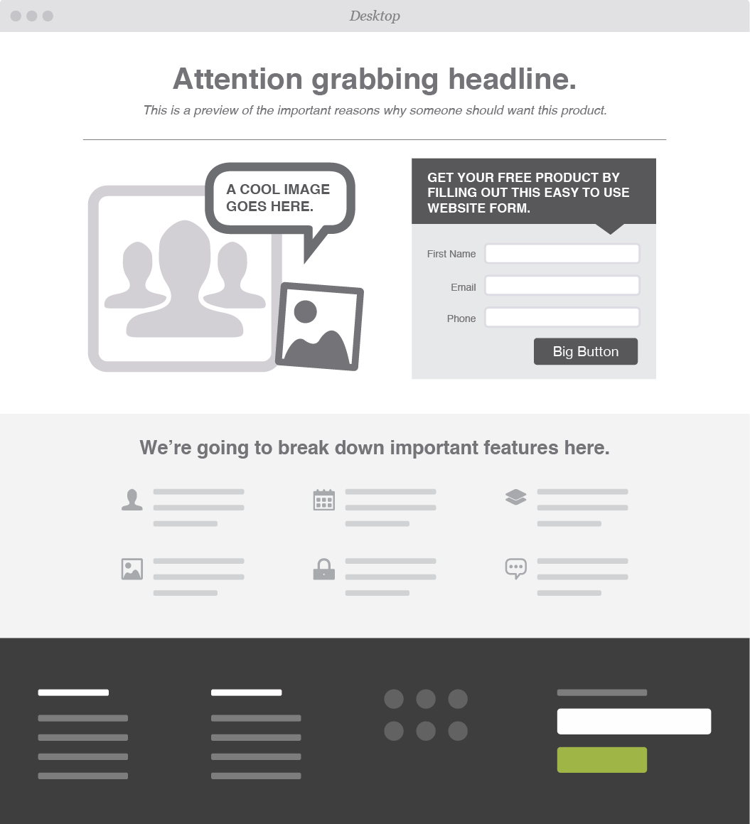
Attention Grabbing Headline

The first thing your visitors see is your headline, so make sure to capture their attention and incentivize them to stay longer. Most people tend to skim over body text quickly, and will leave sites that aren’t relevant or seem too wordy.

To craft the most effective headline, keep these three principles in mind:

  • Share Information

  • Solve a Problem

  • Show Value

What are you selling? Why does your customer need this product/service? What can your customers gain/save? Write a headline that packs a punch and leaves your customer wanting more.


Call to Action

After you’ve effectively gotten your viewer’s attention and promoted your business, it’s crucial to capture their contact information and turn those visitors into leads.

Offer up discounts, free downloads, or exclusive offers -- the catch? All we need is your email address.

To keep your CTA from sounding too self-serving be sure to keep the focus on the customer. Try something like “Get your free coupon” instead of “Sign up for emails here.”


Form

Having a form to capture your customers information is a must. How else will you follow-up so you can turn someone into a potential customer? We suggest asking for as little information as you can get away with -- this ups the chances of someone filling out your form. 


Multiple target demographics? Create multiple, tailored landing pages so that you can effectively reach all of your customers.


Graphics

Eye-tracking studies have found that people pay more attention to information when it’s combined with relevant images. Pair your headline and body text with pictures or videos that will help your information stick.

If you choose to go the video route, make sure the videos load quickly aren’t too distracting to the overall composition of your landing page.


OPTIONAL: Testimonials & Endorsements

A great way to show value in your brand is by providing proof from actual human beings.

People tend to trust others they can relate to. Share feedback from influencers or previous customers. If your products have been featured in any noteworthy blogs, publications, or social media pages, show it off!


Web & Graphic Design in Greensboro, NC

Time to revamp your outdated site? Leave it to the experts! From product websites to landing pages, Hue & Tone can help you market your brand and leave a lasting impression.

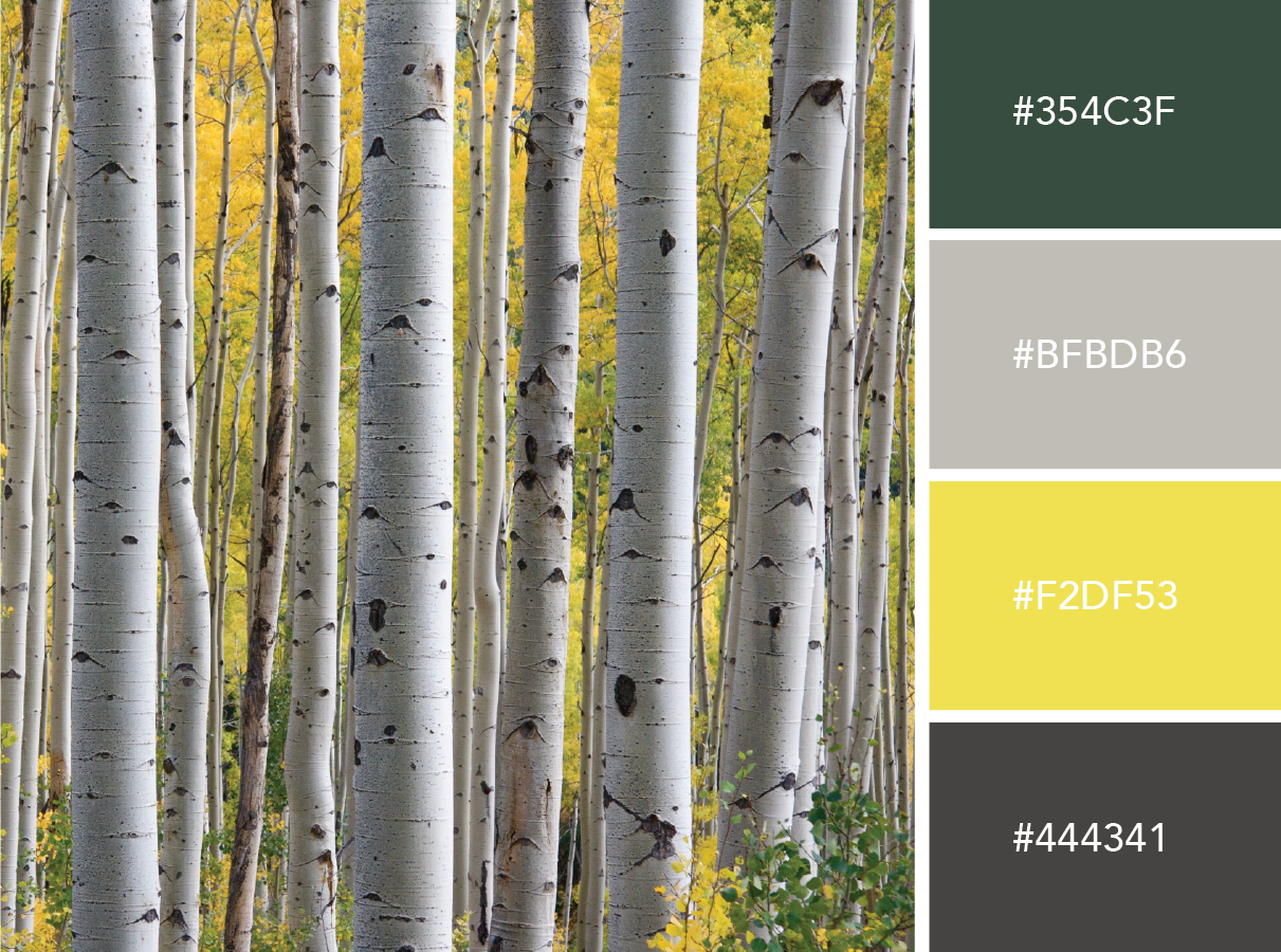
Color Stories: Inspired by Nature

Whether you’re revamping your resume or debuting a new logo, the colors you choose make a difference. With an endless library of colors at your disposal, it can be difficult to decide on the right combo.

Lately, we’ve been finding our inspiration in nature. The great outdoors is a bountiful source of *free* inspiration (and, the photos we used were free too)!

If you can't get away from your desk right this minute, turn to our nature inspired color schemes for your next project. Try out just one... or all of them! 

Neon Forest  |  Hue & Tone Creative

Neon Forest

This bold collection is perfect for trendsetters and influencers. Pair energetic colors with a charcoal brown for a crisp contrast.


Luscious Lavender  |  Hue & Tone Creative

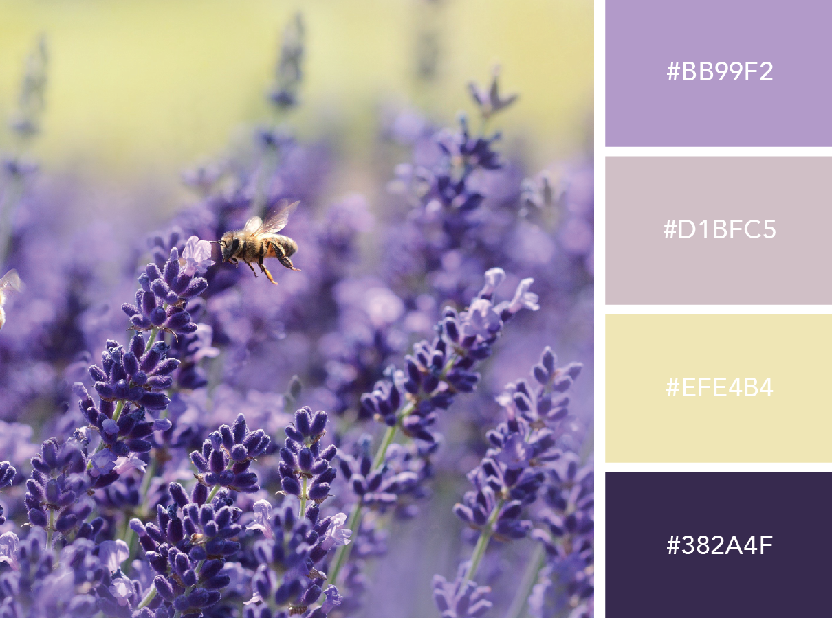
Luscious Lavender

Not afraid to get a little girly? This playful purple match up is for you.


Salt & Seafoam  |  Hue & Tone Creative

Salt & Seafoam

Want to appeal to a wide audience? These cool tones feel calm and approachable.


Citrus Sunrise  |   Hue & Tone Creative

Citrus Sunrise

Feeling a little playful? This bright collection is perfect for a fun new culinary or children’s brand!


Desert Flower  |  Hue & Tone Creative

Desert Flower

This color scheme is perfect for spring! The feminine and playful combo works nicely for logos, business cards, or boutique packaging.


Vivid Autumn  |  Hue & Tone Creative

Vivid Autumn

These bold tones feel warm and confident -- but still modern.


Bold & Earthy  |  Hue & Tone Creative

Bold & Earthy

Looking for a natural palette that can appeal to a down-to-earth demographic? We've got just the thing. 


Pastel Sea  |  Hue & Tone Creative

Pastel Sea

Think pastels are a little too girly? Tone down the femininity with rich tones. This palette would add a modern touch to packaging or branding materials. 


Incandescent  |  Hue & Tone Creative

Incandescent

These subtle colors serve as a great foundation to help your work stand out. Give this palette a try for your next portfolio site. 


Soft & Whimsical  |  Hue & Tone Creative

Soft & Whimsical

This color scheme feels delicate yet subtly strong.


Creative Professionals in Greensboro and Winston Salem

Need a second opinion on your current creative project? We can help! From personal branding to web-design, Hue & Tone is here to help you make your brand pop.

Which Adobe programs should I by?

A few other products worth checking out:

  • Project Felix
  • Premier Pro
  • InCopy
  • Prelude
  • Muse
  • Character Animator

Photoshop is probably the Adobe program you've heard the most about -- but it's only one piece of the larger Adobe Suite.   

Adobe has over twenty different programs to pick from! And, it can be a little overwhelming if you're new to Adobe or trying to figure out what to learn next. 

This isn't an exhaustive list, just an overview of some of the apps creatives are likely to find most useful. If you don't see what you're looking for here, head over to Adobe's website for an overview of some of their more specialty products. 


Photoshop

From basic retouching to creating detailed photo compositions, Photoshop should be your go-to tool for working with raster images. Images are imported into Photoshop in layers for maximum flexibility, and it's widely used by artists of all kinds. 

Perfect For: photo editing and manipulation, web/app layouts, digital art


Lightroom

Lightroom is a photo processor and image editor that can help you organize and fine-tune your images. It's primary function is to catalog and sort your images. You can touch up basics like brightness and contrast, but for the heavy duty editing you'll need to head over to Photoshop.

Perfect for: viewing, organizing and retouching large numbers of digital images


InDesign

Adobe InDesign is the perfect program to create high quality print and digital publications. InDesign possesses intensive typographical features that make it the go to for longer or text-heavy publications like books, white papers, and newspapers.  It's also great for shorter print documents like brochures and company newsletters. 

Perfect For: print materials, résumés, business cards, and cover letters, creating magazines and eBooks
 

Illustrator

Illustrator is a must have for any graphic designer. Illustrator specializes in creating vector images (unlike Photoshop which works only with raster graphics). Vector images can be scaled up or down indefinitely without manipulating the image. 

Perfect for: logo design, vector illustrations, icon creation, infographics


After Effects

Adobe After Effects is the industry standard for creating professional special effects and animations. It has a variety of high-powered effects which allow you to do things like create a rain simulation, create custom titles, or zoom through your clips in 3-D space. Beware, After Effects only lets you work with one clip at a time, so it's not the right choice if you're looking to splice together a series of video clips. 

Perfect for: animation, motion graphics, cinematic effects, green screening
 

Premiere

Adobe is a production and editing tool meant for working with multiple video clips. It's perfect for editing together things like commercials, testimonials, and news video. Whether you're working on a short or long video project, Premiere is for you.

Perfect for: commercials, webcasts, documentaries


Dreamweaver

Dreamweaver is a must have for web designers and developers. This program has a customizable interface and allows you to see your edits in real time. If you’re new to coding, Dreamweaver has built in code hints and Quick Docs to help you along the way.

Perfect for: Web design (supports: ActionScript, ASP, C#, CSS, ColdFusion, EDML, XHTML, XML, XSLT, HTML, Java, JavaScript, PHP, VB, VBScript, and WML) 


PRICING

Adobe offers several different plan options for individuals, businesses, students/ teachers, and universities. We’re going to focus on the individual plans today. If you’re interested in some of the other options, you can learn more here.
 

Photography- $9.99 a month

  • Includes Photoshop CC and Lightroom CC
  • Portfolio website
     

Single App- $19.99 a month

  • Includes your choice of one desktop program
  • 20 GB of cloud storage
  • Premium fonts
  • Portfolio website
     

All Apps- $49.99 a month

  • Includes all the Creative Cloud programs for desktop and mobile
  • Portfolio website
  • 20 GB of cloud storage
  • Premium fonts
     

All Apps and Adobe Stock- $79.98 a month

  • Includes every Creative Cloud application for both mobile and desktop
  • 10 free Adobe Stock photos
  • One free month of Adobe Stock

Greensboro Graphic Design

Want to add a professional creative touch to your next project? We’re here to help! Hue & Tone can help you create one-of-a-kind projects that tell your story. Contact us today to learn more about our graphic design services. 
Get Started with Snapchat Geofilters
Get Started with Snapchat Geofilters  |  Hue & Tone

Snapchat has become a regular part of people’s daily routinue – it’s second nature to snapping your morning coffee or sending a filtered selfie after a big accomplishment. It has also become a regular part of many company’s marketing plans.

Ready to spice up your own marketing strategy with Snapchat Geofilters?  


Types of Filters

First things first, let’s breakdown the types of filters you can create. Snapchat offers two options: Community and On-Demand Geofilters. Community filters are geared towards artists and designers who want to make filters for local landmarks or their hometowns.

About 9,000 Snaps are sent each second.

Unlike Community Geofilters, On-Demand filters are purchased and can contain logos. These are an awesome way to promote your brand, especially if you have a big event or new product launching. It’s a fun and easy way to get exposure and engage with your customers

It’s important to note that you need to obtain specific rights before you use your logo or brand name in your On-Demand filter. Check out at this guideline from Snapchat for more details.
 

Creating your On-Demand Filter

Ready to start building your filter? Let’s get to it!

First, get started on the design. Snapchat offers several templates to choose or you can upload your own as PSDs or AI files.  If you don’t have access to Adobe software, you can also use Canva. Just make sure that the dimensions are 1,080px wide by 1,920px tall. Keep the background transparent and download it as a PNG file.

If you create your filter using Snapchat’s various templates, you can customize your layout, color scheme, and fonts. Try not to overcomplicate your design. When in doubt, keep it simple.

Once you’ve settled on a design, just enter your location and checkout. Super easy!

It takes about one business day for Snapchat to approve your filter design. But, we highly suggest that you submit it 3-4 days before you need it ready – just in case you end up having to rework your design and resubmit it.


Prices

The price of your filter depends on the size and how long you want it to run. Typically, most filters are $5 dollars per 20,000 square feet. You can keep it active from anywhere from 1 hour to 30 days.


Social Media Marketing in GSO and Winston-Salem

In need of a new social media strategy? Hue & Tone Creative can help! Our social media management and personalized branding services will keep your content fresh and up to date. 
Must-have Adobe Typekit Fonts

If you use Adobe’s Creative Cloud suite, then you’re probably no stranger to Typekit. With over 1,000 options at your fingertips, choosing the right font can be a challenge.

At a loss for which fonts to use? We’ve rounded up a collection of our must-sync fonts.


Serif

These serifs give a sophisticated feel to resumes, business cards, and printed media. 

Slab Serif

Need a font that stands out? These bold slab serifs are perfect for headlines.


Sans Serif

We love these sleek sans serif fonts for blogs, websites, and everything in between.


Web & Graphic Design Services in Greensboro: Hue & Tone Creative

Does your brand need a Spring refresh? Hue & Tone Creative will help you update your look. From email campaigns and web design, to presentation graphics and business cards, we’re here to help you put your best foot forward. Contact us today to learn more about our creative services -- 336-365-8559.
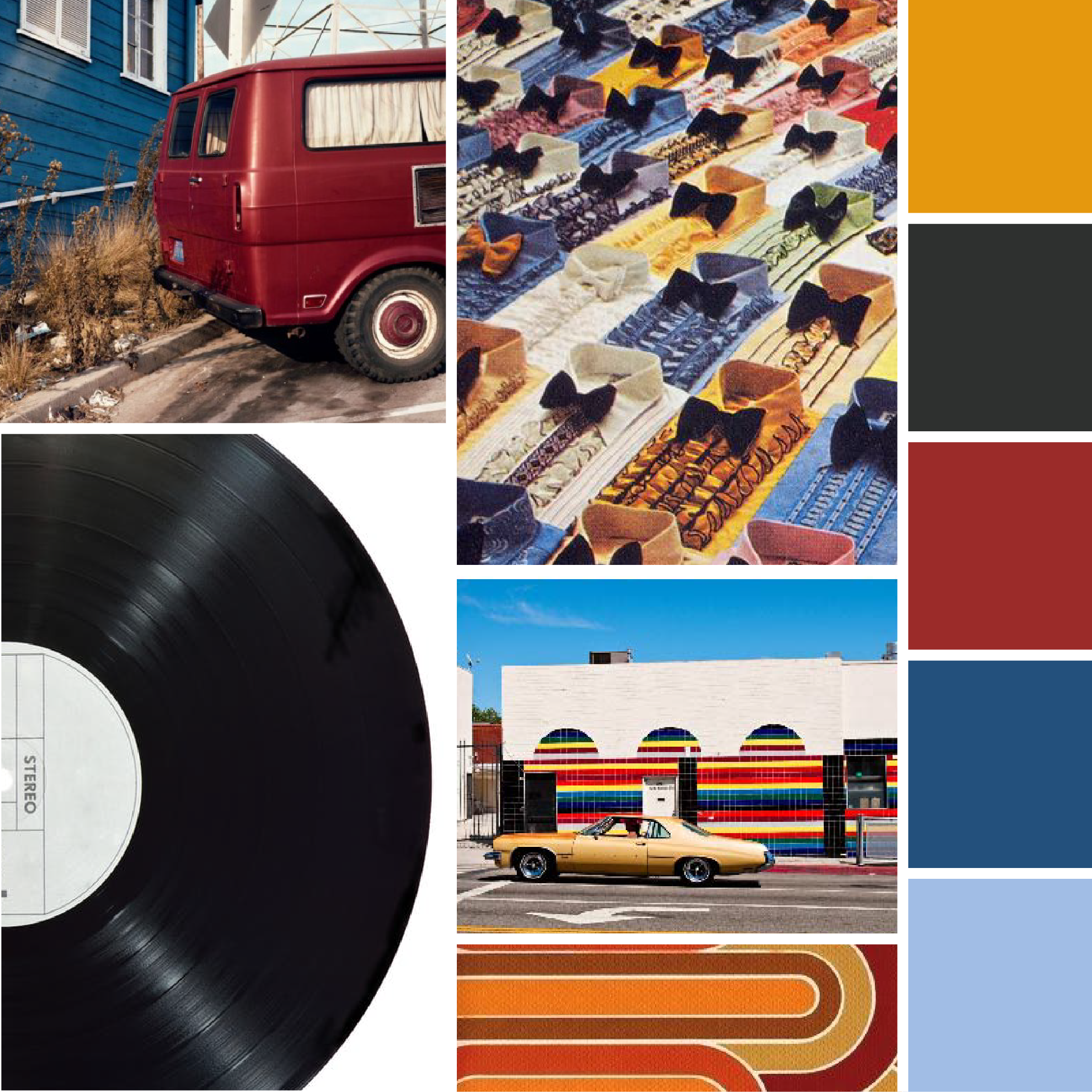
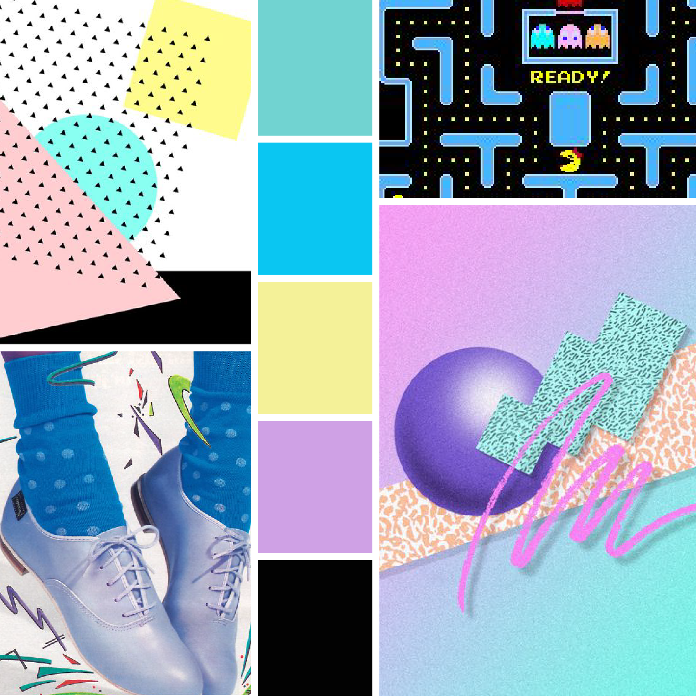
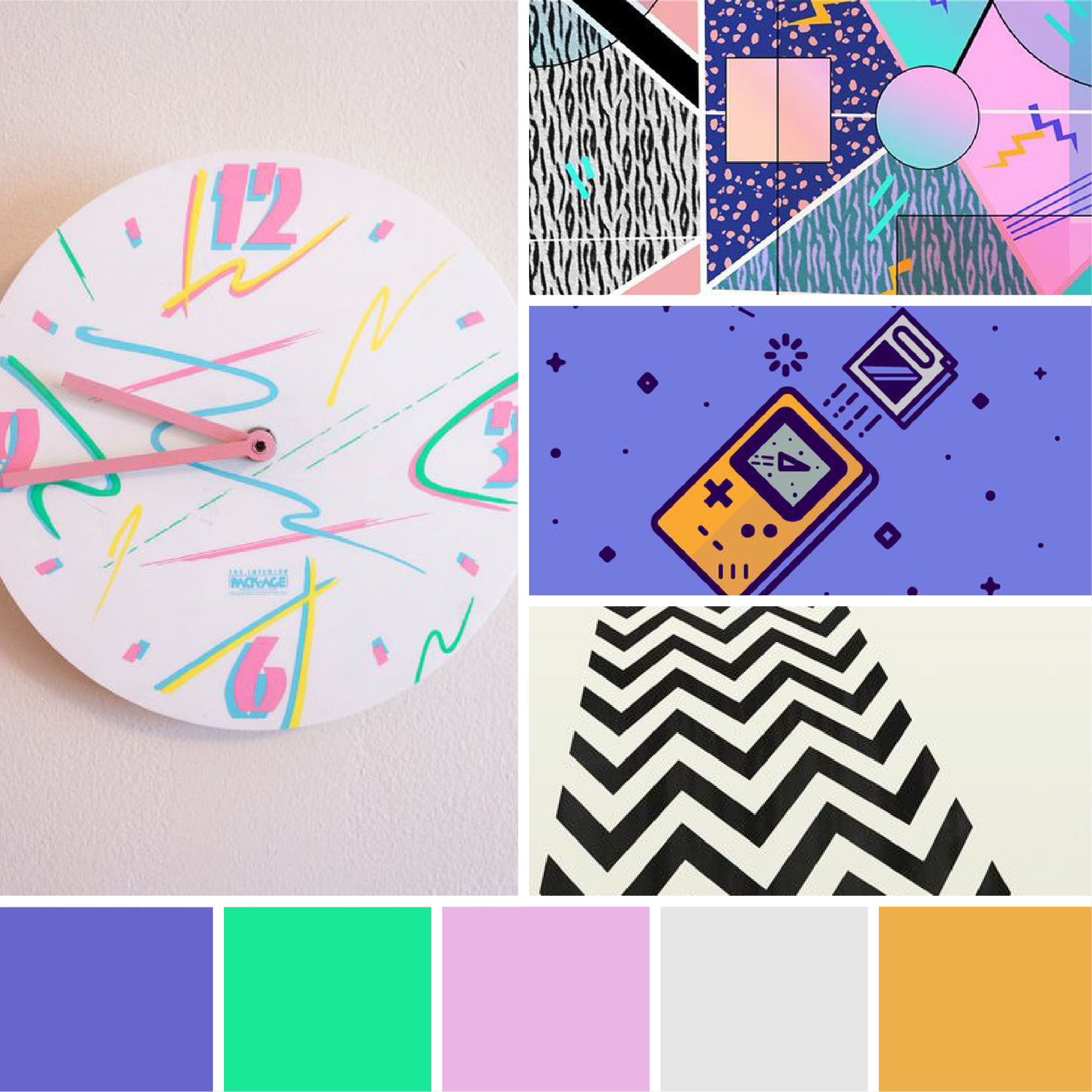
Mood Boards: Blast from the Past

Lately, we’ve been feeling a little nostalgic. Since we don’t have a DeLorian to help us hop back in time, we decided to get a little creative.

Take a trip to the past with our collection of retro mood boards: 

1960’s 

Moodboards: Blast from the Past  |  Hue & Tone Creative

Listening to Pandora’s 60’s French Pop station helped put us in the mood to create our first board. We love the graphic prints and classic style of this iconic decade.


1970's

Moodboards: Blast from the Past  |  Hue & Tone Creative

While we like the look of ruffled shirts in the 70’s, we’re happy they haven’t made a comeback.


1980's 

Moodboards: Blast from the Past  |  Hue & Tone Creative

This bright color scheme may have fueled an 80’s movie marathon on Netflix… 


1990's

Moodboards: Blast from the Past  |  Hue & Tone Creative

90’s style has definitely found its way back in recent years. We’re loving these bold geometric patterns and energetic colors. 

What’s your favorite decade? Let us know in the comments!


Greensboro Graphic Design Company: Hue & Tone Creative

In need of a little inspiration? Hue & Tone can help supercharge your creativity. From graphic design to social media management, we’ve got you covered. 

Beginner tips for Instagram Stories
Beginner tips for Instagram Stories  |  Hue & Tone Creative

With over 150 million daily users, Instagram stories have gained a lot of popularity since their launch. If you haven’t hopped on the stories train yet, it’s not too late!

Instagram stories are the perfect way to engage your followers without overloading their feed. Each story only lasts for 24 hours (aka Snapchat style), so it’s important to post regularly. We suggest adding a lot of variety to your stories so that you can gauge what your followers respond best to.

Not quite sure of what to post? Here are a few ideas to get you started: 

  • Get Artsy: Play around with the pen tool and draw little doodles around your images/ videos. You also scribble a colorful background behind text. 
  • Tie in your other social channels: Did you recently upload a new video on YouTube or create a contest on Facebook? Share a snippet in your stories!
  • Before & after’s: This is perfect for designers, stylists, or anyone showing of a DIY success.
  • Create an ad: At the beginning of this month, Instagram announced that Instagram Stories Ads would be available for businesses worldwide. 30+ brands including Asos, Airbnb, and Netflix tested out the new feature earlier this year with great success.
  • Collaborate: Work with other businesses or try out a guest “takeover” to add a different perspective. 
  • Be consistent: IG stories only last for a day, so make sure that you post regularly. If every day is too much, try to post a few times a week.
  • Have fun: Try not to make your stories too stuffy! Play around with emoji’s, clever captions, color, and fun filters. Adding a bit of candid fun will give your followers something to look forward to. 
  • Mix it up: Instagram stories are kind of like a little patchwork quilt of daily events. Keep it interesting by incorporating pictures, music, videos, and Boomerang clips.

Don’t overthink it! At the end of the day, Instagram stories are a fun and temporary extension to your Instagram feed. Sometimes spontaneity is key.


Marketing & Social Media Services in Greensboro: Hue & Tone Creative

Need a second opinion on your current social media strategy? We've got your back! Our social media management services will help you boost engagement, increase followers, create brand awareness.... and, most importantly, create content your customers will love. 
Event Spotlight: Motown Memories

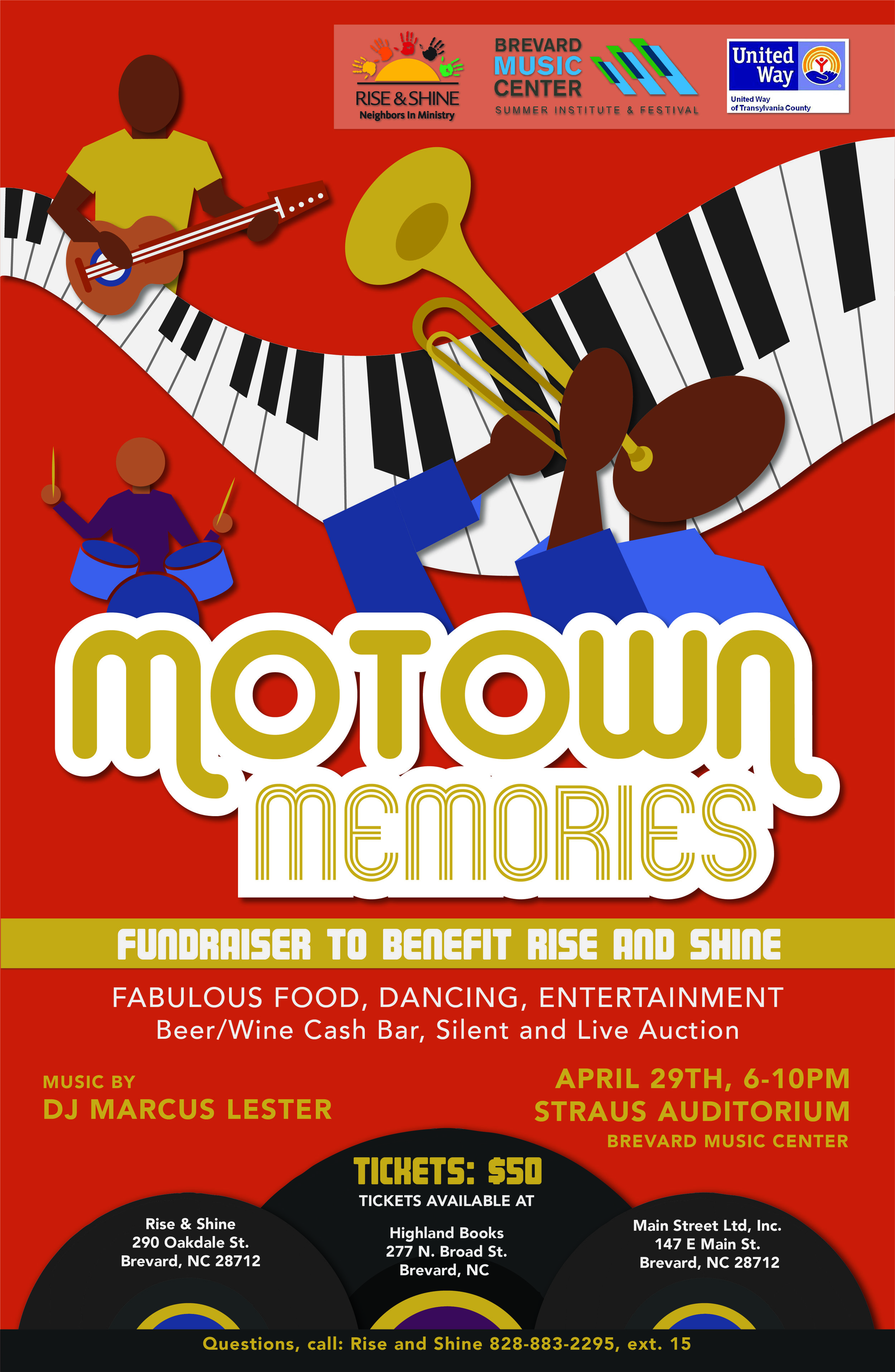
It's been a little while since we've spotlighted our work on the blog -- which makes it the perfect time to tell you a little about Motown Memories, a fundraising event to benefit Rise & Shine (if you haven't heard of Rise & Shine, check out this post). 

We've done a number of projects for them in the past -- including a colorful anniversary campaign -- but our latest project has a whole different feel. Rise & Shine was looking for an upbeat design that would fit in with the colors and style of the Motown era. 

We started by putting together a moodboard to make sure we were evoking the right feel.

Motown Memories  |  Hue & Town Creative

After the Rise & Shine team signed off on the moodboard, we dove right in and designed a coordinating poster and e-vite. Take a peak at our work below, or give them a call at 828-883-2295, ext. 15 to purchase tickets to the event. 

 
Motown Memories  |  Hue & Town Creative

Click to see the full e-blast!


If you live in the Brevard or Asheville area we encourage you to attend Motown Memories and see what Rise & Shine is all about!


Hue & Tone Creative: Non-profit Graphic Design

Is your non-profit looking to build a relationship with a marketing firm? We'll be more than your marketing team -- we'll be your community partner. Working together, we can create the social content, graphic design, and marketing plan to help you increase your local reach.
The 6-step content calendar

"A content calendar is a shareable resource that marketing teams can use to plan all content marketing activity. The benefit of using the calendar format, rather than just a long list of content to be published, is that you can visualize how your content is distributed throughout the year." - Convince and Convert 


When you’re swamped with meetings, deadlines, and daily work hiccups, squeezing in the time to create content to promote your business can be a hassle.

Creating a content calendar will save you time, provide consistency, and help you manage your communication channels. Chances are, if you’re not pre-planning your social posts and blogs in advance, you’re constantly struggling to find last minute material... usually resulting in rushed and irrelevant content.

Avoid stress and get organized with our 6 step process:  


Step 1: Brainstorm with no distractions

Need some fresh posting ideas? Checkout our What to Post series for, Facebook, LinkedIn, Instagram, Twitter, and Pinterest.

Sit down with a pen and paper and set a timer for 30 minutes. In that time, write down a list of every blog/podcast/content idea that pops into your head. Making sure that you have no distractions is key. When the timer goes off, start divvying up what's appropriate for blog and social media.  

If you're a little low on ideas, you may need to do this process a few times. 

Once you’re done brainstorming, go on a fact-finding mission to study what other businesses and experts do. Then, add any new ideas you have to your master list. From here you can start refining things and decide what works best and what to toss. 
 

Step 2: See what worked

Sidebar: Perform an audit to determine how impactful your social presence is.

Before you start planning, take some time to revisit past posts. Which posts have the most likes and engagement? Which blogs and newsletters have been the most successful?

Once you’ve analyzed what your clients respond best to, you can tailor future content to fit their needs.

Step 3: Determine how often you should post

Tip: Plan content for holidays, anniversaries, product launches, or important events in advance. 

If don’t have a plan in place for how often you want to post on your blog and each social network, you run into the problem of inconsistency. If you’re posting on Facebook 10 times on a Monday, 3 times on a Wednesday, and 6 times on a Friday, your followers will probably get confused, annoyed, or simply unfollow you because they're overwhelmed.

Give your audience a routine so that they know when and how often you’re going to post (especially important with a blog, podcast, or email list). 

The 6-step content calendar  |  Hue & Tone Creative

These are just general guidelines, so feel free to adjust to the frequency that works best for your business and audience.

Step 4: Create a resource library for social and blog images

Take time to compile a long list of post ideas and sources for material. Having a database of quotes, photos, statistics, relevant websites, and content ideas at your disposal will help you organize all of your content ahead of time. And, in the case that you need some last minute content, you already have quality content at your fingertips! 
 

Step 5: Select a tool

There are several great content planning calendars to choose from and many of them are free.

Sprout Social

Basecamp

CoSchedule

Asana

Google Docs/Sheets

Excel

Buffer

Requeue


We personally prefer to plan our content with Google Sheets, and then schedule things out from there on a weekly basis in Hootsuite. But, if you already have a tool you're comfortable with, try to fit your content planning tools into your existing work flow.
 

Step 6 : Plan everything out

While planning is great, don't miss out on trending tops and current events. If a post you have planned doesn't work don't be afraid to change things up!

Now that you’ve brainstormed and found out what works for you, spend time planning out your content on an actual calendar. Figure out how far you want to plan - we suggest planning at least two or three months out, all the way up to a year. 

Plan out big pieces of content like blogs, infographics, podcasts, and emails first. Once you've got that in place you can work your social content for the week around these big content offerings. Don't catch yourself getting bogged down planning out every social post -- you can always just put a general outline of content you’d like to post on the calnedar (quotes, stats, blog throwbacks, tips, etc.)


Greensboro Marketing Firm: Hue & Tone Creative

Stumped on how to make the most of your inbound marketing plan? We can help you plan the traffic driving blogs, social, and email campaigns your brand deserves. 
7 Squarespace Font Pairings
7 Squarespace Font Pairings  |  Hue & Tone Creative

You see a Squarespace template, you love it, you start playing with the fonts... and suddenly you don't love it quite so much. No worries -- it happens to everyone!

Although it may be tempting to stick with the default settings of your template, taking the time to select the right fonts adds depth and personality to your site. With over 600 font options through Google and nearly 1,000 on Adobe Typekit, picking the perfect combo can feel almost impossible.

We're here to take the guesswork out of selecting the perfect Squarespace font combination - here's 7 suggestions to revive your favorite template: 

Merriweather + Roboto Condensed  |  Squarespace Font Pairings  |  Hue & Tone Creative

Merriweather & Roboto

This classic and modern mix of serif and sans serif fonts is perfect for any business. 


Skolar Sans + Domine  |  Squarespace Font Pairings  |  Hue & Tone Creative

Domine & Skolar Sans

Need a clean no-fuss combination? Domine and Skolar pairs nicely with strong graphics. 


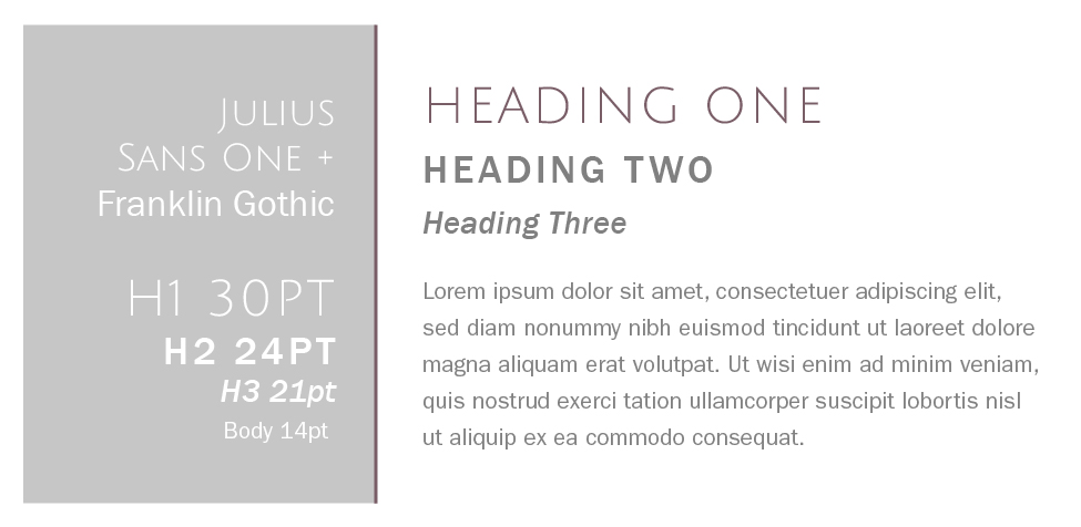
Julius Sans One + Franklin Gothic  |  Squarespace Font Pairings  |  Hue & Tone Creative

Julius Sans One + Franklin Gothic

Franklin Gothic is classic, readable, and approachable -- but add Julius Sans One in and you've got an edgy clean feel.


Rift Soft + Vendetta  |  Squarespace Font Pairings  |  Hue & Tone Creative

Rift Soft & Vendetta

Looking for a sophisticated pairing for an upscale brand? The sleek style of Rift keeps Vendetta from feeling too stuffy. 


Essonnes + Futura  |  Squarespace Font Pairings  |  Hue & Tone Creative

Essones & Futura

This duo feel playful and approachable. We love this serif & sans serif mix for boutiques, portfolios, and blogs. 


Park Lane + Tenso  |  Squarespace Font Pairings  |  Hue & Tone Creative

Park Lane & Tenso

This crisp and versatile combo would work well for real estate, bistros, and trendy salons. 


Lust Script + Sofia Pro  |  Squarespace Font Pairings  |  Hue & Tone Creative

Lust Script + Sofia Pro

Feeling a little edgy? Mixing in Lust Script takes this font palette to the next level. 


branding + web services in greensboro: Hue & Tone

Looking for a web designer in Greensboro, Winston Salem or the surrounding areas? Hue & Tone is a creative graphic design agency specializing in logo design, web design, social media management, and more. Give us a call if you’re interested in a custom, branded website that truly tells your story.
Top LinkedIn Tips for Job Seekers
Top LinkedIn Tips for Job Seekers  |  Hue & Tone Creative

Like a strong resume, a well written cover letter, and strong recommendations, a well cultivated LinkedIn page can help you land your dream job. But snagging a recruiter's attention with your profile can take a bit of elbow grease -- you'll have to get your profile up to date and stay active. Do that, and LinkedIn may just be the secret weapon your job search needs.

So, let's start turning some heads...


Put your best face forward

Having a professional photo makes your page 14 times more likely to pop up in search results. Fortunately, most people have the common sense to avoid unprofessional selfies and dog face filters. If you really want to step up your profile picture game, we recommend taking a simple headshot against a neutral background.

Keep your profile picture recent: If you’re rocking a Jennifer Anniston hairstyle from Friend’s, it’s time for a new picture. 

Not all industries have the same dress code, so be sure to choose an outfit that reflects the position you’re looking for. Searching for a position as a lawyer or a CPA? Wear a suit! Designers, programmers, and creative job seekers can typically keep it casual.

Not sure about the dress code? Dressier is always better. 


Create an attention grabbing headline

Most recruiters are going to scroll past a boring headline.

Sell yourself and entice people into visiting your page by using creative and descriptive headlines. Simply listing “Freelance Designer” doesn’t tell people what you do or why they should connect with you.

  • Before you create your headline ask yourself a few questions:
  • What do you do?
  • What is your specialty?
  • Why should a recruiter hire you?
  • What do you bring to the table?
  • Do you have any certifications or professional accomplishments?

After considering what you bring to the table, incorporate it into your headline. “Innovative Digital Freelance Artist  |  Specializes in Comprehensive Logo Design and Personalized Branding” is much more descriptive and packs more of a punch than “Freelance Designer."


Quality over Quantity

Before you start looking for new leads and connections, try building up your contacts with friends and coworkers. 

Like most people on LinkedIn, you’ve probably received a random request from someone halfway across the world. Some people are under the impression that a huge LinkedIn network equals networking success.

The reality is, a few genuine and meaningful connections are better than a list of hundreds of random strangers you’ll never meet (or probably even talk to). Don’t worry about the amount of contacts you have. Instead, focus on making genuine connections with past coworkers, managers, and recruiters.


Show Interest

Have a dream company? Follow them! This will keep you up to date on any big news, business successes, and job openings. Having a bank of knowledge about your top companies keeps you in the loop and prepared for interview questions when they arise.


Show off your Skills

Endorsements are an excellent way to be recognized for your strengths. Much like on a resume, list your most relevant and important skills towards the top.

If you’re starting out in a new industry or have recently changed career paths, make sure to keep your skills and endorsements updated regularly. Don’t be afraid to delete old skills that are no longer necessary to the jobs you’re applying for.

For those curious about what skills employers are looking for, take a look at the Top LinkedIn Skills of 2016


Customize your URL

Make it easier for employers to find you. LinkedIn automatically assigns a series of numbers to each member’s URL when they sign up.

You can easily edit your existing URL in your Public Profile settings. Just be sure to keep it simple. Linkedin.com/yourname is as complicated as you need to get. This little change can also make it easier for you to add your LinkedIn profile URL to your resume. 


Use LinkedIn Pulse

For more detailed tips on how to use LinkedIn Pulse, be sure to check out this guide from HubSpot. 

In 2014, LinkedIn introduced Pulse and gave its members a way to share custom content instantly.

Posting on LinkedIn Pulse allows other members and recruiters to discover you organically. It gives you a platform to show off your skills, get exposure, and share your perspective on a variety of professional topics.


Hue & Tone Creative: Your job search partner

Are you a recent graduate, in the middle of a career switch, or just looking for a more fulfilling position? Hue & Tone is here to help you achieve your career goals. From resume design to revamping your LinkedIn, Hue & Tone can help you get noticed and make a lasting impression. Contact us today to learn more about our personal marketing services.
What to post: LinkedIn Content Ideas

With 467 million members in more than 200 countries, LinkedIn is the world’s largest professional network. Business leaders, C-level execs, job seekers, and decision makers alike all utilize the platform – and they’re all waiting to hear from your business.

Using LinkedIn for business can help you attract talent, increase your supplier base, generate new leads, and help you show off your brand’s personality. From sales to HR to operations, LinkedIn can benefit every branch of your business.

Ready to step up your LinkedIn posting game? We’ve compiled a list of content ideas to help you get noticed: 

  • Milestones: New products, new employees, and work anniversaries are the perfect content for LinkedIn! 
  • Job Openings: This one almost goes without saying, but if you have a job opening be sure to spread the word on LinkedIn.
  • Original Content: Distribute your blog posts through LinkedIn to help drive traffic to your site.
  • Opinions: Does your business have a philosophy that sets you apart? Share it! Just be sure to keep the political opinions for Facebook (or, ideally, off of social media altogether).
  • Industry specific tips: How have you gotten ahead? What works or doesn’t work for your business? Forge a connection by sharing your personal experience (this is great for B2B).
  • SlideShare: Presenting at a conference? Hosting a round table? Presenting your process to a client? Share your presentations and show people a behind-the-scenes look at what it would be like to work with you.
  • Videos: Share promo videos, tutorials of your product, and behind-the-scenes video!  Leveraging video is the way of the future. 
  • Events: Talk up events you’ve recently attended or are planning to go to. And, be sure to post pictures from the event! It’s a great way to connect with others attendees you might not have gotten to chat with in person.
  • Content from industry sources: See an article that interests you? Go ahead and share it if you can loosely tie it to your work!
  • Podcasts: Promote an industry podcast that has given you good insight.
  • Make a playlist: Make a Spotify playlist to coincide with the release of a new product.
  • Start a LinkedIn Group: Posting on your own page isn’t the only way to get active on LinkedIn – starting a group (or participating in an existing one) is a great way to connect with people one-on-one.

YOU TRY IT:

Push yourself to come up with a set number of posting ideas SPECIFIC TO YOUR BUSIneSS (we suggest at least 50 ideas TO Start). You can look back at this list any time you're stumped for content! And, it's a great jumping off point for creating a content calendar. 

Now that that's out of the way, we suggest creating a list of content tailored to your industry. We've got a few more specific ideas started for you: 

Accountants: Changes in tax code for the upcoming year, downloadable resources (think spending trackers, tip sheets, etc.),  personal saving tips, differences between 401ks + IRAs, steps for setting up your own corporation, important date reminders/deadlines.

Nonprofits: Images from community events and fundraisers, volunteer opportunities, volunteer spotlights, statistics, infographics, donation impact breakdown, recent trends, inspirational quotes, profiles of people your organization has helped.

Hospitality/hotels:  videos of the property, 360 room views, specials, seasonal activities in the area, local festivals, travel tips, nearby restaurants, staff profiles, new property openings, awards/accolades.

Real Estate Agents: Virtual tours, before & after images of homes you sold, housing stock data, neighborhood information/profiles, new home owner checklist, first time buyer financing information, weekly open house schedules, tips for finding the right agent/mortgage broker, moving checklist, property inspection steps, new listings.


Social Media Services for Greensboro and beyond: Hue & Tone

If you’re struggling to come up with original content ideas perhaps it’s time to bring in a little help. Hue & Tone Creative can help you create visually appealing, original content for every social media platform.  If you’re interested in boosting your web traffic, raising brand awareness, and reaching new customers give us a call today to learn more about our social media management options.
6 Skills Every Marketing Professional Needs

If you’ve watched Parks and Rec you might be under the impression that tigers, free iPads, and mobile hot tubs are the way to attract new customers. While part of us is curious to see what would happen if you use the "Ralphio + Haverford method," we're here to offer a few other ideas. 

If you're looking to go into marketing or feel like you're being left behind by the industry, there's a few things you need to learn:  

6 Skills Every Marketing Professional Needs  |  Hue & Tone Creative

1. Inbound Marketing (More specifically, HubSpot)

In response to the growing dislike of pushy advertising strategies, more and more marketers are embracing inbound.

HubSpot offers comprehensive sales and inbound marketing software that helps businesses generate leads and turn them into customers. HubSpot offers a few free certification courses that are perfect for beginners. The best part? You don't even have to be a customer!

What you can earn (with no commitment):

  • Inbound Certification
  • Inbound Sales
  • Content Marketing
  • Email Marketing
  • Growth-Driven Design
     

2. SEO

If you don't already know about Search Engine Optimization -- we hate to say it -- but you're way behind. The good news is it's never too late to catch up! SEO is the complicated process of generating traffic through organic search results. Because the entire process can get pretty complicated, we highly recommend checking out our SEO Do’s and Don’ts -- as well as this great Beginners Guide to SEO from Moz.


3. Google AdWords

Studies show that 75% of people who perform an online search never scroll past the first page of results. 

Google AdWords allows you to plan and purchase display ads, video ads, app ads and search ads. It also helps you discover new keywords, study trends, retarget, and geo-track traffic so that you can continue improving your ads. 

This a valuable tool for beginners especially because you can monitor goals like ROI, brand awareness, traffic, and conversion all in one easy place. They offer resources that allow you to dip your toes into their content -- or become a fully certified Google Partner.

4. Sprout Social

A social media management platform is a must if you have multiple accounts to manage. Sprout Social allows you to manage your channels, post/schedule easily, and monitor your interaction. We like Sprout because it let's you recycle content by easily rescheduling it.

If you're looking for a less heavy-duty social media management tool to start out with, we suggest looking into Hootsuite or Buffer


5. Google Analytics

Another powerful tool from Google, Google Analytics is valuable for beginners and seasoned marketers alike. This “freemium” service monitors and reports traffic so that you can better understand who your target customer is and what they're looking for.

Google Analytics can help you improve your SEO tactics by tracking the ways visitors discover your site. What words are they using when they search? How many pages and what types of pages do they visit? Which pages and links are the most popular? Google Analytics studies these trends and helps provide the answers you need to make your site easier to find and more relevant to searchers

Use what you learn from Google Analytics in conjunction with Google AdWords and you'll be an unstoppable marketing machine!

6. Email Marketing

Email marketing is here to stay. It continues to grow in popularity year after year and consistently generates a high ROI.  

If you're looking for a cost effective and efficient way to keep in touch with customers then email marketing needs to be a part of your marketing strategy. We prefer MailChimp, but IContact, Constant Contact, and Campaign Monster are other great options. 

The takeaway? The platform you use isn't as important as the fact that you are using an email marketing platform! 


Greensboro Marketing Company

Feeling more than a little overwhelmed? Pass your marketing off to the pros and get it off your plate for good. From email campaigns to comprehensive branding, Hue & Tone Creative is here to help you create. Not sure exactly what you need? We can help you figure that out too! 

5 Easy Steps to Creating a Facebook Campaign
4 easy steps to promoting on Facebook -- Hue & Tone Creative

Sometimes it feels like Facebook knows you better than you know yourself. Seriously, how do they know you're dreaming of faux suede ankle boots and organic cold brewed coffee? While Facebook advertisements may feel a little invasive at times, there's no doubt that they're an effective way to market. In fact, 92% of marketers are now advertising on Facebook. 

How it works

Facebook tracks what you do both on and off their site. They know about your online searches, the posts you make, and the pages you like – and they use all that information to decide which ads to show you. For instance, if you were recently browsing for inexpensive winter coats, there’s a good chance you’re going to see similar styles pop up along the side of Facebook.

To ensure that ads are relevant and interesting, Facebook also uses information like your age, gender, location, and device preferences to help target ads. (If you’re interested in learning about this process in more detail, this site has an awesome infographic.)

Ready to get started? 


1. Narrow down your objective

When it comes to deciding on the objective of your social campaign, it’s imperative to think about your ROI first. Facebook ads aren’t free, so you want to make sure you’re making the most of it. We recommend quantifying all your advertising goals. How many people do you want to reach? What are your traffic goals? Set a time frame for each goal to keep yourself on track.

2. Craft your call to action

Think about the last time you saw an ad on Facebook. Like most of the 1.4 billion Facebook users, you probably glanced at it for a second or ignored it entirely. Those quick few seconds of view time are crucial! Make sure your copy or call to action is clear and easy to remember. Are you having a sale? Launching a new service? Providing a free gift to the first visitors? If you don’t grab a users attention right away you’ll likely be ignored for a cute otter video. 

To ensure that you’re getting the most out of your ads, we suggest taking advantage of A/B testing. Also known as split testing, this method allows to you compare the cost, click through rate, number of likes, and conversion rates to determine which factors make your ads successful.

Play around with the look and copy of your ads to determine what’s most effective. But, be sure to tweak only one element at a time -- or how else will you know what's caused the change in effectiveness? 

3. Design a strong graphic

Studies show that 65% of people are more likely to retain information 3 days after viewing if it’s paired with a relevant image. Using things like bright colors, minimal text and high res images can help grab attention. 

4. Target properly

There are several targeting options to consider during this step. Whether you decide on targeting a broad or specific audience should depend on your business and goals. Targeting a specific audience may lead to a smaller audience – but they may be more engaged than a large audience would’ve been. If you decide to target a broad audience you’re essentially relying on Facebook’s ad delivery system. This isn’t a bad approach because it means you might end up discovering customers you would never have known about! It's also a good place to start if you're not sure who you want to target.

Some demographics you can target on Facebook:

  • Age- Include or exclude specific age ranges
  • Location- Breakdown your targeting options to zip code, city, country, etc.
  • Languages
  • Connections
  • Gender
  • Detailed Targeting- You can break your targeting options down even further by looking at interests, behaviors, and even interests.   
  • Custom Audience
     

5. Analyze the Results

Now that you've run your first campaign it's time to sit down and analyze the results. Who engaged with your ad? Which images worked best? Did you hit your goals?

Take a look at what worked and what didn't, then edit the plan for your next set of ads accordingly. There's no way to improve your campaigns if you're not analyzing the results! 


Greensboro Social Media Company: Hue & Tone Creative

Ready to start seeing results? From design to delivery, Hue & Tone can help you create a truly unique social campaign. If you’re ready to start seeing a return on your social media dollars then it’s time to invest in a creative agency that can give you more. If you’re interested in social media management, a new campaign, or another creative service, give us a call today for a free social media audit.

Most Outdated Web Design Trends
Stop boring your visitors with bad web design...

Stop boring your visitors with bad web design...

Like chain wallets, spiked hair, and jelly shoes, many web design effects have come into fashion and then disappeared, never to be seen again. As design technology continues to develop, so do consumers’ opinions of what constitutes a strong, professional design aesthetic. Here are 7 outdated effects we’re happy to say goodbye to.


Drop Shadows

The drop shadow was one of the 90s’ most beloved Photoshop effects. With the click of a mouse, web designers could make big blocks of text appear “fancy” and defined. Unfortunately, when applied to a large area of text, drop shadows made websites uncomfortable to read and difficult to browse. Thankfully, designers have moved on to more minimal font-enhancing effects.


Outdated Fonts

Many fonts which were once very popular now serve as bright red flags that a website was created by someone with very little design experience. Comic Sans is widely recognized as one of the world’s worst fonts, as well as Papyrus, Curlz, and Bradley Hand. Even “normal” fonts such as Times New Roman or Arial can make a website appear unprofessional since, as Microsoft Word default fonts, they indicate “lazy” font selection.


Bevel, Emboss, and Gloss

Bevel and Emboss were once extremely popular Photoshop tools which could be used to create a stylish “3D” appearance. Flash-forward a few decades later, and the effect is now more cringeworthy than impressive. Bevel and emboss were supplanted by the “Gloss” effect, which was used to make web buttons imitate shiny plastic or glass. Nowadays, designers have mostly moved onto more subtle choices to create attractive buttons that beg to be clicked. 


Adobe Flash Intros

Once upon a time, Adobe Flash intro videos like this one were all the rage. Nowadays, however, such videos have become internet dinosaurs. Not only do visitors tend to find them irritating, Flash videos are not supported on most mobile devices and can even hurt a website’s search engine rankings.


Auto-Play ads/music

Auto-play, which has been described as “the most hated digital advertising tactic,” is not yet completely eradicated, but should be. Few things are more alarming than opening a new webpage and being assaulted with a loud advertisement or blast of music. Sadly, many companies still insist on treating their visitors’ ears with everything from loud sales pitches to soft jazz.


Lack of Mobile Optimization

The biggest mistake modern companies are making in terms of web design is lack of mobile optimization. With smartphones and other mobile devices quickly becoming the preferred method of internet access for the majority of consumers, it’s more important than ever for websites to be mobile-friendly. Google itself says that more Google searches are performed on mobile devices than on computers, so if your website isn’t legible when shrunk to fit a smaller screen, you’re missing out on a huge market opportunity.


Professional Greensboro Web Design Company

If your company website features any of the above trends, perhaps it’s time for an update. A professional graphic designer at Hue & Tone Creative can help create a visually pleasing, modern design that guides people to focus on your products and services, not the platform on which you offer them. If you’re interested in logo redesign, website design, or another creative branding service, give us a call today for a free website audit.
6 Signs it’s Time to Update Your Company Logo

The New Year is all about making positive changes: taking up a new hobby, improving your exercise routine, or embarking on another personal journey. Something else you might want to update? Your logo. As your company’s primary visual symbol, your logo is one of your brand’s most important assets. If you haven’t changed it in a while, here are a few signs it’s time for an upgrade.


It was a DIY project.

It’s no secret that fledgling businesses are strapped for cash, and it’s not uncommon for startups to hand the logo design to an artistic friend or family member. Now that your business has had a chance to grow a bit, it may be time to enlist the help of a professional graphic designer. A professional designer will have the best skills and experience necessary to create a modern, polished design that can compete in today’s marketplace.
 

It was designed for print media.

Ten years ago, company logos were most likely to appear on stationery, in newspapers, and in yellow pages. Nowadays, most consumers are squinting at websites on their phones. If your logo was designed for other times, certain details might not have been taken into consideration.

Ask yourself the following questions: is your logo still legible when shrunk to fit a smaller screen? Does it mesh well with your website design, colors, and fonts? Does it still command attention when placed on a web page with competing information? You might also want a logo that makes an appealing mobile app—think of Apple, whose infamous logo doubles as a desktop icon.


Your business has evolved. Your logo hasn’t.

Almost all businesses grow and change with time, adapting to different marketplace demands. For instance, you may have started a bookstore ten years ago, and expanded to offer coffee and small gift items. Does your logo reflect what you now offer? If not, it may be time for a logo that better represents your current services.


It uses dated design trends.

Many graphic design elements which were once extremely popular can now make a logo look dated. Color gradients, drop shadows, and “glossy” buttons are all design features that are—for lack of a better word—so 1990s. If your business is spelled out in Papyrus font or, heaven forbid, Comic Sans, it’s probably time to refresh.


Your company has made, or is making, significant changes.

Moves, mergers, and acquisitions: there are countless huge changes which can affect businesses. If your company has undergone a huge identity change, a new logo can deliver brand clarification that signifies new, better things are happening for your company.


It’s never been changed. Ever.

Many business owners worry that once their logo changes, their business will lose its brand recognition. But these concerns never stopped Starbucks, Google, or countless other popular brands from pursuing a change. A skilled graphic designer will be able to keep your brand’s core identity while still polishing the logo for a modern audience. A sleeker, more refined logo will signify to the marketplace that your company is present, relevant, and not afraid to embrace new challenges and new techniques—while retaining the core values that it has always held.


Greensboro Graphic Design Company: Hue & Tone

Looking for a graphic designer in Greensboro, Winston Salem or the surrounding areas? Hue & Tone is a creative graphic design agency specializing in logo design, web design, social media management, and more. Be sure to check out our design portfolio to see clients we’ve helped in the past, and give us a call if you’d like us to build you a custom, modern logo that truly tells your story.
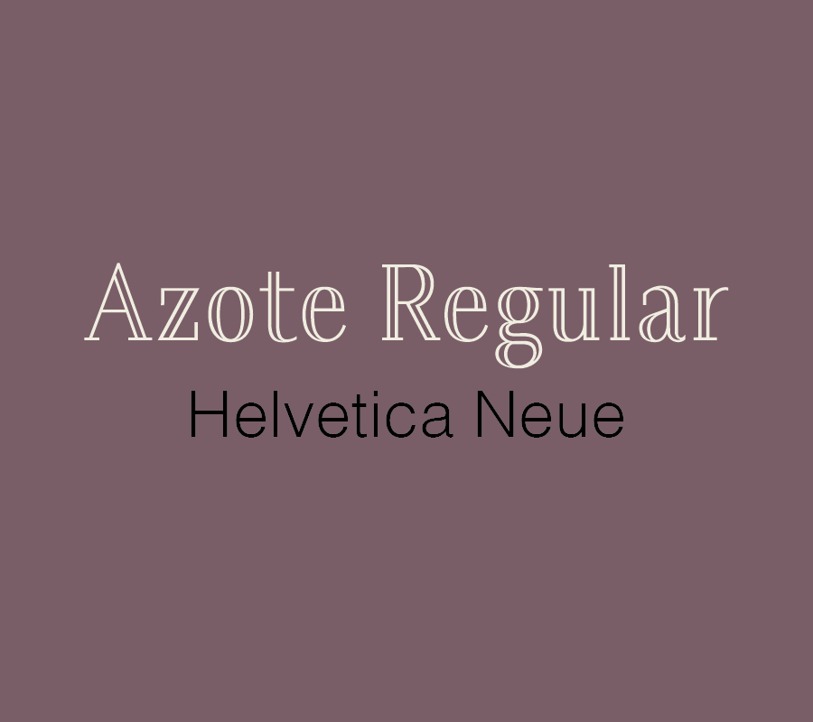
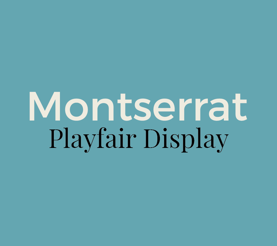
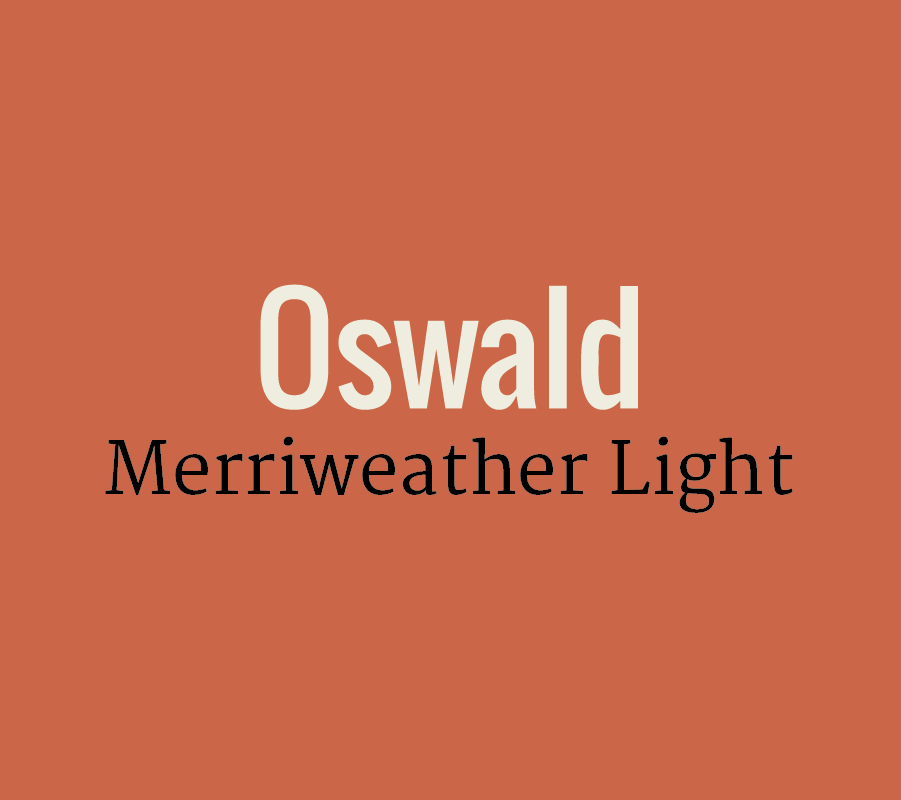
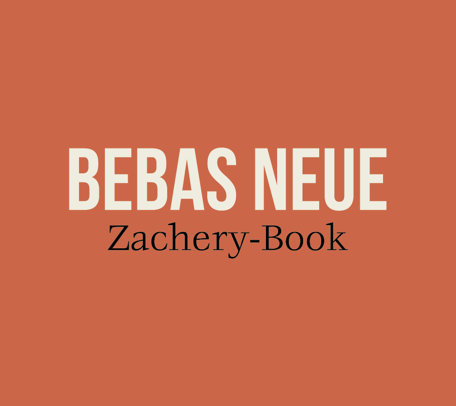
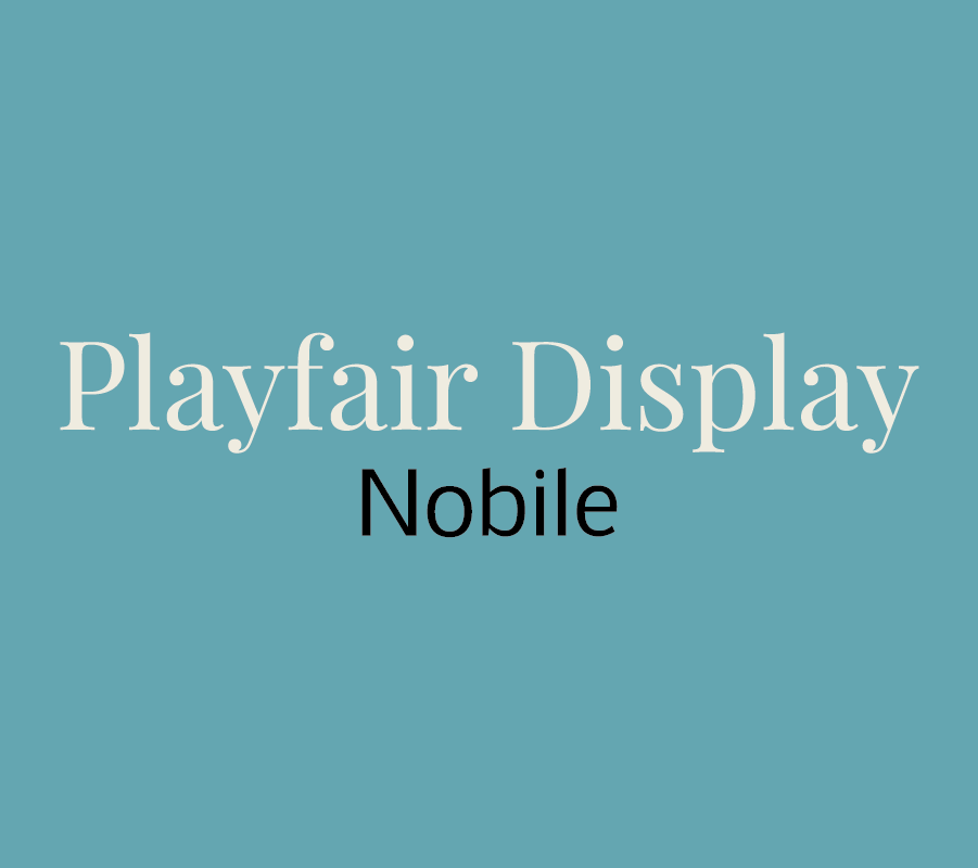
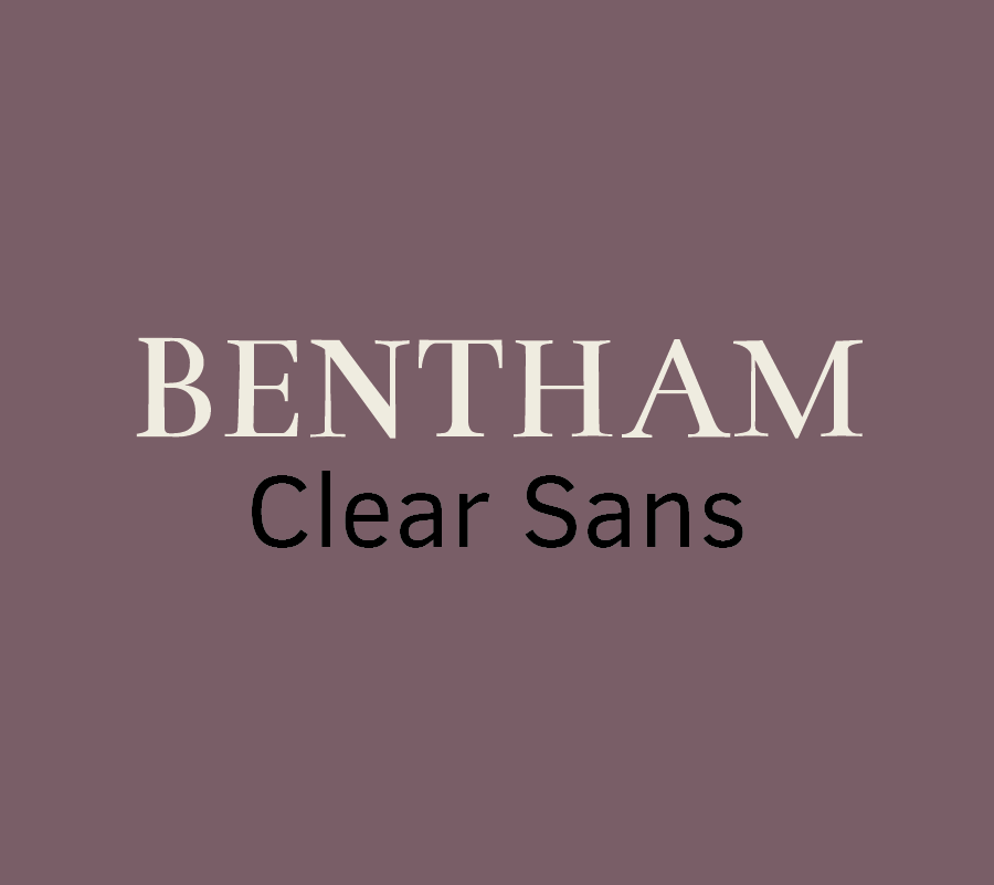
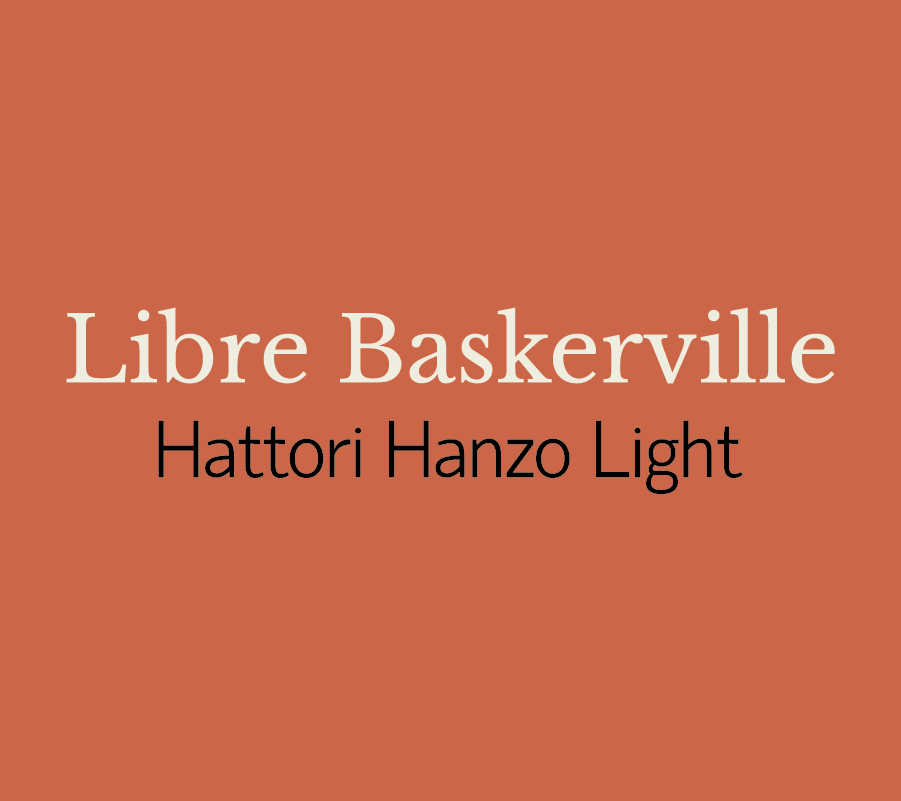
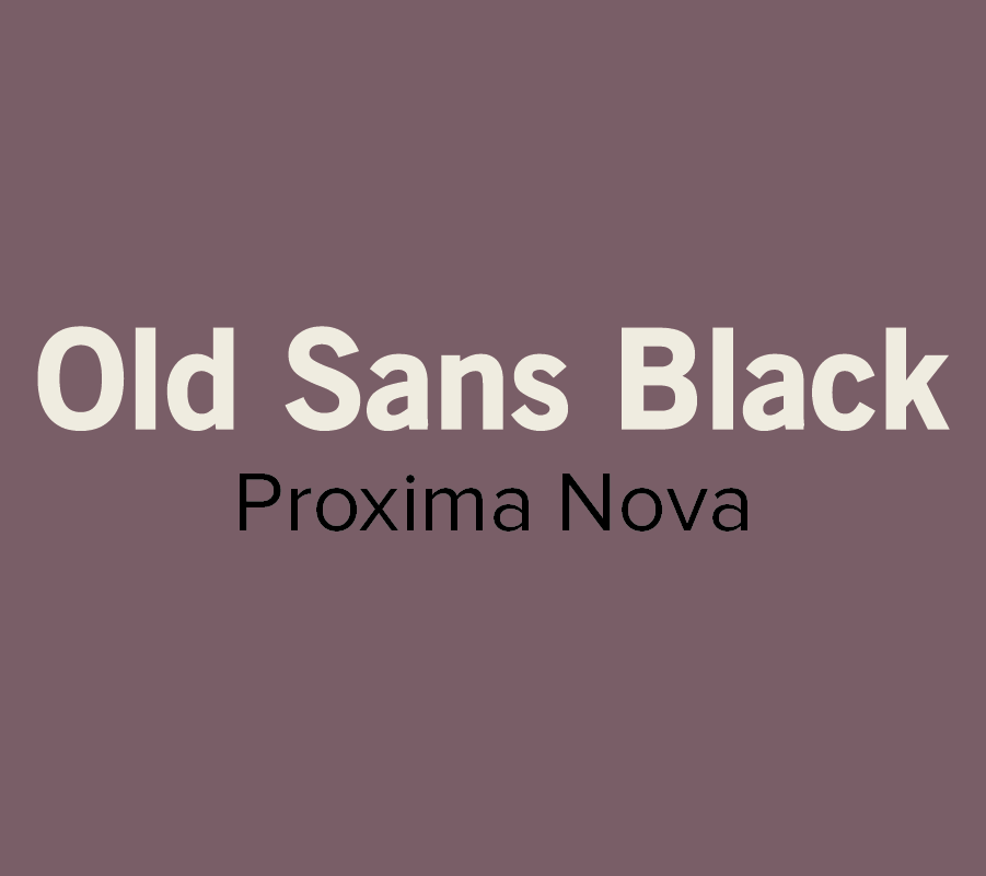
12 Inspiring Font Combination

Whether you’re designing a resume, website, or even a graphic for social media, choosing the right fonts can make a good design even better.  However, the seemingly endless font options available at our disposal can make choosing the right ones a little tricky.

To help alleviate a little stress and confusion, we put together a brief guide on font pairing. 

If you’re interested in the complexities of font typography, you can learn more here. But, if you're just looking to learn a few basics, start with these guidelines: 

  • Try combing a serif with a sans serif.
  • Stick to 2-3 fonts, any more than that can be distracting.
  • Designate rolls to your fonts. Keep headings, subheadings, or body text consistent.
  • Vary the weight to achieve visual hierarchy.
  • Contrast is key! Try not to select fonts that are too similar.
  • Don’t pick fonts that clash with your aesthetic.

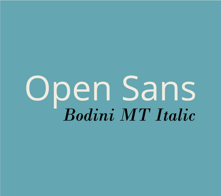
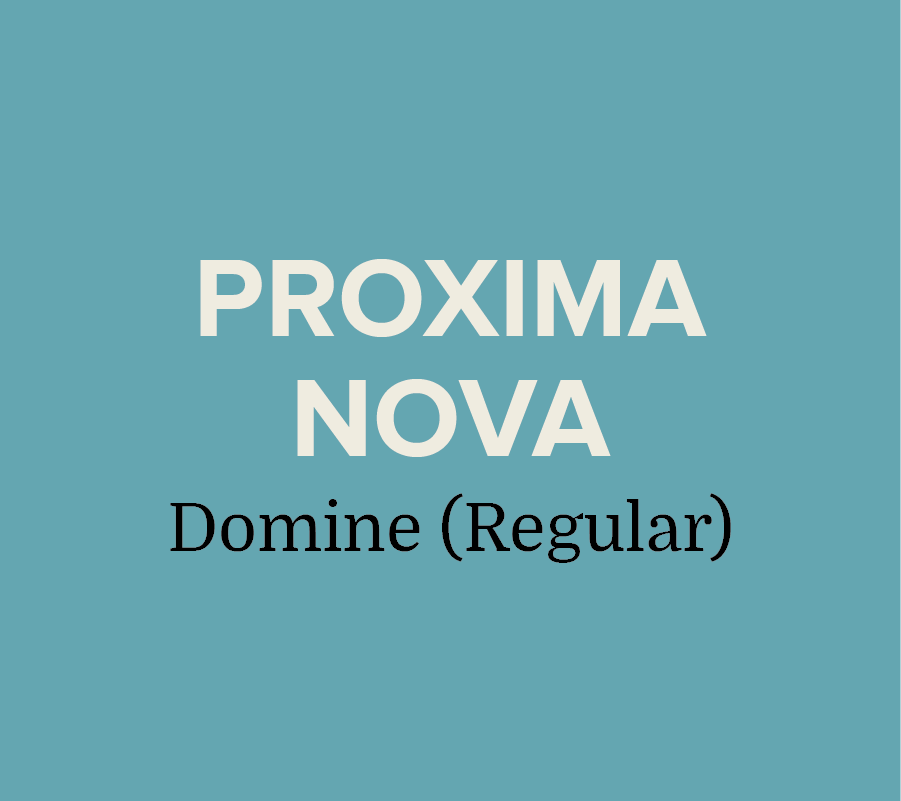
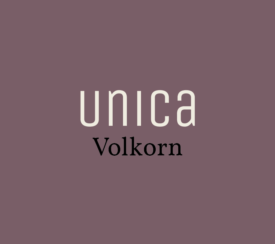
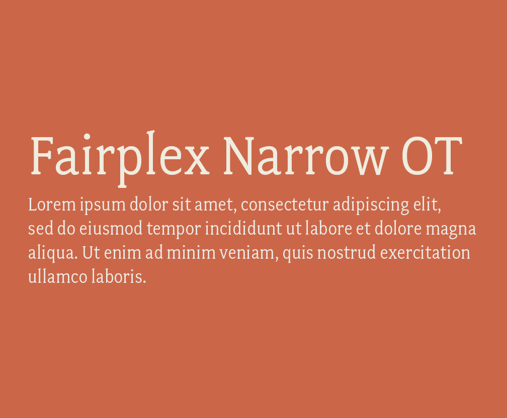
Now that you have some basics down, here are a few of our favorite combinations:

Most of the font examples we used below are from Font Squirrel, but you can also find some free or inexpensive downloads from these sites:

These are just a few of our suggestions, so don’t be afraid to branch out and try something different. There are seemingly endless font combinations to choose from! Play around and try out different combinations until you find what works best for you.

What are your favorite font pairings? Let us know in the comments!